College Magazine Contents Page Analysis This front cover

- Slides: 3

College Magazine Contents Page Analysis

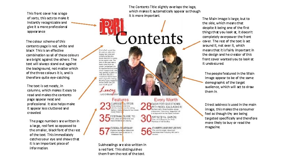
This front cover has a logo of sorts, this acts to make it instantly recognizable and give it a more professional appearance The Contents Title slightly overlaps the logo, which makes it automatically appear as though it is more important. The colour scheme of this contents page is red, white and black. This is an effective combination as all of these colours are bright against the others. The text will always stand out against the background, not matter which of the three colours it is, and is therefore quite eye-catching. The people featured in the Main Image appear to be of the same demographic of the target audience, which will act to draw them in. The text is set neatly, in columns, which makes it easy to read and makes the contents page appear neat and professional. It also helps make it appear less cluttered and crowded. The page numbers are written in a large, red font as opposed to the smaller, black font of the rest of the text. This immediately catches your eye and shows that it is an important piece of information. The Main Image is large, but to the side, which means that despite it being one of the first things that you look at, it doesn't completely overpower the front cover. The rest of the text is set around it, not over it, which means that it is fairly important in the design and he creator of this front cover wanted you to look at it unobscured. Direct address is used in the main image, this makes the consumer feel as though thy are being targeted specifically and therefore more likely to buy or read the magazine. Subheadings are also written in a red font. This distinguishes them from the rest of the text.

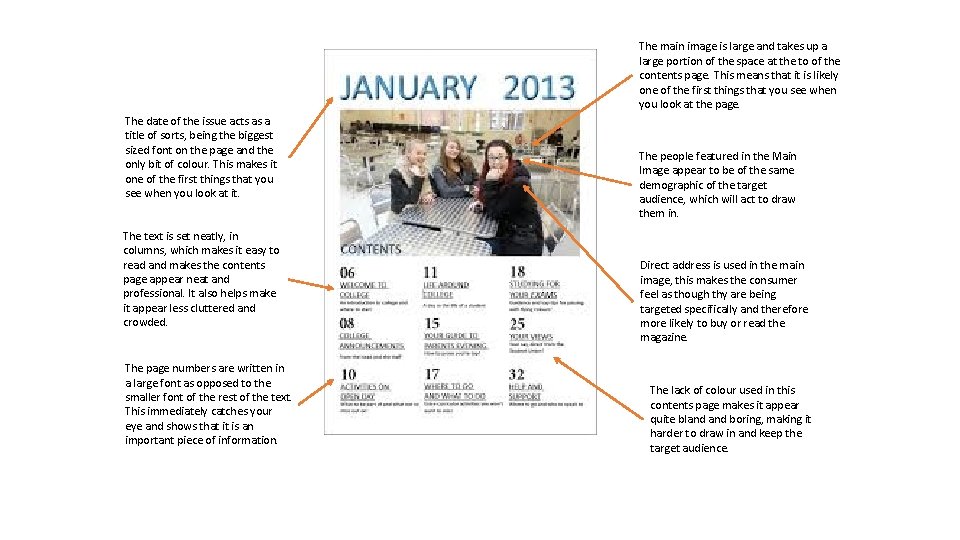
The main image is large and takes up a large portion of the space at the to of the contents page. This means that it is likely one of the first things that you see when you look at the page. The date of the issue acts as a title of sorts, being the biggest sized font on the page and the only bit of colour. This makes it one of the first things that you see when you look at it. The text is set neatly, in columns, which makes it easy to read and makes the contents page appear neat and professional. It also helps make it appear less cluttered and crowded. The page numbers are written in a large font as opposed to the smaller font of the rest of the text. This immediately catches your eye and shows that it is an important piece of information. The people featured in the Main Image appear to be of the same demographic of the target audience, which will act to draw them in. Direct address is used in the main image, this makes the consumer feel as though thy are being targeted specifically and therefore more likely to buy or read the magazine. The lack of colour used in this contents page makes it appear quite bland boring, making it harder to draw in and keep the target audience.