Coffee Rockz By Creative Digitals Thomass Logo Design

Coffee Rockz By Creative Digitals
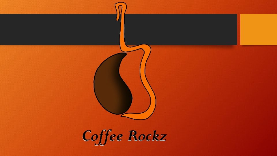

Thomas’s Logo Design • The logo proposed shows a mix between a coffee bean and an electric guitar. • The guitar was chosen as it is the symbol of Rock’n. Roll. • The coffee bean was chosen as it is the prime symbol of most coffee shops and coffee itself. • The design is easily repeatable, it can be placed on all products available at a coffee shop and the P. O. S. • Brown represents the coffee bean and coffee. The orange represents the younger audience as it is a bright colour. • I have chosen this font as it looks like a hand written font which is easy to read. It also has a grey/silver shadow in accordance with the brief.

Logo on products.
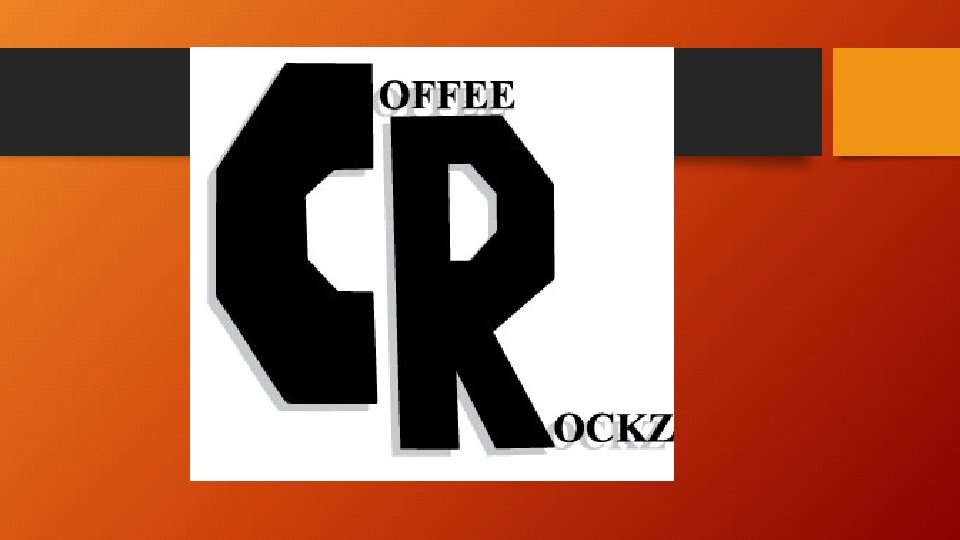

Aiden’s Logo Design • The C and R are the focus point of the logo. • The logo’s colours were chosen by the brief as it stated that a black writing with a silver shadow was preferred. • The C and R were made in that way to have a more digital effect to them. • I have chosen the type of font as it fits in with my main part of the logo. • The logo can be easily put on products, brands, websites and so on.
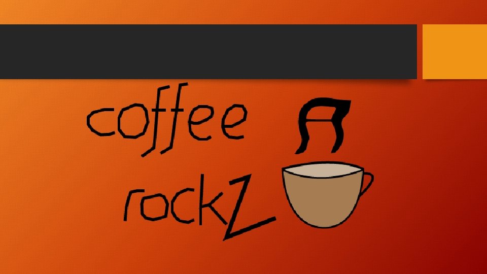

Cain’s Logo design • The font chosen was to represent a much more casual mood than other serious fonts. • The colours in the mug, brown and a lighter brown, represent the typical colours of coffee. • The steam coming from the mug takes the form of a musical note to represent the ‘rock’ music part of the company’s name.
- Slides: 8