Cluster Analysis Hierarchical and kmeans Expression data Expression


")


- Slides: 21
Cluster Analysis Hierarchical and k-means
Expression data • Expression data are typically analyzed in matrix form with each row representing a gene and each column representing a chip or sample.
Expression data • We represent the data matrix by the symbol X and denote the data as follows:
Clustering on transposition of X
Filtering • The first step in analyzing microarray data is to filter out genes that are not expressed or do not show variation across sample types. – always remove from the analyses the rows corresponding to genes that were not expressed on any of the chips. – For example, if gene chips are used to analyze tumor and normal tissues, the two groups can be compared using t-statistics calculated for each gene.
Normalization for Clustering • Normalizing a gene across samples is accomplished by subtracting from each expression level the mean of the expression levels for that gene and then dividing by the standard deviation of that gene. • Calculate the mean and standard deviation of the gene of interest:
Normalized expression values
Distance Measures
Distance Matrix
Hierarchical Clustering • Average Linkage Algorithm (unweighted centroid clustering)
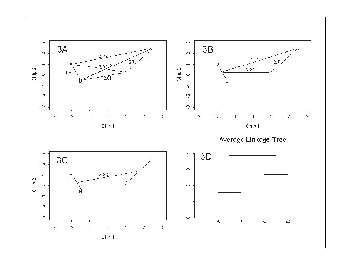
Example: A distance matrix of 4 genes • the first step merges genes A and B whose distance is 1. 58. • The distances are updated as follows: – Replace the two genes A and B by the midpoint (AB) between them and recalculate the distance of gene C to this midpoint (d(AB, C) = 2. 85) and gene D to this midpoint (d(AB, D) = 4. 81). Note that d(C, D) = 2. 7 is unchanged.
Differences between clustering methods • For example, in Figure 3 A the first merging clustered genes A and B and the distance of this new cluster to gene D was d(AB, D) = 4. 81. • For single linkage, the distance would be d(AB, D) = 4. 74 and for complete linkage the distance would be d(AB, D) = 5.
Heat Maps • The heat map presents a grid of colored points where each color represents a gene expression value in the sample.
Heat Map Example • The grid coordinates correspond to the sample by gene combinations. • In this case, the columns (samples) are tumors, some from patients who have relapsed and some from patients who have not relapsed. The rows represent 348 genes found to distinguish the patients according to their relapse status. • Ordering determined by hierarchical clustering
Software for Clustering and Heat. Maps • Eisen first has developed a powerful clustering and visualization tool for microarray data • You can download it from the following website http: //rana. lbl. gov/Eisen. Software. htm
Cluster • Clusters filtered microarray datasets using different methods. • Need to upload data (rows, genes; columns conditions; gene expression values)
Cluster
Adjust Data
Cluster Data
Tree. View • To visualize the clustering result as a heatmap. Load the. cdt file created by Cluster package and visualize coexpressed genes (red upregulated and green down regulated in the condition of interest; median centered dataset)