CIS 4004 Web Based Information Technology Summer 2014
CIS 4004: Web Based Information Technology Summer 2014 Advanced Page Layouts – Part 2 Instructor : Dr. Mark Llewellyn markl@cs. ucf. edu HEC 236, 407 -823 -2790 http: //www. cs. ucf. edu/courses/cis 4004/sum 2014 Department of Electrical Engineering and Computer Science University of Central Florida CIS 4004: Advanced Page Layouts – Part 1 Page 1 © Dr. Mark Llewellyn
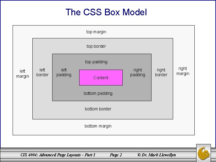
The CSS Box Model top margin top border top padding left margin left border left padding right padding Content right border bottom padding bottom border bottom margin CIS 4004: Advanced Page Layouts – Part 1 Page 2 © Dr. Mark Llewellyn right margin
Three-Column Fluid Center Page Layouts • In Advanced Page Layouts – Part 1, we examined several different approaches to handling a fixed-width multi-column page layout. • The two primary approaches that we took were the more traditional nested <div>s and the new CSS 3 boxsizing: border-box property. Hopefully, you have taken a closer look at both cases by now and are familiar with the techniques that were utilized in both cases. • Our primary concern, in addition to achieving an overall pleasing appearance for our page, was to prevent “breaking” the page when the size of the content changed over time. The two approaches that we took were designed to prevent “float-slip”. CIS 4004: Advanced Page Layouts – Part 1 Page 3 © Dr. Mark Llewellyn
Three-Column Fluid Center Page Layouts • In this set of notes, we focus on a three-column layout with a fluid center. • In other words, we no longer have a fixed overall width to our page layout, but allow it to expand contract as the user alters the size of their browser window. • There are two basic ways to achieve a fluid center column: – Use negative margins to position the right column as the center changes size, or – Make the column containers behave like table cells using CSS 3. • The negative margins work well with older browsers, but the CSS 3 table properties method is more simple and will work with the newer generation browsers, so we’ll look at both techniques. CIS 4004: Advanced Page Layouts – Part 1 Page 4 © Dr. Mark Llewellyn
Three-Column Fluid Center Layout With Negative Margins • The issue with creating a three-column layout where the center content area is fluid is managing the right column, and controlling its relationship to the layout as the center content area resizes. • The solution using negative margins was originally developed by Web designer Ryan Brill. His solution manipulates the margins of two wrapper elements (<div> elements): the first one around all three columns and a second one around just the left and center columns. The effect is shown on the next page. CIS 4004: Advanced Page Layouts – Part 1 Page 5 © Dr. Mark Llewellyn
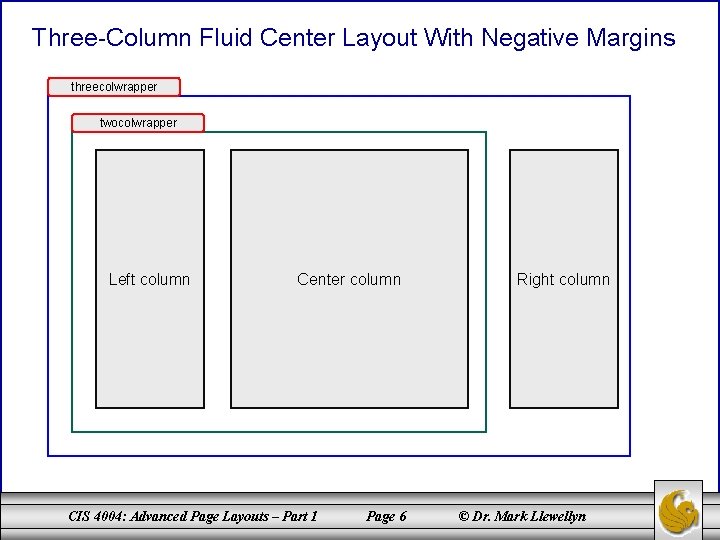
Three-Column Fluid Center Layout With Negative Margins threecolwrapper twocolwrapper Left column Center column CIS 4004: Advanced Page Layouts – Part 1 Page 6 Right column © Dr. Mark Llewellyn
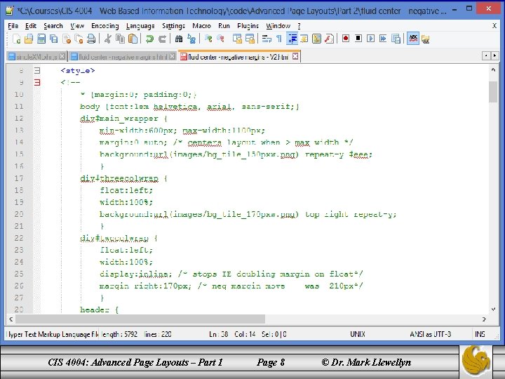
Three-Column Fluid Center Layout With Negative Margins • Since we dealt with the fixed width layout fairly extensively in the previous set of notes, I won’t develop this layout in the same step-by-step fashion. • Instead, I’ll point out some of the highlights in the CSS that allows for the center column to be fluid. The next couple pages illustrate the fluid nature of the center column. Notice that as the browser window is expanded the center column gets wider (it also gets shorter since the content moves up). Notice too, that the left and right columns do not change size, only the center column is fluid. • As shown in the previous page, the CSS effect that allows this behavior is the multiple layers of <div> elements, combined with negative margins applied to the right column. CIS 4004: Advanced Page Layouts – Part 1 Page 7 © Dr. Mark Llewellyn
CIS 4004: Advanced Page Layouts – Part 1 Page 8 © Dr. Mark Llewellyn
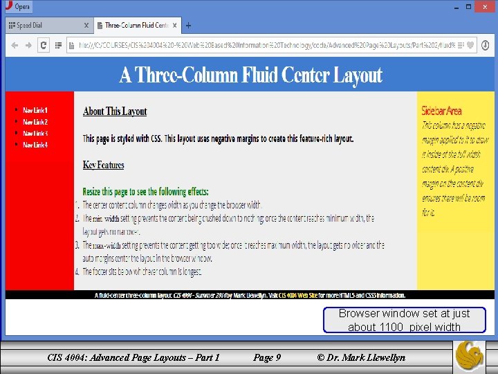
Browser window set at just about 1100 pixel width CIS 4004: Advanced Page Layouts – Part 1 Page 9 © Dr. Mark Llewellyn
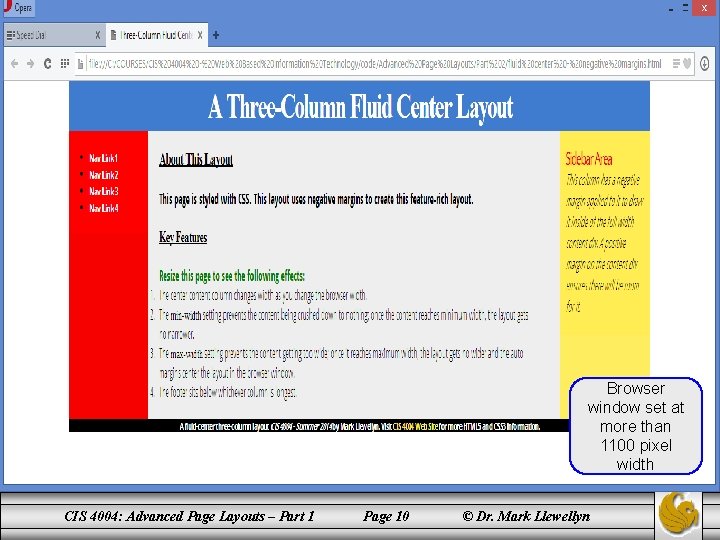
Browser window set at more than 1100 pixel width CIS 4004: Advanced Page Layouts – Part 1 Page 10 © Dr. Mark Llewellyn
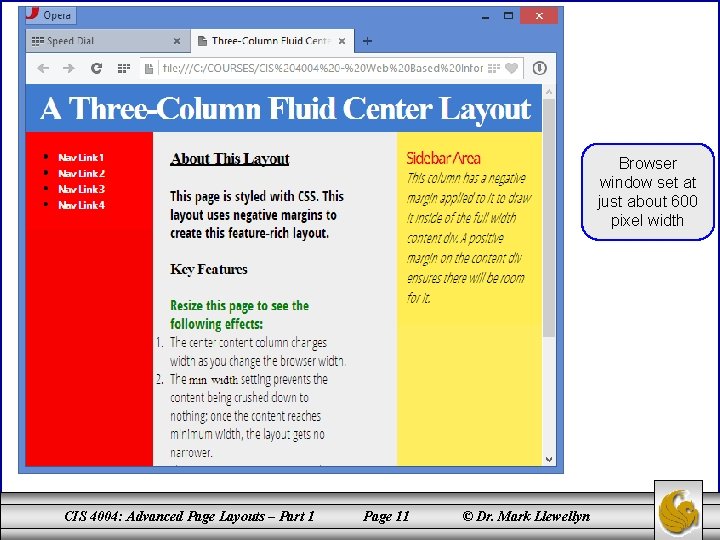
Browser window set at just about 600 pixel width CIS 4004: Advanced Page Layouts – Part 1 Page 11 © Dr. Mark Llewellyn
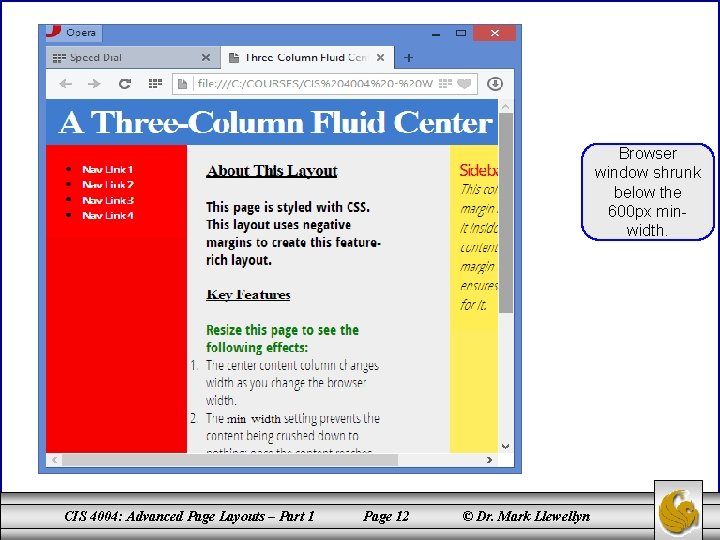
Browser window shrunk below the 600 px minwidth. CIS 4004: Advanced Page Layouts – Part 1 Page 12 © Dr. Mark Llewellyn
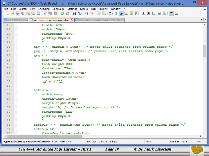
Three-Column Fluid Center Layout With Negative Margins • Here’s how the fluid center column with negative margins works. You should look at the markup and CSS to help you understand what’s happening. • The right column (the <aside>) is 210 pixels wide. There is a right margin of 210 pixels on the center column (the <article> element) to create space for the right column, although doing this pushes the right column 210 pixels away. In other words, it would not have room for it and would slip under the left column. However, a negative right margin of 210 pixels is applied to the two-column wrapper around the left and center columns, which pulls the right column back up and into the space created by the right margin on the <article> element. CIS 4004: Advanced Page Layouts – Part 1 Page 13 © Dr. Mark Llewellyn
Three-Column Fluid Center Layout With Negative Margins • The <article> element (center column) which is sized at 100%, still claims 100% of the space that remains after the left column is floated into position, but its right margin leaves space for the right column to be pulled into position by the negative margin on the inner wrapper. • Another feature of this layout is the full height columns. Notice that the left and right columns are now the same height as the center column in this layout. In our previous version (the fixedwidth multi-column layout), the left and right columns extended only as far as their content allowed. • One technique for accomplishing this effect, and the one that I used here, is known as “faux columns”. CIS 4004: Advanced Page Layouts – Part 1 Page 14 © Dr. Mark Llewellyn
Three-Column Fluid Center Layout With Negative Margins • Faux columns actually only make you think that the columns are full height, actually, they are not, hence the name. • This technique involves adding background graphic elements that are the same width and background color as the columns into the page’s wrapper elements behind the actual columns. • The wrapper elements, unlike the columns themselves, are the full height of the content area, so by repeating the background graphics vertically, they visually extend the columns down the page. • Just to make the effect more pronounced here, I used different color backgrounds for the left and right columns as well as for the fluid center column. CIS 4004: Advanced Page Layouts – Part 1 Page 15 © Dr. Mark Llewellyn
Three-Column Fluid Center Layout With Negative Margins • Again, look at the CSS as you read this explanation and it will help you understand what is happening. • The main_wrapper div element is used for the left column’s graphic and the threecolwrap div element is used for the right graphic and it is positioned to the div element’s right edge. • The background of the main_wrapper is set to the column of the background of the center column. This background color actually fills the background of the entire layout, but the graphics on the side columns, the header, and the footer overlay the main_wrapper, (recall that child elements overlay parent elements), so you only see its color in the center area. CIS 4004: Advanced Page Layouts – Part 1 Page 16 © Dr. Mark Llewellyn
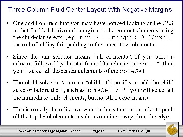
Three-Column Fluid Center Layout With Negative Margins • One addition item that you may have noticed looking at the CSS is that I added horizontal margins to the content elements using the child-star selector, e. g. , nav > * {margin: 0 10 px; }, instead of adding this padding to the inner div elements. • Since the star selector means “all elements”, if you write a selector followed by the star (asterik) such as some. Sel *, then you’ll select all descendant elements of the some. Sel. • The child selector > means “child of”, so if you add the child selector before the *, such as some. Sel > * you will select all the immediate child elements, but no other descendants. • This is exactly the effect we want in this situation in order to push all the top-level elements inside a container away from the edge. CIS 4004: Advanced Page Layouts – Part 1 Page 17 © Dr. Mark Llewellyn
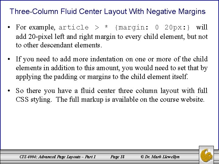
Three-Column Fluid Center Layout With Negative Margins • For example, article > * {margin: 0 20 px: } will add 20 -pixel left and right margin to every child element, but not to other descendant elements. • If you need to add more indentation on one or more of the child elements in addition to this amount, you would need to set that by applying the padding or margins to the child element itself. • So there you have a fluid center three column layout with full CSS styling. The full markup is available on the course website. CIS 4004: Advanced Page Layouts – Part 1 Page 18 © Dr. Mark Llewellyn
Three-Column Fluid Center Layout With Negative Margins • For example, article > * {margin: 0 20 px: } will add 20 -pixel left and right margin to every child element, but not to other descendant elements. • If you need to add more indentation on one or more of the child elements in addition to this amount, you would need to set that by applying the padding or margins to the child element itself. • So there you have a fluid center three column layout with full CSS styling. The full markup is available on the course website. CIS 4004: Advanced Page Layouts – Part 1 Page 19 © Dr. Mark Llewellyn
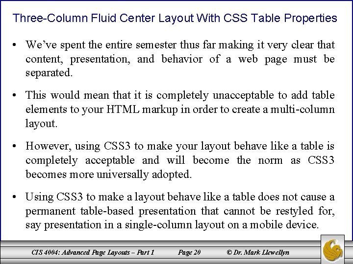
Three-Column Fluid Center Layout With CSS Table Properties • We’ve spent the entire semester thus far making it very clear that content, presentation, and behavior of a web page must be separated. • This would mean that it is completely unacceptable to add table elements to your HTML markup in order to create a multi-column layout. • However, using CSS 3 to make your layout behave like a table is completely acceptable and will become the norm as CSS 3 becomes more universally adopted. • Using CSS 3 to make a layout behave like a table does not cause a permanent table-based presentation that cannot be restyled for, say presentation in a single-column layout on a mobile device. CIS 4004: Advanced Page Layouts – Part 1 Page 20 © Dr. Mark Llewellyn
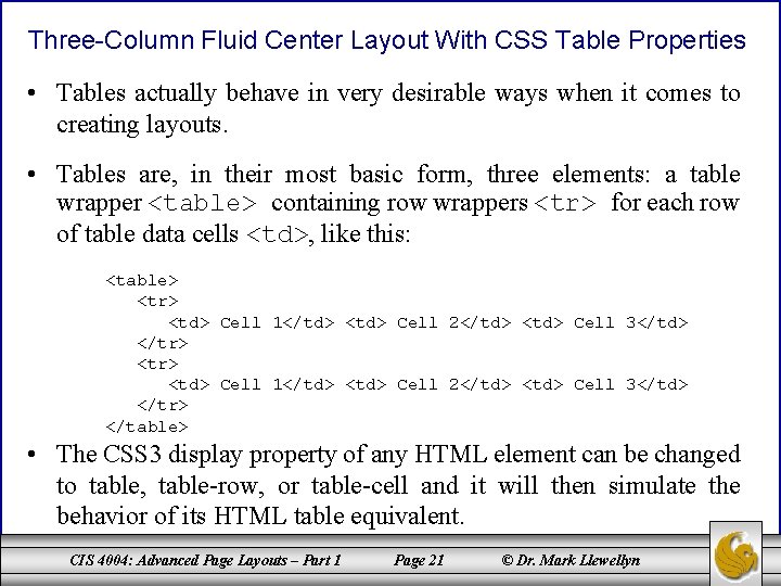
Three-Column Fluid Center Layout With CSS Table Properties • Tables actually behave in very desirable ways when it comes to creating layouts. • Tables are, in their most basic form, three elements: a table wrapper <table> containing row wrappers <tr> for each row of table data cells <td>, like this: <table> <tr> <td> Cell 1</td> <td> Cell 2</td> <td> Cell 3</td> </tr> </table> • The CSS 3 display property of any HTML element can be changed to table, table-row, or table-cell and it will then simulate the behavior of its HTML table equivalent. CIS 4004: Advanced Page Layouts – Part 1 Page 21 © Dr. Mark Llewellyn
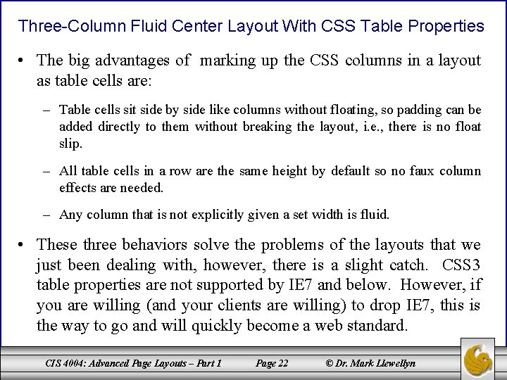
Three-Column Fluid Center Layout With CSS Table Properties • The big advantages of marking up the CSS columns in a layout as table cells are: – Table cells sit side by side like columns without floating, so padding can be added directly to them without breaking the layout, i. e. , there is no float slip. – All table cells in a row are the same height by default so no faux column effects are needed. – Any column that is not explicitly given a set width is fluid. • These three behaviors solve the problems of the layouts that we just been dealing with, however, there is a slight catch. CSS 3 table properties are not supported by IE 7 and below. However, if you are willing (and your clients are willing) to drop IE 7, this is the way to go and will quickly become a web standard. CIS 4004: Advanced Page Layouts – Part 1 Page 22 © Dr. Mark Llewellyn
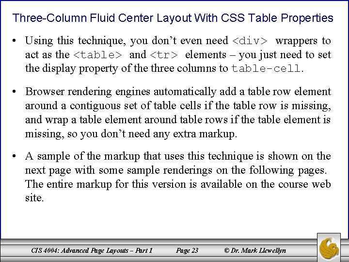
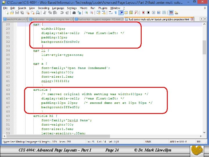
Three-Column Fluid Center Layout With CSS Table Properties • Using this technique, you don’t even need <div> wrappers to act as the <table> and <tr> elements – you just need to set the display property of the three columns to table-cell. • Browser rendering engines automatically add a table row element around a contiguous set of table cells if the table row is missing, and wrap a table element around table rows if the table element is missing, so you don’t need any extra markup. • A sample of the markup that uses this technique is shown on the next page with some sample renderings on the following pages. The entire markup for this version is available on the course web site. CIS 4004: Advanced Page Layouts – Part 1 Page 23 © Dr. Mark Llewellyn
CIS 4004: Advanced Page Layouts – Part 1 Page 24 © Dr. Mark Llewellyn
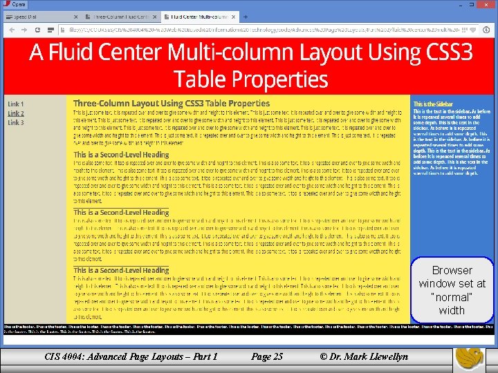
Browser window set at “normal” width CIS 4004: Advanced Page Layouts – Part 1 Page 25 © Dr. Mark Llewellyn
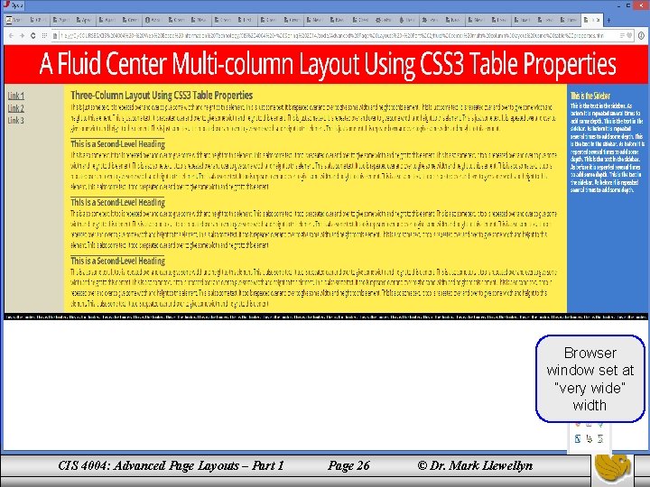
Browser window set at “very wide” width CIS 4004: Advanced Page Layouts – Part 1 Page 26 © Dr. Mark Llewellyn
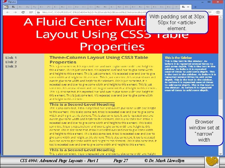
With padding set at 30 px 50 px for <article> element. Browser window set at “narrow” width CIS 4004: Advanced Page Layouts – Part 1 Page 27 © Dr. Mark Llewellyn
- Slides: 27