CIS 388 BootstrapWeb Flow Web development of the
CIS 388 Bootstrap/Web. Flow Web development of the future
Bootstrap! � What is Bootstrap? Bootstrap is a framework to help you design websites faster and easier. It includes HTML and CSS based design templates for typography, forms, buttons, tables, navigation, modals, image carousels, etc. It also gives you support for Java. Script plugins. Bootstrap, originally named Twitter Blueprint, was developed by Mark Otto and. Jacob Thornton at Twitter as a framework to encourage consistency across internal tools. Before Bootstrap, various libraries were used for interface development, which led to inconsistencies and a high maintenance burden. Bootstrap is completely free to download and use!
How to use Bootstrap? �Download Bootstrap from getbootstrap. com Download bootstrap and upload it to a folder on your site and include it in every page (header/include) of your site <link rel="stylesheet" href=“local bootstrap link. css"> �Include Bootstrap from a CDN Include the bootstrap libraries from another popular location/site on the web through a header/include on your page(s). <!-- Latest compiled and minified CSS --> <link rel="stylesheet" href="https: //maxcdn. bootstra pcdn. com/bootstrap/3. 4. 0/css/bootstrap. min. css">
Bootstrap CDN and Jquery � One advantage of using the Bootstrap CDN: Many users already have downloaded Bootstrap from Max. CDN when visiting another site. As a result, it will be loaded from cache when they visit your site, which leads to faster loading time. Also, most CDN's will make sure that once a user requests a file from it, it will be served from the server closest to them, which also leads to faster loading time. � j. Query Bootstrap uses j. Query for Java. Script plugins (like modals, tooltips, etc). However, if you just use the CSS part of Bootstrap, you don't need j. Query.
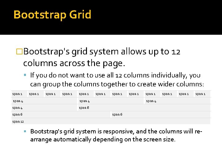
Bootstrap Grid �Bootstrap's grid system allows up to 12 columns across the page. If you do not want to use all 12 columns individually, you can group the columns together to create wider columns: span 1 span 1 span 4 span 8 span 6 span 1 span 1 span 4 span 6 span 12 Bootstrap's grid system is responsive, and the columns will re- arrange automatically depending on the screen size.

Bootstrap Grid (continued) � The Bootstrap grid system has four classes: xs (for phones - screens less than 768 px wide) sm (for tablets - screens equal to or greater than 768 px wide) md (for small laptops - screens equal to or greater than 992 px wide) lg (for laptops and desktops - screens equal to or greater than 1200 px wide) � The classes above can be combined to create more dynamic and flexible layouts. Ex. <div class="col-xs-1 col-md-9 col-lg-6"></div> *Be sure to add a “clear: both” style to start a new row!
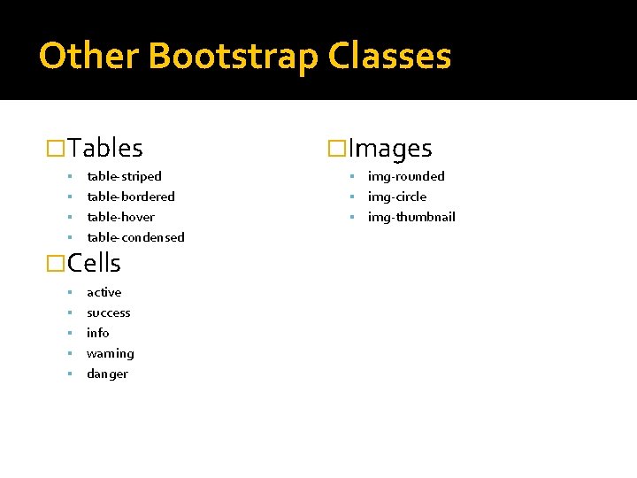
Other Bootstrap Classes �Tables �Images table-striped img-rounded table-bordered img-circle table-hover img-thumbnail table-condensed �Cells active success info warning danger
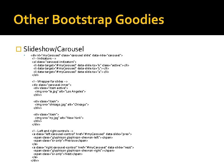
Other Bootstrap Goodies � Slideshow/Carousel <div id="my. Carousel" class="carousel slide" data-ride="carousel"> <!-- Indicators --> <ol class="carousel-indicators"> <li data-target="#my. Carousel" data-slide-to="0" class="active"></li> <li data-target="#my. Carousel" data-slide-to="1"></li> <li data-target="#my. Carousel" data-slide-to="2"></li> </ol> <!-- Wrapper for slides --> <div class="carousel-inner"> <div class="item active"> <img src="la. jpg" alt="Los Angeles"> </div> <div class="item"> <img src="chicago. jpg" alt="Chicago"> </div> <div class="item"> <img src="ny. jpg" alt="New York"> </div> <!-- Left and right controls --> <a class="left carousel-control" href="#my. Carousel" data-slide="prev"> <span class="glyphicon-chevron-left"></span> <span class="sr-only">Previous</span> </a> <a class="right carousel-control" href="#my. Carousel" data-slide="next"> <span class="glyphicon-chevron-right"></span> <span class="sr-only">Next</span> </a> </div>
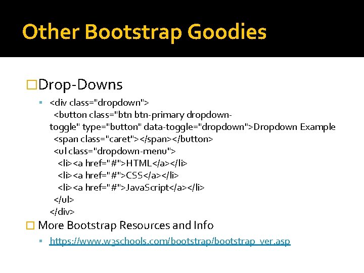
Other Bootstrap Goodies �Drop-Downs <div class="dropdown"> <button class="btn btn-primary dropdowntoggle" type="button" data-toggle="dropdown">Dropdown Example <span class="caret"></span></button> <ul class="dropdown-menu"> <li><a href="#">HTML</a></li> <li><a href="#">CSS</a></li> <li><a href="#">Java. Script</a></li> </ul> </div> � More Bootstrap Resources and Info https: //www. w 3 schools. com/bootstrap_ver. asp
Webflow �What is webflow? Webflow is a design tool, CMS, and hosting platform. It gives designers and developers the power to design, build, and launch responsive websites visually, while writing clean, semantic code for you. Try it for free: https: //webflow. com/pricing
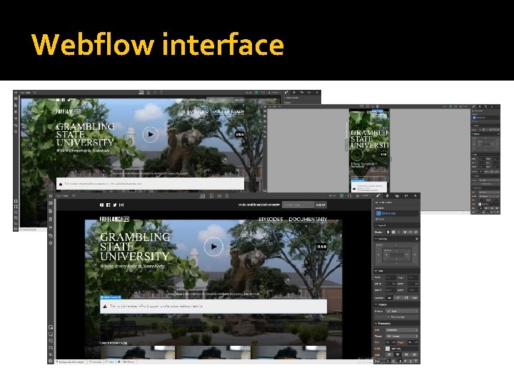
Webflow interface
Webflow Tools and Resources �You. Tube: https: //www. youtube. com/channel/UCELSb. IYi_d 5 r. YFOx. We. Oz 5 g �Facebook: https: //www. facebook. com/webflow/ �Getting Started: https: //university. webflow. com/lesson/introto-designer-101
- Slides: 12