Choropleth Maps An easy to draw map easy
- Slides: 11

Choropleth Maps An easy to draw map, easy to interpret map of distribution patterns, often used to show population statistics (A shaded map)

Lesson Objectives l Know and understand what a Choropleth map is l Understand the advantages and disadvantages of Choropleth maps l Complete your own Choropleth map (Medium)

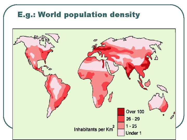
E. g. : World population density

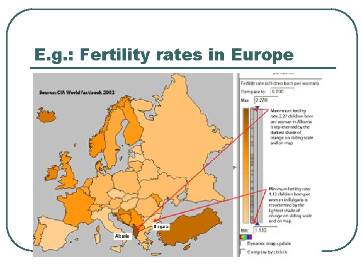
E. g. : Fertility rates in Europe

Choropleth Maps l l l Choropleth maps use different colored shading to show variations between places. They show differences between places and so show distribution patterns They are often used to show population distribution.

Constructing a Choropleth Map l l Each color stands for a range of values First decide on your ranges by looking at the data and dividing it into 4 -6 groups Decide what color to shade the groups using one or two colors shading from Dark (high values) to light (low values) After shading, give title and key

Advantages and disadvantages of choropleth maps?

Advantages and disadvantages of choropleth maps l l l Easy to draw Simple to interpret Give a good overall impression of the area l l They are based on averages so don’t give exact figures of particular locations They can conceal large differences in an area

Medium Assignment l l l Choose colors for shading Practice shading Shade each country in the group the correct color “No data” MUST be left white Add title, north point and key

Describing and explaining the worldwide distributions according to your map Describe and explain why it is so! l Always state names of countries and figures l Use correct unit (i. e. $ per capita) l Give examples of countries with highest values l Give examples of countries with lowest values l Don’t forget to also talk about the countries with medium values l Give general pattern, if any l Give exceptions to any pattern you observe l Use adjectives, e. g. landlocked/coastal l Use “high”, “moderate”, “low”, etc. All in two paragraphs l

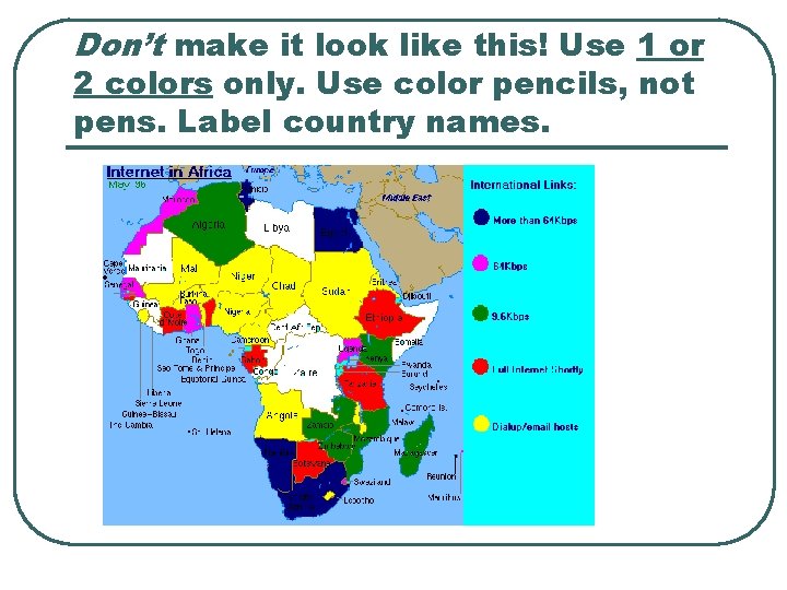
Don’t make it look like this! Use 1 or 2 colors only. Use color pencils, not pens. Label country names.