Choosing an Appropriate Graph Whats the difference between
Choosing an Appropriate Graph What’s the difference between: • Bar Graphs? • Line Graphs? • Circle Graphs?
Bar Graphs �Bar graphs are often used to show various amounts �They are most useful when comparing multiple quantities �Examples of situations: �Comparing real vs. budgeted expenses �Showing how many students voted for which favorite cartoon character �Etc.
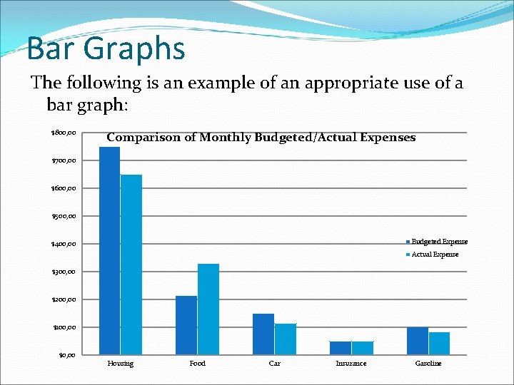
Bar Graphs The following is an example of an appropriate use of a bar graph: $800, 00 Comparison of Monthly Budgeted/Actual Expenses $700, 00 $600, 00 $500, 00 Budgeted Expense $400, 00 Actual Expense $300, 00 $200, 00 $100, 00 $0, 00 Housing Food Car Insurance Gasoline
Line Graphs �Line graphs are used primarily to show quantities change �The most common use involves a quantity that changes over time �Examples of situations: �The class average grade for each test of the semester (in chronological order) �Monthly income over the year �Etc.
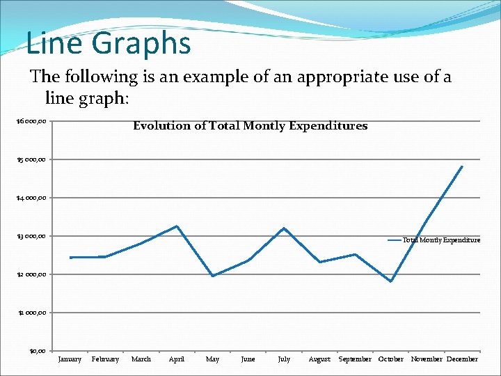
Line Graphs The following is an example of an appropriate use of a line graph: $6 000, 00 Evolution of Total Montly Expenditures $5 000, 00 $4 000, 00 $3 000, 00 Total Montly Expenditure $2 000, 00 $1 000, 00 $0, 00 January February March April May June July August September October November December
Circle Graphs �Circle graphs are used to show various parts combine to form a whole �They must ALWAYS have something that is considered the “whole” �Examples of situations: �Composition of boys and girls in a class �Composition of survey responses in a survey �Composition of budget categories in a budget �Can you identify the “whole” in each of the above situations? �Answer: “class”, “survey”, “budget”
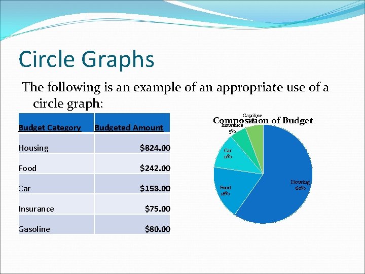
Circle Graphs The following is an example of an appropriate use of a circle graph: Gasoline Budget Category Budgeted Amount Housing $824. 00 Food $242. 00 Car $158. 00 Insurance $75. 00 Gasoline $80. 00 6% Composition of Budget Insurance 5% Car 11% Food 18% Housing 60%
- Slides: 7