Child Window Controls CS 1253 Visual Programming Unit
![Creating the Child Windows Class name TEXT ("button") Window text button[i]. sz. Text Window Creating the Child Windows Class name TEXT ("button") Window text button[i]. sz. Text Window](https://slidetodoc.com/presentation_image_h/8538c1e0bd0b1f8e8e886508f0273dd0/image-4.jpg)
- Slides: 41

Child Window Controls CS 1253 Visual Programming Unit I Topic 5

Presentation Outline l l l Introduction The Button Class Creating the Child Windows Push Buttons Check Boxes Radio Buttons Group Boxes Controls and Colors The Scroll Bar Class The Edit Class The Listbox Class

Introduction l The child window processes mouse and keyboard messages and notifies the parent window when the child window's state has changed. l In this way, the child window becomes a high-level input device for the parent window. l It encapsulates a specific functionality with regard to its graphical appearance on the screen, its response to user input, and its method of notifying another window when an important input event has occurred.
![Creating the Child Windows Class name TEXT button Window text buttoni sz Text Window Creating the Child Windows Class name TEXT ("button") Window text button[i]. sz. Text Window](https://slidetodoc.com/presentation_image_h/8538c1e0bd0b1f8e8e886508f0273dd0/image-4.jpg)
Creating the Child Windows Class name TEXT ("button") Window text button[i]. sz. Text Window style WS_CHILD ¦ WS_VISIBLE ¦ button[i]. i. Style x position cx. Char y position cy. Char * (1 + 2 * i) Width 20 * x. Char Height 7 * y. Char / 4 Parent window hwnd Child window ID (HMENU) i Instance handle ((LPCREATESTRUCT) l. Param) -> h. Instance Extra parameters NULL

Push Buttons

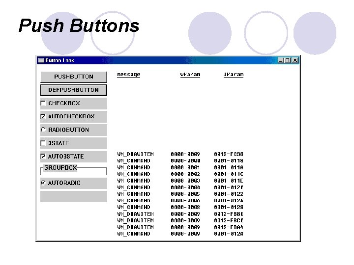
Push Buttons (2) A push button is a rectangle enclosing text specified in the window text parameter of the Create. Window call. The rectangle takes up the full height and width of the dimensions given in the Create. Window or Move. Window call. The text is centered within the rectangle. l Push-button controls are used mostly to trigger an immediate action without retaining any type of on/off indication. l The two types of push-button controls have window styles called BS_PUSHBUTTON and BS_DEFPUSHBUTTON. l When used to design dialog boxes, BS_PUSHBUTTON controls and BS_DEFPUSHBUTTON controls function differently from one another. When used as child window controls, however, the two types of push buttons function the same way, although BS_DEFPUSHBUTTON has a heavier outline. l

Push Buttons (3) A push button looks best when its height is 7/4 times the height of a text character, which is what BTNLOOK uses. The push button's width must accommodate at least the width of the text, plus two additional characters. l When the mouse cursor is inside the push button, pressing the mouse button causes the button to repaint itself using 3 D-style shading to appear as if it's been depressed. Releasing the mouse button restores the original appearance and sends a WM_COMMAND message to the parent window with the notification code BN_CLICKED. l As with the other button types, when a push button has the input focus, a dashed line surrounds the text and pressing and releasing the Spacebar has the same effect as pressing and releasing the mouse button. l

Push Buttons (4) l You can simulate a push-button flash by sending the window a BM_SETSTATE message. l This causes the button to be depressed: Send. Message (hwnd. Button, BM_SETSTATE, 1, 0) ; l This call causes the button to return to normal: Send. Message (hwnd. Button, BM_SETSTATE, 0, 0) ;

Check Boxes (2) A check box is a square box with text; the text usually appears to the right of the check box. l If you include the BS_LEFTTEXT style when creating the button, the text appears to the left; you'll probably want to combine this style with BS_RIGHT to right-justify the text. l Check boxes are usually incorporated in an application to allow a user to select options. l The check box commonly functions as a toggle switch: clicking the box once causes a check mark to appear; clicking again toggles the check mark off. l

Check Boxes (3) The two most common styles for a check box are BS_CHECKBOX and BS_AUTOCHECKBOX. l When you use the BS_CHECKBOX style, you must set the check mark yourself by sending the control a BM_SETCHECK message. The w. Param parameter is set to 1 to create a check mark and to 0 to remove it. l You can obtain the current check state of the box by sending the control a BM_GETCHECK message. You might use code like this to toggle the X mark when processing a WM_COMMAND message from the control: l Send. Message ((HWND) l. Param, BM_SETCHECK, (WPARAM) !Send. Message ((HWND) l. Param, BM_GETCHECK, 0, 0) ;

Check Boxes (4) The other two check box styles are BS_3 STATE and BS_AUTO 3 STATE. As their names indicate, these styles can display a third state as well—a gray color within the check box—which occurs when you send the control a WM_SETCHECK message with w. Param equal to 2. The gray color indicates to the user that the selection is indeterminate or irrelevant. l The check box is aligned with the rectangle's left edge and is centered within the top and bottom dimensions of the rectangle that were specified during the Create. Window call. Clicking anywhere within the rectangle causes a WM_COMMAND message to be sent to the parent. The minimum height for a check box is one character height. The minimum width is the number of characters in the text, plus two. l

Radio Buttons A radio button is named after the row of buttons that were once quite common on car radios. Each button on a car radio is set for a different radio station, and only one button can be pressed at a time. In dialog boxes, groups of radio buttons are conventionally used to indicate mutually exclusive options. Unlike check boxes, radio buttons do not work as toggles—that is, when you click a radio button a second time, its state remains unchanged. l The radio button looks very much like a check box except that it contains a little circle rather than a box. A heavy dot within the circle indicates that the radio button has been checked. The radio button has the window style BS_RADIOBUTTON or BS_AUTORADIOBUTTON, but the latter is used only in dialog boxes. l

Group Boxes l The group box, which has the BS_GROUPBOX style, is an oddity in the button class. l It neither processes mouse or keyboard input nor sends WM_COMMAND messages to its parent. l The group box is a rectangular outline with its window text at the top. Group boxes are often used to enclose other button controls.

Changing the Button Text Set. Window. Text (hwnd, psz. String) ; l where hwnd is a handle to the window whose text is being changed and psz. String is a pointer to a null-terminated string. l For a normal window, this text is the text of the caption bar. For a button control, it's the text displayed with the button. l You can also obtain the current text of a window: i. Length = Get. Window. Text (hwnd, psz. Buffer, i. Max. Length) ; The i. Max. Length parameter specifies the maximum number of characters to copy into the buffer pointed to by psz. Buffer. The function returns the string length copied. l You can prepare your program for a particular text length by first calling i. Length = Get. Window. Text. Length (hwnd) ; l

Visible and Enabled Buttons To receive mouse and keyboard input, a child window must be both visible (displayed) and enabled. When a child window is visible but not enabled, Windows displays the text in gray rather than black. l If you don't include WS_VISIBLE in the window class when creating the child window, the child window will not be displayed until you make a call to Show. Window: l Show. Window (hwnd. Child, SW_SHOWNORMAL) ; l But if you include WS_VISIBLE in the window class, you don't need to call Show. Window. However, you can hide the child window by this call to Show. Window: Show. Window (hwnd. Child, SW_HIDE) ;

Visible and Enabled Buttons (2) You can also enable and disable a child window. By default, a window is enabled. You can disable it by calling Enable. Window (hwnd. Child, FALSE) ; For button controls, this call has the effect of graying the button text string. The button no longer responds to mouse or keyboard input. This is the best method for indicating that a button option is currently unavailable. l You can re-enable a child window by calling Enable. Window (hwnd. Child, TRUE) ; You can determine whether a child window is enabled by calling Is. Window. Enabled (hwnd. Child) ; l

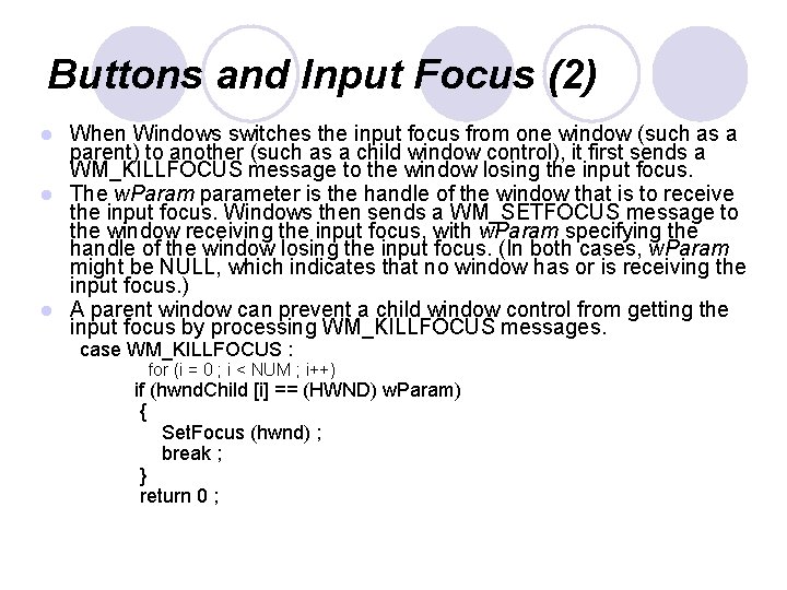
Buttons and Input Focus Push buttons, check boxes, radio buttons, and owner-draw buttons receive the input focus when they are clicked with the mouse. l The control indicates it has the input focus with a dashed line that surrounds the text. When the child window control gets the input focus, the parent window loses it; all keyboard input then goes to the control rather than to the parent window. l However, the child window control responds only to the Spacebar, which now functions like the mouse. This situation presents an obvious l

Buttons and Input Focus (2) When Windows switches the input focus from one window (such as a parent) to another (such as a child window control), it first sends a WM_KILLFOCUS message to the window losing the input focus. l The w. Param parameter is the handle of the window that is to receive the input focus. Windows then sends a WM_SETFOCUS message to the window receiving the input focus, with w. Param specifying the handle of the window losing the input focus. (In both cases, w. Param might be NULL, which indicates that no window has or is receiving the input focus. ) l A parent window can prevent a child window control from getting the input focus by processing WM_KILLFOCUS messages. l case WM_KILLFOCUS : for (i = 0 ; i < NUM ; i++) if (hwnd. Child [i] == (HWND) w. Param) { Set. Focus (hwnd) ; break ; } return 0 ;

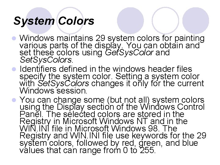
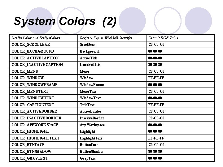
System Colors Windows maintains 29 system colors for painting various parts of the display. You can obtain and set these colors using Get. Sys. Color and Set. Sys. Colors. l Identifiers defined in the windows header files specify the system color. Setting a system color with Set. Sys. Colors changes it only for the current Windows session. l You can change some (but not all) system colors using the Display section of the Windows Control Panel. The selected colors are stored in the Registry in Microsoft Windows NT and in the WIN. INI file in Microsoft Windows 98. The Registry and WIN. INI file use keywords for the 29 system colors, followed by red, green, and blue values that can range from 0 to 255. l

System Colors (2) Get. Sys. Color and Set. Sys. Colors Registry Key or WIN. INI Identifer Default RGB Value COLOR_SCROLLBAR Scrollbar C 0 -C 0 COLOR_BACKGROUND Background 00 -80 -80 COLOR_ACTIVECAPTION Active. Title 00 -00 -80 COLOR_INACTIVECAPTION Inactive. Title 80 -80 -80 COLOR_MENU Menu C 0 -C 0 COLOR_WINDOW Window FF-FF-FF COLOR_WINDOWFRAME Window. Frame 00 -00 -00 COLOR_MENUTEXT Menu. Text C 0 -C 0 COLOR_WINDOWTEXT Window. Text 00 -00 -00 COLOR_CAPTIONTEXT Title. Text FF-FF-FF COLOR_ACTIVEBORDER Active. Border C 0 -C 0 COLOR_INACTIVEBORDER Inactive. Border C 0 -C 0 COLOR_APPWORKSPACE App. Workspace 80 -80 -80 COLOR_HIGHLIGHT Highlight 00 -00 -80 COLOR_HIGHLIGHTTEXT Highlight. Text FF-FF-FF COLOR_BTNFACE Button. Face C 0 -C 0 COLOR_BTNSHADOW Button. Shadow 80 -80 -80 COLOR_GRAYTEXT Gray. Text 80 -80 -80

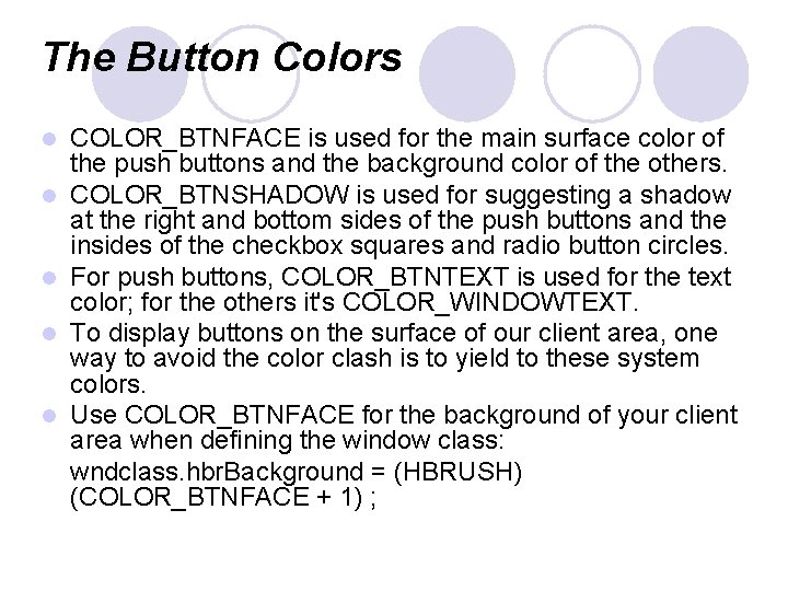
The Button Colors l l l COLOR_BTNFACE is used for the main surface color of the push buttons and the background color of the others. COLOR_BTNSHADOW is used for suggesting a shadow at the right and bottom sides of the push buttons and the insides of the checkbox squares and radio button circles. For push buttons, COLOR_BTNTEXT is used for the text color; for the others it's COLOR_WINDOWTEXT. To display buttons on the surface of our client area, one way to avoid the color clash is to yield to these system colors. Use COLOR_BTNFACE for the background of your client area when defining the window class: wndclass. hbr. Background = (HBRUSH) (COLOR_BTNFACE + 1) ;

Owner-Draw Buttons l If you want to have total control over the visual appearance of a button but don't want to bother with keyboard and mouse logic, you can create a button with the BS_OWNERDRAW style l If you need to display only an icon or a bitmap in the button, you can use the BS_ICON or BS_BITMAP style and set the bitmap using the BM_SETIMAGE message. l The BS_OWNERDRAW button style, allows complete freedom in drawing the button.

The Static Class Static child window controls created by using "static" as the window class in the Create. Window function. l These are fairly benign child windows. They do not accept mouse or keyboard input, and they do not send WM_COMMAND messages back to the parent window. l When you move or click the mouse over a static child window, the child window traps the WM_NCHITTEST message and returns a value of HTTRANSPARENT to Windows. This causes Windows to send the same WM_NCHITTEST message to the underlying window, which is usually the parent. The parent usually passes the message to Def. Window. Proc, where it is converted to a client-area mouse message. l

The Scroll Bar Class l You add window scroll bars to a window by including the identifier WS_VSCROLL or WS_HSCROLL or both in the window style when creating the window. l You create child window scroll bar controls by using the predefined window class "scrollbar" and one of the two scroll bar styles SBS_VERT and SBS_HORZ.

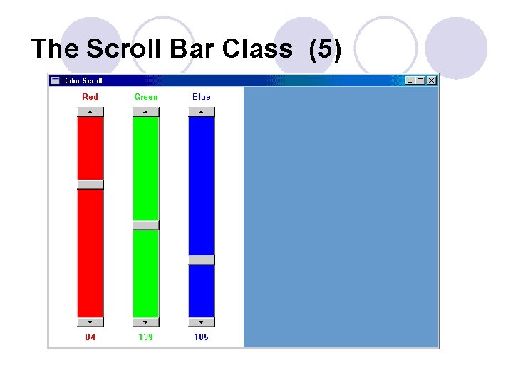
The Scroll Bar Class (3) l l l Unlike the button controls, scroll bar controls do not send WM_COMMAND messages to the parent window. Instead, they send WM_VSCROLL and WM_HSCROLL messages, just like window scroll bars. When processing the scroll bar messages, you can differentiate between window scroll bars and scroll bar controls by the l. Param parameter. It will be 0 for window scroll bars and the scroll bar window handle for scroll bar controls. The high and low words of the w. Param parameter have the same meaning for window scroll bars and scroll bar controls. Although window scroll bars have a fixed width, Windows uses the full rectangle dimensions given in the Create. Window call to size the scroll bar controls. You can make long, thin scroll bar controls or short, pudgy scroll bar controls.

The Scroll Bar Class (4) l You can set the range and position of a scroll bar control with the same calls used for window scroll bars: Set. Scroll. Range (hwnd. Scroll, SB_CTL, i. Min, i. Max, b. Redraw) ; Set. Scroll. Pos (hwnd. Scroll, SB_CTL, i. Pos, b. Redraw) ; Set. Scroll. Info (hwnd. Scroll, SB_CTL, &si, b. Redraw) ; The difference is that window scroll bars use a handle to the main window as the first parameter and SB_VERT or SB_HORZ as the second parameter.

The Scroll Bar Class (5)

The Edit Class

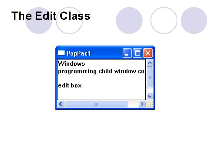
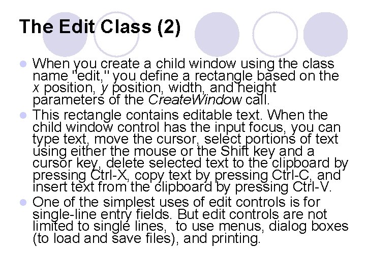
The Edit Class (2) When you create a child window using the class name "edit, " you define a rectangle based on the x position, y position, width, and height parameters of the Create. Window call. l This rectangle contains editable text. When the child window control has the input focus, you can type text, move the cursor, select portions of text using either the mouse or the Shift key and a cursor key, delete selected text to the clipboard by pressing Ctrl-X, copy text by pressing Ctrl-C, and insert text from the clipboard by pressing Ctrl-V. l One of the simplest uses of edit controls is for single-line entry fields. But edit controls are not limited to single lines, to use menus, dialog boxes (to load and save files), and printing. l

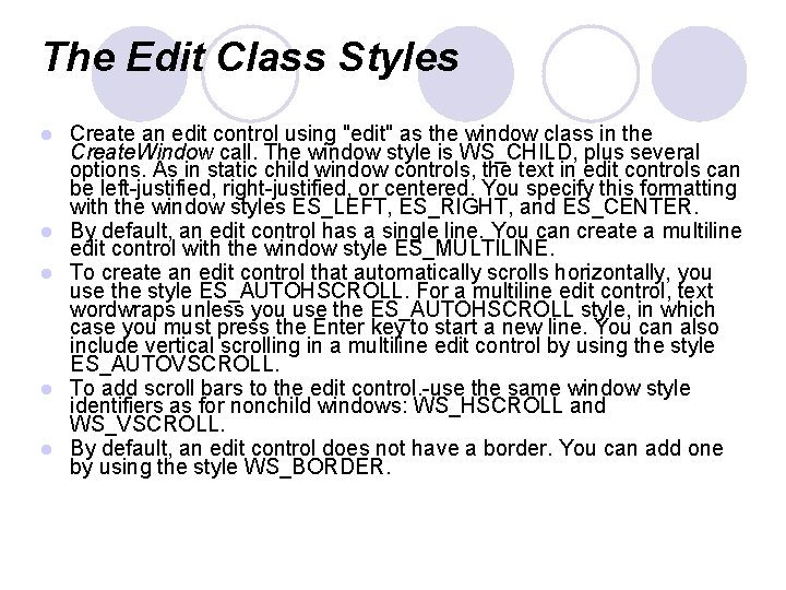
The Edit Class Styles l l l Create an edit control using "edit" as the window class in the Create. Window call. The window style is WS_CHILD, plus several options. As in static child window controls, the text in edit controls can be left-justified, right-justified, or centered. You specify this formatting with the window styles ES_LEFT, ES_RIGHT, and ES_CENTER. By default, an edit control has a single line. You can create a multiline edit control with the window style ES_MULTILINE. To create an edit control that automatically scrolls horizontally, you use the style ES_AUTOHSCROLL. For a multiline edit control, text wordwraps unless you use the ES_AUTOHSCROLL style, in which case you must press the Enter key to start a new line. You can also include vertical scrolling in a multiline edit control by using the style ES_AUTOVSCROLL. To add scroll bars to the edit control. -use the same window style identifiers as for nonchild windows: WS_HSCROLL and WS_VSCROLL. By default, an edit control does not have a border. You can add one by using the style WS_BORDER.

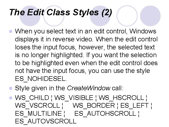
The Edit Class Styles (2) When you select text in an edit control, Windows displays it in reverse video. When the edit control loses the input focus, however, the selected text is no longer highlighted. If you want the selection to be highlighted even when the edit control does not have the input focus, you can use the style ES_NOHIDESEL. l Style given in the Create. Window call: l WS_CHILD ¦ WS_VISIBLE ¦ WS_HSCROLL ¦ WS_VSCROLL ¦ WS_BORDER ¦ ES_LEFT ¦ ES_MULTILINE ¦ ES_AUTOHSCROLL ¦ ES_AUTOVSCROLL l

The Listbox Class

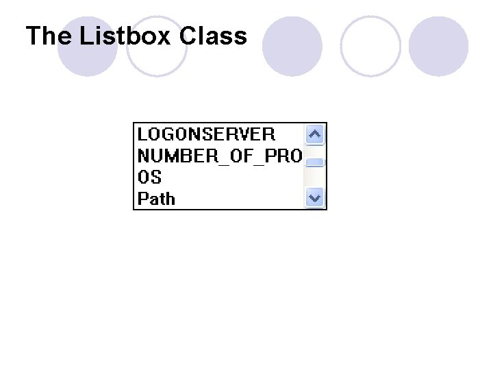
The Listbox Class (2) A list box is a collection of text strings displayed as a scrollable columnar list within a rectangle. A program can add or remove strings in the list by sending messages to the list box window procedure. The list box control sends WM_COMMAND messages to its parent window when an item in the list is selected. The parent window can then determine which item has been selected. l A list box can be either single selection or multiple selection. The latter allows the user to select more than one item from the list box. When a list box has the input focus, it displays a dashed line surrounding an item in the list box. This cursor does not indicate the selected item in the list box. The selected item is indicated by highlighting, which displays the item in reverse video. l

The Listbox Class(3) In a single-selection list box, the user can select the item that the cursor is positioned on by pressing the Spacebar. The arrow keys move both the cursor and the current selection and can scroll the contents of the list box. The Page Up and Page Down keys also scroll the list box by moving the cursor but not the selection. Pressing a letter key moves the cursor and the selection to the first (or next) item that begins with that letter. An item can also be selected by clicking or double-clicking the mouse on the item. l In a multiple-selection list box, the Spacebar toggles the selection state of the item where the cursor is positioned. (If the item is already selected, it is deselected. ) The arrow keys deselect all previously selected items and move the cursor and selection, just as in singleselection list boxes. However, the Ctrl key and the arrow keys can move the cursor without moving the selection. The Shift key and arrow keys can extend a selection. l Clicking or double-clicking an item in a multiple-selection list box deselects all previously selected items and selects the clicked item. However, clicking an item while pressing the Shift key toggles the selection state of the item without changing the selection state of any other item. l

List Box Styles l l l You create a list box child window control with Create. Window using "listbox" as the window class and WS_CHILD as the window style. List box controls always include the list box style identifier LBS_NOTIFY, which allows the parent window to receive WM_COMMAND messages from the list box. To sort the items in the list box, use LBS_SORT By default, list boxes are single selection. Multiple-selection list boxes are relatively rare. If you want to create one, you use the style LBS_MULTIPLESEL. By default, the list box window procedure displays only the list of items without any border around it. You can add a border with the window style identifier WS_BORDER. And to add a vertical scroll bar for scrolling through the list with the mouse, you use the window style identifier WS_VSCROLL.

List Box Styles (2) LBS_STANDARD is defined as (LBS_NOTIFY ¦ LBS_SORT ¦ WS_VSCROLL ¦ WS_BORDER) l The width of a list box should accommodate the width of the longest string plus the width of the scroll bar. You can get the width of the vertical scroll bar using Get. System. Metrics (SM_CXVSCROLL) ; l You can calculate the height of the list box by multiplying the height of a character by the number of items you want to appear in view. l

Putting Strings in the List Box Done By sending messages to the list box window procedure using the Send. Message call. l The text strings are generally referenced by an index number that starts at 0 for the topmost item. Send. Message (hwnd. List, LB_ADDSTRING, 0, (LPARAM) sz. String) ; l If you do not use LBS_SORT, you can insert strings into your list box by specifying an index value with LB_INSERTSTRING: Send. Message (hwnd. List, LB_INSERTSTRING, i. Index, (LPARAM) sz. String) ; l

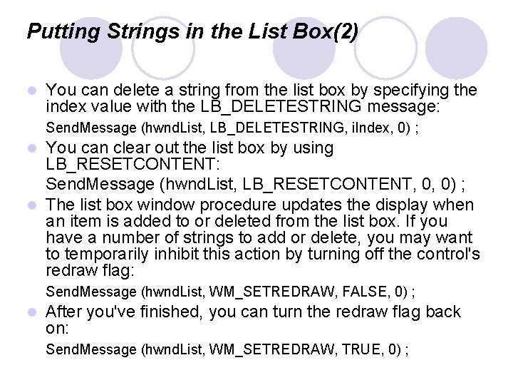
Putting Strings in the List Box(2) l You can delete a string from the list box by specifying the index value with the LB_DELETESTRING message: Send. Message (hwnd. List, LB_DELETESTRING, i. Index, 0) ; You can clear out the list box by using LB_RESETCONTENT: Send. Message (hwnd. List, LB_RESETCONTENT, 0, 0) ; l The list box window procedure updates the display when an item is added to or deleted from the list box. If you have a number of strings to add or delete, you may want to temporarily inhibit this action by turning off the control's redraw flag: l Send. Message (hwnd. List, WM_SETREDRAW, FALSE, 0) ; l After you've finished, you can turn the redraw flag back on: Send. Message (hwnd. List, WM_SETREDRAW, TRUE, 0) ;

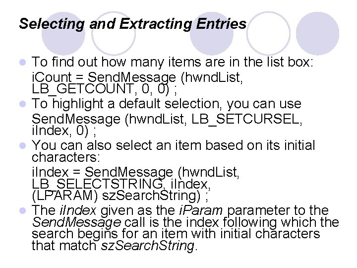
Selecting and Extracting Entries To find out how many items are in the list box: i. Count = Send. Message (hwnd. List, LB_GETCOUNT, 0, 0) ; l To highlight a default selection, you can use Send. Message (hwnd. List, LB_SETCURSEL, i. Index, 0) ; l You can also select an item based on its initial characters: i. Index = Send. Message (hwnd. List, LB_SELECTSTRING, i. Index, (LPARAM) sz. Search. String) ; l The i. Index given as the i. Param parameter to the Send. Message call is the index following which the search begins for an item with initial characters that match sz. Search. String. l

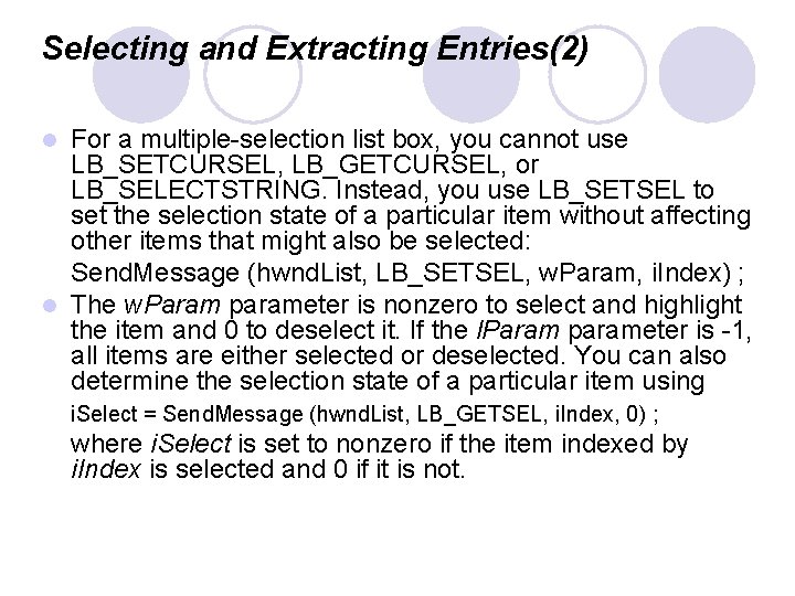
Selecting and Extracting Entries(2) For a multiple-selection list box, you cannot use LB_SETCURSEL, LB_GETCURSEL, or LB_SELECTSTRING. Instead, you use LB_SETSEL to set the selection state of a particular item without affecting other items that might also be selected: Send. Message (hwnd. List, LB_SETSEL, w. Param, i. Index) ; l The w. Param parameter is nonzero to select and highlight the item and 0 to deselect it. If the l. Param parameter is -1, all items are either selected or deselected. You can also determine the selection state of a particular item using l i. Select = Send. Message (hwnd. List, LB_GETSEL, i. Index, 0) ; where i. Select is set to nonzero if the item indexed by i. Index is selected and 0 if it is not.

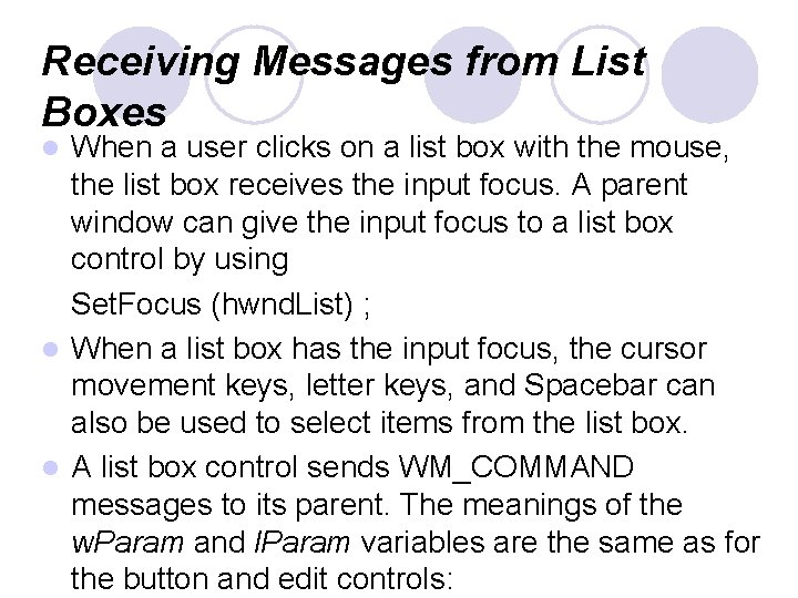
Receiving Messages from List Boxes When a user clicks on a list box with the mouse, the list box receives the input focus. A parent window can give the input focus to a list box control by using Set. Focus (hwnd. List) ; l When a list box has the input focus, the cursor movement keys, letter keys, and Spacebar can also be used to select items from the list box. l A list box control sends WM_COMMAND messages to its parent. The meanings of the w. Param and l. Param variables are the same as for the button and edit controls: l