Chapter Three Graphical Descriptive Techniques II 2012 Cengage

- Slides: 40

Chapter Three Graphical Descriptive Techniques II © 2012 Cengage Learning. All Rights Reserved. May not be scanned, copied or duplicated, or posted to a publicly accessible website, in whole or in part. 2. 1

Example 3. 1 Following deregulation of telephone service, several new companies were created to compete in the business of providing long-distance telephone service. In almost all cases these companies competed on price since the service each offered is similar. Pricing a service or product in the face of stiff competition is very difficult. Factors to be considered include supply, demand, price elasticity, and the actions of competitors. Long-distance packages may employ per-minute charges, a flat monthly rate, or some combination of the two. Determining the appropriate rate structure is facilitated by acquiring information about the behaviors of customers and in particular the size of monthly long-distance bills. © 2012 Cengage Learning. All Rights Reserved. May not be scanned, copied or duplicated, or posted to a publicly accessible website, in whole or in part. 2. 2

Example 3. 1 As part of a larger study, a long-distance company wanted to acquire information about the monthly bills of new subscribers in the first month after signing with the company. The company’s marketing manager conducted a survey of 200 new residential subscribers wherein the first month’s bills were recorded. These data are stored in file Xm 03 -01. The general manager planned to present his findings to senior executives. What information can be extracted from these data? © 2012 Cengage Learning. All Rights Reserved. May not be scanned, copied or duplicated, or posted to a publicly accessible website, in whole or in part. 2. 3

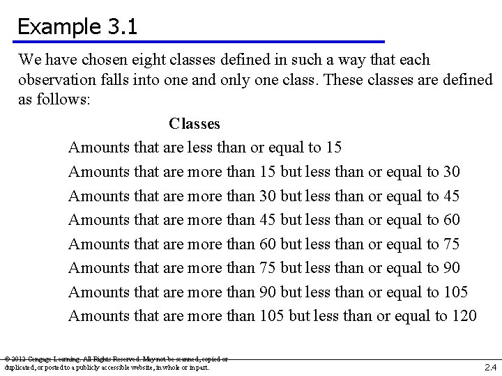
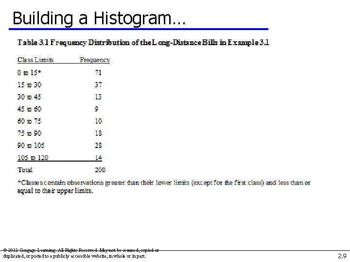
Example 3. 1 We have chosen eight classes defined in such a way that each observation falls into one and only one class. These classes are defined as follows: Classes Amounts that are less than or equal to 15 Amounts that are more than 15 but less than or equal to 30 Amounts that are more than 30 but less than or equal to 45 Amounts that are more than 45 but less than or equal to 60 Amounts that are more than 60 but less than or equal to 75 Amounts that are more than 75 but less than or equal to 90 Amounts that are more than 90 but less than or equal to 105 Amounts that are more than 105 but less than or equal to 120 © 2012 Cengage Learning. All Rights Reserved. May not be scanned, copied or duplicated, or posted to a publicly accessible website, in whole or in part. 2. 4

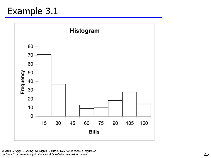
Example 3. 1 © 2012 Cengage Learning. All Rights Reserved. May not be scanned, copied or duplicated, or posted to a publicly accessible website, in whole or in part. 2. 5

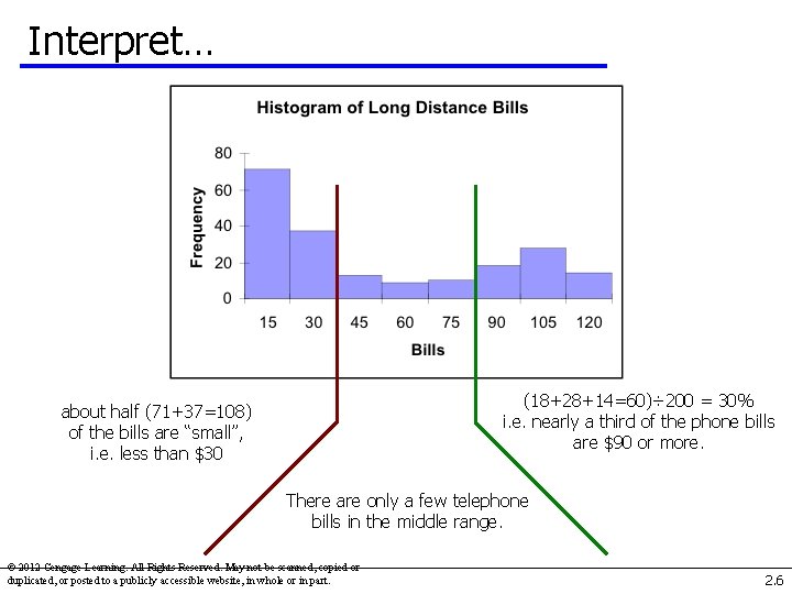
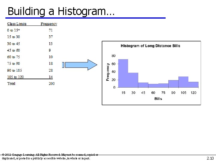
Interpret… (18+28+14=60)÷ 200 = 30% i. e. nearly a third of the phone bills are $90 or more. about half (71+37=108) of the bills are “small”, i. e. less than $30 There are only a few telephone bills in the middle range. © 2012 Cengage Learning. All Rights Reserved. May not be scanned, copied or duplicated, or posted to a publicly accessible website, in whole or in part. 2. 6

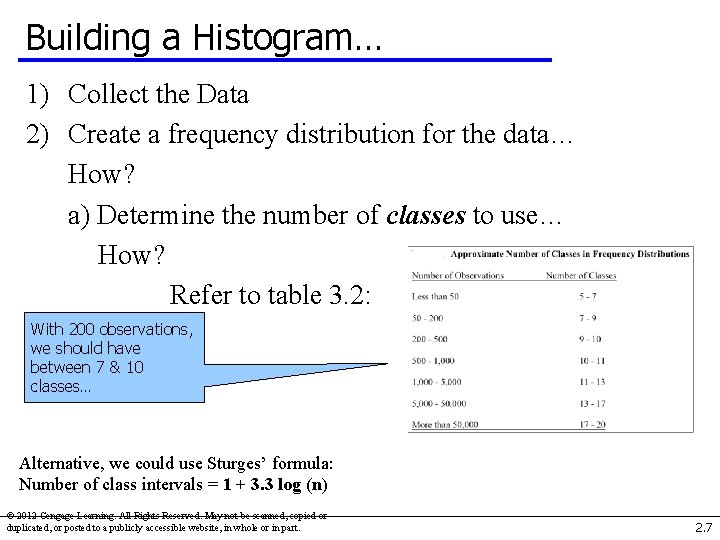
Building a Histogram… 1) Collect the Data 2) Create a frequency distribution for the data… How? a) Determine the number of classes to use… How? Refer to table 3. 2: With 200 observations, we should have between 7 & 10 classes… Alternative, we could use Sturges’ formula: Number of class intervals = 1 + 3. 3 log (n) © 2012 Cengage Learning. All Rights Reserved. May not be scanned, copied or duplicated, or posted to a publicly accessible website, in whole or in part. 2. 7

Building a Histogram… 1) Collect the Data 2) Create a frequency distribution for the data… How? a) Determine the number of classes to use. [8] b) Determine how large to make each class… How? Look at the range of the data, that is, Range = Largest Observation – Smallest Observation Range = $119. 63 – $0 = $119. 63 Then each class width becomes: Range ÷ (# classes) = 119. 63 ÷ 8 ≈ 15 © 2012 Cengage Learning. All Rights Reserved. May not be scanned, copied or duplicated, or posted to a publicly accessible website, in whole or in part. 2. 8

Building a Histogram… © 2012 Cengage Learning. All Rights Reserved. May not be scanned, copied or duplicated, or posted to a publicly accessible website, in whole or in part. 2. 9

Building a Histogram… © 2012 Cengage Learning. All Rights Reserved. May not be scanned, copied or duplicated, or posted to a publicly accessible website, in whole or in part. 2. 10

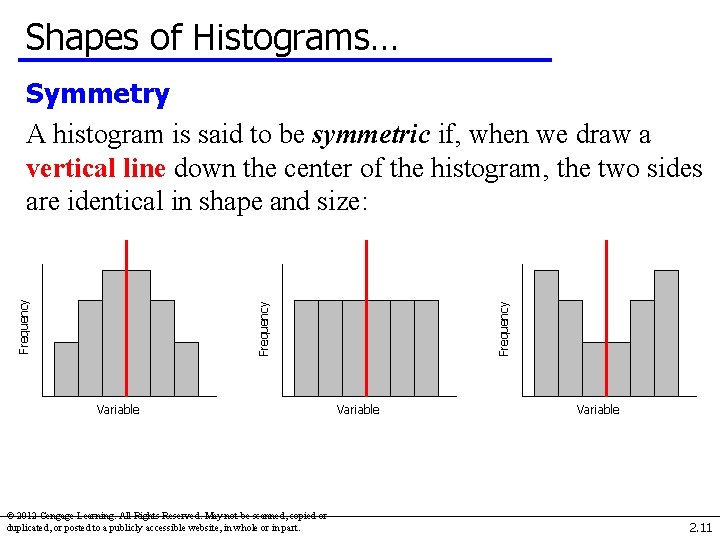
Shapes of Histograms… Variable © 2012 Cengage Learning. All Rights Reserved. May not be scanned, copied or duplicated, or posted to a publicly accessible website, in whole or in part. Frequency Symmetry A histogram is said to be symmetric if, when we draw a vertical line down the center of the histogram, the two sides are identical in shape and size: Variable 2. 11

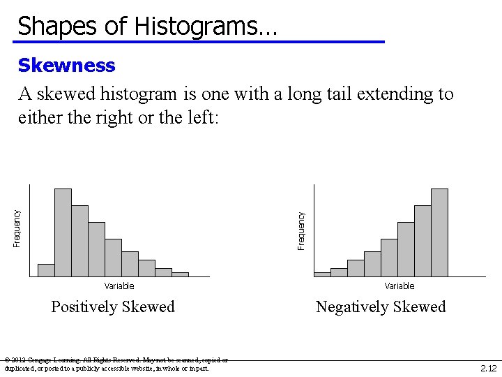
Shapes of Histograms… Frequency Skewness A skewed histogram is one with a long tail extending to either the right or the left: Variable Positively Skewed © 2012 Cengage Learning. All Rights Reserved. May not be scanned, copied or duplicated, or posted to a publicly accessible website, in whole or in part. Variable Negatively Skewed 2. 12

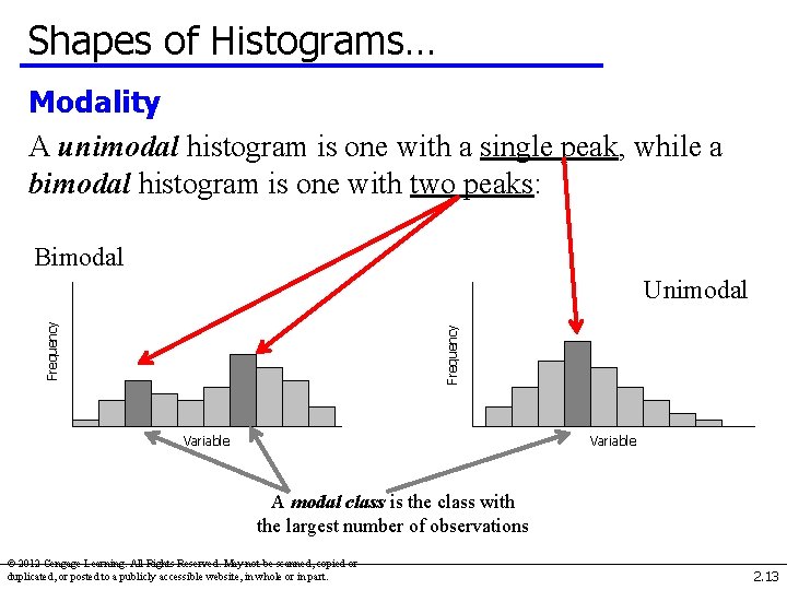
Shapes of Histograms… Modality A unimodal histogram is one with a single peak, while a bimodal histogram is one with two peaks: Bimodal Frequency Unimodal Variable A modal class is the class with the largest number of observations © 2012 Cengage Learning. All Rights Reserved. May not be scanned, copied or duplicated, or posted to a publicly accessible website, in whole or in part. 2. 13

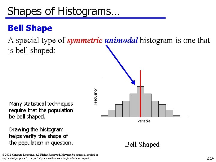
Shapes of Histograms… Many statistical techniques require that the population be bell shaped. Frequency Bell Shape A special type of symmetric unimodal histogram is one that is bell shaped: Drawing the histogram helps verify the shape of the population in question. © 2012 Cengage Learning. All Rights Reserved. May not be scanned, copied or duplicated, or posted to a publicly accessible website, in whole or in part. Variable Bell Shaped 2. 14

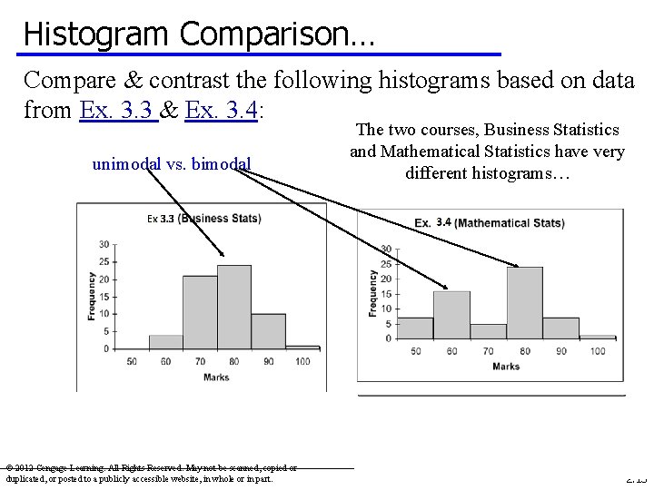
Histogram Comparison… Compare & contrast the following histograms based on data from Ex. 3. 3 & Ex. 3. 4: unimodal vs. bimodal © 2012 Cengage Learning. All Rights Reserved. May not be scanned, copied or duplicated, or posted to a publicly accessible website, in whole or in part. The two courses, Business Statistics and Mathematical Statistics have very different histograms… 2. 15

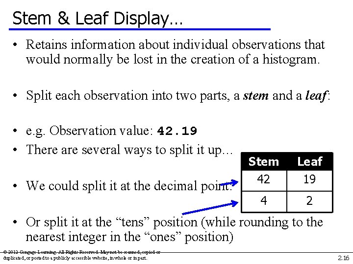
Stem & Leaf Display… • Retains information about individual observations that would normally be lost in the creation of a histogram. • Split each observation into two parts, a stem and a leaf: • e. g. Observation value: 42. 19 • There are several ways to split it up… • We could split it at the decimal point: Stem 42 Leaf 19 4 2 • Or split it at the “tens” position (while rounding to the nearest integer in the “ones” position) © 2012 Cengage Learning. All Rights Reserved. May not be scanned, copied or duplicated, or posted to a publicly accessible website, in whole or in part. 2. 16

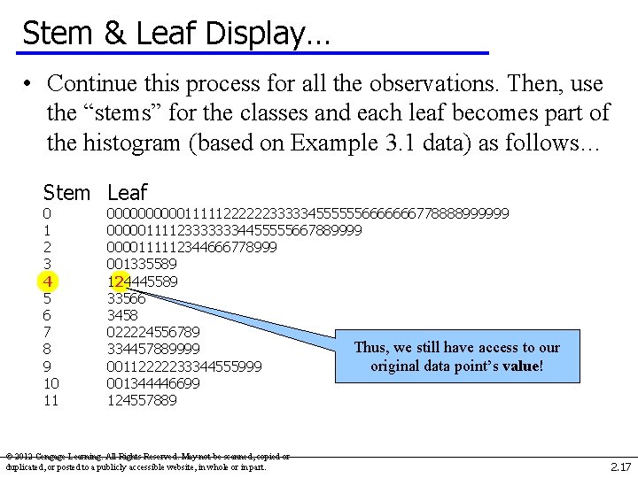
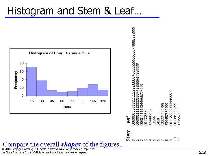
Stem & Leaf Display… • Continue this process for all the observations. Then, use the “stems” for the classes and each leaf becomes part of the histogram (based on Example 3. 1 data) as follows… Stem Leaf 0 1 2 3 4 5 6 7 8 9 10 11 00000111112222223333345555556666666778888999999 000001111233333334455555667889999 0000111112344666778999 001335589 124445589 33566 3458 022224556789 Thus, we still have access to our 334457889999 original data point’s value! 00112222233344555999 001344446699 124557889 © 2012 Cengage Learning. All Rights Reserved. May not be scanned, copied or duplicated, or posted to a publicly accessible website, in whole or in part. 2. 17

Histogram and Stem & Leaf… Compare the overall shapes of the figures… © 2012 Cengage Learning. All Rights Reserved. May not be scanned, copied or duplicated, or posted to a publicly accessible website, in whole or in part. 2. 18

Ogive… • (pronounced “Oh-jive”) is a graph of • a cumulative frequency distribution. • We create an ogive in three steps… • First, from the frequency distribution created earlier, calculate relative frequencies: • Relative Frequency = # of observations in a class • Total # of observations © 2012 Cengage Learning. All Rights Reserved. May not be scanned, copied or duplicated, or posted to a publicly accessible website, in whole or in part. 2. 19

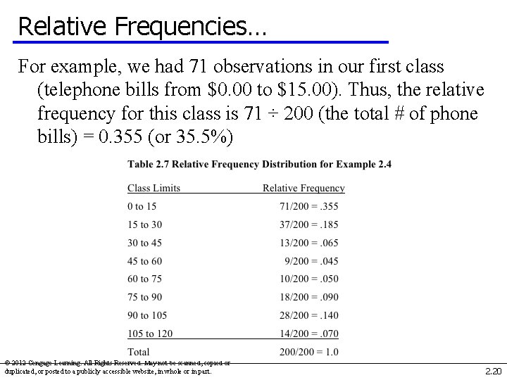
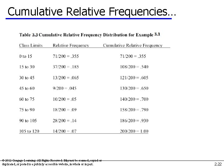
Relative Frequencies… For example, we had 71 observations in our first class (telephone bills from $0. 00 to $15. 00). Thus, the relative frequency for this class is 71 ÷ 200 (the total # of phone bills) = 0. 355 (or 35. 5%) © 2012 Cengage Learning. All Rights Reserved. May not be scanned, copied or duplicated, or posted to a publicly accessible website, in whole or in part. 2. 20

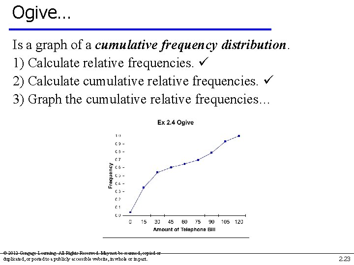
Ogive… Is a graph of a cumulative frequency distribution. We create an ogive in three steps… 1) Calculate relative frequencies. 2) Calculate cumulative relative frequencies by adding the current class’ relative frequency to the previous class’ cumulative relative frequency. (For the first class, its cumulative relative frequency is just its relative frequency) © 2012 Cengage Learning. All Rights Reserved. May not be scanned, copied or duplicated, or posted to a publicly accessible website, in whole or in part. 2. 21

Cumulative Relative Frequencies… first class… : : © 2012 Cengage Learning. All Rights Reserved. May not be scanned, copied or duplicated, or posted to a publicly accessible website, in whole or in part. 2. 22

Ogive… Is a graph of a cumulative frequency distribution. 1) Calculate relative frequencies. 2) Calculate cumulative relative frequencies. 3) Graph the cumulative relative frequencies… © 2012 Cengage Learning. All Rights Reserved. May not be scanned, copied or duplicated, or posted to a publicly accessible website, in whole or in part. 2. 23

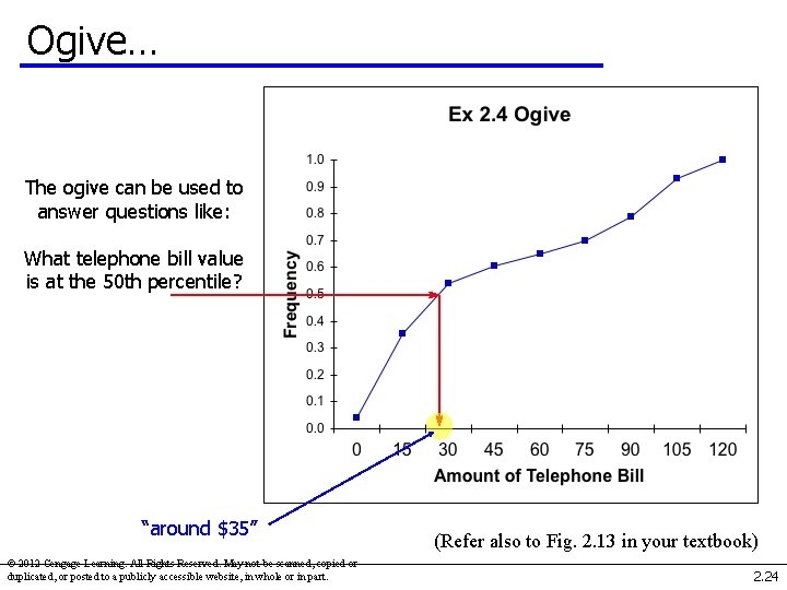
Ogive… The ogive can be used to answer questions like: What telephone bill value is at the 50 th percentile? “around $35” © 2012 Cengage Learning. All Rights Reserved. May not be scanned, copied or duplicated, or posted to a publicly accessible website, in whole or in part. (Refer also to Fig. 2. 13 in your textbook) 2. 24

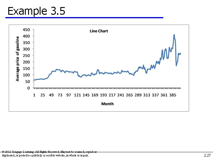
Describing Time Series Data Observations measured at the same point in time are called cross-sectional data. Observations measured at successive points in time are called time-series data. Time-series data graphed on a line chart, which plots the value of the variable on the vertical axis against the time periods on the horizontal axis. © 2012 Cengage Learning. All Rights Reserved. May not be scanned, copied or duplicated, or posted to a publicly accessible website, in whole or in part. 2. 25

Example 3. 5 We recorded the monthly average retail price of gasoline since 1976. Xm 03 -05 Draw a line chart to describe these data and briefly describe the results. © 2012 Cengage Learning. All Rights Reserved. May not be scanned, copied or duplicated, or posted to a publicly accessible website, in whole or in part. 2. 26

Example 3. 5 © 2012 Cengage Learning. All Rights Reserved. May not be scanned, copied or duplicated, or posted to a publicly accessible website, in whole or in part. 2. 27

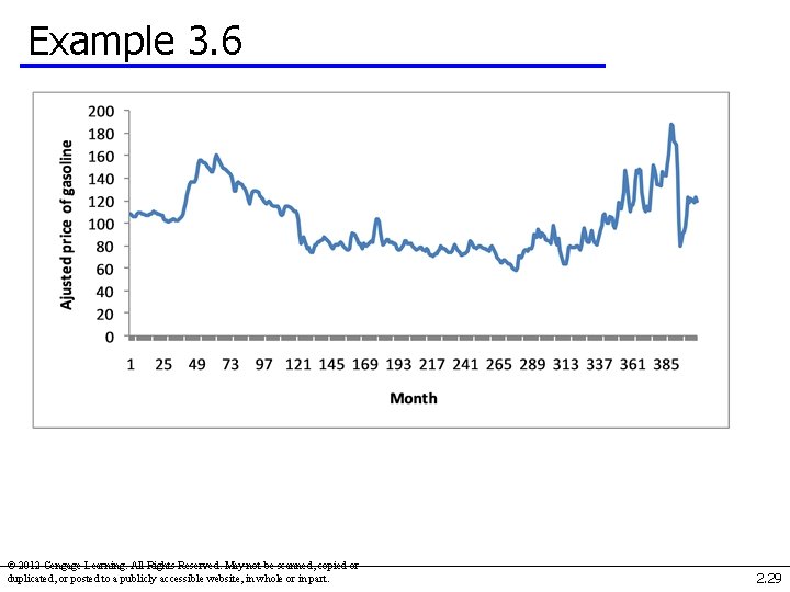
Example 3. 6 Price of Gasoline in 1982 -84 Constant Dollars Xm 03 -06 Remove the effect of inflation in Example 3. 5 to determine whether gasoline prices are higher than they have been in the past after removing the effect of inflation. © 2012 Cengage Learning. All Rights Reserved. May not be scanned, copied or duplicated, or posted to a publicly accessible website, in whole or in part. 2. 28

Example 3. 6 © 2012 Cengage Learning. All Rights Reserved. May not be scanned, copied or duplicated, or posted to a publicly accessible website, in whole or in part. 2. 29

Example 3. 6 Using constant 1982 -1984 dollars, we can see that the average price of a gallon of gasoline hit its peak in the middle of 2008 (month 390). From there it dropped rapidly and in late 2009 it was about equal to the adjusted price in 1976. © 2012 Cengage Learning. All Rights Reserved. May not be scanned, copied or duplicated, or posted to a publicly accessible website, in whole or in part. 2. 30

Graphing the Relationship Between Two Interval Variables… Moving from nominal data to interval data, we are frequently interested in how two interval variables are related. To explore this relationship, we employ a scatter diagram, which plots two variables against one another. The independent variable is labeled X and is usually placed on the horizontal axis, while the other, dependent variable, Y, is mapped to the vertical axis. © 2012 Cengage Learning. All Rights Reserved. May not be scanned, copied or duplicated, or posted to a publicly accessible website, in whole or in part. 2. 31

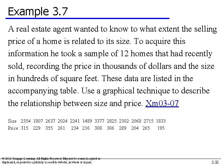
Example 3. 7 A real estate agent wanted to know to what extent the selling price of a home is related to its size. To acquire this information he took a sample of 12 homes that had recently sold, recording the price in thousands of dollars and the size in hundreds of square feet. These data are listed in the accompanying table. Use a graphical technique to describe the relationship between size and price. Xm 03 -07 Size 2354 1807 2637 2024 2241 1489 3377 2825 2302 2068 2715 1833 Price 315 229 355 261 234 216 308 306 289 204 265 195 © 2012 Cengage Learning. All Rights Reserved. May not be scanned, copied or duplicated, or posted to a publicly accessible website, in whole or in part. 2. 32

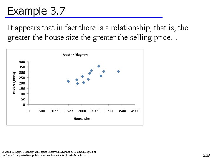
Example 3. 7 It appears that in fact there is a relationship, that is, the greater the house size the greater the selling price… © 2012 Cengage Learning. All Rights Reserved. May not be scanned, copied or duplicated, or posted to a publicly accessible website, in whole or in part. 2. 33

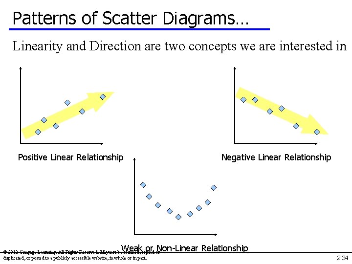
Patterns of Scatter Diagrams… Linearity and Direction are two concepts we are interested in Positive Linear Relationship Negative Linear Relationship Weak or Non-Linear Relationship © 2012 Cengage Learning. All Rights Reserved. May not be scanned, copied or duplicated, or posted to a publicly accessible website, in whole or in part. 2. 34

Chapter-Opening Example WERE OIL COMPANIES GOUGING CUSTOMERS 2000 -2009: SOLUTION In January 2000 the average retail price of gasoline was $01. 301 per gallon and the price of oil (West Texas intermediate crude) was $27. 18 per barrel. Over the next 10 years the price of both substantially increased. Many drivers complained that the oil companies were guilty of price gouging. That is, they believed that when the price of oil increased the price of gas also increased, but when the price of oil decreased, the decrease in the price of gasoline seemed to lag behind. © 2012 Cengage Learning. All Rights Reserved. May not be scanned, copied or duplicated, or posted to a publicly accessible website, in whole or in part. 2. 35

Chapter-Opening Example WERE OIL COMPANIES GOUGING CUSTOMERS 1999 -2006: SOLUTION To determine whether this perception is accurate we determined the monthly figures for both commodities. Xm 03 -00 Graphically depict these data and describe the findings. © 2012 Cengage Learning. All Rights Reserved. May not be scanned, copied or duplicated, or posted to a publicly accessible website, in whole or in part. 2. 36

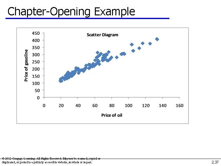
Chapter-Opening Example © 2012 Cengage Learning. All Rights Reserved. May not be scanned, copied or duplicated, or posted to a publicly accessible website, in whole or in part. 2. 37

Chapter-Opening Example The scatter diagram reveals that the two prices are strongly related linearly. When the price of oil was below $40 the relationship between the two was stronger than when the price of oil exceeded $40. © 2012 Cengage Learning. All Rights Reserved. May not be scanned, copied or duplicated, or posted to a publicly accessible website, in whole or in part. 2. 38

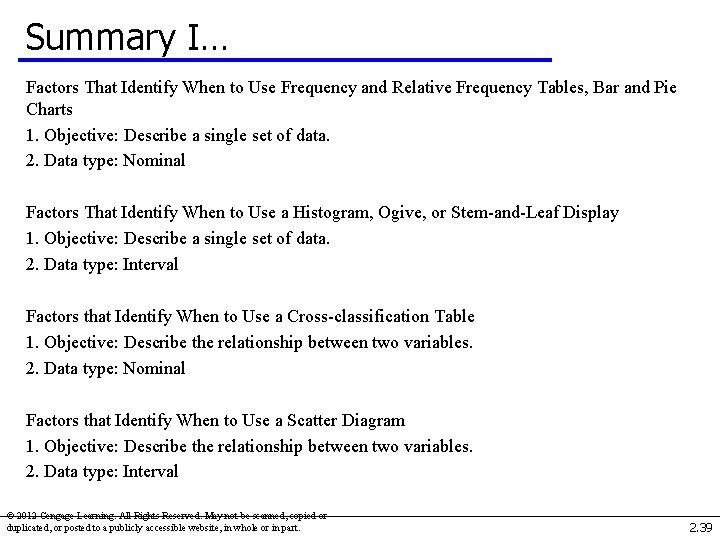
Summary I… Factors That Identify When to Use Frequency and Relative Frequency Tables, Bar and Pie Charts 1. Objective: Describe a single set of data. 2. Data type: Nominal Factors That Identify When to Use a Histogram, Ogive, or Stem-and-Leaf Display 1. Objective: Describe a single set of data. 2. Data type: Interval Factors that Identify When to Use a Cross-classification Table 1. Objective: Describe the relationship between two variables. 2. Data type: Nominal Factors that Identify When to Use a Scatter Diagram 1. Objective: Describe the relationship between two variables. 2. Data type: Interval © 2012 Cengage Learning. All Rights Reserved. May not be scanned, copied or duplicated, or posted to a publicly accessible website, in whole or in part. 2. 39

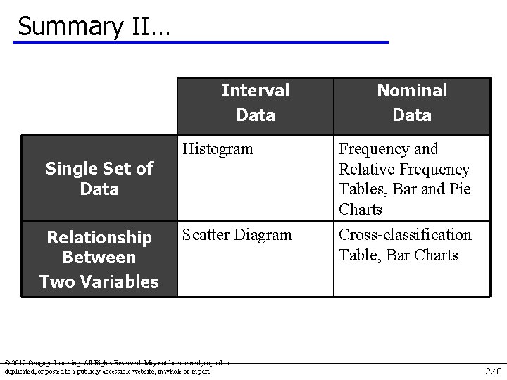
Summary II… Interval Data Histogram Frequency and Relative Frequency Tables, Bar and Pie Charts Scatter Diagram Cross-classification Table, Bar Charts Single Set of Data Relationship Between Two Variables Nominal Data © 2012 Cengage Learning. All Rights Reserved. May not be scanned, copied or duplicated, or posted to a publicly accessible website, in whole or in part. 2. 40