Chapter 9 Graphical User Interfaces Presentation slides for


- Slides: 46

Chapter 9: Graphical User Interfaces Presentation slides for Java Software Solutions Foundations of Program Design Third Edition by John Lewis and William Loftus Java Software Solutions is published by Addison-Wesley Presentation slides are copyright 2002 by John Lewis and William Loftus. All rights reserved. Instructors using the textbook may use and modify these slides for pedagogical purposes.

Graphical User Interfaces Ø Now we can explore the creation of graphical user interfaces in more detail Ø Chapter 9 focuses on: • • • GUI design guidelines layout managers nested containers for organizing components borders, tool tips, mnemonics, and other special features additional GUI components and events 2

GUI Overview Ø To create a Java GUI, we need to understand: • • events listeners components containers listener interfaces and adapter classes layout managers special features Ø In this chapter we will build on ideas presented in the graphics tracks of previous chapters

GUI Design Ø We must remember that our goal is to solve the problem using the tools needed to put a GUI together Ø The GUI designer should: • Know the users and their needs • Prevent user errors whenever possible • Optimize user abilities and make information readily available • Be consistent with placement of components and color schemes

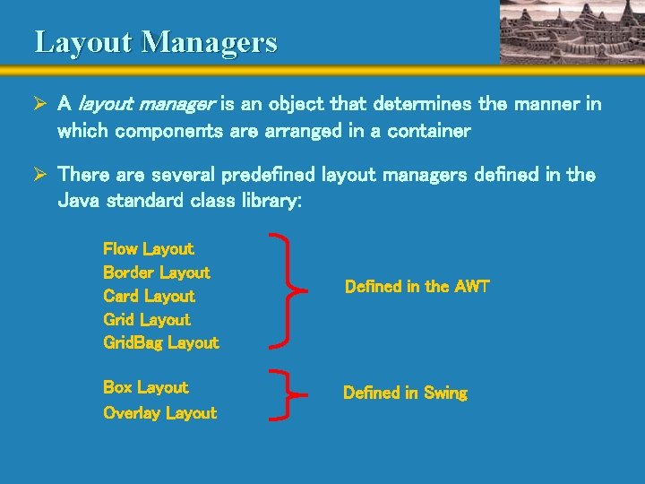
Layout Managers Ø A layout manager is an object that determines the manner in which components are arranged in a container Ø There are several predefined layout managers defined in the Java standard class library: Flow Layout Border Layout Card Layout Grid. Bag Layout Box Layout Overlay Layout Defined in the AWT Defined in Swing

Layout Managers Ø Every container has a default layout manager, but we can explicitly set the layout manager as well Ø Each layout manager has its own particular rules governing how the components will be arranged Ø Some layout managers pay attention to a component's preferred size or alignment, while others do not Ø A layout manager attempts to adjust the layout as components are added and as containers are resized

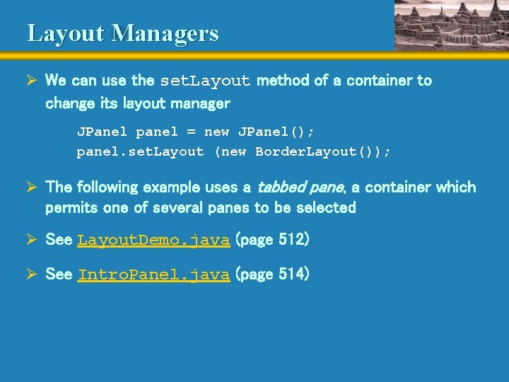
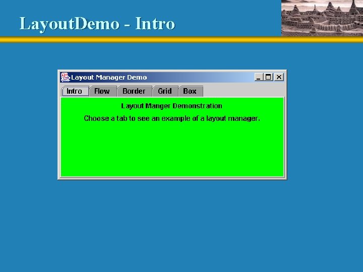
Layout Managers Ø We can use the set. Layout method of a container to change its layout manager JPanel panel = new JPanel(); panel. set. Layout (new Border. Layout()); Ø The following example uses a tabbed pane, a container which permits one of several panes to be selected Ø See Layout. Demo. java (page 512) Ø See Intro. Panel. java (page 514)

Layout. Demo - Intro

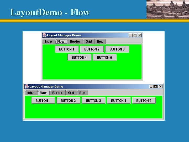
Flow Layout Ø Flow layout puts as many components as possible on a row, and then moves to the next row Ø Rows are created as needed to accommodate all of the components Ø Components are displayed in the order they are added to the container Ø Each row of components is centered horizontally in the window by default, but could also be aligned left or right Ø The horizontal and vertical gaps between the components can be explicitly set also Ø See Flow. Panel. java (page 515)

Layout. Demo - Flow

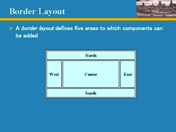
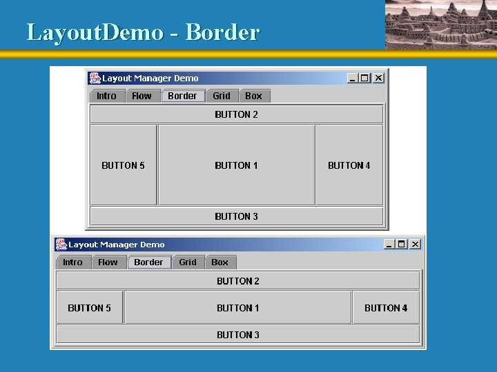
Border Layout Ø A border layout defines five areas to which components can be added North West Center South East

Border Layout Ø Each area displays one component (which could be another container such as a JPanel) Ø Each of the four outer areas enlarges as needed to accommodate the component added to it Ø If nothing is added to the outer areas, they take up no space and other areas expand to fill the void Ø The center area expands to fill space as needed Ø See Border. Panel. java (page 518)

Layout. Demo - Border

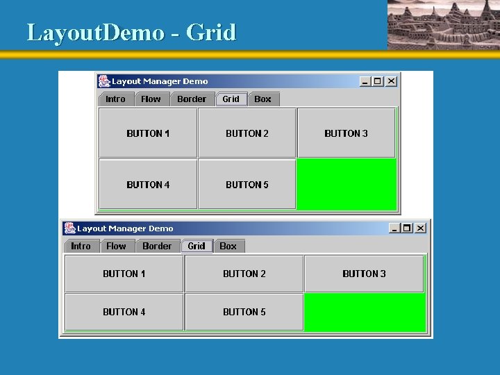
Grid Layout Ø A grid layout presents a container’s components in a rectangular grid of rows and columns Ø One component is placed in each cell of the grid, and all cells have the same size Ø As components are added to the container, they fill the grid from left-to-right and top-to-bottom (by default) Ø The size of each cell is determined by the overall size of the container Ø See Grid. Panel. java (page 521)

Layout. Demo - Grid

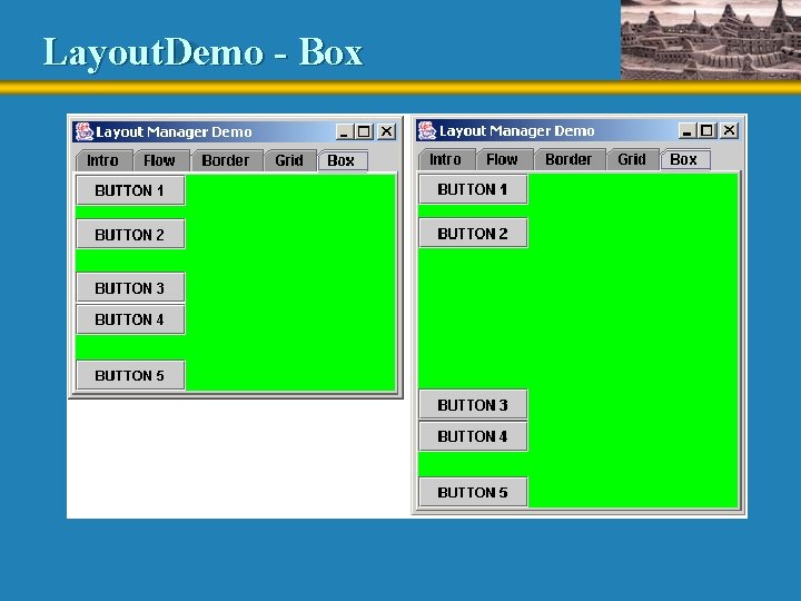
Box Layout Ø A box layout organizes components either horizontally (in one row) or vertically (in one column) Ø Components are placed top-to-bottom or left-to-right in the order in which they are added to the container Ø By combining multiple containers using box layout, many different configurations can be created Ø Multiple containers with box layouts are often preferred to one container that uses the more complicated gridbag layout manager

Box Layout Ø Invisible components can be added to a box layout container to take up space between components • Rigid areas have a fixed size • Glue specifies where excess space should go Ø A rigid area is created using the create. Rigid. Area method of the Box class Ø Glue is created using the create. Horizontal. Glue or create. Vertical. Glue methods Ø See Box. Panel. java (page 524)

Layout. Demo - Box

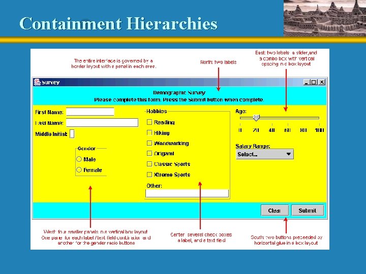
Containment Hierarchies Ø The way components are grouped into containers and the way those containers are nested within each other establishes the containment hierarchy for the GUI Ø Each container can have its own layout manager Ø The appearance of a GUI is determined by: • the containment hierarchy • the layout manager of each container • the properties of individual components Ø All of these issues work together to determine the final visual effect

Containment Hierarchies

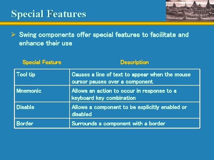
Special Features Ø Swing components offer special features to facilitate and enhance their use Special Feature Description Tool tip Causes a line of text to appear when the mouse cursor pauses over a component Mnemonic Allows an action to occur in response to a keyboard key combination Disable Allows a component to be explicitly enabled or disabled Border Surrounds a component with a border

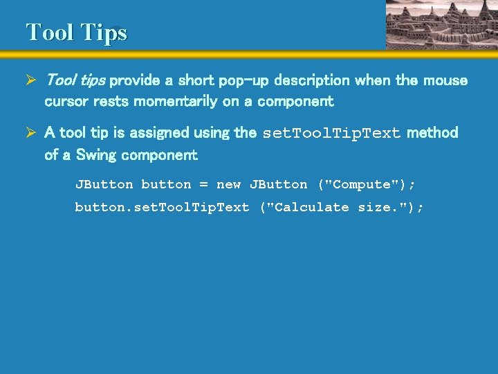
Tool Tips Ø Tool tips provide a short pop-up description when the mouse cursor rests momentarily on a component Ø A tool tip is assigned using the set. Tool. Tip. Text method of a Swing component JButton button = new JButton ("Compute"); button. set. Tool. Tip. Text ("Calculate size. ");

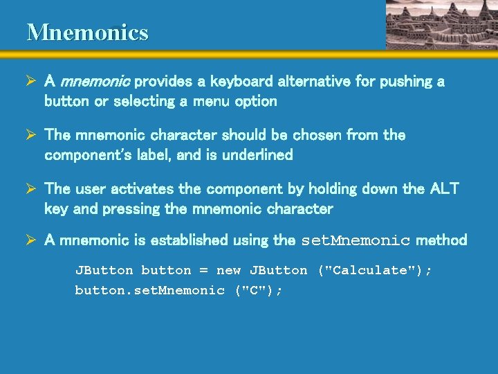
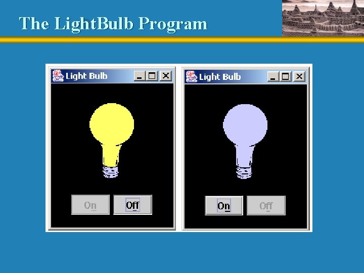
Mnemonics Ø A mnemonic provides a keyboard alternative for pushing a button or selecting a menu option Ø The mnemonic character should be chosen from the component's label, and is underlined Ø The user activates the component by holding down the ALT key and pressing the mnemonic character Ø A mnemonic is established using the set. Mnemonic method JButton button = new JButton ("Calculate"); button. set. Mnemonic ("C");

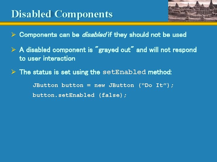
Disabled Components Ø Components can be disabled if they should not be used Ø A disabled component is "grayed out" and will not respond to user interaction Ø The status is set using the set. Enabled method: JButton button = new JButton (“Do It”); button. set. Enabled (false);

Special Features Ø The right combination of special features and components can enhance the usefulness of a GUI Ø See Light. Bulb. java (page 530) Ø See Light. Bulb. Panel. java (page 531) Ø See Light. Bulb. Controls. java (page 533)

The Light. Bulb Program

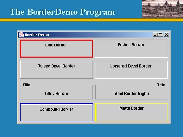
Borders Ø A border can be put around any Swing component to define how the edges of the component should be drawn Ø The Border. Factory class is useful for creating border objects Ø It has methods for creating specific types of borders Ø A border is applied to a component using the set. Border method: JPanel my. Panel = new JPanel(); Border my. Border = Border. Factory. create. Etched. Border(); my. Panel. set. Border(my. Border);

Borders Ø An empty border • buffers the space around the edge of a component • otherwise has no visual effect Ø A line border • surrounds the component with a simple line • the line's color and thickness can be specified Ø An etched border • creates the effect of an etched groove around a component • uses colors for the highlight and shadow

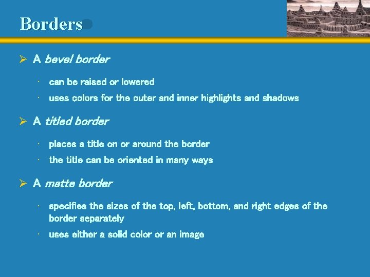
Borders Ø A bevel border • can be raised or lowered • uses colors for the outer and inner highlights and shadows Ø A titled border • places a title on or around the border • the title can be oriented in many ways Ø A matte border • specifies the sizes of the top, left, bottom, and right edges of the border separately • uses either a solid color or an image

Borders Ø A compound border • is a combination of two borders • one or both of the borders can be a compound border Ø See Border. Demo. java (page 536)

The Border. Demo Program

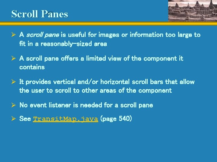
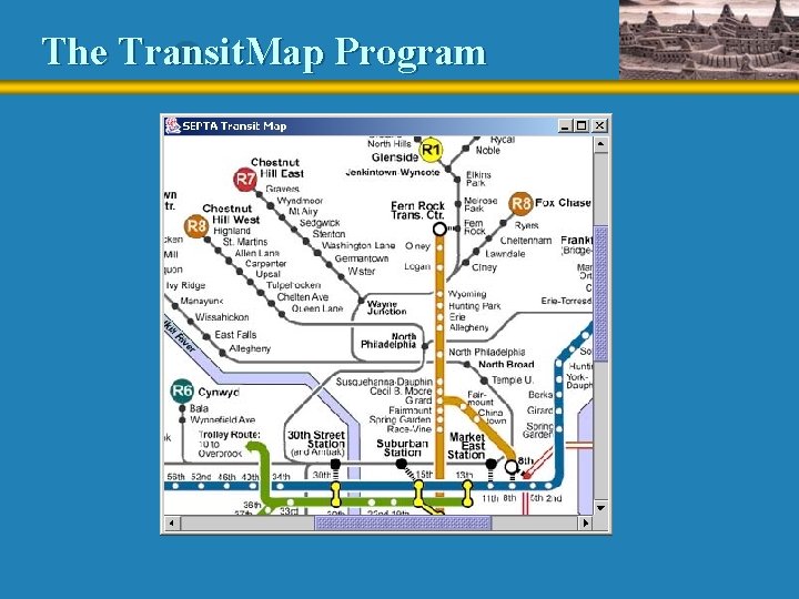
Scroll Panes Ø A scroll pane is useful for images or information too large to fit in a reasonably-sized area Ø A scroll pane offers a limited view of the component it contains Ø It provides vertical and/or horizontal scroll bars that allow the user to scroll to other areas of the component Ø No event listener is needed for a scroll pane Ø See Transit. Map. java (page 540)

The Transit. Map Program

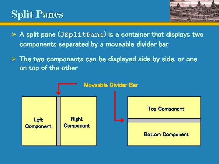
Split Panes Ø A split pane (JSplit. Pane) is a container that displays two components separated by a moveable divider bar Ø The two components can be displayed side by side, or one on top of the other Moveable Divider Bar Top Component Left Component Right Component Bottom Component

Split Panes Ø The orientation of the split pane is set using the HORIZONTAL_SPLIT or VERTICAL_SPLIT constants Ø The divider bar can be set so that it can be fully expanded with one click of the mouse Ø The components can be continuously adjusted as the divider bar is moved, or wait until it stops moving Ø Split panes can be nested

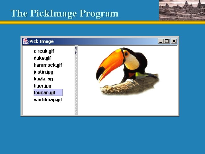
Lists Ø The Swing Jlist class represents a list of items from which the user can choose Ø The contents of a JList object can be specified using an array of objects Ø A JList object generates a list selection event when the current selection changes Ø See Pick. Image. java (page 544) Ø See List. Panel. java (page 546)

The Pick. Image Program

Lists Ø A JList object can be set so that multiple items can be selected at the same time Ø The list selection mode can be one of three options: • single selection – only one item can be selected at a time • single interval selection – multiple, contiguous items can be selected at a time • multiple interval selection – any combination of items can be selected Ø The list selection mode is defined by a List. Selection. Model object

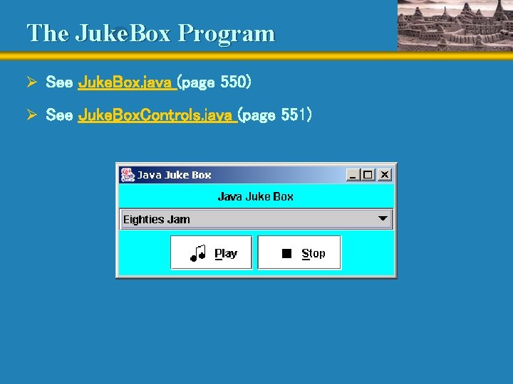
Combo Boxes Ø A combo box provides a menu from which the user can choose one of several options Ø The currently selected option is shown in the combo box Ø Unlike a JList object, a combo box shows its options only when the user presses it using the mouse Ø Options can be established using an array of strings or using the add. Item method Ø A combo box generates an action event when the user makes a selection from it

The Juke. Box Program Ø See Juke. Box. java (page 550) Ø See Juke. Box. Controls. java (page 551)

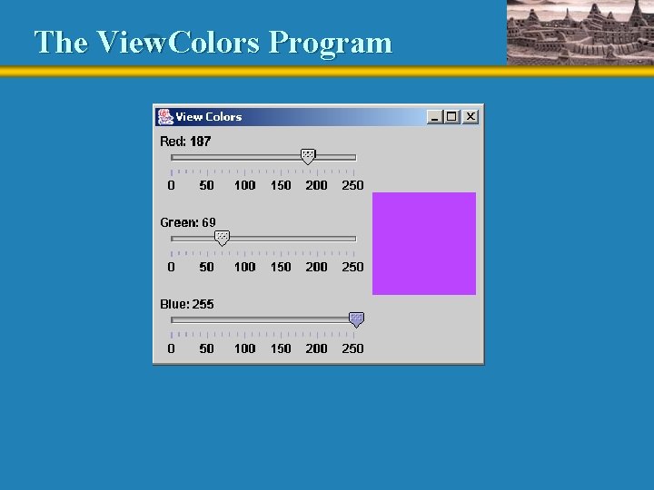
Sliders Ø A slider is a component that allows the user to specify a numeric value within a bounded range Ø The JSlider class has several methods that allow the programmer to tailor the look of a slider Ø Major and minor tick marks, and labels on the tick marks, can be explicitly set and displayed Ø A slider produces a change event Ø See View. Colors. java (page 554) Ø See View. Slider. Panel. java (page 556)

The View. Colors Program

Events Revisited Ø Some events are generated only by certain components Ø But we can set up a listener on any component for any of the following events: • component event - changing a component's size, position, or visibility • focus event - gaining or losing the keyboard focus • key event - pressing, releasing, or clicking keyboard keys • mouse event - clicking the mouse button and moving the mouse onto and off of a component • mouse motion event - moving or dragging a mouse over a component

More About GUIs Ø We've only scratched the surface of GUIs – but we've established the core issues Ø There are several other components and events to use Ø Java supports menus and submenus Ø A tool bar is a container that groups several components into a row or column Ø An internal frame is a container that operates like a regular frame, but only within another window

More About GUIs Ø A layered panel is a container that takes depth into consideration Ø A progress bar indicates the progress of an activity Ø A table displays data in table format Ø A tree presents data in a hierarchical format Ø Java also provides rich support for text processing

Summary Ø Chapter 9 has focused on: • • • GUI design guidelines layout managers nested containers for organizing components borders, tool tips, mnemonics, and other special features additional GUI components and events