Chapter 8 Data Display and Cartography Power Point


 for small point")


 but")


,")


, whereas the line contrast makes the")

 color model. 55")

- Slides: 56
Chapter 8 Data Display and Cartography 数据显示与地图制图 浙江水利水电专科学校 Power. Point by 1 僧德文
Chapter 8 DATA DISPLAY AND CARTOGRAPHY 数据显示与地图制图 • 8. 1 Cartographic Symbolization 制图符号化 2 • 8. 2 Types of Maps 地图的种类 • 8. 3 Typography 地图注记 • 8. 4 Map Design 地图设计 • 8. 5 Map Production 地图作品
Chapter 8 DATA DISPLAY AND CARTOGRAPHY 数据显示和地图制图 • Communication tool 交流 具 • Common map elements include title, body, legend, north arrow, scale, and others 普通的地图要素包括: 图名、地图主体、图例、指北针、比例尺和其 他 3
Figure 8. 1 Common map elements. 4
Chapter 8 DATA DISPLAY AND CARTOGRAPHY 数据显示与地图制图 • Recent advances in GIS software greatly facilitate the mapmaking process 近来, GIS软件的进展大大地便利了地图制作的过程 – However, over-reliance on these features can result in maps of questionable quality 然而, 对于这些要素的过度依赖可能产生劣质地图 Well-designed map aids communication, poorly designed map will confuse 好地图有助于传递信息, 而差地图则使人迷惑 5
8. 1 Cartographic Symbolization 制图符号化 • Cartography - making and study of maps 制图学—地图的制作和研究 • Symbolization - use of map symbols to represent spatial features 符号化—使用地图符号表示空间要素 6
8. 1. 1 Spatial Features and Map Symbols 空间要素和地图符号 • • • 7 Symbol indicates a feature’s location and attributes 符号显示要素的位置和属性 Symbol appearance - visual variables 符号外观—视觉变量 Three symbol types: points,lines,areas 三种符号类型: 点、线、面
Figure 8. 2 This map uses area symbols to show watersheds, a line symbol for streams, and a point symbol for gage stations. 8
Figure 8. 3 Visual variables in cartographic symbolization. 9
8. 1. 2 Use of Color 色彩的运用 • • • Visual appeal, legibility 醒目、可读性 Often misused 常被滥用 Visual dimensions of color 色彩的三个属性 – Hue - dominant wavelength 色相—主波长 – Value - lightness or darkness, black to white 色值—亮度或暗度, 黑色为低值, 白色为高值 – Chroma - richness or brilliance of a color 彩度—一种颜色的饱和程度或鲜明程度 10
Rule of Thumb 经验法则 • • 11 Vary hue to represent nominal data 用不同色相表示标称数据 Vary value and chroma to represent ordinal, interval, and ratio data 用不同色值和彩度表示排序、区间、比率数据 Qualitative mapping and color 定性的地图制图与色彩 Quantitative mapping and color 定量的地图制图与色彩
Color Schemes for Quantitative Mapping 用于定量的地图制图的色彩方案 • Single-hue scheme 单色相方案 • Hue and value scheme 色相和色值方案 • Diverging or double-ended scheme 双端色方案 12 • Part spectral scheme 部分光谱方案 • Full spectral scheme 全光谱方案
Another Rule of Thumb 另一个经验法则 • Use bright colors (maximum chroma) for small point symbols and lettering 用明亮的色彩(高值彩度)描述尺寸小的点状符号和注记 • Use softer colors (pastels, low chroma) for large area symbols 用软色彩(淡雅色彩, 低值彩度)描述尺寸大的面状符号 13
8. 1. 3 Data Classification 数据分类 • Methods for aggregation Data and map features 数据聚合方法和地图要素 • Commonly used methods include 常用方法包括 – Equal interval 等间隔 – Equal frequency (quantile) 等频率(等量) – Mean and standard deviation 平均值和标准差 – Natural breaks 自然分割 – User defined 用户自定义 14
8. 2 Types of Maps 地图的种类 • General reference maps 普通地图 • Thematic (special purpose) maps 专题地图 – Qualitative 定性 – Quantitative 定量 15
Figure 8. 4 Six common types of quantitative maps. 16
8. 2 Types of Maps 地图的种类 • • • 17 Dot map 点值地图 Choropleth map 等值区域地图 Dasymetric map 分区密度地图 graduated color map 色彩渐变地图 Graduated Symbol map 符号渐变地图 • • Proportional symbol map 比例符号地图 Chart map 统计图表地图 Flow map 流量地图 Isarithmic map 等值线地图
Figure 8. 5 Map symbols follow the boundaries in the choropleth map (left) but not the dasymetric map (right). 18
Figure 8. 6 Map showing rasterbased elevation data. Cells with higher elevations have darker shades. 19
8. 3 Typography 地图注记 • Text, lettering 文本、注记 • Highly variable 高度变化性 • Perhaps the most important map element when legibility is considered 考虑到可读性时, 地图注记可能是最重要的 地图要素 20
8. 3. 1 Type Variations 字体变化 • Typeface 字样 – Serif 修饰笔画 – Sans serif 无修饰笔画 Figure 8. 7 Times New Roman is a serif typeface, and Tahoma is a sans serif typeface. 21
8. 3. 1 Type Variations 字体变化 • 22 Type form 字形 – Type weight 字体重量 – Type width 字体宽度 – Upright or slanted 直体或斜体 – Upper and lower case 大写或小写 Figure 8. 8 Type variations in weight and roman versus italic.
Font 字库 • 23 Complete set of all variants of a given typeface 特定字样和大小的所有变体的完整字符
Type Size 字体大小 • • 24 Points - a printer’s measurement of type height 点—量度所要打印字母的高度 72 points to the inch 72个点为 inch Measured from lowest point of the descender (p, q, g, y) to the highest point of the ascender (t, d, b, f) 量测的时候必须从下伸字母的最低点算到上伸字母 的最高点 x-height - the main body of the letter exclusive of ascenders and descenders x-高度—不计上伸和下伸部分的字母主体部分
Type Color 字体颜色 • Main color plus variants of shadow, halo, fill pattern 主要的色彩加上阴影、光环、填充样式的变化 • Rule of Thumb: Use bold, bright colors for small letters for maximum contrast between letter and its background; avoid using pastel colors for lettering 经验法则: 对尺寸小的注记用粗体和明亮的颜色,以 在注记和背景之间产生强烈的对比; 避免使用淡雅色 作注记 25
8. 3. 2 Selection of Type Variations 字体变化的选择 • Practical guideline: group text symbols into qualitative and quantitative classes 实践指导: 把文本符号分为定性和定量两种类型 • Type choices will be consistent for each class 每个类别字体选择一致 26
Other Type Considerations 其他字体因素 • Legibility (but not to the point that it draws attention away form other map elements) • 可读性(并不是对点状符号而言, 点状符号只是区别于 其他地图要素的一种符号) Harmony 协调性 • Convention 习惯性 • May be difficult if we leave decisions to the software 如果我们让软件来决定这些是有困难的 27
Figure 8. 9 The look of the map is not harmonious because of too many typefaces. 28
8. 3. 3 Placement of Text in the Map Body 在地图主体中文字注记的摆放 • Labels directly associated with feature location 注记要直接伴随要素位置 • May also represent an attribute 也能描述一个属性 • Placement of other text elements (title, legend, etc. ) related to overall map layout 其他文本要素(标题、比例尺等)的位置与整个地图布局 有关 29
8. 3. 3 Placement of Text in the Map Body 在地图主体中文本的位置 • Place name above and to the right of point symbol (if space permits) 把 名称放到其点状符号的右上方 • Line symbols - label should be parallel to the symbol 线符号—名称应与该要素走向平行 • Area symbols - label should show extent of the feature 面符号—名称应放在指明其面积范围的地方 • Align labels either with map border or with lines of latitude 名称的排列应与地图边框或纬线对齐 • Place labels either totally on land or on water 将注记完全放置在陆地上或水体上 30
Automated Name Placement 名称自动标识 • Problems of legibility, overlap, clear (correctly identify the feature), follow cartographic convention 有可读性、叠置、清晰(正确辨别要素)、遵循制图惯例等问题 • Problems worsen at small scales 这些问题在小比例尺上更加严重 • Interactive labeling - one feature at a time 交互式标注—一次只标注一个要素 • Dynamic labeling - simultaneously label all features of a given class 动态标注—以指定类型同时标注所有要素 31
32 Figure 8. 10 Dynamic labeling of major cities in the United States. The initial result is good but not totally satisfactory. Philadelphia is missing. Labels of San Antonio, Indianapolis, and Baltimore overlap slightly with point symbols. San Francisco is too close to San Jose.
33 Figure 8. 11 A revised version of Figure 8. 10. Philadelphia is added to the map, and several city names are moved individually to be closer to their point symbols.
Figure 8. 12 A leader line connects a point symbol to its label. 34
Labeling Streams and Other Curved Lines 标注河流和其他曲线 • 35 Spline text tool 样条文字 具
Figure 8. 13 Dynamic labeling of streams may not work for every label. Brown Cr. overlaps with Fagan Cr. , and Pamas Cr. and Short Cr. do not follow the course of the creek. 36
Figure 8. 14 Problem labels in Figure 8. 13 are redrawn with the spline text tool. 37
8. 4 Map Design 地图设计 • Visual plan to achieve a goal 为达一定目标而进行的视觉设计 • Purpose is to enhance communication 目的是增强地图传递信息的功能 • Well-designed map is balanced, coherent, ordered, and interesting 设计良好的地图看起来是平衡的、一致的、有序的、令人感兴趣的 • Poorly designed map is confusing and disoriented 设计粗劣的地图令人迷惑 38
Map Design 地图设计 39 • Both an art and a science 兼有艺术和科学 • Layout and visual hierarchy 版面布局和视觉层次
8. 4. 1 Layout 版面布局 • Planar organization 平面组织 • Arrangement and composition of various map elements 各种地图要素的排列与组合 • Focus, order, balance 焦点、顺序、平衡 • To draw attention, focal center should be near optical center, just above the geometric center 为了吸引读图者注意,焦点中心为地图视觉中心附近, 即地图几何中心偏上一点 40
Figure 8. 15 Use a box around the legend to draw the map reader’s attention to it. 41
Figure 8. 16 A poorly balanced map. 42
43 Figure 8. 17 The basic structure of the conterminous USA layout template in Arc. Map.
Figure 8. 18 a A lengthy legend is confusing and can create a problem in layout design. 44
Figure 8. 18 b The lengthy legend in Figure 8. 18 a is separated into two parts. Also, the unnecessary outline symbol is removed from the legend. 45
Wizards 向导 • 46 Automated map layout 自动地图版面布局
8. 4. 2 Visual Hierarchy 视觉层次 • Visual plan to introduce depth 为产生深度感而进行的视觉设计 • Place map elements at different visual levels, most important element at the top 把地图要素置于不同的视觉层次中,最重要的 要素应放在最顶层 47
8. 4. 2 Visual Hierarchy 视觉层次 • Figure-ground relationship 图形-背景关系 – Foreground-background relationship 前景-背景关系 • • 48 Interposition 插入 Subdivisional organization 续分结构 Contrast 对比 Transparency 透明度
Figure 8. 19 A visual hierarchy example. The two black circles are on top (closest to the map reader), followed by the gray polygon and the grid. 49
Figure 8. 20 The interposition effect in map design. 50
Figure 8. 21 A map looks confusing if it uses too many boxes to highlight individual elements. 51
Figure 8. 22 Contrast is missing in (a), whereas the line contrast makes the state outline look more important than the county boundaries in (b). 52
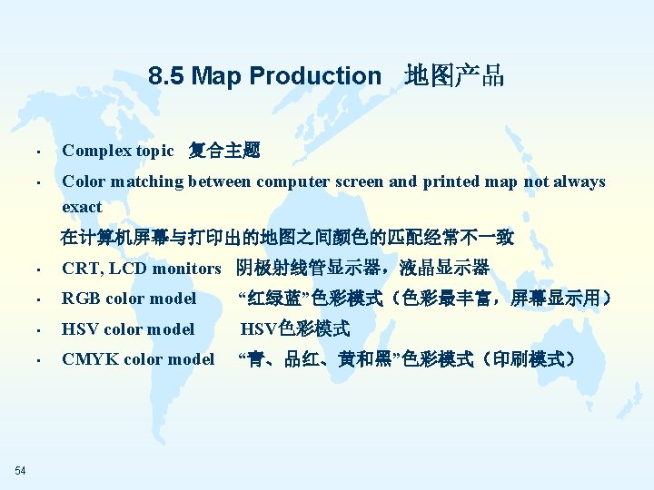
8. 5 Map Production 地图产品 • Hard copy, soft copy 硬拷贝,软拷贝 • Soft copy maps may be printed, exported to Internet, projected, exported to other software, or further processed for publishing 软拷贝地图可以打印出来,输出到网络上,用于计算 机投影,输出到其他软件里,或者为了出版作进一步 处理 53
Figure 8. 23 The RGB (red, green, and blue) color model. 55
8. 5 Map Production 地图产品 • • • 56 Color printers produce dots of ink in place of pixels on computer screen 彩色打印机以墨点绘出像素在计算机屏幕上的位置 Printers translate from RGB (monitor) to CMYK (inks in printer) 打印机把 RGB(显示器)转变为CMYK(打印机墨水) No exact translation, so variations in color will occur 非精确转变,因此色彩会改变