CHAPTER 6 Light and Color Light Light helps


 appear to have sharper")


, 1508")


 • Orange • Green • Violet Secondary colors")
 • • • Yellow-Orange Yellow-Green Blue-Violet Red-Orange The")


, ceiling of the Sistine Chapel, 1508 -12.")


- Slides: 53
CHAPTER 6 ______________ Light and Color
Light • Light helps us to define spatial relationships. Artists are interested in manipulating light. Natural and artificial light produce very different effects on the surrounding environment. These differences in turn affect the way we perceive our surroundings. Let us examine the following ways light is used in art: • Atmospheric Perspective • Chiaroscuro • Contrast: Light and Dark • Value
Atmospheric Perspective • Atmospheric perspective, or aerial perspective, refers to the visual effect of the atmosphere on the appearance of elements in a landscape. • Leonardo da Vinci is credited for deriving the “rules” of how we perceive and depict this, due to his intense preoccupation and study of the matter: – The quality of the atmosphere (the haze and humidity, physically, the actual air molecules that exist in the air) between large objects, such as mountains, and ourselves changes their appearance. – Objects that are farther away appear less clear, and are often more blue in color. – When objects are far away from us, their contrast between light and dark is also reduced.
The objects that are in the foreground (short buildings, trees) appear to have sharper details and brighter colors. They also have greater contrast between darks and lights. The buildings and landscape in the far background appear hazy, with a light blue coloration to them. This is because the vast amount of air and atmosphere between us and those objects that are far away block our vision from seeing them clearly.
Leonardo da Vinci, Madonna of the Rocks, c. 1495 -1508. Note the foreshortening of the Madonna’s hand as it reaches towards the head of the infant Jesus. We do not use linear perspective to sense the space of the distant mountains. We know the rock that the mountains are made of is brown, like those close to us, but the vast atmosphere that lies between them makes the distant mountains appear blue.
Leonardo da Vinci, Madonna of the Rocks, detail. Even within the distant mountain formation, da Vinci emphasizes space by reducing the contrast as the mountains move further away.
Atmospheric Perspective through value.
Chiaroscuro • The word is derived from Italian, with chiaro, meaning “light, ” and oscuro, meaning “dark. ” • The word chiaroscuro refers to the balance of light and dark within the image, especially referring to the artist’s use of representing the gradual shift around a volumetric surface from light to dark. • The use of chiaroscuro to represent light falling across a curved or rounded surface is called modeling.
Albert Durer, Praying Hands (Study for an Apostle figure of the “Heller” Altar), 1508 Durer uses chiaroscuro techniques to model the hands. Drawing on a gray paper, he uses white crayon to create the highlights and black crayon to create the shadows.
Basic Types of Light • Highlights: they directly reflect the light source and are indicated by white. • Shadows: there are various degrees of shadow, and they are indicated by degrees of black. Three basic types of shadow include: – Shadow (proper), which is lighter than and transitions into the core shadow. – Core Shadow, which is the darkest area of shadow on the object itself. – Cast Shadow, which is the darkest area of all. This is where no light falls, as the object blocks the light and casts the shadow.
Highlight Shadow Core Shadow Reflected Light Cast Shadow
Tenebrism • Tenebrism, from the Italian word tenebroso, meaning murky. • As opposed to chiaroscuro, tenebrism is not really connected to modeling at all. • Tenebrism contains large areas of dark, which contrast strongly with smaller areas of light. • This style creates a sense of heightened drama, almost like stage lighting. The very deep shadows compete against the dramatic spots of light.
Artemisia Gentileschi, Judith and Maidservant with the Head of Holofernes, c. 1625. It almost appears as if the figures are illuminated by a spotlight, with strong highlights against a dark and murky background. This intense lighting heightens the drama of the scene, and suggests that something lurks off of the picture plane, as we cannot see the light source.
Michelangelo Merisi da Caravaggio, David with the Head of Goliath, c. 1610.
Contrast: Light and Dark • Generally speaking, the greater the contrast between light and dark within an image, the greater the dramatic impact. • This is heavily employed by filmmakers, video artists, and photographers working in black and white.
Shirin Neshat, Fervor, 2000. Video still. This image’s stark contrast of black and white provides drama and intrigue towards the subject matter. The single white face staring back at us suggests difference (defiance? ) from the large area of black clothing around her. The high contrast gives the image symbolic power, despite the lack of drama from human interaction.
Hiroshi Sugimoto, Seascape: Baltic Sea, near Rügen, 1996. The artist studies the meeting point of light and dark, water and air, at the horizon. The strong contrast of light and dark emphasizes the vast difference between the water and the air.
VALUE Value refers to the relative lightness or darkness of a surface.
The gray square seems heavy and imposing on the white surface, but the same gray square has less visual weight and seems luminous when it is surrounded by a black ground.
Value affects readability.
VALUE SCALE, 14 SEGMENTS
VALUE SCALE, 14 SEGMENTS
When a full range of values is used, a two-dimensional object can seem three-dimensional.
Value in Color • Colors also have an inherent value. Blue is darker than yellow. But a single color can shift in value, by altering the tint or the shade. • Whenever white is added to a color, it concerns the tint. • Whenever black is added to a color, it concerns the shade. • Value also has a culturally assigned role and psychological impact. • In Western culture, since Biblical times, darker values tend to be associated with negative qualities, and lighter values with positive qualities. • Artists can use this system to critique the cultural symbolism.
The pure color is located towards the center of the value scale. As the scale moves to the left, more black is added to the purple, it becomes darker, creating shades of the color purple. As the scale moves to the right, more white is added to the purple, it becomes lighter, creating tints of the color purple.
Nikolai Buglaj, “Race”ing Sideways, 1991. Buglaj creates a double value scale, one using the value of the racers’ skin, and one using the value of the racers’ clothes. The racers are all depicted equally: no one is winning the race. But the artist is calling attention to how our “values” may change as we examine the drawing’s value shifts. Concepts of race (skin color) and class come into mind, and the drawing therefore points towards a lack of progress in “moving forward” with social and class relations.
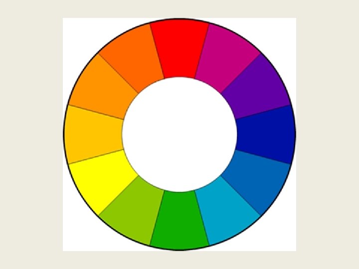
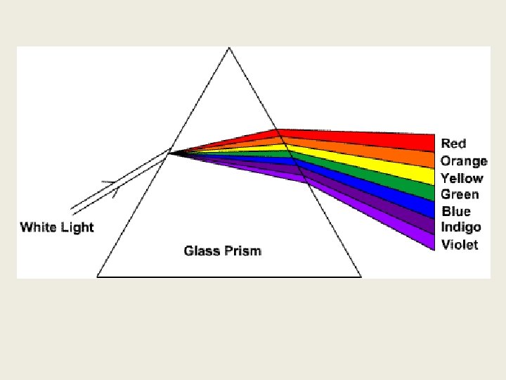
C OL OR • Sir Issac Newton first discovered in the 17 th century that color is a direct function of light. Sunlight passed through a prism breaks into bands of different colors, into a spectrum. • Newton also was the first to conceive this visible spectrum into a circle, which gives us the color wheel. The color wheel is used to determine relationships in a subtractive system.
The “Colorful” Side of the Moon…
Basic Color Vocabulary – Subtractive Process – Additive Process – Hue – Intensity (or Saturation) – Color Schemes – Temperature
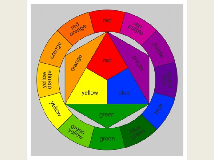
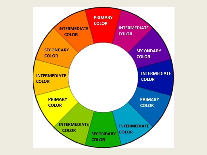
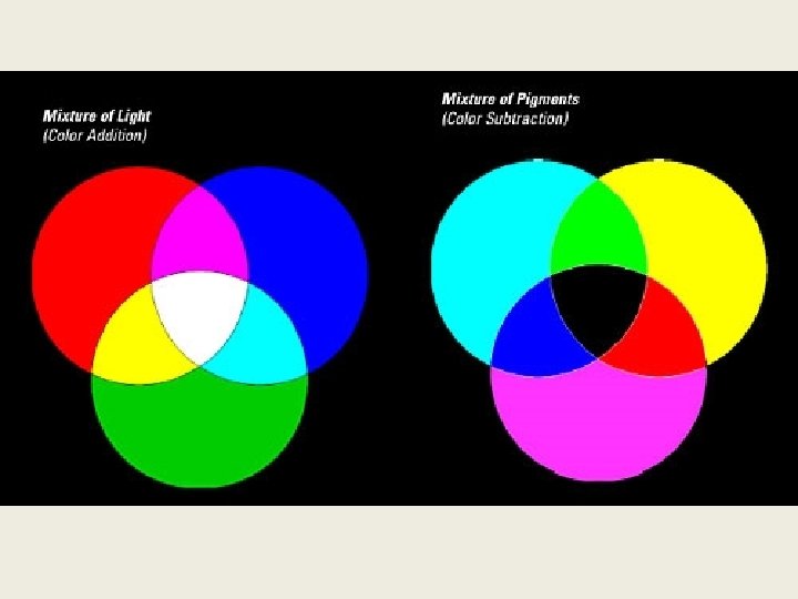
Subtractive Process • We understand the color wheel through the subtractive process. • Important groups of colors within the subtractive process: – Primary Colors – Secondary Colors – Intermediate Colors
Primary Colors • Red • Yellow • Blue The most primal and fundamental colors in the subtractive process The subtractive process is what you will find to be familiar when mixing paint, crayons, etc. It is subtractive because when you mix all the colors together, you get black, or an absence of color.
Secondary Colors (in the Subtractive Process) • Orange • Green • Violet Secondary colors are created by mixing primary colors together. (Yellow and blue make green, red and blue make violet, and so on…)
Intermediate Colors (in the Subtractive Process) • • • Yellow-Orange Yellow-Green Blue-Violet Red-Orange The intermediate colors are made by mixing a primary with a secondary color. Note how all the names begin with the primary color.
Additive Process • Colored Light behaves and mixes differently than the subtractive process. • The Primary Colors of the additive Process are Red, Green, and Blue. • The secondary colors are yellow, magenta, and cyan. Our most common exposure to the additive process is when we look at television or computer screens (old screens, when seen close up, are comprised of tiny red, green, and blue dots). When more colors are added to one another, they become stronger and brighter than when they stand alone. When you look through the other side of the prism, the colors all join to create white, and hence, the additive process.
Hue • Hue describes a color as it is found on the color wheel. Red is a hue, as is blue, green, and so on. • There are 12 hues on a color wheel that shows the primary, secondary, and intermediary colors.
Intensity • Intensity refers to the brightness or dullness of a color. Colors in their pure form are at full intensity, primary colors are most intense, secondary colors next, and then intermediate colors. • You can lower intensity by adding gray (either white, black, or a combination of the two) to the color. • You can also lower intensity by mixing colors that are opposites on the color wheel (ex: adding red and green).
Michelangelo, The Creation of Adam (unrestored), ceiling of the Sistine Chapel, 1508 -12.
The same ceiling, after restoration, shows a greater intensity of the colors. The antiqued palette that had been associated with Michelangelo was apparently just years of grease and smoke build up. The intensity change certainly affects the psychological impact of the piece.
Color Schemes • Monochromatic Color • Analogous Color – Color Temperature • Complimentary Color – Simultaneous Contrast
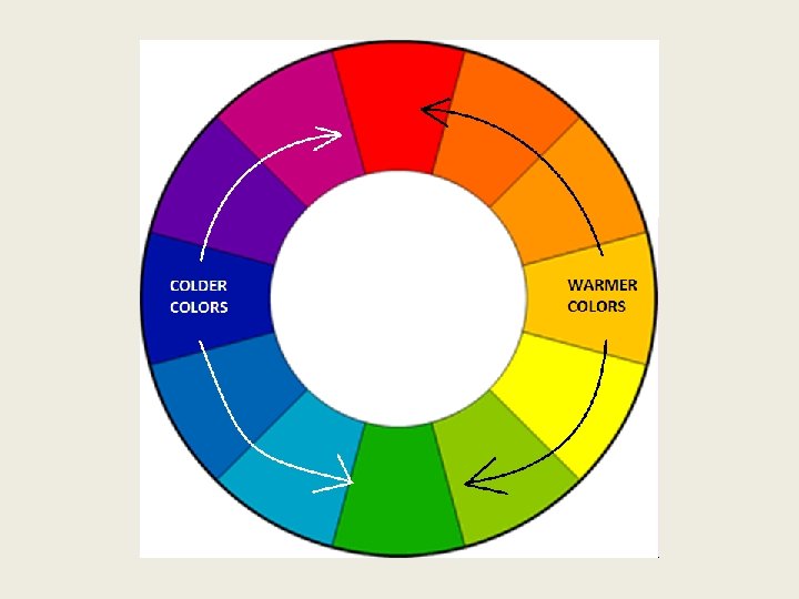
Analogous Color • Analogous color schemes are comprised of colors that neighbor each other on the color wheel. • Such color schemes are often based on the temperature of the color. • Reds, yellows, and oranges are generally received as warm colors. • Blues, greens, and violets are generally perceived as cool colors.
Jane Hammond, Fallen, 2004 -2011. The warm temperature of this installation recalls a sunny fall day. However, the initial warmth perceived by the colors contrasts with the knowledge that Fallen is about the fallen soldiers of the Iraq war.
Complimentary Colors • Complimentary colors are colors that lie opposite each other on the color wheel (ex: red and green, blue and orange). • When two complimentary colors are next to one another, especially if they are pure hues, they will appear more intense. Without mixing, they appear brighter than when they stand alone. • This effect is called simultaneous contrast.
Red and green are directly across from one another on the color wheel, and they are an example of a set of complimentary colors. (Blue and orange are another set, and yellow and violet are a set as well. )
Vincent Van Gogh, Café Terrace on the Place du Forum Arles, 1888. Van Gogh’s use of bright yellows and oranges against the vibrant violets and blues provides an example of simultaneous contrast.
Symbolic Color • Color symbolizes different things, but these distinctions are relative to time and culture. • In America, at a stoplight, red means stop and green means go, but these are not universal rules. • In Western culture, in the context of war, red may mean anger, blood, or violence, but in the same culture, red may mean love (roses, Valentine’s Day). • Of course we experience art with our own associated values and heritage, but it is important to try to look beyond our own definitions to broaden our perspective. Color is contextual.