Chapter 5 EXCEL Graphing Data Intro In EXCEL




- Slides: 24

Chapter 5 EXCEL Graphing Data

Intro • In EXCEL graphs are referred to as CHARTS. • We will do 2 -D graphs known as Scatter Charts or X-Y Charts. • Vocabulary: abscissa (x-axis), ordinate (y-axis), horizontal axis (Category Axis), vertical axis (Value Axis). Note that for XY Charts the horizontal axis is also called the Value Axis.

Sec 5. 1 – Characteristics of a Good Graph • Must convey information clearly and unambiguously. • Usually need a title, clearly labelled axes, units. • Uncluttered, readable grid.

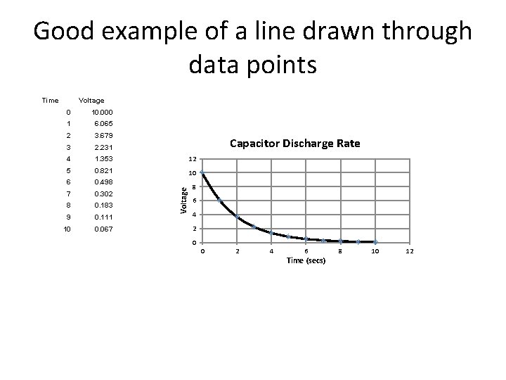
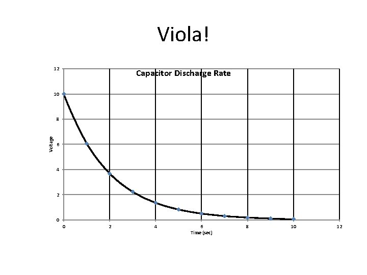
Good example of a line drawn through data points Time Voltage 0 10. 000 1 6. 065 2 3. 679 3 2. 231 4 1. 353 12 5 0. 821 10 6 0. 498 7 0. 302 8 0. 183 9 0. 111 10 0. 067 Voltage Capacitor Discharge Rate 8 6 4 2 0 0 2 4 6 Time (secs) 8 10 12

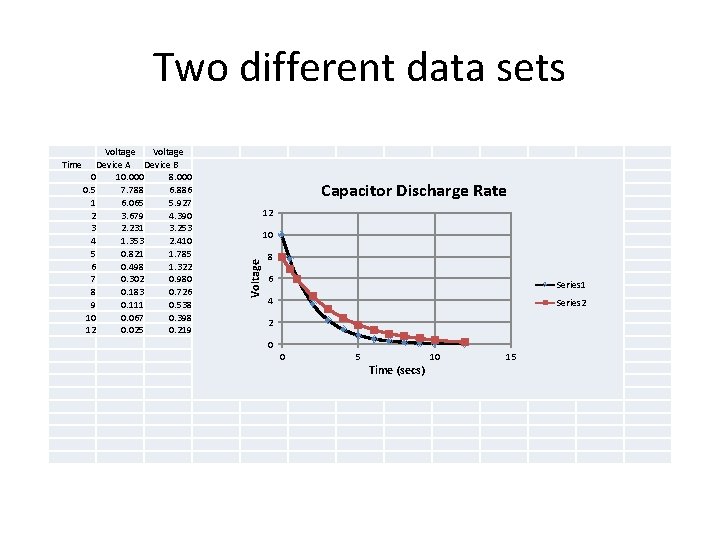
Two different data sets Voltage Device A Device B 0 10. 000 8. 000 0. 5 7. 788 6. 886 1 6. 065 5. 927 2 3. 679 4. 390 3 2. 231 3. 253 4 1. 353 2. 410 5 0. 821 1. 785 6 0. 498 1. 322 7 0. 302 0. 980 8 0. 183 0. 726 9 0. 111 0. 538 10 0. 067 0. 398 12 0. 025 0. 219 Capacitor Discharge Rate 12 10 Voltage Time 8 6 Series 1 4 Series 2 2 0 0 5 Time (secs) 10 15

Create a Graph in EXCEL – Sec 5. 2 • 1. Select block of contiguous cells containing the data to be plotted. • 2. Choose the chart type based upon the preview given. • 3. Edit individual objects such as axis label or or legend as needed from the ribbon tab or by right clicking. • 4. Add objects as needed from the ribbon LAYOUT tab.

Notes on Charts • Select an x-y graph for paired data. • Select a line graph, bar graph, pie chart for valued data (y-values only). • Can move charts from one worksheet to another by selecting the chart and then using Cut (or Copy)

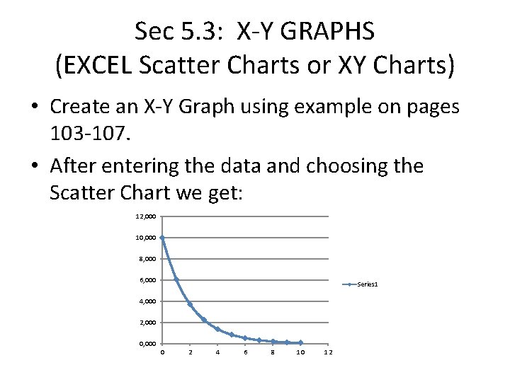
Sec 5. 3: X-Y GRAPHS (EXCEL Scatter Charts or XY Charts) • Create an X-Y Graph using example on pages 103 -107. • After entering the data and choosing the Scatter Chart we get: 12, 000 10, 000 8, 000 6, 000 Series 1 4, 000 2, 000 0 2 4 6 8 10 12

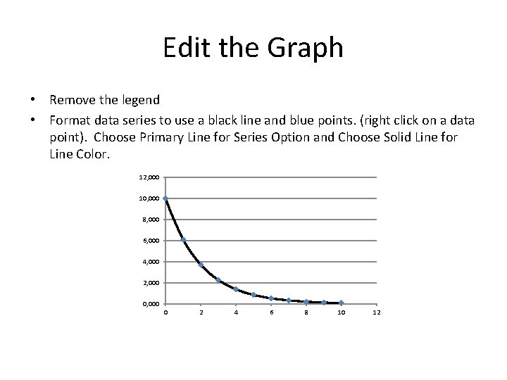
Edit the Graph • Remove the legend • Format data series to use a black line and blue points. (right click on a data point). Choose Primary Line for Series Option and Choose Solid Line for Line Color. 12, 000 10, 000 8, 000 6, 000 4, 000 2, 000 0 2 4 6 8 10 12

Edit the Graph • Add major gridlines if needed (right-click on a value on horizontal axis). • Format the axis (right click on a value on the axis, then choose appropriate option). • Enter a title (Layout Tab, chart title). • Enter axis names (Layout Tab, axis)

Viola! 12 Capacitor Discharge Rate 10 Voltage 8 6 4 2 0 0 2 4 6 Time (sec) 8 10 12

5 -4: Adding Data to Existing Chart • Add additional data points. If these fall within the data range, they will automatically be added to the chart. • If outside the range, then enlarge the chart by dragging the handles (small black squares) so that the data points appear.

Adding Additional Data – 2 graphs on same chart • Activate the chart. Note that the data is also selected. • Simply drag the lower right handle to include the other column of data. • Can add data that is non-adjacent. Hold down CTRL key while choosing.

Assignment • Classwork: Problem 5. 2 • Homework: Problem 5. 3, 5. 7

Sec 5. 5: Semi-Log Graphs • Plotting x or y on a logarithmic scale is equivalent to plotting log x or log y on an arithmetic scale. • Semi-log has a logarithmic scale for the ordinate (y-axis) and an arithmetic scale for the abscissa (x-axis). • All y-values must be greater than zero.

Semi-log • Use when y-values span several orders of magnitude. • Use for exponential equations b/c the semi-log graph plots as a straight line and is easier to interpolate visually. • Works for all bases of logarithms. • In EXCEL, LN(x) is for base e, LOG 10(x) is for base 10.

Assignment • Classwork: Prob 5. 10 • Homework: Prob 5. 9

Sec 5. 6 Log-Log Graphs • Has log coordinates on both axes. • Very useful for POWER EQUATION y=axb because plots as a straight line. • Very useful when data spans several orders of magnitude on both axes. • Example is Volume of a Sphere where V=(4/3)πr 3.

Assignment • Classwork: Prob 5. 11 • Homework: Prob 5. 13

Sec 5. 7 – 5. 9 Line Graphs • Used for SINGLE-VALUED data like for example the high temperature each day for a week. • The data points are always plotted and then connected with straight lines (not a smooth curve). • Create like an XY graph but choose line graph.

Assignment • Classwork: Prob. 5. 15 • Homework: Prob 5. 17

Bar Graph • Used for single-valued data like a line graph. • Uses a series of vertical rectangles (bars). • Easier to read than a line graph.

Assignment • Classwork: Prob. 5. 18 • Homework: Prob 5. 21

Sec 5. 9 Pie Charts • Shows distribution of items within a data set. • Represent single-valued data. • Can also calculate percentages and display on the graph. • NO CLASSWORK OR HOMEWORK