Chapter 5 Describing Distributions Numerically Copyright 2007 Pearson
Chapter 5 Describing Distributions Numerically Copyright © 2007 Pearson Education, Inc. Publishing as Pearson Addison-Wesley
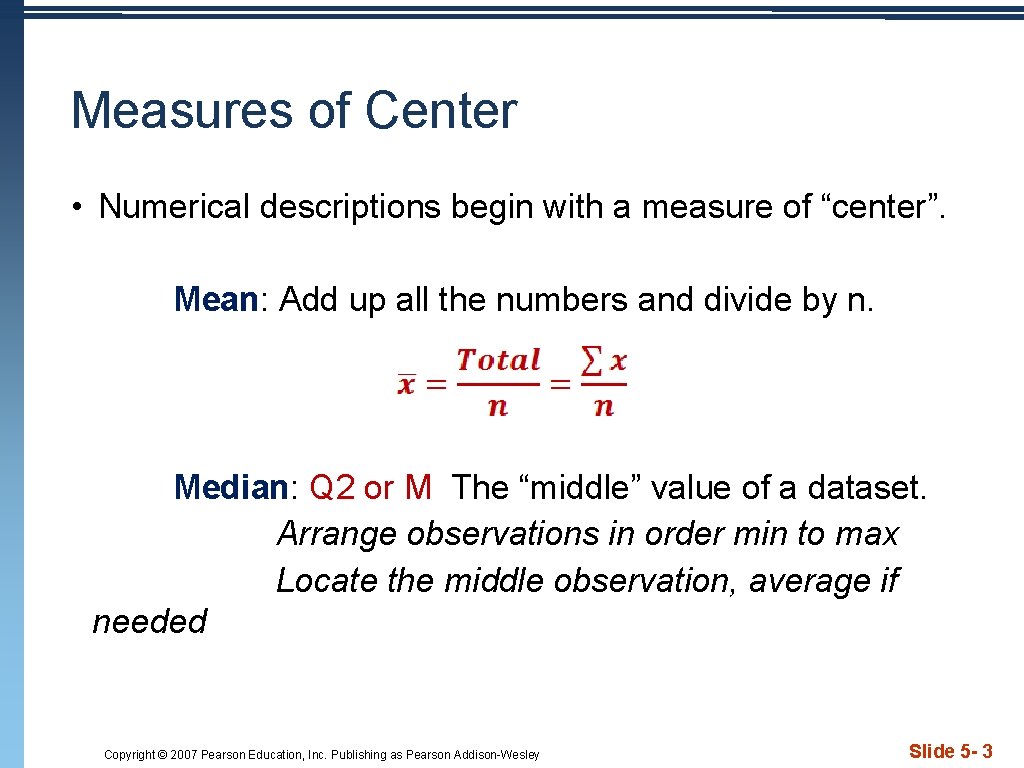
Measures of Center • Numerical descriptions begin with a measure of “center”. Mean: Add up all the numbers and divide by n. Median: Q 2 or M The “middle” value of a dataset. Arrange observations in order min to max Locate the middle observation, average if needed Copyright © 2007 Pearson Education, Inc. Publishing as Pearson Addison-Wesley Slide 5 - 3
Finding the Center • Consider the data set 1, 2, 3, 4, 4, 6, 8 • Determine the mean and median. • Next add 100 to the data set. Find the new mean and median. Copyright © 2007 Pearson Education, Inc. Publishing as Pearson Addison-Wesley Slide 5 - 4
Finding the Center • The mean and the median are the most common measures of center. • If a distribution is perfectly symmetric, the mean and the median are the same. • The mean is not resistant to outliers. So we don't use the mean if we have outliers or skewed data. • You must decide which number is the most appropriate description of the center. . . Copyright © 2007 Pearson Education, Inc. Publishing as Pearson Addison-Wesley Slide 5 - 4
Measures of Spread • Variability is the key to Statistics. Without variability, there would be no need for the subject. • When describing data, never rely on center alone. • Measures of Spread • Range = max – min {Rarely used – why? } • Quartiles – Interquartile Range {IQR = Q 3 – Q 1} • Variance and Standard Deviation {Var and sx} • Like Measures of Center, you must choose the most appropriate measure of spread. Copyright © 2007 Pearson Education, Inc. Publishing as Pearson Addison-Wesley Slide 5 - 5
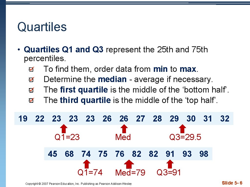
Quartiles • Quartiles Q 1 and Q 3 represent the 25 th and 75 th percentiles. To find them, order data from min to max. Determine the median - average if necessary. The first quartile is the middle of the ‘bottom half’. The third quartile is the middle of the ‘top half’. 19 22 23 23 23 26 26 27 28 29 30 31 32 Q 1=23 Med Q 3=29. 5 45 68 74 75 76 82 82 91 93 98 Q 1=74 Med=79 Copyright © 2007 Pearson Education, Inc. Publishing as Pearson Addison-Wesley Q 3=91 Slide 5 - 6
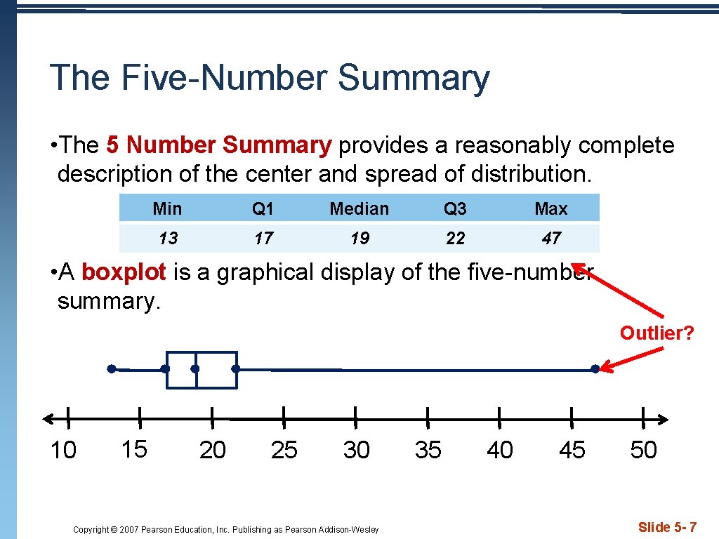
The Five-Number Summary • The 5 Number Summary provides a reasonably complete description of the center and spread of distribution. Min Q 1 Median Q 3 Max 13 17 19 22 47 • A boxplot is a graphical display of the five-number summary. Outlier? 10 15 20 25 30 Copyright © 2007 Pearson Education, Inc. Publishing as Pearson Addison-Wesley 35 40 45 50 Slide 5 - 7
Outliers • Inter. Quartile Range “IQR”: Distance between Q 1 and Q 3. Resistant measure of spread…only measures middle 50% of data. • IQR = Q 3 – Q 1 {width of the “box” in a boxplot} • 1. 5 IQR Rule: If an observation falls more than 1. 5 IQRs above Q 3 or below Q 1, it is an outlier. Why 1. 5? According to John Tukey, 1 IQR seemed too little and 2 IQRs seemed like too much… Copyright © 2007 Pearson Education, Inc. Publishing as Pearson Addison-Wesley Slide 5 - 8
The Outlier Test • To determine outliers: Find 5 Number Summary Determine IQR Multiply 1. 5 x. IQR Set up “fences” Outlier < Q 1 -(1. 5 IQR) or Outlier > Q 3+(1. 5 IQR) Observations “outside” the fences are outliers. Copyright © 2007 Pearson Education, Inc. Publishing as Pearson Addison-Wesley Slide 5 - 9
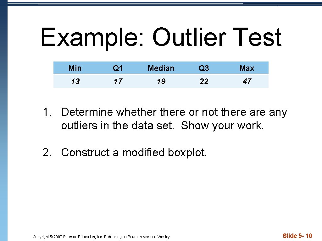
Example: Outlier Test Min Q 1 Median Q 3 Max 13 17 19 22 47 1. Determine whethere or not there any outliers in the data set. Show your work. 2. Construct a modified boxplot. Copyright © 2007 Pearson Education, Inc. Publishing as Pearson Addison-Wesley Slide 5 - 10
TI Tips • Making and Comparing Boxplots p 63 • Use the TI 83/84 to construct a modified box plot • Construct parallel boxplots • Remember, do not rely on your calculator until you know how to do it by hand. Copyright © 2007 Pearson Education, Inc. Publishing as Pearson Addison-Wesley Slide 5 - 11
Comparing Groups • Parallel boxplots are a good way to compare groups. • Use the same scale to construct the boxplots. • Be sure to label each so you can easily compare the SOCS of the distributions. Copyright © 2007 Pearson Education, Inc. Publishing as Pearson Addison-Wesley Slide 5 - 12
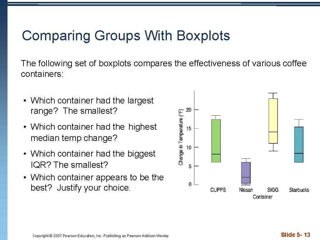
Comparing Groups With Boxplots The following set of boxplots compares the effectiveness of various coffee containers: • Which container had the largest range? The smallest? • Which container had the highest median temp change? • Which container had the biggest IQR? The smallest? • Which container appears to be the best? Justify your choice. Copyright © 2007 Pearson Education, Inc. Publishing as Pearson Addison-Wesley Slide 5 - 13
- Slides: 13