Chapter 5 Affective aspects Overview Expressive interfaces how
- Slides: 17

Chapter 5 Affective aspects

Overview • Expressive interfaces – how the ‘appearance’ of an interface can affect users • User frustration – what it is and how to reduce it • Persuasive technologies – how technologies can be designed to change people’s attitudes and behavior • Anthropomorphism and interaction design – The pros and cons • Interface agents and interactive physical toys • Conceptual models of the relationship between affect and user experience

Affective aspects • HCI has traditionally been about designing efficient and effective systems • Now more about how to design interactive systems that make people respond in certain ways – e. g. to be happy, to be trusting, to learn, to be motivated

Expressive interfaces • Colour, icons, sounds, graphical elements and animations are used to make the ‘look and feel’ of an interface appealing – Conveys an emotional state • In turn this can affect the usability of an interface – People are prepared to put up with certain aspects of an interface (e. g. slow download rate) if the end result is appealing and aesthetic

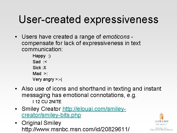
User-created expressiveness • Users have created a range of emoticons compensate for lack of expressiveness in text communication: Happy : ) Sad : < Sick : X Mad >: Very angry >: -( • Also use of icons and shorthand in texting and instant messaging has emotional connotations, e. g. I 12 CU 2 NITE • Smiley Creator http: //elouai. com/smileycreator/smiley-bits. php • Original Smiley http: //www. msnbc. msn. com/id/20829611/

Would you use any of these? What for?

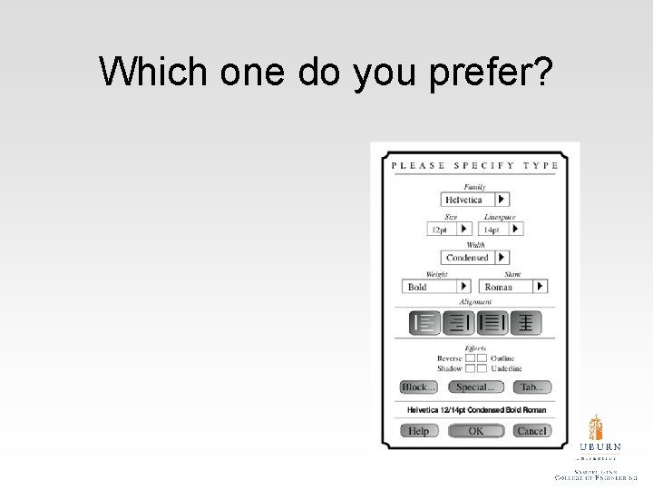
Which one do you prefer?

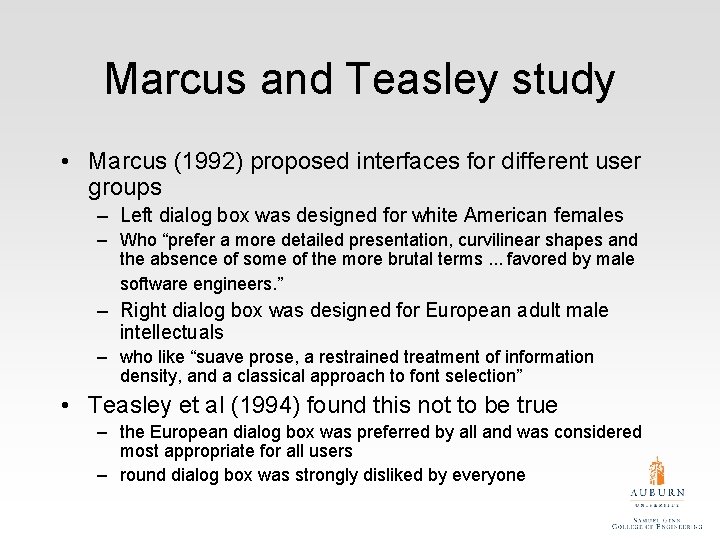
Marcus and Teasley study • Marcus (1992) proposed interfaces for different user groups – Left dialog box was designed for white American females – Who “prefer a more detailed presentation, curvilinear shapes and the absence of some of the more brutal terms. . . favored by male software engineers. ” – Right dialog box was designed for European adult male intellectuals – who like “suave prose, a restrained treatment of information density, and a classical approach to font selection” • Teasley et al (1994) found this not to be true – the European dialog box was preferred by all and was considered most appropriate for all users – round dialog box was strongly disliked by everyone

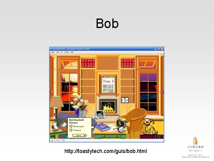
Friendly interfaces • Microsoft pioneered friendly interfaces for technophobes - ‘At home with Bob’ software • 3 D metaphors based on familiar places (e. g. living rooms) • Agents in the guise of pets (e. g. bunny, dog) were included to talk to the user – Make users feel more at ease and comfortable

Bob http: //toastytech. com/guis/bob. html

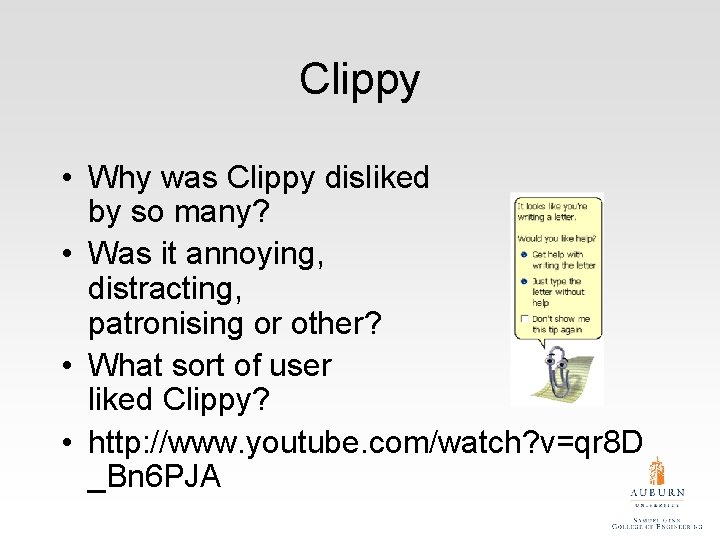
Clippy • Why was Clippy disliked by so many? • Was it annoying, distracting, patronising or other? • What sort of user liked Clippy? • http: //www. youtube. com/watch? v=qr 8 D _Bn 6 PJA

User frustration • Many causes: – – When an application doesn’t work properly or crashes When a system doesn’t do what the user wants it to do When a user’s expectations are not met When a system does not provide sufficient information to enable the user to know what to do – When error messages pop up that are vague, obtuse or condemning – When the appearance of an interface is garish, noisy, gimmicky or patronizing – When a system requires users to carry out too many steps to perform a task, only to discover a mistake was made earlier and they need to start all over again

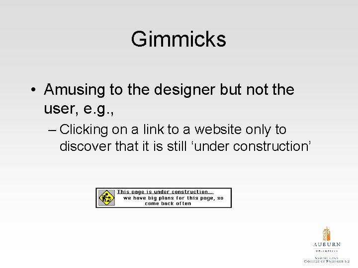
Gimmicks • Amusing to the designer but not the user, e. g. , – Clicking on a link to a website only to discover that it is still ‘under construction’

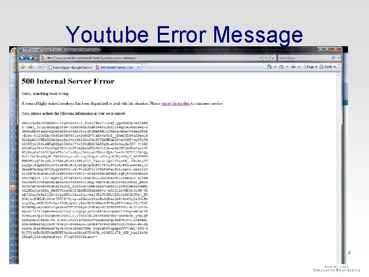
Youtube Error Message

Error messages “The application Word Wonder has unexpectedly quit due to a type 2 error. ” Why not instead: “the application has expectedly quit due to poor coding in the operating system” • Shneiderman’s guidelines for error messages include: • • • avoid using terms like FATAL, INVALID, BAD Audio warnings Avoid UPPERCASE and long code numbers Messages should be precise rather than vague Provide context-sensitive help

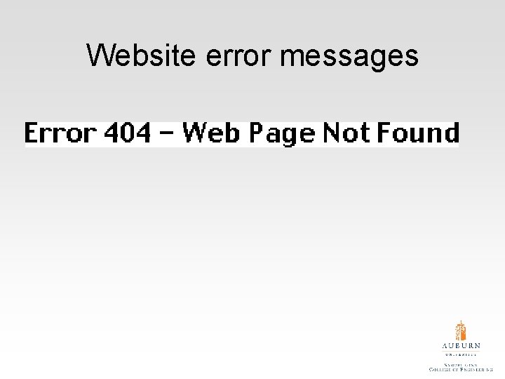
Website error messages

More helpful error message “The requested page /helpme is not available on the web server. If you followed a link or bookmark to get to this page, please let us know, so that we can fix the problem. Please include the URL of the referring page as well as the URL of the missing page. Otherwise check that you have typed the address of the web page correctly. The Web site you seek Cannot be located, but Countless more exist. ”