Chapter 4 Visual Communication Visual Communication Visual communication


- Slides: 59

Chapter 4 Visual Communication .

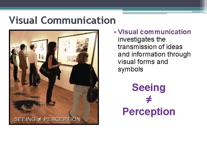
Visual Communication • Visual communication investigates the transmission of ideas and information through visual forms and symbols Seeing ≠ Perception

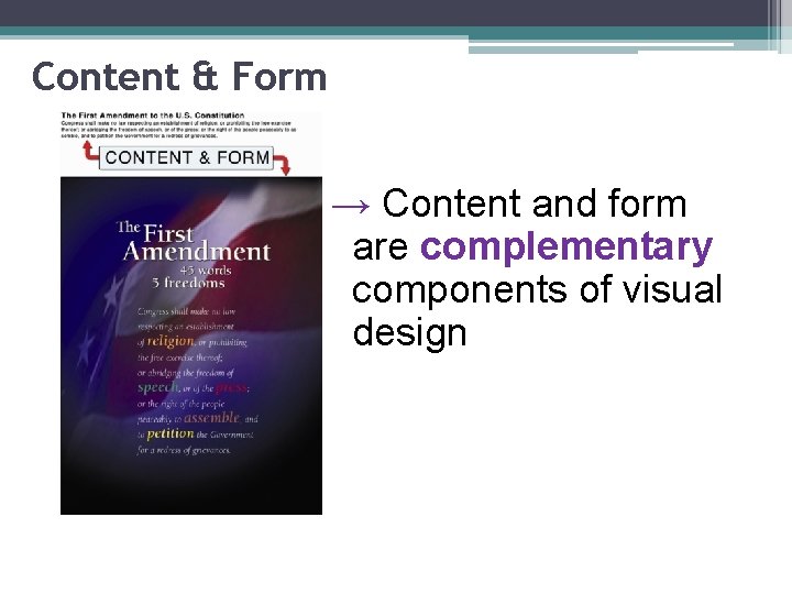
Content & Form → Content and form are complementary components of visual design

Aesthetics • We make perceptual judgments about visual beauty every day • In professional design, there are industry-specific rules and guidelines – applied aesthetics • Learning these guidelines is important – design choices influence choices made during production • Having an aesthetic framework draws you away from unfounded sensibilities and towards informed observations

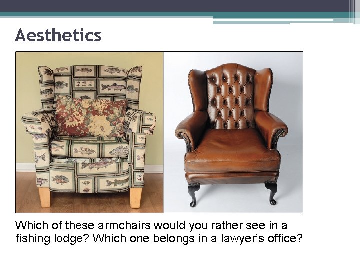
Aesthetics Which of these armchairs would you rather see in a fishing lodge? Which one belongs in a lawyer’s office?

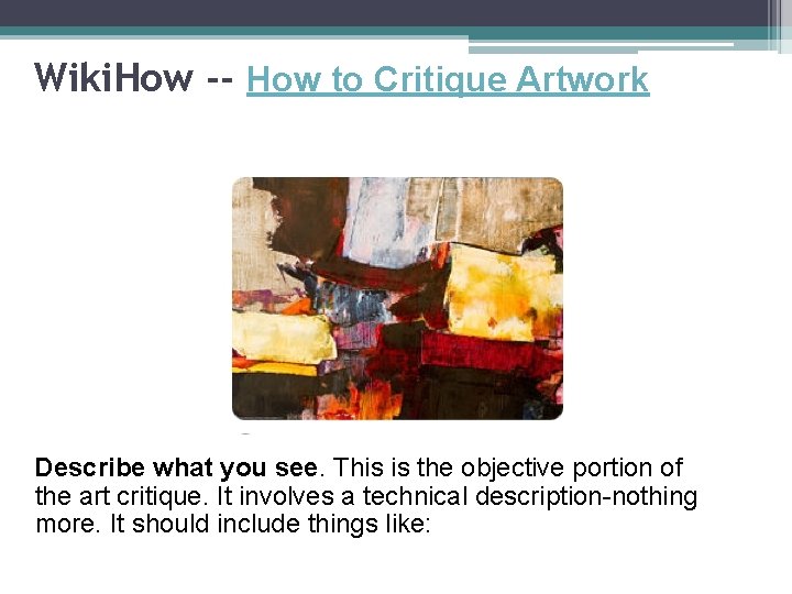
Wiki. How -- How to Critique Artwork Describe what you see. This is the objective portion of the art critique. It involves a technical description-nothing more. It should include things like:

• • • Artist's name. Title of work. Type of artwork. Subject of the painting (scene). Objects in the painting. First impression. Characteristics of the artwork that first jump out at you. Colors used. Shapes, lines and texture. Light saturation. Sensory qualities. Identify the predominant mood and visual effect.

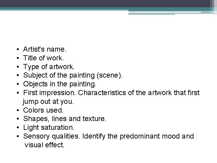
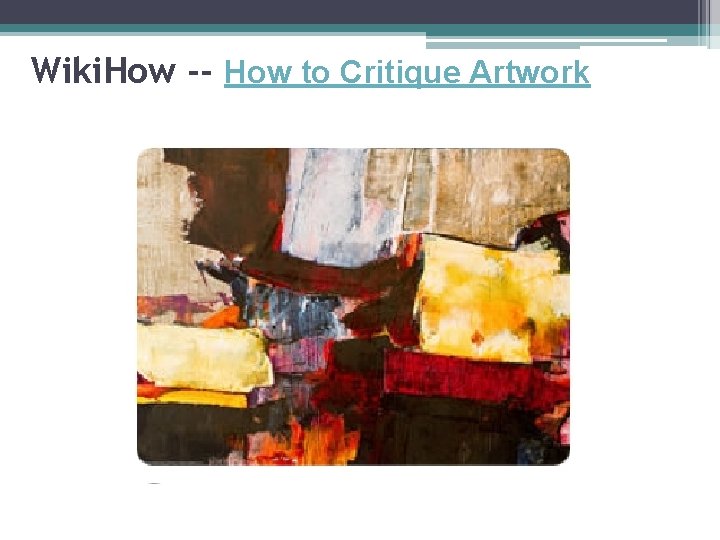
Wiki. How -- How to Critique Artwork

Analyze the artwork -Color. -Shapes, forms and lines. -Texture. -Light and shadow. -How each technical element contributes to the mood, meaning and aesthetic sensation of the artwork.

Interpret the artwork -Communicate the artist's statement. Describe what you think the artist is trying to say through the work of art. -Expound on the feeling conveyed by the artwork. Describe what the artwork means to you, and why. -Explain what you feel is the artist's intended purpose for creating that particular work of art. Examine why the artist made the choices in technique, materials and subject matter and how they relate to the intended purpose. -Identify symbols in the artwork and describe how they relate to the artist's technical choices and contribute to the artist's execution of the intended purpose.

Evaluate the artwork State what you think the artwork's value is. For example, its value may be to evoke nostalgia, to incite anger or to impart beauty. Explain why you feel this way. Describe the artwork's relevance to the art community and to people as a whole. Explain where you feel the artwork has strong value and where you think it falls short.

Evaluate a musical composition…

Elements of Design • These are the fundamental building blocks of visual content • There are 8 elements of design common to all forms of visual communication: • • • Space Dot Line Shape Form • Texture • Pattern • Color

Elements of Design Understanding the elements of design and their influence on human perception will help you become a better visual media producer and consumer.

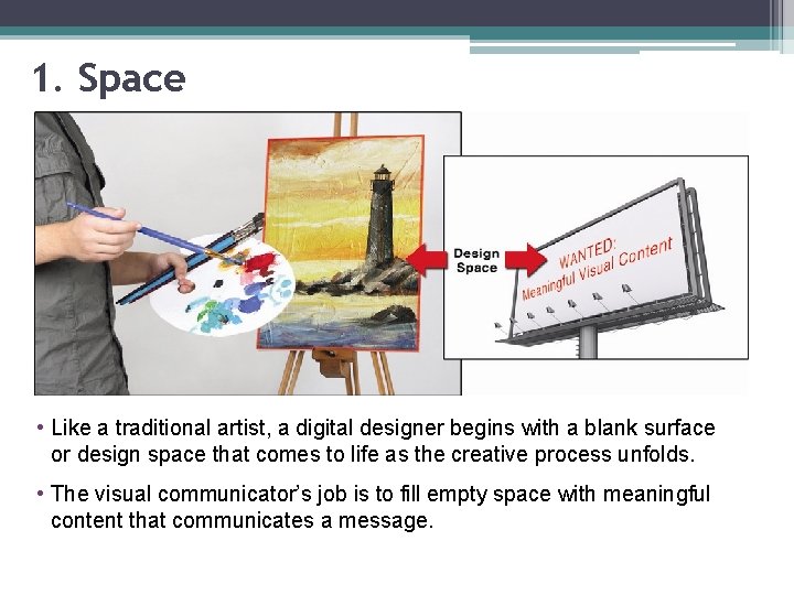
1. Space • Like a traditional artist, a digital designer begins with a blank surface or design space that comes to life as the creative process unfolds. • The visual communicator’s job is to fill empty space with meaningful content that communicates a message.

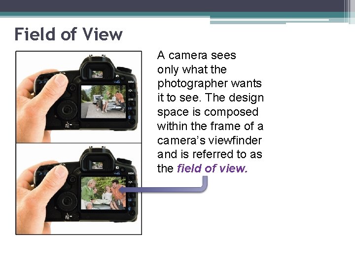
Field of View A camera sees only what the photographer wants it to see. The design space is composed within the frame of a camera’s viewfinder and is referred to as the field of view.


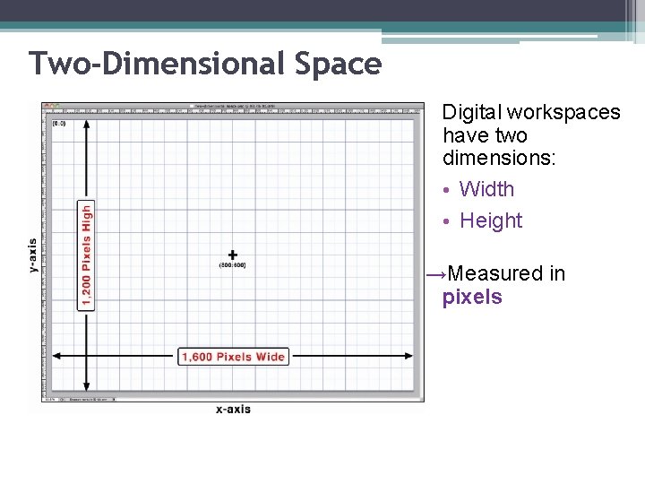
Two-Dimensional Space Digital workspaces have two dimensions: • Width • Height →Measured in pixels

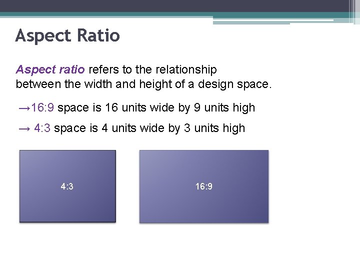
Aspect Ratio Aspect ratio refers to the relationship between the width and height of a design space. → 16: 9 space is 16 units wide by 9 units high → 4: 3 space is 4 units wide by 3 units high 4: 3 16: 9

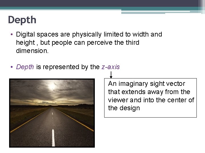
Depth • Digital spaces are physically limited to width and height , but people can perceive third dimension. • Depth is represented by the z-axis An imaginary sight vector that extends away from the viewer and into the center of the design

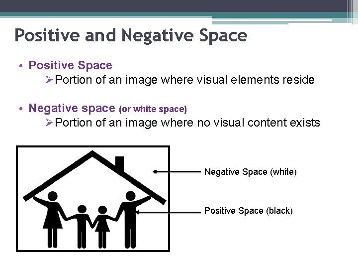
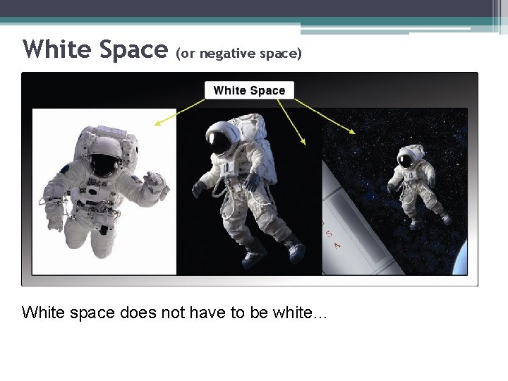
Positive and Negative Space • Positive Space ØPortion of an image where visual elements reside • Negative space (or white space) ØPortion of an image where no visual content exists Negative Space (white) Positive Space (black)

White Space (or negative space) White space does not have to be white…

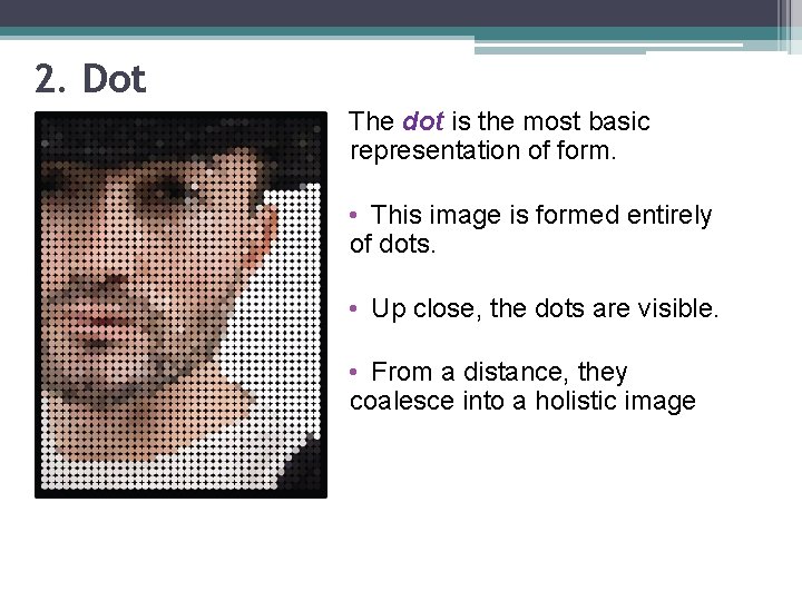
2. Dot The dot is the most basic representation of form. • This image is formed entirely of dots. • Up close, the dots are visible. • From a distance, they coalesce into a holistic image

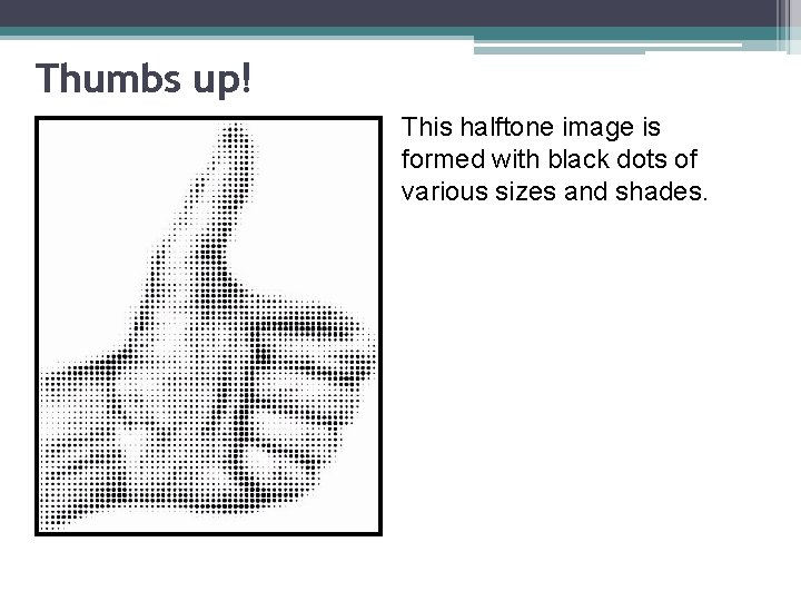
Dot • Dots can be combined in large numbers to portray complex visual objects and images. • Under a magnifying glass, you can see that a modern printed image, a halftone print, is made up of dots (positive space) surrounded by white space. • The dots merge and coalesce to form the optical illusion of a continuous tone image in our visual receptors.

Thumbs up! This halftone image is formed with black dots of various sizes and shades.

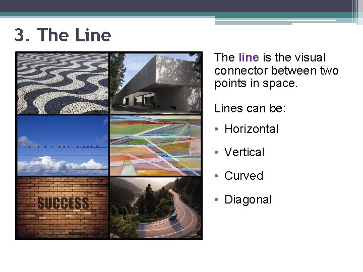
3. The Line The line is the visual connector between two points in space. Lines can be: • Horizontal • Vertical • Curved • Diagonal

Types of Lines Straight lines: • Static (horizontal or vertical) • Diagonal (dynamic) Ø Indicate a sense of balance Vertical lines: • Reach upward Ø Promote a sense of power, strength, & grandeur • Diagonal lines: Ø Energize a visual design Ø Exude a sense of speed, movement, & depth

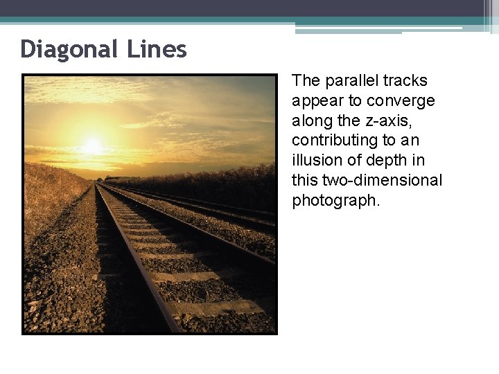
Diagonal Lines The parallel tracks appear to converge along the z-axis, contributing to an illusion of depth in this two-dimensional photograph.

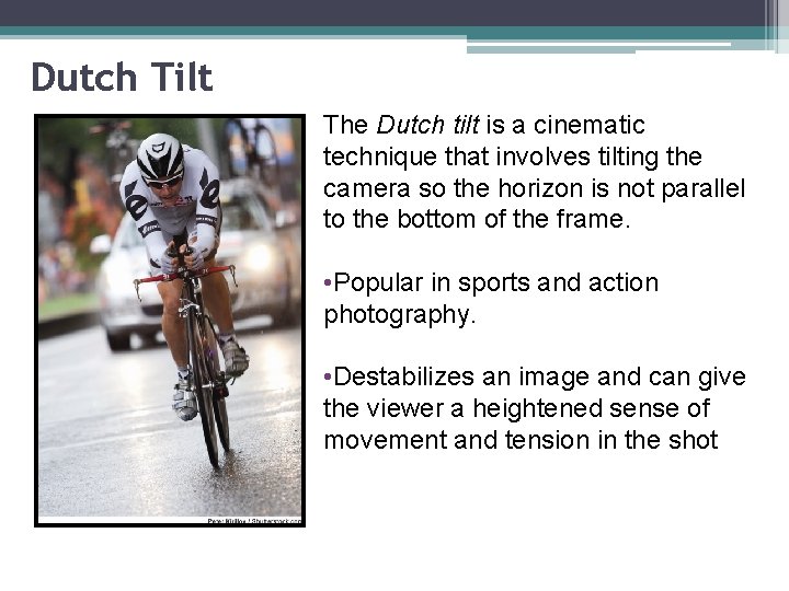
Dutch Tilt The Dutch tilt is a cinematic technique that involves tilting the camera so the horizon is not parallel to the bottom of the frame. • Popular in sports and action photography. • Destabilizes an image and can give the viewer a heightened sense of movement and tension in the shot

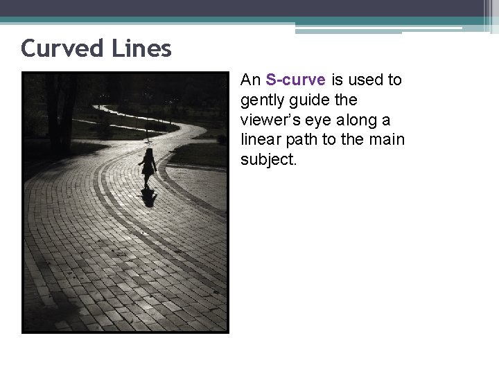
Curved Lines An S-curve is used to gently guide the viewer’s eye along a linear path to the main subject.

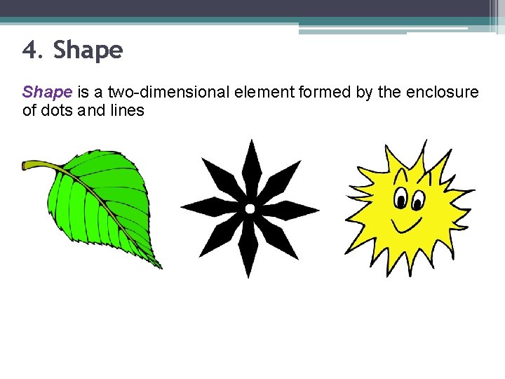
4. Shape is a two-dimensional element formed by the enclosure of dots and lines

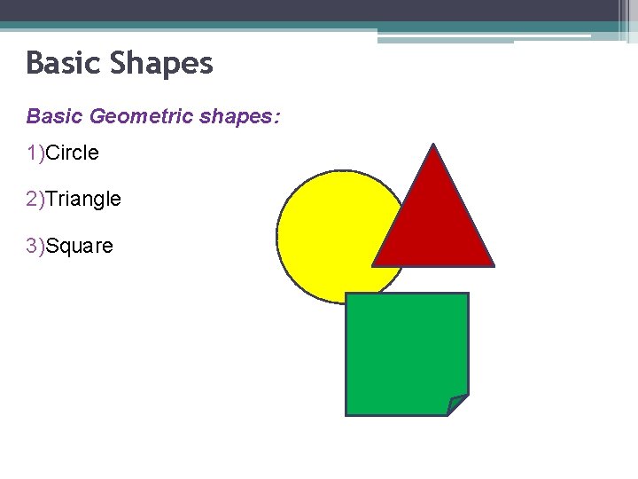
Basic Shapes Basic Geometric shapes: 1)Circle 2)Triangle 3)Square

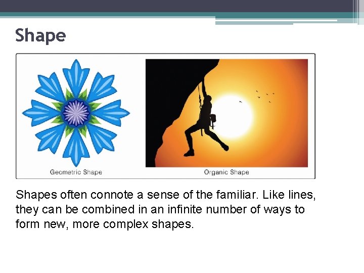
Shapes often connote a sense of the familiar. Like lines, they can be combined in an infinite number of ways to form new, more complex shapes.

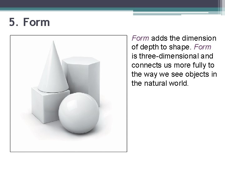
5. Form adds the dimension of depth to shape. Form is three-dimensional and connects us more fully to the way we see objects in the natural world.

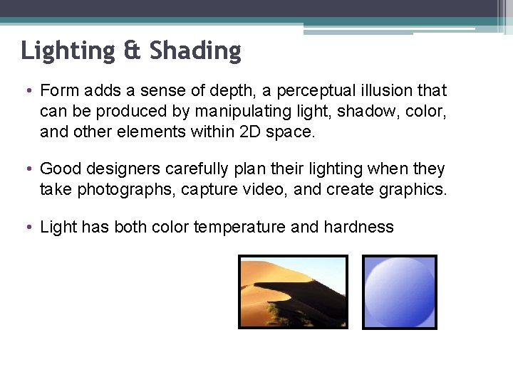
Lighting & Shading • Form adds a sense of depth, a perceptual illusion that can be produced by manipulating light, shadow, color, and other elements within 2 D space. • Good designers carefully plan their lighting when they take photographs, capture video, and create graphics. • Light has both color temperature and hardness

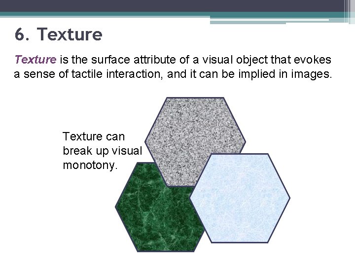
6. Texture is the surface attribute of a visual object that evokes a sense of tactile interaction, and it can be implied in images. Texture can break up visual monotony.

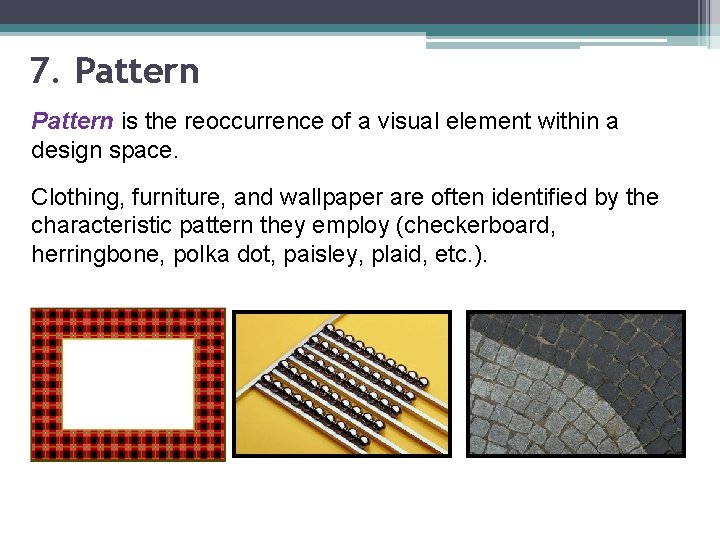
7. Pattern is the reoccurrence of a visual element within a design space. Clothing, furniture, and wallpaper are often identified by the characteristic pattern they employ (checkerboard, herringbone, polka dot, paisley, plaid, etc. ).

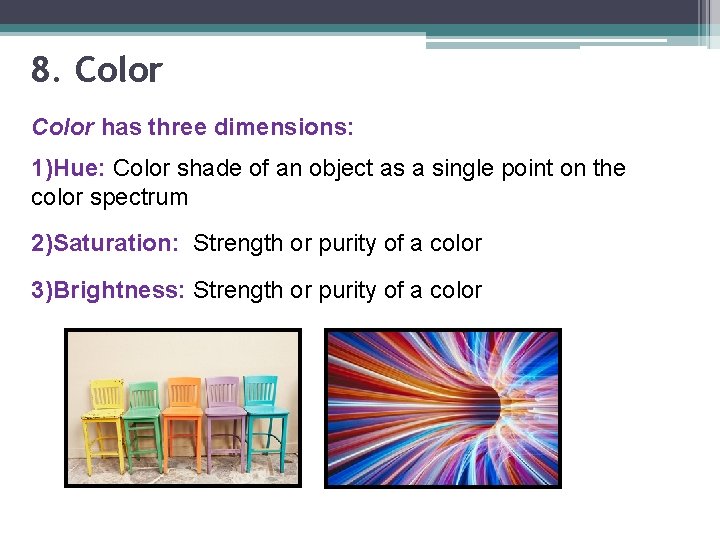
8. Color has three dimensions: 1)Hue: Color shade of an object as a single point on the color spectrum 2)Saturation: Strength or purity of a color 3)Brightness: Strength or purity of a color

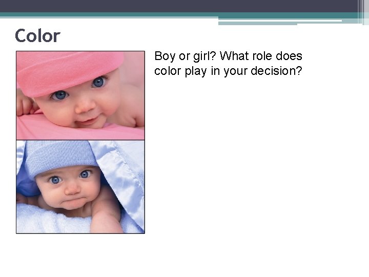
Color Boy or girl? What role does color play in your decision?

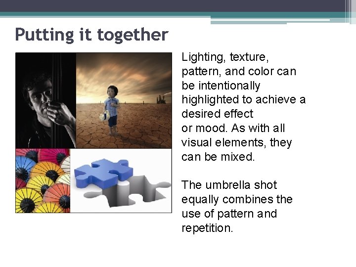
Putting it together Lighting, texture, pattern, and color can be intentionally highlighted to achieve a desired effect or mood. As with all visual elements, they can be mixed. The umbrella shot equally combines the use of pattern and repetition.

Principles of Design 1) Unity 2) Emphasis 3) Perceptual forces

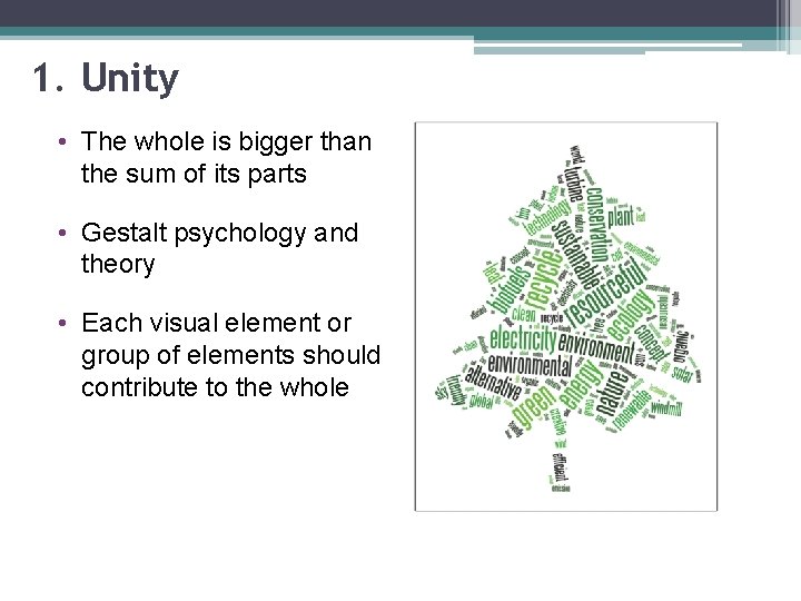
1. Unity • The whole is bigger than the sum of its parts • Gestalt psychology and theory • Each visual element or group of elements should contribute to the whole

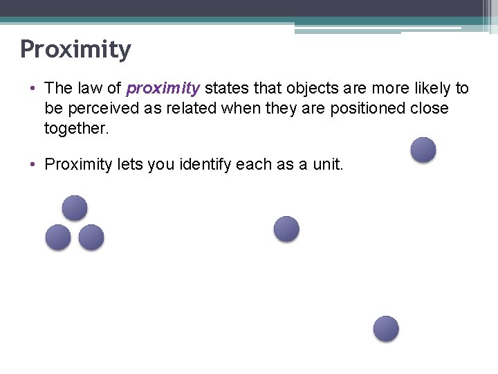
Proximity • The law of proximity states that objects are more likely to be perceived as related when they are positioned close together. • Proximity lets you identify each as a unit.

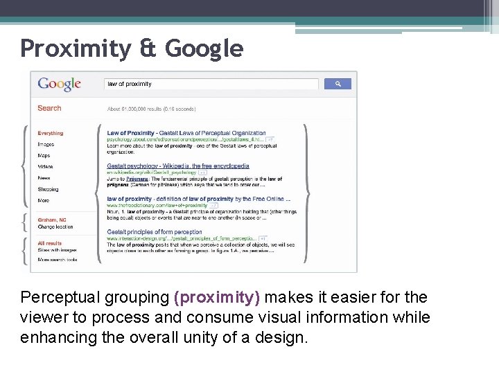
Proximity & Google Perceptual grouping (proximity) makes it easier for the viewer to process and consume visual information while enhancing the overall unity of a design.

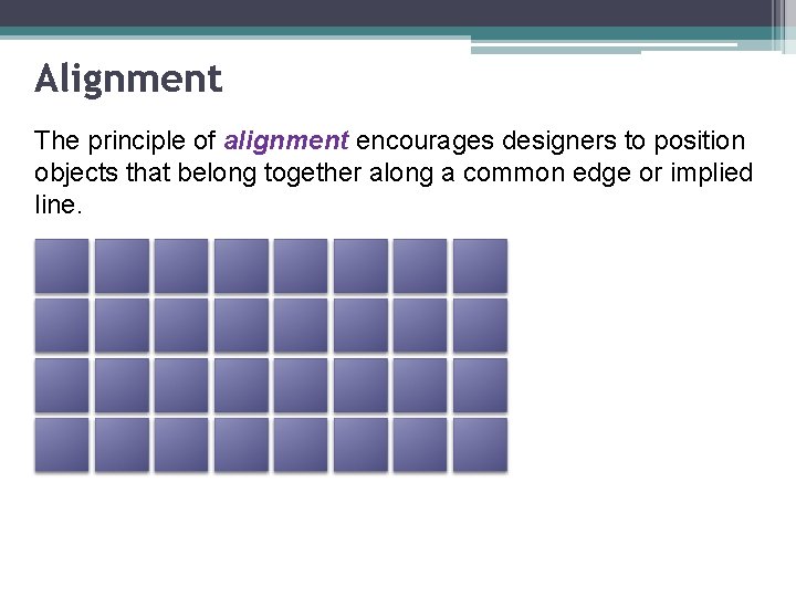
Alignment The principle of alignment encourages designers to position objects that belong together along a common edge or implied line.

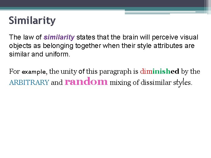
Similarity The law of similarity states that the brain will perceive visual objects as belonging together when their style attributes are similar and uniform. For example, the unity of this paragraph is diminished by the ARBITRARY and random mixing of dissimilar styles.

Repetition is related to similarity and suggests that repeating visual elements such as lines, colors, shapes, and patterns help strengthen the overall unity of a design. ØIn web design, it brings harmony and consistency to the look of a multipage website. • Occurs frequently in nature • Produces pattern • Repeating elements can preserve visual brand identification

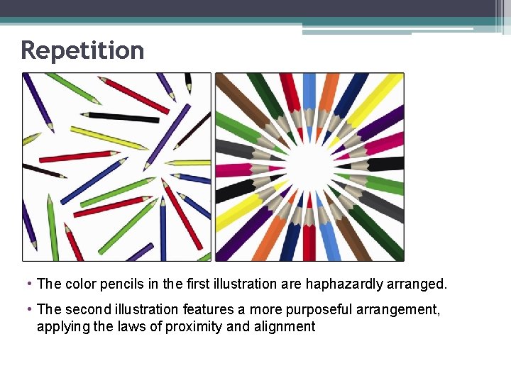
Repetition • The color pencils in the first illustration are haphazardly arranged. • The second illustration features a more purposeful arrangement, applying the laws of proximity and alignment

Web design template… How are proximity, alignment, similarity, and repetition used in the layout of this web page design template?

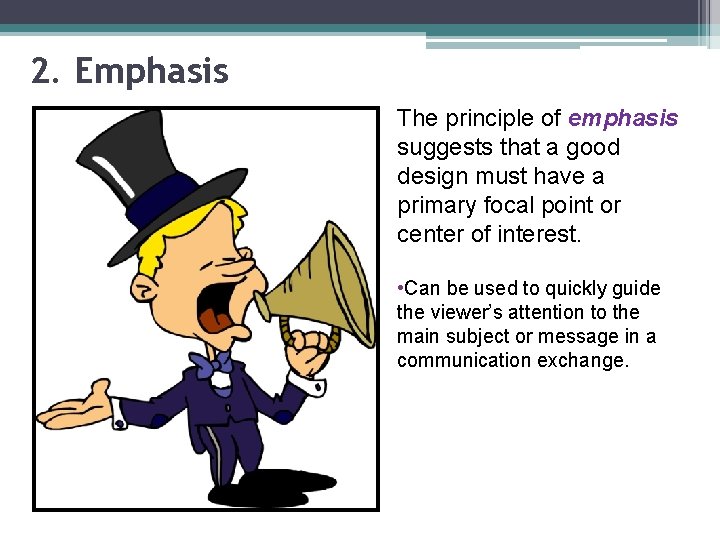
2. Emphasis The principle of emphasis suggests that a good design must have a primary focal point or center of interest. • Can be used to quickly guide the viewer’s attention to the main subject or message in a communication exchange.

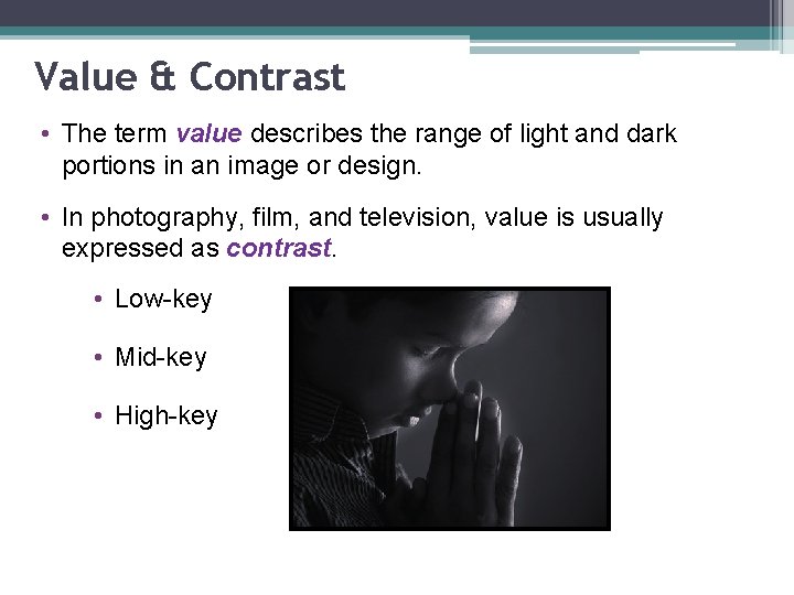
Value & Contrast • The term value describes the range of light and dark portions in an image or design. • In photography, film, and television, value is usually expressed as contrast. • Low-key • Mid-key • High-key

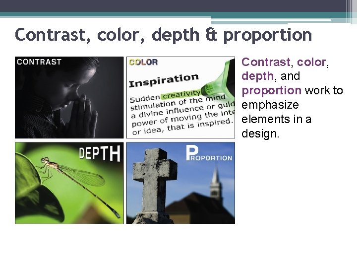
Contrast, color, depth & proportion Contrast, color, depth, and proportion work to emphasize elements in a design.

Color, Depth, & Proportion • Color is a powerful tool for enhancing contrast in visual design space • Depth powerful tool for achieving emphasis in a design • Proportion is the scale of an object relative to other elements within a composition

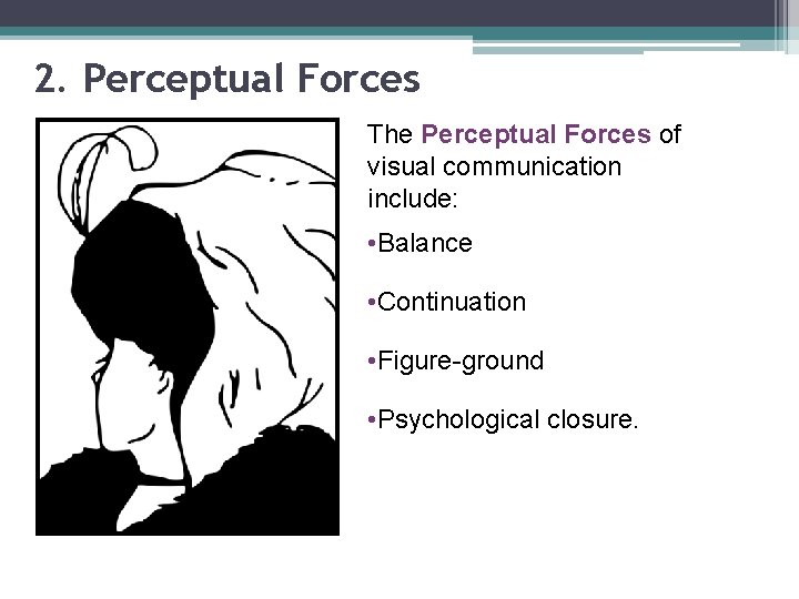
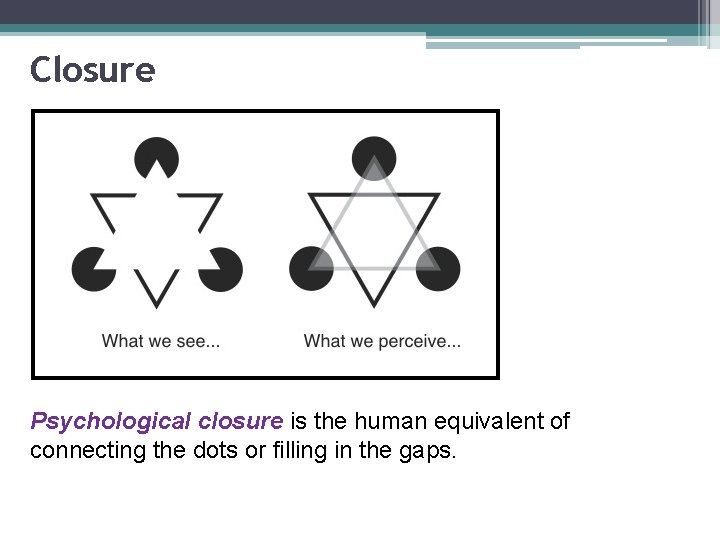
2. Perceptual Forces The Perceptual Forces of visual communication include: • Balance • Continuation • Figure-ground • Psychological closure.

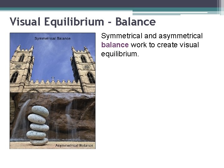
Visual Equilibrium - Balance Symmetrical and asymmetrical balance work to create visual equilibrium.

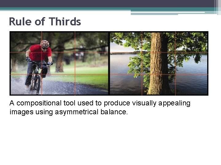
Rule of Thirds A compositional tool used to produce visually appealing images using asymmetrical balance.

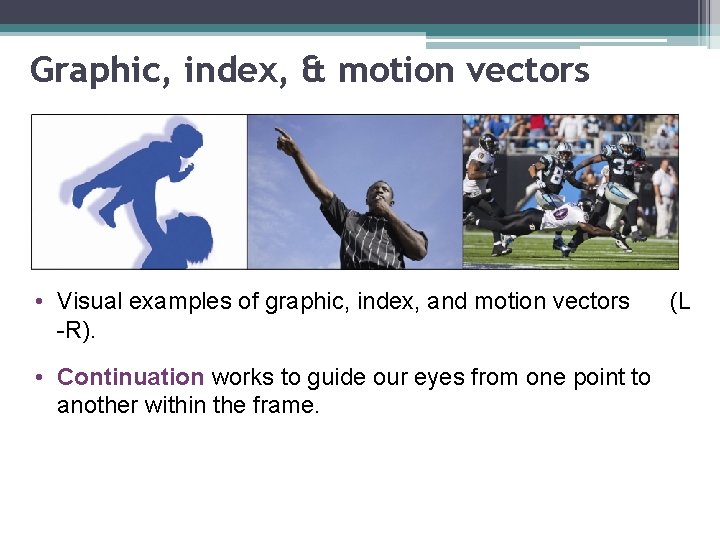
Graphic, index, & motion vectors • Visual examples of graphic, index, and motion vectors -R). • Continuation works to guide our eyes from one point to another within the frame. (L

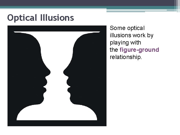
Optical Illusions Some optical illusions work by playing with the figure-ground relationship.

Closure Psychological closure is the human equivalent of connecting the dots or filling in the gaps.