Chapter 4 Understanding and Comparing Distributions Copyright 2014
Chapter 4 Understanding and Comparing Distributions Copyright © 2014, 2012, 2009 Pearson Education, Inc. 1
Objectives Construct side by side histograms or boxplots on comparable scales to compare the distributions of two groups. 18. Compare the distributions of two or more groups by comparing their shapes, centers, spreads, and unusual features. 17. Copyright © 2014, 2012, 2009 Pearson Education, Inc. 2
4. 1 Comparing Groups with Histograms Copyright © 2014, 2012, 2009 Pearson Education, Inc. 3
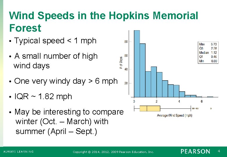
Wind Speeds in the Hopkins Memorial Forest • Typical speed < 1 mph • A small number of high wind days • One very windy day > 6 mph • IQR ~ 1. 82 mph • May be interesting to compare winter (Oct. – March) with summer (April – Sept. ) Copyright © 2014, 2012, 2009 Pearson Education, Inc. 4
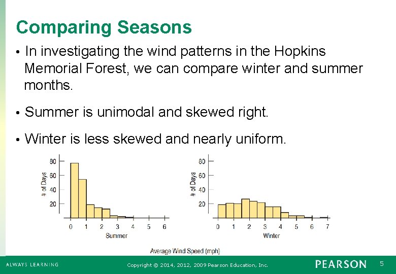
Comparing Seasons • In investigating the wind patterns in the Hopkins Memorial Forest, we can compare winter and summer months. • Summer is unimodal and skewed right. • Winter is less skewed and nearly uniform. Copyright © 2014, 2012, 2009 Pearson Education, Inc. 5
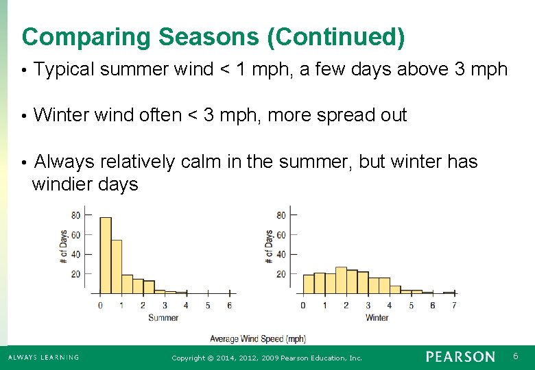
Comparing Seasons (Continued) • Typical summer wind < 1 mph, a few days above 3 mph • Winter wind often < 3 mph, more spread out • Always relatively calm in the summer, but winter has windier days Copyright © 2014, 2012, 2009 Pearson Education, Inc. 6
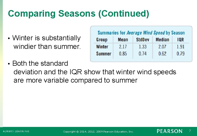
Comparing Seasons (Continued) • Winter is substantially windier than summer. • Both the standard deviation and the IQR show that winter wind speeds are more variable compared to summer Copyright © 2014, 2012, 2009 Pearson Education, Inc. 7

Comparing Stem-and-Leaf • A back-to-back stem-and-leaf diagram compares nest egg indices (savings and investments). • Northeast and Midwest generally have bigger nest egg indices than the South and West. • Back-to-back charts are best for comparisons. Copyright © 2014, 2012, 2009 Pearson Education, Inc. 8
4. 2 Comparing Groups with Boxplots Copyright © 2014, 2012, 2009 Pearson Education, Inc. 9
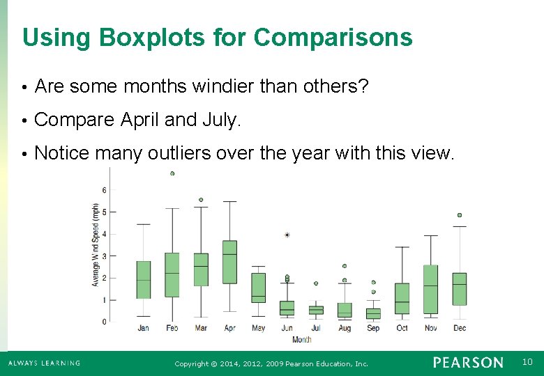
Using Boxplots for Comparisons • Are some months windier than others? • Compare April and July. • Notice many outliers over the year with this view. Copyright © 2014, 2012, 2009 Pearson Education, Inc. 10
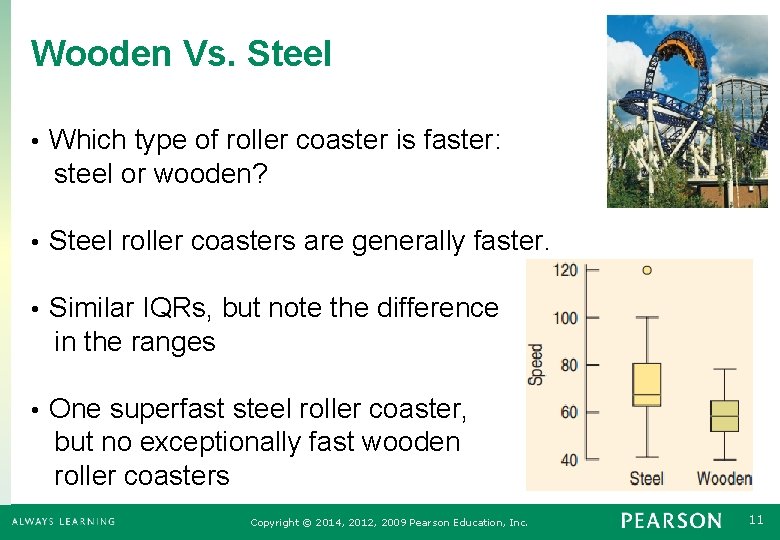
Wooden Vs. Steel • Which type of roller coaster is faster: steel or wooden? • Steel roller coasters are generally faster. • Similar IQRs, but note the difference in the ranges • One superfast steel roller coaster, but no exceptionally fast wooden roller coasters Copyright © 2014, 2012, 2009 Pearson Education, Inc. 11
Please, No Cold Coffee! • We want to compare which of 4 different coffee cups keeps the coffee hot. • Measure the temperature 30 minutes after being poured for each of the four types. Repeat the experiment 8 times. • Think • Plan: Compare the data sets for the four types. • Variables: Quantitative – Temperature change of coffee Copyright © 2014, 2012, 2009 Pearson Education, Inc. 12
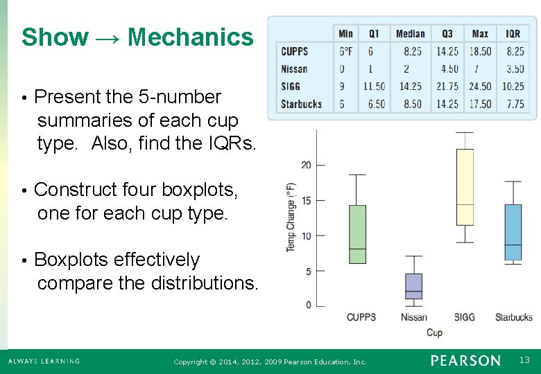
Show → Mechanics • Present the 5 -number summaries of each cup type. Also, find the IQRs. • Construct four boxplots, one for each cup type. • Boxplots effectively compare the distributions. Copyright © 2014, 2012, 2009 Pearson Education, Inc. 13
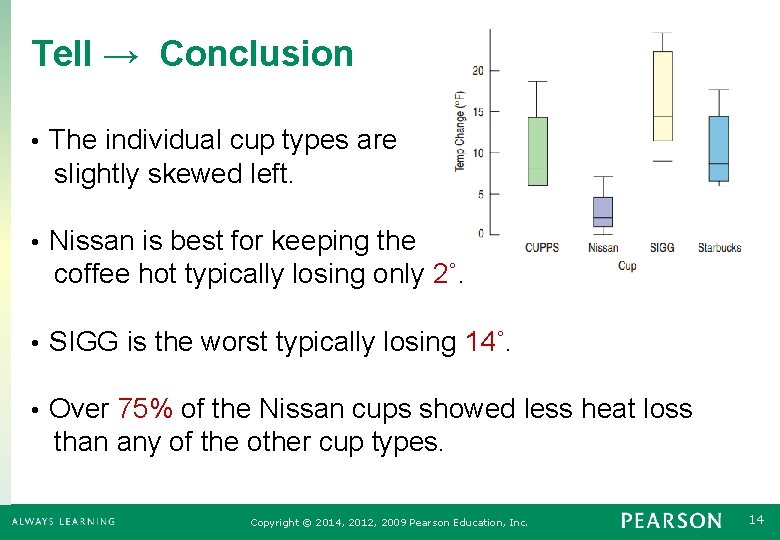
Tell → Conclusion • The individual cup types are slightly skewed left. • Nissan is best for keeping the coffee hot typically losing only 2˚. • SIGG is the worst typically losing 14˚. • Over 75% of the Nissan cups showed less heat loss than any of the other cup types. Copyright © 2014, 2012, 2009 Pearson Education, Inc. 14
4. 3 Outliers Copyright © 2014, 2012, 2009 Pearson Education, Inc. 15
How to Approach Outliers • Check to see if there may have been an error in the data collection or data input. • If the reported heights of students includes a student that is 170 inches tall (14 feet), maybe that student was measured in centimeters. • Check to see if there was an extraordinary outcome. • The median number of daily customers at the Punxsutawney, PA, gift store may be 42 with an IQR of 12, but on February 2, there were 831 customers. Copyright © 2014, 2012, 2009 Pearson Education, Inc. 16
Common Errors Causing an Outlier • Transposing the digits • A respondent not understanding the survey question • Misreading results • Confusion about units • Cheating Copyright © 2014, 2012, 2009 Pearson Education, Inc. 17
The Outliers Can be the Most Interesting Data Values • • • Income Data: • The CEO Student Height: • The basketball team’s center Snowfall: • The great blizzard of ’ 98 Exam Score: • The curve breaker Milk Purchased: • Octomom! Always comment on the outliers. Copyright © 2014, 2012, 2009 Pearson Education, Inc. 18
What Can Go Wrong? • Avoid inconsistent scales. • Don’t try to compare one thing measured in feet to another measured in meters. • Label Clearly. • Variables should be identified and axes labeled. • Beware of Outliers! • If the outliers are errors, remove them. • Otherwise, considering presenting with and without the outliers. Copyright © 2014, 2012, 2009 Pearson Education, Inc. 19
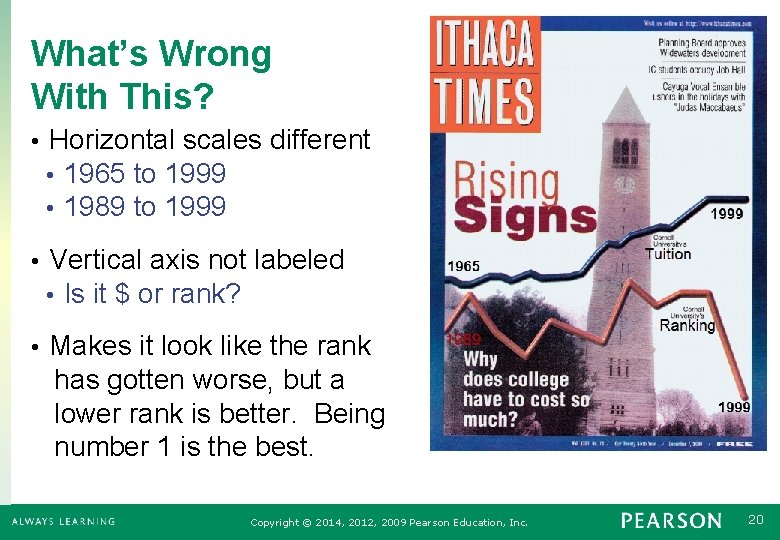
What’s Wrong With This? • Horizontal scales different • 1965 to 1999 • 1989 to 1999 • Vertical axis not labeled • Is it $ or rank? • Makes it look like the rank has gotten worse, but a lower rank is better. Being number 1 is the best. Copyright © 2014, 2012, 2009 Pearson Education, Inc. 20
What Have We Learned? • Choose the right tool. • Use histograms to compare two or three groups. • Use boxplots to compare many groups. • Treat outliers with attention and care. • Local or global, especially in a time series • Investigate if the outliers are errors or remarkable. Copyright © 2014, 2012, 2009 Pearson Education, Inc. 21
- Slides: 21