Chapter 4 GRAPHS AND SLOPES When you have


 measures")


 relationship. At a speed of 40 MPH, you")
 relationship. As the distance sprinted increases, recovery time")
 relationship. As study time increases, the number of")
 relationship. As the time playing tennis increases, the")


 relationship. As the journey")
 relationship. As leisure")


, 2. ∆y is 3. (6 -3).")
")


 Study time There")
 Production cost There")
 Positive Slope and (b) Negative Slope A")


, income person was $32, 335")
, 20 percent of")

 Total Sales of Industry (B) Truncated Vertical Axis")


 Cause (Step Score 2) (Step 3 ) 1 Phones")

. He scores each group by")


- Slides: 64
Chapter 4 GRAPHS AND SLOPES
When you have completed your study of this chapter, you will be able to 1 Interpret graphs that display data. 2 Interpret the graphs used in economic models. 3 Define and calculate slope. 4 Graph relationships among more than two variables.
MAKING AND USING GRAPHS <Basic Idea – A graph enables us to visualize the relationship between two variables. – To make a graph, set two lines perpendicular (dikine) to each other: • The horizontal line is called the x-axis. • The vertical line is called the y-axis. • The common zero point is called the origin.
Figure 1 shows how to make a graph. 1. The horizontal axis (x-axis) measures temperature. 2. The vertical axis (y-axis) measures ice cream consumption.
MAKING AND USING GRAPHS 3. Point A shows that when the temperature is 40 degrees, ice cream consumption is only 5 gallons a day. 4. Point B shows that when the temperature is 80 degrees, ice cream consumption jumps to 20 gallons a day.
Interpreting Graphs Used in Economic Models – Positive relationship or direct relationship is a relationship between two variables that move in the same direction. • negative relationship A relationship in which two variables move in opposite directions. Linear relationship is a relationship that graphs as a straight line.
Figure 2 shows a positive (direct) relationship. At a speed of 40 MPH, you travel 200 miles in 5 hours— point A. At a speed of 60 MPH, you travel 300 miles in 5 hours— point B. As the speed increases, the distance traveled in 5 hours increases proportionately, or the higher the speed, the greater the distance traveled in five hours
Figure 3 shows a positive (direct) relationship. As the distance sprinted increases, recovery time increases. Koşu mesafesi arttıkça, iyileşme süresi artar. But sprint twice as far and it takes more than twice as long to recover—the curve gets steeper. Look at the arrow… Koşu mesafesi iki kat artınca, iyileşme süresi iki katından fazla artar. dik
Figure 4 shows a positive (direct) relationship. As study time increases, the number of problems worked increases. Çalışma süresi arttıkça, çalışılan problem sayısı artacaktır But study twice as long and the number of problems you work less than double —the curve gets less steep. Look at the arrow… Çalışma süresi iki katı arttınca, çalışılan problem sayısı iki katından az artar.
Figure 5 shows a negative (inverse) relationship. As the time playing tennis increases, the time playing squash decreases. Because one more hour of tennis means one hour less of squash, the relationship between these two variables is described by a straight line.
FIGURE 6 Relationship between Hours Worked and Income Y Y = 8 X There is a positive relationship between work hours and income, so the income curve is positively sloped. The slope(eğim)of the curve is $8: Each additional hour of work increases income by $8. Conclusion: If hours worked per week increase one unit, the income per week will increase 8 units. X
Computing the Slope • slope of a curve – The vertical difference between two points (the rise) divided by the horizontal difference (the run). In general, if the variable on the vertical axis is Y and the variable on the horizontal axis is X, we can express the slope as
MAKING AND USING GRAPHS Figure 7 shows a negative (inverse) relationship. As the journey length increases, the cost per mile of the trip falls. But there is a limit to how much the cost per mile can fall, so the curve becomes less steep as journey length increases.
APPENDIX: MAKING AND USING GRAPHS Figure 8 shows a negative (inverse) relationship. As leisure time increases, the number of problems worked decreases. But during the tenth hour of leisure (the first hour of work) the decrease in the number of problems worked is largest, so the curve becomes steeper as leisure time increases.
MAKING AND USING GRAPHS Figure 9 shows a maximum point. As the rainfall increases: 1. The curve slopes upward as the yield rises. 2. The curve is flat at point A, the maximum yield. 3. Then slopes downward as the yield falls.
MAKING AND USING GRAPHS Figure 10 shows a minimum point. As the speed increases: 1. The curve slopes downward as the cost per mile falls. 2. The curve is flat at point B, the minimum cost per mile. 3. The curve slopes upward as the cost per mile rises.
Figure 11 shows variables that are unrelated. The line or the curve is horizontal As the price of bananas increases, the student’s grade in economics remains at 75 percent. There is no relation between the grade and price of bananas. unrelated variables.
Figure 12 shows variables that are unrelated. As rainfall in California increases, the output of French vineyards(üzüm bağları)remains at 3 billion gallons. The line is vertical.
EX: 1. When ∆x is 4. (6 -2), 2. ∆y is 3. (6 -3). 3. Slope (∆y/∆x) is 3/4. Slope is positive
EX: 1. When ∆x is 4, 2. ∆y is – 3. 3. Slope (∆y/∆x) is – 3/4. Slope is negative
MAKING AND USING GRAPHS Figure 13 shows the slope of a curve at a point. Slope of the curve at A equals the slope of the red line tangent (teğet) to the curve at A. 1. When ∆x is 4, 2. ∆y is 3. 3. Slope (∆y/∆x) is 3/4.
MAKING AND USING GRAPHS • Relationships Among More Than Two Variables – To graph a relationship that involves more than two variables, we use the ceteris paribus assumption. – Ceteris Paribus – “other things remaining the same” – Figure 14 shows the relationships between ice cream consumed, the temperature, and the price of ice cream.
APPENDIX: AND USING As price increases. MAKING the consumption of ice cream on different GRAPHS temperatures decreases (because the slope is negative) Figure 14 shows the relationship between price and consumption, temperature remaining the same.
As temperature the AND consumption APPENDIX: increases MAKING USING of ice cream on different price level GRAPHS increases, because the slope is positive Figure 15 shows the relationship between temperature and consumption, price remaining the same.
MAKING AND USING GRAPHS Figure 16 shows the relationship between price and temperature, consumption remaining the same.
Movement Along a Curve versus Shifting the Curve ► FIGURE 17 Movement Along a Curve versus Shifting the Curve To draw a curve showing the relationship between hours worked and income, we fix the weekly allowance (haftalık harçlık) ($40) and the wage ($8 per hour). A change in the hours worked causes movement along the curve, for example, from point b to point c. A change in any other variable shifts the entire curve. For example, a $50 increase in the allowance (to $90) shifts the entire curve upward by $50.
Nonlinear Relationships Graphing Nonlinear Relationships ► FIGURE 18 Nonlinear Relationships (A) Study time There is a positive and nonlinear relationship between study time and the grade on an exam. As study time increases, the exam grade increases at a decreasing rate. For example, the second hour of study increased the grade by 4 points (from 6 points to 10 points), but the ninth hour of study increases the grade by only 1 point (from 24 points to 25 points).
Nonlinear Relationships Graphing Nonlinear Relationships ► FIGURE 19 Nonlinear Relationships (B) Production cost There is a positive and nonlinear relationship between the quantity of grain produced and total production cost. As the quantity increases, the total cost increases at an increasing rate. For example, to increase production from 1 ton to 2 tons, production cost increases by $5 (from $10 to $15) but to increase the production from 10 to 11 tons, total cost increases by $25 (from $100 to $125).
FIGURE 2 A Curve with (a) Positive Slope and (b) Negative Slope A positive slope indicates that increases in X are associated with increases in Y and that decreases in X are associated with decreases in Y. A negative slope indicates the opposite— when X increases, Y decreases; and when X decreases, Y increases.
Changing Slopes Along Curves
Time Series Graphs • A time series graph shows how a single measure or variable changes over time.
TABLE 1 Total Disposable Personal Income in the United States, 1975– 2012 (in billions of dollars) Year 1975 1976 1977 1978 1979 1980 1981 1982 1983 1984 1985 1986 1987 1988 1989 1990 1991 1992 1993 Total Disposable Personal Income 1, 187. 3 1, 302. 3 1, 435. 0 1, 607. 3 1, 790. 8 2, 002. 7 2, 237. 1 2, 412. 7 2, 599. 8 2, 891. 5 3, 079. 3 3, 258. 8 3, 435. 3 3, 726. 3 3, 991. 4 4, 254. 0 4, 444. 9 4, 736. 7 4, 921. 6 Year 1994 1995 1996 1997 1998 1999 2000 2001 2002 2003 2004 2005 2006 2007 2008 2009 2010 2011 2012 Total Disposable Personal Income 5, 184. 3 5, 457. 0 5, 759. 6 6, 074. 6 6, 498. 9 6, 803. 3 7, 327. 2 7, 648. 5 8, 009. 7 8, 377. 8 8, 889. 4 9, 277. 3 9, 915. 7 10, 423. 6 11, 024. 5 10, 772. 4 11, 127. 1 11, 549. 3 11, 930. 6 Total Disposable Personal Income in the United States: 1975– 2012 (in billions of dollars)
Plotting Income and Consumption Data for Households TABLE 2 Consumption Expenditures and Income, 2008 Bottom fifth 2 nd fifth 3 rd fifth 4 th fifth Top fifth Average Income Before Taxes Average Consumption Expenditures $ 10, 263 27, 442 47, 196 74, 090 158, 652 $ 22, 304 31, 751 42, 659 58, 632 97, 003 FIGURE 11 Household Consumption and Income A graph is a simple two-dimensional geometric representation of data. This graph displays the data from Table 1 A. 2. Along the horizontal scale (X-axis), we measure household income. Along the vertical scale (Y-axis), we measure household consumption. Note: At point A, consumption equals $22, 304 and income equals $10, 263. At point B, consumption equals $31, 751 and income equals $27, 442.
Some Precautions TABLE 3 Aggregate National Income and Consumption for the United States, 1930– 2012 (in billions of dollars) Aggregate National Income Consumption 1930 1940 1950 1960 1970 1980 1990 2005 2006 2007 2008 2009 2010 2011 2012 82. 9 90. 9 263. 9 473. 9 929. 5 2433. 0 5059. 8 8938. 9 11, 273. 8 12, 031. 2 12, 396. 4 12, 609. 1 12, 132. 6 12, 811. 4 13, 358. 9 13, 720. 9 70. 1 71. 3 192. 2 331. 8 648. 3 1, 755. 8 3, 835. 5 6, 830. 4 8, 803. 5 9, 301. 0 9, 772. 3 10, 035. 5 9, 845. 9 10, 215. 7 10, 729. 0 11, 119. 5 FIGURE 12 National Income and Consumption It is important to think carefully about what is represented by points in the space defined by the axes of a graph. In this graph, we have graphed income with consumption, as in Figure 1 A. 2, but here each observation point is national income and aggregate consumption in different years, measured in billions of dollars.
Interpreting Data Graphs – Scatter diagram is a graph of the value of one variable against the value of another variable. – Time-series graph is a graph that measures time on the x-axis and the variable or variables in which we are interested on the y-axis.
-Trend is a general tendency for the value of a variable to rise or fall. –Cross-section graph is a graph that shows the values of an economic variable for different groups in a population at a point in time.
Figure 20 shows Scatter diagram. In 2010 (marked 10), income person was $32, 335 and expenditure person was $29, 686. The data for 2000 to 2012 show that as income increases, expenditure increases. Linear relation between expenditure and income Y=f(X)
Figure 21 shows another scatter diagram. – In 1997 (marked 97), 20 percent of U. S. cell-phone subscribers had a monthly cell phone bill of $50. The data show that as the monthly bill fell, more people became cell phone subscribers.
Figure 22 shows a times-series graph. • The graph shows when the price of coffee was: • Low or high. • Rising or falling. • Changing quickly or slowly.
Time-Series Graphing Single Variables (A) Total Sales of Industry (B) Truncated Vertical Axis
Figure 23 shows a cross-section graph. The graph shows the percentage of people who participate in various sporting activities.
PIE GRAPH AND BAR GRAPH FIGURE 24 ▼ Graphs of Single Variables
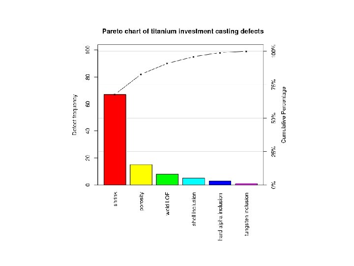
Pareto chart A Pareto chart, named after Vilfredo Pareto, is a type of chart that contains both bars and a line graph, where individual values are represented in descending order by bars, and the cumulative total is represented by the line. The left vertical axis is the frequency of occurrence, but it can alternatively represent cost or another important unit of measure. The right vertical axis is the cumulative percentage of the total number of occurrences, total cost, or total of the particular unit of measure. Because the reasons are in decreasing order, the cumulative function is a concave function(içbükey foksiyon). The purpose of the Pareto chart is to highlight the most important among a (typically large) set of factors. In quality control, it often represents the most common sources of defects, the highest occurring type of defect, or the most frequent reasons for customer complaints, and so on.
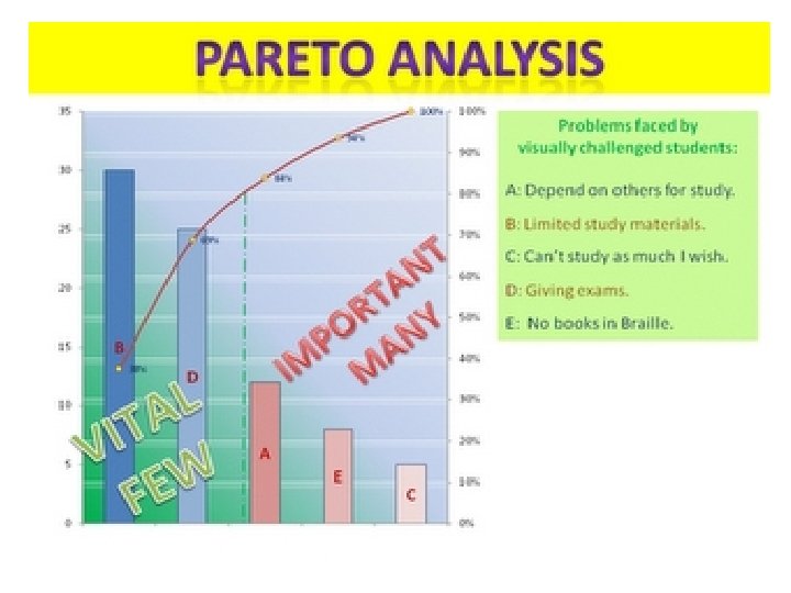
PARETO ANALYSIS Pareto analysis is a formal technique useful where many possible courses of action are competing for attention.
Pareto analysis is a creative way of looking at causes of problems because it helps stimulate thinking and organize thoughts.
• This technique helps to identify the top 20% of causes that needs to be addressed to resolve the 80% of the problems.
• The value of the Pareto Principle for a project manager is that it reminds you to focus on the 20% of things that matter. Of the things you do during your project, only 20% are really important. Those 20% produce 80% of your results. Identify and focus on those things first, but don't totally ignore the remaining 80% of causes.
History of Pareto Analysis • The Pareto effect is named after Vilfredo Pareto, an economist and sociologist who lived from 1848 to 1923.
• This method stems in the first place from Pareto’s suggestion of a curve of the distribution of wealth in a book of 1896. Whatever the source, the phrase of ‘the vital few and the trivial many’ deserves a place in every manager’s thinking. It is itself one of the most vital concepts in modern management. The results of thinking along Pareto lines are immense.
HOW TO USE IT ?
• Step 1: Identify and List Problems • Step 2: Identify the Root Cause of Each Problem • Step 3: Score Problems • Step 4: Group Problems Together By Root Cause • Step 5: Add up the Scores for Each Group • Step 6: Take Action
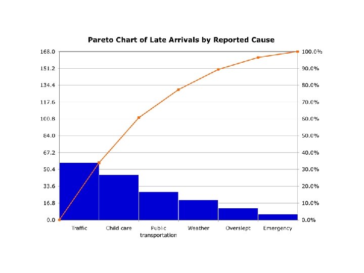
The Pareto Chart A Pareto chart is a graphical representation that displays data in order of priority.
This is a simple example of a Pareto diagram using sample data showing the relative frequency of causes for errors on websites. It enables you to see what 20% of cases are causing 80% of the problems and where efforts should be focused to achieve the greatest improvement.
Some Problems Difficulties associated with pareto analysis • Misrepresentation of the data. • Inappropriate measurements depicted. • Lack of understanding of how it should be applied to particular problems. • Knowing when and how to use Pareto Analysis. • Inaccurate plotting of cumulative percent data.
Overcoming the difficulties • Define the purpose of using the tool. • Identify the most appropriate measurement parameters. • Use check sheets to collect data for the likely major causes. • Arrange the data in descending order of value and calculate % frequency and/or cost and cumulative percent. • Plot the cumulative percent through the top right side of the first bar. • Carefully scrutinize the results. Has the exercise clarified the situation?
Pareto Analysis Example Ahmet has taken over a failing service center, with a lot of problems that need resolving. His objective is to increase overall customer satisfaction. He decides to score each problem by the number of complaints that the center has received for each one.
# Problem (Step 1 ) Cause (Step Score 2) (Step 3 ) 1 Phones aren’t answered quickly enough. Too few service center staff. 2 Staff seem distracted and under pressure. Too few service center staff. Engineers don’t appear to be well organized. They need second visits to bring extra parts. Poor organization and preparation. 3 15 6 4
4 5 6 Engineers don’t know what time they’ll arrive. This means that customers may have to be in all day for an engineer to visit. Poor organization and preparation. Service center staff don’t always seem to know Lack of training. what they’re doing. When engineers visit, the customer finds that the Lack of training. problem could have been solved over the phone. 2 30 21
Ahmet then groups problems together (steps 4 and 5). He scores each group by the number of complaints, and orders the list as follows: 1. Lack of training (items 5 and 6) – 51 complaints. 2. Too few service center staff (items 1 and 42) – 21 complaints. 3. Poor organization and preparation (items 3 and 4) – 6 complaints
Figure 1. Ahmet’s Pareto Analysis
It is the discipline of organizing the data that is central to the success of using Pareto Analysis. Once calculated and displayed graphically, it becomes a selling tool to the improvement team and management, raising the question why the team is focusing its energies on certain aspects of the problem.