Chapter 4 Elements Light and Color Elements Light


- Slides: 86
Chapter 4 Elements: Light and Color
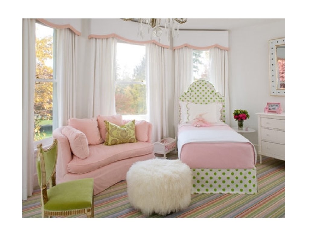
Elements: Light and color • Color is an influential element of design • cheering or relaxing, depressing, distressful • affect apparent size of a room • make ceilings seem higher or lower • can simulate sunlight • can speed up recovery in a healthcare setting
When we talk about color. . . • We have to talk first about light • without light, we cannot see color or any other elements previously discussed. • without light reflecting off the surface of an object, we cannot physically see the color. • So does color exist in the dark?
NO • Color is dependent on the element of light.
Technical Definition • Light is the electromagnetic energy from the sun or other celestial bodies, from fire, from artificial sources that travel in wavelengths that range from too long (infrared) to too short (ultraviolet) for us to see.
In other words. . . • When light hits an object, some of the colors of light rays are absorbed and others are reflected. The wavelengths that are reflected give the object its color. • White objects reflect almost all the colors in light, while black objects absorb most of them.
Example: • A lemon absorbs all wavelengths of color except the wavelength yellow. That is why we see it as yellow.
If White Objects § reflect almost all the color wavelengths, § Then what color do we see if an object absorbs all color wavelengths?
The color of an object that we see results from three factors: § The way in which the object reflects light. § The kind of light that makes the object visible. (moonlight, sunlight, light bulb etc. ) § and the physical condition of the viewer’s eyes.
Did you know? § You can actually change colors by changing the color of your light sources. § You can use filters, reflectors, diffusers, sheers, and special light bulbs to alter the colors we see. § A warm light will intensify red, yellow and orange, but will neutralize blue and violets. § Light that is cool and bluish neutralizes red, yellow and orange.
Color Psychology § You must consider more than aesthetics § You must understand the importance of light and color upon people’s physical and psychological responses to the environment as well as their health. § You will need to know what result is desired, how to achieve it and how to predict its effect.
Three dimensions of color 1. Hue: The name of a color 2. Value: The lightness or darkness of a color 3. Intensity: its degree of purity or strength: brightness vs. dullness
Hue – The name of a color • The simplest and most familiar color theory is based on the concept that there are three primary hues that cannot be produced by mixing any other hue • Red • Blue • Yellow
Primary Hues • Primary hues cannot be created by mixing any other color together. Red, yellow and blue are three primary hues used to create all other colors. • Memorize this color wheel!
Secondary Hue • Secondary hues stand midway between the primary colors of which it is the product • Green between blue and yellow • Orange between yellow and red • Violet between blue and red
Tertiary • Tertiary hues are the colors that stand midway between a primary and a secondary color. For example: • • Yellow-green Yellow-orange Red-Orange Blue-green Blue-Violet Red-violet Note: The primary color is written first.
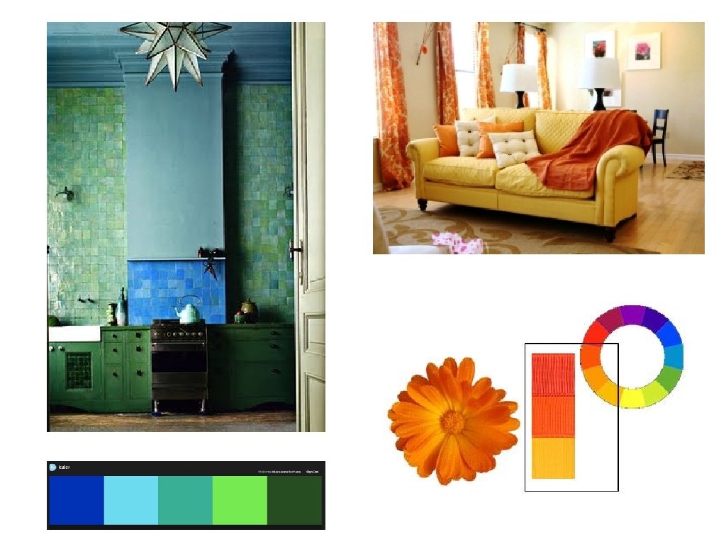
Background • The effects of background also lead to apparent changes in colors. • Orange placed against a blue background seems warmer and brighter • The same orange placed against orange and yellow seems duller and darker.
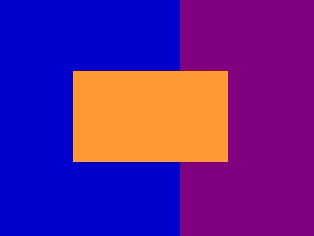
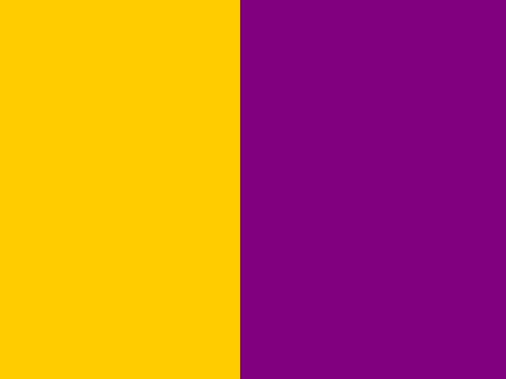
Interaction of Hues • When placed next to each other, colors produce effects ranging from unity to decisive contrast. • Blue, blue-green and green give a restful unified effect • Blue and orange produces more excitement and contrast
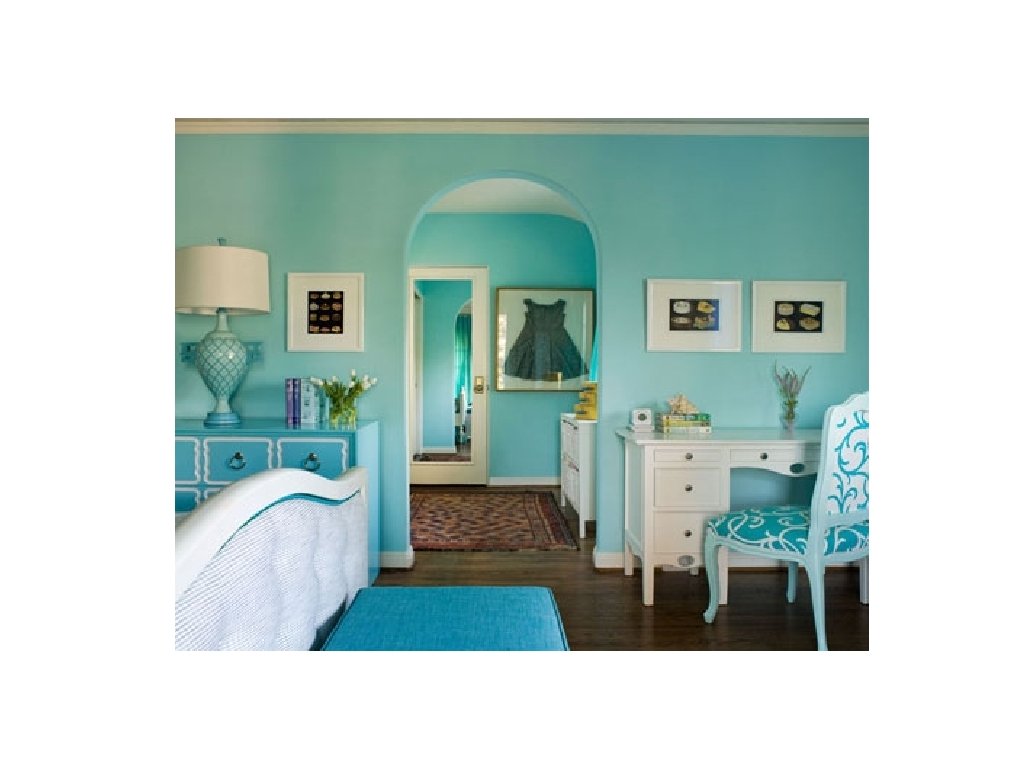
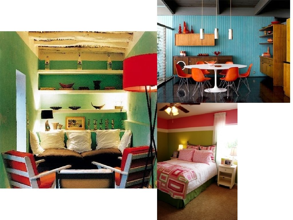
Analogous Hues • Near each other on the color wheel • Create a unified interior • Yellow, orange, red • Blue, blue-green and green
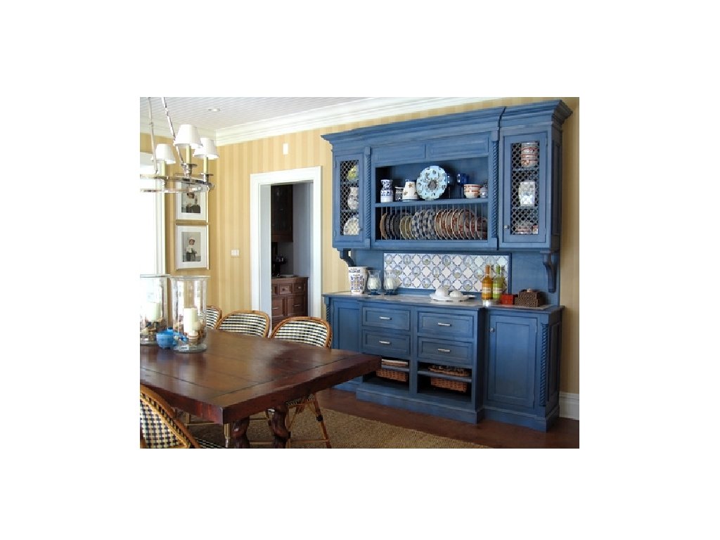
WARM- ANALOGOUS
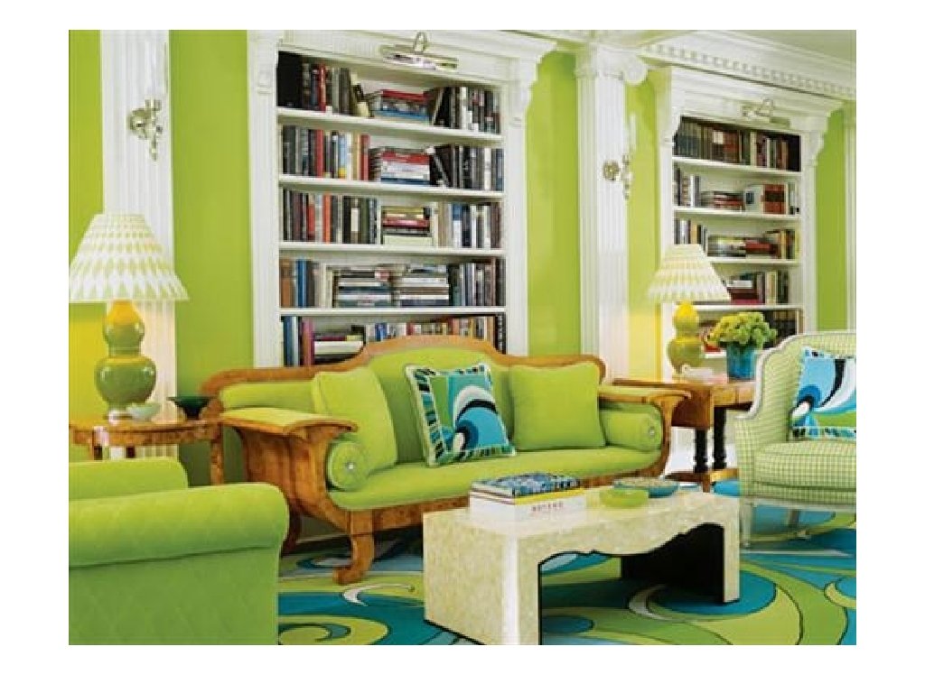
COOL- ANALOGOUS
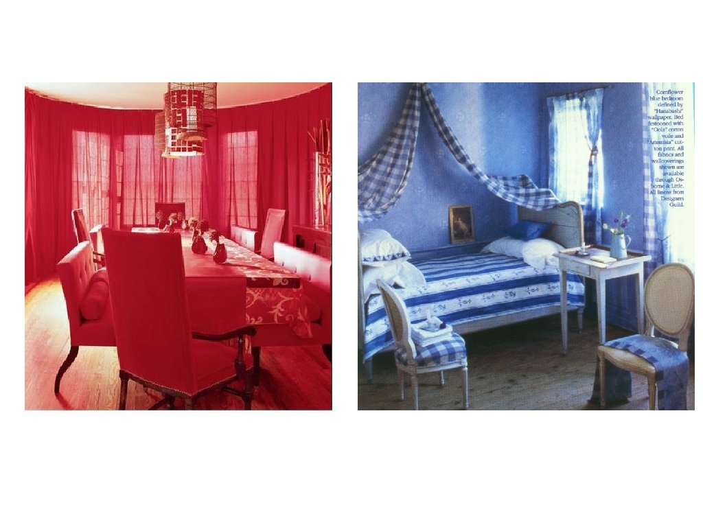
Complementary Hues • These colors lie directly opposite each other on the color wheel. • Creates contrast in an interior • Red and Green • Yellow and Violet • Orange and Blue
Monochromatic • Only one hue is used
Warmth and Coolness of Hues § All colors have a “temperature” § Red, orange and yellow seem warm § Blues and greens seem cool
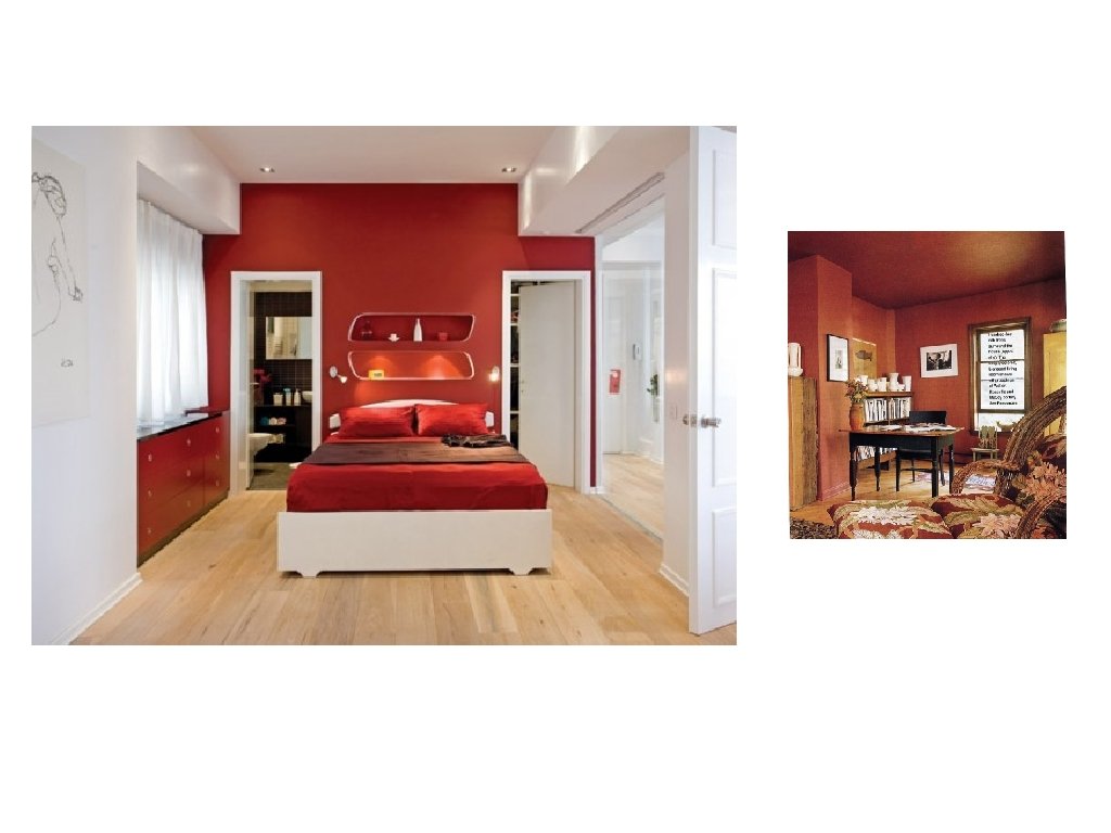
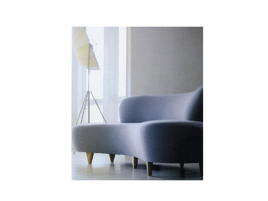
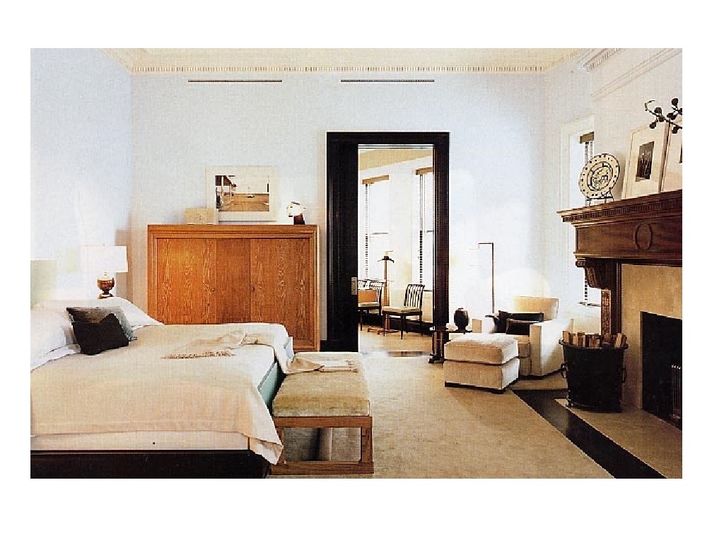
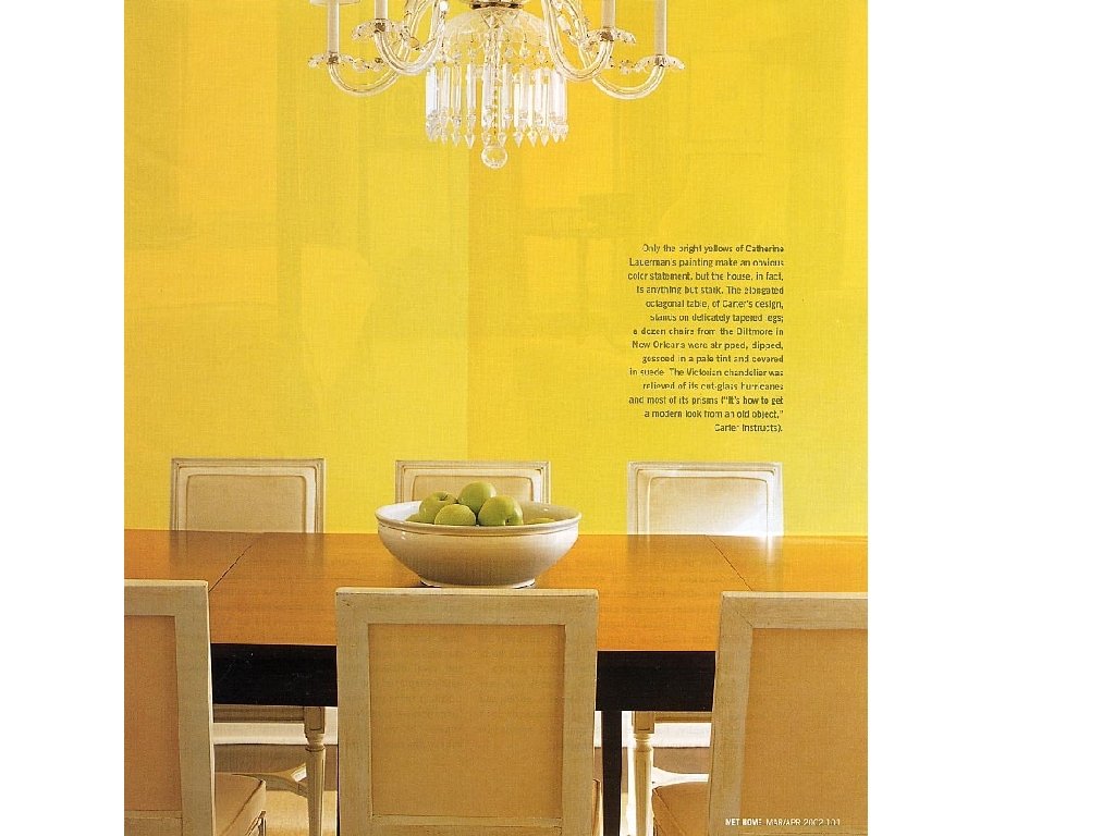
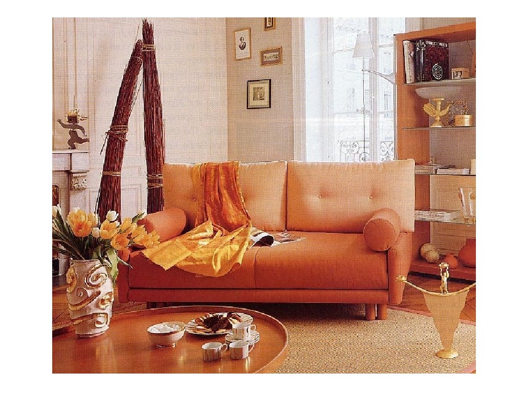
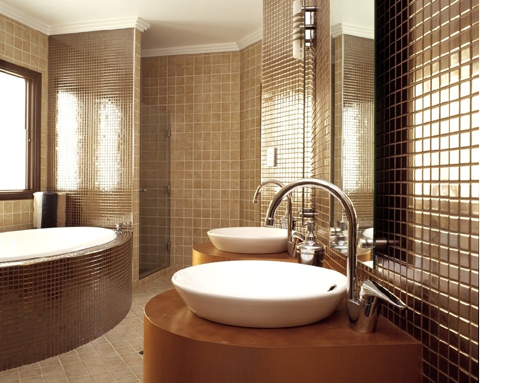
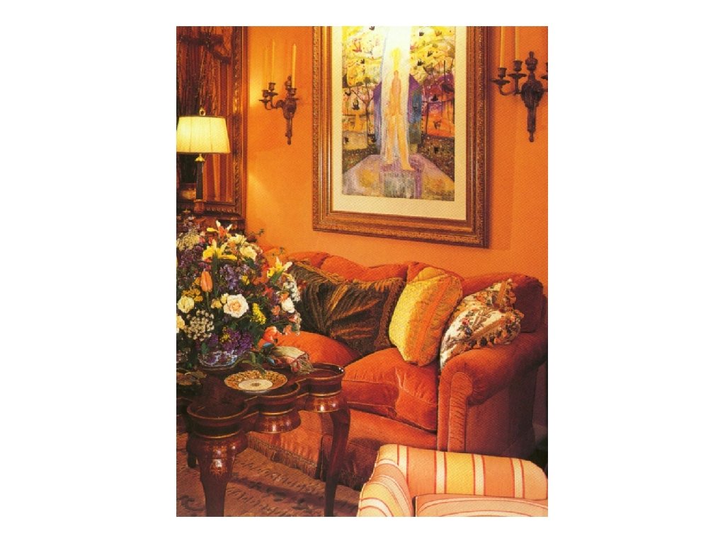
Advancing Colors § Warm colors: Red, Orange and Yellow § They are considered advancing because they seem nearer to us than they actually are. § Upholstering a piece of furniture in intense red increases its apparent size § Painting a wall red will visually make a room seem smaller, because the color advances.
Advancing color
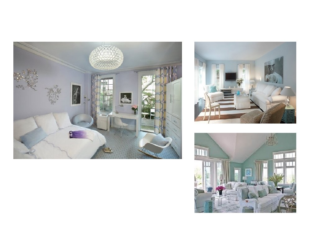
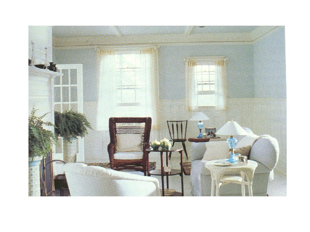
Receding Colors § Cool Colors: Blues and Greens § Reduces the apparent size of objects. On a piece of furniture, cool colors will make it appear smaller § Used on a wall, it will help visually increase the size of a room
VALUE § The relative lightness and darkness of a hue § Easy to understand when done without color where it indicates the lightness or darkness between pure white and pure black
However • Value gradations apply equally to colors and are determined by the amount of light the colors reflect.
How can a color’s value be made lighter? § By adding white to the color, which we call a tint. § Pink is a tint of Red. § Tints are very pale, clear and cool.
How can a color’s value be made darker? § By adding black to the color, which is called a shade. § Maroon is a shade of red. § Can also be created by adding gray or brown.
A room composed almost entirely of light values seems § § Bright Airy Cheerful Uplifting
A room consisting of all dark values brings • A sense of security • Solidity
A final word about Value § In a monochromatic room, value is a key element in providing transition and avoiding monotony and harshness. § Value can also affect the apparent size of objects, light values increase the size because they reflect light and dark colors reduce the size because they absorb light. § When perception is concerned, value is the single most critical characteristic of color. Value contrasts are vital in distinguishing forms, judging depth and distinguishing changes in plane, especially for the very young, elderly and those with limited vision.
Fun Trick
Intensity § Refers to a colors purity and strength. § In other words, the degree to which it differs from gray. § Example: pink is always red in hue and light in value, but it can be vivid, almost pure pink or it can be neutralized or grayed pink.
Example: pink is always red in hue and light in value, but it can be vivid, almost pure pink or it can be neutralized or grayed pink. High Intensity or Strong Low Intensity or weak
Playing with intensities If a hue is placed next to an analogous color, it will appear to have a lower intensity than when it is placed next to its complement.
In other words § If you want to decrease the intensity of a color, use an analogous scheme, filter the light (less light), or provide an object that is more intense such as a painting. § If you want to increase the intensity of a color, use a complementary color scheme and illuminate with bright light.
Color Harmonies § Planning a color scheme for a room is one of the fun steps of the design process. § As a designer, you will need to know what happens when colors are combined in order to produce the desired effects for your customer.
Two Categories • Related – harmony and unity • Monochromatic • Analogous • Contrasting – variety • • Complementary Double Complement Triad Tetrad
Monochromatic Colors Scheme § § Literally one hue is used Can vary in regard to light and dark Can vary in intensity If done right, this room will be unified and harmonious, however, a major danger is monotony. § You must provide variety in other elements.
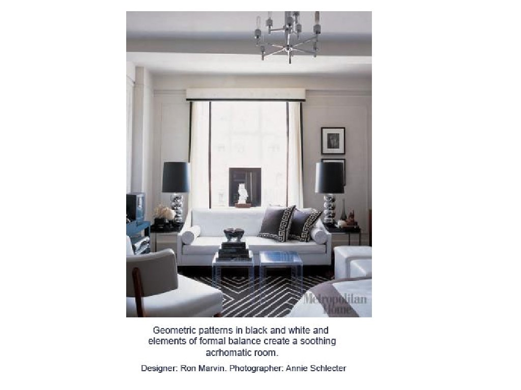
Achromatic Color Scheme § § Neutral Color Scheme White, Black, grey Very low intensities of warms colors Will need to accent with color in accessories for visual excitement
Analogous Color Scheme § Based on two or more colors with the same degree of common hue. § The interior will automatically have some degree of unity.
Contrasting Color Schemes § § Complementary Double Complement Triad Tetrad
Complementary Scheme § Built on two hues that are directly opposite each other on the color wheel. § Can be a lively scheme, but can also be more subdued when using a low intensity.
Split Complement § Composed of three hues § Any hue and the two hues at each side of its complement. § Makes the contrast less violent § Adds interest and variety
Yellow, Blue-violet and Red-violet
Double Complement § Two set of complements § Usually near each other on the color wheel § If too far apart, it is hard to identify and create a harmonious feeling.
Triad Color Scheme § Any three hues equidistant from each other on the color wheel. § In full intensity, it can be a bit shocking. § Can translate to: § Mahogany, French gray and vanilla (red, blue and yellow) § Sage Green, Cocoa Brown and dove gray (Green, orange and violet)
Triad Orange – Green – Violet
Tetrad § Any four hues equidistant from each other on the color wheel § These schemes can lead to rich, yet unified interiors.
Factors to Consider in Selecting Colors: § The reaction to color is highly subjective. You will need to spend a lot of time with your customer to get a good feel for their preferences. § Always get large samples of carpet, paints and wallcoverings. You cannot make a true judgment from a small sample. § Select samples under similar lighting and in the setting it will be going into.
Cont… § Increasing the area of a color will change its apparent hue, value and intensity. For example, a small paint chip will appear several times darker when seen on a large wall area because vertical surfaces receive less direct illumination than horizontal surfaces. § Textures will affect color as well. Color appears brighter on a smooth, shiny surface and is neutralized on a rough textured surface.
Finally…. When trying to unify an entire house, it is best not to consider the rooms individually. A unified color scheme throughout the house brings harmony and continuity, increases visual spaciousness and makes it possible to shift furnishings from one room to another.
Test yourself…. What have you learned about light and color?
End of lecture - color