Chapter 4 Displaying and Summarizing Quantitative Data Copyright


- Slides: 30

Chapter 4 Displaying and Summarizing Quantitative Data Copyright © 2009 Pearson Education, Inc.

Types of Graphs (Quantitative Data) n n n Histograms Stem Plots (Stem and Leaf) Box Plots (Box and Whisker) Dot Plots Scatter Plots (Two variables x and y) Copyright © 2009 Pearson Education, Inc. Slide 4 - 2

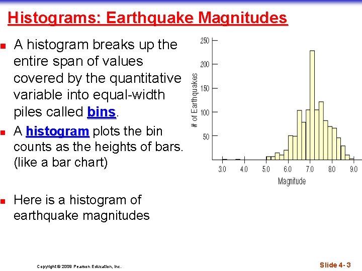
n n n Histograms: Earthquake Magnitudes A histogram breaks up the entire span of values covered by the quantitative variable into equal-width piles called bins A histogram plots the bin counts as the heights of bars. (like a bar chart) Here is a histogram of earthquake magnitudes Copyright © 2009 Pearson Education, Inc. Slide 4 - 3

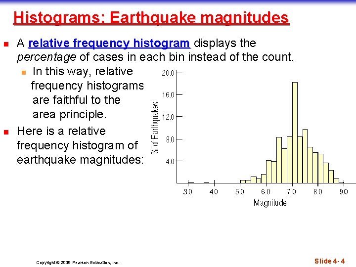
Histograms: Earthquake magnitudes n n A relative frequency histogram displays the percentage of cases in each bin instead of the count. n In this way, relative frequency histograms are faithful to the area principle. Here is a relative frequency histogram of earthquake magnitudes: Copyright © 2009 Pearson Education, Inc. Slide 4 - 4

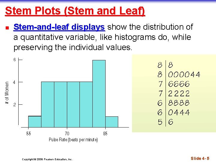
Stem Plots (Stem and Leaf) n Stem-and-leaf displays show the distribution of a quantitative variable, like histograms do, while preserving the individual values. Copyright © 2009 Pearson Education, Inc. Slide 4 - 5

Constructing a Stem-and-Leaf Display n n n First, cut each data value into leading digits (“stems”) and trailing digits (“leaves”). Use the stems to label the bins. Use only one digit for each leaf—either round or truncate the data values to one decimal place after the stem. Copyright © 2009 Pearson Education, Inc. Slide 4 - 6

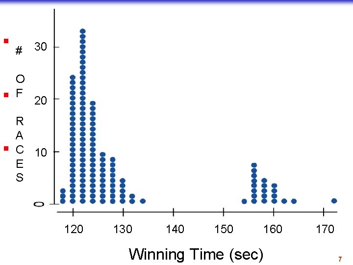
Dotplots n n n A dotplot is a simple 30 #display. It just places a dot along an axis for each case in the data. O F The dotplot to the right 20 Kentucky Derby shows winning times, plotting R each race as its own dot. A You 10 might see a dotplot C displayed horizontally or E vertically. S 120 130 Copyright © 2009 Pearson Education, Inc. 140 150 160 Winning Time (sec) 170 Slide 4 - 7

Think Before You Draw, Again n Remember before you decide what type of graph to use check what kind of variable you are graphing. (Quantitative or Categorical) Shape, Center, and Spread n When describing a distribution, make sure to always tell about three things: Shape, Center, and Spread… Copyright © 2009 Pearson Education, Inc. Slide 4 - 8

What is the Shape of the Distribution? Distribution 1. Is the histogram symmetric or skewed? 2. Do any unusual features stick out? Copyright © 2009 Pearson Education, Inc. Slide 4 - 9

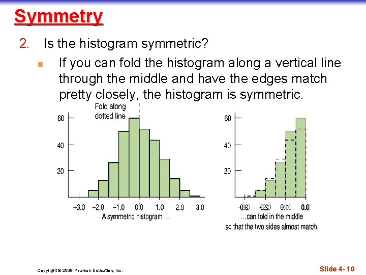
Symmetry 2. Is the histogram symmetric? n If you can fold the histogram along a vertical line through the middle and have the edges match pretty closely, the histogram is symmetric. Copyright © 2009 Pearson Education, Inc. Slide 4 - 10

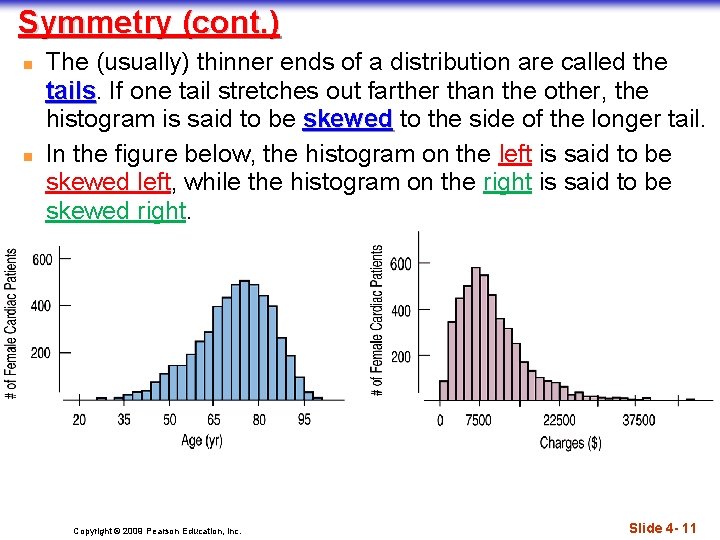
Symmetry (cont. ) n n The (usually) thinner ends of a distribution are called the tails If one tail stretches out farther than the other, the histogram is said to be skewed to the side of the longer tail. In the figure below, the histogram on the left is said to be skewed left, while the histogram on the right is said to be skewed right. Copyright © 2009 Pearson Education, Inc. Slide 4 - 11

Anything Unusual? 3. Do any unusual features stick out? n Sometimes it’s the unusual features that tell us something interesting or exciting about the data. n You should always mention any stragglers, or outliers, that stand off away from the body of the distribution. n Are there any gaps in the distribution? If so, we might have data from more than one group. Slide 4 - 12 Copyright © 2009 Pearson Education, Inc.

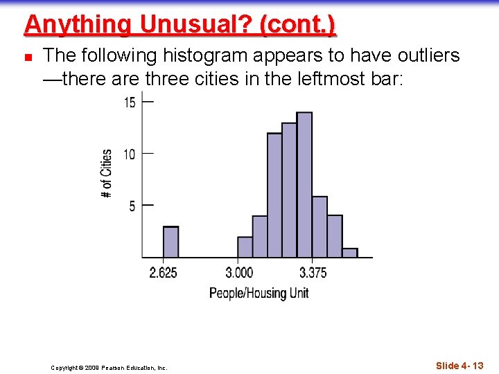
Anything Unusual? (cont. ) n The following histogram appears to have outliers —there are three cities in the leftmost bar: Copyright © 2009 Pearson Education, Inc. Slide 4 - 13

Symmetric Distributions – The Mean n When we have symmetric data, there is an alternative other than the median, If we want to calculate a number, we can average the data. We use the Greek letter sigma to mean “sum” and write: The formula says that to find the mean, we add up the numbers and divide by n. Copyright © 2009 Pearson Education, Inc. Slide 4 - 14

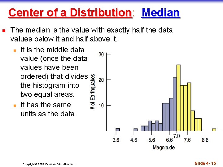
Center of a Distribution: Distribution Median n The median is the value with exactly half the data values below it and half above it. n It is the middle data value (once the data values have been ordered) that divides the histogram into two equal areas. n It has the same units as the data. Copyright © 2009 Pearson Education, Inc. Slide 4 - 15

Symmetric Distributions (Mean vs. Median) n n n Because the median considers only the order of values, it is resistant to values that are extraordinarily large or small; it simply notes that they are one of the “big ones” or “small ones” and ignores their distance from center. To choose between the mean and median, start by looking at the data. If the histogram is symmetric and there are no outliers, outliers use the mean However, if the histogram is skewed or with outliers, outliers you are better off with the median Copyright © 2009 Pearson Education, Inc. Slide 4 - 16

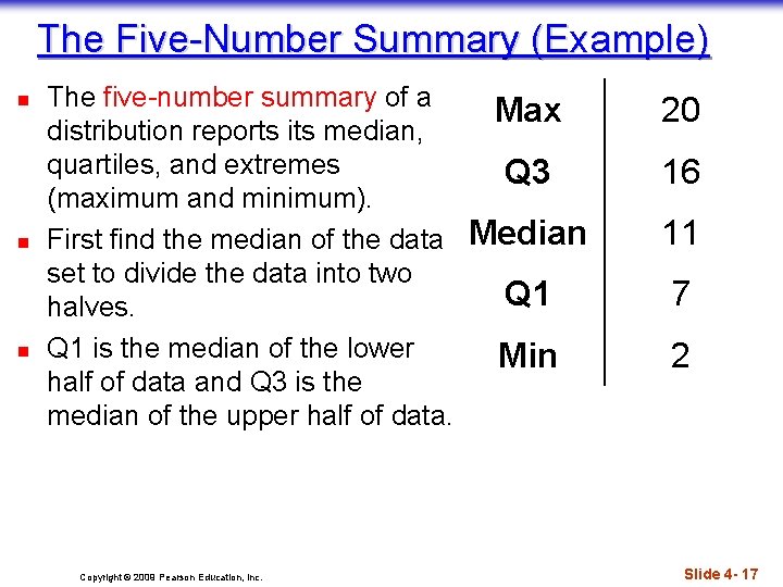
The Five-Number Summary (Example) n n n The five-number summary of a distribution reports its median, quartiles, and extremes (maximum and minimum). First find the median of the data set to divide the data into two halves. Q 1 is the median of the lower half of data and Q 3 is the median of the upper half of data. Copyright © 2009 Pearson Education, Inc. Max 20 Q 3 16 Median 11 Q 1 7 Min 2 Slide 4 - 17

Spread: The Interquartile Range n n The interquartile range (IQR) lets us ignore extreme data values and concentrate on the middle of the data. To find the IQR, we first need to know what quartiles are… Copyright © 2009 Pearson Education, Inc. Slide 4 - 18

Spread: The Interquartile Range n n Quartiles divide the data into four equal sections. n One quarter of the data lies below the lower quartile, Q 1 n One quarter of the data lies above the upper quartile, Q 3. The difference between the quartiles is the interquartile range (IQR), so IQR = upper quartile – lower quartile IQR = Q 3 – Q 1 Copyright © 2009 Pearson Education, Inc. Slide 4 - 19

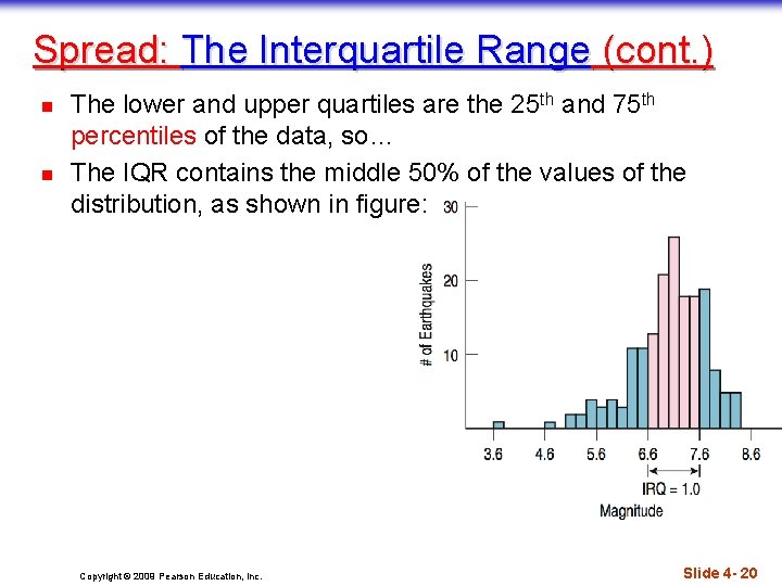
Spread: The Interquartile Range (cont. ) n n The lower and upper quartiles are the 25 th and 75 th percentiles of the data, so… The IQR contains the middle 50% of the values of the distribution, as shown in figure: Copyright © 2009 Pearson Education, Inc. Slide 4 - 20

What About Spread? The Standard Deviation n n A more powerful measure of spread than the IQR is the standard deviation, which takes into account how far each data value is from the mean. A deviation is the distance that a data value is from the mean. n Since adding all deviations together would total zero, we square each deviation and find an average of sorts for the deviations. Copyright © 2009 Pearson Education, Inc. Slide 4 - 21

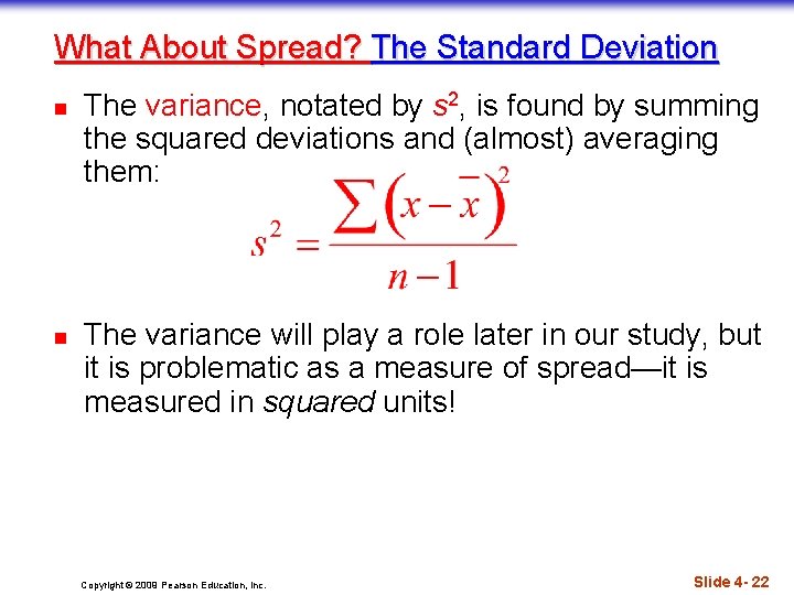
What About Spread? The Standard Deviation n n The variance, notated by s 2, is found by summing the squared deviations and (almost) averaging them: The variance will play a role later in our study, but it is problematic as a measure of spread—it is measured in squared units! Copyright © 2009 Pearson Education, Inc. Slide 4 - 22

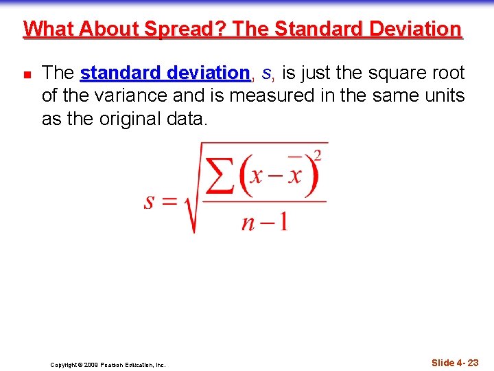
What About Spread? The Standard Deviation n The standard deviation, deviation s, is just the square root of the variance and is measured in the same units as the original data. Copyright © 2009 Pearson Education, Inc. Slide 4 - 23

Thinking About Variation n n Since Statistics is about variation, spread is an important fundamental concept of Statistics. Measures of spread help us talk about what we don’t know. When the data values are tightly clustered around the center of the distribution, the IQR and standard deviation will be small. When the data values are scattered far from the center, the IQR and standard deviation will be large. Copyright © 2009 Pearson Education, Inc. Slide 4 - 24

Summary: Shape, Center, and Spread n n n Shape: Symmetric vs. Skewed (left or right) Center: Mean vs. Median Spread: Standard Deviation vs. IQR Mean and Standard Deviation always go together Median and IQR always go together. Copyright © 2009 Pearson Education, Inc. Slide 4 - 25

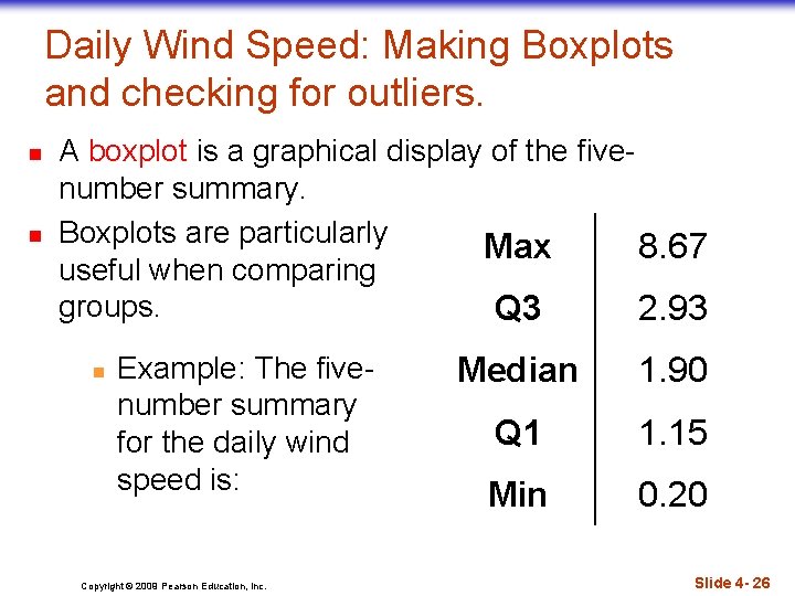
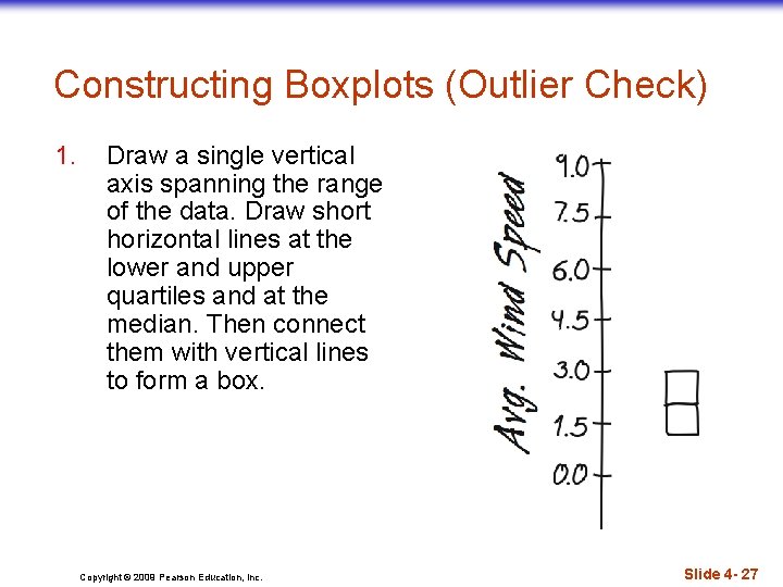
Daily Wind Speed: Making Boxplots and checking for outliers. n n A boxplot is a graphical display of the fivenumber summary. Boxplots are particularly Max 8. 67 useful when comparing groups. Q 3 2. 93 n Example: The fivenumber summary for the daily wind speed is: Copyright © 2009 Pearson Education, Inc. Median 1. 90 Q 1 1. 15 Min 0. 20 Slide 4 - 26

Constructing Boxplots (Outlier Check) 1. Draw a single vertical axis spanning the range of the data. Draw short horizontal lines at the lower and upper quartiles and at the median. Then connect them with vertical lines to form a box. Copyright © 2009 Pearson Education, Inc. Slide 4 - 27

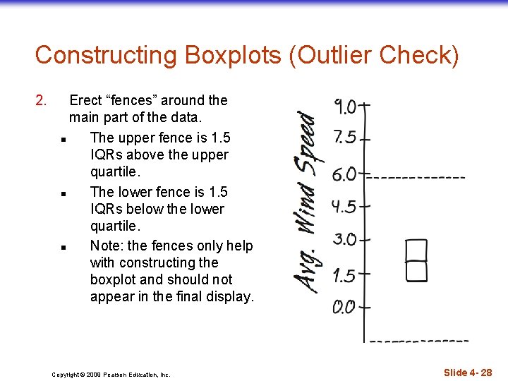
Constructing Boxplots (Outlier Check) 2. Erect “fences” around the main part of the data. n The upper fence is 1. 5 IQRs above the upper quartile. n The lower fence is 1. 5 IQRs below the lower quartile. n Note: the fences only help with constructing the boxplot and should not appear in the final display. Copyright © 2009 Pearson Education, Inc. Slide 4 - 28

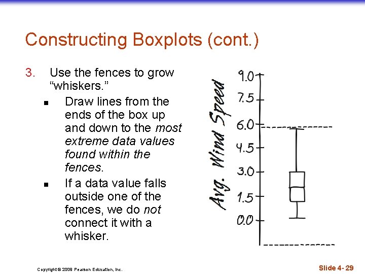
Constructing Boxplots (cont. ) 3. Use the fences to grow “whiskers. ” n Draw lines from the ends of the box up and down to the most extreme data values found within the fences. n If a data value falls outside one of the fences, we do not connect it with a whisker. Copyright © 2009 Pearson Education, Inc. Slide 4 - 29

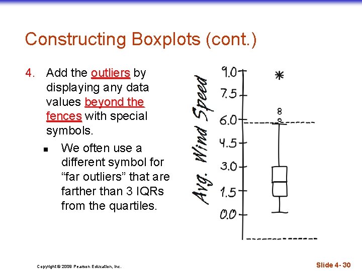
Constructing Boxplots (cont. ) 4. Add the outliers by displaying any data values beyond the fences with special symbols. n We often use a different symbol for “far outliers” that are farther than 3 IQRs from the quartiles. Copyright © 2009 Pearson Education, Inc. Slide 4 - 30