Chapter 3 SCATTERPLOTS AND CORRELATION Why do we





- Slides: 48

Chapter 3 SCATTERPLOTS AND CORRELATION

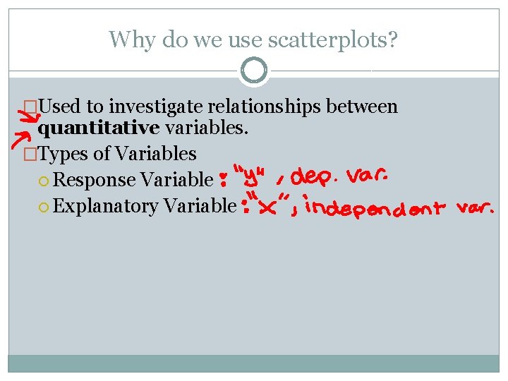
Why do we use scatterplots? �Used to investigate relationships between quantitative variables. �Types of Variables Response Variable Explanatory Variable

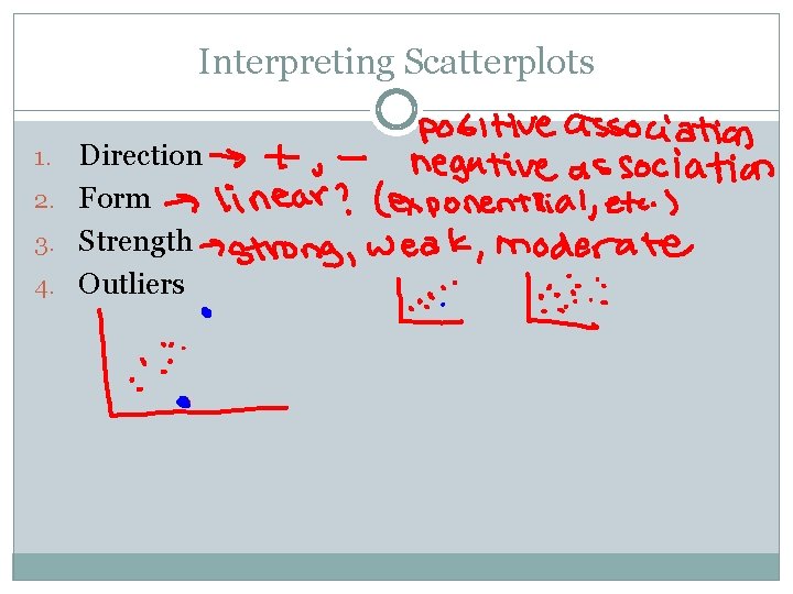
Interpreting Scatterplots Direction 2. Form 3. Strength 4. Outliers 1.

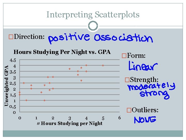
Interpreting Scatterplots �Direction: Unweighted GPA Hours Studying Per Night vs. GPA �Form: 4, 5 4 3, 5 3 2, 5 2 1, 5 1 0, 5 0 �Strength: �Outliers: 0 1 2 3 4 5 # Hours Studying per Night 6

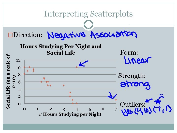
Interpreting Scatterplots Social Life (on a scale of 0 -10) �Direction: Hours Studying Per Night and Social Life Form: 12 10 Strength: 8 6 4 2 0 0 1 2 3 4 5 6 # Hours Studying per Night 7 Outliers:

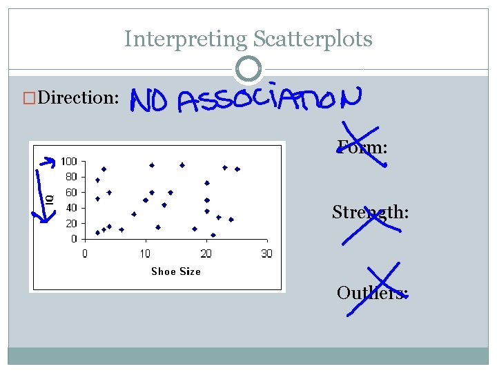
Interpreting Scatterplots �Direction: Form: Strength: Outliers:

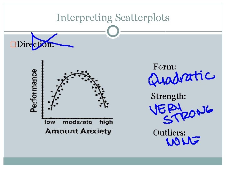
Interpreting Scatterplots �Direction: Form: Strength: Outliers:

Pearson’s Correlation Coefficient �Karl Pearson (1857 -1936) was an English lawyer, mathematician and statistician. �He spent most of his career applying statistics in the field of biology. �His contributions to the field of statistics include the correlation coefficient and the chi squared test (coming up later).

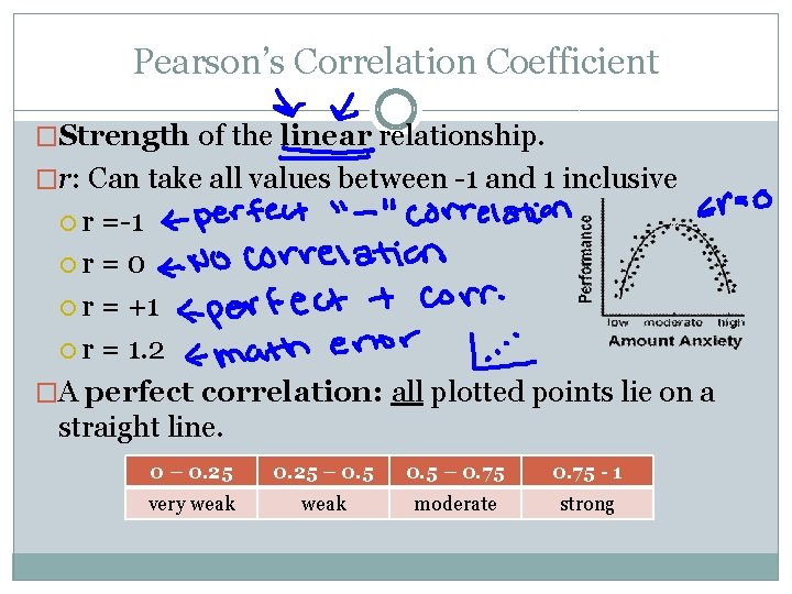
Pearson’s Correlation Coefficient �Strength of the linear relationship. �r: Can take all values between -1 and 1 inclusive r =-1 r = 0 r = +1 r = 1. 2 �A perfect correlation: all plotted points lie on a straight line. 0 – 0. 25 – 0. 75 - 1 very weak moderate strong

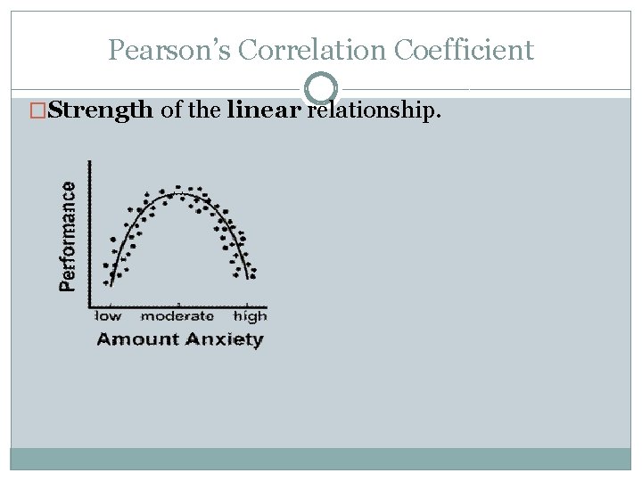
Pearson’s Correlation Coefficient �Strength of the linear relationship.

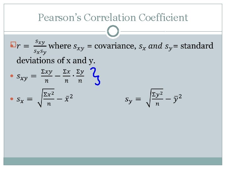
Pearson’s Correlation Coefficient �

Pearson’s Correlation Coefficient �

CAUTION �Did you know that there is an almost perfect correlation between ice cream sales and drowning deaths in Santa Monica? �CORRELATION DOES NOT IMPLY CAUSATION!!! �In my class you may not use the word cause to describe a statistical relationship. Ever.

CAUTION �Read p. 191 -193 KNOW THESE!!!!!!!

Activity Extension 11. Remove the data points 1, 11, 2 and calculate a new correlation coefficient for DAD vs. MOM. What do you notice about the new correlation coefficient when compared to the original r? What does this tell us about r’s resistance to outliers?

3. 2: Line of Best Fit

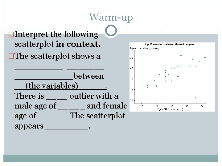
Warm-up �Interpret the following scatterplot in context. �The scatterplot shows a ___________between __(the variables)_____. There is ____ outlier with a male age of _____ and female age of ______The scatterplot appears ____.

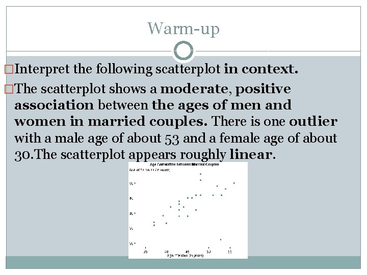
Warm-up �Interpret the following scatterplot in context. �The scatterplot shows a moderate, positive association between the ages of men and women in married couples. There is one outlier with a male age of about 53 and a female age of about 30. The scatterplot appears roughly linear.

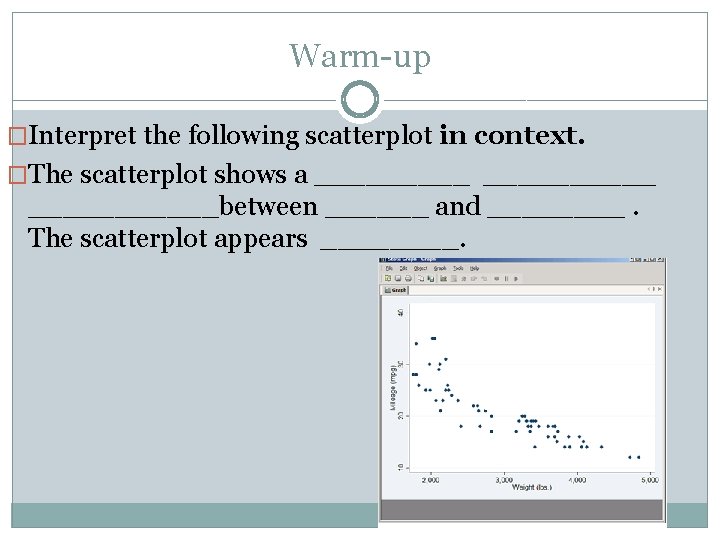
Warm-up �Interpret the following scatterplot in context. �The scatterplot shows a __________between ______ and ____. The scatterplot appears ____.

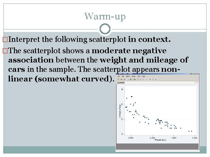
Warm-up �Interpret the following scatterplot in context. �The scatterplot shows a moderate negative association between the weight and mileage of cars in the sample. The scatterplot appears nonlinear (somewhat curved).

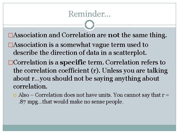
Reminder… �Association and Correlation are not the same thing. �Association is a somewhat vague term used to describe the direction of data in a scatterplot. �Correlation is a specific term. Correlation refers to the correlation coefficient (r). Unless you are talking about r…you should not be saying anything about correlation. Also – Correlation does not have units. You cannot say that r =. 87 mpg…that would make no sense people.

�Line of Best Fit!

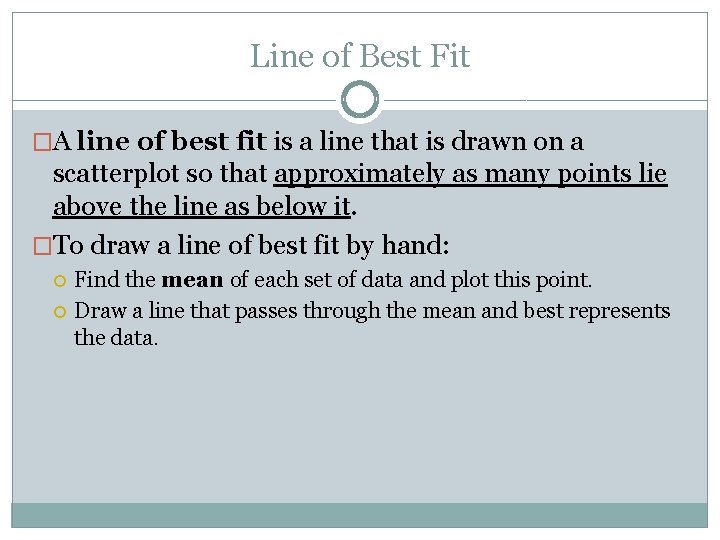
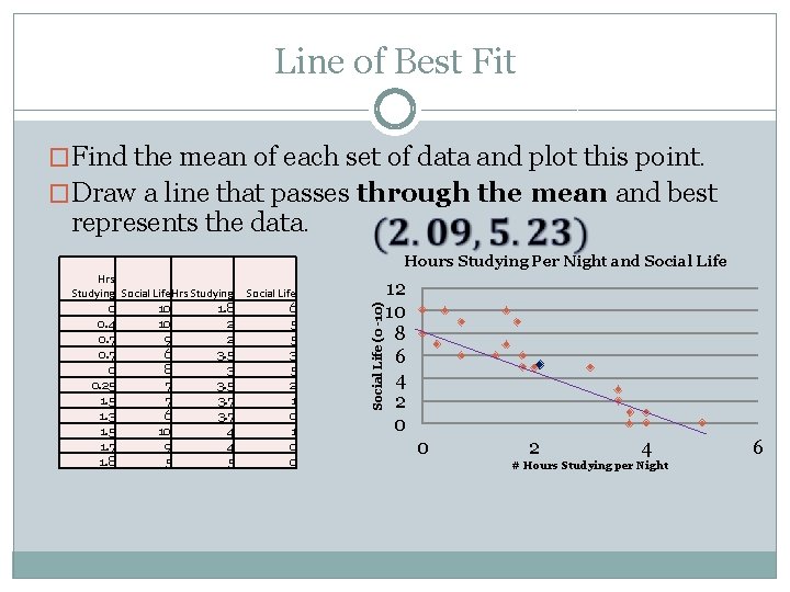
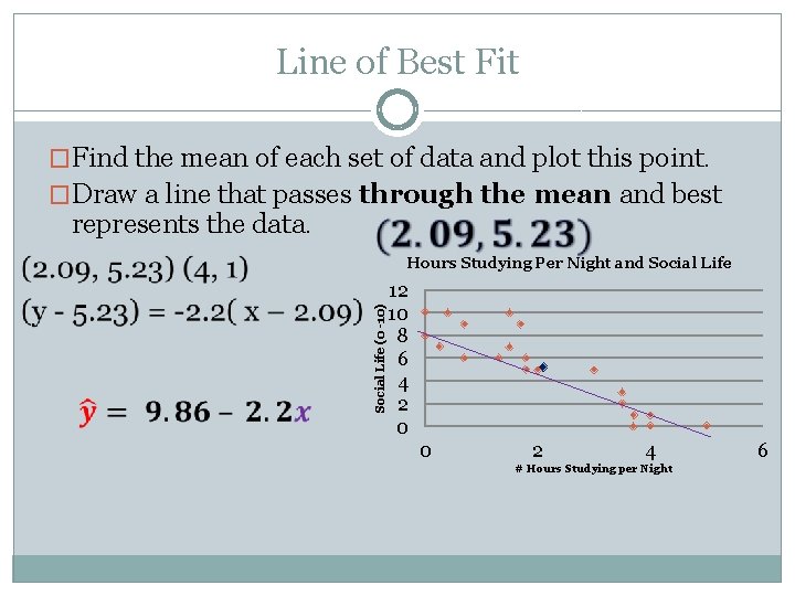
Line of Best Fit �A line of best fit is a line that is drawn on a scatterplot so that approximately as many points lie above the line as below it. �To draw a line of best fit by hand: Find the mean of each set of data and plot this point. Draw a line that passes through the mean and best represents the data.

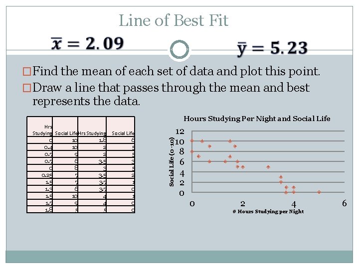
Line of Best Fit �Find the mean of each set of data and plot this point. �Draw a line that passes through the mean and best represents the data. Hrs Studying Social Life Hrs Studying 0 10 1. 8 0. 4 10 2 0. 7 9 2 0. 7 6 3. 5 0 8 3 0. 25 7 3. 5 1. 5 7 3. 7 1. 3 6 3. 7 1. 5 10 4 1. 7 9 4 1. 8 5 5 Social Life 6 5 5 3 5 2 1 0 0 Social Life (0 -10) Hours Studying Per Night and Social Life 12 10 8 6 4 2 0 0 2 4 # Hours Studying per Night 6

Line of Best Fit �Find the mean of each set of data and plot this point. �Draw a line that passes through the mean and best represents the data. Hrs Studying Social Life Hrs Studying 0 10 1. 8 0. 4 10 2 0. 7 9 2 0. 7 6 3. 5 0 8 3 0. 25 7 3. 5 1. 5 7 3. 7 1. 3 6 3. 7 1. 5 10 4 1. 7 9 4 1. 8 5 5 Social Life 6 5 5 3 5 2 1 0 0 Social Life (0 -10) Hours Studying Per Night and Social Life 12 10 8 6 4 2 0 0 2 4 # Hours Studying per Night 6

Line of Best Fit �Find the mean of each set of data and plot this point. �Draw a line that passes through the mean and best represents the data. Social Life (0 -10) Hours Studying Per Night and Social Life 12 10 8 6 4 2 0 0 2 4 # Hours Studying per Night 6

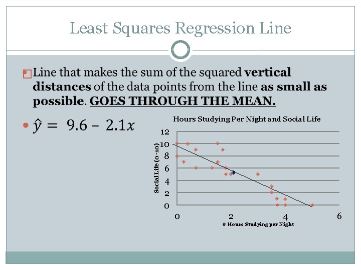
Least Squares Regression Line � Social Life (0 -10) Hours Studying Per Night and Social Life 12 10 8 6 4 2 0 0 2 4 # Hours Studying per Night 6

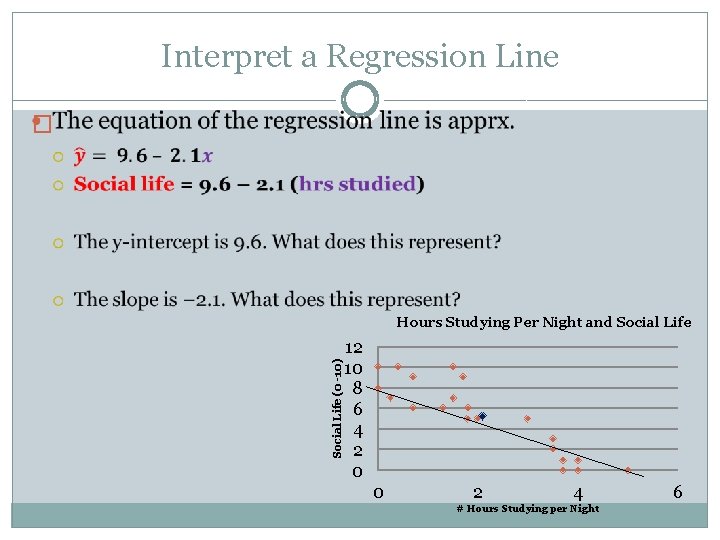
Interpret a Regression Line � Social Life (0 -10) Hours Studying Per Night and Social Life 12 10 8 6 4 2 0 0 2 4 # Hours Studying per Night 6

Careful… �A small slope does not mean an insignificant relationship and a large slope does not necessarily signify importance!!!

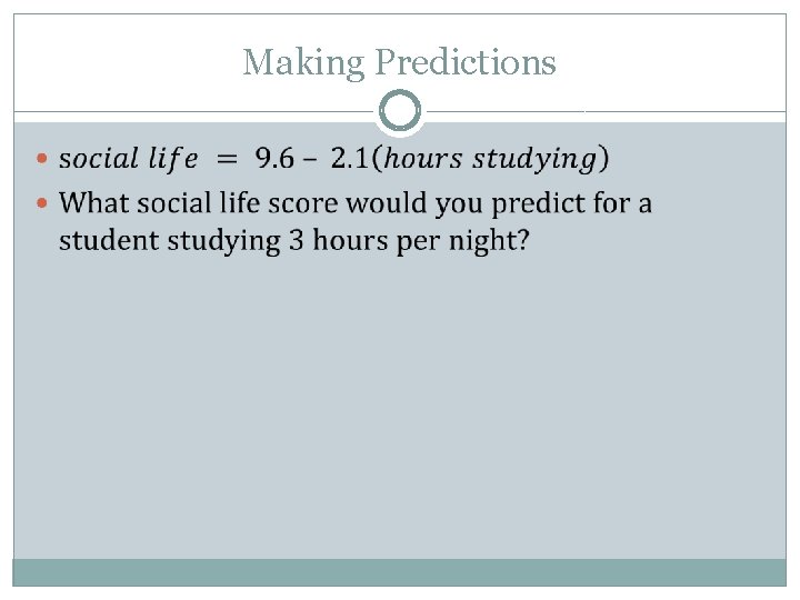
Making Predictions

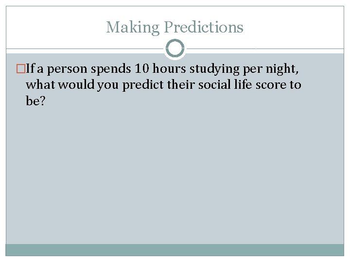
Making Predictions �If a person spends 10 hours studying per night, what would you predict their social life score to be?

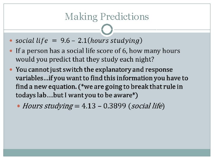
Making Predictions

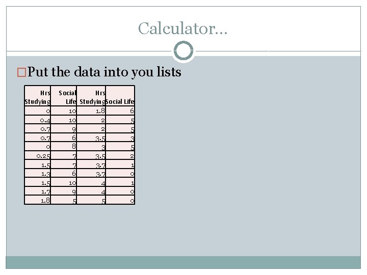
Calculator… �Put the data into you lists Hrs Studying 0 0. 4 0. 7 0 0. 25 1. 3 1. 5 1. 7 1. 8 Social Hrs Life Studying. Social Life 10 1. 8 6 10 2 5 9 2 5 6 3. 5 3 8 3 5 7 3. 5 2 7 3. 7 1 6 3. 7 0 10 4 1 9 4 0 5 5 0

Barbie Bungee!!!!

Finish Barbie Bungee

Lesson 1. 2 Continued �<3 Statistics <3

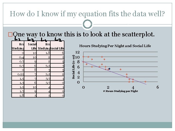
How do I know if my equation fits the data well? �One way to know this is to look at the scatterplot. Social Hrs Life Studying. Social Life 10 1. 8 6 10 2 5 9 2 5 6 3. 5 3 8 3 5 7 3. 5 2 7 3. 7 1 6 3. 7 0 10 4 1 9 4 0 5 5 0 Hours Studying Per Night and Social Life (0 -10) Hrs Studying 0 0. 4 0. 7 0 0. 25 1. 3 1. 5 1. 7 1. 8 12 10 8 6 4 2 0 0 2 4 # Hours Studying per Night 6

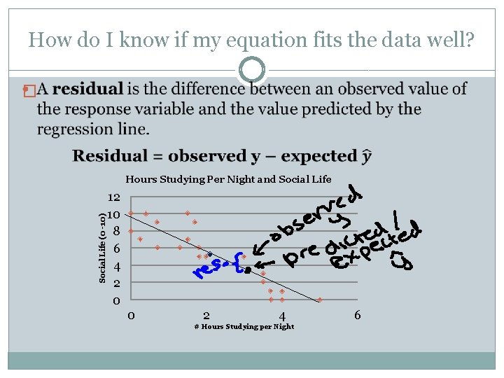
How do I know if my equation fits the data well? � Social Life (0 -10) Hours Studying Per Night and Social Life 12 10 8 6 4 2 0 0 2 4 # Hours Studying per Night 6

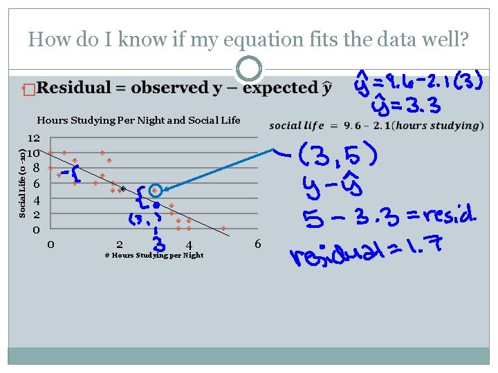
How do I know if my equation fits the data well? � Social Life (0 -10) Hours Studying Per Night and Social Life 12 10 8 6 4 2 0 0 2 4 # Hours Studying per Night 6

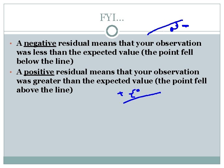
FYI… • A negative residual means that your observation was less than the expected value (the point fell below the line) • A positive residual means that your observation was greater than the expected value (the point fell above the line)

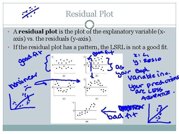
Residual Plot • A residual plot is the plot of the explanatory variable (x- axis) vs. the residuals (y-axis). • If the residual plot has a pattern, the LSRL is not a good fit.

Residual Plot • This get’s annoying to do on the ppt so we are going to use out calculators for a minute… • Things to keep in mind!!! Residual plots: � YOU HAVE TO RUN LINREG IN ORDER TO HAVE YOU CALCULATOR FIND THE RESIDUALS FOR YOU!!!! � Your calculator cannot read your mind… � Seriously… � It can’t…

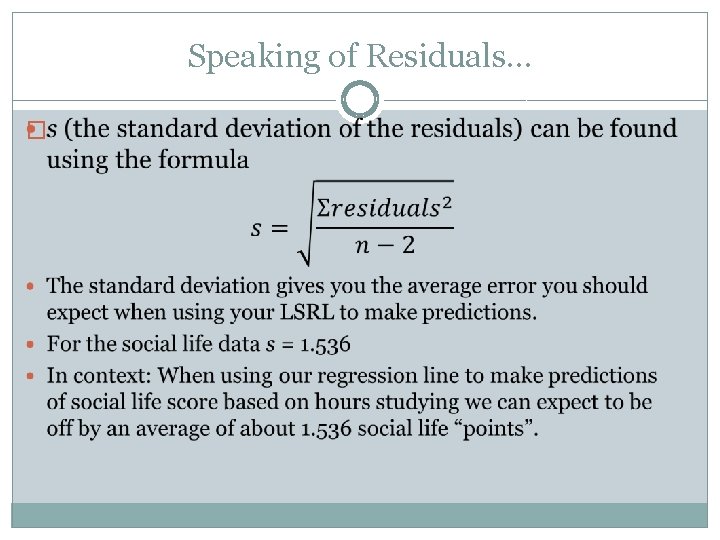
Speaking of Residuals… �

Residual Plots are kind of time consuming… We have another way to talk about how well out line fits the data…and it’s really easy to find. (HOWEVER…if you are asked about the fit of our line should always do both )

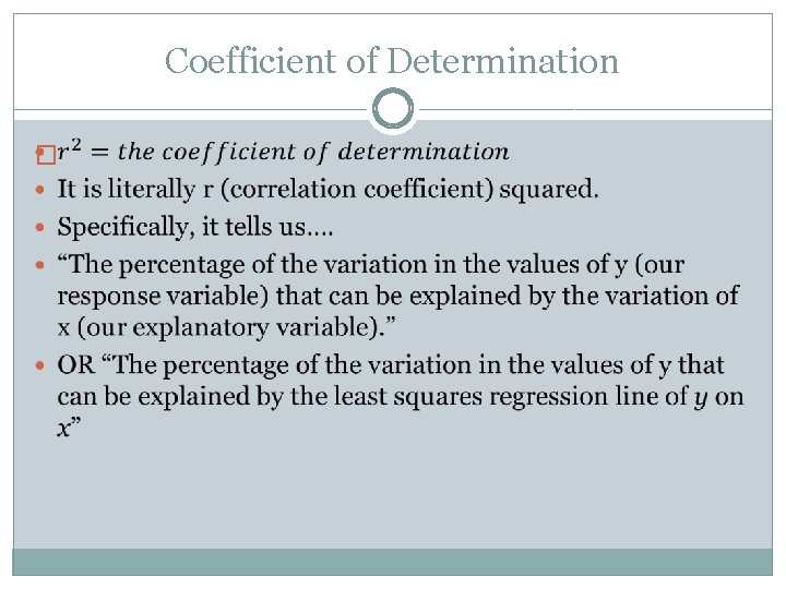
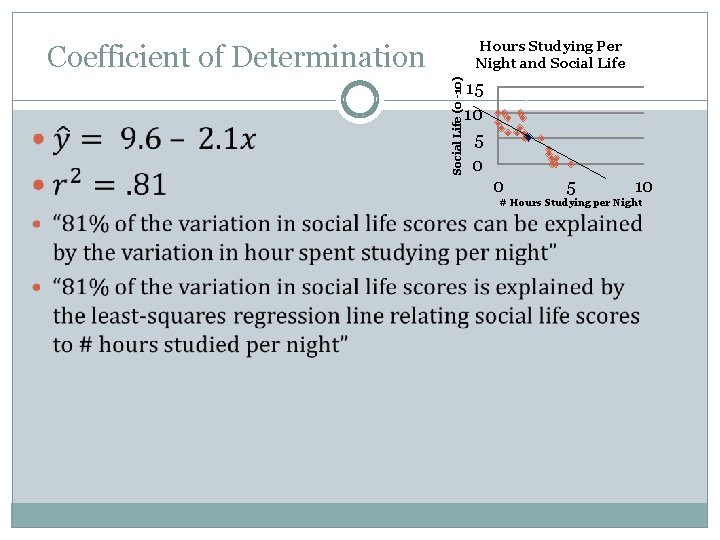
Coefficient of Determination �

Hours Studying Per Night and Social Life (0 -10) Coefficient of Determination 15 10 5 0 0 5 10 # Hours Studying per Night

Important Facts about the LSRL READ p. 225 -226

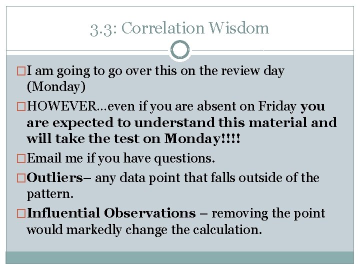
3. 3: Correlation Wisdom �I am going to go over this on the review day (Monday) �HOWEVER…even if you are absent on Friday you are expected to understand this material and will take the test on Monday!!!! �Email me if you have questions. �Outliers– any data point that falls outside of the pattern. �Influential Observations – removing the point would markedly change the calculation.