Chapter 3 Range Width minmax Values and Graphs


 / n Where, x = Maximum Value y")
 of an event is the number")


: A bar chart is a graph which uses parallel rectangular")


 is a circular statistical graphic")

")
 are similar to line graphs. A line graph")


- Slides: 88
Chapter 3 Range, Width, min-max Values and Graphs
Range: The Range is the difference between the lowest and highest values. Example: In {4, 6, 9, 3, 7} the lowest value is 3, and the highest is 9.
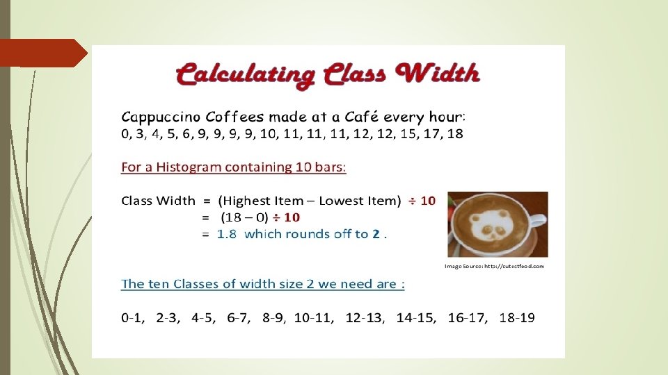
Class Width = (x - y) / n Where, x = Maximum Value y = Minimum Value n = Number of Classes Calculate class width for 3 data items having a maximum value of 9, minimum value of 5. Solution: Class Width = (x - y) / n = (9 - 5) / 3 = 1. 333
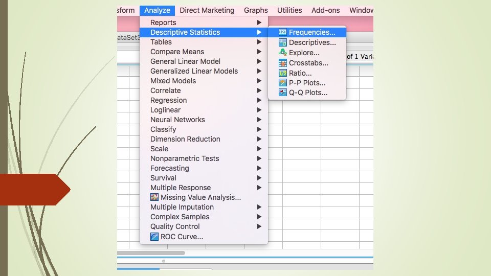
Frequency In statistics the frequency (or absolute frequency) of an event is the number of times the event occurred in an experiment or study. These frequencies are often graphically represented in histograms.
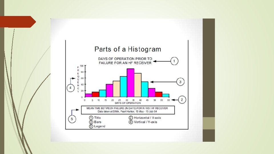
Histogram A histogram is a chart that shows frequencies for equal width intervals of values of a metric variable. A histogram is a graphical representation that organizes a group of data points into user-specified ranges. It is similar in appearance to a bar graph. The histogram condenses a data series into an easily interpreted visual by taking many data points and grouping them into logical ranges.
Example of a Histogram:
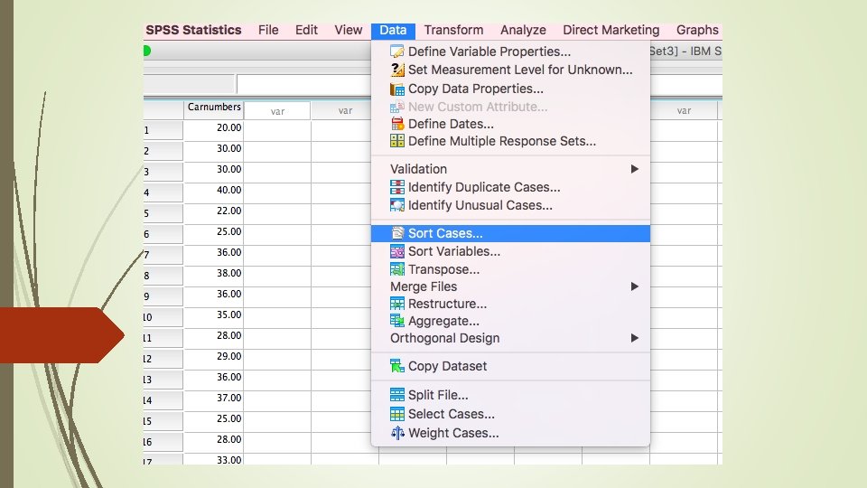
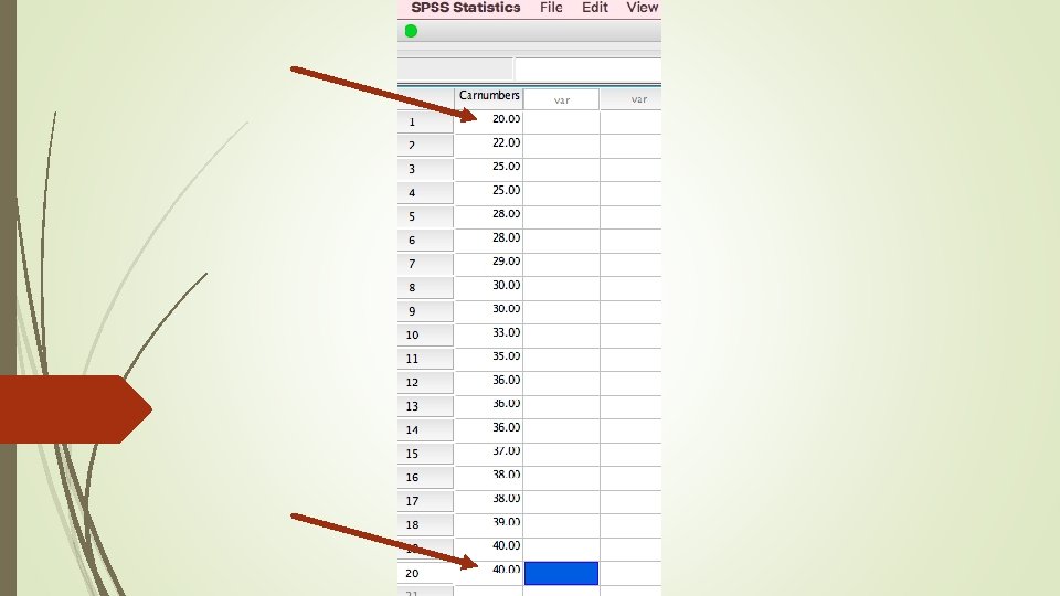
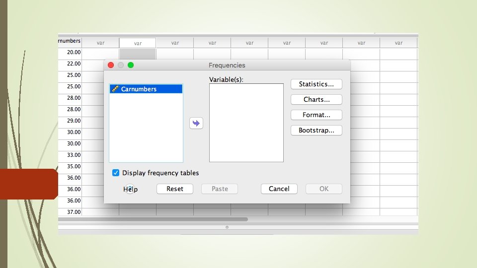
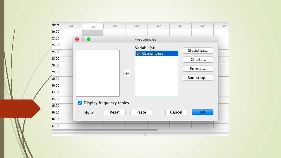
Class Work: Let us assume that we have 20 workers and they are installing different number of (let us say cars) weekly. Each worker assemble different numbers. Let us find the min-max numbers, range, width of the distribution. The let us draw the histogram of the distribution.
The minimum value is 20 cars and the maximum value is 40 cars Range=highest value – Lowest Value Range is 40 -20=20 into interval scale. İn order to find the width we need to classify the observations
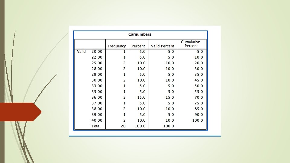
Number of Cars Frequency 20 -25 4 26 -30 5 31 -35 2 36 -40 9 Total 20
Width= Range/The Number of Classes Width= 20/4= 5
The Percentage and Cumulative Number of Cars Frequency Percentage Cumulative 20 -25 4 20 20 26 -30 5 25 45 31 -35 2 10 55 36 -40 9 45 100 Total 20 100 -- Let us calculate The Weekly Average We need the middle value for each classes (20+25)/2=22, 5 (26+30)/2=28 (31+35)/2=33 (36+40)/2=38
Number of Cars Mid Classes Frequency Percentage Cumulative 20 -25 22, 5 4 20 20 26 -30 28 5 25 45 31 -35 33 2 10 55 36 -40 38 9 45 100 20 100 -- Total (22, 5 x 0. 2)+(28 x 0. 25)+(33 x 0. 10)+(38 x 0. 45) = 31. 9 = 32 Cars
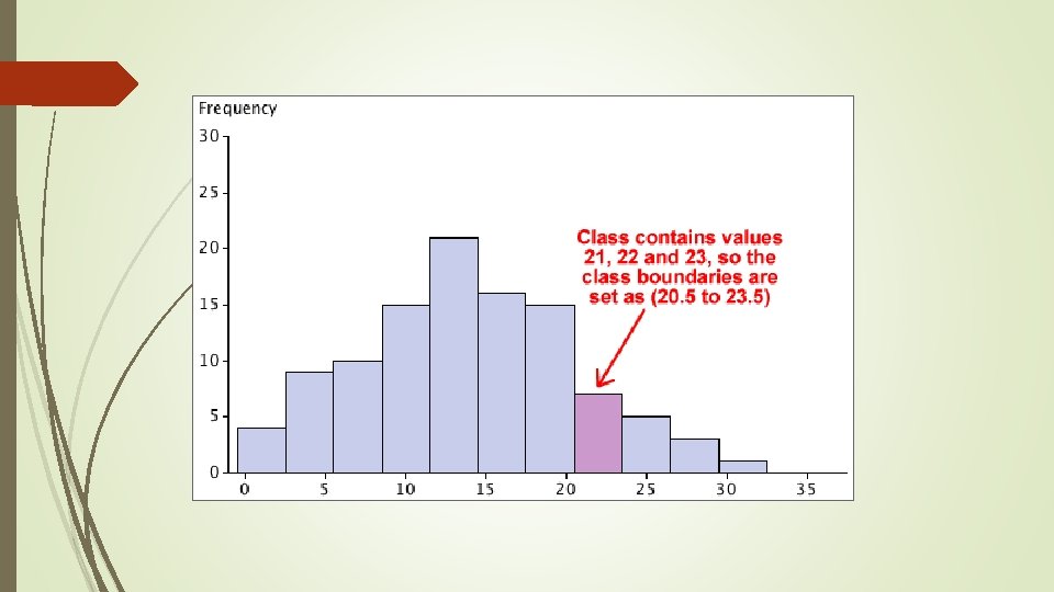
In order the lengths are: 1, 1, 1, 4, 4, 5, 5, 5, 6, 7, 8, 8, 8, 9, 9, 9, 10, 11, 12, 13, 14, 15, 16, 16, 17, 17, 18 The smallest value (the "minimum") is 1 cm The largest value (the "maximum") is 18 cm The range is 18− 1 = 17 cm Let us say we want about 5 groups. Divide the range by 5: 17/5 = 3. 4 Then round that up to 4 Pick a starting value that is less than or equal to the smallest value. Try to make it a multiple of the group size if you can. In our case a start value of 0 makes the most sense
Starting at 0 and with a group size of 4 we get: 0, 4, 8, 12, 16 Write down the groups, include the end value of each group (must be less than the next group): The last group goes to 19 which is greater than the largest value. That is OK: the main thing is that it must include the largest value.
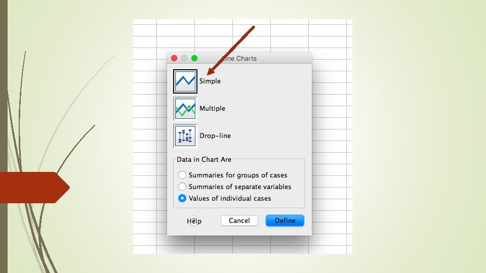
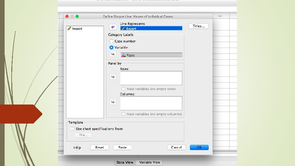
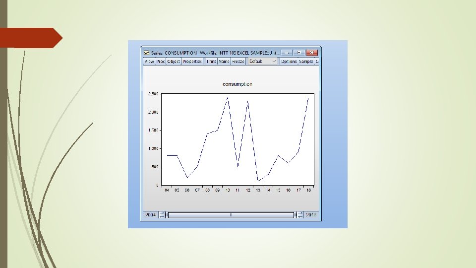
Line Graph With One Variable
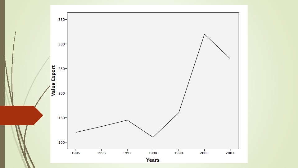
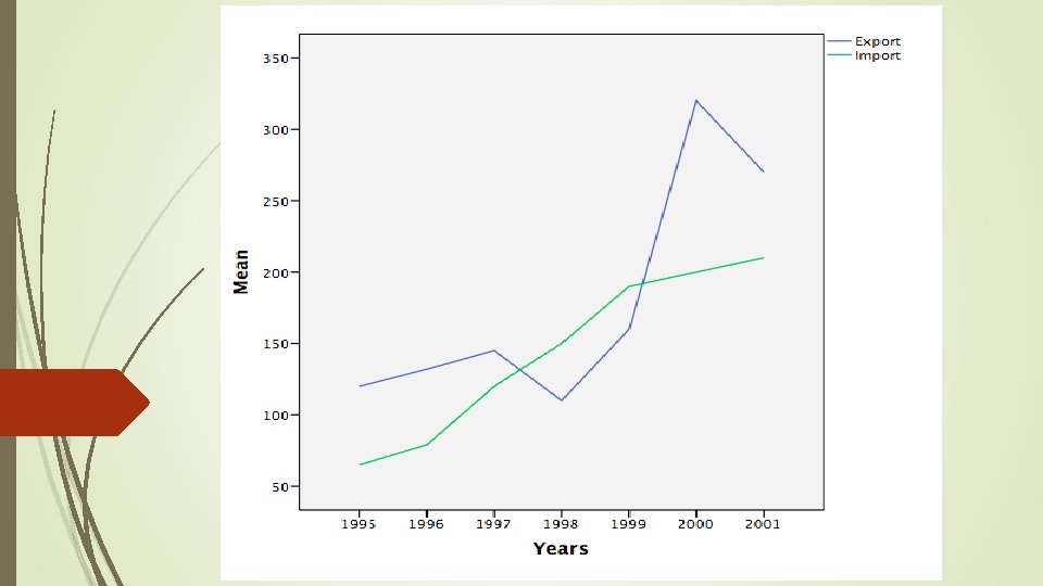
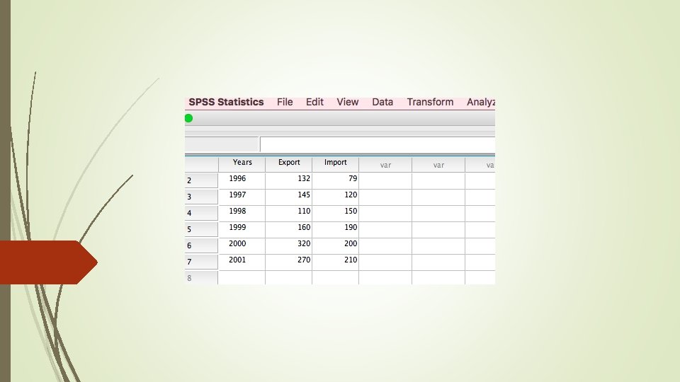
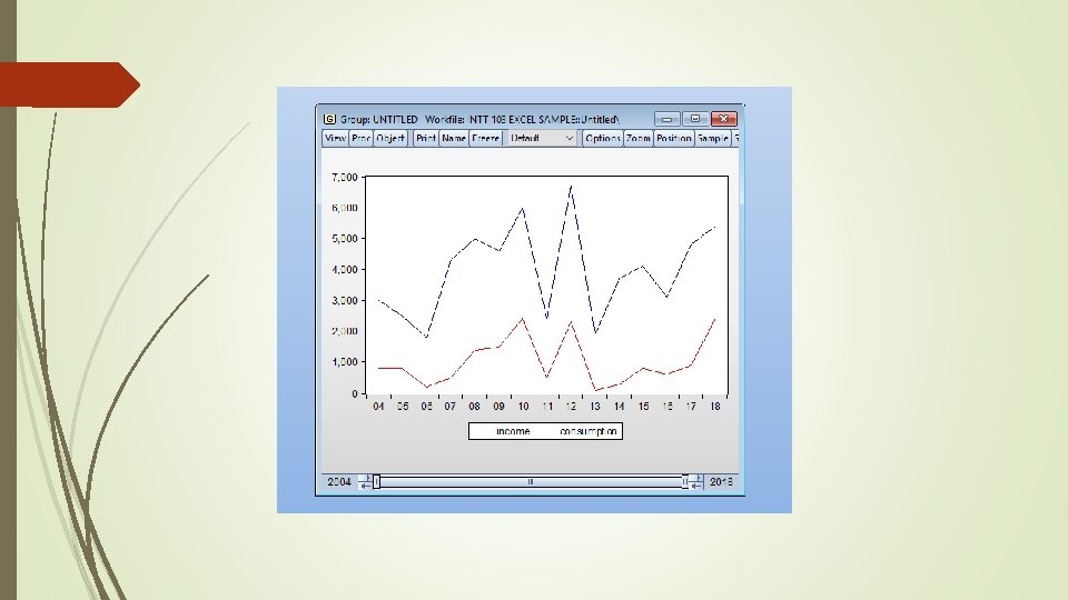
Line Graphs With two Variables
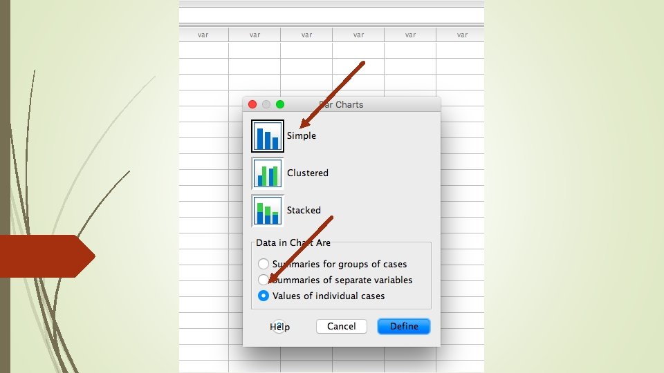
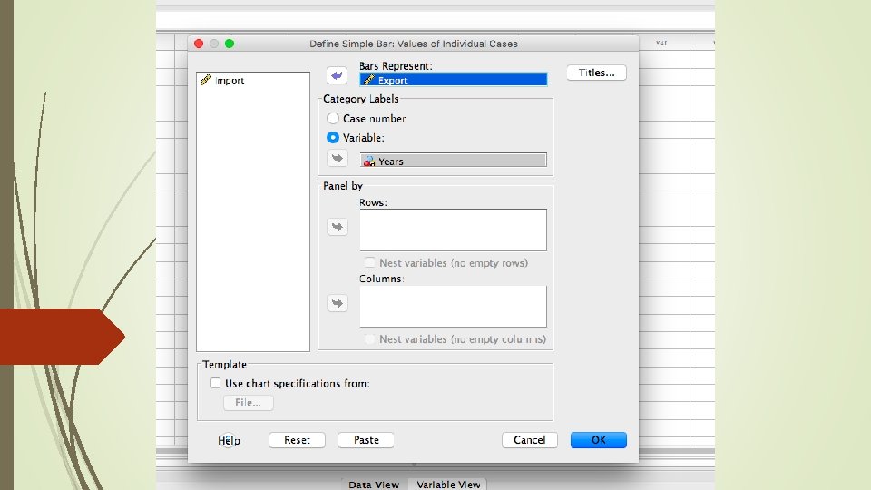
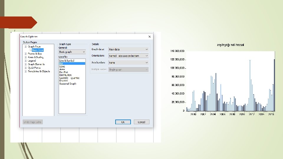
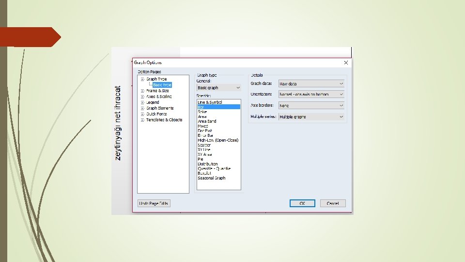
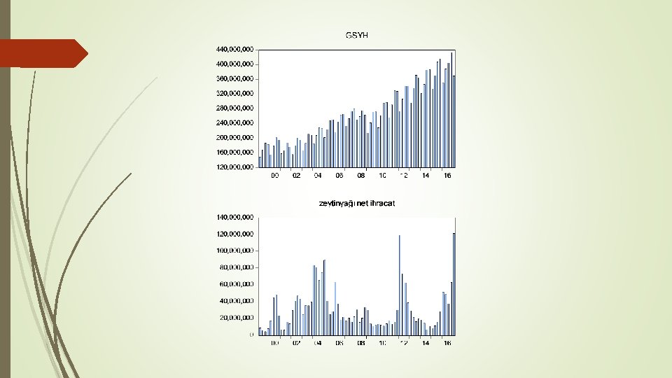
Bar chart (or graph): A bar chart is a graph which uses parallel rectangular shapes to represent changes in the size, value, or rate of something or to compare the amount of something relating to a number of different countries or groups.
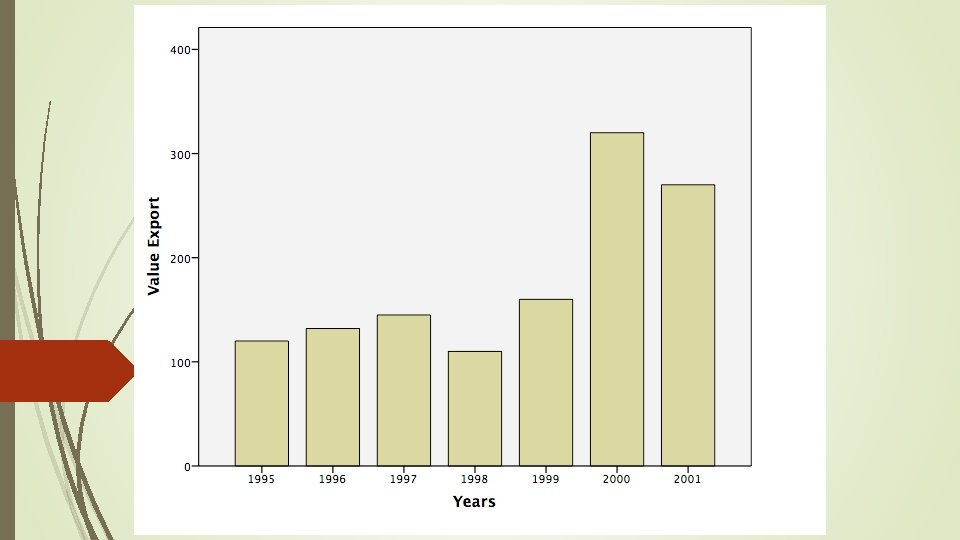
Bar Graph With One Variable
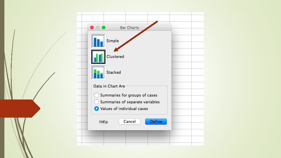
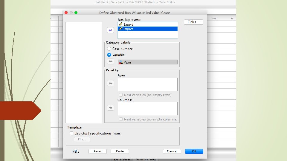
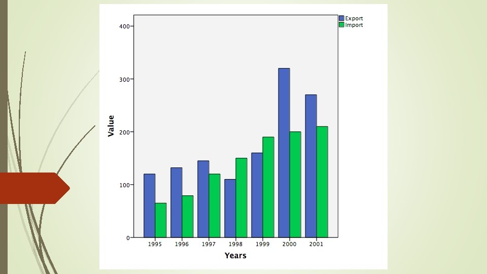
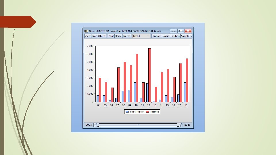
Bar Graph With Two Variables
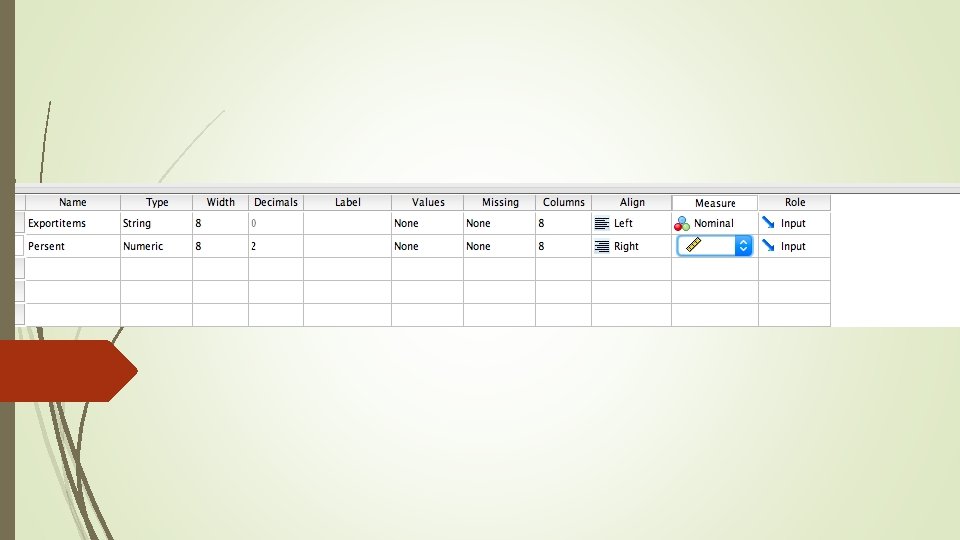
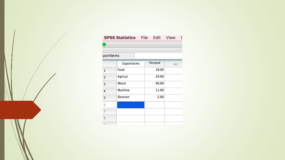
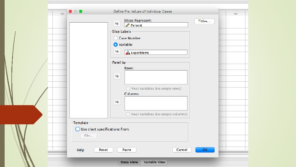
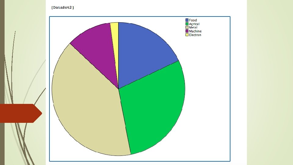
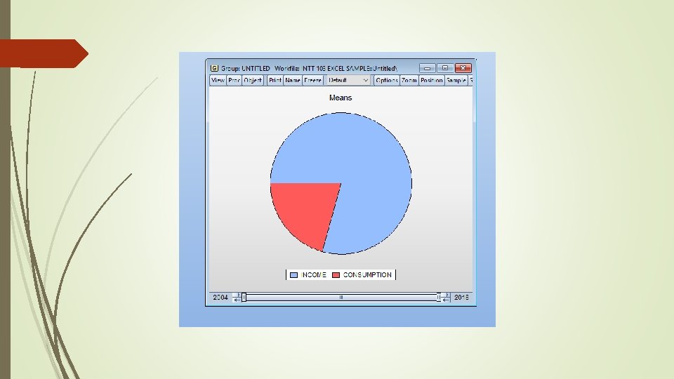
Pie Chart: A pie chart (or a circle chart) is a circular statistical graphic which is divided into slices to illustrate numerical proportion. In a pie chart, the arc length of each slice (and consequently its central angle and area), is proportional to the quantity it represents.
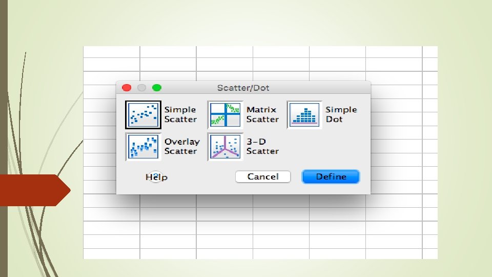
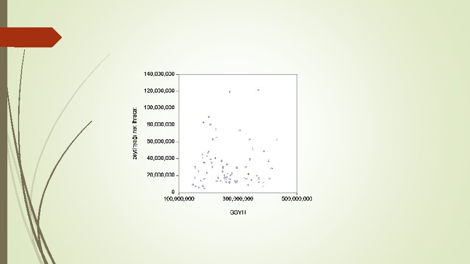
Static Relation Between Two Variables (Scatter Graph)
Scatter plots (also called scatter graphs) are similar to line graphs. A line graph uses a line on an X-Y axis to plot a continuous function, while a scatter plot uses dots to represent individual pieces of data. In statistics, these plots are useful to see if two variables are related to each other. For example, a scatter chart can suggest a linear relationship (i. e. a straight line).
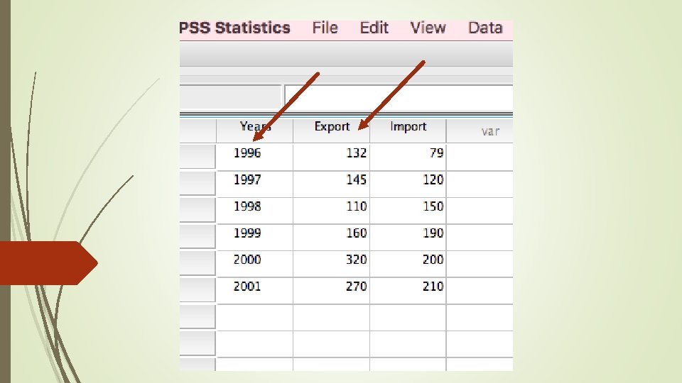
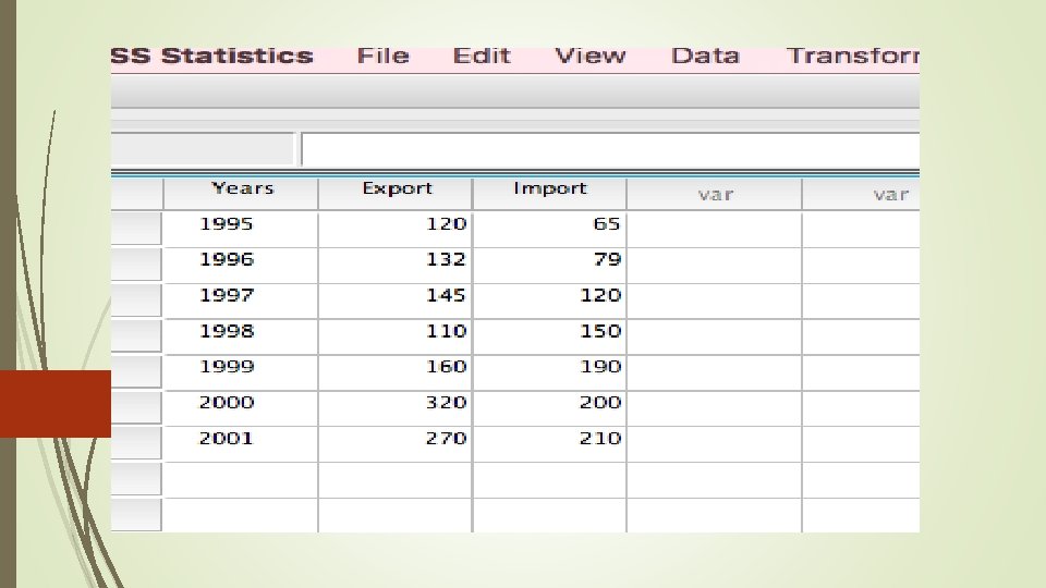
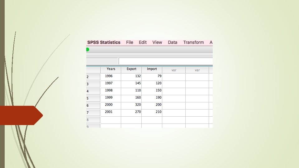
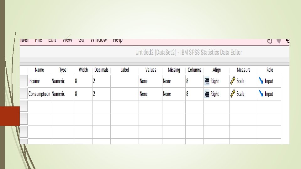
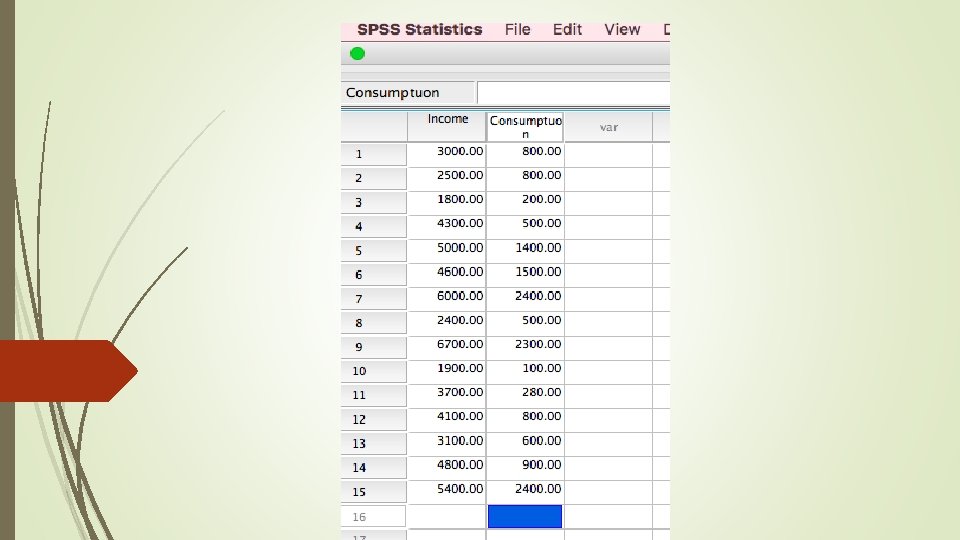
Suppose we have 15 consumers; their monthly income and consumptions are given in the table
Week estimation Strong estimation
EViews