Chapter 3 Graphical and Tabular Displays of Data
Chapter 3 Graphical and Tabular Displays of Data Copyright © 2016 Pearson Education, Inc. Slide 1
3. 1 Frequency Tables, Relative Frequency Tables, and Bar Graphs Copyright © 2016 Pearson Education, Inc. Slide 2
Types of Variables A categorical variable (or qualitative variable) consists of names or labels of groups of individuals. A numerical variable (or quantitative variable) consists of measurable quantities that describe individuals. Copyright © 2016 Pearson Education, Inc. Slide 3
Example: Identifying Categorical and Numerical Variables Identify whether the variable is categorical or numerical. 1. Age of a person at a hip-hop concert 2. Academic major of a community college student 3. Maximum speed of a car (in miles per hour) 4. ZIP code of a home in Arkansas 5. A variable consisting of zeroes and ones, where 0 stands for a man and 1 stands for a woman Copyright © 2016 Pearson Education, Inc. Slide 4
Solution 1. The ages of people who attend a hip-hop concert are numerical measures such as 19 years and 25 years. So, the variable is numerical. 2. Majors are categories of community college students such as business majors and psychology majors. So, the variable is categorical. 3. Maximum speeds of cars are numerical measures such as 108 miles per hour and 231 miles per hour. So, the variable is numerical. 4. ZIP codes identify groups of homes. So, the variable is categorical. 5. The numbers 0 and 1 represent the categories men and women, respectively. So, the variable is categorical. Copyright © 2016 Pearson Education, Inc. Slide 5
Definitions The frequency of a category is the number of observations in that category. A frequency table for a categorical variable is a table that lists all the categories and their frequencies. Copyright © 2016 Pearson Education, Inc. Slide 6
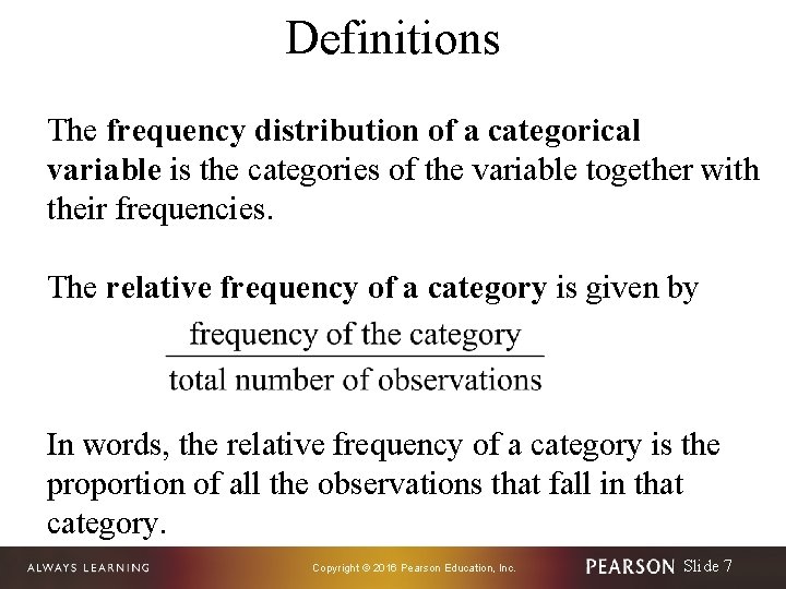
Definitions The frequency distribution of a categorical variable is the categories of the variable together with their frequencies. The relative frequency of a category is given by In words, the relative frequency of a category is the proportion of all the observations that fall in that category. Copyright © 2016 Pearson Education, Inc. Slide 7
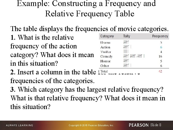
Example: Constructing a Frequency and Relative Frequency Table The table displays the frequencies of movie categories. 1. What is the relative frequency of the action category? What does it mean in this situation? 2. Insert a column in the table for the relative frequencies of the categories. 3. Which category has the largest relative frequency? What is that relative frequency? What does it mean in this situation? Copyright © 2016 Pearson Education, Inc. Slide 8
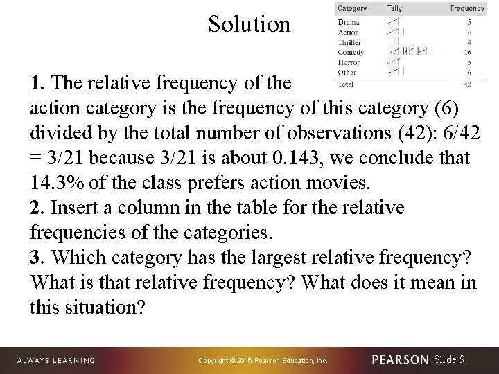
Solution 1. The relative frequency of the action category is the frequency of this category (6) divided by the total number of observations (42): 6/42 = 3/21 because 3/21 is about 0. 143, we conclude that 14. 3% of the class prefers action movies. 2. Insert a column in the table for the relative frequencies of the categories. 3. Which category has the largest relative frequency? What is that relative frequency? What does it mean in this situation? Copyright © 2016 Pearson Education, Inc. Slide 9
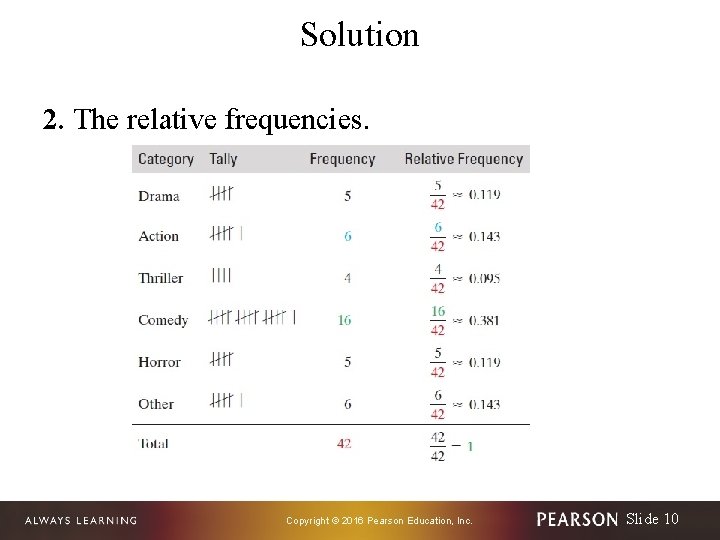
Solution 2. The relative frequencies. Copyright © 2016 Pearson Education, Inc. Slide 10
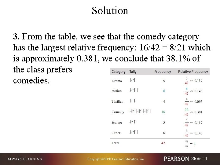
Solution 3. From the table, we see that the comedy category has the largest relative frequency: 16/42 = 8/21 which is approximately 0. 381, we conclude that 38. 1% of the class prefers comedies. Copyright © 2016 Pearson Education, Inc. Slide 11
Relative frequency distribution of a categorical variable The relative frequency distribution of a categorical variable is the categories of the variable together with their relative frequencies. Sum of Relative Frequencies For a categorical variable, the sum of the relative frequencies of all the categories is equal to 1. Copyright © 2016 Pearson Education, Inc. Slide 12

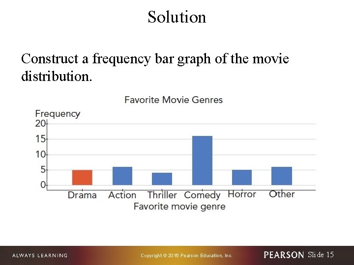
Example: Constructing a Frequency Bar Graph Construct a frequency bar graph of the movie distribution. Copyright © 2016 Pearson Education, Inc. Slide 13

Solution To begin, we list the categories on the horizontal axis and write the variable “Favorite movie genre” below the categories. Because the frequencies range from 4 to 16, we write 0, 5, 10, 15, and 20 equally spaced on the vertical axis and “Frequency” above the numbers. Then we draw bars above the categories so that the tops of the bars line up with the appropriate frequencies on the vertical axis. For example, because the drama category has frequency 5, the top of the red bar lines up with 5 on the vertical axis. Copyright © 2016 Pearson Education, Inc. Slide 14
Solution Construct a frequency bar graph of the movie distribution. Copyright © 2016 Pearson Education, Inc. Slide 15
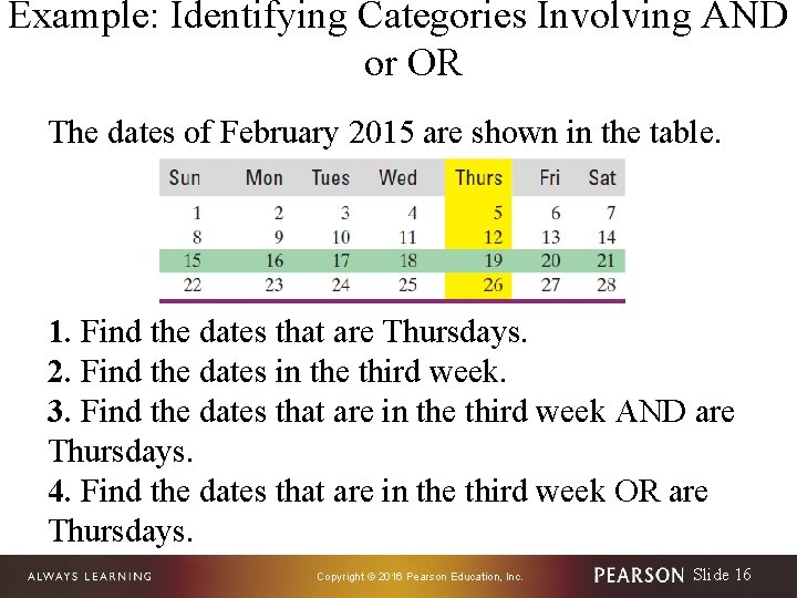
Example: Identifying Categories Involving AND or OR The dates of February 2015 are shown in the table. 1. Find the dates that are Thursdays. 2. Find the dates in the third week. 3. Find the dates that are in the third week AND are Thursdays. 4. Find the dates that are in the third week OR are Thursdays. Copyright © 2016 Pearson Education, Inc. Slide 16
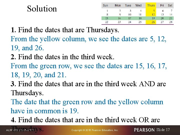
Solution 1. Find the dates that are Thursdays. From the yellow column, we see the dates are 5, 12, 19, and 26. 2. Find the dates in the third week. From the green row, we see the dates are 15, 16, 17, 18, 19, 20, and 21. 3. Find the dates that are in the third week AND are Thursdays. The date that the green row and the yellow column have in common is 19. 4. Find the dates that are in the third week OR are Slide 17 Thursdays. Copyright © 2016 Pearson Education, Inc.
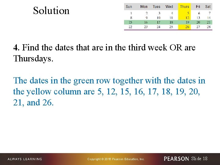
Solution 4. Find the dates that are in the third week OR are Thursdays. The dates in the green row together with the dates in the yellow column are 5, 12, 15, 16, 17, 18, 19, 20, 21, and 26. Copyright © 2016 Pearson Education, Inc. Slide 18
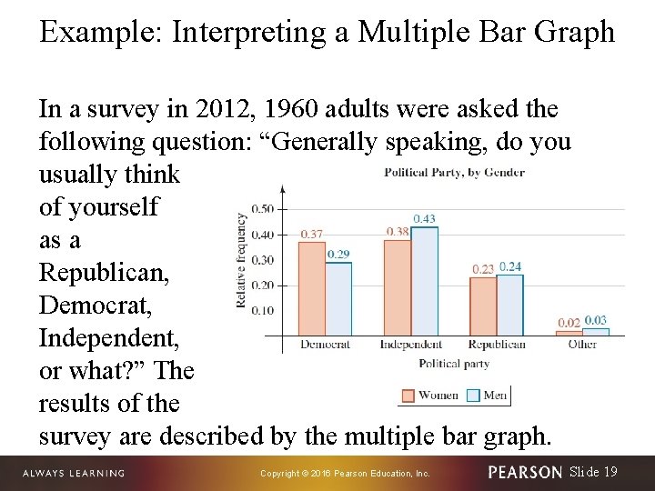
Example: Interpreting a Multiple Bar Graph In a survey in 2012, 1960 adults were asked the following question: “Generally speaking, do you usually think of yourself as a Republican, Democrat, Independent, or what? ” The results of the survey are described by the multiple bar graph. Copyright © 2016 Pearson Education, Inc. Slide 19
Example: Interpreting a Multiple Bar Graph 1. What proportion of women thought of themselves as Democrats? 2. Which political party did the greatest proportion of men choose? 3. Compare the proportion of women who thought of themselves as Independents to the proportion of men who thought of themselves as Independents. Copyright © 2016 Pearson Education, Inc. Slide 20
Example: Interpreting a Multiple Bar Graph 4. A total of 1081 women and 879 men responded to the survey. Were there more women or men who thought of themselves as Independents? How is this possible, given there was a smaller proportion of women who thought of themselves as Independents than men? 5. On the basis of the multiple bar graph, a student concludes that 24% of all American men are Republicans. What would you tell the student? Copyright © 2016 Pearson Education, Inc. Slide 21
Solution 1. The orange bar above “Democrat” has height 0. 37, so the proportion of women who thought of themselves as Democrats is 0. 37. 2. The tallest blue bar is above “Independent. ” The height of the bar is 0. 43. So, the proportion of men who thought of themselves as Independents is 0. 43 the largest proportion of men for any political party. Copyright © 2016 Pearson Education, Inc. Slide 22
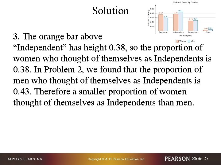
Solution 3. The orange bar above “Independent” has height 0. 38, so the proportion of women who thought of themselves as Independents is 0. 38. In Problem 2, we found that the proportion of men who thought of themselves as Independents is 0. 43. Therefore a smaller proportion of women thought of themselves as Independents than men. Copyright © 2016 Pearson Education, Inc. Slide 23
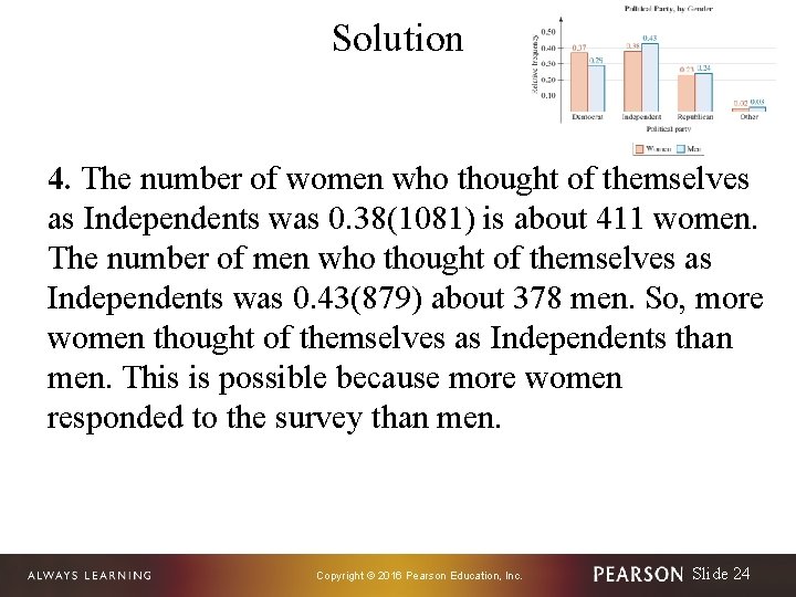
Solution 4. The number of women who thought of themselves as Independents was 0. 38(1081) is about 411 women. The number of men who thought of themselves as Independents was 0. 43(879) about 378 men. So, more women thought of themselves as Independents than men. This is possible because more women responded to the survey than men. Copyright © 2016 Pearson Education, Inc. Slide 24
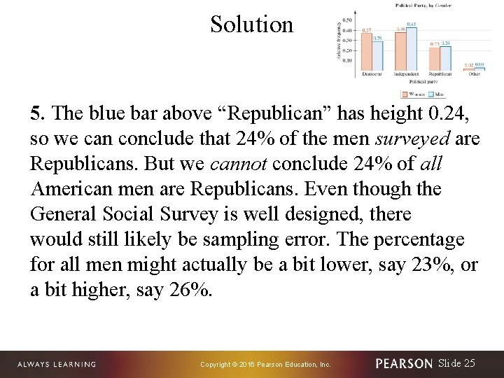
Solution 5. The blue bar above “Republican” has height 0. 24, so we can conclude that 24% of the men surveyed are Republicans. But we cannot conclude 24% of all American men are Republicans. Even though the General Social Survey is well designed, there would still likely be sampling error. The percentage for all men might actually be a bit lower, say 23%, or a bit higher, say 26%. Copyright © 2016 Pearson Education, Inc. Slide 25
- Slides: 25