Chapter 3 Displaying and Summarizing Quantitative Data Dealing







- Slides: 76

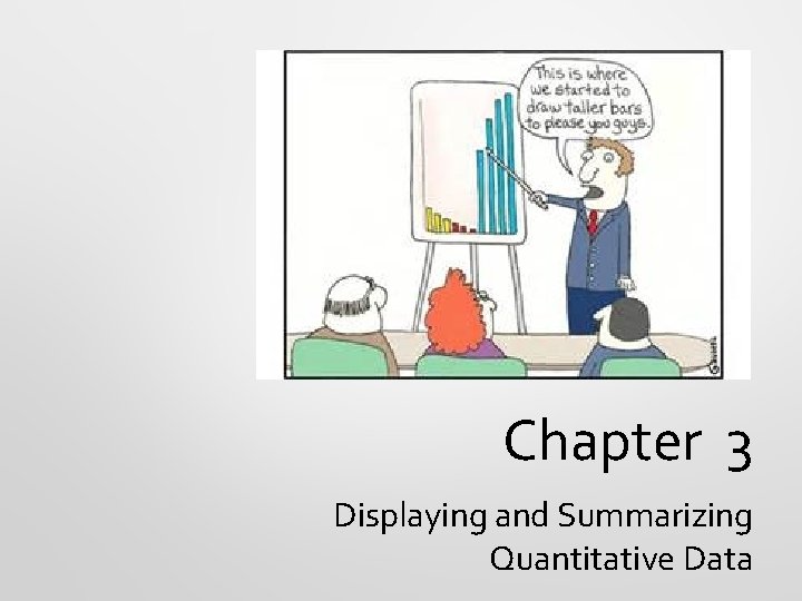
Chapter 3 Displaying and Summarizing Quantitative Data

Dealing With a Lot of Numbers… • When we look at large sets of quantitative data and summarize it, what do you think is the best thing to do? • • Make a picture! • • Those displays are for what kind of variables? We can’t use bar charts or pie charts for quantitative data. Categorical.

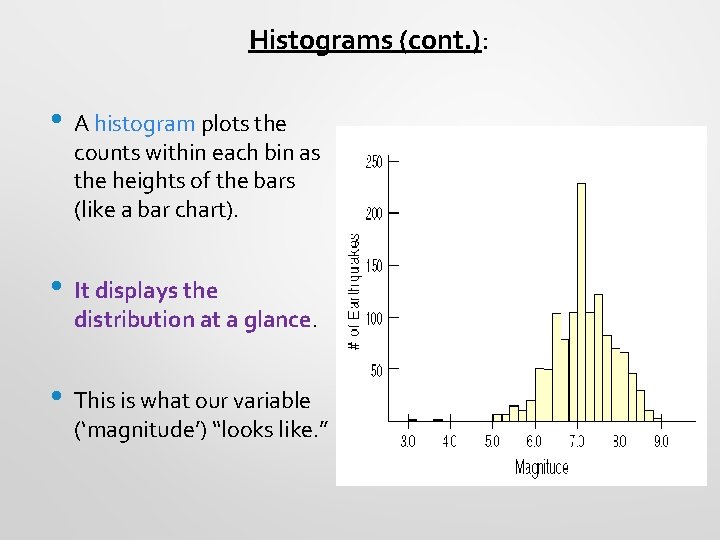
Making a Histogram: • Divide the range of x- values into equal-width groups called bins; • The counts in each bin display the distribution of the variable. • This histogram shows the distribution of the magnitudes of earthquakes. How does this display differ from a bar chart?

Histograms (cont. ): • A histogram plots the counts within each bin as the heights of the bars (like a bar chart). • It displays the distribution at a glance. • This is what our variable (‘magnitude’) “looks like. ”

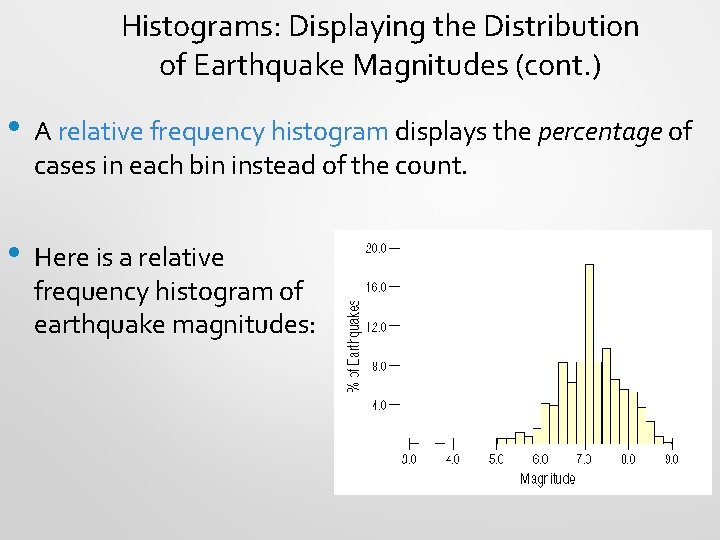
Histograms: Displaying the Distribution of Earthquake Magnitudes (cont. ) • A relative frequency histogram displays the percentage of cases in each bin instead of the count. • Here is a relative frequency histogram of earthquake magnitudes:

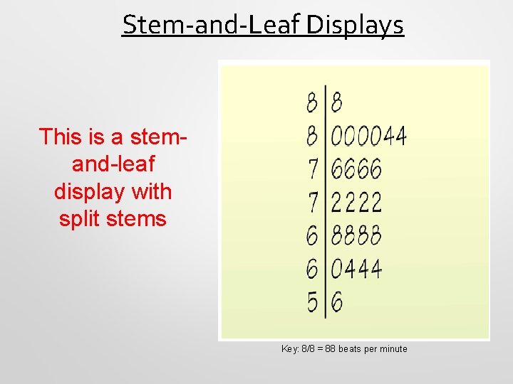
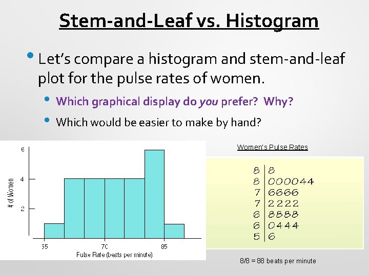
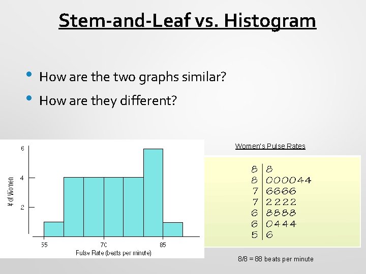
Stem-and-Leaf Displays This is a stemand-leaf display with split stems Key: 8/8 = 88 beats per minute

Stem-and-Leaf vs. Histogram • Let’s compare a histogram and stem-and-leaf plot for the pulse rates of women. • • Which graphical display do you prefer? Why? Which would be easier to make by hand? Women’s Pulse Rates 8/8 = 88 beats per minute

Stem-and-Leaf vs. Histogram • • How are the two graphs similar? How are they different? Women’s Pulse Rates 8/8 = 88 beats per minute

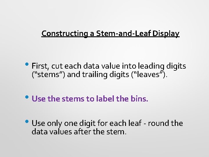
Constructing a Stem-and-Leaf Display • First, cut each data value into leading digits (“stems”) and trailing digits (“leaves”). • Use the stems to label the bins. • Use only one digit for each leaf - round the data values after the stem.

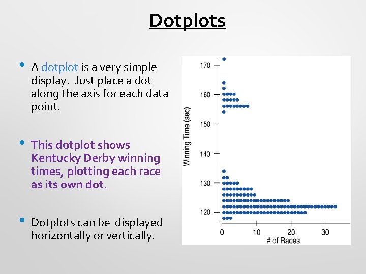
Dotplots • A dotplot is a very simple display. Just place a dot along the axis for each data point. • This dotplot shows Kentucky Derby winning times, plotting each race as its own dot. • Dotplots can be displayed horizontally or vertically.

Always THINK Before you Draw: • • • Remember the “Make a picture” rule? Think carefully about which type of display to make. Before making a stem-and-leaf display, a histogram, or a dotplot, check the • Quantitative Data Condition: The data are values of a quantitative variable whose units are known.

Now for Some Misleading Visual Displays…

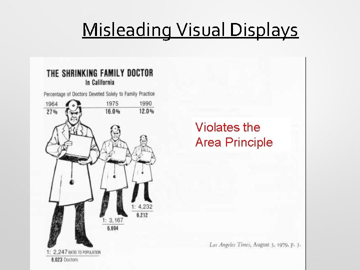
Misleading Visual Displays Violates the Area Principle

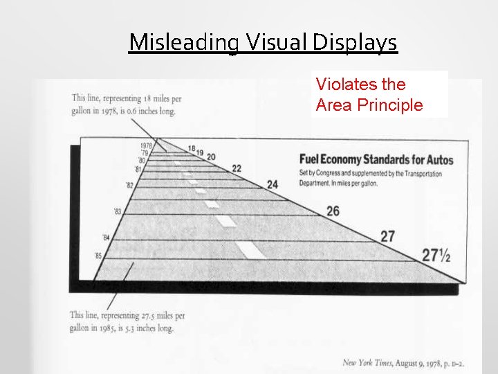
Misleading Visual Displays Violates the Area Principle

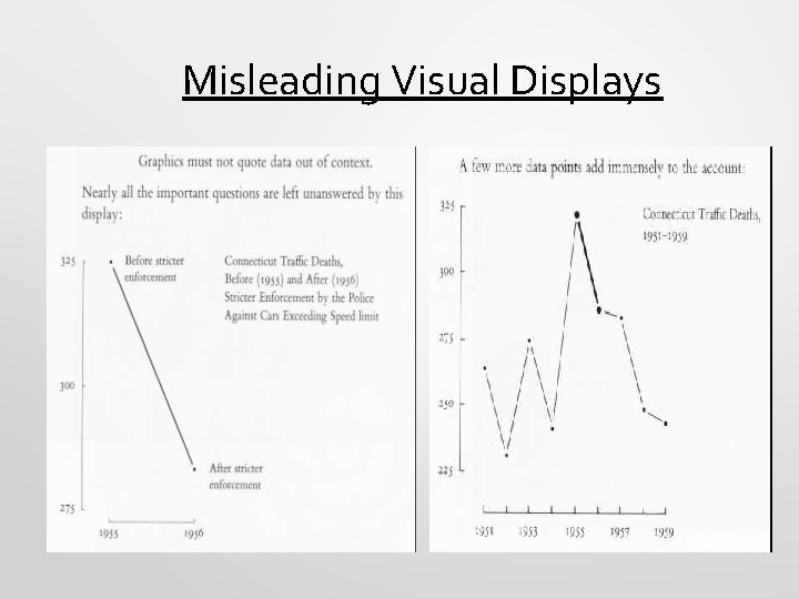
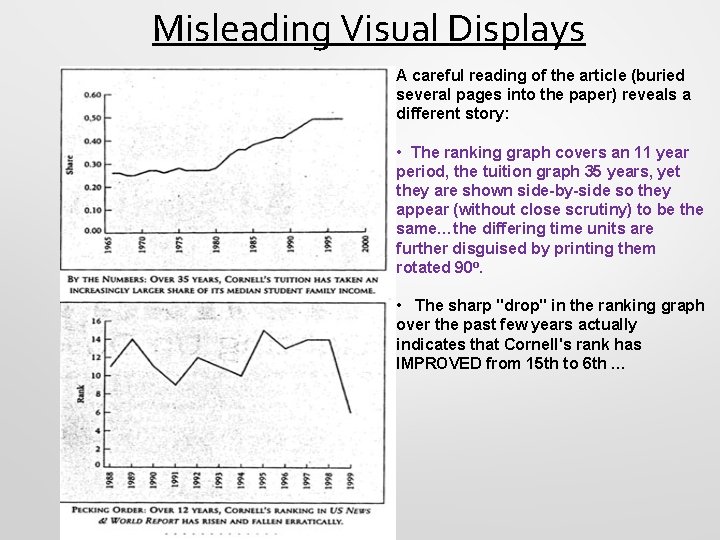
Misleading Visual Displays

Misleading Visual Displays A careful reading of the article (buried several pages into the paper) reveals a different story: • The ranking graph covers an 11 year period, the tuition graph 35 years, yet they are shown side-by-side so they appear (without close scrutiny) to be the same…the differing time units are further disguised by printing them rotated 90 o. • The sharp "drop" in the ranking graph over the past few years actually indicates that Cornell's rank has IMPROVED from 15 th to 6 th …

Classwork (In Pairs): Creating different types of displays from “Siblings Data”

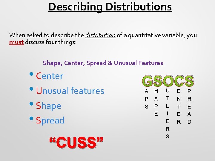
Describing Distributions When asked to describe the distribution of a quantitative variable, you must discuss four things: Shape, Center, Spread & Unusual Features • Center • Unusual features • Shape • Spread “CUSS” GSOCS A P S H A P E U T L I E R S E N T E R P R E A D

What is the Shape of the Distribution? 1. Does the histogram have a single, central hump or several separated humps? 2. Is the histogram symmetric? 3. Do any unusual features stick out?

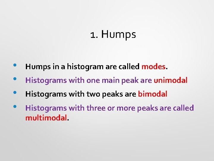
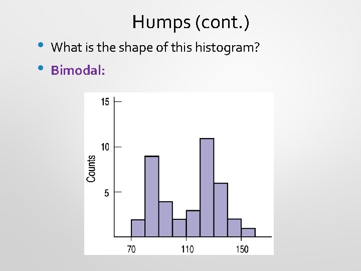
1. Humps • • Humps in a histogram are called modes. Histograms with one main peak are unimodal Histograms with two peaks are bimodal Histograms with three or more peaks are called multimodal.

• • Humps (cont. ) What is the shape of this histogram? Bimodal:

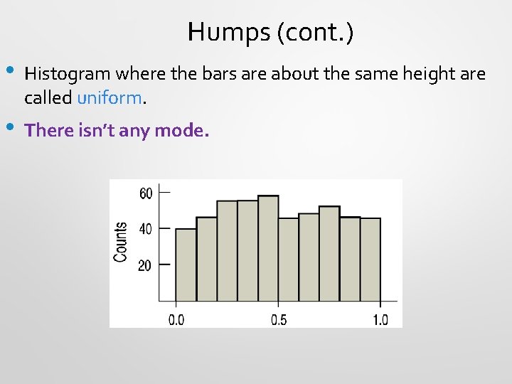
Humps (cont. ) • Histogram where the bars are about the same height are called uniform. • There isn’t any mode.

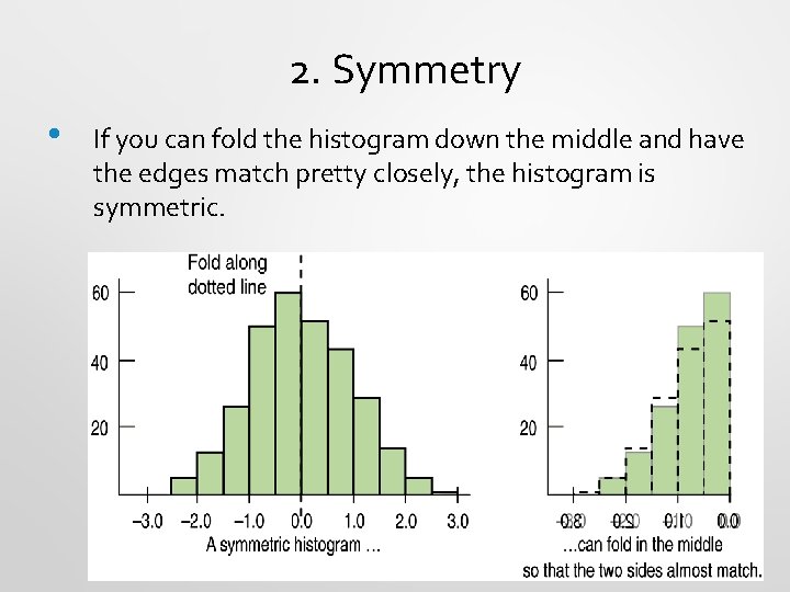
2. Symmetry • If you can fold the histogram down the middle and have the edges match pretty closely, the histogram is symmetric.

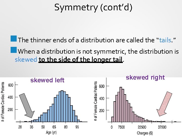
Symmetry (cont’d) n. The thinner ends of a distribution are called the “tails. ” n. When a distribution is not symmetric, the distribution is skewed to the side of the longer tail. skewed left skewed right

3. Anything Unusual? • • • Sometimes it’s the unusual features that tell us something interesting about the data. You should always mention any outliers that stand away from the body of the distribution. Are there any gaps in the distribution? If so, we might have data from more than one group.

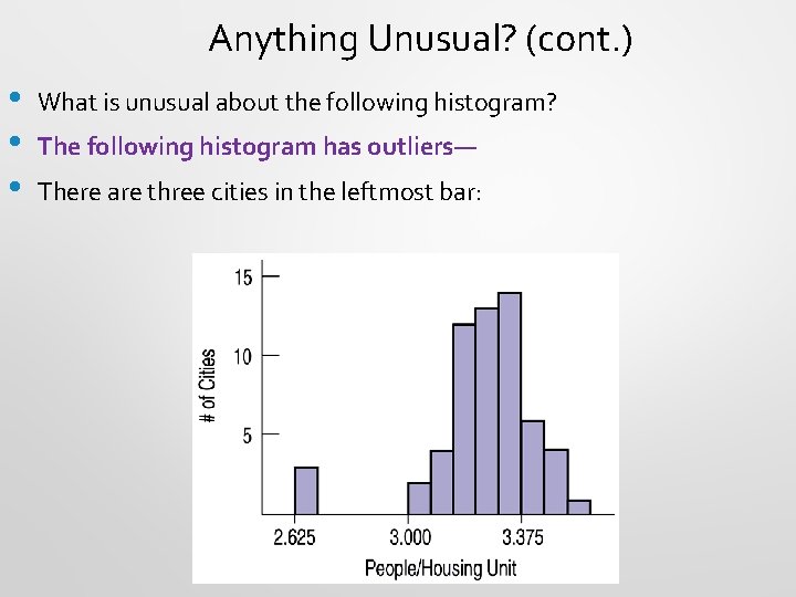
Anything Unusual? (cont. ) • • • What is unusual about the following histogram? The following histogram has outliers— There are three cities in the leftmost bar:

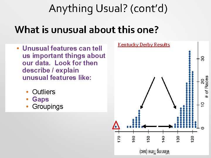
Anything Usual? (cont’d) What is unusual about this one? • Unusual features can tell us important things about our data. Look for then describe / explain unusual features like: • Outliers • Gaps • Groupings Kentucky Derby Results

In Pairs: Chapter 3 Classwork: Thinking about Shape

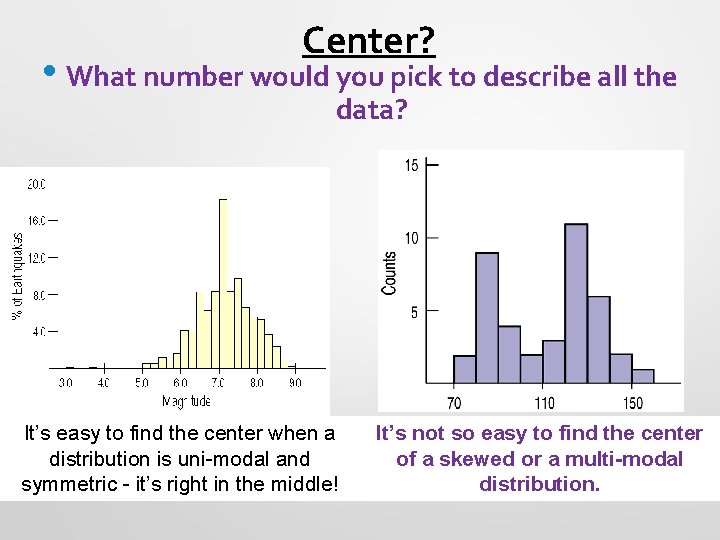
Center? • What number would you pick to describe all the data? It’s easy to find the center when a distribution is uni-modal and symmetric - it’s right in the middle! It’s not so easy to find the center of a skewed or a multi-modal distribution.

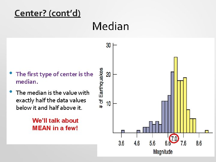
Center? (cont’d) Median • The first type of center is the median. • The median is the value with exactly half the data values below it and half above it. We’ll talk about MEAN in a few!

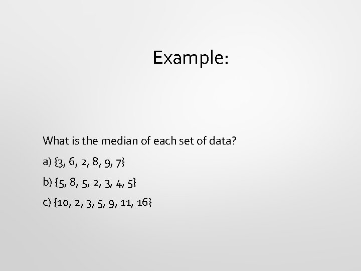
Example: What is the median of each set of data? a) {3, 6, 2, 8, 9, 7} b) {5, 8, 5, 2, 3, 4, 5} c) {10, 2, 3, 5, 9, 11, 16}

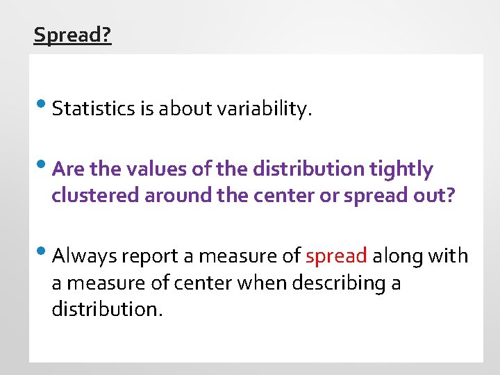
Spread? • Statistics is about variability. • Are the values of the distribution tightly clustered around the center or spread out? • Always report a measure of spread along with a measure of center when describing a distribution.

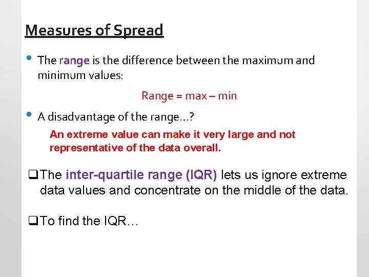
Measures of Spread • The range is the difference between the maximum and minimum values: Range = max – min • A disadvantage of the range…? An extreme value can make it very large and not representative of the data overall. q The inter-quartile range (IQR) lets us ignore extreme data values and concentrate on the middle of the data. q To find the IQR…

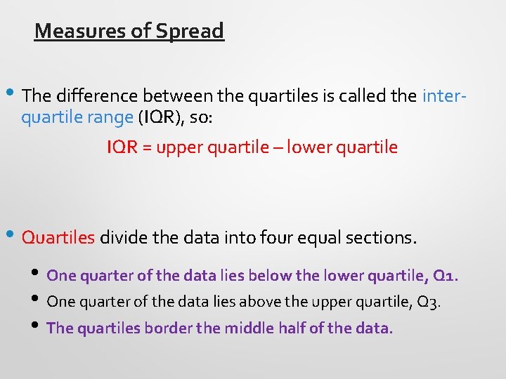
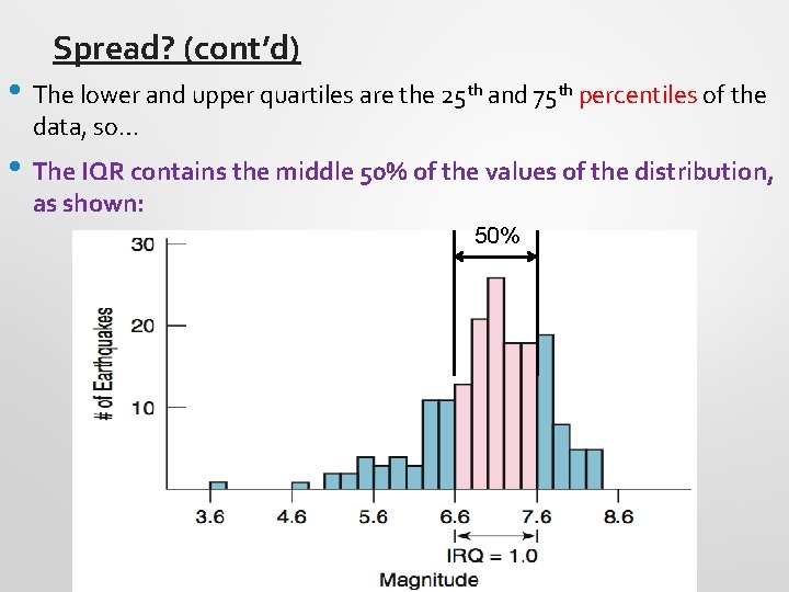
Measures of Spread • The difference between the quartiles is called the interquartile range (IQR), so: IQR = upper quartile – lower quartile • Quartiles divide the data into four equal sections. • One quarter of the data lies below the lower quartile, Q 1. • One quarter of the data lies above the upper quartile, Q 3. • The quartiles border the middle half of the data.

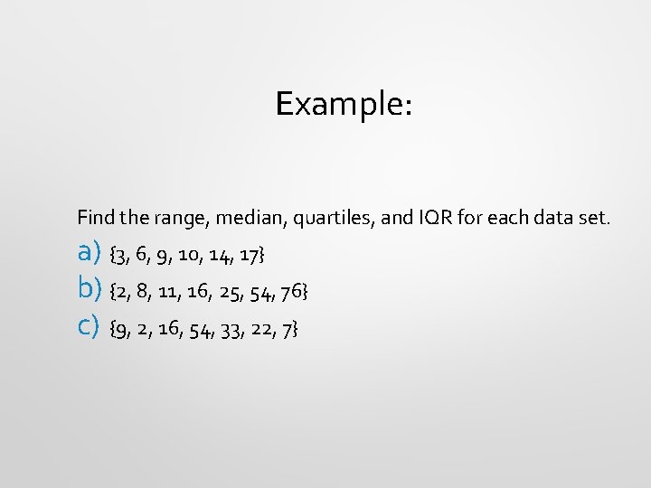
Example: Find the range, median, quartiles, and IQR for each data set. a) {3, 6, 9, 10, 14, 17} b) {2, 8, 11, 16, 25, 54, 76} c) {9, 2, 16, 54, 33, 22, 7}

Spread? (cont’d) • The lower and upper quartiles are the 25 th and 75 th percentiles of the data, so… • The IQR contains the middle 50% of the values of the distribution, as shown: 50%

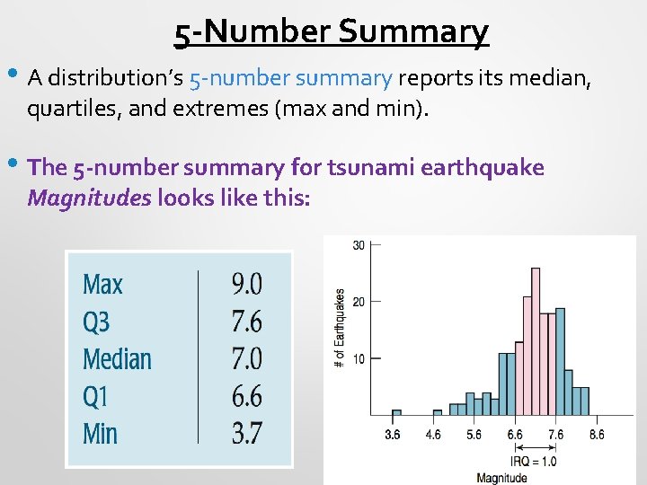
5 -Number Summary • A distribution’s 5 -number summary reports its median, quartiles, and extremes (max and min). • The 5 -number summary for tsunami earthquake Magnitudes looks like this:

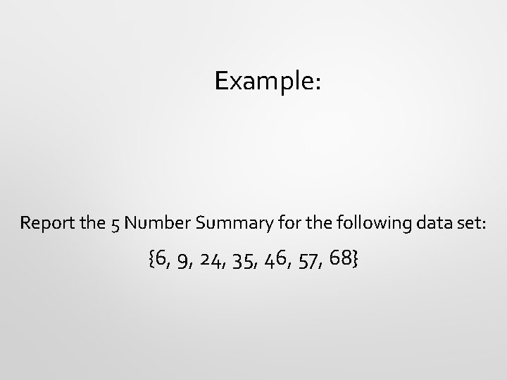
Example: Report the 5 Number Summary for the following data set: {6, 9, 24, 35, 46, 57, 68}

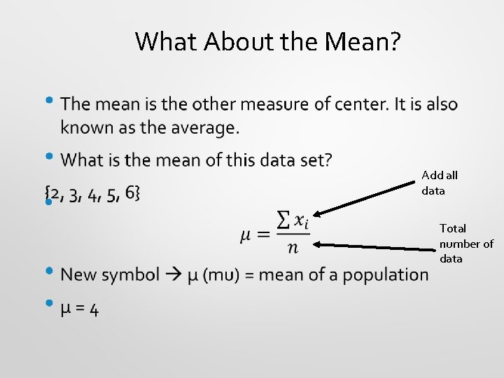
What About the Mean? • Add all data Total number of data

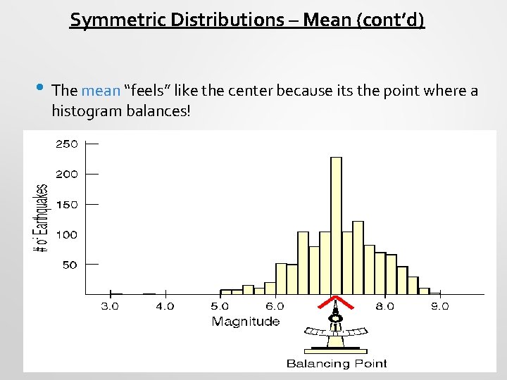
Symmetric Distributions – Mean (cont’d) • The mean “feels” like the center because its the point where a histogram balances!

Examples: Find the mean of each of the following: a){1, 2, 5, 7, 9, 10, 11, 12} b){34, 56, 76, 45, 24, 32, 12}

Mean or Median? • If the data is skewed, would you use the mean or median as a measure for the center? Why? • The median because it considers only the order of values. It is resistant to values that are extraordinarily large or small.

Mean or Median? • To choose between the mean and median, start by looking at the data. • If the histogram is symmetric and there are no outliers, use the mean. • However, if the histogram is skewed or with outliers, use the median.

Handout: How Shape Changes Measures of Center

Classwork: Measuring Shape and Center Worksheet

Classwork: Creating Boxplots

Fish Tank Method (Method on how to match boxplots to histograms)

Classwork: Matching Boxplots to Histograms Activity Cut out each of the graphs. On a separate piece of paper, glue all the matches together and write a brief explanation as to why you matched up those graphs. You can draw fish tanks if it helps you.

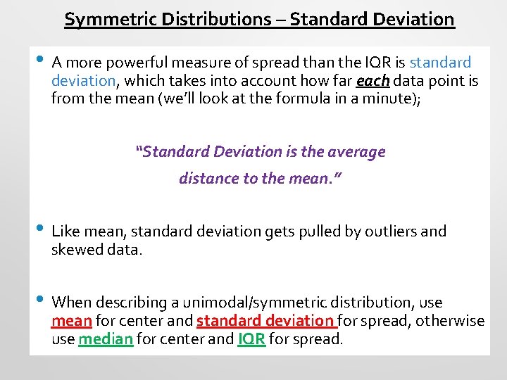
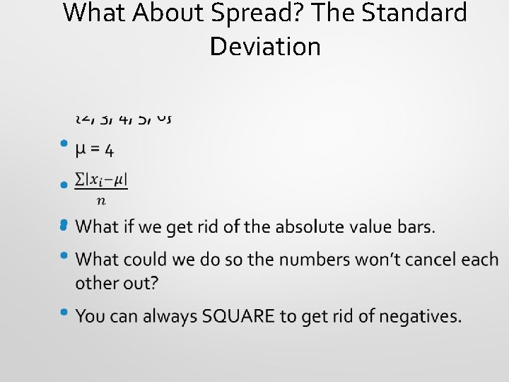
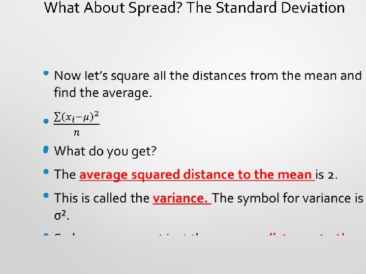
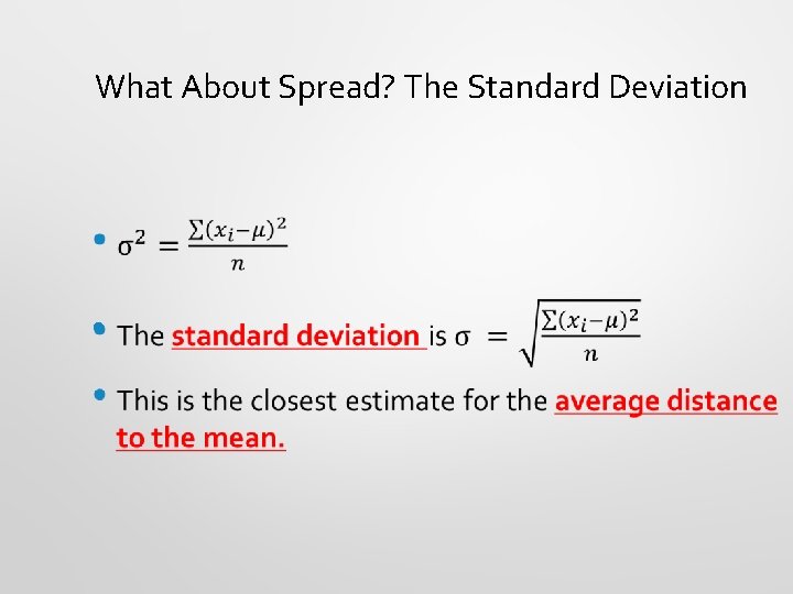
Symmetric Distributions – Standard Deviation • A more powerful measure of spread than the IQR is standard deviation, which takes into account how far each data point is from the mean (we’ll look at the formula in a minute); “Standard Deviation is the average distance to the mean. ” • Like mean, standard deviation gets pulled by outliers and skewed data. • When describing a unimodal/symmetric distribution, use mean for center and standard deviation for spread, otherwise use median for center and IQR for spread.

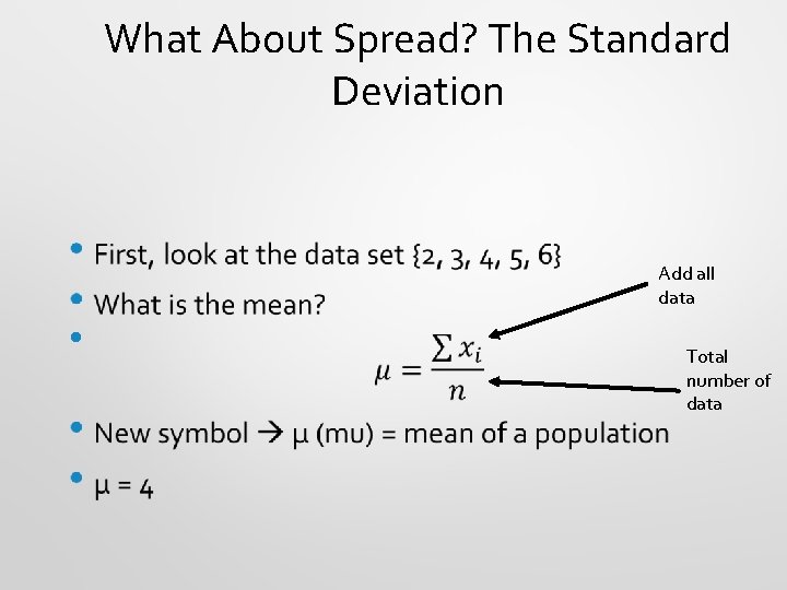
What About Spread? The Standard Deviation Add all data • Total number of data

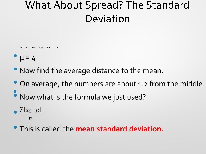
What About Spread? The Standard Deviation •

What About Spread? The Standard Deviation •

What About Spread? The Standard Deviation •

What About Spread? The Standard Deviation •

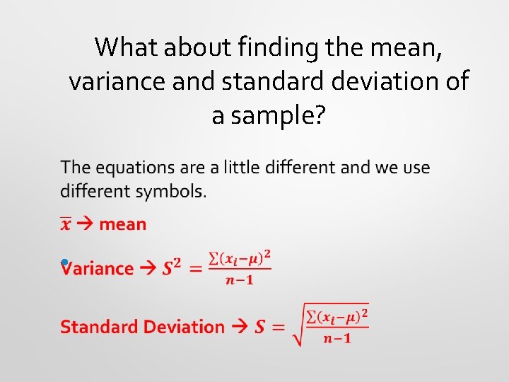
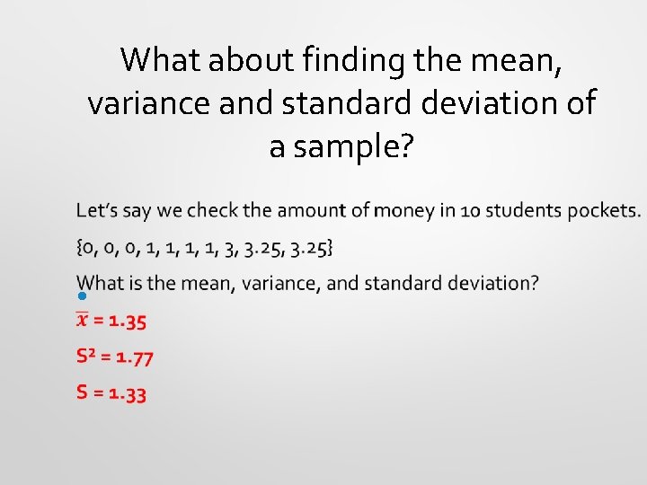
What about finding the mean, variance and standard deviation of a sample? •

What about finding the mean, variance and standard deviation of a sample? •

Let’s calculate some by hand (worksheet)!!

Homework: Finish Classwork: Variance and Standard Deviation Exercise

Thinking About Variation § Statistics is about variability, so spread is an important fundamental concept. § Measures of spread help us talk about what we don’t know … think of the spread as the “error” in our data - stuff we can’t explain. § Data with large deviations from the mean are not BAD…just notable; the “stuff” we need to be aware of and talk about when we analyze data.

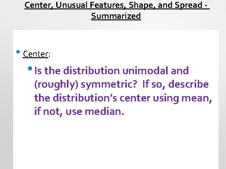
Center, Unusual Features, Shape, and Spread Summarized • Center: • Is the distribution unimodal and (roughly) symmetric? If so, describe the distribution’s center using mean, if not, use median.

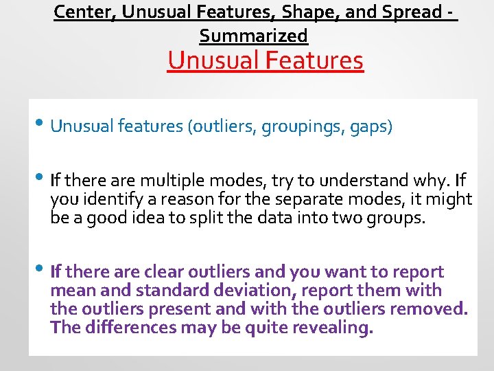
Center, Unusual Features, Shape, and Spread Summarized Unusual Features • Unusual features (outliers, groupings, gaps) • If there are multiple modes, try to understand why. If you identify a reason for the separate modes, it might be a good idea to split the data into two groups. • If there are clear outliers and you want to report mean and standard deviation, report them with the outliers present and with the outliers removed. The differences may be quite revealing.

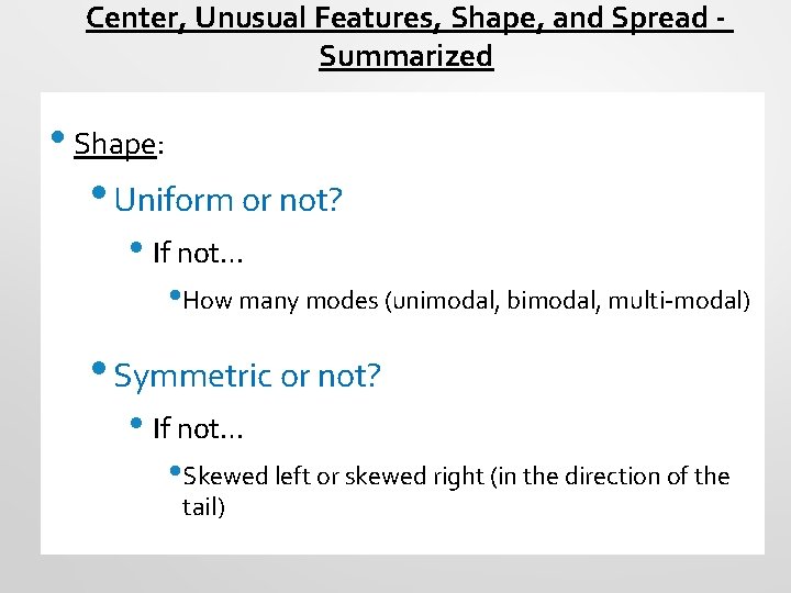
Center, Unusual Features, Shape, and Spread Summarized • Shape: • Uniform or not? • If not… • How many modes (unimodal, bimodal, multi-modal) • Symmetric or not? • If not… • Skewed left or skewed right (in the direction of the tail)

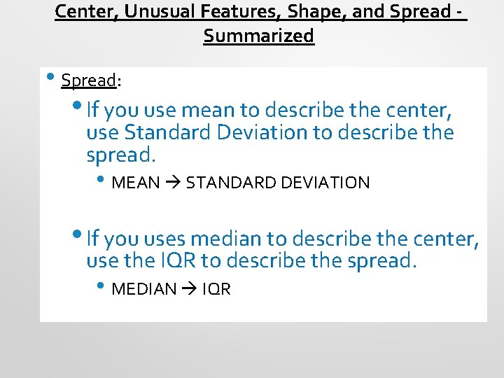
Center, Unusual Features, Shape, and Spread Summarized • Spread: • If you use mean to describe the center, use Standard Deviation to describe the spread. • MEAN STANDARD DEVIATION • If you uses median to describe the center, use the IQR to describe the spread. • MEDIAN IQR

Which is Higher, Mean or Median? ? • For unimodal & symmetric data, mean and median will be very close…. • For skewed data, and data with outliers, mean will be IN THE DIRECTION of the skew (or outlier).

“Resistant” or not? IQR? Range? Mean? Median? Standard Deviation? Variance?

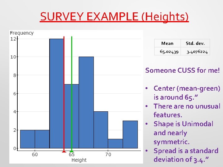
SURVEY EXAMPLE (Heights) Mean 65. 02439 Std. dev. 3. 4076224 Someone CUSS for me! • Center (mean-green) is around 65. ” • There are no unusual features. • Shape is Unimodal and nearly symmetric. • Spread is a standard deviation of 3. 4. ”

Classwork (In Pairs): Activity: Matching Statistics and Graphs (Explain how you made your choices on a separate piece of paper for Activity 1 and 2)

Classwork: Using 1 -Var Stats on the Calculator

Classwork: 1. Creating Ogives 2. Matching Ogives to Histograms (Rectangle Drop Method)

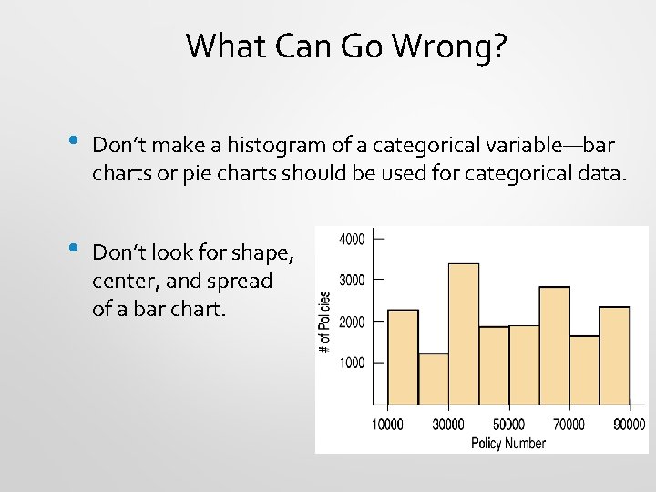
What Can Go Wrong? • Don’t make a histogram of a categorical variable—bar charts or pie charts should be used for categorical data. • Don’t look for shape, center, and spread of a bar chart.

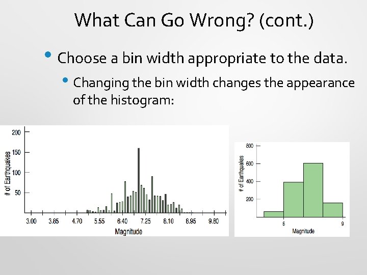
What Can Go Wrong? (cont. ) • Choose a bin width appropriate to the data. • Changing the bin width changes the appearance of the histogram:

What Can Go Wrong? (cont. ) • • • Don’t forget to do a reality check – don’t let the calculator do the thinking for you. Don’t forget to sort the values before finding the median or percentiles. Don’t worry about small differences when using different methods. Don’t compute numerical summaries of a categorical variable. Don’t report too many decimal places. Don’t round in the middle of a calculation. Watch out for multiple modes Beware of outliers Make a picture … make a picture. . . make a picture !!!

What have we learned? • • • We’ve learned how to make a picture for quantitative data to help us see the story the data have to Tell. We can display the distribution of quantitative data with a histogram, stem-and-leaf display, dotplot, or boxplot We’ve learned how to summarize distributions of quantitative variables numerically. • Measures of center for a distribution include the median and mean. • Measures of spread include the range, IQR, and standard deviation. • Use the median and IQR when the distribution is skewed. Use the mean and standard deviation if the distribution is symmetric.

What have we learned? (cont. ) • We’ve learned to Think about the type of variable we are summarizing. • All methods of this chapter assume the data are quantitative. • The Quantitative Data Condition serves as a check that the data are, in fact, quantitative.

Classwork: Chapter 3 Review for Test: Displaying and Summarizing Quantitative Data

Homework: Study for the Chapter 3 Test Tomorrow!