Chapter 24 Raving about Results In the same
Chapter 24: Raving about Results! “In the same way, let your light shine before others, so that they may see your good works and give glory to your Father who is in heaven. ” Matthew 5: 16
Introduction Your results are tops in terms of importance. What happened during your experiment? How did your measurements turn out? This is the section where you report the facts and ONLY the facts. Displaying them in graphs, charts, and on pictures is the best thing to do. You may also have a small section where you describe your results in words, but don’t overdo it. DO NOT use this section to tell why the results came out the way they did. That is for the next section called the discussion.

Only the Facts. Collect all your data and put it together in one place in your journal so you can make sense of it. If you need to, you can make a note in your journal and tell the judge you are rewriting it to make it clearer. Take a careful look. What do you think it shows? Do you think your hypothesis is correct or… Did you prove your null hypothesis?
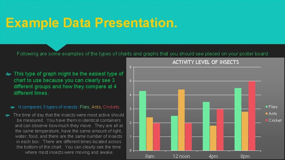
Example Data Presentation. Following are some examples of the types of charts and graphs that you should see placed on your poster board: ACTIVITY LEVEL OF INSECTS 6 This type of graph might be the easiest type of chart to use because you can clearly see 3 different groups and how they compare at 4 different times. It compares 3 types of insects: Flies, Ants, Crickets. The time of day that the insects were most active should be measured. You have them in identical containers and can observe how much they move. They are all at the same temperature, have the same amount of light, water, food, and there are the same number of insects in each box. There are different times located across the bottom of the chart. You can clearly see the time where most insects were moving and awake. 5 4 Flies 3 Ants Cricket 2 1 0 8 am 12 noon 4 pm 8 pm
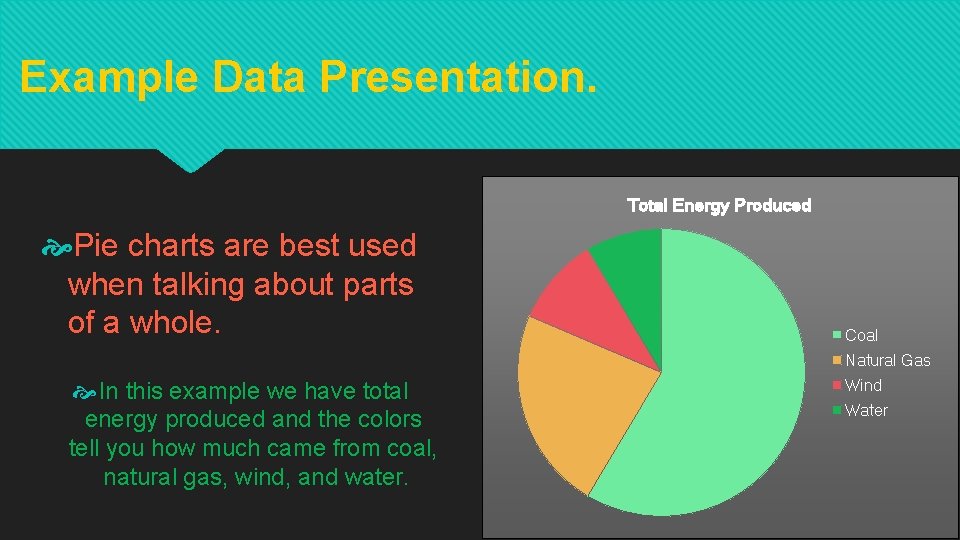
Example Data Presentation. Total Energy Produced Pie charts are best used when talking about parts of a whole. Coal Natural Gas In this example we have total energy produced and the colors tell you how much came from coal, natural gas, wind, and water. Wind Water
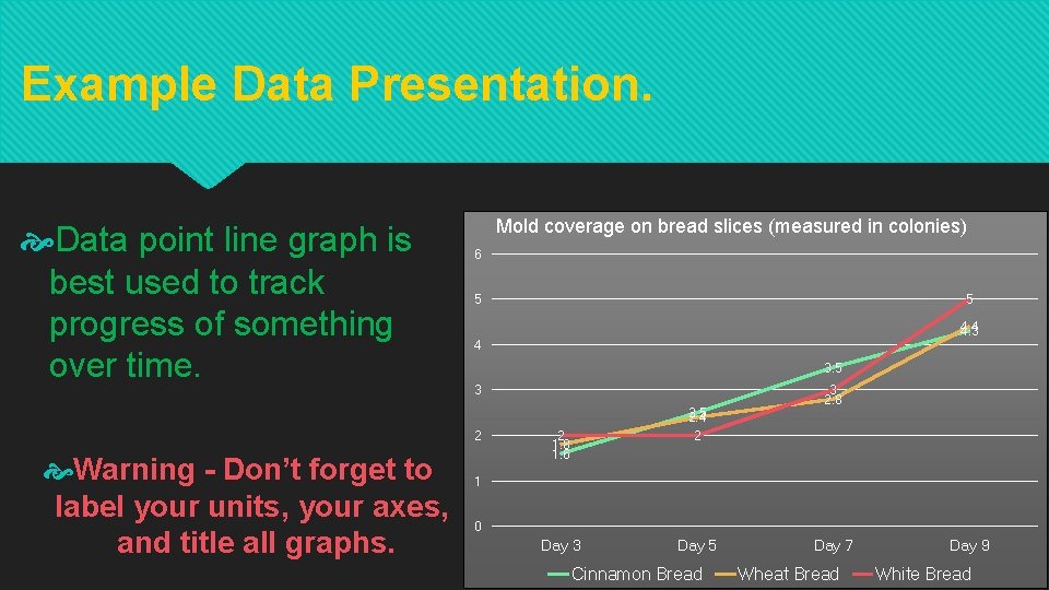
Example Data Presentation. Data point line graph is best used to track progress of something over time. Mold coverage on bread slices (measured in colonies) 6 5 4. 4 4. 3 4 3. 5 3 2 Warning - Don’t forget to label your units, your axes, and title all graphs. 5 2. 4 2 2 1. 8 1. 6 3 2. 8 1 0 Day 3 Day 5 Cinnamon Bread Day 7 Wheat Bread Day 9 White Bread
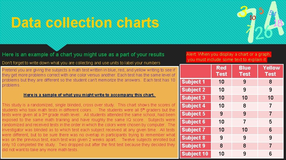
Data collection charts Here is an example of a chart you might use as a part of your results Don’t forget to write down what you are collecting and use units to label your numbers Pretend you are giving the subjects a math test written in blue, red, and yellow writing to see if they get more problems correct with one color versus another. Each test has the same level of problems but they are different so the student can’t memorize the answers. Each test has 10 problems. Here is a sample of what you might write to accompany this chart. This study is a randomized, single blinded, cross over study. This chart shows the scores of students who took math tests in different colors. The students were all 5 th graders but the tests were given at a 3 rd grade math level. All students attended the same school, had been exposed to the same math training and have roughly the same IQ score. Subjects were randomized and received tests in the order in which the colors were chosen by computer. The investigator was blinded as to which test each subject received at any given time. All tests were different, but to be sure there was no overlap in participants trying to remember what was on the previous test, each test was given 2 weeks apart. Twelve subjects enrolled but only 10 completed the study. Two dropped out after the first test because they decided they did not want to take any more math tests. Alert: When you display a chart or a graph, you must include some text to explain it. Subject 1 Subject 2 Subject 3 Subject 4 Subject 5 Subject 6 Subject 7 Subject 8 Subject 9 Subject 10 Red Test 10 10 9 8 10 Blue Test 9 9 10 8 9 7 10 9 8 9 Yellow Test 8 9 10 7 7 5 6 9 7 6
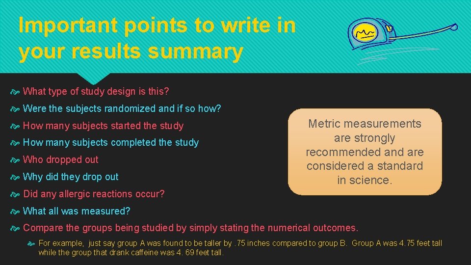
Important points to write in your results summary What type of study design is this? Were the subjects randomized and if so how? How many subjects started the study How many subjects completed the study Who dropped out Why did they drop out Metric measurements are strongly recommended and are considered a standard in science. Did any allergic reactions occur? What all was measured? Compare the groups being studied by simply stating the numerical outcomes. For example, just say group A was found to be taller by. 75 inches compared to group B. Group A was 4. 75 feet tall while the group that drank caffeine was 4. 69 feet tall.
Statistical Analysis The following is for high school students or advanced middle school students. It is time to complete your statistical analysis. Make sure you submit your data to the person who will be entering it into the computer program or arrange to do the data entry yourself. Decide now what colors you want your graphs to be printed in because most statistical packages allow you to print graphs directly from the results. Checklist to use while you work on you stats. o o o Bring all your data, including your journal. Know what test you are going to run. Know what you are going to define as statistically significant. Be ready to ask question about properly interpreting your results. Make sure you take complete notes on the process before you leave so you will be able to write clear explanations of your graphs for your poster.
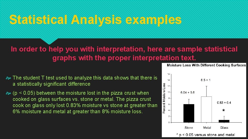
Statistical Analysis examples In order to help you with interpretation, here are sample statistical graphs with the proper interpretation text. The student T test used to analyze this data shows that there is a statistically significant difference (p < 0. 05) between the moisture lost in the pizza crust when cooked on glass surfaces vs. stone or metal. The pizza crust cook on glass only lost 0. 83% moisture vs stone at greater than 6% moisture and metal at greater than 8% moisture loss.

Statistical Analysis examples In order to help you with interpretation, here are sample statistical graphs with the proper interpretation text. The Student T test performed on this data reveals a statistically significant difference (P <0. 05) in the ability to jump higher during a demi plie when comparing jumpers who had a high degree of flexibility to those that demonstrated a lower degree of flexibility. There was also a statistically significant difference (P=0. 013) in how high people jumped while doing a grand plie if they were more flexible compared to those that were less flexible. However there was no statistical difference between participants when comparing their jump heights doing demi plies and grand plies if they had low flexibility or high flexibility.
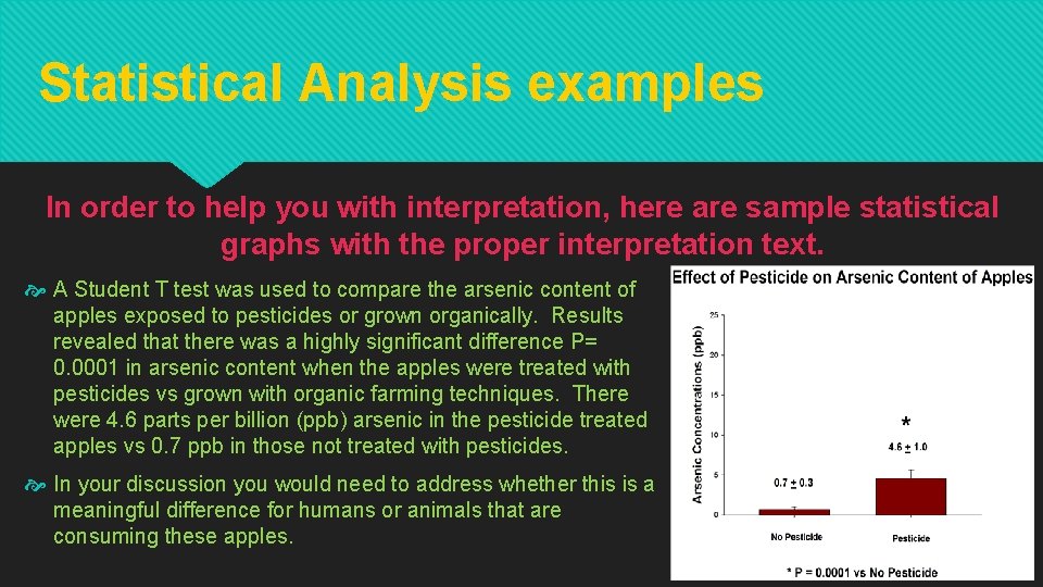
Statistical Analysis examples In order to help you with interpretation, here are sample statistical graphs with the proper interpretation text. A Student T test was used to compare the arsenic content of apples exposed to pesticides or grown organically. Results revealed that there was a highly significant difference P= 0. 0001 in arsenic content when the apples were treated with pesticides vs grown with organic farming techniques. There were 4. 6 parts per billion (ppb) arsenic in the pesticide treated apples vs 0. 7 ppb in those not treated with pesticides. In your discussion you would need to address whether this is a meaningful difference for humans or animals that are consuming these apples.

Remember to write in your prayer journal and scientific notebook!! Review your results. Did you accept or reject your hypothesis based on the data you collected?
- Slides: 13