Chapter 21 Using Controls Using Controls The ease
- Slides: 10

Chapter 21: Using Controls

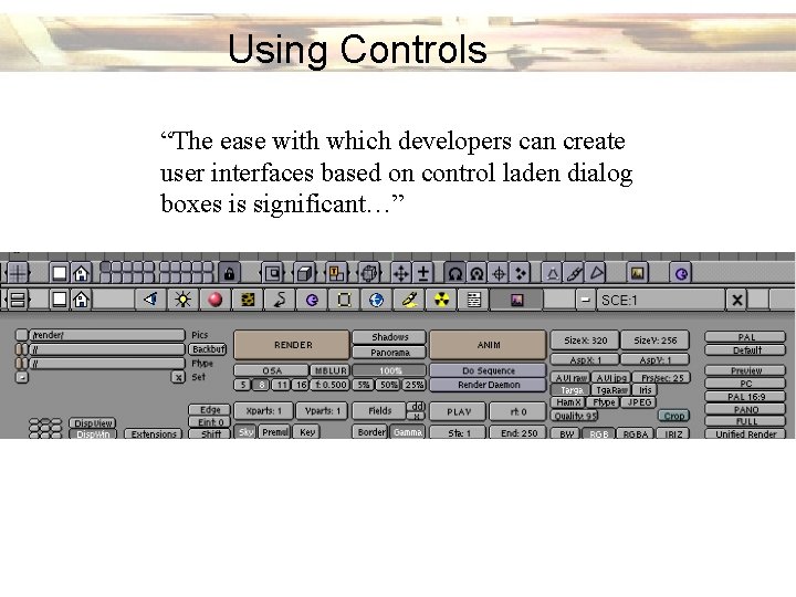
Using Controls “The ease with which developers can create user interfaces based on control laden dialog boxes is significant…”

Imperative Controls - take an action, corresponds to a verb Selection Controls - allow user to select operand from a set of valid choices Entry Controls - enable user to enter new info into the program Display Controls - manage the visual presentation of information

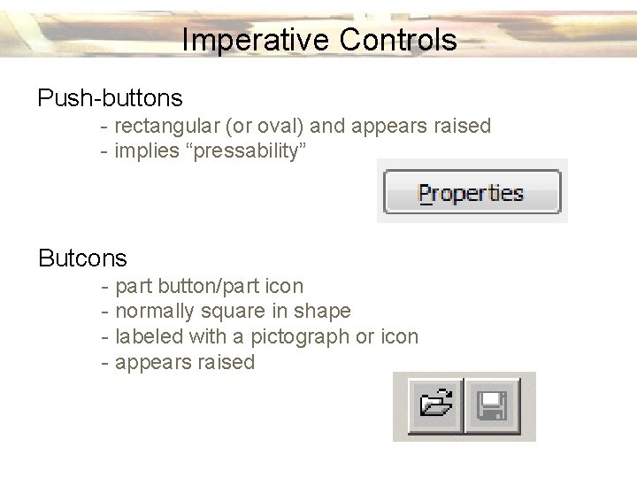
Imperative Controls Push-buttons - rectangular (or oval) and appears raised - implies “pressability” Butcons - part button/part icon - normally square in shape - labeled with a pictograph or icon - appears raised

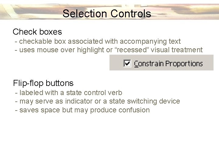
Selection Controls Check boxes - checkable box associated with accompanying text - uses mouse over highlight or “recessed” visual treatment Flip-flop buttons - labeled with a state control verb - may serve as indicator or a state switching device - saves space but may produce confusion

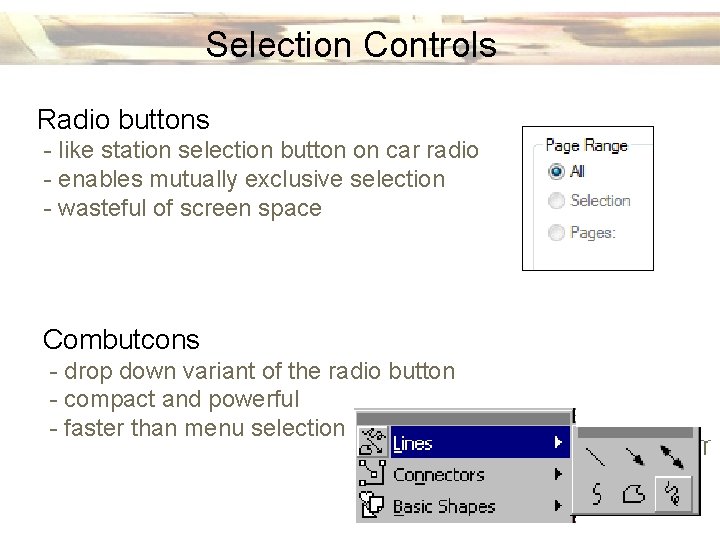
Selection Controls Radio buttons - like station selection button on car radio - enables mutually exclusive selection - wasteful of screen space Combutcons - drop down variant of the radio button - compact and powerful - faster than menu selection

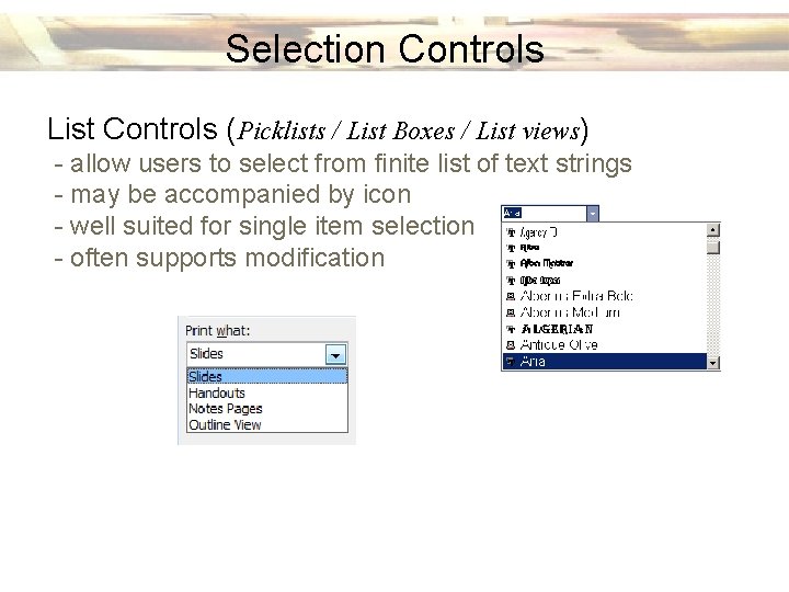
Selection Controls List Controls (Picklists / List Boxes / List views) - allow users to select from finite list of text strings - may be accompanied by icon - well suited for single item selection - often supports modification

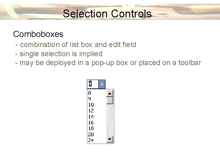
Selection Controls Comboboxes - combination of list box and edit field - single selection is implied - may be deployed in a pop-up box or placed on a toolbar

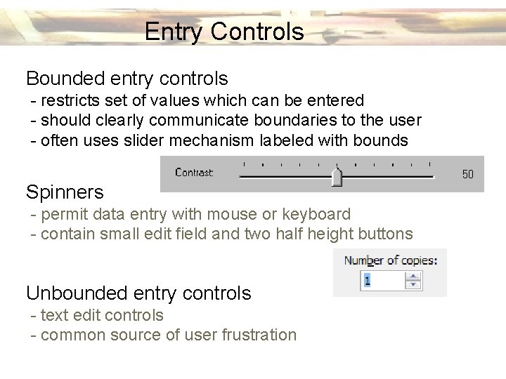
Entry Controls Bounded entry controls - restricts set of values which can be entered - should clearly communicate boundaries to the user - often uses slider mechanism labeled with bounds Spinners - permit data entry with mouse or keyboard - contain small edit field and two half height buttons Unbounded entry controls - text edit controls - common source of user frustration

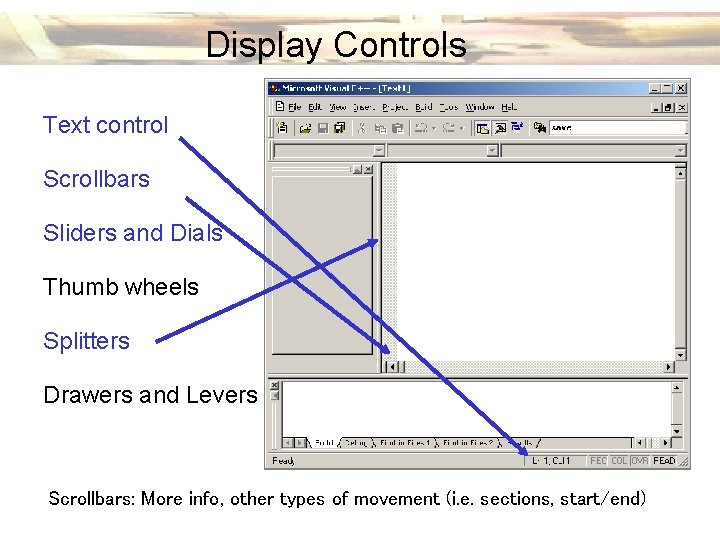
Display Controls Text control Scrollbars Sliders and Dials Thumb wheels Splitters Drawers and Levers Text control: Output information, actually(i. e. a control. not? Scrollbars: More info, of other types of not movement sections, Why start/end)