Chapter 2 Thinking Like an Economist The Economist

- Slides: 41

Chapter 2 Thinking Like an Economist

The Economist as a Scientist • Economics = science • Economists = scientists – Devise theories – Collect data – Analyze these data • Verify or refute their theories • Scientific method – Dispassionate development and testing of theories about how the world works 2

The Economist as a Scientist The scientific method: observation, theory, and more observation • Observation • Theory • Conducting experiments – Difficult / impossible • Observation – Close attention to natural experiments history 3

The Economist as a Scientist The role of assumptions • Assumptions – Can simplify the complex world • Make it easier to understand – Focus our thinking - essence of the problem • Different assumptions – To answer different questions – Short-run effects – Long-run effects 4

The Economist as a Scientist Economic models • Diagrams & equations • Omit many details • Allow us to see what’s truly important • Built with assumptions • Simplify reality to improve our understanding of it 5

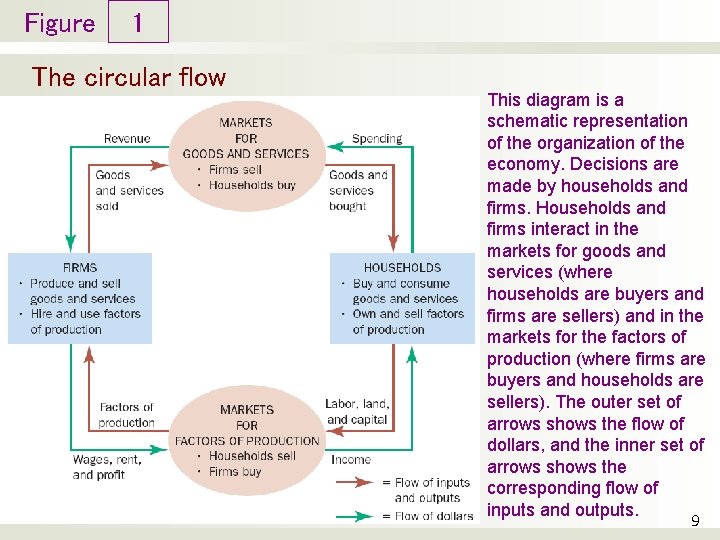
The Economist as a Scientist Our first model: The circular-flow diagram • Circular-flow diagram – Visual model of the economy – Shows how dollars flow through markets among households and firms • Decision makers • Firms & Households • Markets • For gods and services • For factors of production 6

The Economist as a Scientist Our first model: The circular-flow diagram • Firms – Produce goods and services – Use factors of production / inputs • Households – Own factors of production – Consume goods and services 7

The Economist as a Scientist Our first model: The circular-flow diagram • Markets for goods and services – Firms – sellers – Households – buyers • Markets for inputs – Firms – buyers – Households - sellers 8

Figure 1 The circular flow This diagram is a schematic representation of the organization of the economy. Decisions are made by households and firms. Households and firms interact in the markets for goods and services (where households are buyers and firms are sellers) and in the markets for the factors of production (where firms are buyers and households are sellers). The outer set of arrows shows the flow of dollars, and the inner set of arrows shows the corresponding flow of inputs and outputs. 9

The Economist as a Scientist Our second model: The production possibilities frontier • Production possibilities frontier – A graph – Combinations of output that the economy can possibly produce – Given the available • Factors of production • Production technology 10

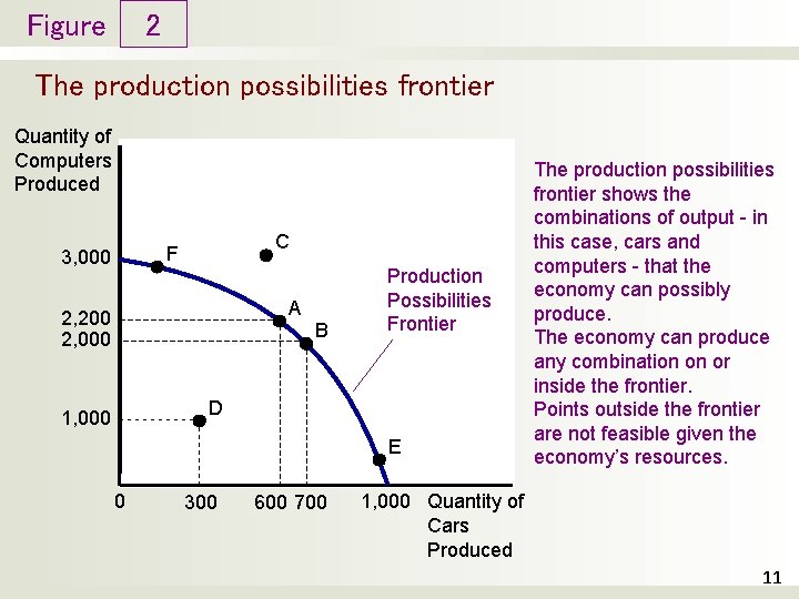
Figure 2 The production possibilities frontier Quantity of Computers Produced C F 3, 000 A 2, 200 2, 000 B Production Possibilities Frontier D 1, 000 E 0 300 600 700 The production possibilities frontier shows the combinations of output - in this case, cars and computers - that the economy can possibly produce. The economy can produce any combination on or inside the frontier. Points outside the frontier are not feasible given the economy’s resources. 1, 000 Quantity of Cars Produced 11

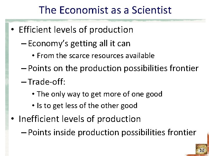
The Economist as a Scientist • Efficient levels of production – Economy’s getting all it can • From the scarce resources available – Points on the production possibilities frontier – Trade-off: • The only way to get more of one good • Is to get less of the other good • Inefficient levels of production – Points inside production possibilities frontier 12

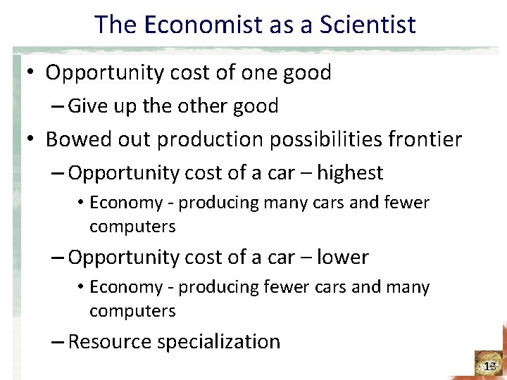
The Economist as a Scientist • Opportunity cost of one good – Give up the other good • Bowed out production possibilities frontier – Opportunity cost of a car – highest • Economy - producing many cars and fewer computers – Opportunity cost of a car – lower • Economy - producing fewer cars and many computers – Resource specialization 13

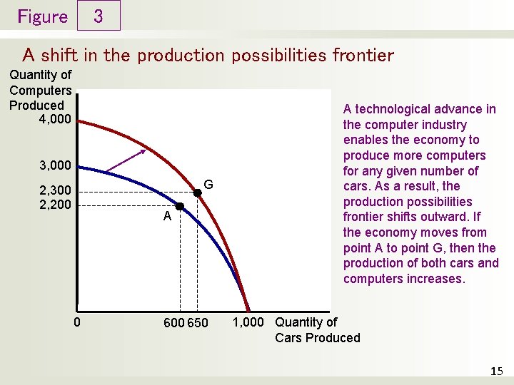
The Economist as a Scientist • Technological advance – Outward shift of the production possibilities frontier – Economic growth – Produce more of both goods 14

Figure 3 A shift in the production possibilities frontier Quantity of Computers Produced 4, 000 3, 000 G 2, 300 2, 200 A 0 600 650 A technological advance in the computer industry enables the economy to produce more computers for any given number of cars. As a result, the production possibilities frontier shifts outward. If the economy moves from point A to point G, then the production of both cars and computers increases. 1, 000 Quantity of Cars Produced 15

The Economist as a Scientist Microeconomics and Macroeconomics • Microeconomics – The study of how households and firms make decisions – And how they interact in markets • Macroeconomics – The study of economy-wide phenomena, including inflation, unemployment, and economic growth 16

The Economist as a Policy Adviser Positive vs. Normative analysis • Positive statements – Attempt to describe the world as it is – Descriptive – Confirm or refute by examining evidence • Normative statements – Attempt to prescribe how the world should be – Prescriptive 17

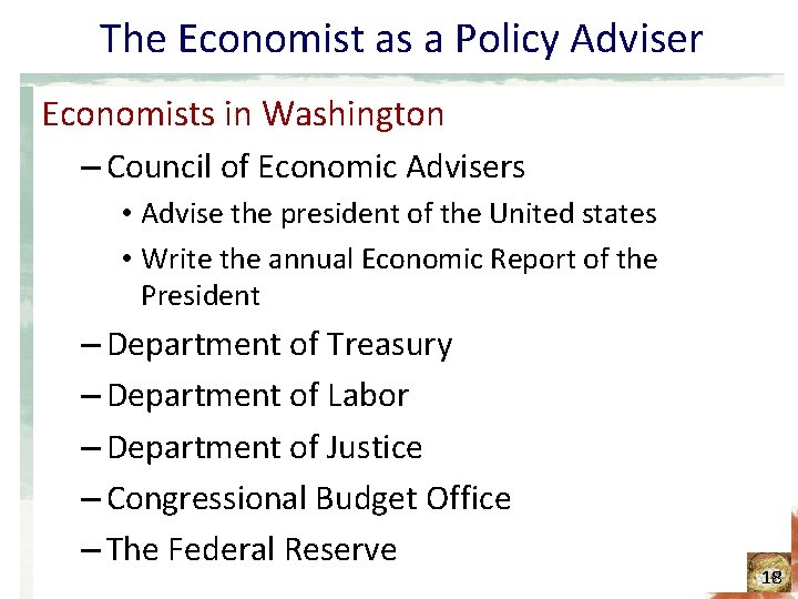
The Economist as a Policy Adviser Economists in Washington – Council of Economic Advisers • Advise the president of the United states • Write the annual Economic Report of the President – Department of Treasury – Department of Labor – Department of Justice – Congressional Budget Office – The Federal Reserve 18

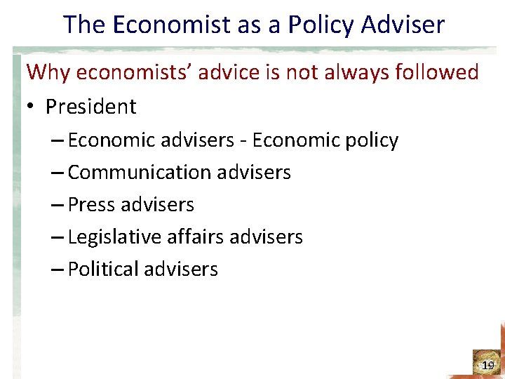
The Economist as a Policy Adviser Why economists’ advice is not always followed • President – Economic advisers - Economic policy – Communication advisers – Press advisers – Legislative affairs advisers – Political advisers 19

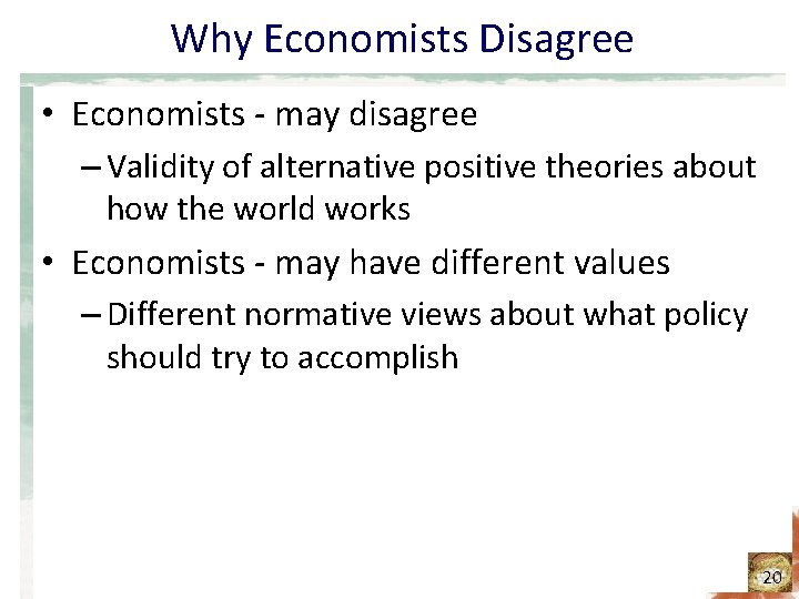
Why Economists Disagree • Economists - may disagree – Validity of alternative positive theories about how the world works • Economists - may have different values – Different normative views about what policy should try to accomplish 20

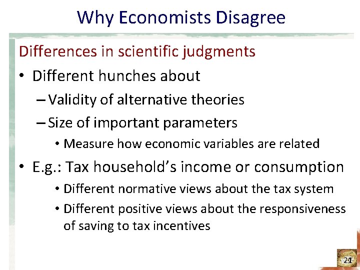
Why Economists Disagree Differences in scientific judgments • Different hunches about – Validity of alternative theories – Size of important parameters • Measure how economic variables are related • E. g. : Tax household’s income or consumption • Different normative views about the tax system • Different positive views about the responsiveness of saving to tax incentives 21

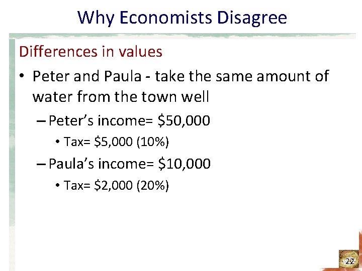
Why Economists Disagree Differences in values • Peter and Paula - take the same amount of water from the town well – Peter’s income= $50, 000 • Tax= $5, 000 (10%) – Paula’s income= $10, 000 • Tax= $2, 000 (20%) 22

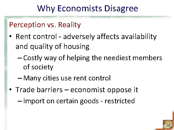
Why Economists Disagree Perception vs. Reality • Rent control - adversely affects availability and quality of housing – Costly way of helping the neediest members of society – Many cities use rent control • Trade barriers – economist oppose it – Import on certain goods - restricted 23

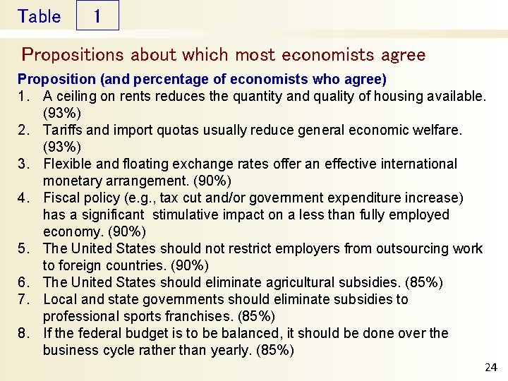
Table 1 Propositions about which most economists agree Proposition (and percentage of economists who agree) 1. A ceiling on rents reduces the quantity and quality of housing available. (93%) 2. Tariffs and import quotas usually reduce general economic welfare. (93%) 3. Flexible and floating exchange rates offer an effective international monetary arrangement. (90%) 4. Fiscal policy (e. g. , tax cut and/or government expenditure increase) has a significant stimulative impact on a less than fully employed economy. (90%) 5. The United States should not restrict employers from outsourcing work to foreign countries. (90%) 6. The United States should eliminate agricultural subsidies. (85%) 7. Local and state governments should eliminate subsidies to professional sports franchises. (85%) 8. If the federal budget is to be balanced, it should be done over the business cycle rather than yearly. (85%) 24

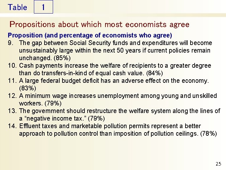
Table 1 Propositions about which most economists agree Proposition (and percentage of economists who agree) 9. The gap between Social Security funds and expenditures will become unsustainably large within the next 50 years if current policies remain unchanged. (85%) 10. Cash payments increase the welfare of recipients to a greater degree than do transfers-in-kind of equal cash value. (84%) 11. A large federal budget deficit has an adverse effect on the economy. (83%) 12. A minimum wage increases unemployment among young and unskilled workers. (79%) 13. The government should restructure the welfare system along the lines of a “negative income tax. ” (79%) 14. Effluent taxes and marketable pollution permits represent a better approach to pollution control than imposition of pollution ceilings. (78%) 25

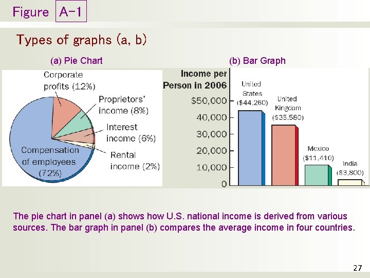
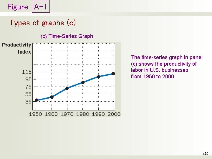
APPENDIX Graphing: a brief review • Graphs’ purposes: – Visually express ideas that might be less clear if described with equations or words – Powerful way of finding and interpreting patterns • Graphs of a single variable – Pie chart – Bar graph – Time-series graph 26

Figure A-1 Types of graphs (a, b) (a) Pie Chart (b) Bar Graph The pie chart in panel (a) shows how U. S. national income is derived from various sources. The bar graph in panel (b) compares the average income in four countries. 27

Figure A-1 Types of graphs (c) Time-Series Graph The time-series graph in panel (c) shows the productivity of labor in U. S. businesses from 1950 to 2000. 28

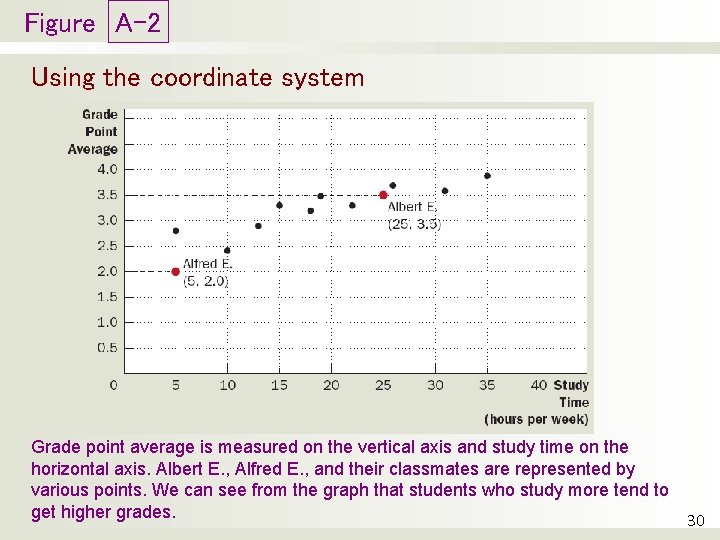
APPENDIX Graphing: a brief review • Graphs of two variables: the coordinate system – Display two variables on a single graph – Scatterplot – Ordered pairs of points • x-coordinate – Horizontal location • y-coordinate – Vertical location 29

Figure A-2 Using the coordinate system Grade point average is measured on the vertical axis and study time on the horizontal axis. Albert E. , Alfred E. , and their classmates are represented by various points. We can see from the graph that students who study more tend to get higher grades. 30

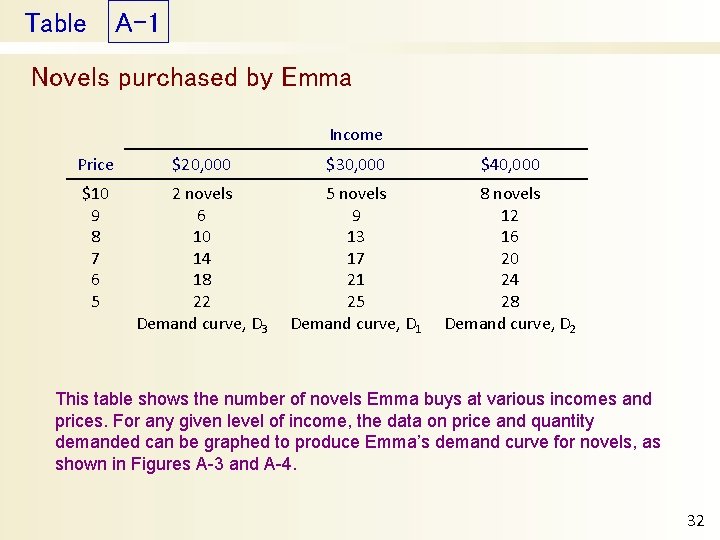
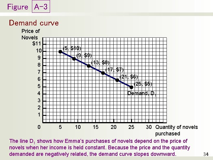
APPENDIX Graphing: a brief review • Curves in the coordinate system • Data – Number of novels – Price of novels – Income • Demand curve – Effect of a good’s price – On the quantity of the good consumers want to buy – For a given income 31

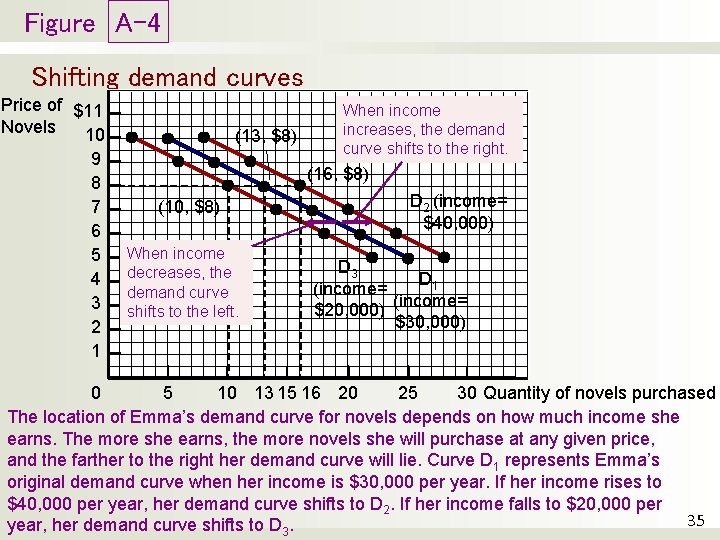
Table A-1 Novels purchased by Emma Income Price $20, 000 $30, 000 $40, 000 $10 9 8 7 6 5 2 novels 6 10 14 18 22 Demand curve, D 3 5 novels 9 13 17 21 25 Demand curve, D 1 8 novels 12 16 20 24 28 Demand curve, D 2 This table shows the number of novels Emma buys at various incomes and prices. For any given level of income, the data on price and quantity demanded can be graphed to produce Emma’s demand curve for novels, as shown in Figures A-3 and A-4. 32

APPENDIX Graphing: a brief review • Curves in the coordinate system • Negatively related variables – The two variables move in opposite direction – Downward sloping curve • Positively related variables – The two variables move in the same direction – Upward sloping curve • Movement along a curve • Shifts in a curve 33

Figure A-3 Demand curve Price of Novels $11 10 9 8 7 6 5 4 3 2 1 (5, $10) (9, $9) (13, $8) (17, $7) (21, $6) (25, $5) Demand, D 1 30 Quantity of novels purchased The line D 1 shows how Emma’s purchases of novels depend on the price of novels when her income is held constant. Because the price and the quantity demanded are negatively related, the demand curve slopes downward. 34 0 5 10 15 20 25

Figure A-4 Shifting demand curves Price of $11 Novels 10 9 8 7 6 5 4 3 2 1 (13, $8) When income increases, the demand curve shifts to the right. (16, $8) (10, $8) When income decreases, the demand curve shifts to the left. D 2 (income= $40, 000) D 3 D 1 (income= $20, 000) $30, 000) 5 10 13 15 16 20 25 30 Quantity of novels purchased 0 The location of Emma’s demand curve for novels depends on how much income she earns. The more she earns, the more novels she will purchase at any given price, and the farther to the right her demand curve will lie. Curve D 1 represents Emma’s original demand curve when her income is $30, 000 per year. If her income rises to $40, 000 per year, her demand curve shifts to D 2. If her income falls to $20, 000 per 35 year, her demand curve shifts to D 3.

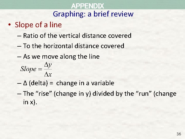
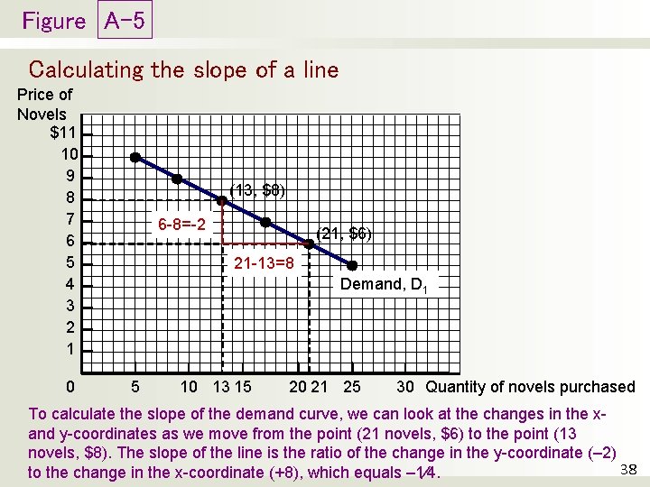
APPENDIX Graphing: a brief review • Slope of a line – Ratio of the vertical distance covered – To the horizontal distance covered – As we move along the line – Δ (delta) = change in a variable – The “rise” (change in y) divided by the “run” (change in x). 36

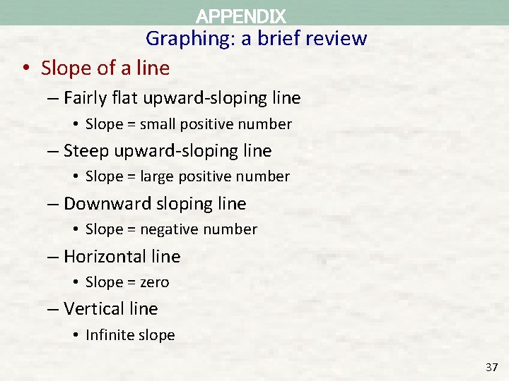
APPENDIX Graphing: a brief review • Slope of a line – Fairly flat upward-sloping line • Slope = small positive number – Steep upward-sloping line • Slope = large positive number – Downward sloping line • Slope = negative number – Horizontal line • Slope = zero – Vertical line • Infinite slope 37

Figure A-5 Calculating the slope of a line Price of Novels $11 10 9 8 7 6 5 4 3 2 1 0 (13, $8) 6 -8=-2 (21, $6) 21 -13=8 Demand, D 1 5 10 13 15 20 21 25 30 Quantity of novels purchased To calculate the slope of the demand curve, we can look at the changes in the xand y-coordinates as we move from the point (21 novels, $6) to the point (13 novels, $8). The slope of the line is the ratio of the change in the y-coordinate (– 2) 38 to the change in the x-coordinate (+8), which equals – 1⁄4.

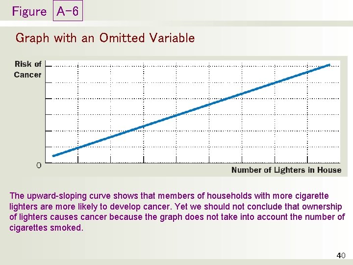
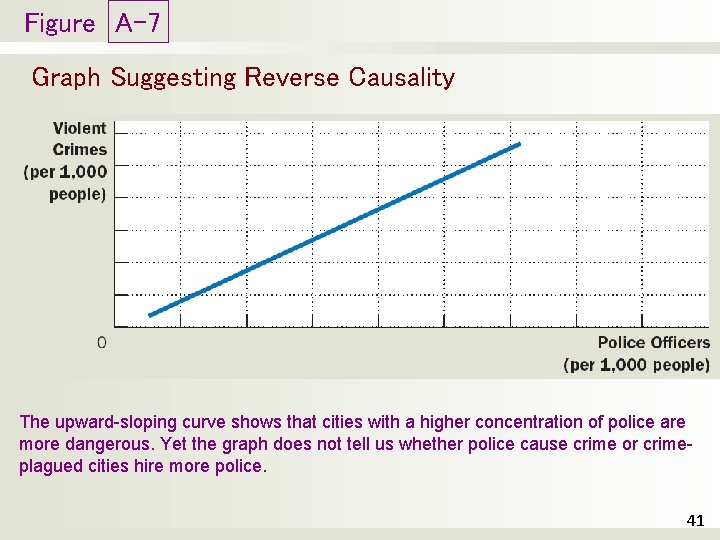
APPENDIX Graphing: a brief review • Cause and effect – One set of events • Causes another set of events – Omitted variables • Lead to a deceptive graph – Reverse causality • Decide that event A causes event B • Facts: event B causes event A 39

Figure A-6 Graph with an Omitted Variable The upward-sloping curve shows that members of households with more cigarette lighters are more likely to develop cancer. Yet we should not conclude that ownership of lighters causes cancer because the graph does not take into account the number of cigarettes smoked. 40

Figure A-7 Graph Suggesting Reverse Causality The upward-sloping curve shows that cities with a higher concentration of police are more dangerous. Yet the graph does not tell us whether police cause crime or crimeplagued cities hire more police. 41