Chapter 2 Graphical Display of Data Part I


- Slides: 107

Chapter 2 Graphical Display of Data Part I Overview: 2. 1 Categorical 2. 2 Continuous 2. 2. 1 Histograms 2. 2. 2 Stem-&-Leaf Plots 2. 2. 3 Boxplots 2. 2. 4 Dotplots 2. 2. 5 Error bar charts 2. 2. 6 Error bar charts with lines 2. 2. 7 Pie-charts 1

Graphical Display of Data Part 2 Overview: 2. 2. 8 Simple Scatterplot 2. 2. 8. 1 Labeling points 2. 2. 8. 2 Identifying different groups for scatterplot 2. 2. 8. 3 Representing Multiple Points 2. 2. 9 Scatterplot Matrix 2. 2. 9. 1 Addling lines into scatter plots 2. 2. 9. 2 Overlay plot with Loess Smoothers 2. 2. 10 Three-dimensional Scatterplot 2

Graphs are pictorial representations of numerical data: “A picture is worth a thousand t-tests. ” Graphical displays should: • Easily convey characteristics of the data. • Present many numbers in a small space. • Make large datasets coherent. • Encourage the eye to compare different sections of data. • Be closely integrated with the statistical and verbal descriptions of the dataset. • Be clearly labeled for easy understanding. 3

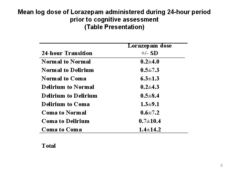
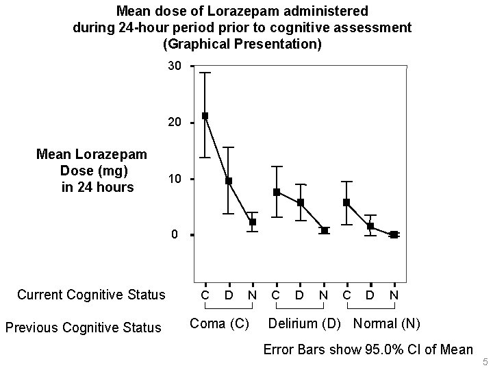
Mean log dose of Lorazepam administered during 24 -hour period prior to cognitive assessment (Table Presentation) 24 -hour Transition Normal to Delirium Normal to Coma Delirium to Normal Delirium to Coma to Normal Coma to Delirium Coma to Coma Lorazepam dose +/- SD 0. 2± 4. 0 0. 5± 7. 3 6. 3± 1. 3 0. 2± 4. 3 0. 5± 8. 4 1. 3± 9. 1 0. 6± 7. 2 0. 7± 10. 4 1. 4± 14. 2 Total 4

Mean dose of Lorazepam administered during 24 -hour period prior to cognitive assessment (Graphical Presentation) 30 20 Mean Lorazepam Dose (mg) in 24 hours 10 0 Current Cognitive Status Previous Cognitive Status C D N Coma (C) C D N Delirium (D) Normal (N) Error Bars show 95. 0% Cl of Mean 5

Data to be used in this lecture: Randomized Controlled Clinical Trial. A randomized controlled trial of 217 patients with type 2 diabetes and poor glycemic control (A 1 C 8. 0%) was conducted at an academic general medicine practice. The intervention group received intensive management from clinical pharmacists and a diabetes care coordinator who: provided diabetes education; applied algorithms for treating glucose and decreasing cardiovascular risk, and addressed barriers to care. Control patients received a one-time management session from pharmacists followed by usual care from their primary care provider. Outcomes were collected at baseline, 6, and 12 months. Primary outcomes were improvements in blood pressure, A 1 C and aspirin use. Diab. RCT. sav consists data from this study. Assess if there is a change in Hb. A 1 c level between baseline and 12 months. Rothman RL et al, A Randomized Trial of Disease Management to Improve Cardiovascular Risk and A 1 C in Patients with Diabetes The American Journal of Medicine 2005; 118(3): 276 -284. Rothman RL et. al. , The Influence of Patient Literacy on the Effectiveness of a Primary-Care Based Diabetes Disease Management Program, JAMA 2004. 13; 292 (14): 1711 -1716. 6

Technical Note; Editing graphs SPSS has two graphics options: • Interactive option • Non-interactive option In SPSS v 13, graphs created by interactive option can be edited in other software such as Power Point, graphs created by noninteractive mode cannot be edited in other software. SPSS has chart editor further edit of data. Double click on figures to open SPSS chart editor. To edit in Power Point, click on figures, copy, and open Power Point, then paste into Power Point. Right click on mouse, ungroup the figure twice. 7

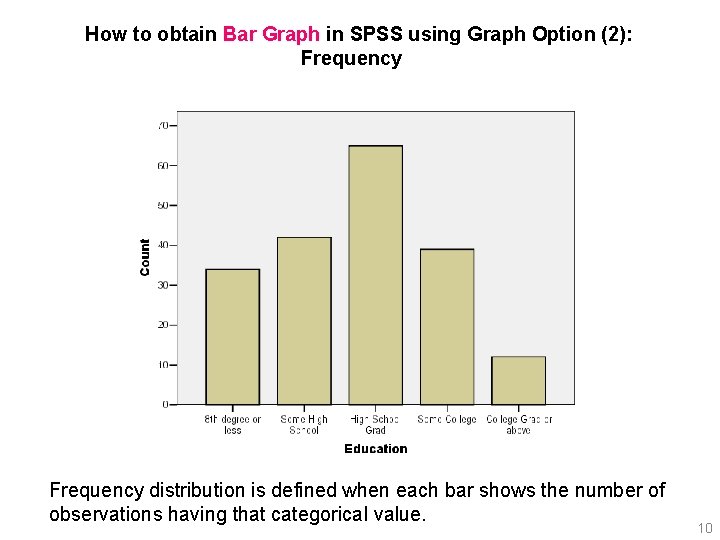
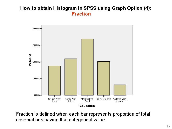
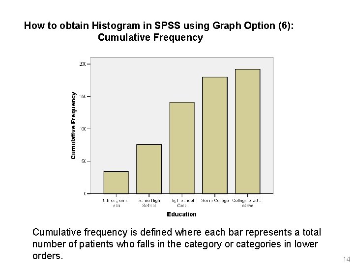
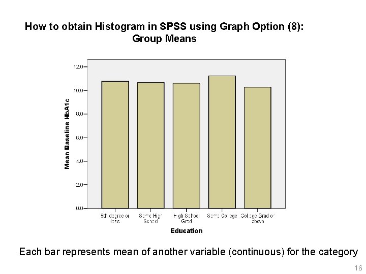
2. 1 Graphical Display of Categorical Data In medical papers, categorical data are very rarely graphically displayed. However, for posters, such graphical displays are typically more eye-catching than a table. Bar graph (bar diagram, bar chart) • The x-axis denotes each value of the categorical variable. • A vertical bar is drawn for each category. The bar can denote: • Frequency (number of observations having that categorical value). • Fraction (proportion of total observations having that categorical value). • Cumulative Frequency (each bar represents a total number of patients who falls in the category or categories in lower orders. ) • Mean (or other summary measures) of other variable for the category 8

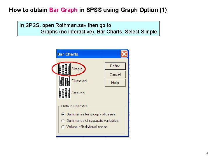
How to obtain Bar Graph in SPSS using Graph Option (1) In SPSS, open Rothman. sav then go to Graphs (no interactive), Bar Charts, Select Simple 9

How to obtain Bar Graph in SPSS using Graph Option (2): Frequency distribution is defined when each bar shows the number of observations having that categorical value. 10

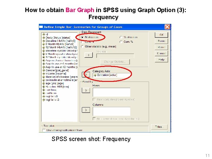
How to obtain Bar Graph in SPSS using Graph Option (3): Frequency SPSS screen shot: Frequency 11

How to obtain Histogram in SPSS using Graph Option (4): Fraction is defined when each bar represents proportion of total observations having that categorical value. 12

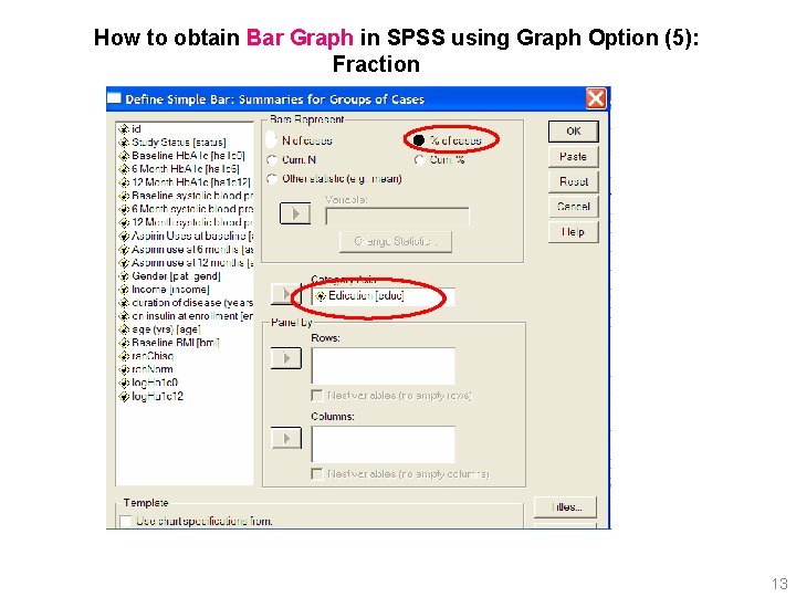
How to obtain Bar Graph in SPSS using Graph Option (5): Fraction 13

How to obtain Histogram in SPSS using Graph Option (6): Cumulative Frequency Cumulative frequency is defined where each bar represents a total number of patients who falls in the category or categories in lower orders. 14

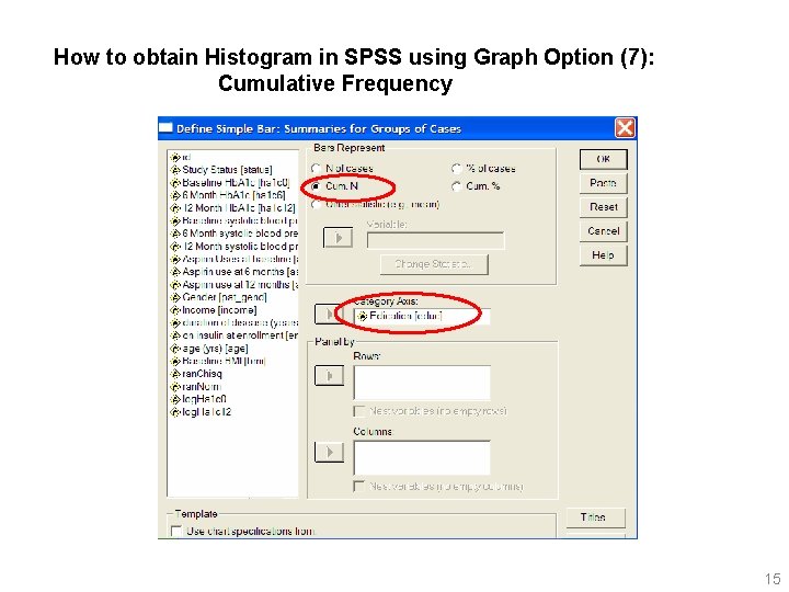
How to obtain Histogram in SPSS using Graph Option (7): Cumulative Frequency 15

How to obtain Histogram in SPSS using Graph Option (8): Group Means Each bar represents mean of another variable (continuous) for the category 16

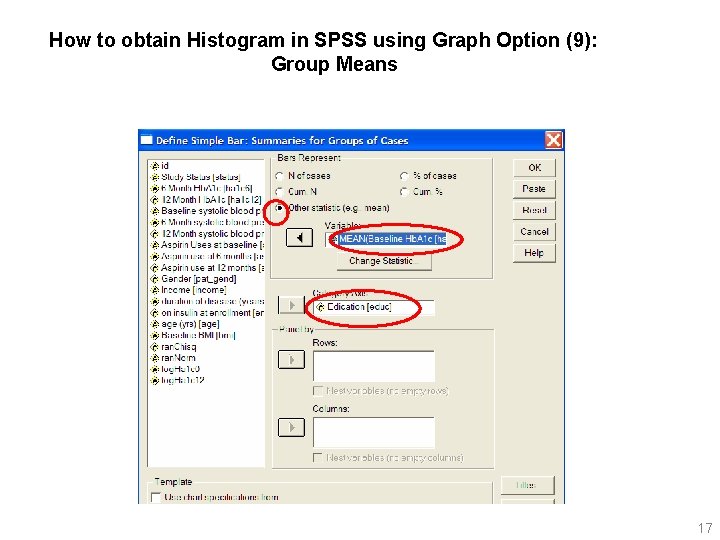
How to obtain Histogram in SPSS using Graph Option (9): Group Means 17

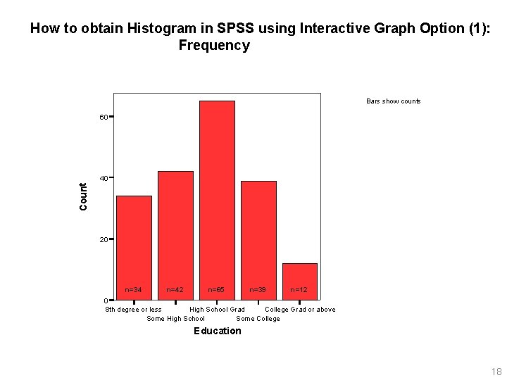
How to obtain Histogram in SPSS using Interactive Graph Option (1): Frequency Bars show counts 60 Count 40 20 n=34 n=42 n=65 n=39 n=12 0 8 th degree or less High School Grad College Grad or above Some High School Some College Education 18

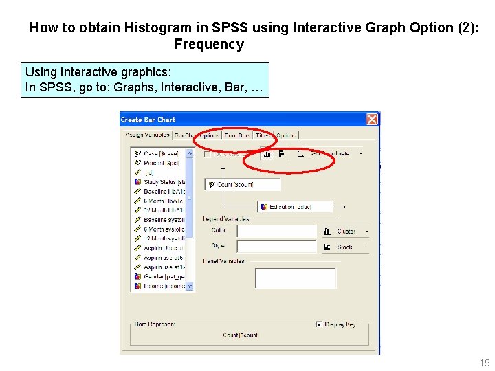
How to obtain Histogram in SPSS using Interactive Graph Option (2): Frequency Using Interactive graphics: In SPSS, go to: Graphs, Interactive, Bar, … 19

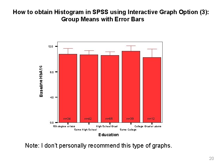
How to obtain Histogram in SPSS using Interactive Graph Option (3): Group Means with Error Bars Baseline Hb. A 1 c 12. 0 8. 0 4. 0 n=34 n=42 n=65 n=39 n=12 0. 0 8 th degree or less High School Grad College Grad or above Some High School Some College Education Note: I don’t personally recommend this type of graphs. 20

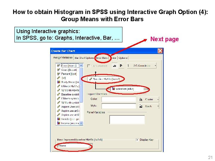
How to obtain Histogram in SPSS using Interactive Graph Option (4): Group Means with Error Bars Using Interactive graphics: In SPSS, go to: Graphs, Interactive, Bar, … Next page 21

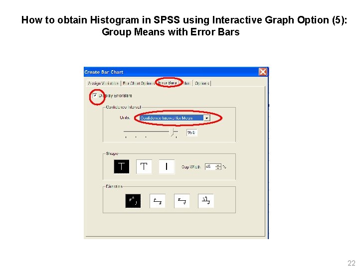
How to obtain Histogram in SPSS using Interactive Graph Option (5): Group Means with Error Bars 22

2. 2 Graphical Displays of Continuous Data 2. 2. 1 Histograms Displays frequency distribution for continuous data. However, in contrast to categorical data, continuous data need to be grouped, and the # of groups must be chosen, which is subjective. 23

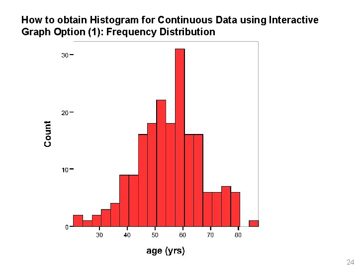
How to obtain Histogram for Continuous Data using Interactive Graph Option (1): Frequency Distribution 24

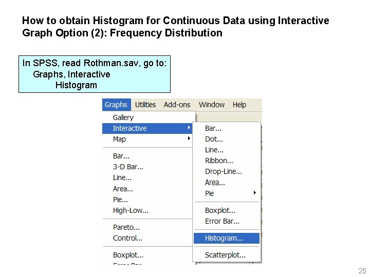
How to obtain Histogram for Continuous Data using Interactive Graph Option (2): Frequency Distribution In SPSS, read Rothman. sav, go to: Graphs, Interactive Histogram 25

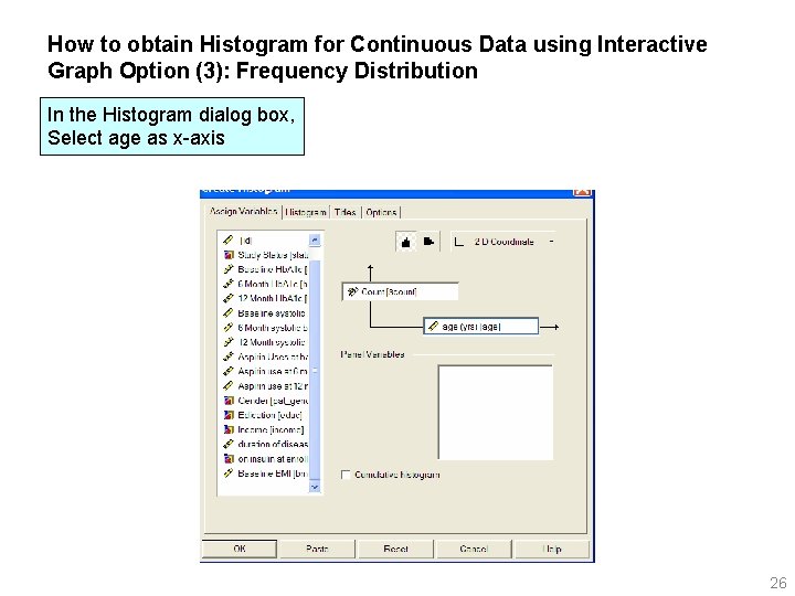
How to obtain Histogram for Continuous Data using Interactive Graph Option (3): Frequency Distribution In the Histogram dialog box, Select age as x-axis 26

What should I look for in a histogram? 1. Look for cases with values very different from the rest. 2. Look whether distribution is symmetric (normality). 3. Look for separate clusters of data values. For example, you may see a two clusters, i. e. , peaks. One peak may be from male patients, and the other may from female. In such situation, you may want to analyze the data separately for males and females. 27

Editing Histogram (1): Adding normality curve 28

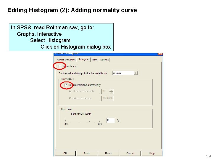
Editing Histogram (2): Adding normality curve In SPSS, read Rothman. sav, go to: Graphs, Interactive Select Histogram Click on Histogram dialog box 29

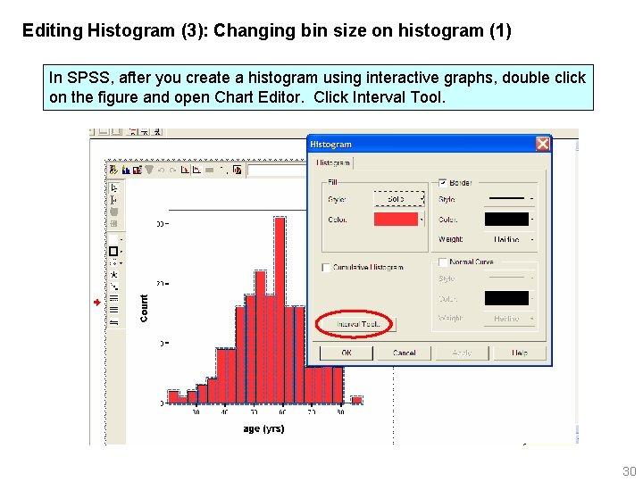
Editing Histogram (3): Changing bin size on histogram (1) In SPSS, after you create a histogram using interactive graphs, double click on the figure and open Chart Editor. Click Interval Tool. 30

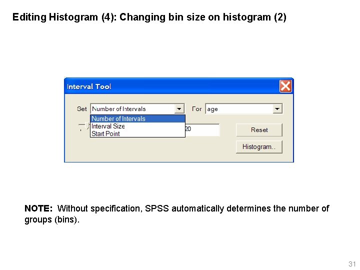
Editing Histogram (4): Changing bin size on histogram (2) NOTE: Without specification, SPSS automatically determines the number of groups (bins). 31

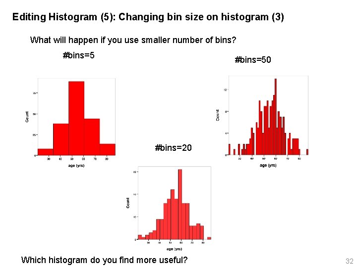
Editing Histogram (5): Changing bin size on histogram (3) What will happen if you use smaller number of bins? #bins=50 #bins=20 Which histogram do you find more useful? 32

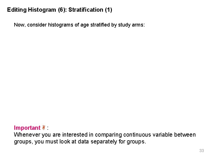
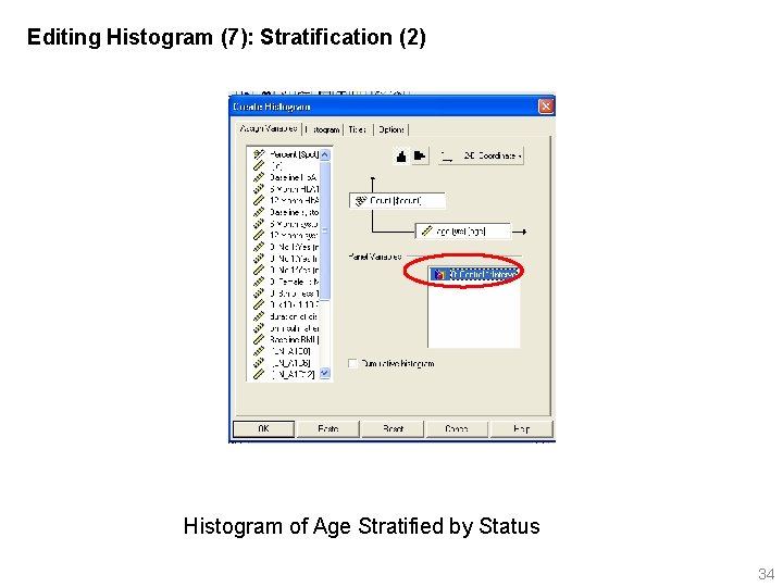
Editing Histogram (6): Stratification (1) Now, consider histograms of age stratified by study arms: Important : Whenever you are interested in comparing continuous variable between groups, you must look at data separately for groups. 33

Editing Histogram (7): Stratification (2) Histogram of Age Stratified by Status 34

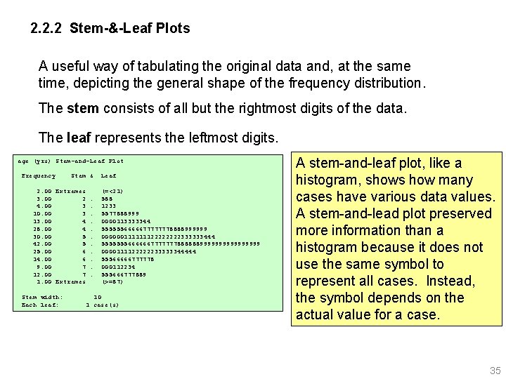
2. 2. 2 Stem-&-Leaf Plots A useful way of tabulating the original data and, at the same time, depicting the general shape of the frequency distribution. The stem consists of all but the rightmost digits of the data. The leaf represents the leftmost digits. age (yrs) Stem-and-Leaf Plot Frequency Stem & 2. 00 Extremes 3. 00 2. 4. 00 3. 10. 00 3. 13. 00 4. 28. 00 4. 30. 00 5. 42. 00 5. 25. 00 6. 14. 00 6. 9. 00 7. 12. 00 7. 1. 00 Extremes Stem width: Each leaf: Leaf (=<21) 588 1233 5577888999 0000113333344 5555556666677777778888999999 00000011111112222333333444 5555555666666777777788888899999999 0000111122222233333344444 55566666777778 000112234 555666777889 (>=87) 10 1 case(s) A stem-and-leaf plot, like a histogram, shows how many cases have various data values. A stem-and-lead plot preserved more information than a histogram because it does not use the same symbol to represent all cases. Instead, the symbol depends on the actual value for a case. 35

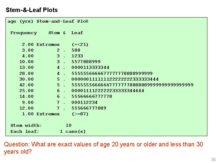
Stem-&-Leaf Plots age (yrs) Stem-and-Leaf Plot Frequency Stem & 2. 00 Extremes 3. 00 2. 4. 00 3. 10. 00 3. 13. 00 4. 28. 00 4. 30. 00 5. 42. 00 5. 25. 00 6. 14. 00 6. 9. 00 7. 12. 00 7. 1. 00 Extremes Stem width: Each leaf: Leaf (=<21) 588 1233 5577888999 0000113333344 5555556666677777778888999999 00000011111112222333333444 5555555666666777777788888899999999 0000111122222233333344444 55566666777778 000112234 555666777889 (>=87) 10 1 case(s) Question: What are exact values of age 20 years or older and less than 30 years old? 36

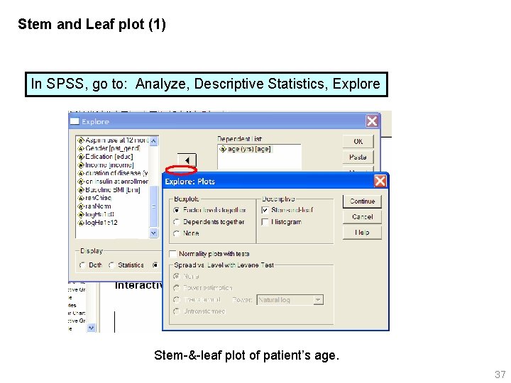
Stem and Leaf plot (1) In SPSS, go to: Analyze, Descriptive Statistics, Explore Stem-&-leaf plot of patient’s age. 37

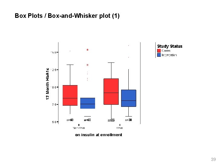
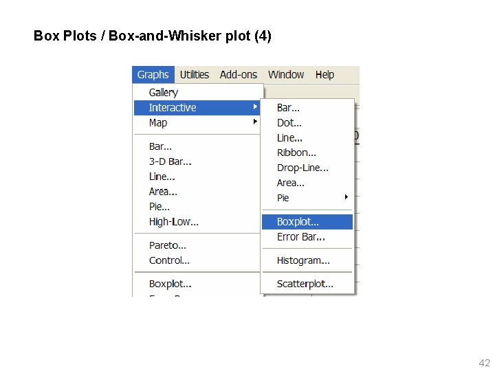
2. 2. 3 Box Plots / Box-and-Whisker plot A graphical summary for continuous data using percentiles (median, IQR) 38

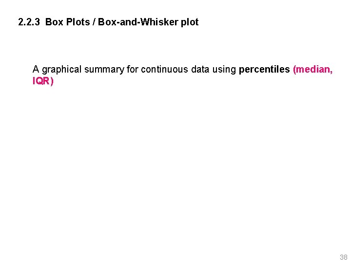
Box Plots / Box-and-Whisker plot (1) 39

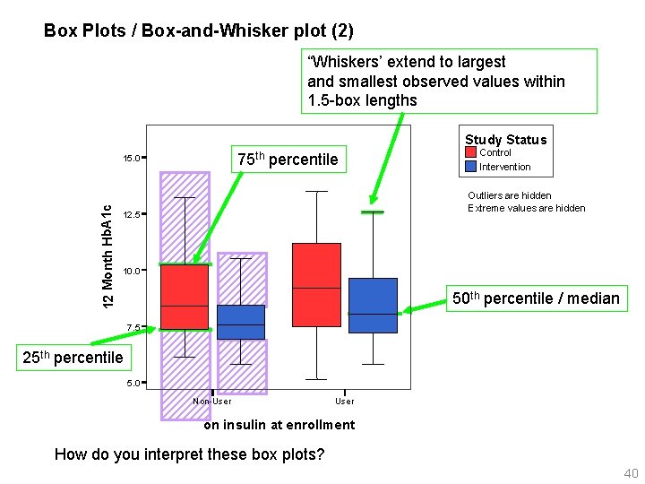
Box Plots / Box-and-Whisker plot (2) “Whiskers’ extend to largest and smallest observed values within 1. 5 -box lengths Study Status 75 th percentile 12 Month Hb. A 1 c 15. 0 Control Intervention Outliers are hidden Extreme values are hidden 12. 5 10. 0 50 th percentile / median 7. 5 25 th percentile 5. 0 Non-User on insulin at enrollment How do you interpret these box plots? 40

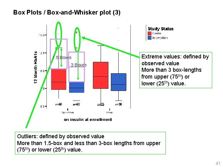
Box Plots / Box-and-Whisker plot (3) 1. 5 Boxes 3 Boxes Extreme values: defined by observed value More than 3 box-lengths from upper (75 th) or lower (25 th) value. Outliers: defined by observed value More than 1. 5 -box and less than 3 -box lengths from upper (75 th) or lower (25 th) value. 41

Box Plots / Box-and-Whisker plot (4) 42

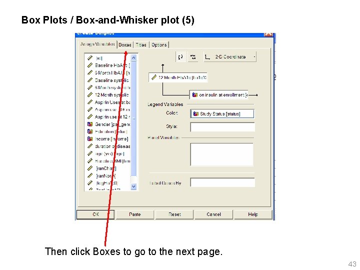
Box Plots / Box-and-Whisker plot (5) Then click Boxes to go to the next page. 43

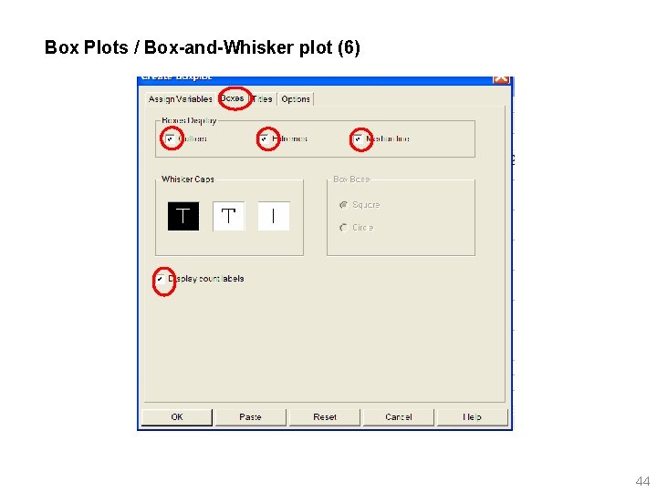
Box Plots / Box-and-Whisker plot (6) 44

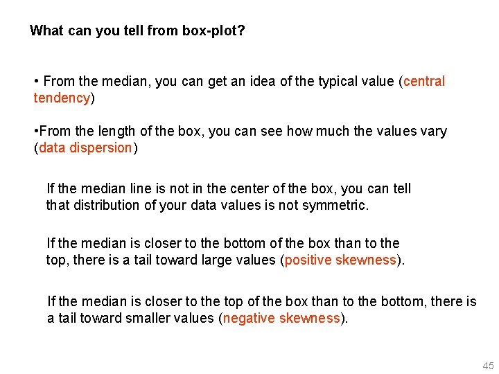
What can you tell from box-plot? • From the median, you can get an idea of the typical value (central tendency) • From the length of the box, you can see how much the values vary (data dispersion) If the median line is not in the center of the box, you can tell that distribution of your data values is not symmetric. If the median is closer to the bottom of the box than to the top, there is a tail toward large values (positive skewness). If the median is closer to the top of the box than to the bottom, there is a tail toward smaller values (negative skewness). 45

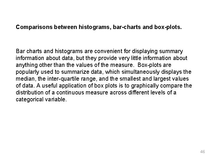
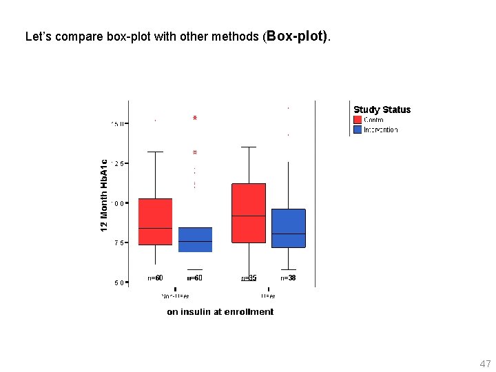
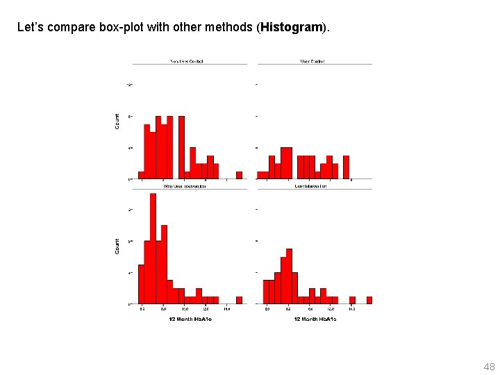
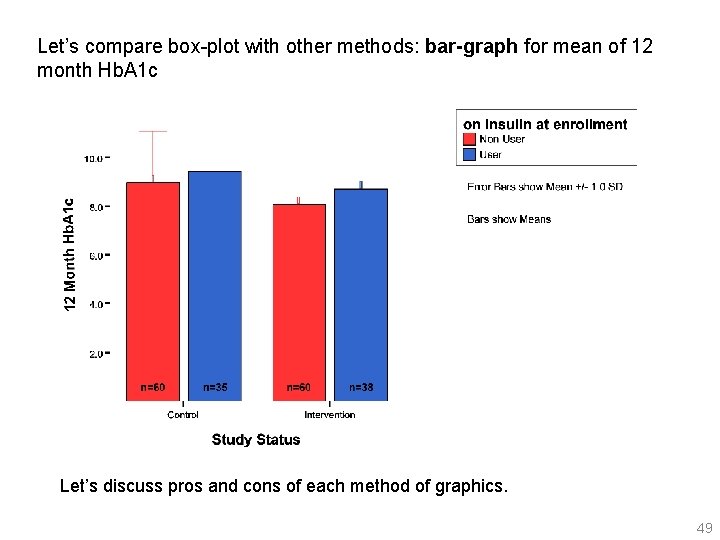
Comparisons between histograms, bar-charts and box-plots. Bar charts and histograms are convenient for displaying summary information about data, but they provide very little information about anything other than the values of the measure. Box-plots are popularly used to summarize data, which simultaneously displays the median, the inter-quartile range, and the smallest and largest values of data. A useful application of box plots is to graphically compare the distribution of a continuous measure across different levels of a categorical variable. 46

Let’s compare box-plot with other methods (Box-plot). 47

Let’s compare box-plot with other methods (Histogram). 48

Let’s compare box-plot with other methods: bar-graph for mean of 12 month Hb. A 1 c Let’s discuss pros and cons of each method of graphics. 49

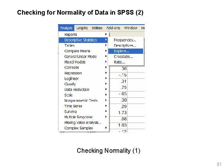
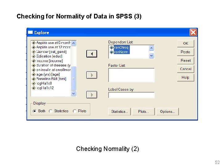
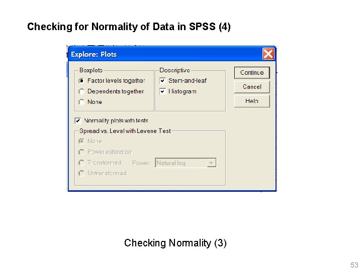
Checking for Normality of Data in SPSS (1) How do we know if data are normally distributed? SPSS has a nice features for testing and visual diagnosis for normality. In SPSS, open Rothman. sav and go to: Analyze, Descriptive Statistics, Explore put ran. Chisq and ran. Norm into dependent list box Click on Plots, In Plots dialog box, select Normality plots with tests 50

Checking for Normality of Data in SPSS (2) Checking Normality (1) 51

Checking for Normality of Data in SPSS (3) Checking Normality (2) 52

Checking for Normality of Data in SPSS (4) Checking Normality (3) 53

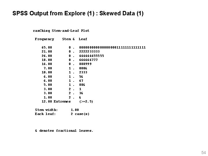
SPSS Output from Explore (1) : Skewed Data (1) ran. Chisq Stem-and-Leaf Plot Frequency Stem & 65. 00 0 21. 00 0 26. 00 0 18. 00 0 14. 00 0 7. 00 1 10. 00 1 4. 00 1 5. 00 1 3. 00 2 12. 00 Extremes Stem width: Each leaf: . . . Leaf 0000000001111111 2222233333 444444455555 666666777 888999 000& 2333 5& 67 88& 1 3& & (>=2. 5) 1. 00 2 case(s) & denotes fractional leaves. 54

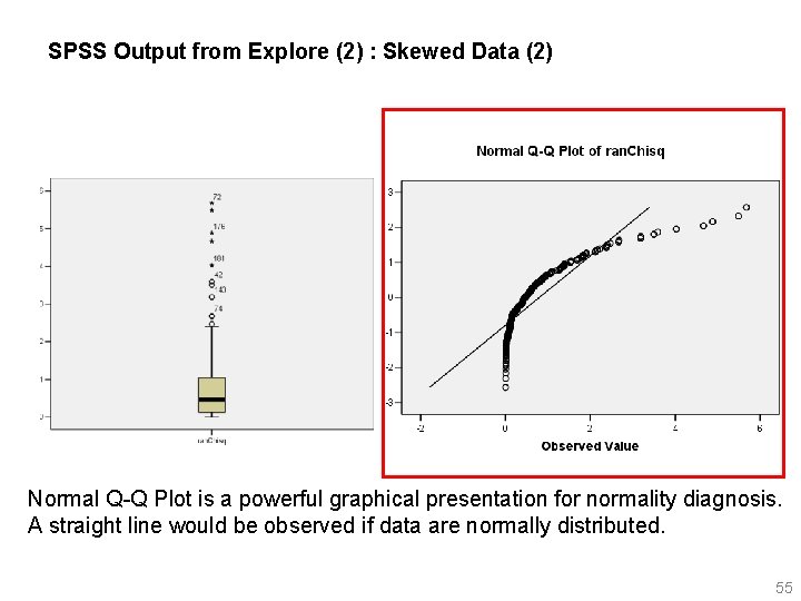
SPSS Output from Explore (2) : Skewed Data (2) Normal Q-Q Plot is a powerful graphical presentation for normality diagnosis. A straight line would be observed if data are normally distributed. 55

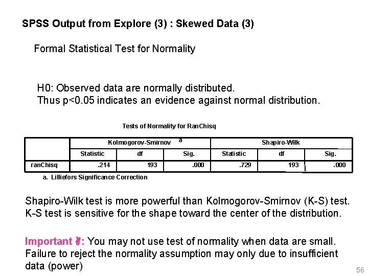
SPSS Output from Explore (3) : Skewed Data (3) Formal Statistical Test for Normality H 0: Observed data are normally distributed. Thus p<0. 05 indicates an evidence against normal distribution. Tests of Normality for Ran. Chisq Kolmogorov-Smirnov Statistic ran. Chisq . 214 df a Shapiro-Wilk Sig. 193 . 000 Statistic. 729 df Sig. 193 . 000 a. Lilliefors Significance Correction Shapiro-Wilk test is more powerful than Kolmogorov-Smirnov (K-S) test. K-S test is sensitive for the shape toward the center of the distribution. Important : You may not use test of normality when data are small. Failure to reject the normality assumption may only due to insufficient data (power) 56

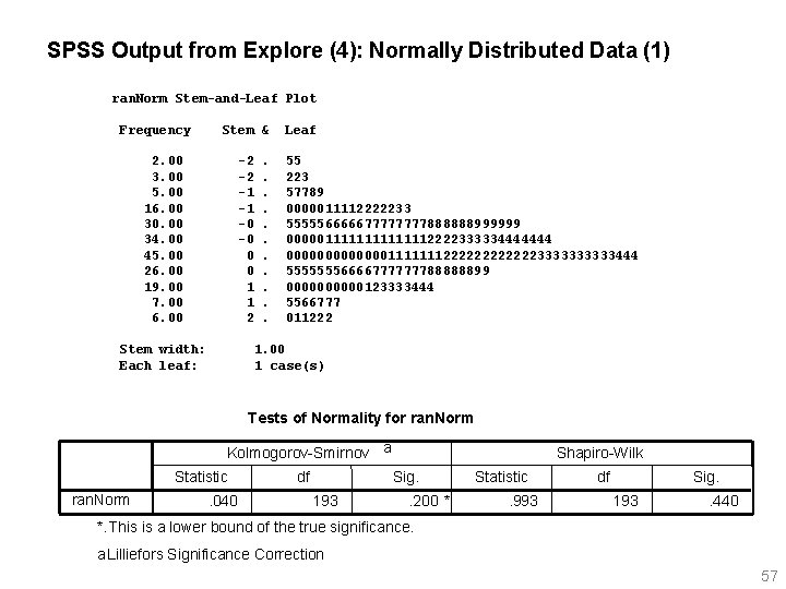
SPSS Output from Explore (4): Normally Distributed Data (1) ran. Norm Stem-and-Leaf Plot Frequency Stem & 2. 00 3. 00 5. 00 16. 00 30. 00 34. 00 45. 00 26. 00 19. 00 7. 00 6. 00 -2 -2 -1 -1 -0 -0 0 0 1 1 2 Stem width: Each leaf: . . . Leaf 55 223 57789 0000011112222233 55555666667777888888999999 0000011111112222333334444444 0000000111111122222233333444 55555556666777777788888899 00000123333444 5566777 011222 1. 00 1 case(s) Tests of Normality for ran. Norm Kolmogorov-Smirnov a Statistic ran. Norm . 040 df Shapiro-Wilk Sig. 193 . 200 * Statistic. 993 df Sig. 193 . 440 *. This is a lower bound of the true significance. a. Lilliefors Significance Correction 57

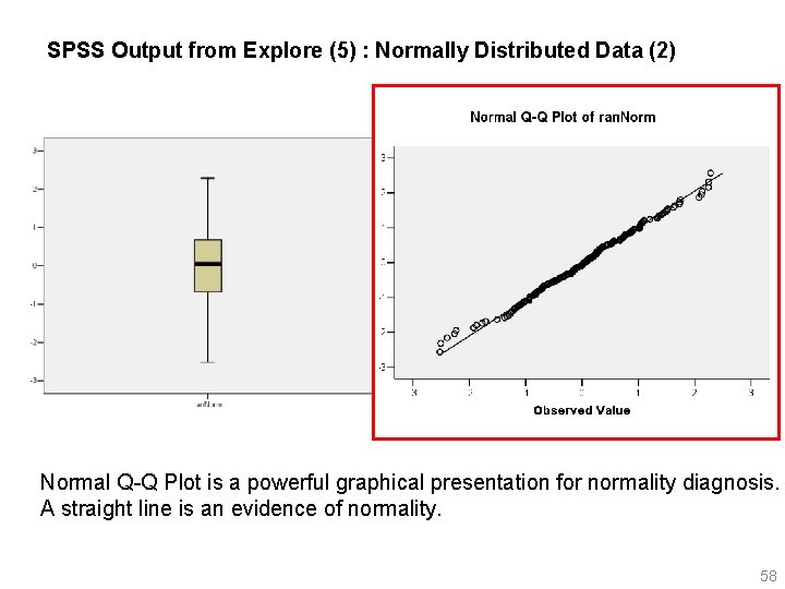
SPSS Output from Explore (5) : Normally Distributed Data (2) Normal Q-Q Plot is a powerful graphical presentation for normality diagnosis. A straight line is an evidence of normality. 58

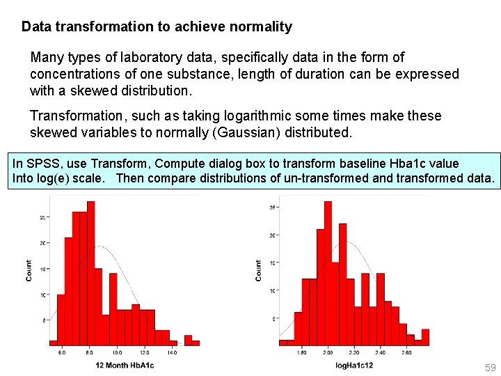
Data transformation to achieve normality Many types of laboratory data, specifically data in the form of concentrations of one substance, length of duration can be expressed with a skewed distribution. Transformation, such as taking logarithmic some times make these skewed variables to normally (Gaussian) distributed. In SPSS, use Transform, Compute dialog box to transform baseline Hba 1 c value Into log(e) scale. Then compare distributions of un-transformed and transformed data. 59

2. 2. 4 Dotplots Similar to a stem-&-leaf plot (or a histogram displayed vertically), but data expressed using dots. Similar to box plots, dotplots are useful for comparing distributions of a continuous measure across different levels of a categorical variable. 60

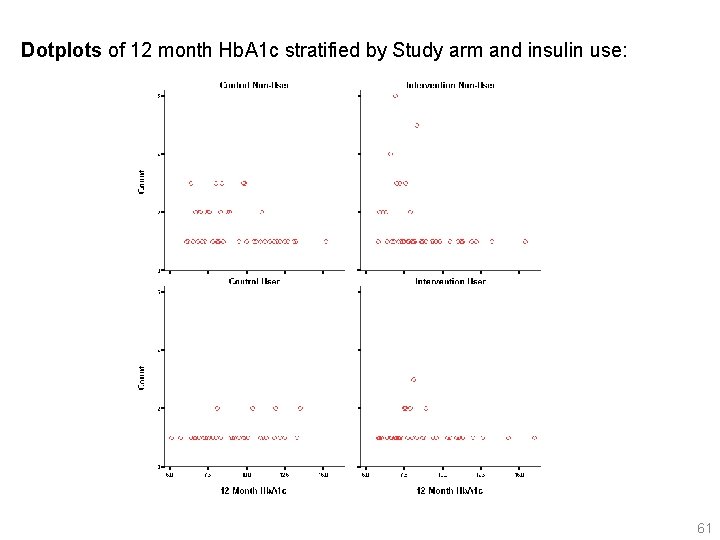
Dotplots of 12 month Hb. A 1 c stratified by Study arm and insulin use: 61

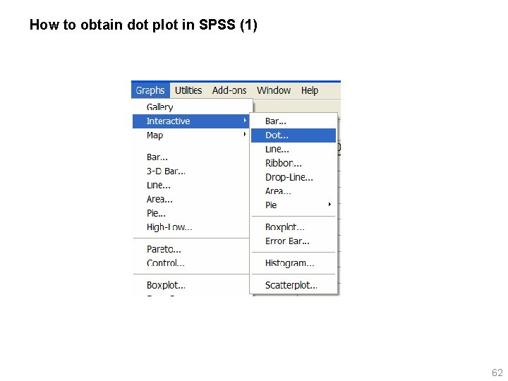
How to obtain dot plot in SPSS (1) 62

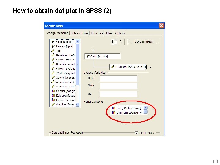
How to obtain dot plot in SPSS (2) 63

2. 2. 5. Error Bar Chart 64

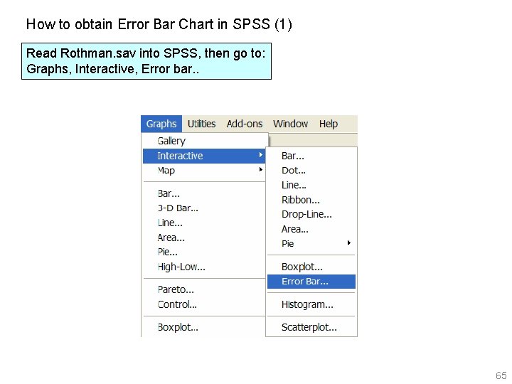
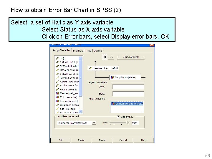
How to obtain Error Bar Chart in SPSS (1) Read Rothman. sav into SPSS, then go to: Graphs, Interactive, Error bar. . 65

How to obtain Error Bar Chart in SPSS (2) Select a set of Ha 1 c as Y-axis variable Select Status as X-axis variable Click on Error bars, select Display error bars, OK 66

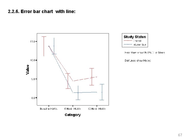
2. 2. 6. Error bar chart with line: 67

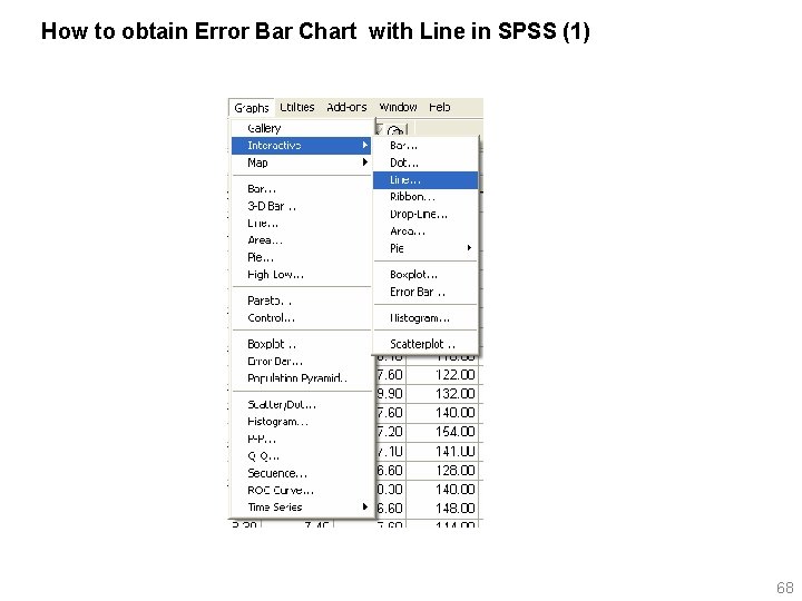
How to obtain Error Bar Chart with Line in SPSS (1) 68

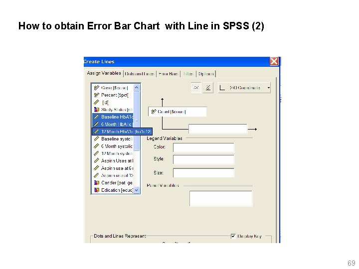
How to obtain Error Bar Chart with Line in SPSS (2) 69

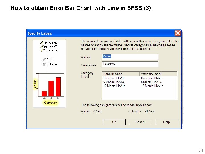
How to obtain Error Bar Chart with Line in SPSS (3) 70

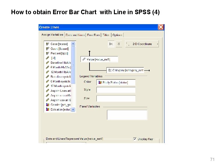
How to obtain Error Bar Chart with Line in SPSS (4) 71

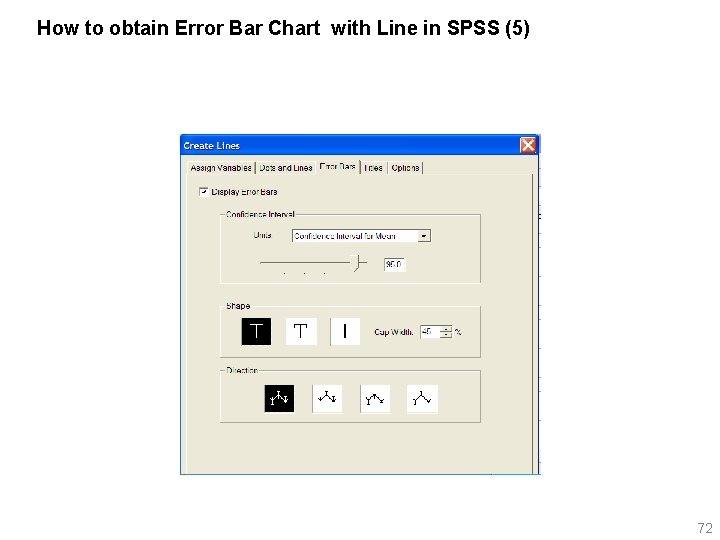
How to obtain Error Bar Chart with Line in SPSS (5) 72

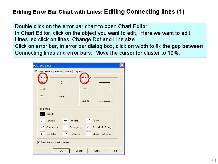
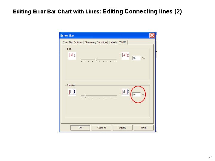
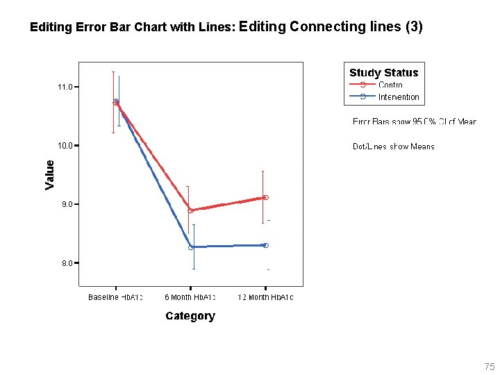
Editing Error Bar Chart with Lines: Editing Connecting lines (1) Double click on the error bar chart to open Chart Editor. In Chart Editor, click on the object you want to edit, Here we want to edit Lines, so click on lines. Change Dot and Line size. Click on error bar, in error bar dialog box, click on width to fix the gap between Connecting lines and error bars. Move the cursor for cluster to 10%. 73

Editing Error Bar Chart with Lines: Editing Connecting lines (2) 74

Editing Error Bar Chart with Lines: Editing Connecting lines (3) 75

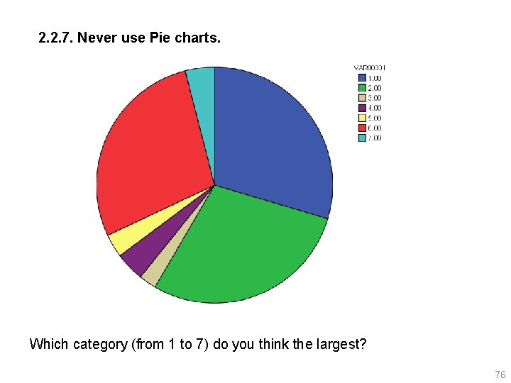
2. 2. 7. Never use Pie charts. Which category (from 1 to 7) do you think the largest? 76

Redoing the previous page graph pie chart using bar-charts and line chart. In SPSS, go to: Graphs, Interactive, Bar, 77

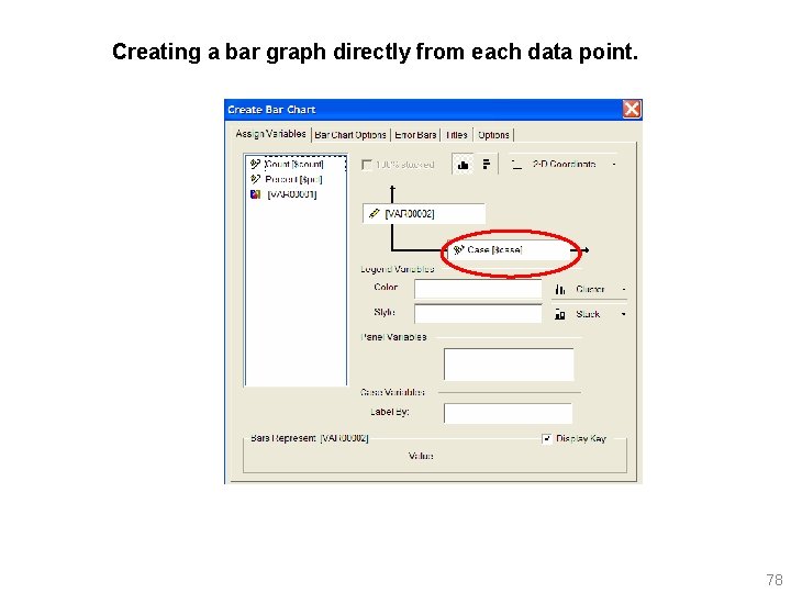
Creating a bar graph directly from each data point. 78

Redoing the previous page graph pie chart using line chart. 79

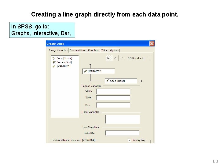
Creating a line graph directly from each data point. In SPSS, go to: Graphs, Interactive, Bar, 80

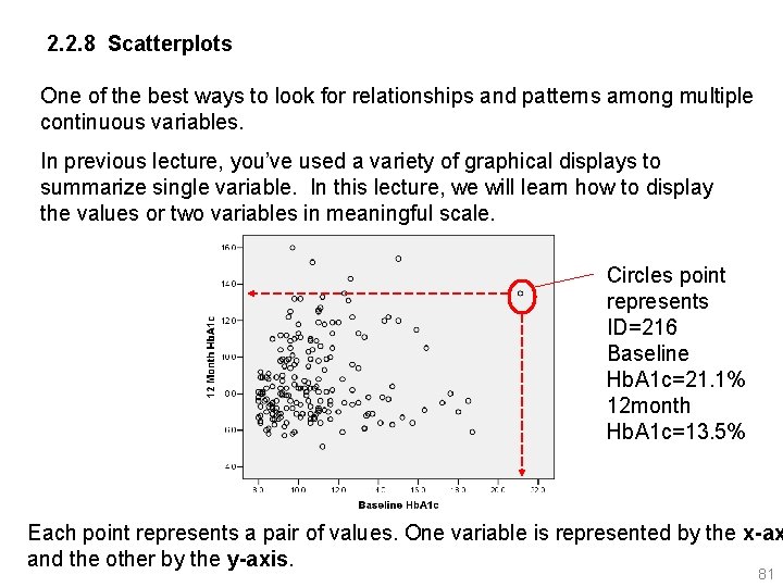
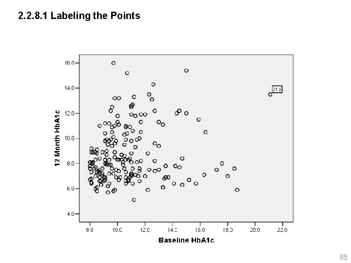
2. 2. 8 Scatterplots One of the best ways to look for relationships and patterns among multiple continuous variables. In previous lecture, you’ve used a variety of graphical displays to summarize single variable. In this lecture, we will learn how to display the values or two variables in meaningful scale. Circles point represents ID=216 Baseline Hb. A 1 c=21. 1% 12 month Hb. A 1 c=13. 5% Each point represents a pair of values. One variable is represented by the x-ax and the other by the y-axis. 81

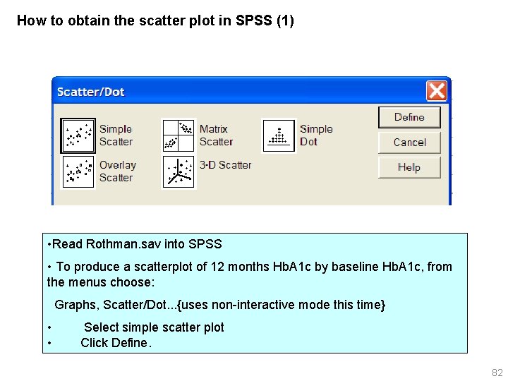
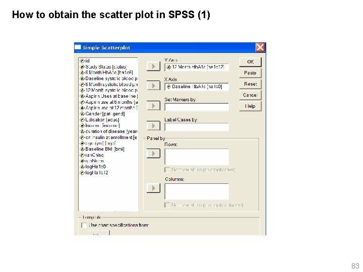
How to obtain the scatter plot in SPSS (1) • Read Rothman. sav into SPSS • To produce a scatterplot of 12 months Hb. A 1 c by baseline Hb. A 1 c, from the menus choose: Graphs, Scatter/Dot. . . {uses non-interactive mode this time} • Select simple scatter plot • Click Define. 82

How to obtain the scatter plot in SPSS (1) 83

What can you tell from the scatterplot? Scatterplots are not randomly scattered over the grid. There seems to be a pattern. The points are concentrated in a bottom left to top right, indicating as baseline Hb. A 1 c value increases, 12 month value increases. That is, a straight line might be a reasonable summary of the data. You can also determine whether these are cases that have unusual combinations of values for the two variables. You may want to validate the observations on ID=216, is it clinically real to have Baseline Hb. A 1 c=21. 1% with 12 month Hb. A 1 c=13. 5%. 84

2. 2. 8. 1 Labeling the Points 85

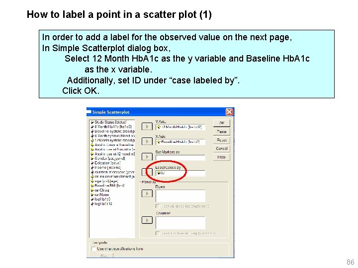
How to label a point in a scatter plot (1) In order to add a label for the observed value on the next page, In Simple Scatterplot dialog box, Select 12 Month Hb. A 1 c as the y variable and Baseline Hb. A 1 c as the x variable. Additionally, set ID under “case labeled by”. Click OK. 86

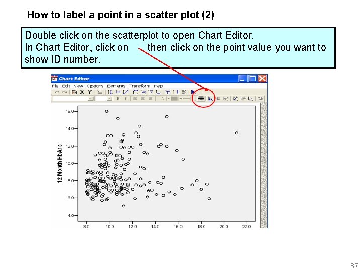
How to label a point in a scatter plot (2) Double click on the scatterplot to open Chart Editor. In Chart Editor, click on then click on the point value you want to show ID number. 87

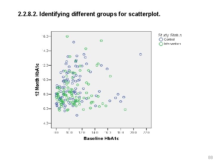
2. 2. 8. 2. Identifying different groups for scatterplot. 88

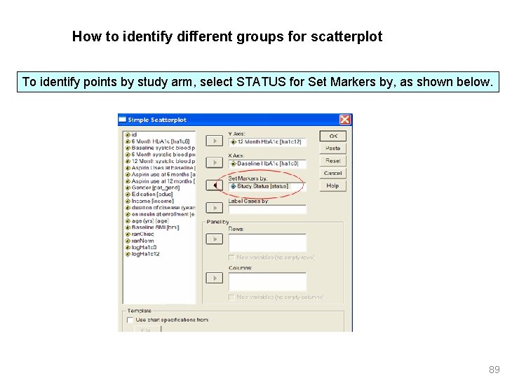
How to identify different groups for scatterplot To identify points by study arm, select STATUS for Set Markers by, as shown below. 89

2. 2. 8. 3. Overlay Plots Un-interactive option does not work well for this, so use interactive graphs. 90

91

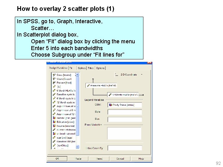
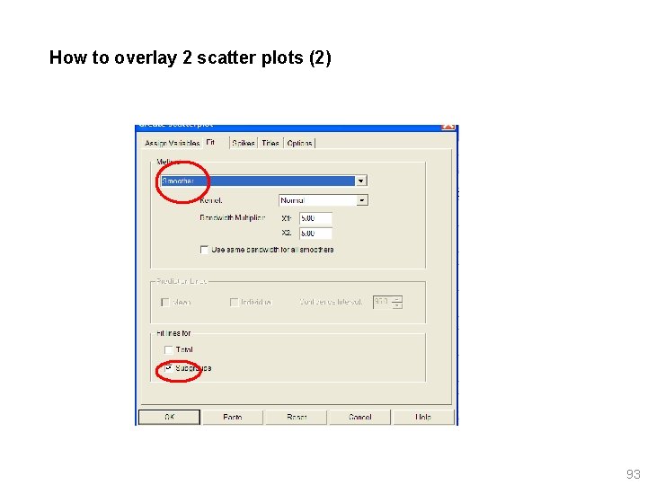
How to overlay 2 scatter plots (1) In SPSS, go to, Graph, Interactive, Scatter… In Scatterplot dialog box, Open “Fit” dialog box by clicking the menu Enter 5 into each bandwidths Choose Subgroup under “Fit lines for” 92

How to overlay 2 scatter plots (2) 93

2. 2. 8. 4. Representing Multiple Points 94

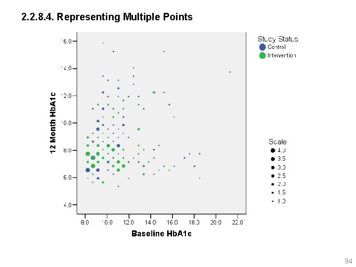
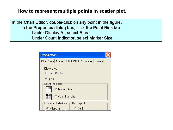
How to represent multiple points in scatter plot. In the Chart Editor, double-click on any point in the figure. In the Properties dialog box, click the Point Bins tab. Under Display At, select Bins. Under Count Indicator, select Marker Size. 95

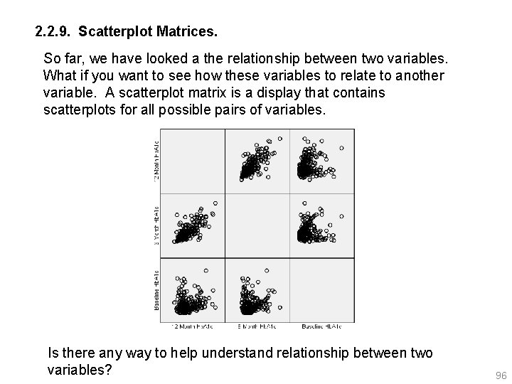
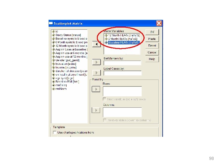
2. 2. 9. Scatterplot Matrices. So far, we have looked a the relationship between two variables. What if you want to see how these variables to relate to another variable. A scatterplot matrix is a display that contains scatterplots for all possible pairs of variables. Is there any way to help understand relationship between two variables? 96

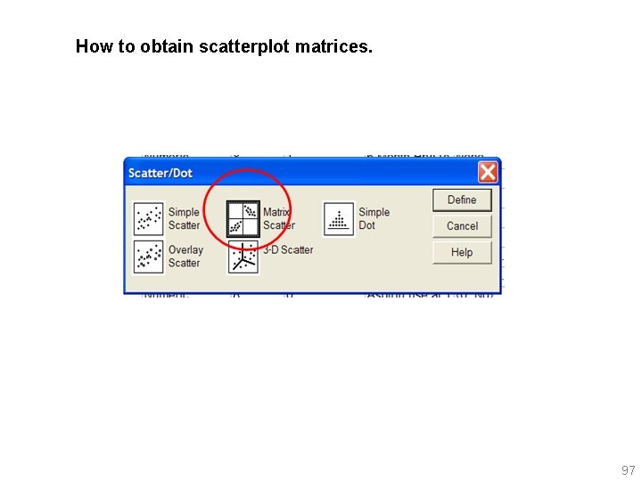
How to obtain scatterplot matrices. 97

98

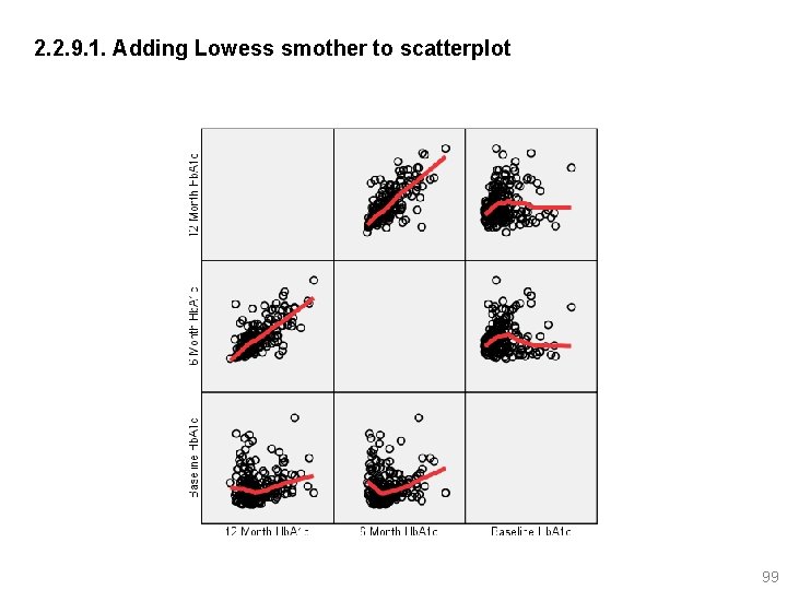
2. 2. 9. 1. Adding Lowess smother to scatterplot 99

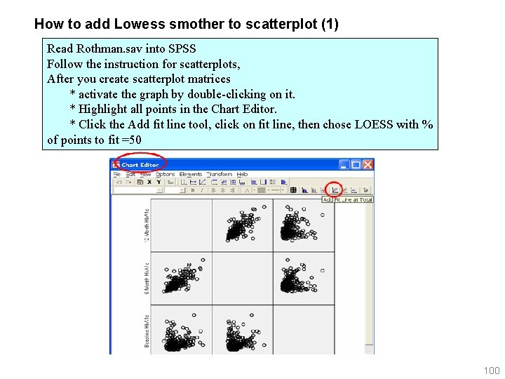
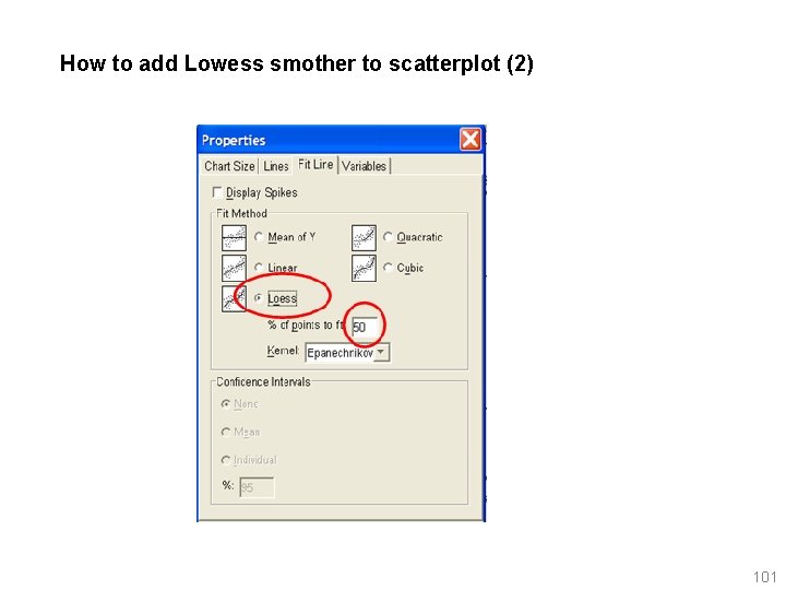
How to add Lowess smother to scatterplot (1) Read Rothman. sav into SPSS Follow the instruction for scatterplots, After you create scatterplot matrices * activate the graph by double-clicking on it. * Highlight all points in the Chart Editor. * Click the Add fit line tool, click on fit line, then chose LOESS with % of points to fit =50 100

How to add Lowess smother to scatterplot (2) 101

What’s the easiest way to read a scatterplot matrix? Try to scan across an entire row or column. For example, in the previous page figure, you will see that 12 month Hb. A 1 c value correlate to 6 month value but not much with baseline value. Plots symmetric along diagonal line is in fact the same plots, so you may want to ignore one of the plots. 102

2. 2. 10. Three dimensional Scatter Plots Un-interactive option does not work well for this, so use interactive graphs. 103

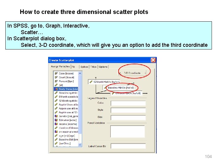
How to create three dimensional scatter plots In SPSS, go to, Graph, Interactive, Scatter… In Scatterplot dialog box, Select, 3 -D coordinate, which will give you an option to add the third coordinate 104

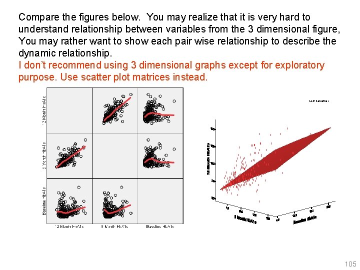
Compare the figures below. You may realize that it is very hard to understand relationship between variables from the 3 dimensional figure, You may rather want to show each pair wise relationship to describe the dynamic relationship. I don’t recommend using 3 dimensional graphs except for exploratory purpose. Use scatter plot matrices instead. LLR Smoother 105

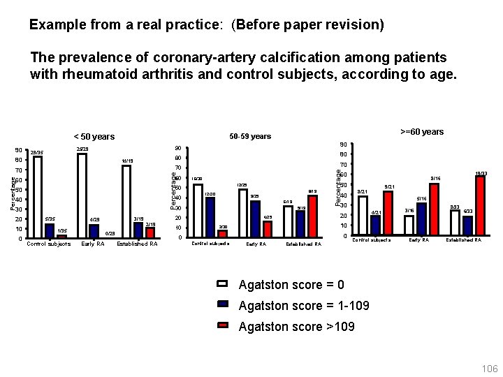
Example from a real practice: (Before paper revision) The prevalence of coronary-artery calcification among patients with rheumatoid arthritis and control subjects, according to age. 80 Percentage 60 16/30 40 40 8/19 12/30 9/25 6/19 30 30 5/35 1/35 Control subjects 2/19 0/29 Early RA Established RA 10 0 5/16 30 4/21 3/16 8/33 6/33 10 2/30 0 Control subjects 9/21 8/21 40 20 4/25 20 3/19 4/29 5/19 19/33 8/16 50 12/25 50 50 0 70 70 60 10 80 80 14/19 70 20 90 90 25/29 29/35 Percentage 90 >=60 years 50 -59 years < 50 years Early RA Established RA Control subjects Early RA Established RA Agatston score = 0 Agatston score = 1 -109 Agatston score >109 106

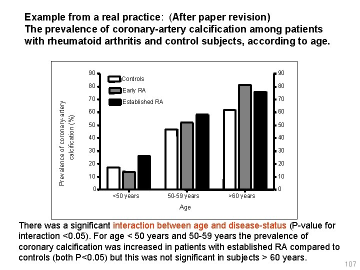
Example from a real practice: (After paper revision) The prevalence of coronary-artery calcification among patients with rheumatoid arthritis and control subjects, according to age. 90 70 calcification (%) Prevalence of coronary-artery 80 90 Controls 80 Early RA 70 Established RA 60 60 50 50 40 40 30 30 20 20 10 10 0 0 <50 years 50 -59 years >60 years Age There was a significant interaction between age and disease-status (P-value for interaction <0. 05). For age < 50 years and 50 -59 years the prevalence of coronary calcification was increased in patients with established RA compared to controls (both P<0. 05) but this was not significant in subjects > 60 years. 107