Chapter 2 Frequency Distributions Power Point Lecture Slides
Chapter 2 Frequency Distributions Power. Point Lecture Slides Essentials of Statistics for the Behavioral Sciences Eighth Edition by Frederick J Gravetter and Larry B. Wallnau
Learning Outcomes 1 • Understand how frequency distributions are used 2 • Organize data into a frequency distribution table… 3 • …and into a grouped frequency distribution table 4 • Know how to interpret frequency distributions 5 • Organize data into frequency distribution graphs 6 • Know how to interpret and understand graphs
Tools You Will Need • Proportions (math review, Appendix A) – Fractions – Decimals – Percentages • Scales of measurement (Chapter 1) – Nominal, ordinal, interval, and ratio – Continuous and discrete variables (Chapter 1) • Real limits (Chapter 1)
2. 1 Frequency Distributions • A frequency distribution is – An organized tabulation – Showing the number of individuals located in each category on the scale of measurement • Can be either a table or a graph • Always shows – The categories that make up the scale – The frequency, or number of individuals, in each category
2. 2 Frequency Distribution Tables • Structure of Frequency Distribution Table – Categories in a column (often ordered from highest to lowest but could be reversed) – Frequency count next to category • Σf = N • To compute ΣX from a table – Convert table back to original scores or – Compute Σf. X
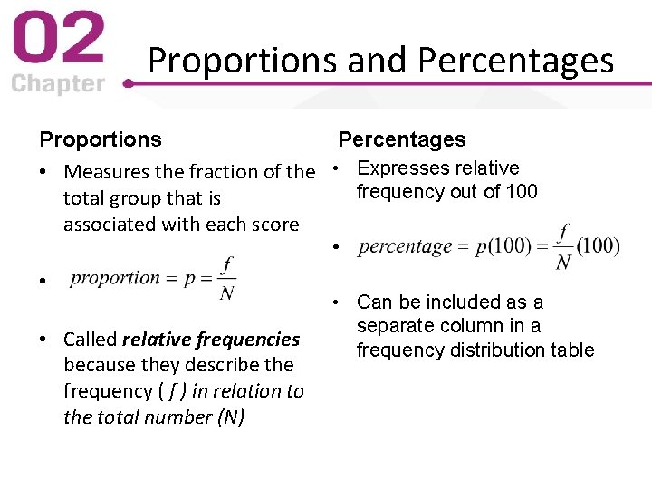
Proportions and Percentages Proportions Percentages • Measures the fraction of the • Expresses relative frequency out of 100 total group that is associated with each score • • • Called relative frequencies because they describe the frequency ( f ) in relation to the total number (N) • Can be included as a separate column in a frequency distribution table
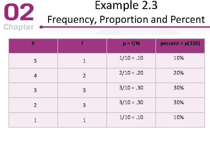
Example 2. 3 Frequency, Proportion and Percent X f p = f/N percent = p(100) 5 1 1/10 =. 10 10% 4 2 2/10 =. 20 20% 3 3 3/10 =. 30 30% 2 3 3/10 =. 30 30% 1 1 1/10 =. 10 10%
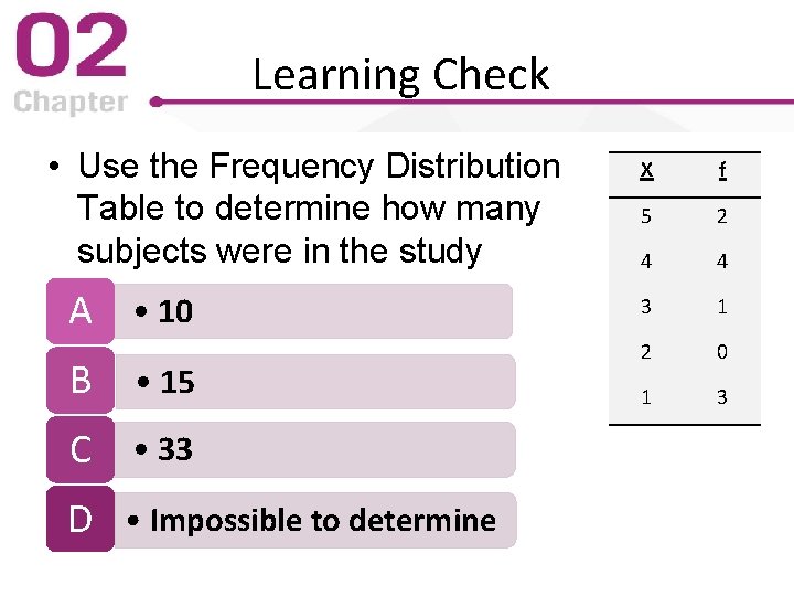
Learning Check • Use the Frequency Distribution Table to determine how many subjects were in the study A • 10 B • 15 C • 33 D • Impossible to determine X f 5 2 4 4 3 1 2 0 1 3
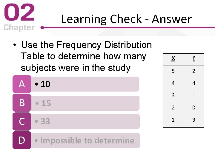
Learning Check - Answer • Use the Frequency Distribution Table to determine how many subjects were in the study A • 10 B • 15 C • 33 D • Impossible to determine X f 5 2 4 4 3 1 2 0 1 3
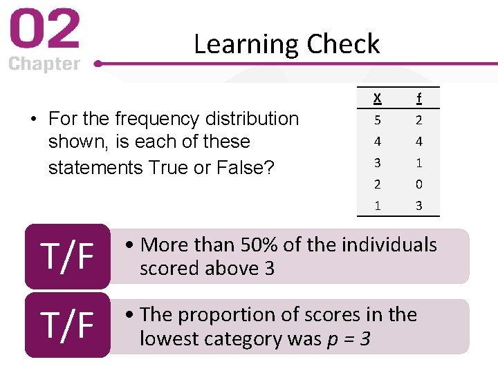
Learning Check • For the frequency distribution shown, is each of these statements True or False? X f 5 2 4 4 3 1 2 0 1 3 T/F • More than 50% of the individuals scored above 3 T/F • The proportion of scores in the lowest category was p = 3
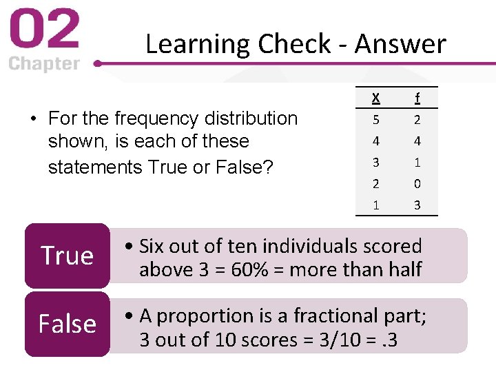
Learning Check - Answer • For the frequency distribution shown, is each of these statements True or False? X f 5 2 4 4 3 1 2 0 1 3 True • Six out of ten individuals scored above 3 = 60% = more than half False • A proportion is a fractional part; 3 out of 10 scores = 3/10 =. 3
Grouped Frequency Distribution Tables • If the number of categories is very large they are combined (grouped) to make the table easier to understand • However, information is lost when categories are grouped – Individual scores cannot be retrieved – The wider the grouping interval, the more information is lost
“Rules” for Constructing Grouped Frequency Distributions • Requirements (Mandatory Guidelines) – All intervals must be the same width – Make the bottom (low) score in each interval a multiple of the interval width • “Rules of Thumb” (Suggested Guidelines) – Ten or fewer class intervals is typical (but use good judgment for the specific situation) – Choose a “simple” number for interval width
Discrete Variables in Frequency or Grouped Distributions • Constructing either frequency distributions or grouped frequency distributions for discrete variables is uncomplicated – Individuals with the same recorded score had precisely the same measurements – The score is an exact score
Continuous Variables in Frequency Distributions • Constructing frequency distributions for continuous variables requires understanding that a score actually represents an interval – A given “score” actually could have been any value within the score’s real limits – The recorded value was rounded off to the middle value between the score’s real limits – Individuals with the same recorded score probably differed slightly in their actual performance
Continuous Variables in Frequency Distributions • Constructing grouped frequency distributions for continuous variables also requires understanding that a score actually represents an interval • Consequently, grouping several scores actually requires grouping several intervals • Apparent limits of the (grouped) class interval are always one unit smaller than the real limits of the (grouped) class interval. (Why? )
Learning Check • A Grouped Frequency Distribution table has categories 0 -9, 10 -19, 20 -29, and 30 -39. What is the width of the interval 20 -29? A • 9 points B • 9. 5 points C • 10 points D • 10. 5 points
Learning Check - Answer • A Grouped Frequency Distribution table has categories 0 -9, 10 -19, 20 -29, and 30 -39. What is the width of the interval 20 -29? A • 9 points B • 9. 5 points C • 10 points (29. 5 – 19. 5 = 10) D • 10. 5 points
Learning Check • Decide if each of the following statements is True or False. T/F • You can determine how many individuals had each score from a Frequency Distribution Table T/F • You can determine how many individuals had each score from a Grouped Frequency Distribution
Learning Check - Answer True • The original scores can be recreated from the Frequency Distribution Table False • Only the number of individuals in the class interval is available once the scores are grouped
2. 3 Frequency Distribution Graphs • Pictures of the data organized in tables – All have two axes – X-axis (abscissa) typically has categories of measurement scale increasing left to right – Y-axis (ordinate) typically has frequencies increasing bottom to top • General principles – Both axes should have value 0 where they meet – Height should be about ⅔ to ¾ of length
Data Graphing Questions • Level of measurement? (nominal; ordinal; interval; or ratio) • Discrete or continuous data? • Describing samples or populations? The answers to these questions determine which is the appropriate graph
Frequency Distribution Histogram • Requires numeric scores (interval or ratio) • Represent all scores on X-axis from minimum thru maximum observed data values • Include all scores with frequency of zero • Draw bars above each score (interval) – Height of bar corresponds to frequency – Width of bar corresponds to score real limits (or one-half score unit above/below discrete scores)
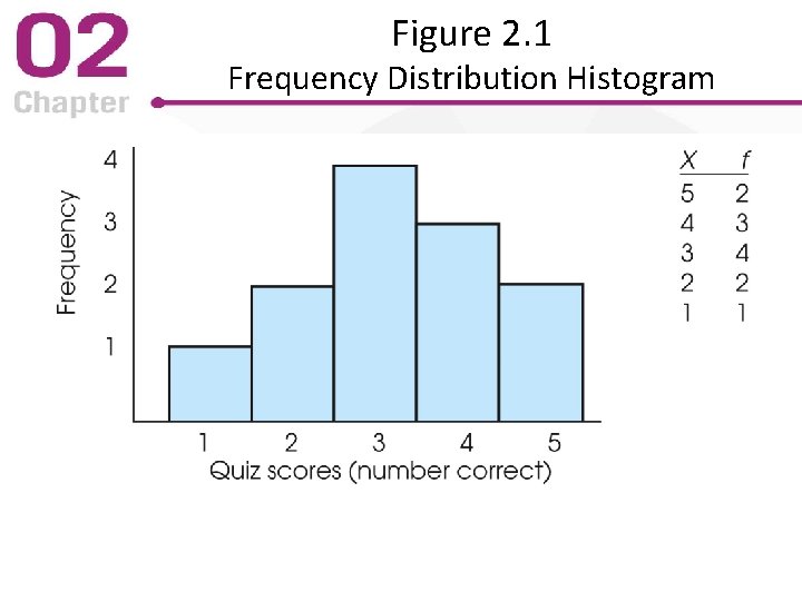
Figure 2. 1 Frequency Distribution Histogram
Grouped Frequency Distribution Histogram Same requirements as for frequency distribution histogram except: • Draw bars above each (grouped) class interval – Bar width is the class interval real limits – Consequence? Apparent limits are extended out one-half score unit at each end of the interval
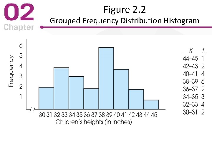
Figure 2. 2 Grouped Frequency Distribution Histogram
Block Histogram • A histogram can be made a “block” histogram • Create a bar of the correct height by drawing a stack of blocks • Each block represents one per case • Therefore, block histograms show the frequency count in each bar
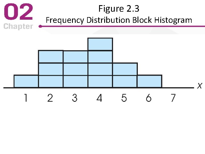
Figure 2. 3 Frequency Distribution Block Histogram
Frequency Distribution Polygons • List all numeric scores on the X-axis – Include those with a frequency of f = 0 • Draw a dot above the center of each interval – Height of dot corresponds to frequency – Connect the dots with a continuous line – Close the polygon with lines to the Y = 0 point • Can also be used with grouped frequency distribution data
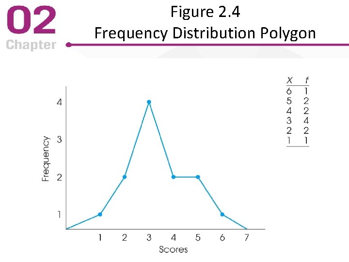
Figure 2. 4 Frequency Distribution Polygon
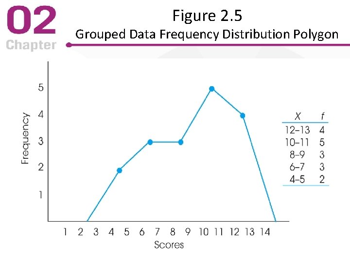
Figure 2. 5 Grouped Data Frequency Distribution Polygon
Graphs for Nominal or Ordinal Data • For non-numerical scores (nominal and ordinal data), use a bar graph – Similar to a histogram – Spaces between adjacent bars indicates discrete categories • without a particular order (nominal) • non-measurable width (ordinal)
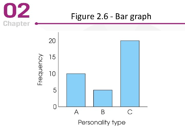
Figure 2. 6 - Bar graph
Population Distribution Graphs • When population is small, scores for each member are used to make a histogram • When population is large, scores for each member are not possible – Graphs based on relative frequency are used – Graphs use smooth curves to indicate exact scores were not used • Normal – Symmetric with greatest frequency in the middle – Common structure in data for many variables
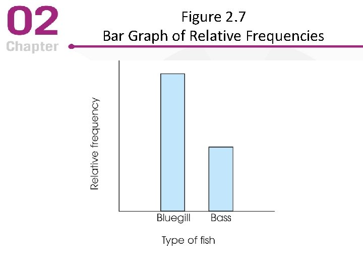
Figure 2. 7 Bar Graph of Relative Frequencies
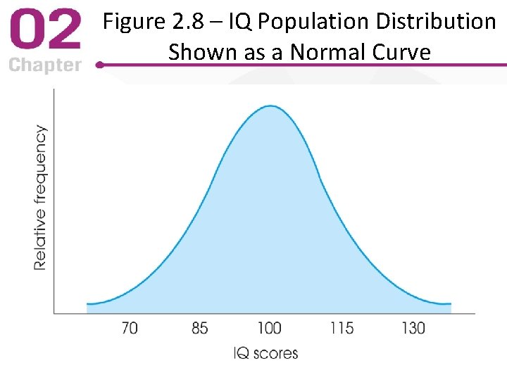
Figure 2. 8 – IQ Population Distribution Shown as a Normal Curve
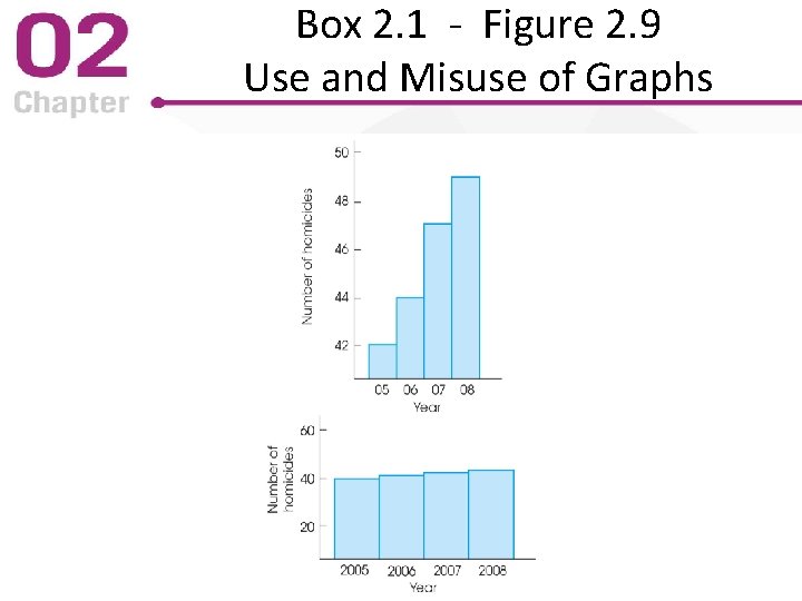
Box 2. 1 - Figure 2. 9 Use and Misuse of Graphs
2. 4 Frequency Distribution Shape • Researchers describe a distribution’s shape in words rather than drawing it • Symmetrical distribution: each side is a mirror image of the other • Skewed distribution: scores pile up on one side and taper off in a tail on the other – Tail on the right (high scores) = positive skew – Tail on the left (low scores) = negative skew
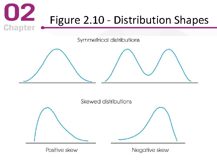
Figure 2. 10 - Distribution Shapes
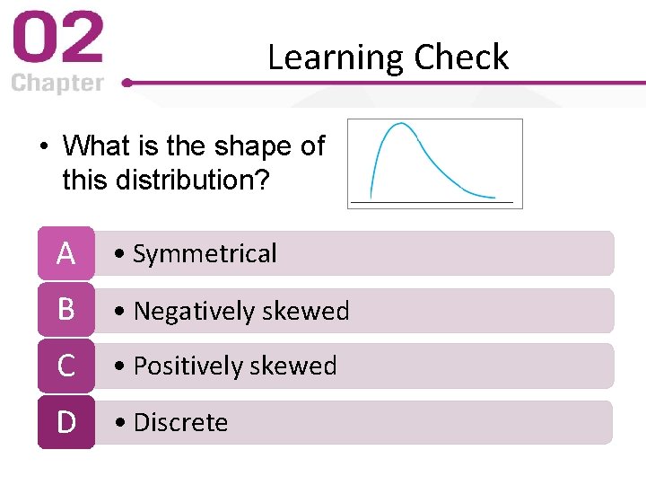
Learning Check • What is the shape of this distribution? A • Symmetrical B • Negatively skewed C • Positively skewed D • Discrete
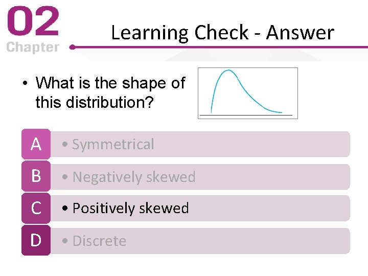
Learning Check - Answer • What is the shape of this distribution? A • Symmetrical B • Negatively skewed C • Positively skewed D • Discrete
Learning Check • Decide if each of the following statements is True or False. T/F • It would be correct to use a histogram to graph parental marital status data (single, married, divorced. . . ) from a treatment center for children T/F • It would be correct to use a histogram to graph the time children spent playing with other children from data collected in children’s treatment center

Learning Check - Answer False • Marital Status is a nominal variable; a bar graph is required True • Time is measured continuously and is an interval variable
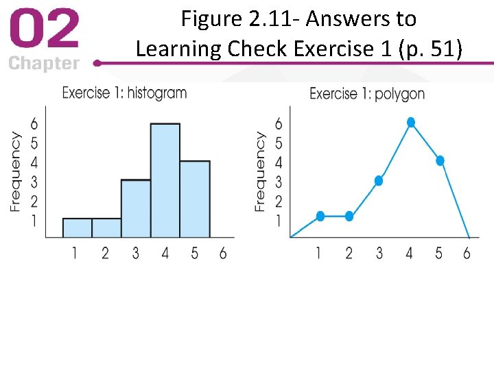
Figure 2. 11 - Answers to Learning Check Exercise 1 (p. 51)
Equations? Concepts? Any Questions?
- Slides: 45