Chapter 2 Frequency Distributions and Graphs Outline Introduction

Chapter 2 Frequency Distributions and Graphs

Outline Introduction Organizing Data Histograms, Frequency Polygons, and Ogives Other Types of Graphs(pie or circular graph)

Objectives Organize data using frequency distributions. Represent data in frequency distributions graphically using histograms, frequency, polygons, and ogives.

Organizing Data When data are collected in original form, they are called raw data When the raw data is organized into a frequency distribution, distribution the frequency will be the number of values in a specific class of the distribution. A frequency distribution is the organizing of raw data in table form, using classes and frequencies.

Types of frequency distribution 1. Ungroup frequency distribution. Frequency distribution is called ungroup frequency distribution if the RANGE of data is not large. Example: -Number of girls in a 4 -child family etc. 2. Group frequency distribution. Frequency distribution is called group frequency distribution if the RANGE of data is large.

daily people smoking cigarettes. 50 peoples surveyed the following points come out. 3 4 5 6 4 3 6 3 7 4 5 4 3 6 7 7 3 5 5 3 6 7 3 7 7 3 3 4 3 5 7 3 4 5 5 4 5 6 3 4 6 7 5 4 3 7

Frequency distribution s. no No. of cigrets f R. f P. R. f 1 3 15 15/50. 100 15 2 4 10 10/50 25 3 5 9 9/50 34 4 6 7 7/50 41 5 7 9 9/50 50 6 7 C. f Tally Bar

Histogram, 3= 4= 5= 6= 7=

Histogram 3= 4= 5= 6= 7=

Frequency polygon , , 15 Frequency polygon , , 10 , , 9 , , 7 , , 0 , , 0

Pie chart 0%, Title 0% Chart 7=, 18% 3=, 30% 6=, 14% 5=, 18% 4=, 20%

Cumulative frequency Ogive graph or comulative frequency graph , , 50 , , 41 , , 34 , , 25 , , 15 , , 0 , , 0
 - can be used when the range of")
Grouped Frequency Distributions Grouped frequency distributions(continuose) - can be used when the range of values in the data set is very large. The data must be grouped into classes that are more than one unit in width. Examples - the life of boat batteries in hours.

Categorical frequency distributions - can be used for data that can be placed in specific categories Examples - political affiliation, religious affiliation, blood type , nationality of student in the university, colors of eyes, etc.

Blood group are given in table. make a frequency distribution. A B O A A AB O B O AB A B O O AB O A AB B

Blood Type Frequency Distribution -

Histogram A= B= O= AB=

Frequency polygon A= B= O= AB=

Pie graph A= Series 1; AB=; 4; 16% B= O= Series 1 AB= Series 1; A=; 5; 20% Series 1; O=; 9; 36% Series 1; B=; 7; 28%

FREQUENCY DISTRIBUTIONS 102 124 71 104 103 116 105 97 109 99 108 112 85 107 105 86 118 122 67 99 103 87 87 78 101 82 95 100 125 92 Make a frequency distribution table with five classes. Key values: Minimum value = Maximum value =

STEPS TO CONSTRUCT A FREQUENCY DISTRIBUTION 1. Choose the number of classes 2. Calculate the Class Width Find the range = maximum value – minimum. Then divide this by the number of classes. Finally, round up to a convenient number. (125 - 67) / 5 = 11. 6 Round up to 12. 3. Determine Class Limits The lower class limit is the lowest data value that belongs in a class and the upper class limit is the highest. Use the minimum value as the lower class limit in the first class. (67) 4. Mark a tally | in appropriate class for each data value. After all data values are tallied, count the tallies in each class for the class frequencies.

CONSTRUCT A FREQUENCY DISTRIBUTION Minimum = 67, Maximum = 125 Number of classes = 5 Class width = 12 Class Limits 78 67 Tally 3 79 90 5 91 102 8 103 114 9 126 115 Do all lower class limits first. 5

FREQUENCY HISTOGRAM Boundaries Class 67 - 78 3 66. 5 - 78. 5 79 - 90 5 78. 5 - 90. 5 91 - 102 8 90. 5 - 102. 5 103 -114 9 102. 5 -114. 5 Time on Phone 9 9 8 8 7 115 -126 5 114. 5 -126. 5 6 5 5 5 4 3 3 2 1 0 66. 5 78. 5 90. 5 102. 5 minutes 114. 5 126. 5

Frequency Histogram Boundaries Class 67 - 78 3 66. 5 - 78. 5 79 - 90 5 78. 5 - 90. 5 91 - 102 8 90. 5 - 102. 5 103 -114 115 -126 9 5 102. 5 -114. 5 -126. 5 Time on Phone 9 9 8 8 7 6 5 5 5 4 3 3 2 1 0 66. 5 78. 5 90. 5 102. 5 minutes 114. 5 126. 5
 / 2 Relative frequency: class frequency/total")
OTHER INFORMATION Midpoint: (lower limit + upper limit) / 2 Relative frequency: class frequency/total frequency Cumulative frequency: Number of values in that class + in lower class Midpoint Class Relative Frequency (67 + 78)/2 3/30 Cumulative Frequency 67 - 78 3 72. 5 0. 10 3 79 - 90 5 84. 5 0. 17 8 91 - 102 8 96. 5 0. 27 16 103 - 114 9 108. 5 0. 30 25 115 - 126 5 120. 5 0. 17 30

Relative Frequency Histogram Relative frequency Time on Phone minutes Relative frequency on vertical scale

Ogive Cumulative Frequency An ogive reports the number of values in the data set that are less than or equal to the given value, x. Minutes on Phone 30 30 25 20 16 10 8 3 0 0 66. 5 78. 5 90. 5 102. 5 minutes 114. 5 126. 5

EXAMPLE – Creating a Frequency Distribution Table Mr. Bill of Auto USA wants to develop tables, charts, and graphs to show the typical selling price on various dealer lots. The table on the reports only the price of the 80 vehicles sold last month at Whitner Autoplex.
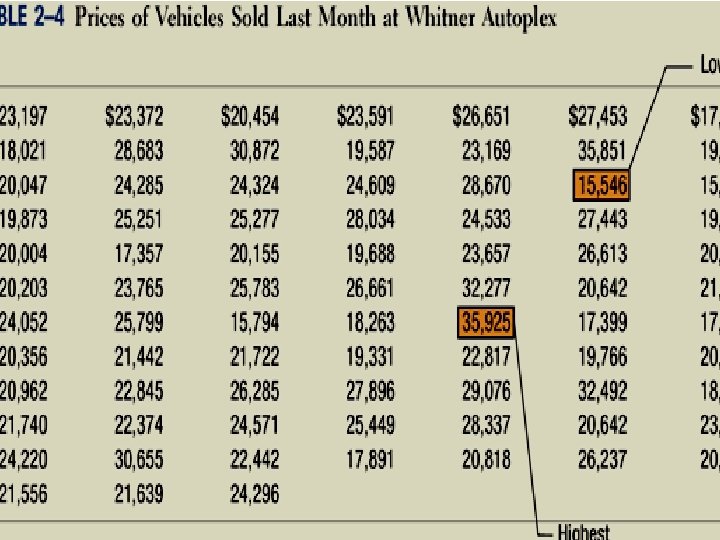

Constructing a Frequency Table Example Step 1: Decide on the number of classes. Numbers of classes = 7 Step 2: Determine the class interval or width. The formula is: i (H-L)/k where I is the class interval, H is the highest observed value, L is the lowest observed value, and k is the number of classes. ($35, 925 - $15, 546)/7 = $2, 911=3000 Round up to some convenient number.

Constructing a Frequency Table – Example: Step 3: Set the individual class limits

Constructing a Frequency Table Step 4: Tally the vehicle selling prices into the classes. Step 5: Count the number of items in each class.

To convert a frequency distribution to a relative frequency distribution, each of the class frequencies is divided by the total number of observations.

Graphic Presentation of a Frequency Distribution The three commonly used graphic forms are: Histograms Frequency polygons Cumulative frequency distributions

Histogram for a frequency distribution based on quantitative data is very similar to the bar chart showing the distribution of qualitative data. The classes are marked on the horizontal axis and the class frequencies on the vertical axis. The class frequencies are represented by the heights of the bars.

Frequency Polygon A frequency polygon also shows the shape of a distribution and is similar to a histogram. It consists of line segments connecting the points formed by the intersections of the class midpoints and the class frequencies.

Cumulative Frequency Distribution

Numbers of mile travel by instructor from home to campus 5 15 5 5 15 10 15 5 5 10 10 15 15 10 5 5 10 10 5 15 10 5 10 5 5 15 5 5 10 5

Number of Miles Traveled -

An accident occurred in 2011. 40 people were injured. make a frequency distribution and show which class people injured more using numbers of classes 3. following are the ages of different classes. 24 25 30 52 60 39 61 62 53 42 63 56 62 45 49 59 34 54 50 51 56 57 54 58 36 51 60 64 62 61 34 25 37 41 34 61 38 59 39 45

Class limits Class Frequency Cumulative Boundaries frequency 24 - 37 23. 5 - 37. 5 9 4 38 - 51 37. 5 - 51. 5 11 20 52 - 65 51. 5 - 65. 5 20 40

Terms Associated with a Grouped Frequency Distribution The class width for a class in a frequency distribution is found by subtracting the lower (or upper) class limit of one class minus the lower (or upper) class limit of the previous class.

Constructing a Frequency Distribution There should be between 5 and 20 classes. The class width should be an odd number. The classes must be mutually exclusive.

Guidelines for Constructing a Frequency Distribution The classes must be continuous. The classes must be exhaustive. The class must be equal in width.

Important points for frequency distribution Find the highest and lowest value. Find the range. Select the number of classes desired. Find the width by dividing the range by the number of classes and rounding up.

Procedure for Constructing a Grouped Frequency Distribution Select a starting point (usually the lowest value); add the width to get the lower limits. Find the upper class limits. Find the boundaries. Tally the data, find the frequencies, and find the cumulative frequency.

Grouped Frequency Distribution Example In a survey of 20 patients who smoked, the following data were obtained. Each value represents the number of cigarettes the patient smoked per day. Construct a frequency distribution using six classes. (The data is given on the next slide. )

Construct frequency distributions using numbers of classes 6.

Grouped Frequency Distribution Example Step 1: Find the highest and lowest values: H = 22 and L = 5. Step 2: Find the range: R = H – L = 22 – 5 = 17. Step 3: Select the number of classes desired. In this case it is equal to 6.

Grouped Frequency Distribution Example Step 4: Find the class width by dividing the range by the number of classes. Width = 17/6 = 2. 83. This value is rounded up to 3.

Grouped Frequency Distribution Example Step 5: Select a starting point for the lowest class limit. For convenience, this value is chosen to be 5, the smallest data value. The lower class limits will be 5, 8, 11, 14, 17, and 20.

Grouped Frequency Distribution Example Step 6: The upper class limits will be 7, 10, 13, 16, 19, and 22. For example, the upper limit for the first class is computed as 8 - 1, etc.

Grouped Frequency Distribution Example Step 7: Find the class boundaries by subtracting 0. 5 from each lower class limit and adding 0. 5 to the upper class limit.

Grouped Frequency Distribution Example Step 8: Tally the data, write the numerical values for the tallies in the frequency column, and find the cumulative frequencies. The grouped frequency distribution is shown on the next slide.

Note: The dash “-” represents “to”.

Histograms, Frequency Polygons, and Ogives The three most commonly used graphs in research are: The histogram. The frequency polygon. The cumulative frequency graph, or ogive (pronounced o-jive). pie graph or circular graph

Histograms, Frequency Polygons, and Ogives The histogram is a graph that displays the data by using vertical bars of various heights to represent the frequencies.

Example of a Histogram 6 Frequency 5 4 3 2 1 0 4. 5 7. 5 10. 5 13. 5 16. 5 Number of Cigarettes Smoked per Day 20. 5 22. 5

Polygons A frequency polygon is a graph that displays the data by using lines that connect points plotted for frequencies at the midpoint of classes. The frequencies represent the heights of the midpoints.

Example of a Frequency Polygon 6 Frequency 5 4 3 2 1 0 2 4. 5 7. 5 10. 5 13. 5 16. 5 219. 5 22. 5 Number of Cigarettes Smoked per Day 26

Histograms, Frequency Polygons, and Ogives A cumulative frequency graph or ogive is a graph that represents the cumulative frequencies for the classes in a frequency distribution.

Example of an Ogive

Other Types of Graphs Pie graph - A pie graph is a circle that is divided into sections or wedges according to the percentage of frequencies in each category of the distribution.

Pie graph Chart Title

Other Types of Graphs Pie Graph Pie Chart of the Number of Crimes Investigated by Law Enforcement Officers In U. S. National Parks During 1995 Assaults (164, 68. 3%) Robbery (29, 12. 1%) Theft (34, 14. 2%) Murder (13, 5. 4%)

Marks obtained by 60 students of class are given as under: 13 30 30 60 59 15 7 18 40 49 14 18 19 40 43 4 17 45 25 43 34 54 10 21 51 52 12 43 48 66 48 22 39 26 34 19 10 17 47 38 40 51 55 32 41 22 30 35 63 25 3 4 4 5 6 4 30 7 45 23 Construct a frequency table, and also show by different Type of graph. TRY YOURSELF

Marks obtained by 50 students of class are given as under: 13 30 30 60 59 15 7 18 40 49 14 18 19 40 43 4 17 45 25 43 34 54 10 21 51 52 12 43 48 66 48 22 39 26 34 19 10 17 47 38 40 51 55 32 41 22 30 35 63 25 3 4 4 5 6 4 30 7 45 23 Construct a frequency table with a class width 10 and lower class Limit of the first class should be zero, and also show by different Type of graph.
 Frequency 0 -----9 9 10 ---19 12 20 ---29")
Marks of students (class interval) Frequency 0 -----9 9 10 ---19 12 20 ---29 7 30 ---39 10 40 ---49 13 50 ---59 6 60 ---69 3

Example: Summarize by frequency distribution from the following data, relating to the marks of 60 students and lower class limit of first class must be 65. using numbers of classes 7 106 107 95 123 130 129 84 99 115 98 173 146 75 184 76 125 139 113 110 158 104 82 111 119 204 78 194 110 109 92 115 111 185 148 80 107 86 128 141 162 90 118 115 70 100 136 178 107 93 126 186 123 140 181 187 68 84 90 152 131
 Largest value=max = 204 Smallest value=min = 68 Range = Largest Value")
Solution: (2) Largest value=max = 204 Smallest value=min = 68 Range = Largest Value – Smallest Value = 204 – 68 = 136 (3) Classes Interval =

Class 65 ------84 Tally frequency 9 85 ------104 10 105 ------124 17 125 ------144 10 145 ------164 5 165 ------184 4 185 ------204 5

Class Frequency Relative Frequency 100 x Relative Frequency = %age Relative Frequency 65 -----84 9 9/60= 0. 15 x 100=15 85 -----104 10 10/60= 0. 167 x 100=16. 7 105 ----124 17 17/60 = 0. 283 x 100=28. 3 125 ----144 10 10/60= 0. 167 x 100=16. 7 145 ----164 5 5/60= 0. 083 x 100=8. 3 165 ----184 4 4/60= 0. 067 x 100=6. 7 185 ----204 5 5/60= 0. 083 x 100=8. 3 Total 60 1 100
 64. 5 -84. 5 -104. 5 ---124. 5 125. 5 --144.")
Histogram (Bar graph) 64. 5 -84. 5 -104. 5 ---124. 5 125. 5 --144. 5— 164. 5 ---184. 5 ---204. 5

Frequency polygon , , 17 , , 10 Chart Title , , 10 , , 9 , , 5 , , 4 , , 0 , , 0
 64. 5 -84. 5 -104. 5 -124. 5 125. 5 --144.")
Pie chart(Circular graph) 64. 5 -84. 5 -104. 5 -124. 5 125. 5 --144. 5 -164. 5 -184. 5 ---204. 5

the five top selling vehicles during 2003 were the chevrolet silverado/c/k pickup, Dodge Ram pickup, Ford f-series pickup , Honda Accord, and Toyota Camry (moter trend 2003). Data form a sample of 50 vehicle purchases are presented in table. show by frequency distribution and show by histogram the best one. Vehicle Silverado F-Series Ram Silverado F-Series Camry Ram Silverado Ram F-Series Silverado Ram Camry Accord Ram F-Series Ram Silverado F-Series Silverado Ram Silverado Accord Camry Silverado Ram F-Series Silverado F-Series Camry Silverado Accord Camry Silverado Camry F-Series Accord Silverado

Car type Frequency Silverido 13 F. seriese 14 Camry 7 Ram 10 Accord 6 Sum of f =50

Silverido=13 Ram=10 F. series=14 Camry=6 Acord =7 Sales 1 st Qtr 2 nd Qtr 3 rd Qtr 4 th Qtr 5 th Qtr

data from a sample of 50 soft drink purchases make a frequency distribution and show ur result by bar graph Brand Purchased Coke Classic, Diet Coke, Pepsi. Cola, Pepsi-Cola, Diet Coke, Coke Classic, Pepsi-Cola, Coke Classic, Sprite, Pepsi-Cola Diet Coke Sprite Dr. Pepper Pepsi-Cola Coke Classic Diet Coke Dr. Pepper Coke Classic Pepsi-Cola Pepsi. Cola Diet Coke Classic Sprite Pepsi-Cola Coke Classic Pepsi-Cola Sprite Coke Classic Diet Coke Classic Pepsi-Cola Coke Classic Dr. Pepper Coke Classic Sprite Coke Classic

Frequency Bar Graph of Soft Drink Purchases Soft Drink

Pie graph Coke Classic Diet Coke Dr. Pepper Pepsi-Cola Sprite

OUTPUT; unit per labor hour for 60 working days 4. 1 4. 5 4. 9 5. 1 5. 2 5. 3 5. 5 5. 6 5. 7 5. 8 5. 9 6. 0 6. 1 6. 2 6. 3 6. 5 6. 7 6. 9 7. 0 7. 1 7. 3 7. 5 7. 7 7. 9 8. 1 8. 3 8. 7 8. 9 9. 1 8. 9 9. 2 9. 3 9. 4 9. 6

Stem-and-leaf: Example

Stem-and-leaf
- Slides: 84