CHAPTER 2 FREQUENCY DISTRIBUTION AND GRAPH When data

CHAPTER# 2 FREQUENCY DISTRIBUTION AND GRAPH

When data are in original form, they are called raw data. 2 -1 Organizing Data: ü Frequency distribution: Categorical distribution Ø Grouped distribution Ø Ø Ungrouped Distribution
 2 6 5 8 8 5")
• For example : row data (scores) 2 6 5 8 8 5 7 2 2 5 2 7 4 5 6 2 8 6 The researcher organized the raw data into a frequency distribution (is the organizing of raw data in table form, using classes and frequencies).
 8 7 6 5 4 2 f 3 2 3 4 1")
Class (score) 8 7 6 5 4 2 f 3 2 3 4 1 5

Types of Frequency Distributions Categorical frequency distributions Grouped Frequency Distributions Ungrouped Frequency Distributions

Categorical frequency distributions: can be used for data that can be placed in specific categories (nominal- or ordinal). l Examples: political affiliation, religious affiliation, blood type etc. l

Example: 25 Army inductees were given a blood test to determine their blood type. The data set is : A B B AB O O O B AB B O A O O O AB AB A O B A *Find the frequency distribution:
*100 Rf=f/n CLASS A B O AB TALLY FREQUENCY (f) IIII II IIII ||||")
P=(f/n)*100 Rf=f/n CLASS A B O AB TALLY FREQUENCY (f) IIII II IIII |||| Relative frequency PERCENT 5 7 9 4 0. 28 0. 36 0. 16 20% 28% 36% 16% n=25 1 100%

l l l Grouped frequency distributions: can be used when the range of values in the data set is very large. The data must be grouped into classes that are more than one unit in width. Examples - the life of boat batteries in hours.

Lower class Upper class Lower boundary Upper boundary Class limits Class boundaries Tally Frequency 24 -30 31 -37 38 -44 45 -51 52 -58 59 -65 23. 5 -30. 5 -37. 5 -44. 5 -51. 5 -58. 5 -65. 5 /// / //// / / 3 1 5 9 6 1

l l l Class limits: represent the smallest and largest data values that can be included in a class. In the lifetimes of boat batteries example, the values 24 and 30 of the first class are the class limits The lower class limit is 24 and the upper class limit is 30.

The class boundaries are used to separate the classes so that there are no gaps in the frequency distribution. Ø Lower boundary= lower limit - 0. 5 Ø Upper boundary= upper limit + 0. 5

Class limits should have the same decimal place value as the data, but the class boundaries should have one additional place value and end in a 5. For example: Class limit 7. 8 -8. 8 find the class boundaries?

The class width for a class in a frequency distribution is found by subtracting the lower (or upper) class limit of one class minus the lower (or upper) class limit of the previous class Class width=lower of second class limit-lower of first class limit Or Class width=upper of second class limit-upper of first class limit

• The class midpoint Xm is found by adding the lower and upper class limit (or boundary) and dividing by 2. Xm Or Xm = For example : =

*EXAMPLE: *Find the boundaries for the following class limits: 44 - 37 22. 2 – 23. 0 6. 25 - 6. 55 547. 047 - 553. 205 *Find the class boundaries for the class 24: *Find the class width for the following class limit: • 37 -- 44 45 – 52

Age 10 -20 20 -30 30 -40 40 -50 Better way to construct a frequency distribution Age 10 -20 21 -31 32 -42 43 -53

PROCEDURE FOR CONSTRUCTING A GROUPED FREQUENCY DISTRIBUTION STEP 1: Determine the classes : ü ü ü Find the highest and lowest value. Find the range. Select the number of classes desired. Find the width by dividing the range by the number of classes and rounding up. Select a starting point (usually the lowest value); add the width to get the lower limits. Find the upper class limits. ü Find the boundaries. ü STEP 2: Tally the data. STEP 3: Find the frequencies and find the cumulative frequency.

EXAMPLE: 1 - The following data represent the record high temperatures for each of the 50 states. Construct a grouped frequency distribution for the data using 7 classes. 112 110 107 116 120 100 118 112 108 113 127 114 110 120 116 115 121 117 134 118 113 105 118 122 117 120 110 105 114 118 119 118 110 114 122 111 112 109 105 106 104 112 109 110 111 114

STEP 2 Tally the data. STEP 3 Find the frequencies.

Class Limits Class Boundaries Frequency Cumulative Frequency 100 - 104 105 - 109 110 - 114 115 - 119 120 - 124 125 - 129 130 - 134 99. 5 - 104. 5 - 109. 5 - 114. 5 - 119. 5 - 124. 5 - 129. 5 - 134. 5 2 8 18 13 7 1 1 2 10 28 41 48 49 50

UNGROUPED FREQUENCY DISTRIBUTION: Example : The data shown here represent the number of miles per gallon that 30 selected four-wheel- drive sports utility vehicles obtained in city driving. 12 16 15 12 19 17 18 16 14 13 12 12 12 15 16 14 16 15 12 18 16 17 16 15 16 18 15 16 15 14

STEP 1 Determine the classes. The rang of the data set is small. rang e of the is sm data all Range = High – Low = 19 – 12 = 7 So the class consisting of the single data value can be used. They are 12, 13, 14, 15, 16, 17, 18, 19. q This type of distribution is called ungrouped frequency distribution

STEP 2 Tally the data. STEP 3 Find the frequencies. Class Limits Class Boundaries Frequency Cumulative Frequency 12 13 14 15 16 17 18 19 11. 5 -12. 5 -13. 5 -14. 5 -15. 5 -16. 5 -17. 5 -18. 5 -19. 5 6 1 3 6 8 2 3 1 6 7 10 16 24 26 29 30

HISTOGRAMS, FREQUENCY POLYGONS, OGIVES

CLASS AGENDA: The three most commonly used graphs in research are: 1. The histogram 2. The frequency polygon 3. The cumulative frequency graph (ogive)

Graphical representation: why? Purpose of graphs in statistics is to convey the data to the viewers in pictorial form • Easier for most people to understand the meaning of data in form of graphs • They can also be used to discover a trend or pattern in a situation over a period of time • Useful in getting the audience’s attention in a publication or a speaking presentation

Histogram The histogram is a graph that displays the data by using contiguous vertical bars (unless the frequency of a class is 0) of various heights to represent the frequencies of the classes. q. The class boundaries are represented on the horizontal axis

Example 2 -4: Construct a histogram to represent the data for the record high temperatures for each of the 50 states (see Example 2– 2 for the data). Class Limits Class Boundaries 100 - 104 105 - 109 110 - 114 115 - 119 120 - 124 125 - 129 130 - 134 99. 5 - 104. 5 - 109. 5 - 114. 5 - 119. 5 - 124. 5 - 129. 5 - 134. 5 Frequency 2 8 18 13 7 1 1

ü Histograms use class boundaries and frequencies of the classes.

Frequency polygons The frequency polygon is a graph that displays the data by using lines that connect points plotted for the frequencies at the midpoints of the classes. The frequencies are represented by the heights of the points. q. The class midpoints are represented on the horizontal axis.

Example 2 -5: Construct a frequency polygon to represent the data for the record high temperatures for each of the 50 states (see Example 2– 2 for the data). Class Limits Class Midpoints Frequency 100 - 104 105 - 109 110 - 114 115 - 119 120 - 124 125 - 129 130 – 134 102 107 112 117 122 127 132 2 8 18 13 7 1 1

ü Frequency polygons use class midpoints and frequencies of the classes. A frequency polygon is anchored on the x-axis before the first class and after the last class.
 Dependent variables b) Quantitative")
• A frequency polygon is used to represent: a) Dependent variables b) Quantitative variables c) Qualitative variables

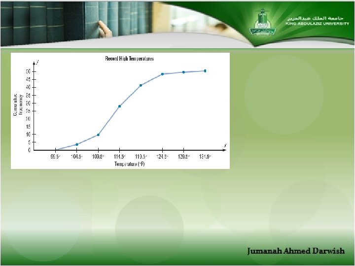
Cumulative Frequency Graphs Or Ogives The ogive is a graph that represents the cumulative frequencies for the classes in a frequency distribution q The upper class boundaries are represented on the horizontal axis

Example 2 -6: Construct an ogive to represent the data for the record high temperatures for each of the 50 states (see Example 2– 2 for the data). Class Limits Class Boundaries 100 - 104 105 - 109 110 - 114 115 - 119 120 - 124 125 - 129 130 - 134 99. 5 - 104. 5 - 109. 5 - 114. 5 - 119. 5 - 124. 5 - 129. 5 - 134. 5 Frequency 2 8 18 13 7 1 1

Class Limits Class Boundaries Frequency 100 - 104 105 - 109 110 - 114 115 - 119 120 - 124 125 - 129 130 - 134 99. 5 - 104. 5 - 109. 5 - 114. 5 - 119. 5 - 124. 5 - 129. 5 - 134. 5 2 8 18 13 7 1 1 Class Boundaries Cumulative Frequency Less than 99. 5 Less than 104. 5 Less than 109. 5 Less than 114. 5 Less than 119. 5 Less than 124. 5 Less than 129. 5 Less than 134. 5 0 2 10 28 41 48 49 50

ü Ogives use upper class boundaries and cumulative frequencies of the classes.

PROCEDURE TABLE Constructing Statistical Graphs 1: Draw and label the x and y axes. 2: Choose a suitable scale for the frequencies or cumulative frequencies, and label it on the y axis. 3: Represent the class boundaries for the histogram or ogive, or the midpoint for the frequency polygon, on the x axis. 4: Plot the points and then draw the bars or lines.
")
* …… is used starting zero and finishing the total number of observations a) Grouped frequency b) Cumulative frequency graphs

• If proportions are used instead of frequencies, the graphs are called ……………… • The sum of the relative frequencies will always be ……. . • The sum of the percent will always be ……. . • ………. And …………. . graphs are used to represent continuous data.

• What types of frequency distribution? • “ Cars Colors” what type of frequency distribution should be used? • The boundaries of 16. 7 are …………. . • The boundaries of 13 -19 …………. . And class width is ………. .

SHAPES OF DISTRIBUTIONS Flat J shaped : few data values on left side and increases as one moves to right Reverse J shaped: opposite of the j-shaped distribution

Positively skewed Negatively skewed

2. 3 OTHER TYPES OF GRAPHS 1. Bar graph 2. Pareto chart 3. The Pie graph

q. Bar graph represents the data by using vertical bar or horizontal bar whose heights or lengths represent the frequencies of the data. When the data are qualitative or categorical , bar graphs can be used.
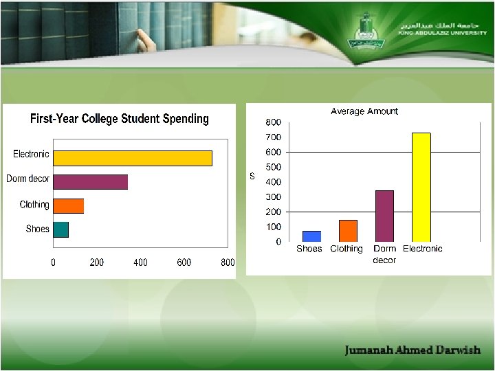
: COLLEGE SPENDING FOR FIRST -YEAR STUDENTS: Class Frequency Electronic 728$")
*EXAMPLE 2 -8 P(69): COLLEGE SPENDING FOR FIRST -YEAR STUDENTS: Class Frequency Electronic 728$ Dorm decor 344$ Clothing 141$ Shoes 72$

q. A Pareto chart is used to represent a frequency distribution for a categorical variable (Qualitative), and the frequencies are displayed by the heights of vertical bars, which are arranged in order from highest to lowest.
: TURNPIKE COSTS: Class (State) Freq. Indiana 2. 9 Oklahoma 4.")
*EXAMPLE 2 -9 P(70): TURNPIKE COSTS: Class (State) Freq. Indiana 2. 9 Oklahoma 4. 3 Florida 6 Maine 3. 8 Pennsylvania 5. 8

q Time series graph represents data that occur over a specific period of time. year Freq. 2000 11 2001 10 2002 16 2003 15 2004 18

q. A pie graph is a circle that is divided into sections or wedges according to the percentage of frequencies in each category of the distribution.

EXAMPLE 2 -12: Construct a pie graph showing the blood types of the army inductees described in example 2 -1. Class A B O Frequency 5 7 9 AB Total 4 25 percent

q. A stem and leaf plots is a data plot that uses part of a data value as the stem and part of the data value as the leaf to form groups or classes. q. The stem and leaf plot is a method of organizing data and is a combination of sorting and graphing. q It has the advantage over a grouped frequency distribution of retaining the actual data while showing them in graphical form.

Example 2 -13: At an outpatient testing center, the number of cardiograms performed each day for 20 days is shown. Construct a stem and leaf plot for the data. 25 14 36 32 31 43 32 52 20 02 33 44 32 57 32 51 13 23 44 45
 Range: R= highest value – lowest value ------------------------------------Class width: Class Limits 24")
Formulas (CH#2) Range: R= highest value – lowest value ------------------------------------Class width: Class Limits 24 – 30 31 – 37 c. w= L 2 -L 1 Or c. w= U 2 -U 1 The class width is the same for any class. c. w= R/ no. of classes
 ** Class midpoint Xm = ** Total of frequency= n= number of")
Formulas (CH#2) ** Class midpoint Xm = ** Total of frequency= n= number of observations ** Relative Frequency= (f/n) ** Sum of relative frequency= 1 ** Percentage= (f/n) * 100 ** Sum of percentages= 100 ** Class Width should be: Odd number ** Degree= (f/n) * 360 ** sum of degrees= 360 ** Less than Cumulative frequency

REVIEW CH # 2

The following data represent the fire in the weak for 4 city. Choose the correct frequency distribution to organize the data: Class Limit Frequency 4 -7 2 7 -11 3 11 -14 6 14 -17 8 Class Limit Frequency 4 -7 2 7 -10 3 10 -13 1 13 -16 5 Class Limit Frequency 4 -7 2 8 -11 5 12 -15 9 16 -19 2
 49 -50 ounces b)")
What are the boundaries of 49. 005 ounces ? a) 49 -50 ounces b) 48. 505 -49. 505 ounces c) 49. 0045 -49. 0055 ounces d) 48. 955 -49. 055 ounces ---------------------------------- The class width for the class 28 -33 is: a) 5 b) 6 c) 33 d) 28
 of 30")
The following table shows the frequency distribution of temperature (in degree centigrade) of 30 countries : Class Limit Frequency 30 -34 10 35 -39 5 40 -44 8 45 -49 7 Use the above table to answer questions: a) The number of countries with temperature less than 44. 5 is: b)The midpoint in the first class is: c) The percentage of values in second class is :

What graph should be used to show the relationship between the parts and the whole ? a) Histogram b) Pie graph c) Pareto graph d) Ogives ------------------------------------------- In a pie chart, if the percentage of married people is 40 %. Then their corresponding degree of the angle is: a) 144⁰ b) 151. 1⁰ c) 216. 8⁰ d) 180⁰

In a stem and leaf plot, the leaf part for the data value 347 is a. 34 b. 7 c. 47 d. 3 ----------------------------------------------------- Which graph should be used to represent "types of cars sold in Jeddah"? A) Ogive B) Histogram C) Pareto chart D) Time series graph
 Histogram b)")
……. can be drown by using vertical or horizontal bars : a) Histogram b) Bar graph c) Pareto chart d) Pie graph -------------------------------------------Other name for ogive is: a) Histogram b) Frequency Polygon c) Cumulative frequency graph d) Pareto Chart
Two b)Three c) One d) None ---------------------------------------------------Types of")
The graph has ………. . Peak: a)Two b)Three c) One d) None ---------------------------------------------------Types of graph is: a) Frequency polygon b) Ogive c) Cumulative frequency d) Curve
 Pareto")
Data collected over period of time can be graphed using ………. . a) Pareto graph b) Pie graph c) Time serious d) Curve -----------------------------------------following : what the correct stem and leaf plot which represent the data 16 10 11 30 35 33 35 44 47

In a stem and leaf plot, the leaf part for the data value 347 is 34 7 47 3 ----------------------------------------

Class 50 -52 53 -55 56 -58 59 -61 62 -64 Frequency 5 8 12 13 11 The number whose height or less than 55. 5 inches • 5 • 13 • 8 • 25
Class width b)Sample size")
The heights of vertical bars in the histogram represent the a)Class width b)Sample size c)Frequencies of classes d)Number of classes ------------------------------------Which graph should be used to represent the relationship between years of production and number of buses product?
- Slides: 71