Chapter 2 Exploring Data with Graphs and Numerical


![Proportion & Percentage (Relative Frequencies) [Example] EX: There are 5 students joining a field Proportion & Percentage (Relative Frequencies) [Example] EX: There are 5 students joining a field](https://slidetodoc.com/presentation_image_h2/6e2dcbe7c2ebb377f60c3242b0309d0e/image-8.jpg)
![Proportion & Percentage (Relative Frequencies) [Class Problem #1] EX: There were 268 reported shark Proportion & Percentage (Relative Frequencies) [Class Problem #1] EX: There were 268 reported shark](https://slidetodoc.com/presentation_image_h2/6e2dcbe7c2ebb377f60c3242b0309d0e/image-9.jpg)
![Frequency Table [Class Problem #2] A frequency table is a listing of possible values Frequency Table [Class Problem #2] A frequency table is a listing of possible values](https://slidetodoc.com/presentation_image_h2/6e2dcbe7c2ebb377f60c3242b0309d0e/image-10.jpg)

![Dot Plots [Step 1: data validation] Dot Plots are used for summarizing a quantitative Dot Plots [Step 1: data validation] Dot Plots are used for summarizing a quantitative](https://slidetodoc.com/presentation_image_h2/6e2dcbe7c2ebb377f60c3242b0309d0e/image-23.jpg)
![Trim and also split stems [Summary] p p Eg: Make a stemplot for the Trim and also split stems [Summary] p p Eg: Make a stemplot for the](https://slidetodoc.com/presentation_image_h2/6e2dcbe7c2ebb377f60c3242b0309d0e/image-32.jpg)







- Slides: 97

Chapter 2 Exploring Data with Graphs and Numerical Summaries Section 2. 1 Different Types of Data Copyright © 2013, 2009, and 2007, Pearson Education, Inc.

Variable A variable is any characteristic observed in a study. Examples: Marital status, Height, Weight, IQ A variable can be classified as either § Categorical (in Categories), A variable can be classified as categorical if each observation belongs to one of a set of categories: Examples: Gender (Male or Female), Religious Affiliation (Catholic, Jewish, …) Type of Residence (Apartment, Condo, …), Belief in Life After Death (Yes or No) § Quantitative (Numerical), A variable is called quantitative if observations on it take numerical values that represent different magnitudes of the variable. Examples: Age, Number of Siblings, Annual Income 2 Copyright © 2013, 2009, and 2007, Pearson Education, Inc.

Main Features of Quantitative and Categorical Variables For Quantitative variables: key features are the center and spread (variability) of the data, which means we can add and subtract the data. Example: What’s a typical annual amount of precipitation? Is there much variation from year to year? For Categorical variables: a key feature is the percentage of observations in each of the categories, and addition and subtraction of the original data do not make sense. Example: What percentage of students at a certain college are Democrats? Question: is zip code of an area categorical or quantitative? 3 Copyright © 2013, 2009, and 2007, Pearson Education, Inc.

Discrete and Continuous Quantitative Variable A quantitative variable is discrete if its possible values form a set of separate numbers, such as 0, 1, 2, 3, …. Discrete variables have a finite number of possible values. Examples: § Number of pets in a household § Number of children in a family § Number of foreign languages spoken by an individual 4 Copyright © 2013, 2009, and 2007, Pearson Education, Inc.

Continuous Quantitative Variable A quantitative variable is continuous if its possible values form an interval. Continuous variables have an infinite number of possible values. Examples: § Height/Weight § Age § Blood pressure 5 Copyright © 2013, 2009, and 2007, Pearson Education, Inc.

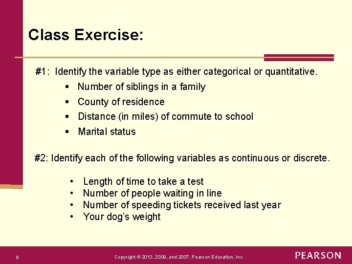
Class Exercise: #1: Identify the variable type as either categorical or quantitative. § § Number of siblings in a family County of residence Distance (in miles) of commute to school Marital status #2: Identify each of the following variables as continuous or discrete. • • 6 Length of time to take a test Number of people waiting in line Number of speeding tickets received last year Your dog’s weight Copyright © 2013, 2009, and 2007, Pearson Education, Inc.

Chapter 2 Exploring Data with Graphs and Numerical Summaries Section 2. 2 Graphical Summaries of Data Copyright © 2013, 2009, and 2007, Pearson Education, Inc.
![Proportion Percentage Relative Frequencies Example EX There are 5 students joining a field Proportion & Percentage (Relative Frequencies) [Example] EX: There are 5 students joining a field](https://slidetodoc.com/presentation_image_h2/6e2dcbe7c2ebb377f60c3242b0309d0e/image-8.jpg)
Proportion & Percentage (Relative Frequencies) [Example] EX: There are 5 students joining a field trip. The gender of these students are M, F, M, M, F. 1. 2. 3. 4. 5. 8 What is the variable of interest? What type of variable is it? Summarize the variable into a frequency table. Find the relative frequency. Make Bar graph and Pie chart. [By hand by Excel] Copyright © 2013, 2009, and 2007, Pearson Education, Inc.
![Proportion Percentage Relative Frequencies Class Problem 1 EX There were 268 reported shark Proportion & Percentage (Relative Frequencies) [Class Problem #1] EX: There were 268 reported shark](https://slidetodoc.com/presentation_image_h2/6e2dcbe7c2ebb377f60c3242b0309d0e/image-9.jpg)
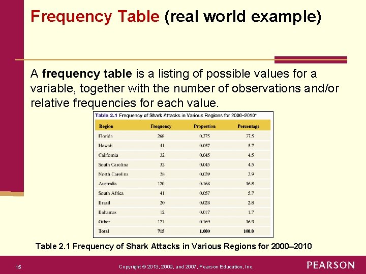
Proportion & Percentage (Relative Frequencies) [Class Problem #1] EX: There were 268 reported shark attacks in Florida between 2000 and 2010. There were 715 shark attacks reported from 2000 through 2010 in US. Q: For Florida, what are the frequency, relative freq, and percent? § 268 is the frequency. § 0. 375 =268/715 is the proportion and relative frequency. § the percentage is 0. 375 *100%= 37. 5%. 9 Copyright © 2013, 2009, and 2007, Pearson Education, Inc.
![Frequency Table Class Problem 2 A frequency table is a listing of possible values Frequency Table [Class Problem #2] A frequency table is a listing of possible values](https://slidetodoc.com/presentation_image_h2/6e2dcbe7c2ebb377f60c3242b0309d0e/image-10.jpg)
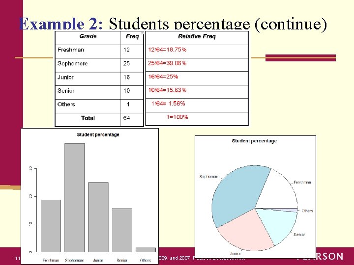
Frequency Table [Class Problem #2] A frequency table is a listing of possible values for a variable, together with the number of observations and/or relative frequencies for each value. Grade Relative Freq Freshman 12 12/64=0. 1875=18. 75% Sophomore 25 25/64=0. 390625=39. 0625% Junior 16 16/64=0. 25=25% Senior 10 10/64=0. 15625=15. 625% Others 1 Total 10 Freq 64 1/64=0. 015625= 1. 5625% 1=100% Copyright © 2013, 2009, and 2007, Pearson Education, Inc.

Example 2: Students percentage (continue) 11 Copyright © 2013, 2009, and 2007, Pearson Education, Inc.

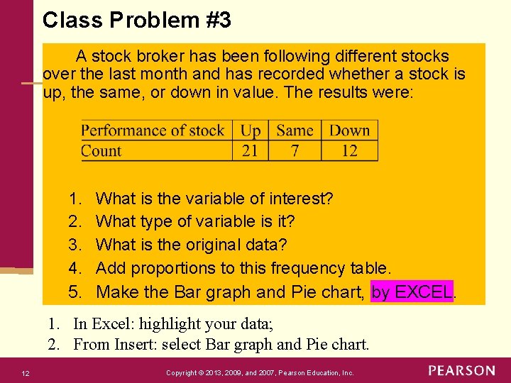
Class Problem #3 A stock broker has been following different stocks over the last month and has recorded whether a stock is up, the same, or down in value. The results were: 1. 2. 3. 4. 5. What is the variable of interest? What type of variable is it? What is the original data? Add proportions to this frequency table. Make the Bar graph and Pie chart, by EXCEL. 1. In Excel: highlight your data; 2. From Insert: select Bar graph and Pie chart. 12 Copyright © 2013, 2009, and 2007, Pearson Education, Inc.

Excel: to plot bar graph 1. In your spreadsheet, select data to use for your pie chart. 2. On Insert tab, in Charts group, click Column symbol. 3. Click Clustered Bar. 4. You can copy the plot into Word file. https: //www. excel-easy. com/examples/bar-chart. html 13 Copyright © 2013, 2009, and 2007, Pearson Education, Inc.

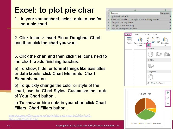
Excel: to plot pie char 1. In your spreadsheet, select data to use for your pie chart. 2. Click Insert > Insert Pie or Doughnut Chart, and then pick the chart you want. 3. Click the chart and then click the icons next to the chart to add finishing touches: a) To show, hide, or format things like axis titles or data labels, click Chart Elements button. b) To quickly change the color or style of the chart, use the Chart Styles Customize the Look of Your Chart button. c) To show or hide data in your chart click Chart Filters button. https: //support. office. com/en-us/article/add-a-pie-chart-1 a 5 f 08 ae-ba 4046 f 2 -9 ed 0 -ff 84873 b 7863 14 Copyright © 2013, 2009, and 2007, Pearson Education, Inc.

Frequency Table (real world example) A frequency table is a listing of possible values for a variable, together with the number of observations and/or relative frequencies for each value. Table 2. 1 Frequency of Shark Attacks in Various Regions for 2000– 2010 15 Copyright © 2013, 2009, and 2007, Pearson Education, Inc.

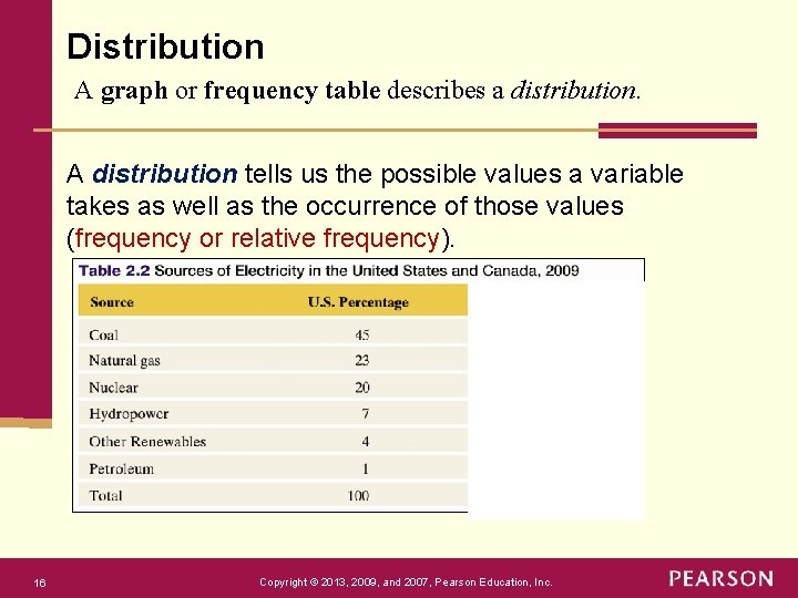
Distribution A graph or frequency table describes a distribution. A distribution tells us the possible values a variable takes as well as the occurrence of those values (frequency or relative frequency). 16 Copyright © 2013, 2009, and 2007, Pearson Education, Inc.

Graphs for Categorical Variables The two primary graphical displays for summarizing a categorical variable are the pie chart and the bar graph. Pie Chart: A circle having a “slice of pie” for each category. Bar Graph: A graph that displays a vertical bar for each category. 17 Copyright © 2013, 2009, and 2007, Pearson Education, Inc.

Pie Charts: § Used for summarizing a categorical variable. 18 § Drawn as a circle where each category is represented as a “slice of the pie”. § The size of each pie slice is proportional to the percentage of observations falling in that category. Copyright © 2013, 2009, and 2007, Pearson Education, Inc.

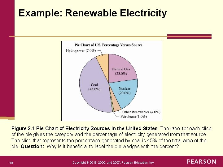
Example: Renewable Electricity Figure 2. 1 Pie Chart of Electricity Sources in the United States. The label for each slice of the pie gives the category and the percentage of electricity generated from that source. The slice that represents the percentage generated by coal is 45% of the total area of the pie. Question: Why is it beneficial to label the pie wedges with the percent? 19 Copyright © 2013, 2009, and 2007, Pearson Education, Inc.

Bar Graphs Bar graphs are used for summarizing a categorical variable. § Bar Graphs display a vertical bar for each category. § The height of each bar represents either counts (“frequencies”) or percentages (“relative frequencies”) for that category. § It is usually easier to compare categories with a bar graph rather than with a pie chart. § Bar Graphs are called Pareto Charts when the categories are ordered by their frequency, from the tallest bar to the shortest bar. 20 Copyright © 2013, 2009, and 2007, Pearson Education, Inc.

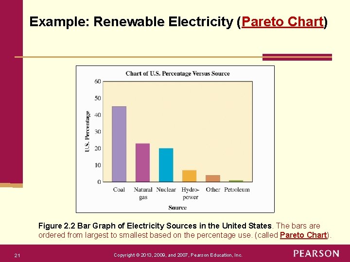
Example: Renewable Electricity (Pareto Chart) Figure 2. 2 Bar Graph of Electricity Sources in the United States. The bars are ordered from largest to smallest based on the percentage use. (called Pareto Chart). 21 Copyright © 2013, 2009, and 2007, Pearson Education, Inc.

Next, Graphs for Quantitative Variables Dot Plot: shows a dot for each observation placed above its value on a # line. Histogram: uses bars to portray the data. How do we decide which to use? Here are some guidelines: Dot-plot More useful for small data sets Data values are retained Histogram More useful for large data sets Most compact display More flexibility in defining intervals 22 Copyright © 2013, 2009, and 2007, Pearson Education, Inc.
![Dot Plots Step 1 data validation Dot Plots are used for summarizing a quantitative Dot Plots [Step 1: data validation] Dot Plots are used for summarizing a quantitative](https://slidetodoc.com/presentation_image_h2/6e2dcbe7c2ebb377f60c3242b0309d0e/image-23.jpg)
Dot Plots [Step 1: data validation] Dot Plots are used for summarizing a quantitative variable. To construct a dot plot 23 1. Draw a horizontal line. 2. Label it with the name of the variable. 3. Mark regular values of the variable on it. 4. For each observation, place a dot above its value on the number line. Copyright © 2013, 2009, and 2007, Pearson Education, Inc.

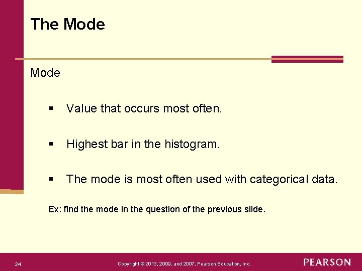
The Mode § Value that occurs most often. § Highest bar in the histogram. § The mode is most often used with categorical data. Ex: find the mode in the question of the previous slide. 24 Copyright © 2013, 2009, and 2007, Pearson Education, Inc.

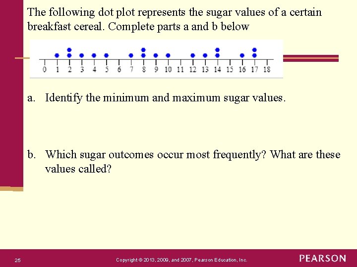
The following dot plot represents the sugar values of a certain breakfast cereal. Complete parts a and b below a. Identify the minimum and maximum sugar values. b. Which sugar outcomes occur most frequently? What are these values called? 25 Copyright © 2013, 2009, and 2007, Pearson Education, Inc.

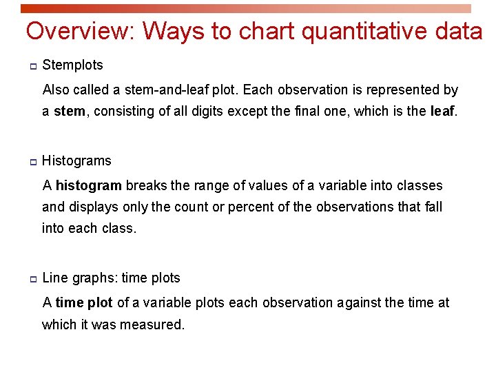
Overview: Ways to chart quantitative data p Stemplots Also called a stem-and-leaf plot. Each observation is represented by a stem, consisting of all digits except the final one, which is the leaf. p Histograms A histogram breaks the range of values of a variable into classes and displays only the count or percent of the observations that fall into each class. p Line graphs: time plots A time plot of a variable plots each observation against the time at which it was measured.

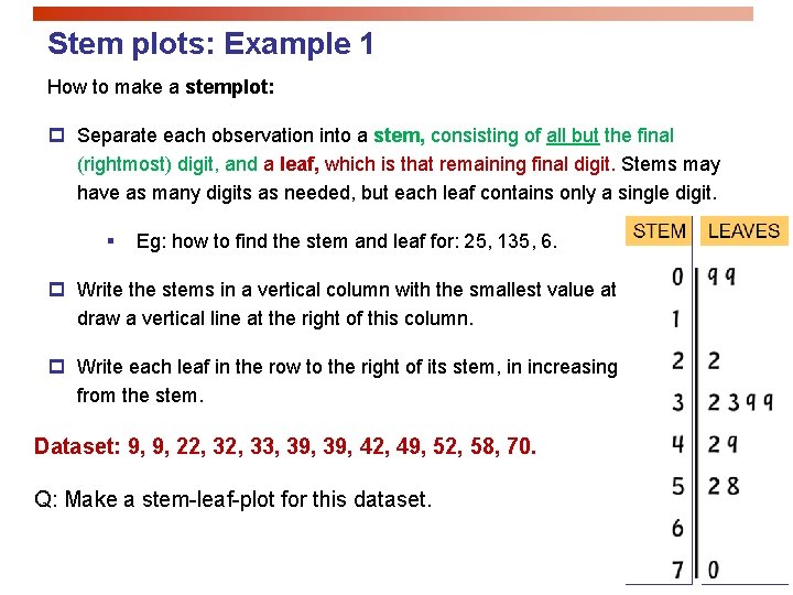
Stem plots: Example 1 How to make a stemplot: p Separate each observation into a stem, consisting of all but the final (rightmost) digit, and a leaf, which is that remaining final digit. Stems may have as many digits as needed, but each leaf contains only a single digit. § Eg: how to find the stem and leaf for: 25, 135, 6. p Write the stems in a vertical column with the smallest value at the top, and draw a vertical line at the right of this column. p Write each leaf in the row to the right of its stem, in increasing order out from the stem. Dataset: 9, 9, 22, 33, 39, 42, 49, 52, 58, 70. Q: Make a stem-leaf-plot for this dataset.

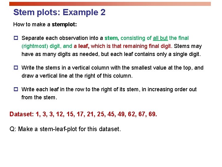
Stem plots: Example 2 How to make a stemplot: p Separate each observation into a stem, consisting of all but the final (rightmost) digit, and a leaf, which is that remaining final digit. Stems may have as many digits as needed, but each leaf contains only a single digit. p Write the stems in a vertical column with the smallest value at the top, and draw a vertical line at the right of this column. p Write each leaf in the row to the right of its stem, in increasing order out from the stem. Dataset: 1, 3, 3, 12, 15, 17, 21, 25, 49, 62, 67, 69. Q: Make a stem-leaf-plot for this dataset.

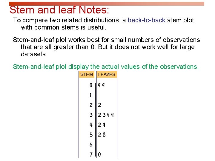
Stem and leaf Notes: To compare two related distributions, a back-to-back stem plot with common stems is useful. Stem-and-leaf plot works best for small numbers of observations that are all greater than 0. But it does not work well for large datasets. Stem-and-leaf plot display the actual values of the observations.

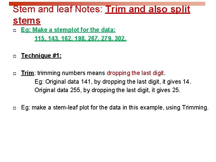
Stem and leaf Notes: Trim and also split stems p Eg: Make a stemplot for the data: 115, 143, 162, 198, 267, 279, 302. p Technique #1: p Trim: trimming numbers means dropping the last digit. Eg: Original data 141, by dropping the last digit, it gives 14. Original data 255, by dropping the last digit, it gives 25. p Eg: make a stem-leaf plot for the data in this example, using Trimming.

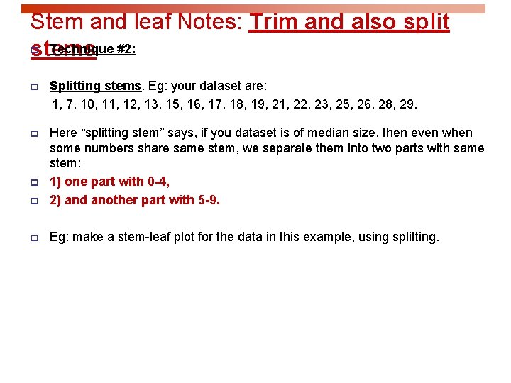
Stem and leaf Notes: Trim and also split Technique #2: stems p p Splitting stems. Eg: your dataset are: 1, 7, 10, 11, 12, 13, 15, 16, 17, 18, 19, 21, 22, 23, 25, 26, 28, 29. p p Here “splitting stem” says, if you dataset is of median size, then even when some numbers share same stem, we separate them into two parts with same stem: 1) one part with 0 -4, 2) and another part with 5 -9. p Eg: make a stem-leaf plot for the data in this example, using splitting. p
![Trim and also split stems Summary p p Eg Make a stemplot for the Trim and also split stems [Summary] p p Eg: Make a stemplot for the](https://slidetodoc.com/presentation_image_h2/6e2dcbe7c2ebb377f60c3242b0309d0e/image-32.jpg)
Trim and also split stems [Summary] p p Eg: Make a stemplot for the data: 115, 143, 162, 198, 267, 279, 302. Trim and also split stems. That means: trimming numbers means dropping the last digit. Eg: Original data 141, by dropping the last digit, it gives 14. Original data 255, by dropping the last digit, it gives 25. p Splitting stems. Eg: your dataset are: 1, 7, 10, 11, 12, 13, 15, 16, 17, 18, 19, 21, 22, 23, 25, 26, 28, 29. Then by “splitting stem”, it gives: 0|1 0|7 1|0123 1|56789 2|123 2|5689 p Here “splitting stem” says, if you dataset is of median size, then even when some numbers share same stem, we separate them into two parts with same stem, one part with 0 -4, and another part with 5 -9.

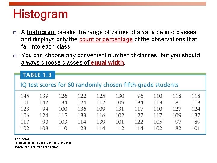
Histogram p p A histogram breaks the range of values of a variable into classes and displays only the count or percentage of the observations that fall into each class. You can choose any convenient number of classes, but you should always choose classes of equal width. Table 1. 3 Introduction to the Practice of Statistics, Sixth Edition © 2009 W. H. Freeman and Company

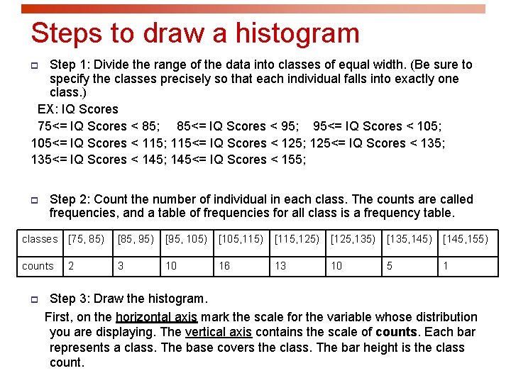
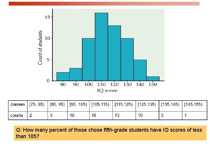
Steps to draw a histogram Step 1: Divide the range of the data into classes of equal width. (Be sure to specify the classes precisely so that each individual falls into exactly one class. ) EX: IQ Scores 75<= IQ Scores < 85; 85<= IQ Scores < 95; 95<= IQ Scores < 105; 105<= IQ Scores < 115; 115<= IQ Scores < 125; 125<= IQ Scores < 135; 135<= IQ Scores < 145; 145<= IQ Scores < 155; p p Step 2: Count the number of individual in each class. The counts are called frequencies, and a table of frequencies for all class is a frequency table. classes [75, 85) [85, 95) [95, 105) [105, 115) [115, 125) [125, 135) [135, 145) [145, 155) counts 3 10 16 13 10 5 1 p 2 Step 3: Draw the histogram. First, on the horizontal axis mark the scale for the variable whose distribution you are displaying. The vertical axis contains the scale of counts. Each bar represents a class. The base covers the class. The bar height is the class count.

Q: How many percent of those chose fifth-grade students have IQ scores of less than 105?

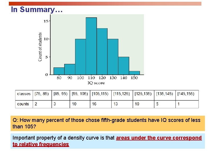
In Summary… Q: How many percent of those chose fifth-grade students have IQ scores of less than 105? Important property of a density curve is that areas under the curve correspond to relative frequencies

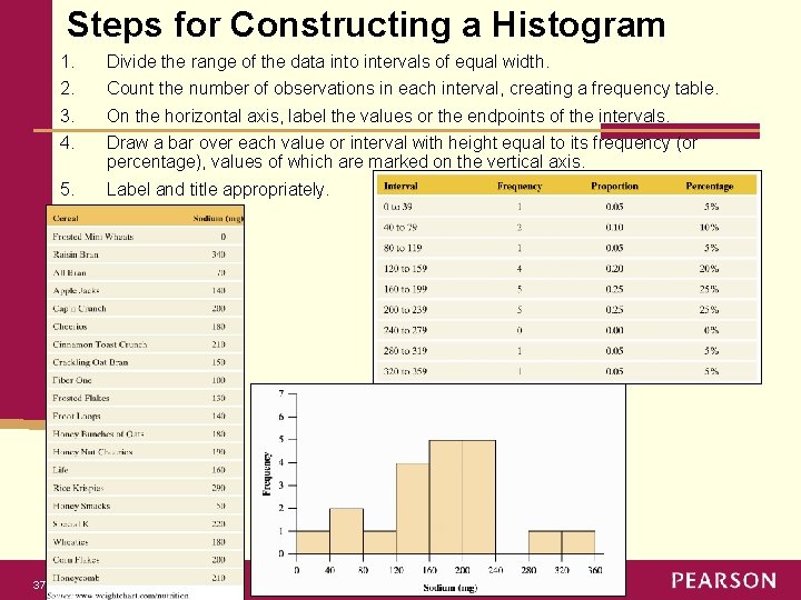
Steps for Constructing a Histogram 37 1. 2. 3. 4. Divide the range of the data into intervals of equal width. 5. Label and title appropriately. Count the number of observations in each interval, creating a frequency table. On the horizontal axis, label the values or the endpoints of the intervals. Draw a bar over each value or interval with height equal to its frequency (or percentage), values of which are marked on the vertical axis. Copyright © 2013, 2009, and 2007, Pearson Education, Inc.

Interpreting Histograms Overall pattern consists of center, spread, and shape. 38 § Assess where a distribution is centered by finding the median (50% of data below median 50% of data above). § Assess the spread of a distribution. § Shape of a distribution: roughly symmetric, skewed to the right, or skewed to the left. Copyright © 2013, 2009, and 2007, Pearson Education, Inc.

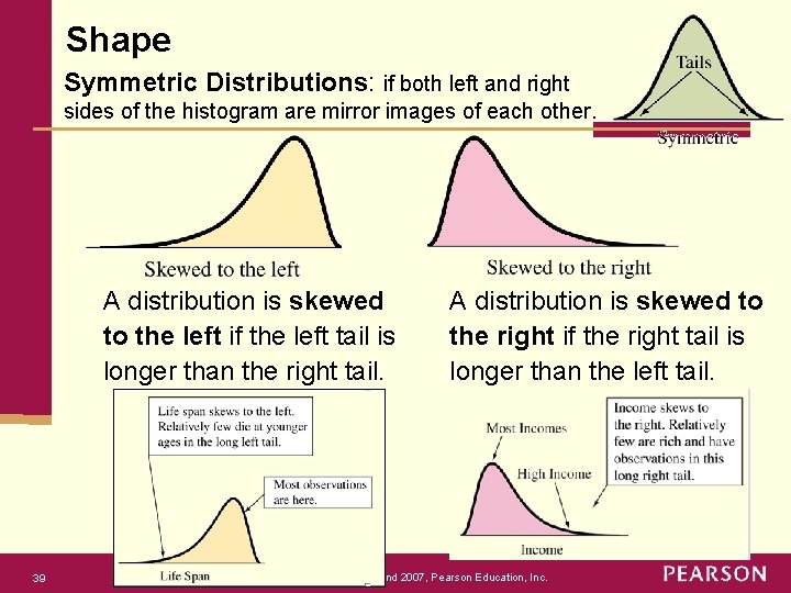
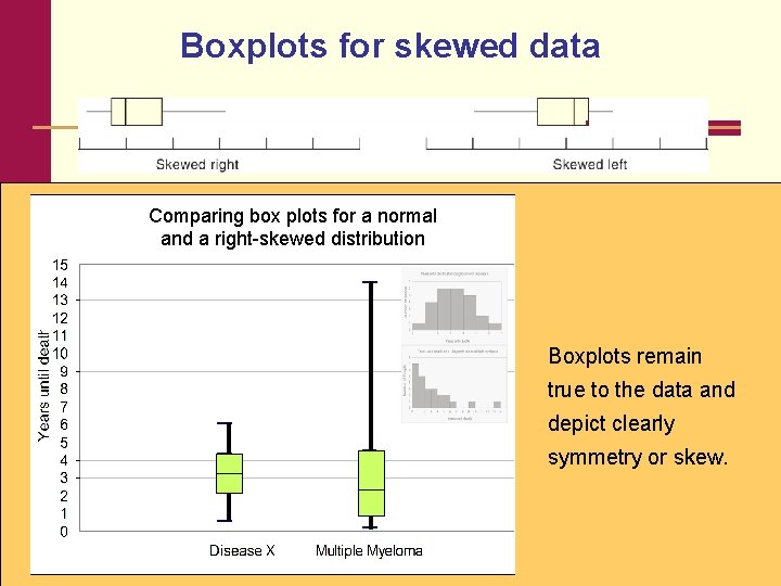
Shape Symmetric Distributions: if both left and right sides of the histogram are mirror images of each other. A distribution is skewed to the left if the left tail is longer than the right tail. 39 A distribution is skewed to the right if the right tail is longer than the left tail. Copyright © 2013, 2009, and 2007, Pearson Education, Inc.

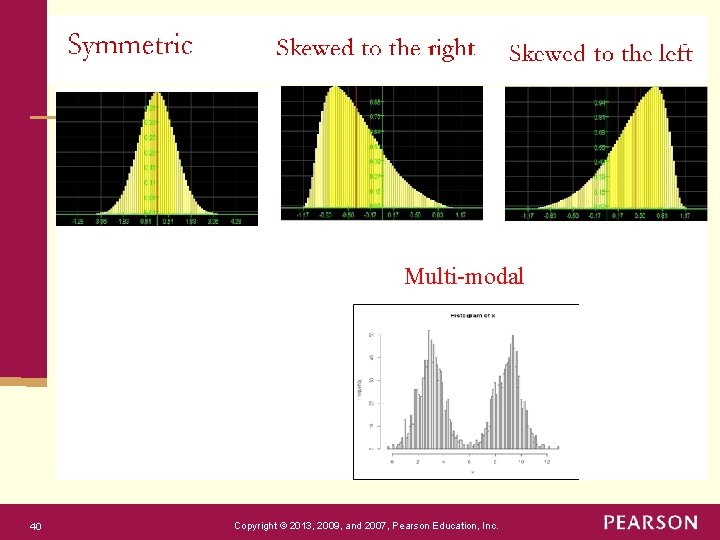
Multi-modal 40 Copyright © 2013, 2009, and 2007, Pearson Education, Inc.

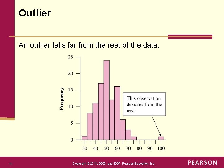
Outlier An outlier falls far from the rest of the data. 41 Copyright © 2013, 2009, and 2007, Pearson Education, Inc.

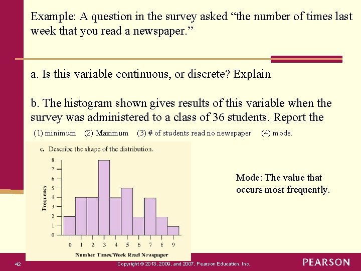
Example: A question in the survey asked “the number of times last week that you read a newspaper. ” a. Is this variable continuous, or discrete? Explain b. The histogram shown gives results of this variable when the survey was administered to a class of 36 students. Report the (1) minimum (2) Maximum (3) # of students read no newspaper (4) mode. Mode: The value that occurs most frequently. 42 Copyright © 2013, 2009, and 2007, Pearson Education, Inc.

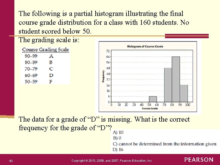
The following is a partial histogram illustrating the final course grade distribution for a class with 160 students. No student scored below 50. The grading scale is: The data for a grade of “D” is missing. What is the correct frequency for the grade of “D”? 43 Copyright © 2013, 2009, and 2007, Pearson Education, Inc.

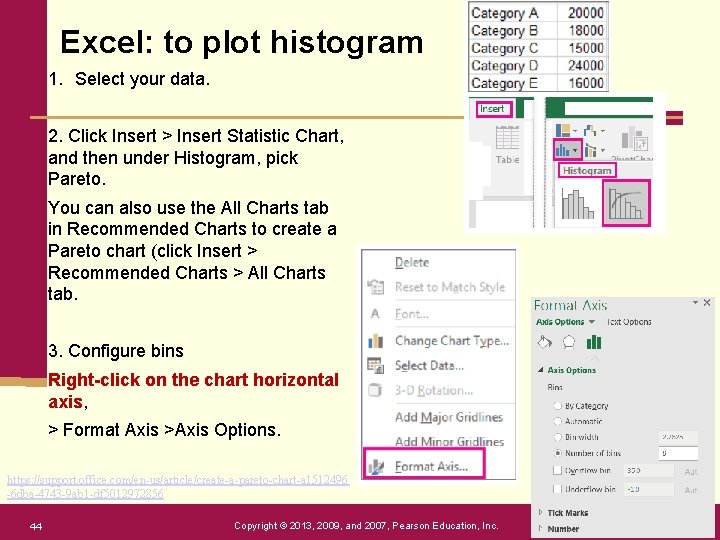
Excel: to plot histogram 1. Select your data. 2. Click Insert > Insert Statistic Chart, and then under Histogram, pick Pareto. You can also use the All Charts tab in Recommended Charts to create a Pareto chart (click Insert > Recommended Charts > All Charts tab. 3. Configure bins Right-click on the chart horizontal axis, > Format Axis >Axis Options. https: //support. office. com/en-us/article/create-a-pareto-chart-a 1512496 -6 dba-4743 -9 ab 1 -df 5012972856 44 Copyright © 2013, 2009, and 2007, Pearson Education, Inc.

Chapter 2 Exploring Data with Graphs and Numerical Summaries Section 2. 3 Measuring the Center of Quantitative Data Copyright © 2013, 2009, and 2007, Pearson Education, Inc.

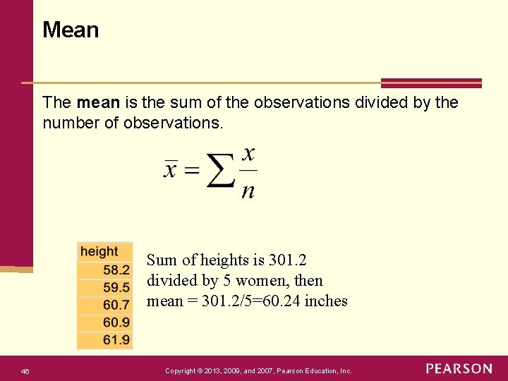
Mean The mean is the sum of the observations divided by the number of observations. Sum of heights is 301. 2 divided by 5 women, then mean = 301. 2/5=60. 24 inches 46 Copyright © 2013, 2009, and 2007, Pearson Education, Inc.

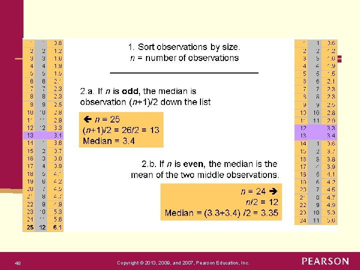
Median The median is the midpoint of the observations when they are ordered from the smallest to the largest (or from the largest to smallest). How to Determine the Median: Put the n observations in order of their size. If the number of observations, n, is: § odd, then the median is the middle observation. § even, then the median is the average of the two middle observations. 47 Copyright © 2013, 2009, and 2007, Pearson Education, Inc.

48 Copyright © 2013, 2009, and 2007, Pearson Education, Inc.

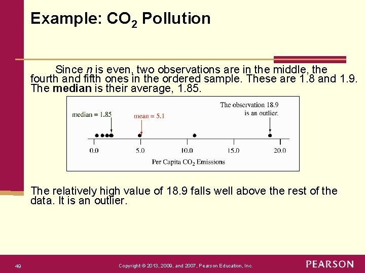
Example: CO 2 Pollution Since n is even, two observations are in the middle, the fourth and fifth ones in the ordered sample. These are 1. 8 and 1. 9. The median is their average, 1. 85. The relatively high value of 18. 9 falls well above the rest of the data. It is an outlier. 49 Copyright © 2013, 2009, and 2007, Pearson Education, Inc.

Comparing Mean and Median, Examples: Example 1: with the data listed below, what are the mean and median? 2, 3, 5, 1. Example 2: with the data listed below, what are the mean and median? 2, 3, 5, 1, 100. Example 3: with the data listed below, what are the mean and median? -100, 2, 3, 5, 1, 100. Question: What can we conclude from the examples above? 50 Copyright © 2013, 2009, and 2007, Pearson Education, Inc.

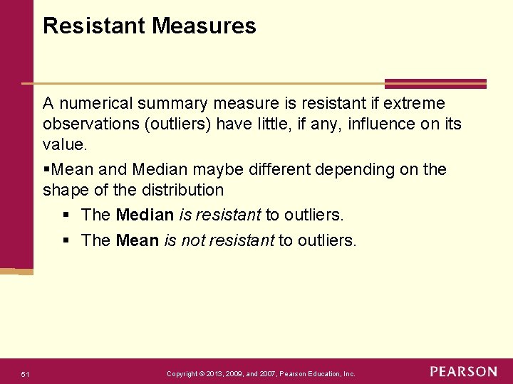
Resistant Measures A numerical summary measure is resistant if extreme observations (outliers) have little, if any, influence on its value. §Mean and Median maybe different depending on the shape of the distribution § The Median is resistant to outliers. § The Mean is not resistant to outliers. 51 Copyright © 2013, 2009, and 2007, Pearson Education, Inc.

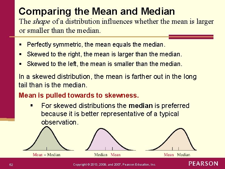
Comparing the Mean and Median The shape of a distribution influences whether the mean is larger or smaller than the median. § Perfectly symmetric, the mean equals the median. § Skewed to the right, the mean is larger than the median. § Skewed to the left, the mean is smaller than the median. In a skewed distribution, the mean is farther out in the long tail than is the median. Mean is pulled towards to skewness. § For skewed distributions the median is preferred because it is better representative of a typical observation. 52 Copyright © 2013, 2009, and 2007, Pearson Education, Inc.

Chapter 2 Exploring Data with Graphs and Numerical Summaries Section 2. 4 Measuring the Variability of Quantitative Data Copyright © 2013, 2009, and 2007, Pearson Education, Inc.

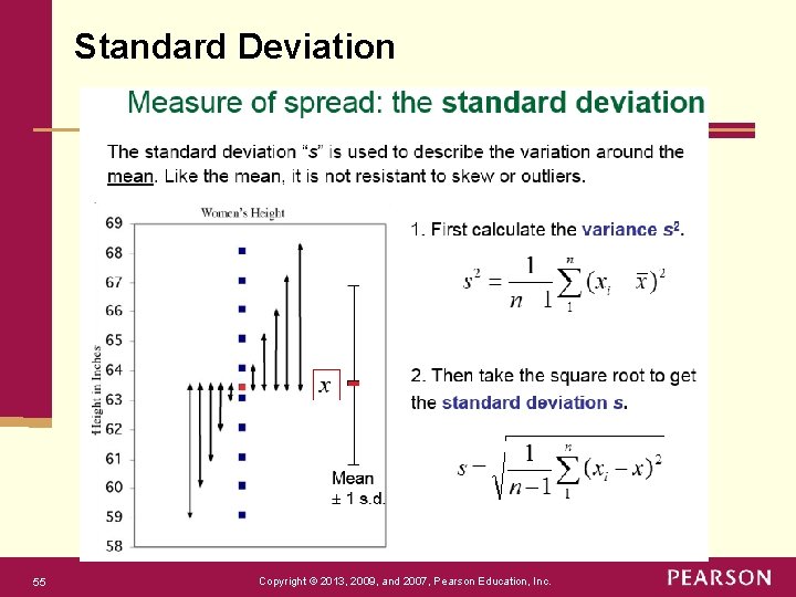
Range One way to measure the spread is to calculate the range. The range is the difference between the largest and smallest values in the data set: Range = max min The range is simple to compute and easy to understand, but it uses only the extreme values and ignores the other values. Therefore, it’s affected severely by outliers (not resistant to outliers). Eg: find the range for data: 3, 5, 8, 12. 54 Copyright © 2013, 2009, and 2007, Pearson Education, Inc.

Standard Deviation 55 Copyright © 2013, 2009, and 2007, Pearson Education, Inc.

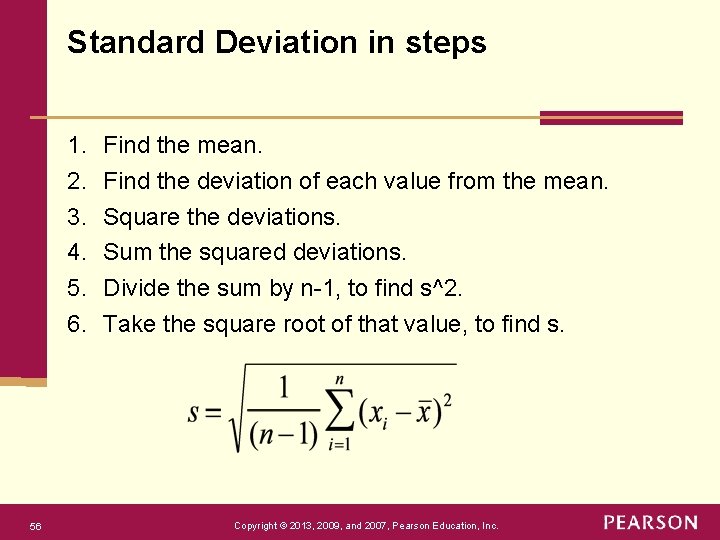
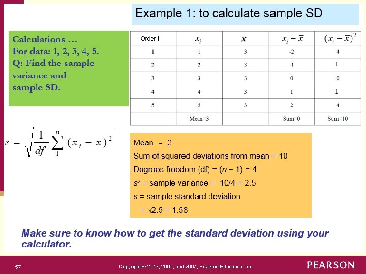
Standard Deviation in steps 1. 2. 3. 4. 5. 6. 56 Find the mean. Find the deviation of each value from the mean. Square the deviations. Sum the squared deviations. Divide the sum by n-1, to find s^2. Take the square root of that value, to find s. Copyright © 2013, 2009, and 2007, Pearson Education, Inc.

57 Copyright © 2013, 2009, and 2007, Pearson Education, Inc.

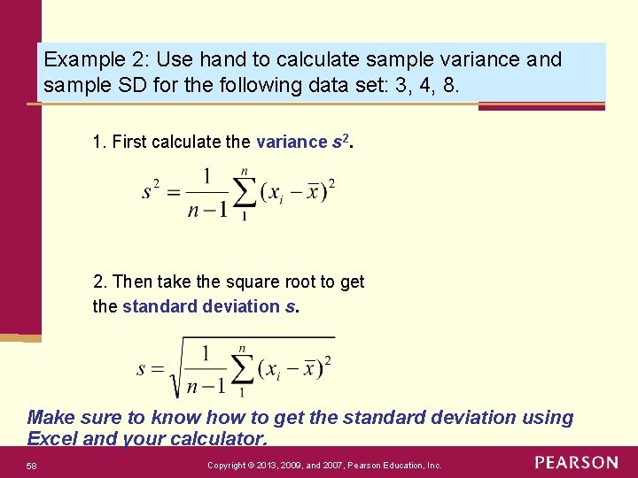
Example 2: Use hand to calculate sample variance and sample SD for the following data set: 3, 4, 8. 1. First calculate the variance s 2. Then take the square root to get the standard deviation s. Make sure to know how to get the standard deviation using Excel and your calculator. 58 Copyright © 2013, 2009, and 2007, Pearson Education, Inc.

Load the Analysis Tool. Pak in Excel (Windows) https: //support. office. com/en-us/article/load-the-analysis-toolpak-in-excel 6 a 63 e 598 -cd 6 d-42 e 3 -9317 -6 b 40 ba 1 a 66 b 4 Note: You will need to click on “Go” button in the bottom. 59 Copyright © 2013, 2009, and 2007, Pearson Education, Inc.

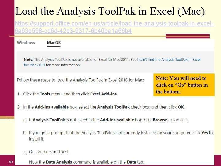
Load the Analysis Tool. Pak in Excel (Mac) https: //support. office. com/en-us/article/load-the-analysis-toolpak-in-excel 6 a 63 e 598 -cd 6 d-42 e 3 -9317 -6 b 40 ba 1 a 66 b 4 Note: You will need to click on “Go” button in the bottom. 60 Copyright © 2013, 2009, and 2007, Pearson Education, Inc.

How to use the Analysis Tool. Pak in Excel Descriptive Statistics in Tool. Pak: https: //www. excel-easy. com/examples/descriptivestatistics. html Data Analysis Select Descriptive Statistics and click OK. Select the range A 2: A 15 as the Input Range. Select cell C 1 as the Output Range. Make sure Summary statistics is checked. Click OK. 61 Copyright © 2013, 2009, and 2007, Pearson Education, Inc.

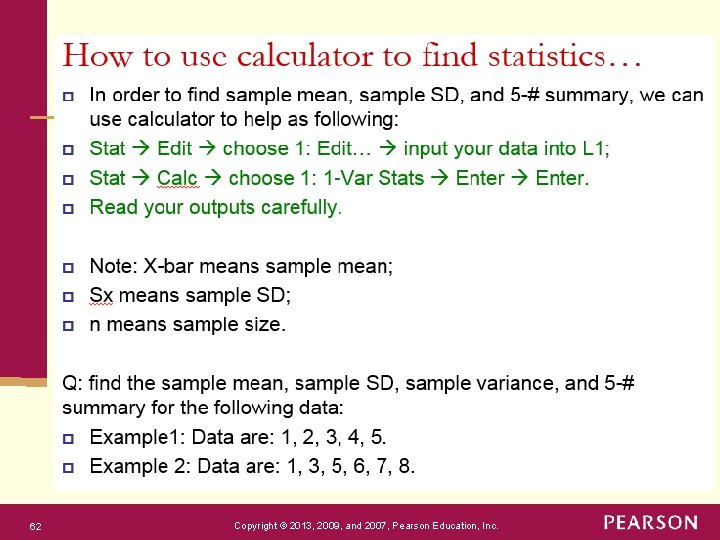
62 Copyright © 2013, 2009, and 2007, Pearson Education, Inc.

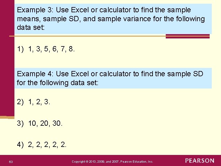
Example 3: Use Excel or calculator to find the sample means, sample SD, and sample variance for the following data set: 1) 1, 3, 5, 6, 7, 8. Example 4: Use Excel or calculator to find the sample SD for the following data set: 2) 1, 2, 3. 3) 10, 20, 30. 4) 2, 2, 2. 63 Copyright © 2013, 2009, and 2007, Pearson Education, Inc.

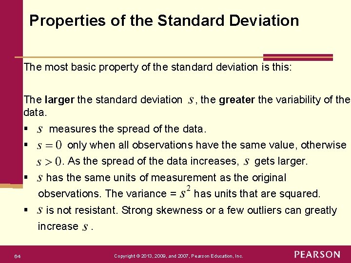
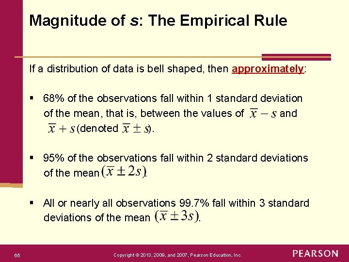
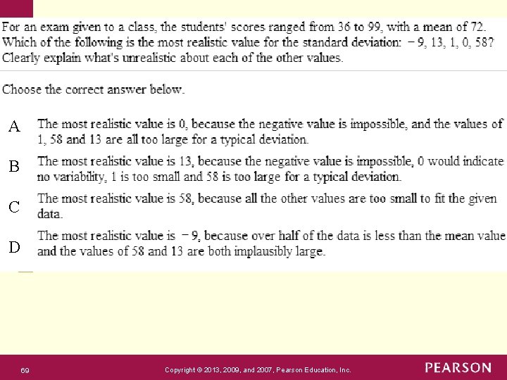
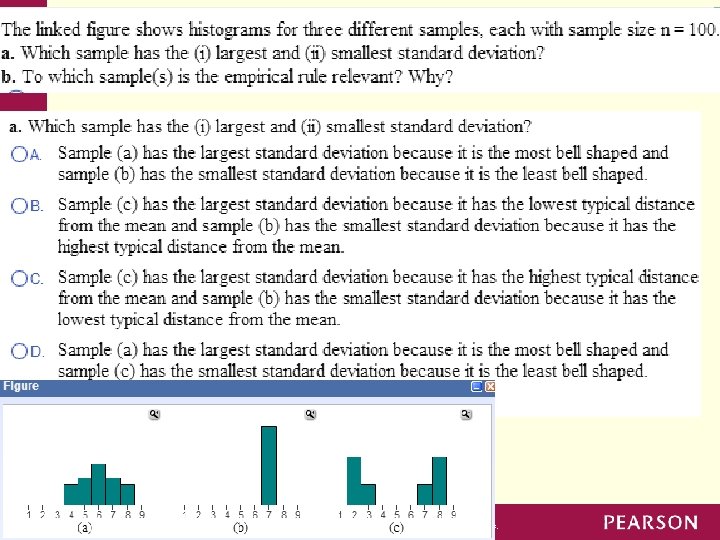
Properties of the Standard Deviation The most basic property of the standard deviation is this: The larger the standard deviation data. § § , the greater the variability of the measures the spread of the data. only when all observations have the same value, otherwise. As the spread of the data increases, § has the same units of measurement as the original observations. The variance = § has units that are squared. is not resistant. Strong skewness or a few outliers can greatly increase 64 gets larger. . Copyright © 2013, 2009, and 2007, Pearson Education, Inc.

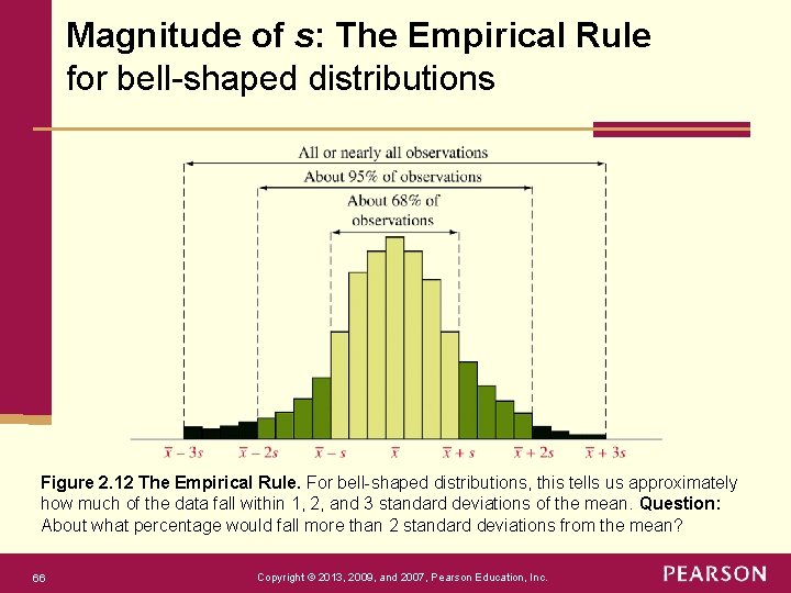
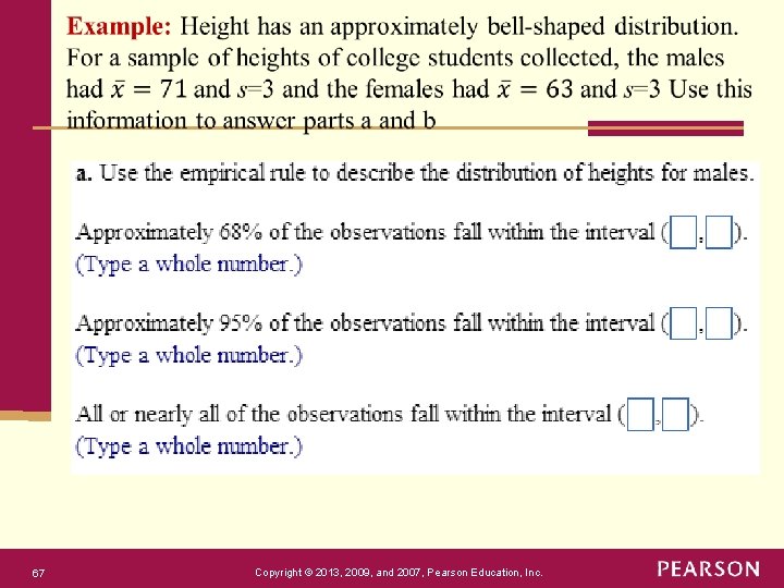
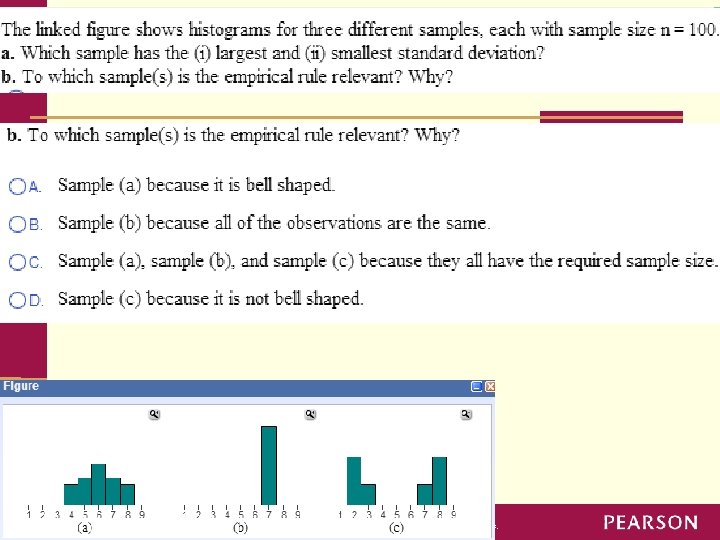
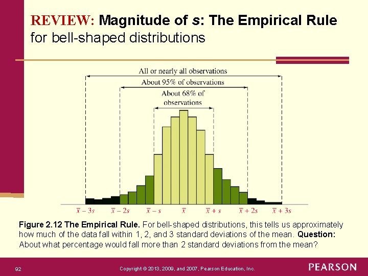
Magnitude of s: The Empirical Rule If a distribution of data is bell shaped, then approximately: § 68% of the observations fall within 1 standard deviation of the mean, that is, between the values of and (denoted ). § 95% of the observations fall within 2 standard deviations of the mean. § All or nearly all observations 99. 7% fall within 3 standard deviations of the mean. 65 Copyright © 2013, 2009, and 2007, Pearson Education, Inc.

Magnitude of s: The Empirical Rule for bell-shaped distributions Figure 2. 12 The Empirical Rule. For bell-shaped distributions, this tells us approximately how much of the data fall within 1, 2, and 3 standard deviations of the mean. Question: About what percentage would fall more than 2 standard deviations from the mean? 66 Copyright © 2013, 2009, and 2007, Pearson Education, Inc.

67 Copyright © 2013, 2009, and 2007, Pearson Education, Inc.

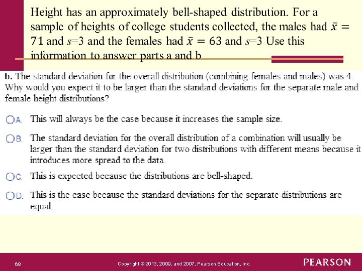
68 Copyright © 2013, 2009, and 2007, Pearson Education, Inc.

A B C D 69 Copyright © 2013, 2009, and 2007, Pearson Education, Inc.

70 Copyright © 2013, 2009, and 2007, Pearson Education, Inc.

71 Copyright © 2013, 2009, and 2007, Pearson Education, Inc.

Chapter 2 Exploring Data with Graphs and Numerical Summaries Section 2. 5 Using Measures of Position to Describe Variability Copyright © 2013, 2009, and 2007, Pearson Education, Inc.

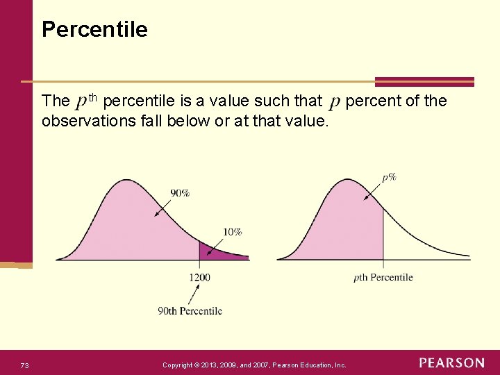
Percentile The th percentile is a value such that percent of the observations fall below or at that value. 73 Copyright © 2013, 2009, and 2007, Pearson Education, Inc.

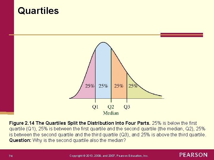
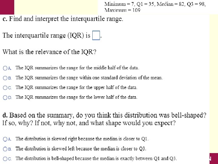
Quartiles Figure 2. 14 The Quartiles Split the Distribution Into Four Parts. 25% is below the first quartile (Q 1), 25% is between the first quartile and the second quartile (the median, Q 2), 25% is between the second quartile and the third quartile (Q 3), and 25% is above third quartile. Question: Why is the second quartile also the median? 74 Copyright © 2013, 2009, and 2007, Pearson Education, Inc.

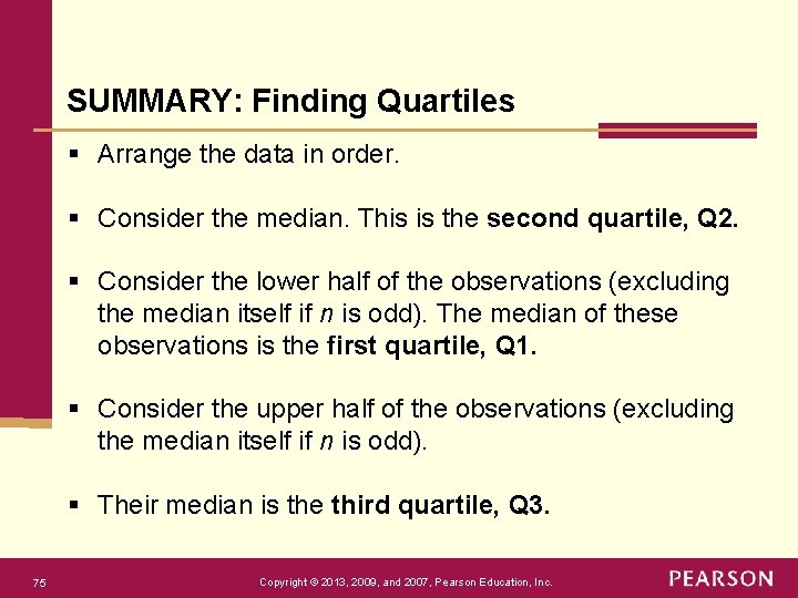
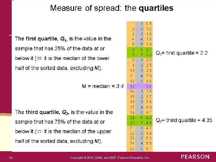
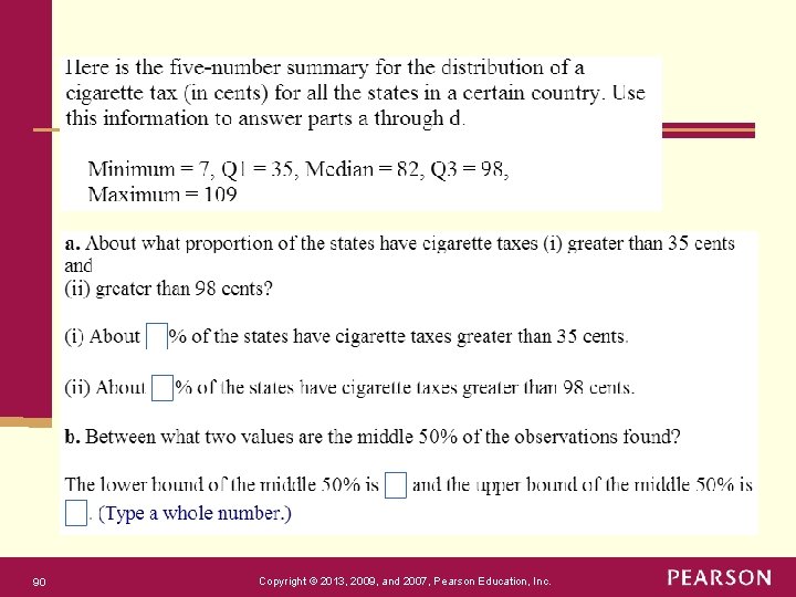
SUMMARY: Finding Quartiles § Arrange the data in order. § Consider the median. This is the second quartile, Q 2. § Consider the lower half of the observations (excluding the median itself if n is odd). The median of these observations is the first quartile, Q 1. § Consider the upper half of the observations (excluding the median itself if n is odd). § Their median is the third quartile, Q 3. 75 Copyright © 2013, 2009, and 2007, Pearson Education, Inc.

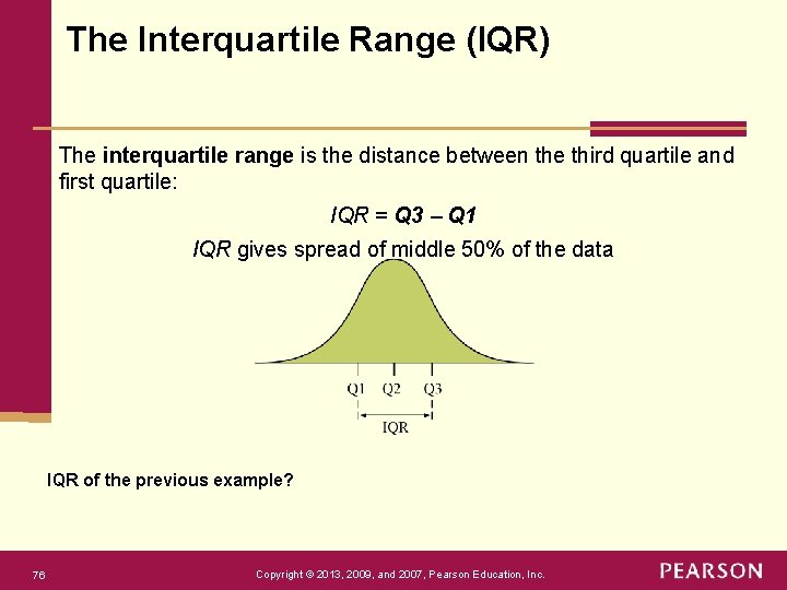
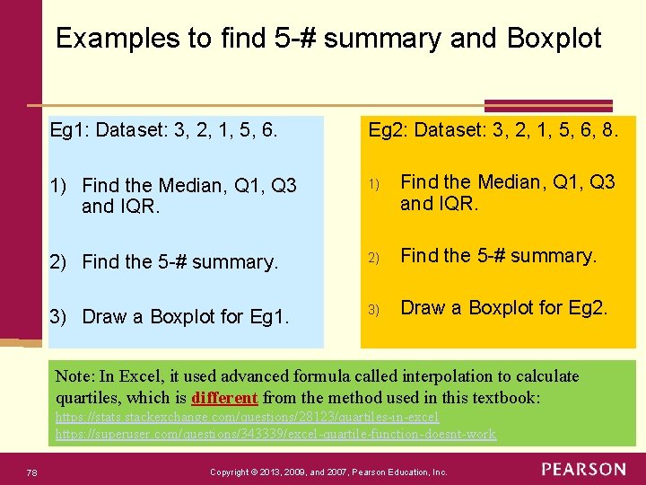
The Interquartile Range (IQR) The interquartile range is the distance between the third quartile and first quartile: IQR = Q 3 Q 1 IQR gives spread of middle 50% of the data IQR of the previous example? 76 Copyright © 2013, 2009, and 2007, Pearson Education, Inc.

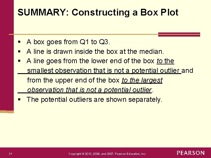
SUMMARY: Constructing a Box Plot § A box goes from Q 1 to Q 3. § A line is drawn inside the box at the median. § A line goes from the lower end of the box to the smallest observation that is not a potential outlier and from the upper end of the box to the largest observation that is not a potential outlier. § The potential outliers are shown separately. 77 Copyright © 2013, 2009, and 2007, Pearson Education, Inc.

Examples to find 5 -# summary and Boxplot Eg 1: Dataset: 3, 2, 1, 5, 6. Eg 2: Dataset: 3, 2, 1, 5, 6, 8. 1) Find the Median, Q 1, Q 3 and IQR. 2) Find the 5 -# summary. 3) Draw a Boxplot for Eg 1. 3) Draw a Boxplot for Eg 2. Note: In Excel, it used advanced formula called interpolation to calculate quartiles, which is different from the method used in this textbook: https: //stats. stackexchange. com/questions/28123/quartiles-in-excel https: //superuser. com/questions/343339/excel-quartile-function-doesnt-work 78 Copyright © 2013, 2009, and 2007, Pearson Education, Inc.

79 Copyright © 2013, 2009, and 2007, Pearson Education, Inc.

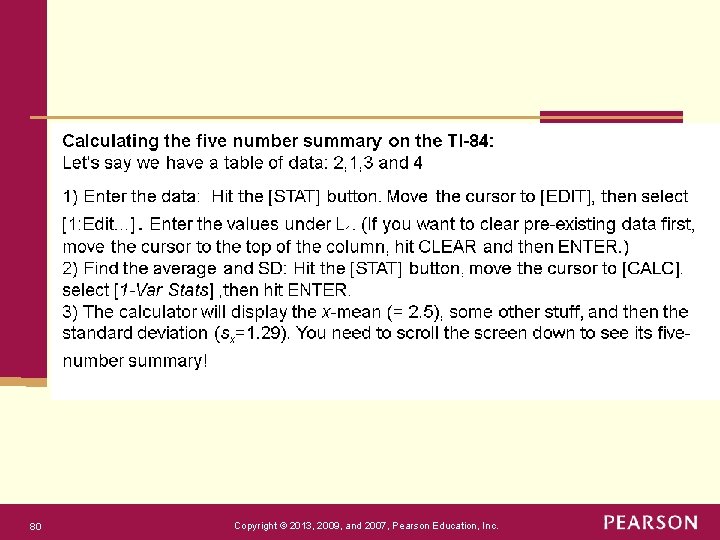
80 Copyright © 2013, 2009, and 2007, Pearson Education, Inc.

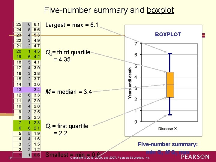
Five-number summary and boxplot Largest = max = 6. 1 BOXPLOT Q 3= third quartile = 4. 35 M = median = 3. 4 Q 1= first quartile = 2. 2 Five-number summary: min Q 1 M Q 3 max 81 Smallest = min = 0. 6 Copyright © 2013, 2009, and 2007, Pearson Education, Inc.

Boxplots for skewed data Comparing box plots for a normal and a right-skewed distribution Boxplots remain true to the data and depict clearly symmetry or skew. 82 Copyright © 2013, 2009, and 2007, Pearson Education, Inc.

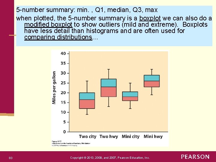
5 -number summary: min. , Q 1, median, Q 3, max when plotted, the 5 -number summary is a boxplot we can also do a modified boxplot to show outliers (mild and extreme). Boxplots have less detail than histograms and are often used for comparing distributions… 83 Copyright © 2013, 2009, and 2007, Pearson Education, Inc.

Detecting Potential Outliers Examining the data for unusual observations, such as outliers, is important in any statistical analysis. Is there a formula for flagging an observation as potentially being an outlier? The 1. 5 x IQR Criterion for Identifying Potential Outliers An observation is a potential outlier if it falls more than 1. 5 x IQR below the first quartile or more than 1. 5 x IQR above third quartile. 84 Copyright © 2013, 2009, and 2007, Pearson Education, Inc.

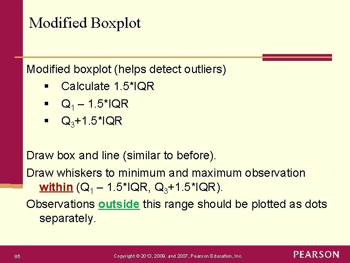
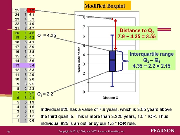
Modified Boxplot Modified boxplot (helps detect outliers) § Calculate 1. 5*IQR § Q 1 – 1. 5*IQR § Q 3+1. 5*IQR Draw box and line (similar to before). Draw whiskers to minimum and maximum observation within (Q 1 – 1. 5*IQR, Q 3+1. 5*IQR). Observations outside this range should be plotted as dots separately. 85 Copyright © 2013, 2009, and 2007, Pearson Education, Inc.

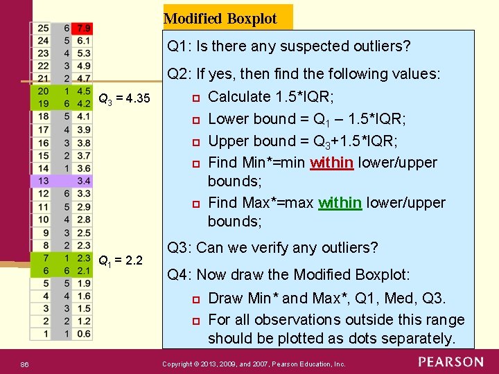
Modified Boxplot Q 1: Is there any suspected outliers? Q 2: If yes, then find the following values: Q 3 = 4. 35 p p p Q 1 = 2. 2 Q 3: Can we verify any outliers? Q 4: Now draw the Modified Boxplot: p p 86 Calculate 1. 5*IQR; Lower bound = Q 1 – 1. 5*IQR; Upper bound = Q 3+1. 5*IQR; Find Min*=min within lower/upper bounds; Find Max*=max within lower/upper bounds; Draw Min* and Max*, Q 1, Med, Q 3. For all observations outside this range should be plotted as dots separately. Copyright © 2013, 2009, and 2007, Pearson Education, Inc.

Modified Boxplot 8 Q 3 = 4. 35 Distance to Q 3 7. 9 − 4. 35 = 3. 55 Interquartile range Q 3 – Q 1 4. 35 − 2. 2 = 2. 15 Q 1 = 2. 2 Individual #25 has a value of 7. 9 years, which is 3. 55 years above third quartile. This is more than 3. 225 years, 1. 5 * IQR. Thus, individual #25 is an outlier by our 1. 5 * IQR rule. 87 Copyright © 2013, 2009, and 2007, Pearson Education, Inc.

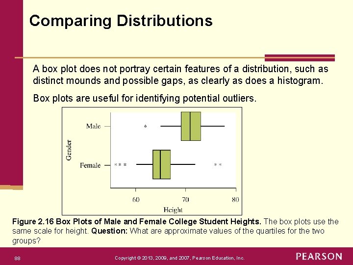
Comparing Distributions A box plot does not portray certain features of a distribution, such as distinct mounds and possible gaps, as clearly as does a histogram. Box plots are useful for identifying potential outliers. Figure 2. 16 Box Plots of Male and Female College Student Heights. The box plots use the same scale for height. Question: What are approximate values of the quartiles for the two groups? 88 Copyright © 2013, 2009, and 2007, Pearson Education, Inc.

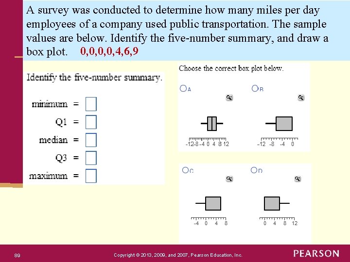
A survey was conducted to determine how many miles per day employees of a company used public transportation. The sample values are below. Identify the five-number summary, and draw a box plot. 0, 0, 4, 6, 9 89 Copyright © 2013, 2009, and 2007, Pearson Education, Inc.

90 Copyright © 2013, 2009, and 2007, Pearson Education, Inc.

91 Copyright © 2013, 2009, and 2007, Pearson Education, Inc.

REVIEW: Magnitude of s: The Empirical Rule for bell-shaped distributions Figure 2. 12 The Empirical Rule. For bell-shaped distributions, this tells us approximately how much of the data fall within 1, 2, and 3 standard deviations of the mean. Question: About what percentage would fall more than 2 standard deviations from the mean? 92 Copyright © 2013, 2009, and 2007, Pearson Education, Inc.

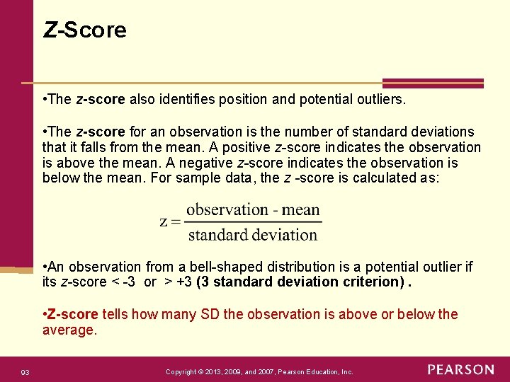
Z-Score • The z-score also identifies position and potential outliers. • The z-score for an observation is the number of standard deviations that it falls from the mean. A positive z-score indicates the observation is above the mean. A negative z-score indicates the observation is below the mean. For sample data, the z -score is calculated as: • An observation from a bell-shaped distribution is a potential outlier if its z-score < -3 or > +3 (3 standard deviation criterion). • Z-score tells how many SD the observation is above or below the average. 93 Copyright © 2013, 2009, and 2007, Pearson Education, Inc.

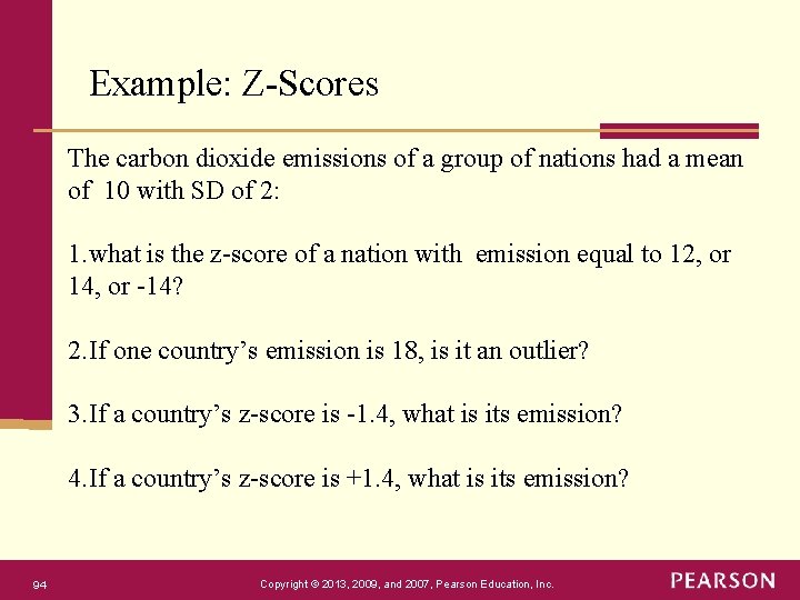
Example: Z-Scores The carbon dioxide emissions of a group of nations had a mean of 10 with SD of 2: 1. what is the z-score of a nation with emission equal to 12, or 14, or -14? 2. If one country’s emission is 18, is it an outlier? 3. If a country’s z-score is -1. 4, what is its emission? 4. If a country’s z-score is +1. 4, what is its emission? 94 Copyright © 2013, 2009, and 2007, Pearson Education, Inc.

Chapter 2 Appendix Copyright © 2013, 2009, and 2007, Pearson Education, Inc.

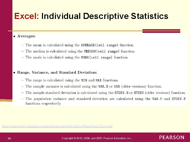
Excel: Individual Descriptive Statistics https: //cosmosweb. champlain. edu/people/stevens/webtech/Excel. Files/Chap 2 -Excel. pdf 96 Copyright © 2013, 2009, and 2007, Pearson Education, Inc.

Interactive Web App p Interactive Web p Explore statistical concepts in an interactive way. The following apps have graphs that update with clicks on buttons or sliders. Each explores a different statistical topic and allows results to be saved. Click on a picture to start the corresponding app. p http: //www. artofstat. com/webapps. html p https: //istats. shinyapps. io/EDA_categorical/ p https: //istats. shinyapps. io/EDA_quantitative/ p https: //istats. shinyapps. io/Meanvs. Median/