Chapter 2 Displaying and Describing Categorical Data How
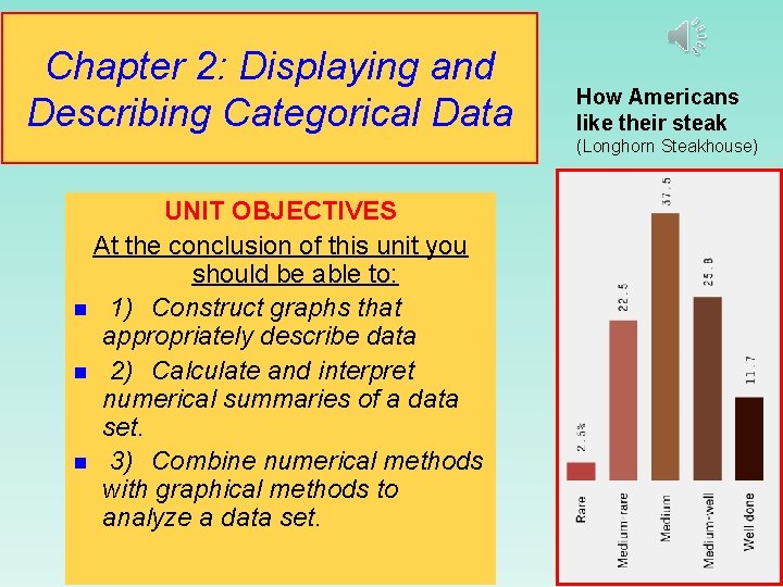
Chapter 2: Displaying and Describing Categorical Data How Americans like their steak (Longhorn Steakhouse) UNIT OBJECTIVES At the conclusion of this unit you should be able to: n 1) Construct graphs that appropriately describe data n 2) Calculate and interpret numerical summaries of a data set. n 3) Combine numerical methods with graphical methods to analyze a data set.
Displaying Qualitative Data “Sometimes you can see a lot just by looking. ” Will Rogers (1879 -1935) American humorist and social commentator
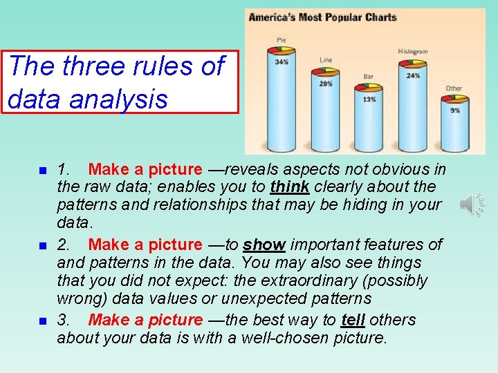
The three rules of data analysis n n n 1. Make a picture —reveals aspects not obvious in the raw data; enables you to think clearly about the patterns and relationships that may be hiding in your data. 2. Make a picture —to show important features of and patterns in the data. You may also see things that you did not expect: the extraordinary (possibly wrong) data values or unexpected patterns 3. Make a picture —the best way to tell others about your data is with a well-chosen picture.
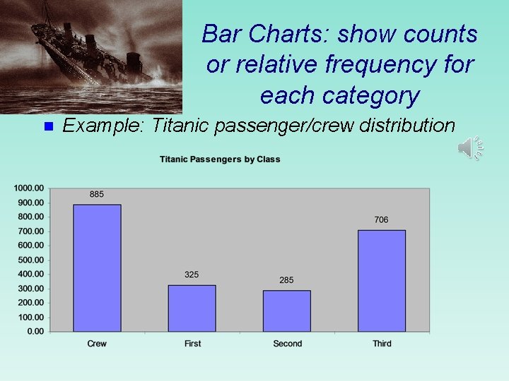
Bar Charts: show counts or relative frequency for each category n Example: Titanic passenger/crew distribution
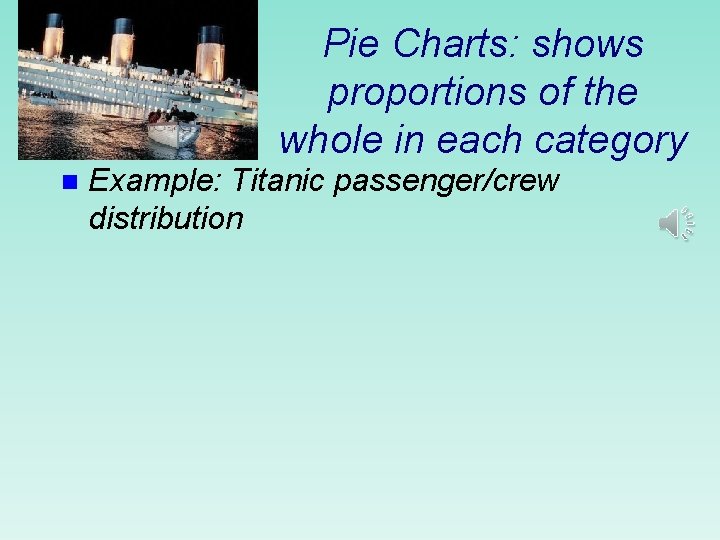
Pie Charts: shows proportions of the whole in each category n Example: Titanic passenger/crew distribution
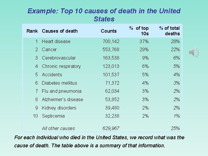
Example: Top 10 causes of death in the United States Rank Causes of death Counts % of top 10 s % of total deaths 1 Heart disease 700, 142 37% 28% 2 Cancer 553, 768 29% 22% 3 Cerebrovascular 163, 538 9% 6% 4 Chronic respiratory 123, 013 6% 5% 5 Accidents 101, 537 5% 4% 6 Diabetes mellitus 71, 372 4% 3% 7 Flu and pneumonia 62, 034 3% 2% 8 Alzheimer’s disease 53, 852 3% 2% 9 Kidney disorders 39, 480 2% 2% 32, 238 2% 1% 10 Septicemia All other causes 629, 967 25% For each individual who died in the United States, we record what was the cause of death. The table above is a summary of that information.
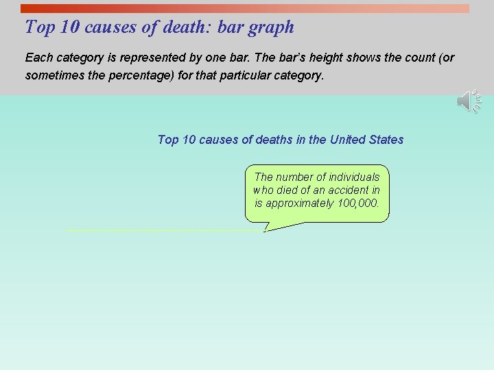
Top 10 causes of death: bar graph Each category is represented by one bar. The bar’s height shows the count (or sometimes the percentage) for that particular category. Top 10 causes of deaths in the United States The number of individuals who died of an accident in is approximately 100, 000.
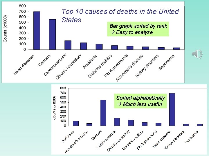
Top 10 causes of deaths in the United States Bar graph sorted by rank Easy to analyze Sorted alphabetically Much less useful
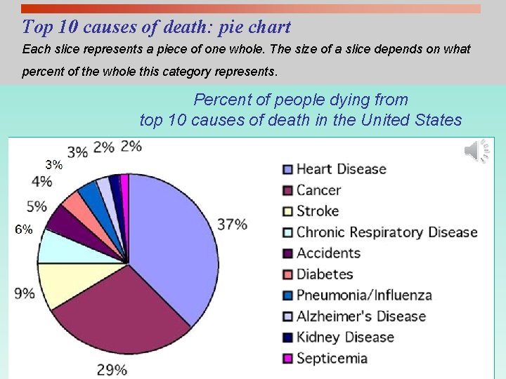
Top 10 causes of death: pie chart Each slice represents a piece of one whole. The size of a slice depends on what percent of the whole this category represents. Percent of people dying from top 10 causes of death in the United States
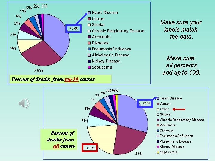
Make sure your labels match the data. Make sure all percents add up to 100. Percent of deaths from top 10 causes Percent of deaths from all causes
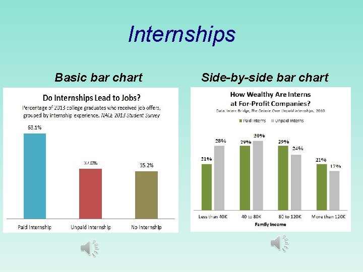
Internships Basic bar chart Side-by-side bar chart
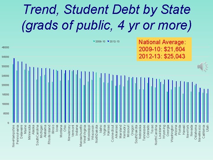
40000 35000 New. Hampshire Pennsylvania Delaware Maine Minnesota Alaska South. Carolina Michigan Alabama Rhode Island Illinois Iowa Montana Ohio New. Jersey Vermont Indiana Massachusetts West. Virginia Mississippi Wisconsin North. Dakota Idaho Virginia Kansas Connecticut Arkansas Maryland Kentucky Missouri Oregon South. Dakota Nebraska Tennessee Colorado Texas North. Carolina Louisiana Wyoming Georgia Washington Arizona Florida Hawaii New. York Nevada Oklahoma New. Mexico California Utah Trend, Student Debt by State (grads of public, 4 yr or more) 2009 -10 2012 -13 National Average: 2009 -10: $21, 604 2012 -13: $25, 043 30000 25000 20000 15000 10000 5000 0
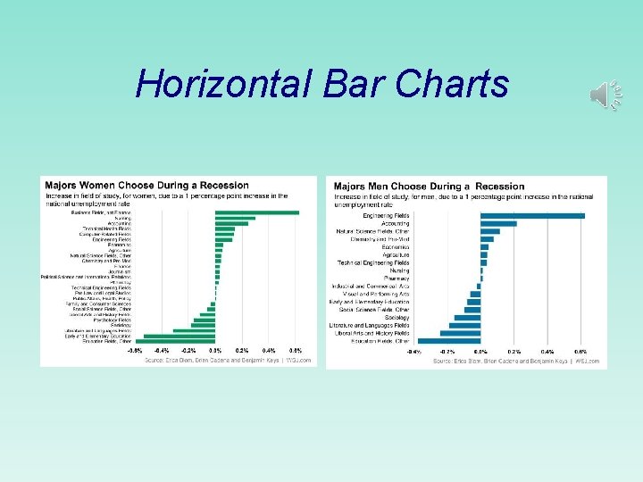
Horizontal Bar Charts
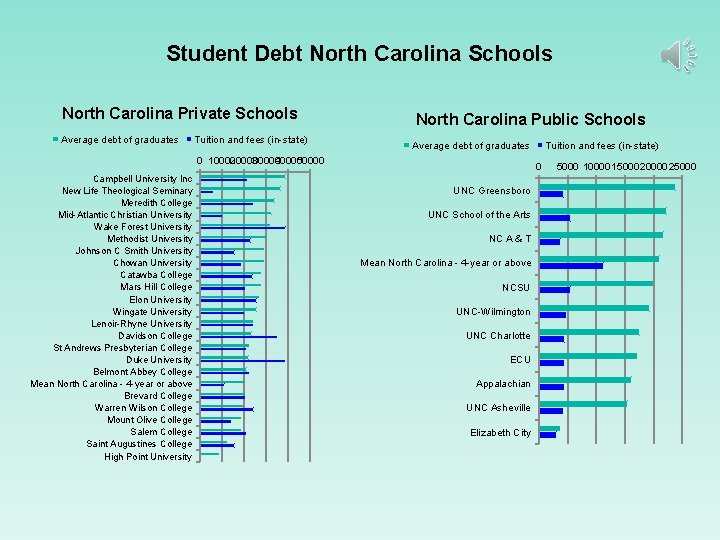
Student Debt North Carolina Schools North Carolina Private Schools Average debt of graduates Tuition and fees (in-state) North Carolina Public Schools Average debt of graduates 0 10000 20000 30000 40000 50000 Campbell University Inc New Life Theological Seminary Meredith College Mid-Atlantic Christian University Wake Forest University Methodist University Johnson C Smith University Chowan University Catawba College Mars Hill College Elon University Wingate University Lenoir-Rhyne University Davidson College St Andrews Presbyterian College Duke University Belmont Abbey College Mean North Carolina - 4 -year or above Brevard College Warren Wilson College Mount Olive College Salem College Saint Augustines College High Point University Tuition and fees (in-state) 0 UNC Greensboro UNC School of the Arts NC A & T Mean North Carolina - 4 -year or above NCSU UNC-Wilmington UNC Charlotte ECU Appalachian UNC Asheville Elizabeth City 5000 10000150002000025000
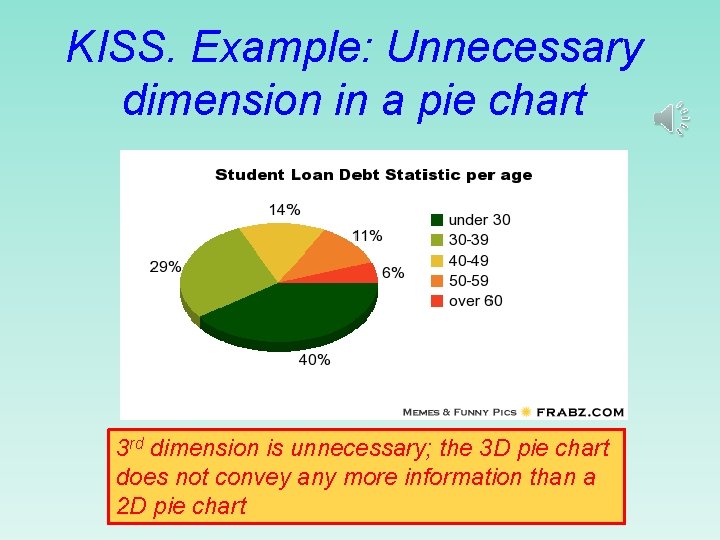
KISS. Example: Unnecessary dimension in a pie chart 3 rd dimension is unnecessary; the 3 D pie chart does not convey any more information than a 2 D pie chart
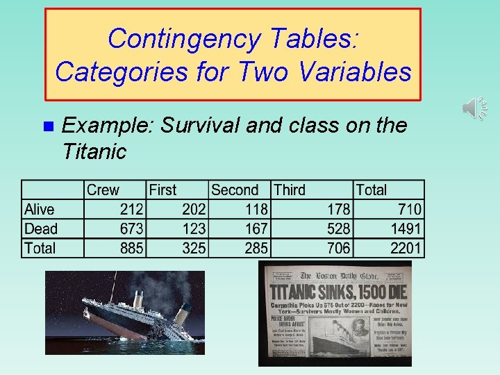
Contingency Tables: Categories for Two Variables n Example: Survival and class on the Titanic
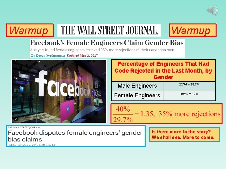
Warmup Percentage of Engineers That Had Code Rejected in the Last Month, by Gender 22/74 = 29. 7% Male Engineers Female Engineers 16/40 = 40% Is there more to the story? We shall see. More to come.
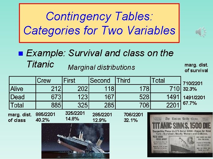
Contingency Tables: Categories for Two Variables n Example: Survival and class on the Titanic Marginal distributions marg. dist. of survival 710/2201 32. 3% 1491/2201 67. 7% marg. dist. 885/2201 40. 2% of class 325/2201 14. 8% 285/2201 12. 9% 706/2201 32. 1%
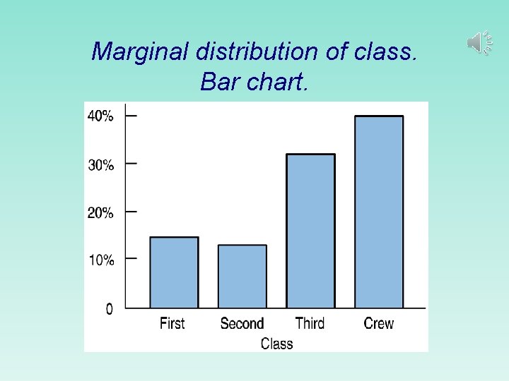
Marginal distribution of class. Bar chart.
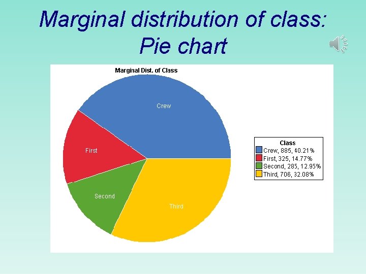
Marginal distribution of class: Pie chart
Contingency Tables: Categories for Two Variables (cont. ) n Conditional distributions. Given the class of a passenger, what is the chance the passenger survived?
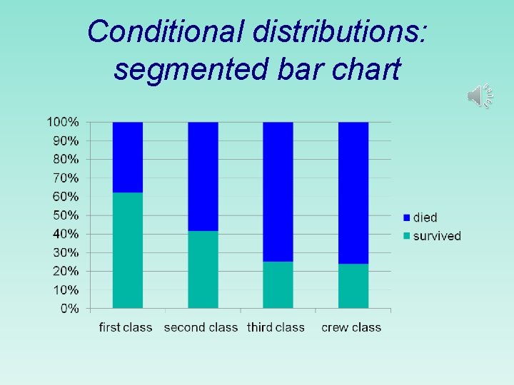
Conditional distributions: segmented bar chart
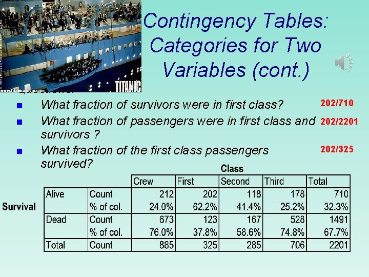
Contingency Tables: Categories for Two Variables (cont. ) Questions: n What fraction of survivors were in first class? n What fraction of passengers were in first class and survivors ? n What fraction of the first class passengers survived? 202/710 202/2201 202/325

Automating the Creation of Tables and Graphical Displays of Categorical Data Video: Using Excel Pivot Tables to Construct Contingency Tables and Charts Video: Using Statcrunch to Construct Contingency Tables and Charts
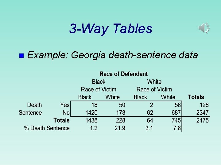
3 -Way Tables n Example: Georgia death-sentence data
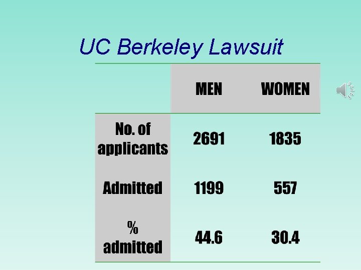
UC Berkeley Lawsuit
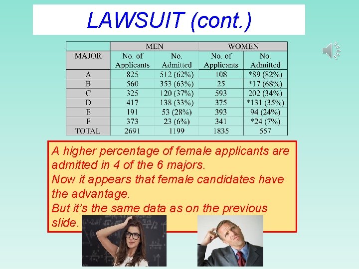
LAWSUIT (cont. ) A higher percentage of female applicants are admitted in 4 of the 6 majors. Now it appears that female candidates have the advantage. But it’s the same data as on the previous slide.
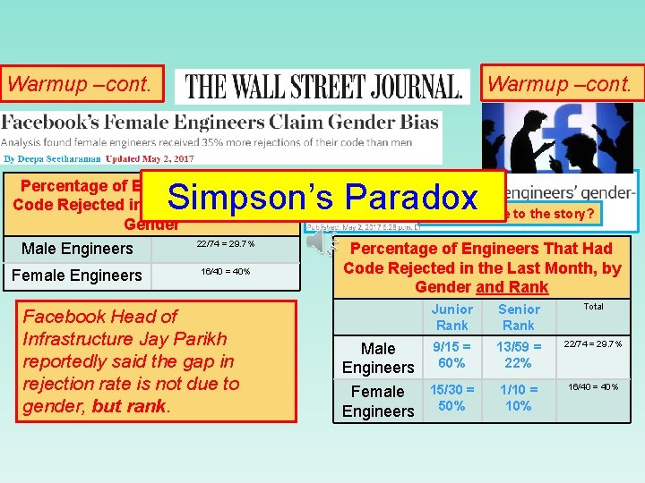
Warmup –cont. Simpson’s Paradox Percentage of Engineers That Had Code Rejected in the Last Month, by Gender 22/74 = 29. 7% Male Engineers Female Engineers 16/40 = 40% Facebook Head of Infrastructure Jay Parikh reportedly said the gap in rejection rate is not due to gender, but rank. Is there more to the story? Percentage of Engineers That Had Code Rejected in the Last Month, by Gender and Rank Junior Rank Senior Rank Total 9/15 = 60% 13/59 = 22% 22/74 = 29. 7% 15/30 = Female 50% Engineers 1/10 = 10% 16/40 = 40% Male Engineers
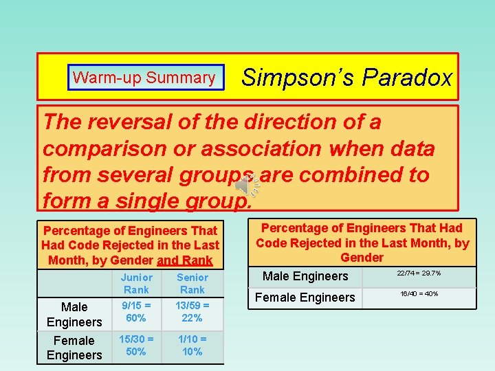
Warm-up Summary Simpson’s Paradox The reversal of the direction of a comparison or association when data from several groups are combined to form a single group. Percentage of Engineers That Had Code Rejected in the Last Month, by Gender and Rank Junior Rank Senior Rank Male Engineers 9/15 = 60% 13/59 = 22% Female Engineers 15/30 = 50% 1/10 = 10% Percentage of Engineers That Had Code Rejected in the Last Month, by Gender Male Engineers 22/74 = 29. 7% Female Engineers 16/40 = 40%
Fly Alaska Airlines, the ontime airline!

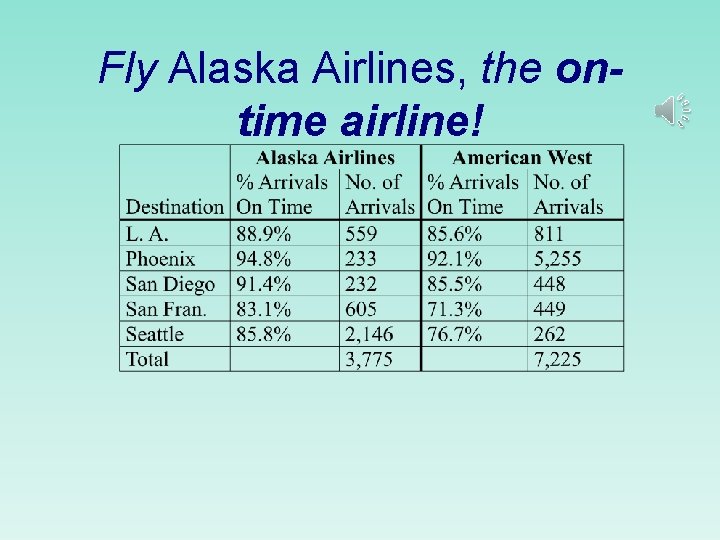
American West Wins! You’re a Hero! (. 889*559)+(. 948*233)+(. 914*232) +(. 831*605)+(. 858*2146)=3273. 9; 3273. 9/3775 = 86. 7% (. 856*811)+(. 921*5255)+(. 855*448) +(. 713*449)+(. 767*262)=6438. 2; 6438. 2/7225 = 89. 1%

End of Chapter 2
- Slides: 33