Chapter 2 Descriptive Statistics Goal To organize and


- Slides: 15

Chapter 2 Descriptive Statistics Goal: To organize and describe data sets to make the data easier to understand. �Frequency Distributions and their graphs. �Stem-and-Leaf Plots �Dot Plot �Pie Chart �Measures of Central Tendency �Measures of Variation �Measures of Position �The Shape of Frequency Distributions

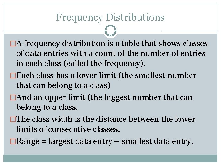
Frequency Distributions �A frequency distribution is a table that shows classes of data entries with a count of the number of entries in each class (called the frequency). �Each class has a lower limit (the smallest number that can belong to a class) �And an upper limit (the biggest number that can belong to a class. �The class width is the distance between the lower limits of consecutive classes. �Range = largest data entry – smallest data entry.

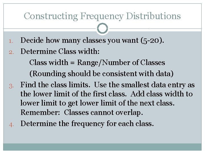
Constructing Frequency Distributions Decide how many classes you want (5 -20). 2. Determine Class width: Class width = Range/Number of Classes (Rounding should be consistent with data) 3. Find the class limits. Use the smallest data entry as the lower limit of the first class. Add class width to lower limit to get lower limit of the next class. Remember: Classes cannot overlap. 4. Determine the frequency for each class. 1.

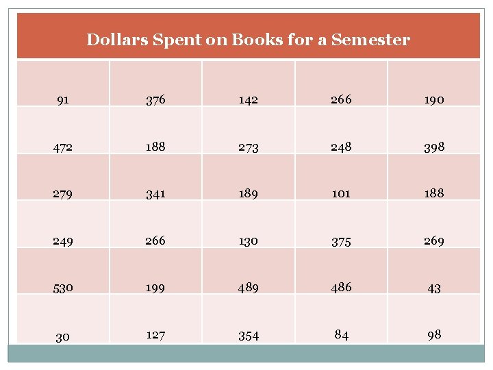
Dollars Spent on Books for a Semester 91 376 142 266 190 472 188 273 248 398 279 341 189 101 188 249 266 130 375 269 530 199 486 43 30 127 354 84 98

Graphs of Frequency Distributions �A histogram is a bar graph of a frequency distribution. �Properties: �Data is quantitative �Consecutive bars must touch �Horizontal scale measures data values �Vertical scale measures class frequency

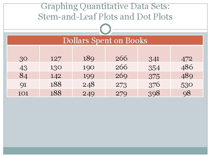
Graphing Quantitative Data Sets: Stem-and-Leaf Plots and Dot Plots Dollars Spent on Books 30 43 84 91 101 127 130 142 188 189 190 199 248 249 266 269 273 279 341 354 375 376 398 472 486 489 530 98

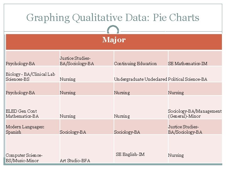
Graphing Qualitative Data: Pie Charts Major Psychology-BA Justice Studies. BA/Sociology-BA Continuing Education Biology - BA/Clinical Lab Sciences-BS Nursing Undergraduate Undeclared Political Science-BA Psychology-BA Nursing Sociology-BA/Management (General)-Minor Sociology-BA Justice Studies. BA/Sociology-BA ELED Gen Cont Mathematics-BA Modern Languages: Spanish Computer Science. BS/Music-Minor Nursing Sociology-BA SE English-IM Art Studio-BFA SE Mathematics-IM Nursing

Last Time: �Let's devise an experiment to see if for commercially available chocolate chip cookies price translates into quality. Devise an experiment to answer this question. Work in small groups to come up with a plan for the experiment. Generate your ideas for a good experiment with as much detail as possible.

Pareto Chart �Bar chart used to display qualitative Data �Properties: �Bars do not touch �Bars are positioned in decreasing order

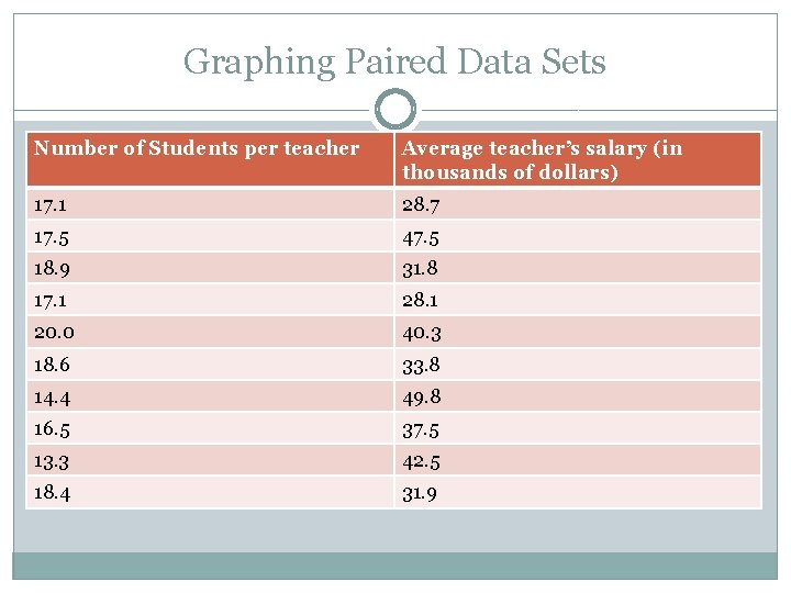
Graphing Paired Data Sets Number of Students per teacher Average teacher’s salary (in thousands of dollars) 17. 1 28. 7 17. 5 47. 5 18. 9 31. 8 17. 1 28. 1 20. 0 40. 3 18. 6 33. 8 14. 4 49. 8 16. 5 37. 5 13. 3 42. 5 18. 4 31. 9

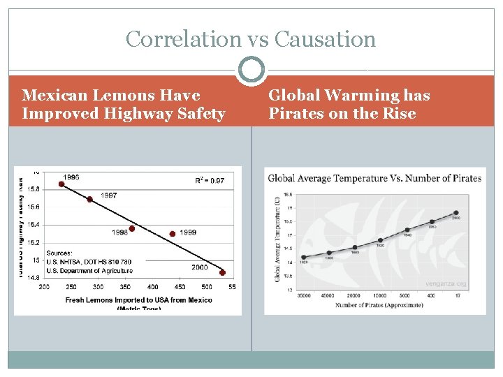
Correlation vs Causation Mexican Lemons Have Improved Highway Safety Global Warming has Pirates on the Rise

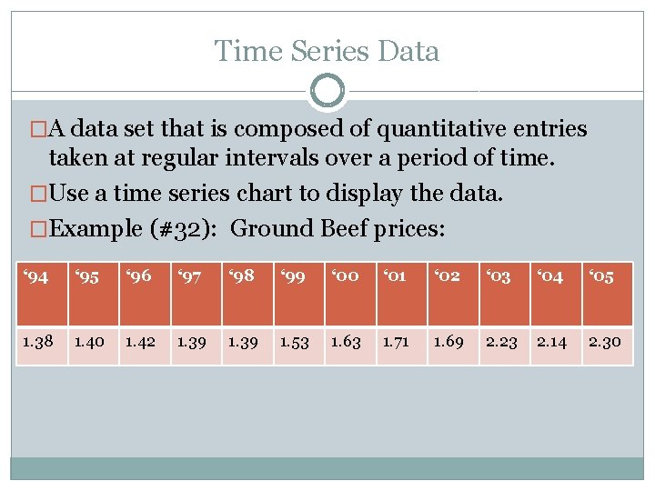
Time Series Data �A data set that is composed of quantitative entries taken at regular intervals over a period of time. �Use a time series chart to display the data. �Example (#32): Ground Beef prices: ‘ 94 ‘ 95 ‘ 96 ‘ 97 ‘ 98 ‘ 99 ‘ 00 ‘ 01 ‘ 02 ‘ 03 ‘ 04 ‘ 05 1. 38 1. 40 1. 42 1. 39 1. 53 1. 63 1. 71 1. 69 2. 23 2. 14 2. 30

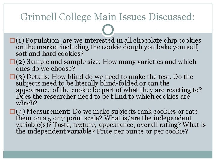
Grinnell College Main Issues Discussed: � (1) Population: are we interested in all chocolate chip cookies on the market including the cookie dough you bake yourself, soft and hard cookies? � (2) Sample and sample size: How many varieties and which ones do we choose? � (3) Details: How blind do we need to make the test. Do the subjects need to be literally blind-folded or can the appearance of the cookie be part of what they are reacting to? Does the researcher need to be blind to which cookies are which? � (4) Measurement: Do we make subjects rank cookies or rate them on a 5 or 7 point scale? What is/are the independent variable(s)? Taste, texture, appearance, overall rating? What is the independent variable? Price per ounce or per cookie?

Last Time: Let's devise an experiment to see if for commercially available chocolate chip cookies price translates into quality. Devise an experiment to answer this question. Work in small groups to come up with a plan for the experiment. Generate your ideas for a good experiment with as much detail as possible.

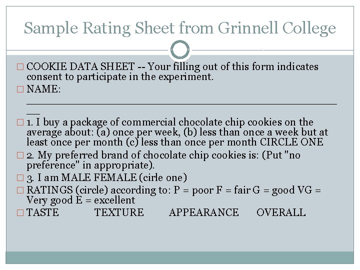
Sample Rating Sheet from Grinnell College � COOKIE DATA SHEET -- Your filling out of this form indicates consent to participate in the experiment. � NAME: _______________________ __ � 1. I buy a package of commercial chocolate chip cookies on the average about: (a) once per week, (b) less than once a week but at least once per month (c) less than once per month CIRCLE ONE � 2. My preferred brand of chocolate chip cookies is: (Put "no preference" in appropriate). � 3. I am MALE FEMALE (cirle one) � RATINGS (circle) according to: P = poor F = fair G = good VG = Very good E = excellent � TASTE TEXTURE APPEARANCE OVERALL