Chapter 2 Density Curves and the Normal Distribution

Chapter 2 Density Curves and the Normal Distribution Happy Monday!!
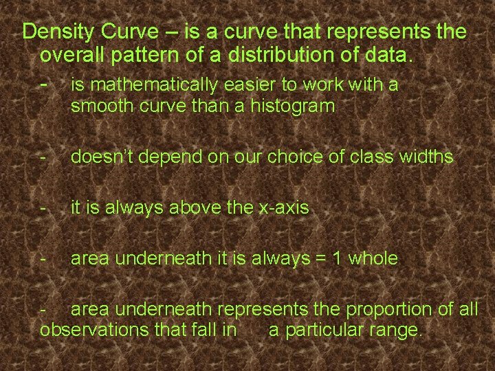
Density Curve – is a curve that represents the overall pattern of a distribution of data. - is mathematically easier to work with a smooth curve than a histogram - doesn’t depend on our choice of class widths - it is always above the x-axis - area underneath it is always = 1 whole - area underneath represents the proportion of all observations that fall in a particular range.

Draw Density Curves
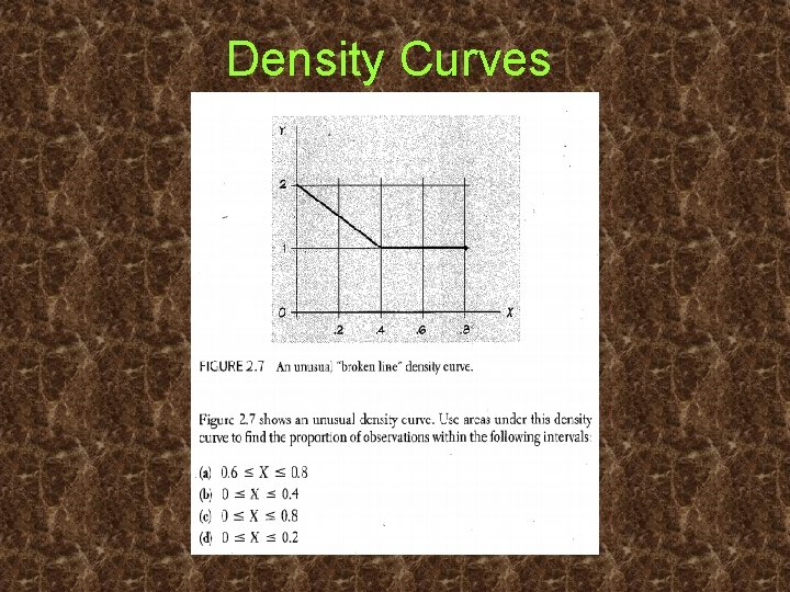
Density Curves
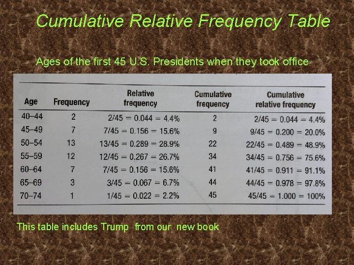
Cumulative Relative Frequency Table Ages of the first 45 U. S. Presidents when they took office This table includes Trump from our new book
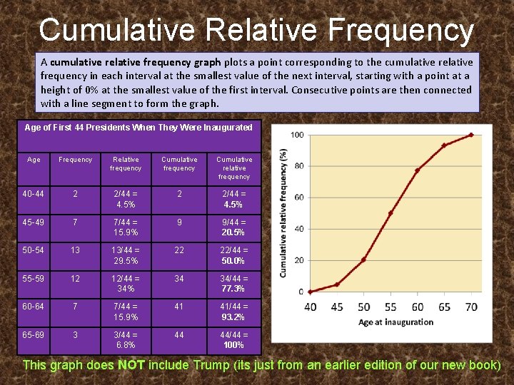
Cumulative Relative Frequency Graphs A cumulative relative frequency graph plots a point corresponding to the cumulative relative frequency in each interval at the smallest value of the next interval, starting with a point at a height of 0% at the smallest value of the first interval. Consecutive points are then connected with a line segment to form the graph. Age of First 44 Presidents When They Were Inaugurated Age Frequency Relative frequency Cumulative relative frequency 40 -44 2 2/44 = 4. 5% 45 -49 7 7/44 = 15. 9% 9 9/44 = 20. 5% 50 -54 13 13/44 = 29. 5% 22 22/44 = 50. 0% 55 -59 12 12/44 = 34% 34 34/44 = 77. 3% 60 -64 7 7/44 = 15. 9% 41 41/44 = 93. 2% 65 -69 3 3/44 = 6. 8% 44 44/44 = 100% This graph does NOT include Trump (its just from an earlier edition of our new book)
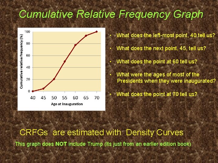
Cumulative Relative Frequency Graph • What does the left-most point, 40 tell us? • What does the next point, 45, tell us? • What does the point at 60 tell us? • What were the ages of most of the Presidents when they were inaugurated? • What does the point at 70 tell us? CRFGs are estimated with Density Curves This graph does NOT include Trump (its just from an earlier edition book)
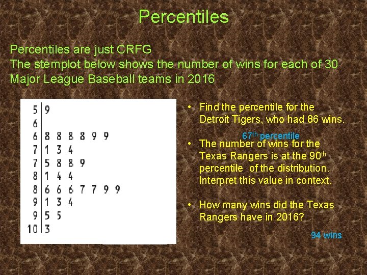
Percentiles are just CRFG The stemplot below shows the number of wins for each of 30 Major League Baseball teams in 2016 • Find the percentile for the Detroit Tigers, who had 86 wins. 67 th percentile • The number of wins for the Texas Rangers is at the 90 th percentile of the distribution. Interpret this value in context. • How many wins did the Texas Rangers have in 2016? 94 wins
Percentiles – separate distribution of data into 100 equal parts, the area to the left of a value gives the proportion/percent of values less than that value. Typically used with a large data set to see where an individual point lies relative to the other individual observations in the distribution.
Remember: Symmetric distributions; mean = median - uses standard deviation, σ, to measure spread Many naturally found data, heights of people, arm or foot lengths, test scores - SAT & ACT, blood pressure measurements, bags of Doritos etc. when graphed create a normal distribution. Notation for a normal distribution is written N(µ, σ)

Pages 104 -105 #s 1, 3, 7, 9, 11
- Slides: 11