Chapter 2 3 Graphical Tabular Descriptive Techniques 1
Chapter 2 & 3 Graphical & Tabular Descriptive Techniques 1 Copyright © 2005 Brooks/Cole, a division of Thomson Learning, Inc.
2. 1 Introduction Descriptive statistics methods make use of n n graphical techniques numerical descriptive measures. The methods presented apply to both n n the entire population the population sample 2 Copyright © 2005 Brooks/Cole, a division of Thomson Learning, Inc.
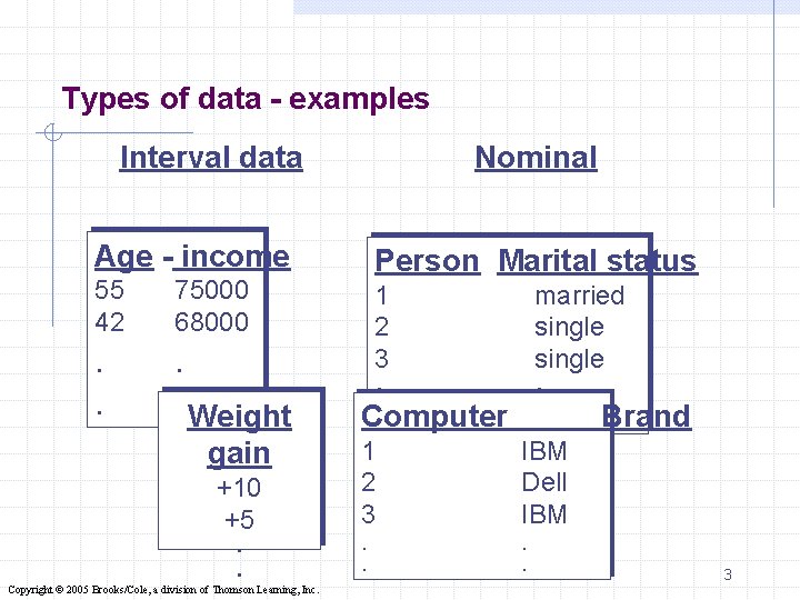
Types of data - examples Interval data Age - income 55 42 75000 68000 . . Weight gain +10 +5 . . Copyright © 2005 Brooks/Cole, a division of Thomson Learning, Inc. Nominal Person Marital status 1 2 3 married single . . Computer 1 2 3. . IBM Dell IBM. . Brand 3
2. 2 Types of data and information A variable - a characteristic of population or sample that is of interest for us. n n n Age, income Marital status, weight gain The waiting time for medical services Data - the actual values of variables n n Interval data are numerical observations Nominal data are categorical observations 4 Copyright © 2005 Brooks/Cole, a division of Thomson Learning, Inc.
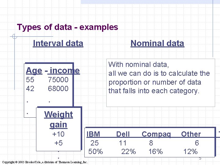
Types of data - examples Interval data Nominal data With nominal data, all we can do is to calculate the proportion or number of data that falls into each category. Age - income 55 42 . . 75000 68000 . . Weight gain +10 +5 . . IBM 25 50% Copyright © 2005 Brooks/Cole, a division of Thomson Learning, Inc. Dell Compaq 11 8 22% 16% Other 6 12% 5 T
Graphical & Tabular Techniques for Nominal Data… The only allowable calculation on nominal data is to count the frequency of each value of the variable. We can summarize the data in a table that presents the categories and their counts called a frequency distribution. A relative frequency distribution lists the categories and the proportion with which each occurs. Refer to Example 2. 1 6 Copyright © 2005 Brooks/Cole, a division of Thomson Learning, Inc.
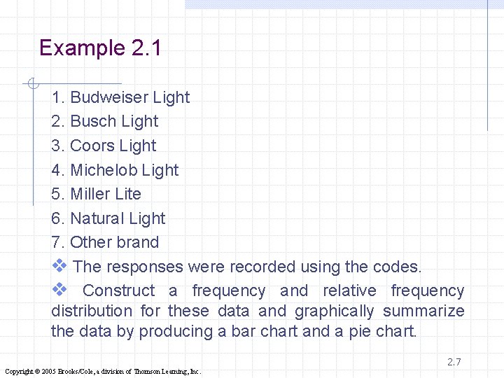
Example 2. 1 1. Budweiser Light 2. Busch Light 3. Coors Light 4. Michelob Light 5. Miller Lite 6. Natural Light 7. Other brand v The responses were recorded using the codes. v Construct a frequency and relative frequency distribution for these data and graphically summarize the data by producing a bar chart and a pie chart. 2. 7 Copyright © 2005 Brooks/Cole, a division of Thomson Learning, Inc.
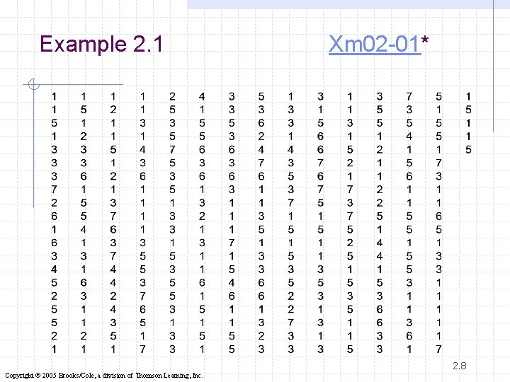
Example 2. 1 Xm 02 -01* 2. 8 Copyright © 2005 Brooks/Cole, a division of Thomson Learning, Inc.
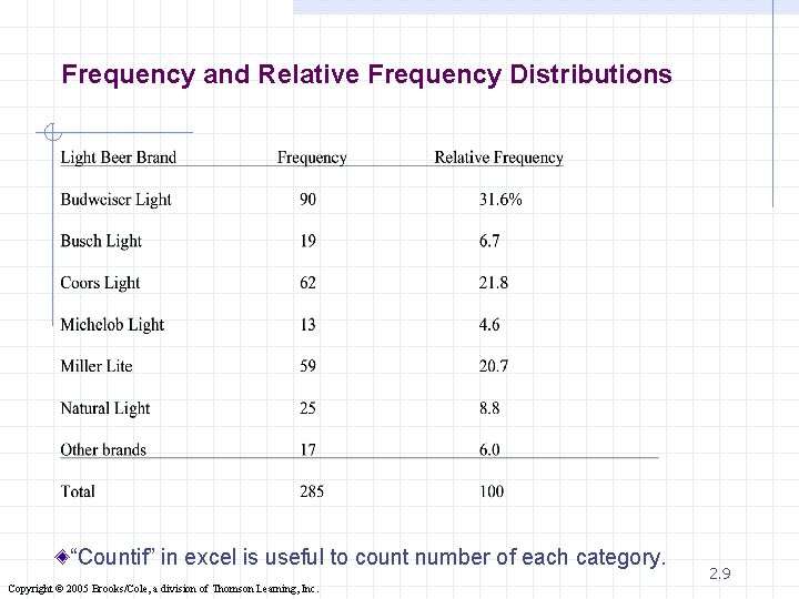
Frequency and Relative Frequency Distributions “Countif” in excel is useful to count number of each category. Copyright © 2005 Brooks/Cole, a division of Thomson Learning, Inc. 2. 9
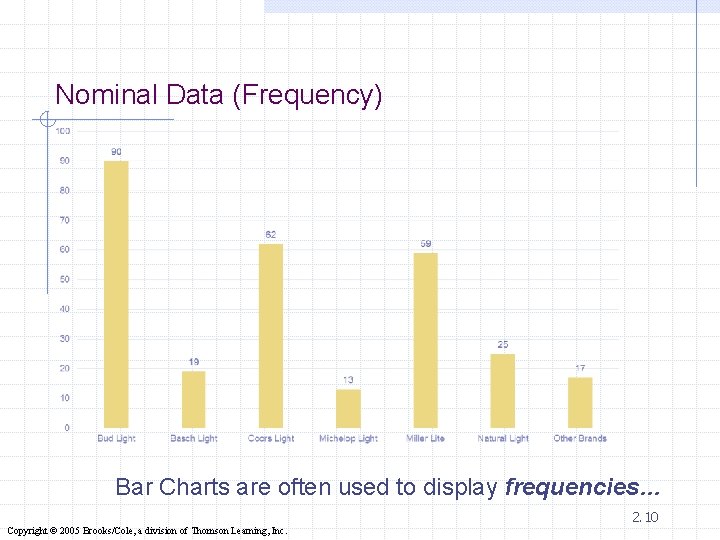
Nominal Data (Frequency) Bar Charts are often used to display frequencies… 2. 10 Copyright © 2005 Brooks/Cole, a division of Thomson Learning, Inc.
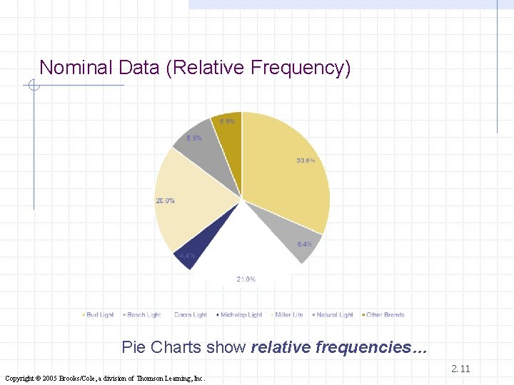
Nominal Data (Relative Frequency) Pie Charts show relative frequencies… 2. 11 Copyright © 2005 Brooks/Cole, a division of Thomson Learning, Inc.
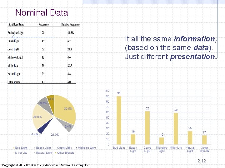
Nominal Data It all the same information, (based on the same data). Just different presentation. 2. 12 Copyright © 2005 Brooks/Cole, a division of Thomson Learning, Inc.
Graphical Techniques for Interval Data There are several graphical methods that are used when the data are interval (i. e. numeric, noncategorical). The most important of these graphical methods is the histogram. The histogram is not only a powerful graphical technique used to summarize interval data, but it is also used to help explain probability distribution. 13 Copyright © 2005 Brooks/Cole, a division of Thomson Learning, Inc.
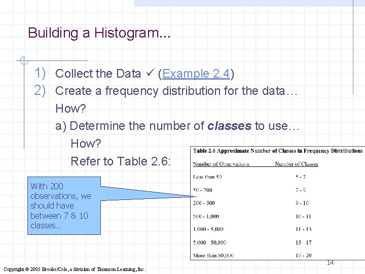
Building a Histogram… 1) Collect the Data (Example 2. 4) 2) Create a frequency distribution for the data… How? a) Determine the number of classes to use… How? Refer to Table 2. 6: With 200 observations, we should have between 7 & 10 classes… 14 Copyright © 2005 Brooks/Cole, a division of Thomson Learning, Inc.
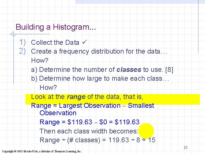
Building a Histogram… 1) Collect the Data 2) Create a frequency distribution for the data… How? a) Determine the number of classes to use. [8] b) Determine how large to make each class… How? Look at the range of the data, that is, Range = Largest Observation – Smallest Observation Range = $119. 63 – $0 = $119. 63 Then each class width becomes: Range ÷ (# classes) = 119. 63 ÷ 8 ≈ 15 15 Copyright © 2005 Brooks/Cole, a division of Thomson Learning, Inc.
Building a Histogram… 1) Collect the Data 2) Create a frequency distribution for the data… How? a) Determine the number of classes to use. [8] b) Determine how large to make each class. [15] c) Place the data into each class… Ø each item can only belong to one class; • lower limit of each class ≤ observations of each class < their upper limits. • lower limit of each class < observations of each class ≤ their upper limits. • 16 Copyright © 2005 Brooks/Cole, a division of Thomson Learning, Inc.
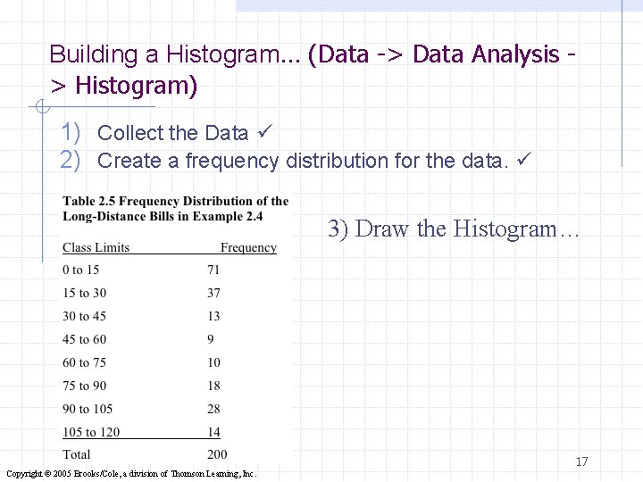
Building a Histogram… (Data -> Data Analysis > Histogram) 1) Collect the Data 2) Create a frequency distribution for the data. 3) Draw the Histogram… 17 Copyright © 2005 Brooks/Cole, a division of Thomson Learning, Inc.
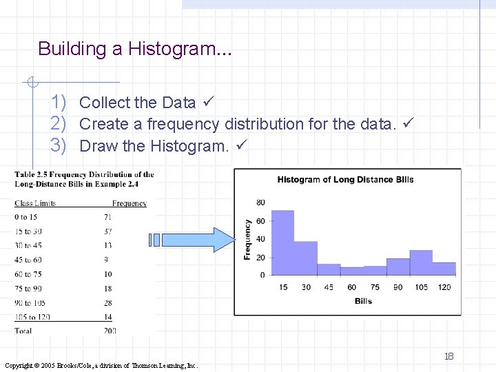
Building a Histogram… 1) Collect the Data 2) Create a frequency distribution for the data. 3) Draw the Histogram. 18 Copyright © 2005 Brooks/Cole, a division of Thomson Learning, Inc.
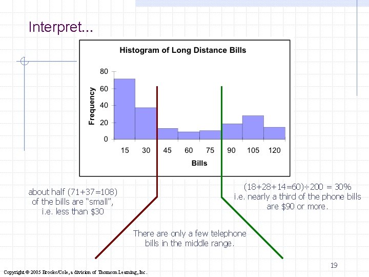
Interpret… (18+28+14=60)÷ 200 = 30% i. e. nearly a third of the phone bills are $90 or more. about half (71+37=108) of the bills are “small”, i. e. less than $30 There are only a few telephone bills in the middle range. 19 Copyright © 2005 Brooks/Cole, a division of Thomson Learning, Inc.
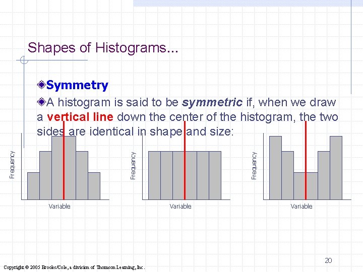
Shapes of Histograms… Variable Frequency Symmetry A histogram is said to be symmetric if, when we draw a vertical line down the center of the histogram, the two sides are identical in shape and size: Variable 20 Copyright © 2005 Brooks/Cole, a division of Thomson Learning, Inc.
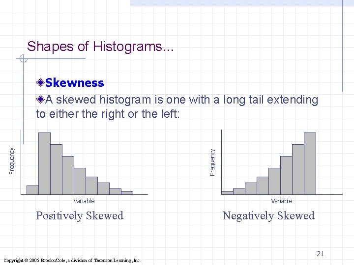
Shapes of Histograms… Frequency Skewness A skewed histogram is one with a long tail extending to either the right or the left: Variable Positively Skewed Variable Negatively Skewed 21 Copyright © 2005 Brooks/Cole, a division of Thomson Learning, Inc.
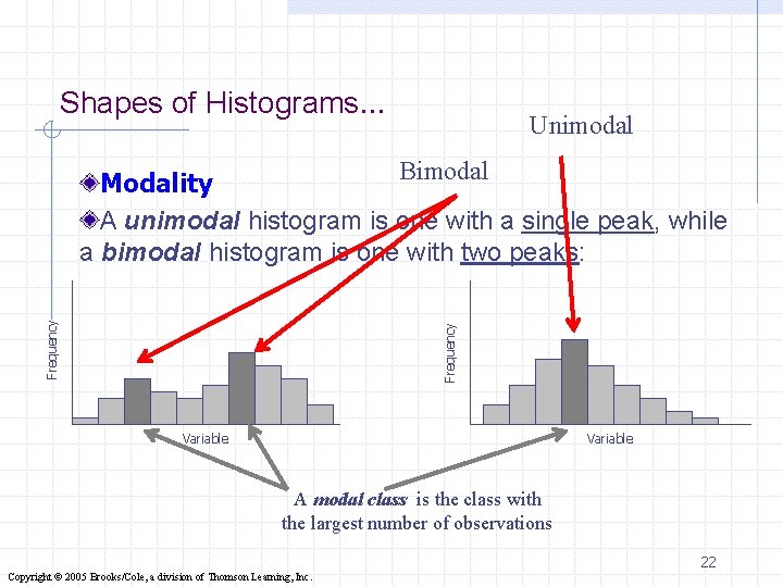
Shapes of Histograms… Unimodal Frequency Bimodal Modality A unimodal histogram is one with a single peak, while a bimodal histogram is one with two peaks: Variable A modal class is the class with the largest number of observations 22 Copyright © 2005 Brooks/Cole, a division of Thomson Learning, Inc.
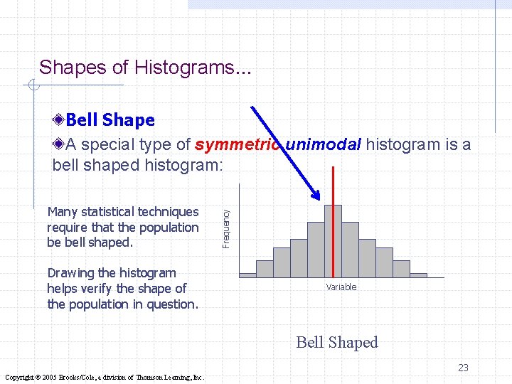
Shapes of Histograms… Many statistical techniques require that the population be bell shaped. Drawing the histogram helps verify the shape of the population in question. Frequency Bell Shape A special type of symmetric unimodal histogram is a bell shaped histogram: Variable Bell Shaped 23 Copyright © 2005 Brooks/Cole, a division of Thomson Learning, Inc.
Example (Histogram 1) The weights in pounds of a sample of 25 workers: 164, 148, 137, 157, 173, 156, 177, 172, 169, 165, 145, 168, 163, 162, 174, 152, 156, 168, 154, 151, 174, 146, 134, 140, and 171. Q 1. Construct Histogram (Frequency Distribution). Q 2. Construct Relative Frequency Distribution. Q 3. How many observations satisfying W<170? Q 4. How many observations satisfying W>160? Q 5. What is the relative frequency satisfying W>150? Q 6. What is a variable? If 25 workers are population, the relative frequency distribution can be regarded as the probability distribution. Q 6. What is the probability of selecting a worker whose weight is larger than 160 pounds? Q 7. What is the probability of selecting a worker with W<=180? 24 Copyright © 2005 Brooks/Cole, a division of Thomson Learning, Inc.
Stem and Leaf Display (Add in -> Data plus ) This is a graphical technique most often used in a preliminary analysis. Stem and leaf diagrams use the actual value of the original observations (whereas, the histogram does not). 25 Copyright © 2005 Brooks/Cole, a division of Thomson Learning, Inc.
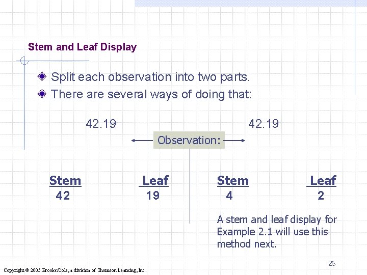
Stem and Leaf Display Split each observation into two parts. There are several ways of doing that: 42. 19 Observation: Stem 42 Leaf 19 Stem 4 Leaf 2 A stem and leaf display for Example 2. 1 will use this method next. 26 Copyright © 2005 Brooks/Cole, a division of Thomson Learning, Inc.
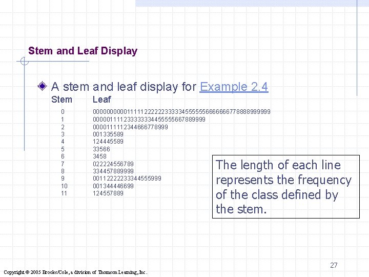
Stem and Leaf Display A stem and leaf display for Example 2. 4 Stem 0 1 2 3 4 5 6 7 8 9 10 11 Leaf 00000111112222223333345555556666666778888999999 000001111233333334455555667889999 0000111112344666778999 001335589 124445589 33566 3458 022224556789 334457889999 00112222233344555999 001344446699 124557889 The length of each line represents the frequency of the class defined by the stem. 27 Copyright © 2005 Brooks/Cole, a division of Thomson Learning, Inc.
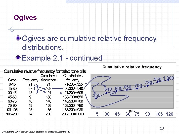
Ogives are cumulative relative frequency distributions. Example 2. 1 - continued }} . 700. 650. 605. 540 . 790 . 930 1. 000 . 355 15 30 45 60 75 90 105 120 28 Copyright © 2005 Brooks/Cole, a division of Thomson Learning, Inc.
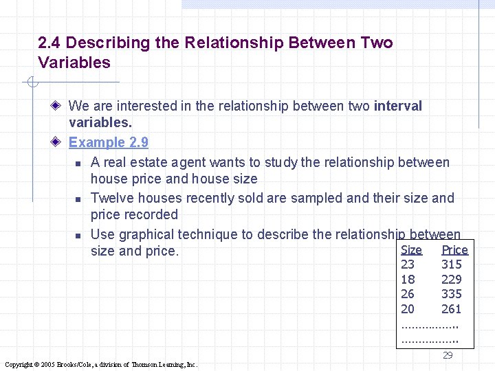
2. 4 Describing the Relationship Between Two Variables We are interested in the relationship between two interval variables. Example 2. 9 n A real estate agent wants to study the relationship between house price and house size n Twelve houses recently sold are sampled and their size and price recorded n Use graphical technique to describe the relationship between Size Price size and price. 23 315 18 229 26 335 20 261 ……………. . 29 Copyright © 2005 Brooks/Cole, a division of Thomson Learning, Inc.
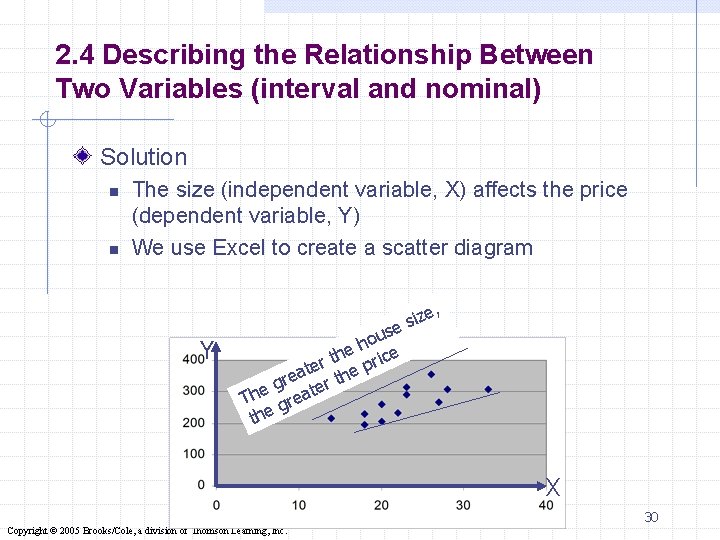
2. 4 Describing the Relationship Between Two Variables (interval and nominal) Solution n n The size (independent variable, X) affects the price (dependent variable, Y) We use Excel to create a scatter diagram Y se u o e h ice h t er e pr t a re er th g The great the , size X 30 Copyright © 2005 Brooks/Cole, a division of Thomson Learning, Inc.
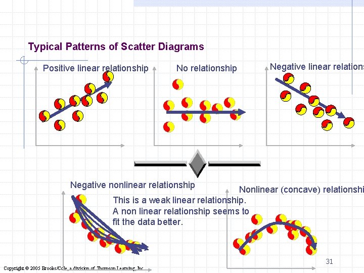
Typical Patterns of Scatter Diagrams Positive linear relationship No relationship Negative linear relations Negative nonlinear relationship Nonlinear (concave) relationshi This is a weak linear relationship. A non linear relationship seems to fit the data better. 31 Copyright © 2005 Brooks/Cole, a division of Thomson Learning, Inc.
Relationship between Two Nominal Variables… v A cross-classification table (or cross-tabulation table) is used to describe the relationship between two nominal variables: a contingency table. v. A cross-classification table lists the frequency of each combination of the values of the two variables… 2. 32 Copyright © 2005 Brooks/Cole, a division of Thomson Learning, Inc.
Example 2. 10 A sample of newspaper readers was asked to report which newspaper they read: Globe and Mail (1) Post (2), Star (3), Sun (4), and to indicate whether they were blue-collar worker (1), white-collar worker (2), or professional (3). The responses are stored in file Ex 2. 10 2. 33 Copyright © 2005 Brooks/Cole, a division of Thomson Learning, Inc.
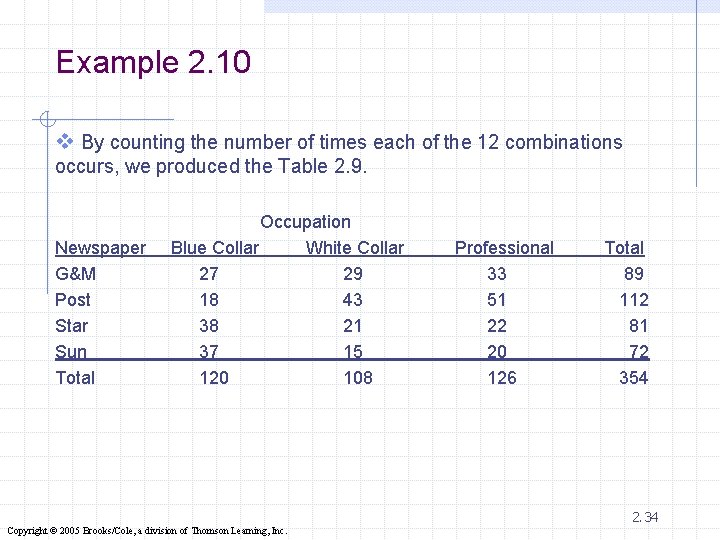
Example 2. 10 v By counting the number of times each of the 12 combinations occurs, we produced the Table 2. 9. Newspaper G&M Post Star Sun Total Occupation Blue Collar White Collar 27 29 18 43 38 21 37 15 120 108 Professional 33 51 22 20 126 Total 89 112 81 72 354 2. 34 Copyright © 2005 Brooks/Cole, a division of Thomson Learning, Inc.
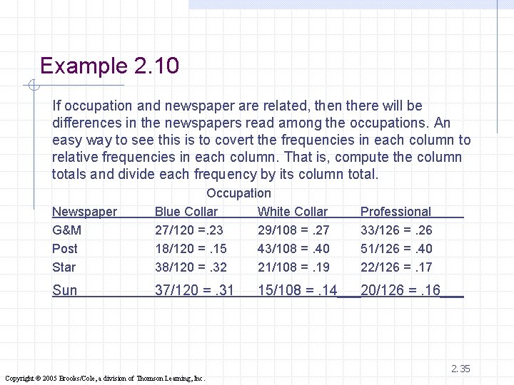
Example 2. 10 If occupation and newspaper are related, then there will be differences in the newspapers read among the occupations. An easy way to see this is to covert the frequencies in each column to relative frequencies in each column. That is, compute the column totals and divide each frequency by its column total. Newspaper G&M Post Star Occupation Blue Collar White Collar 27/120 =. 23 29/108 =. 27 18/120 =. 15 43/108 =. 40 38/120 =. 32 21/108 =. 19 Professional 33/126 =. 26 51/126 =. 40 22/126 =. 17 Sun 37/120 =. 31 20/126 =. 16 15/108 =. 14 2. 35 Copyright © 2005 Brooks/Cole, a division of Thomson Learning, Inc.
Contingency table Solution If there is no relationship between occupation and newspaper read, the bar charts describing the frequency of readership of newspapers should look similar across occupations. 36 Copyright © 2005 Brooks/Cole, a division of Thomson Learning, Inc.
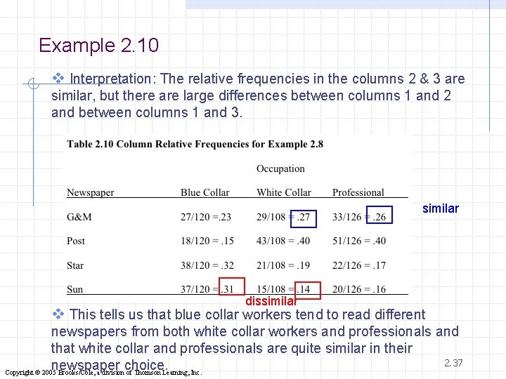
Example 2. 10 v Interpretation: The relative frequencies in the columns 2 & 3 are similar, but there are large differences between columns 1 and 2 and between columns 1 and 3. similar dissimilar v This tells us that blue collar workers tend to read different newspapers from both white collar workers and professionals and that white collar and professionals are quite similar in their 2. 37 newspaper choice. Copyright © 2005 Brooks/Cole, a division of Thomson Learning, Inc.
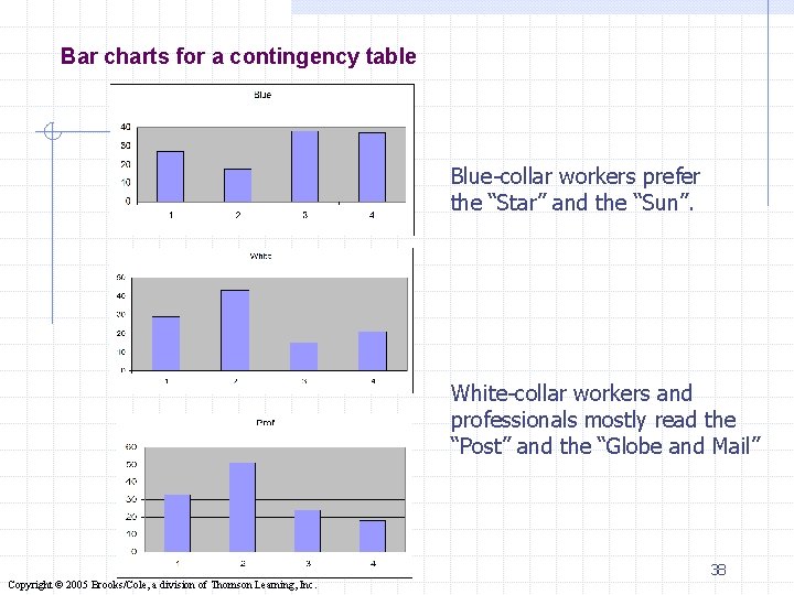
Bar charts for a contingency table Blue-collar workers prefer the “Star” and the “Sun”. White-collar workers and professionals mostly read the “Post” and the “Globe and Mail” 38 Copyright © 2005 Brooks/Cole, a division of Thomson Learning, Inc.
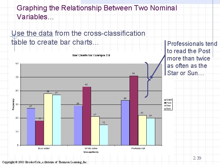
Graphing the Relationship Between Two Nominal Variables… Use the data from the cross-classification table to create bar charts… Professionals tend to read the Post more than twice as often as the Star or Sun… 2. 39 Copyright © 2005 Brooks/Cole, a division of Thomson Learning, Inc.
Describing Time Series Data Observations measured at the same point in time are called cross-sectional data. Observations measured at successive points in time are called time-series data. Time-series data graphed on a line chart, which plots the value of the variable on the vertical axis against the time periods on the horizontal axis. 2. 40 Copyright © 2005 Brooks/Cole, a division of Thomson Learning, Inc.
Example 2. 8 We recorded the monthly average retail price of gasoline since 1978. Xm 02 -08 Draw a line chart to describe these data and briefly describe the results. 2. 41 Copyright © 2005 Brooks/Cole, a division of Thomson Learning, Inc.
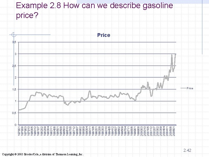
0 197801 197808 197903 197910 198005 198012 198107 198202 198209 198304 198311 198406 198501 198508 198603 198610 198705 198712 198807 198902 198909 199004 199011 199106 199201 199208 199303 199310 199405 199412 199507 199602 199609 199704 199711 199806 199901 199908 200003 200010 200105 200112 200207 200302 200309 200404 200411 200506 200601 Example 2. 8 How can we describe gasoline price? Price 3, 5 3 2, 5 2 1, 5 Price 1 0, 5 Copyright © 2005 Brooks/Cole, a division of Thomson Learning, Inc. 2. 42
Example 2. 9 Price of Gasoline in 1982 -84 Constant Dollars Xm 02 -09 v Remove the effect of inflation in Example 2. 8 to determine whether gasoline prices are higher than they have been in the past after removing the effect of inflation. 2. 43 Copyright © 2005 Brooks/Cole, a division of Thomson Learning, Inc.
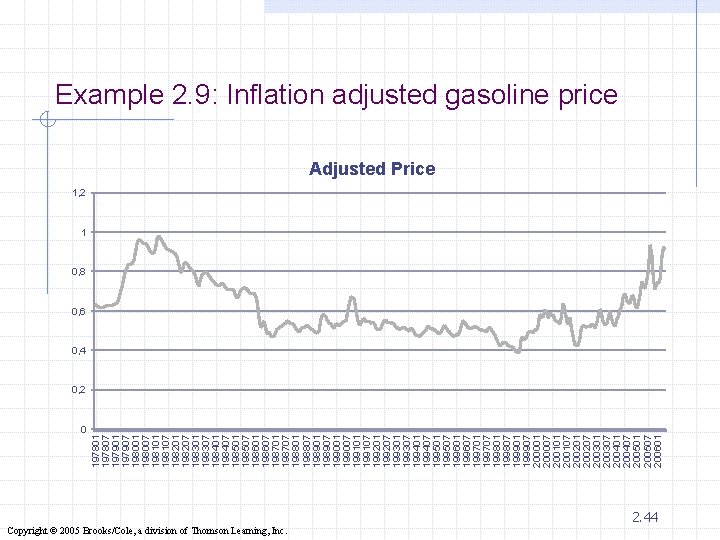
0 197801 197807 197901 197907 198001 198007 198101 198107 198201 198207 198301 198307 198401 198407 198501 198507 198601 198607 198701 198707 198801 198807 198901 198907 199001 199007 199101 199107 199201 199207 199301 199307 199401 199407 199501 199507 199601 199607 199701 199707 199801 199807 199901 199907 200001 200007 200101 200107 200201 200207 200301 200307 200401 200407 200501 200507 200601 Example 2. 9: Inflation adjusted gasoline price Adjusted Price 1, 2 1 0, 8 0, 6 0, 4 0, 2 Copyright © 2005 Brooks/Cole, a division of Thomson Learning, Inc. 2. 44
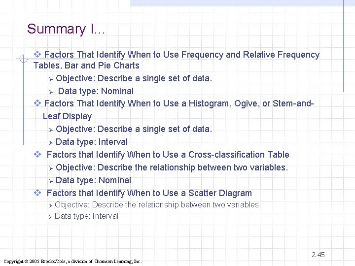
Summary I… v Factors That Identify When to Use Frequency and Relative Frequency Tables, Bar and Pie Charts Ø Objective: Describe a single set of data. Ø Data type: Nominal v Factors That Identify When to Use a Histogram, Ogive, or Stem-and. Leaf Display Ø Objective: Describe a single set of data. Ø Data type: Interval v Factors that Identify When to Use a Cross-classification Table Ø Objective: Describe the relationship between two variables. Ø Data type: Nominal v Factors that Identify When to Use a Scatter Diagram Objective: Describe the relationship between two variables. Ø Data type: Interval Ø 2. 45 Copyright © 2005 Brooks/Cole, a division of Thomson Learning, Inc.
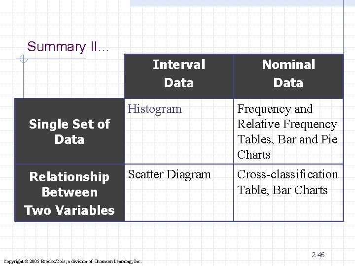
Summary II… Interval Data Histogram Frequency and Relative Frequency Tables, Bar and Pie Charts Scatter Diagram Cross-classification Table, Bar Charts Single Set of Data Relationship Between Two Variables Nominal Data 2. 46 Copyright © 2005 Brooks/Cole, a division of Thomson Learning, Inc.
- Slides: 46