Chapter 14 Visual Interface Design Visual Interface Design
- Slides: 16

Chapter 14: Visual Interface Design

Visual Interface Design - addresses the goals of those other than the designer - finding a representation that communicates information effectively - interface designers aim to communicate information about the behavior of the software

Visual Interface Design - avoid visual noise and clutter - use contrast, similarity, and layering to distinguish and organize elements - provide visual structure and flow at each level of organization - use cohesive, consistent imagery - integrate style and function purposefully

Visual Interface Design Principles: Avoid visual noise and clutter - refrain from using superfluous visual elements that distract - avoid providing an excess of functionality - use simple geometric forms, minimal contours - limit to one or two typefaces - multiple windows, panes, controls should be similar in size, shape, orientation, spacing, etc.

Visual Interface Design Use of contrast, similarity, and layering to distinguish and organize elements - to provide visual contrast between active and passive element - to provide contrast between logical sets of active elements to communicate distinct functions

Visual Interface Design Use of contrast, similarity, and layering to distinguish and organize elements Dimensional contrast: pseudo 3 D to suggest manual affordance (Raised look for buttons to be pressed, Indented looks for text fields for data entry) Tonal contrast to offset controls from background Spatial contrast to group tools of similar functions together Layering - Use to allow active items to be differentiated from background (color, size, overlap) Figure/Ground properties. Tendency to perceive light area as figure

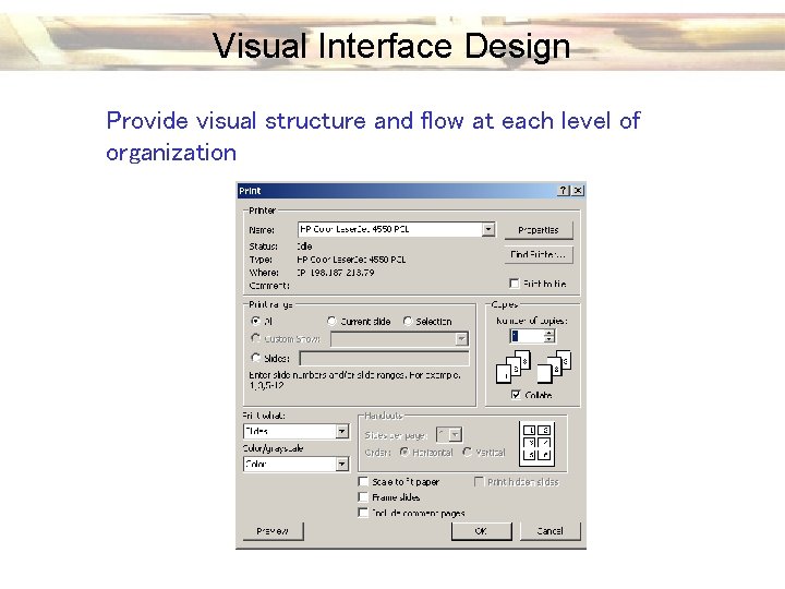
Visual Interface Design provide visual structure and flow at each level of organization - Alignment of labels (left better than right justified) - Align to a regular grid Use a grid structure for large scale elements and groups of controls - Path flows most easily upper left to lower right - Symmetry and balance (usually vertical or diagonal) - Spatial harmony and balance -The Golden Ratio versus 4: 3 - White space between elements and surrounding element groups

Visual Interface Design Provide visual structure and flow at each level of organization

Visual Interface Design use cohesive, consistent imagery - cultural issues (color, gesture, symbology) - function oriented icons – how do we represent an abstract concept - attempt to represent both action and object acted upon - beware of metaphors - create idiomatic associations of symbols to objects/actions - icons – simplicity is better that realism - use pictures to accompany textual descriptions

Visual Interface Design Integrate style and function purposefully - don’t sacrifice the basic shape and visual behavior to adapt to a visual style - consistent verbal, visual, behavioral brand messages

Visual Interface Design - enforce visual comparisons - show causality - show multiple variables - integrate text, graphics and data in one display - ensure quality, relevance and integrity of the content - show things adjacently in space, not stacked in time - do not de-quantify quantifiable data

Visual Interface Design Use of Text - use short, easy to recognize words - avoid using all capital letters - use contrasting (brightness) text and background - avoid small fonts (minimum 10 point) - for titles, use sans serif; for large textual regions, use serif font (Times) - minimize number of words used, but retain clarity

Visual Interface Design Use of Color - avoid using too many colors - avoid using complementary colors in adjacent regions - avoid highly saturated colors (bright primaries) - colors should differ in brightness as well as hue - attention to color impairment

Visual Interface Design Consistency and Standards Consistency: a similar look, feel and behavior 1) across various modules of a software product 2) across all software products a vendor sells For at-large software vendors (Macromedia, Adobe, …) a need to make acquired software look like in-house developed software Apple, Microsoft have a need for third-party software developers to have the look and feel of the OS platform.

Visual Interface Design Standards Benefits: 1) improves users’ ability to quickly learn interface 2) Enhances productivity by increasing throughput and reducing errors Risks: 1) Products are only as good as the standards themselves 2) Interface standards do little to control deeper behaviors or organizational structures

Visual Interface Design Standards - Standards should evolve with the technology - Should be treated as guidelines or rules of thumb When to violate the guidelines: 1) Idiom is clearly seen as better by users who try it (toolbar, outline views, tabs) 2) Distinct products with primarily non-overlapping users