
CHAPTER 13 Advanced GUI Applications Copyright 2016 Pearson
- Slides: 83
CHAPTER 13 Advanced GUI Applications Copyright © 2016 Pearson Education, Inc. , Hoboken NJ
Chapter Topics Chapter 13 discusses the following main topics: – The Swing and AWT Class Hierarchy – Read-Only Text Fields – Lists – Combo Boxes – Displaying Images in Labels and Buttons – Mnemonics and Tool Tips © 2016 Pearson Education, Inc. Upper Saddle River, NJ. All Rights Reserved. 13 -2
Chapter Topics Chapter 13 discusses the following main topics: – File Choosers and Color Choosers – Menus – More about Text Components: Text Areas and Fonts – Sliders – Look and Feel © 2016 Pearson Education, Inc. Upper Saddle River, NJ. All Rights Reserved. 13 -3
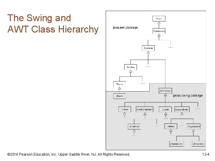
The Swing and AWT Class Hierarchy © 2016 Pearson Education, Inc. Upper Saddle River, NJ. All Rights Reserved. 13 -4
Read Only Text Fields • Read only text fields are a different way to use the JText. Field component. • The JText. Field component has a method named set. Editable: set. Editable(boolean editable) • By default a text field is editable. • The set. Editable method must be called and passed false to make the field read-only. © 2016 Pearson Education, Inc. Upper Saddle River, NJ. All Rights Reserved. 13 -5
Lists • A list is a component that displays a list of items and allows the user to select items from the list. • The JList component is used for creating lists. • When an instance of the JList class is created, an array of objects is passed to the constructor. JList (Object[] array) • The JList component uses the array to create the list of items. String[] names = { "Bill", "Geri", "Greg", "Jean", "Kirk", "Phillip", "Susan" }; JList name. List = new JList(names); © 2016 Pearson Education, Inc. Upper Saddle River, NJ. All Rights Reserved. 13 -6
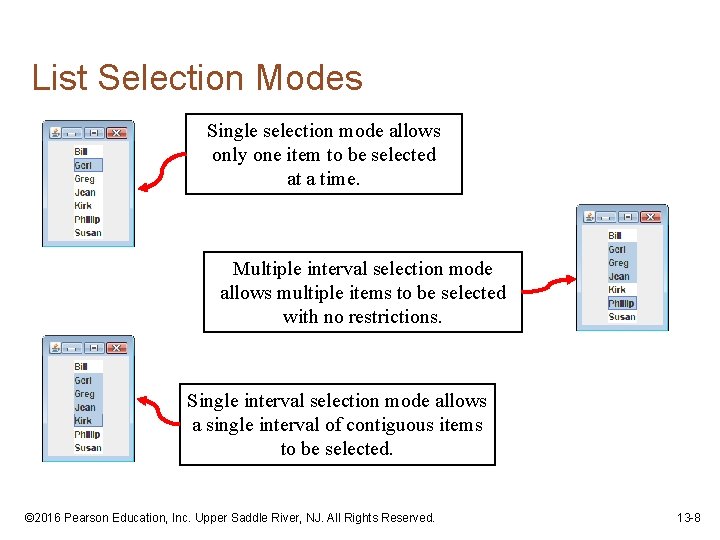
List Selection Modes • The JList component can operate in any of the following selection modes: – Single Selection Mode - Only one item can be selected at a time. – Single Interval Selection Mode - Multiple items can be selected, but they must be in a single interval. An interval is a set of contiguous items. – Multiple Interval Selection Mode - In this mode multiple items may be selected with no restrictions. • This is the default selection mode. © 2016 Pearson Education, Inc. Upper Saddle River, NJ. All Rights Reserved. 13 -7
List Selection Modes Single selection mode allows only one item to be selected at a time. Multiple interval selection mode allows multiple items to be selected with no restrictions. Single interval selection mode allows a single interval of contiguous items to be selected. © 2016 Pearson Education, Inc. Upper Saddle River, NJ. All Rights Reserved. 13 -8
List Selection Modes • You change a JList component’s selection mode with the set. Selection. Mode method. • The method accepts an int argument that determines the selection mode: – List. Selection. Model. SINGLE_SELECTION – List. Selection. Model. SINGLE_INTERVAL_SELECTION – List. Selection. Model. MULTIPLE_INTERVAL_SELECTION • Example: name. List. set. Selection. Mode( List. Selection. Model. SINGLE_SELECTION); © 2016 Pearson Education, Inc. Upper Saddle River, NJ. All Rights Reserved. 13 -9
List Events • When an item in a JList object is selected it generates a list selection event. • The event is handled by an instance of a list selection listener class, which must meet the following requirements: – It must implement the List. Selection. Listener interface. – It must have a method named value. Changed. This method must take an argument of the List. Selection. Event type. • Use the add. List. Selection. Listener method of the JList class to register the instance of the list selection listener class with the list object. © 2016 Pearson Education, Inc. Upper Saddle River, NJ. All Rights Reserved. 13 -10
List Events • When the JList component generates an event: – it automatically executes the value. Changed method of the list selection listener object – It passes the event object as an argument. © 2016 Pearson Education, Inc. Upper Saddle River, NJ. All Rights Reserved. 13 -11
Retrieving Selected Items • You may use: • get. Selected. Value or • get. Selected. Index – to determine which item in a list is currently selected. • get. Selected. Value returns a reference to the item that is currently selected. String selected. Name; selected. Name = (String)name. List. get. Selected. Value(); • The return value must be cast to String is required in order to store it in the selected. Name variable. • If no item in the list is selected, the method returns null. © 2016 Pearson Education, Inc. Upper Saddle River, NJ. All Rights Reserved. 13 -12
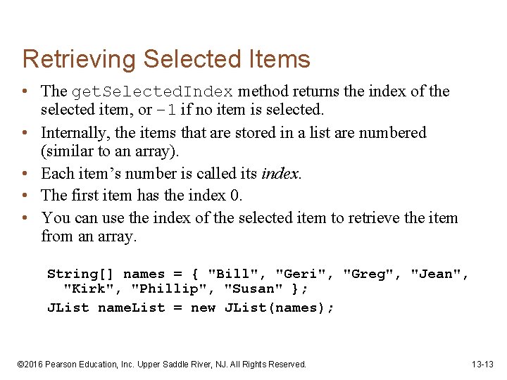
Retrieving Selected Items • The get. Selected. Index method returns the index of the selected item, or – 1 if no item is selected. • Internally, the items that are stored in a list are numbered (similar to an array). • Each item’s number is called its index. • The first item has the index 0. • You can use the index of the selected item to retrieve the item from an array. String[] names = { "Bill", "Geri", "Greg", "Jean", "Kirk", "Phillip", "Susan" }; JList name. List = new JList(names); © 2016 Pearson Education, Inc. Upper Saddle River, NJ. All Rights Reserved. 13 -13
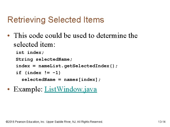
Retrieving Selected Items • This code could be used to determine the selected item: int index; String selected. Name; index = name. List. get. Selected. Index(); if (index != -1) selected. Name = names[index]; • Example: List. Window. java © 2016 Pearson Education, Inc. Upper Saddle River, NJ. All Rights Reserved. 13 -14
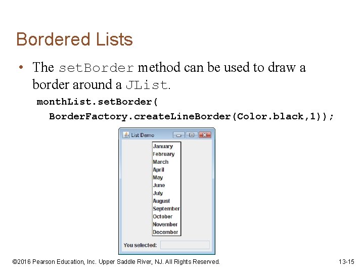
Bordered Lists • The set. Border method can be used to draw a border around a JList. month. List. set. Border( Border. Factory. create. Line. Border(Color. black, 1)); © 2016 Pearson Education, Inc. Upper Saddle River, NJ. All Rights Reserved. 13 -15
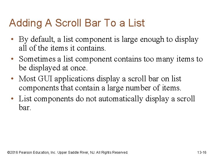
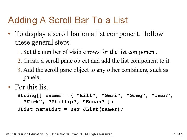
Adding A Scroll Bar To a List • By default, a list component is large enough to display all of the items it contains. • Sometimes a list component contains too many items to be displayed at once. • Most GUI applications display a scroll bar on list components that contain a large number of items. • List components do not automatically display a scroll bar. © 2016 Pearson Education, Inc. Upper Saddle River, NJ. All Rights Reserved. 13 -16
Adding A Scroll Bar To a List • To display a scroll bar on a list component, follow these general steps. 1. Set the number of visible rows for the list component. 2. Create a scroll pane object and add the list component to it. 3. Add the scroll pane object to any other containers, such as panels. • For this list: String[] names = { "Bill", "Geri", "Greg", "Jean", "Kirk", "Phillip", "Susan" }; JList name. List = new JList(names); © 2016 Pearson Education, Inc. Upper Saddle River, NJ. All Rights Reserved. 13 -17
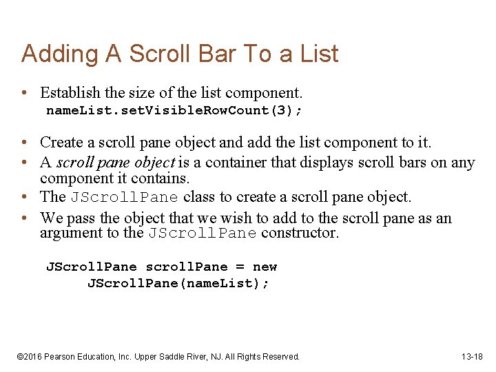
Adding A Scroll Bar To a List • Establish the size of the list component. name. List. set. Visible. Row. Count(3); • Create a scroll pane object and add the list component to it. • A scroll pane object is a container that displays scroll bars on any component it contains. • The JScroll. Pane class to create a scroll pane object. • We pass the object that we wish to add to the scroll pane as an argument to the JScroll. Pane constructor. JScroll. Pane scroll. Pane = new JScroll. Pane(name. List); © 2016 Pearson Education, Inc. Upper Saddle River, NJ. All Rights Reserved. 13 -18
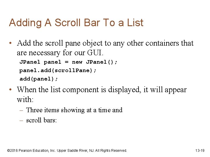
Adding A Scroll Bar To a List • Add the scroll pane object to any other containers that are necessary for our GUI. JPanel panel = new JPanel(); panel. add(scroll. Pane); add(panel); • When the list component is displayed, it will appear with: – Three items showing at a time and – scroll bars: © 2016 Pearson Education, Inc. Upper Saddle River, NJ. All Rights Reserved. 13 -19
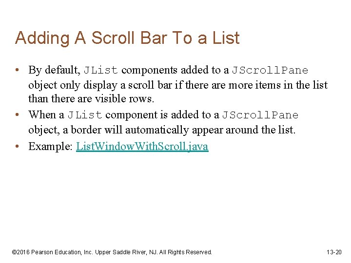
Adding A Scroll Bar To a List • By default, JList components added to a JScroll. Pane object only display a scroll bar if there are more items in the list than there are visible rows. • When a JList component is added to a JScroll. Pane object, a border will automatically appear around the list. • Example: List. Window. With. Scroll. java © 2016 Pearson Education, Inc. Upper Saddle River, NJ. All Rights Reserved. 13 -20
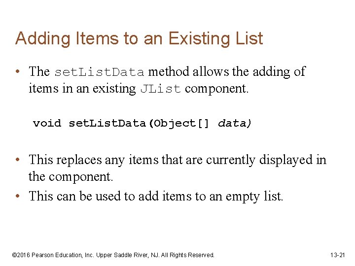
Adding Items to an Existing List • The set. List. Data method allows the adding of items in an existing JList component. void set. List. Data(Object[] data) • This replaces any items that are currently displayed in the component. • This can be used to add items to an empty list. © 2016 Pearson Education, Inc. Upper Saddle River, NJ. All Rights Reserved. 13 -21
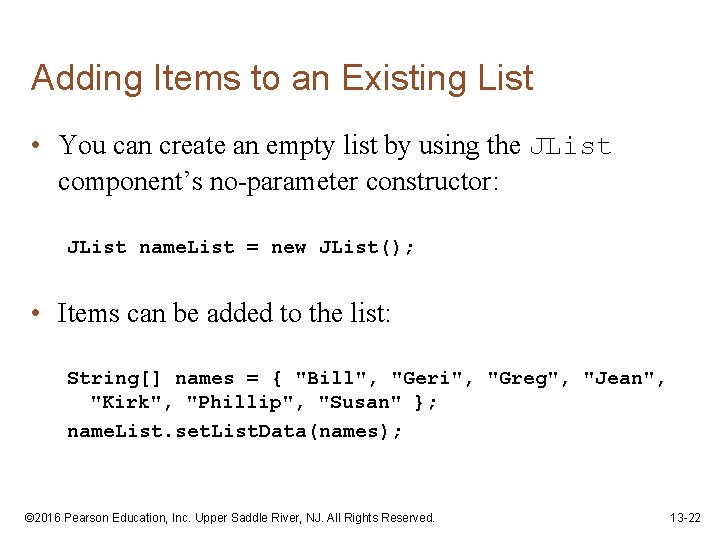
Adding Items to an Existing List • You can create an empty list by using the JList component’s no-parameter constructor: JList name. List = new JList(); • Items can be added to the list: String[] names = { "Bill", "Geri", "Greg", "Jean", "Kirk", "Phillip", "Susan" }; name. List. set. List. Data(names); © 2016 Pearson Education, Inc. Upper Saddle River, NJ. All Rights Reserved. 13 -22
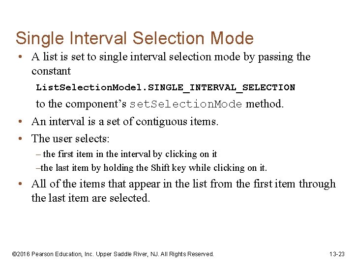
Single Interval Selection Mode • A list is set to single interval selection mode by passing the constant List. Selection. Model. SINGLE_INTERVAL_SELECTION to the component’s set. Selection. Mode method. • An interval is a set of contiguous items. • The user selects: – the first item in the interval by clicking on it –the last item by holding the Shift key while clicking on it. • All of the items that appear in the list from the first item through the last item are selected. © 2016 Pearson Education, Inc. Upper Saddle River, NJ. All Rights Reserved. 13 -23
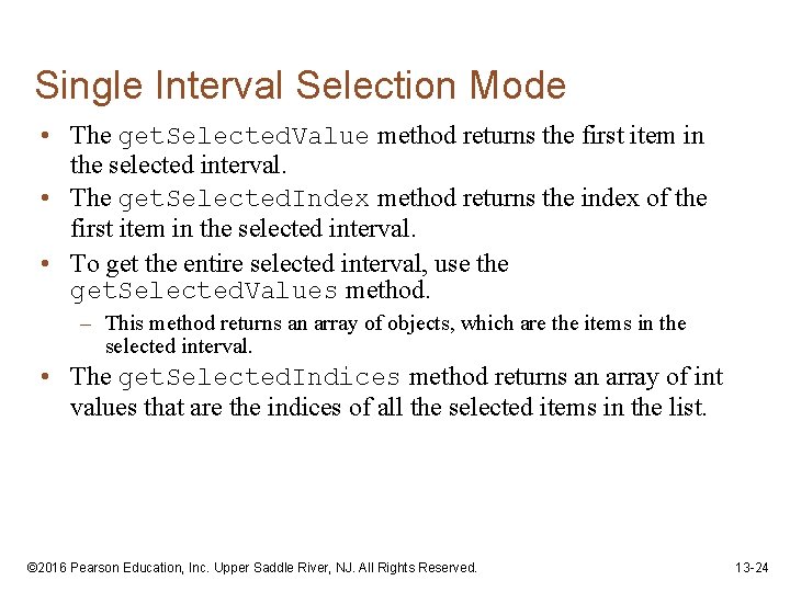
Single Interval Selection Mode • The get. Selected. Value method returns the first item in the selected interval. • The get. Selected. Index method returns the index of the first item in the selected interval. • To get the entire selected interval, use the get. Selected. Values method. – This method returns an array of objects, which are the items in the selected interval. • The get. Selected. Indices method returns an array of int values that are the indices of all the selected items in the list. © 2016 Pearson Education, Inc. Upper Saddle River, NJ. All Rights Reserved. 13 -24
Multiple Interval Selection Mode • Set multiple interval selection mode by passing the constant List. Selection. Model. MULTIPLE_INTERVAL_SELECTION to the component’s set. Selection. Mode method. • In multiple interval selection mode: – multiple items can be selected – the items do not have to be in the same interval. • In multiple interval selection mode the user can select single items or intervals. © 2016 Pearson Education, Inc. Upper Saddle River, NJ. All Rights Reserved. 13 -25
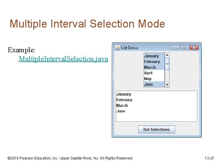
Multiple Interval Selection Mode • The user holds down the Ctrl key while clicking on an item – it selects the item without deselecting other items. • The get. Selected. Value method returns the first selected item. • The get. Selected. Index method returns the index of the first selected item. • The get. Selected. Values method returns an array of objects containing the items that are selected. • The get. Selected. Indices method returns an int array containing the indices of the selected items. © 2016 Pearson Education, Inc. Upper Saddle River, NJ. All Rights Reserved. 13 -26
Multiple Interval Selection Mode Example: Multiple. Interval. Selection. java © 2016 Pearson Education, Inc. Upper Saddle River, NJ. All Rights Reserved. 13 -27
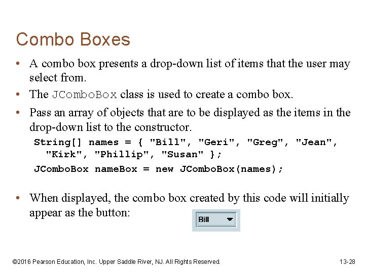
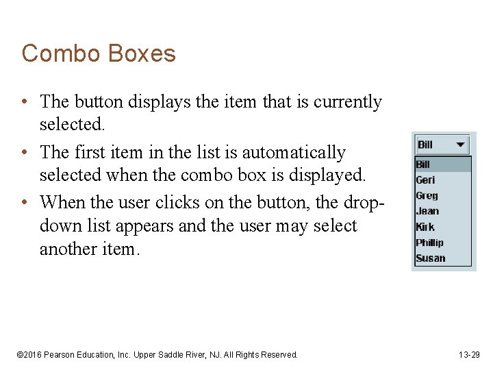
Combo Boxes • A combo box presents a drop-down list of items that the user may select from. • The JCombo. Box class is used to create a combo box. • Pass an array of objects that are to be displayed as the items in the drop-down list to the constructor. String[] names = { "Bill", "Geri", "Greg", "Jean", "Kirk", "Phillip", "Susan" }; JCombo. Box name. Box = new JCombo. Box(names); • When displayed, the combo box created by this code will initially appear as the button: © 2016 Pearson Education, Inc. Upper Saddle River, NJ. All Rights Reserved. 13 -28
Combo Boxes • The button displays the item that is currently selected. • The first item in the list is automatically selected when the combo box is displayed. • When the user clicks on the button, the dropdown list appears and the user may select another item. © 2016 Pearson Education, Inc. Upper Saddle River, NJ. All Rights Reserved. 13 -29
Combo Box Events • When an item in a JCombo. Box object is selected, it generates an action event. • Handle action events with an action event listener class, which must have an action. Performed method. • When the user selects an item in a combo box, the combo box executes its action event listener’s action. Performed method, passing an Action. Event object as an argument. © 2016 Pearson Education, Inc. Upper Saddle River, NJ. All Rights Reserved. 13 -30
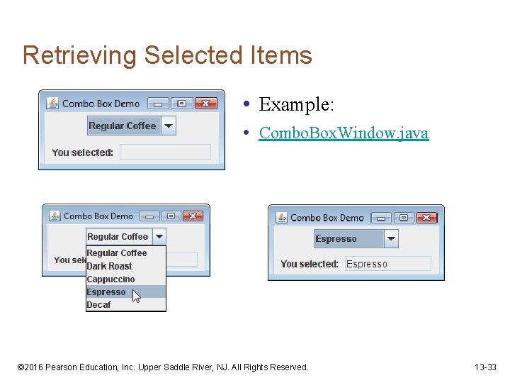
Retrieving Selected Items • There are two methods in the JCombo. Box class that can be used to determine which item in a list is currently selected: – get. Selected. Item – get. Selected. Index • The get. Selected. Item method returns a reference to the item that is currently selected. String selected. Name; selected. Name = (String) name. Box. get. Selected. Item(); • get. Selected. Item returns an Object reference so we cast the return value to a String. © 2016 Pearson Education, Inc. Upper Saddle River, NJ. All Rights Reserved. 13 -31
Retrieving Selected Items • The get. Selected. Index method returns the index of the selected item. String[] names = { "Bill", "Geri", "Greg", "Jean", "Kirk", "Phillip", "Susan" }; JCombo. Box name. Box = new JCombo. Box(names); • Get the selected item from the names array: int index; String selected. Name; index = name. Box. get. Selected. Index(); selected. Name = names[index]; © 2016 Pearson Education, Inc. Upper Saddle River, NJ. All Rights Reserved. 13 -32
Retrieving Selected Items • Example: • Combo. Box. Window. java © 2016 Pearson Education, Inc. Upper Saddle River, NJ. All Rights Reserved. 13 -33
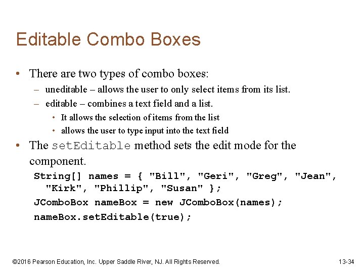
Editable Combo Boxes • There are two types of combo boxes: – uneditable – allows the user to only select items from its list. – editable – combines a text field and a list. • It allows the selection of items from the list • allows the user to type input into the text field • The set. Editable method sets the edit mode for the component. String[] names = { "Bill", "Geri", "Greg", "Jean", "Kirk", "Phillip", "Susan" }; JCombo. Box name. Box = new JCombo. Box(names); name. Box. set. Editable(true); © 2016 Pearson Education, Inc. Upper Saddle River, NJ. All Rights Reserved. 13 -34
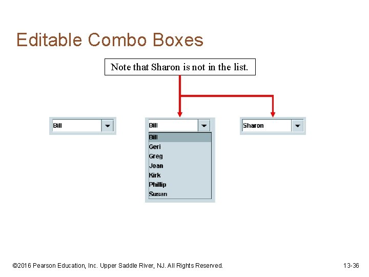
Editable Combo Boxes • An editable combo box appears as a text field with a small button displaying an arrow joining it. • When the user clicks on the button, the drop-down list appears as shown in the center of the figure. • The user may: – select an item from the list. – type a value into the text field. • The user is not restricted to the values that appear in the list, and may type any input into the text field. © 2016 Pearson Education, Inc. Upper Saddle River, NJ. All Rights Reserved. 13 -35
Editable Combo Boxes Note that Sharon is not in the list. © 2016 Pearson Education, Inc. Upper Saddle River, NJ. All Rights Reserved. 13 -36
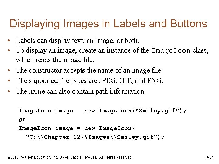
Displaying Images in Labels and Buttons • Labels can display text, an image, or both. • To display an image, create an instance of the Image. Icon class, which reads the image file. • The constructor accepts the name of an image file. • The supported file types are JPEG, GIF, and PNG. • The name can also contain path information. Image. Icon image = new Image. Icon("Smiley. gif"); or Image. Icon image = new Image. Icon( "C: \Chapter 12\Images\Smiley. gif"); © 2016 Pearson Education, Inc. Upper Saddle River, NJ. All Rights Reserved. 13 -37
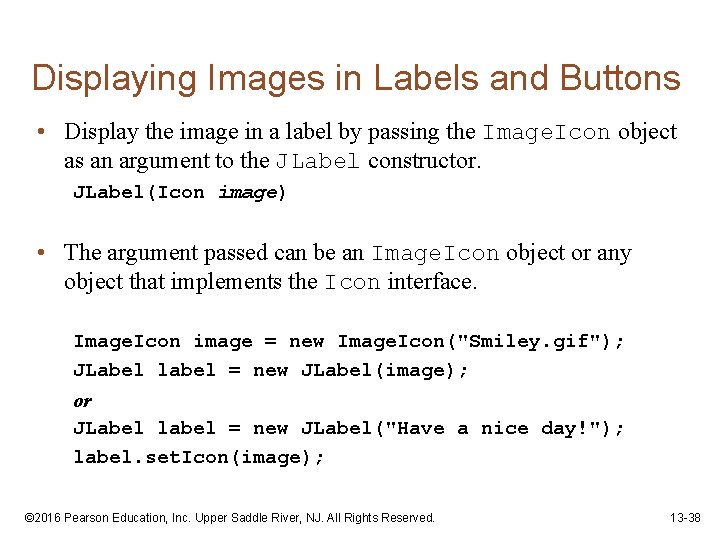
Displaying Images in Labels and Buttons • Display the image in a label by passing the Image. Icon object as an argument to the JLabel constructor. JLabel(Icon image) • The argument passed can be an Image. Icon object or any object that implements the Icon interface. Image. Icon image = new Image. Icon("Smiley. gif"); JLabel label = new JLabel(image); or JLabel label = new JLabel("Have a nice day!"); label. set. Icon(image); © 2016 Pearson Education, Inc. Upper Saddle River, NJ. All Rights Reserved. 13 -38
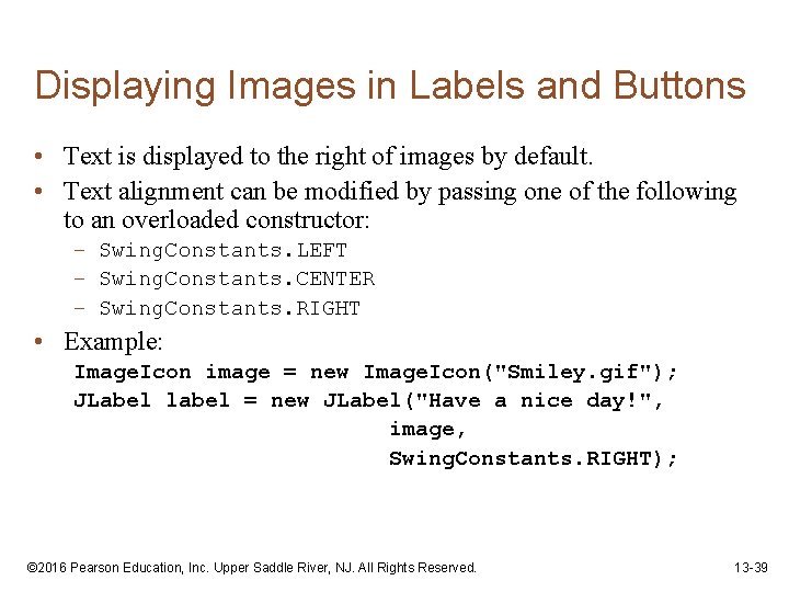
Displaying Images in Labels and Buttons • Text is displayed to the right of images by default. • Text alignment can be modified by passing one of the following to an overloaded constructor: – Swing. Constants. LEFT – Swing. Constants. CENTER – Swing. Constants. RIGHT • Example: Image. Icon image = new Image. Icon("Smiley. gif"); JLabel label = new JLabel("Have a nice day!", image, Swing. Constants. RIGHT); © 2016 Pearson Education, Inc. Upper Saddle River, NJ. All Rights Reserved. 13 -39
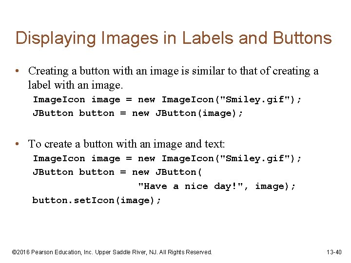
Displaying Images in Labels and Buttons • Creating a button with an image is similar to that of creating a label with an image. Icon image = new Image. Icon("Smiley. gif"); JButton button = new JButton(image); • To create a button with an image and text: Image. Icon image = new Image. Icon("Smiley. gif"); JButton button = new JButton( "Have a nice day!", image); button. set. Icon(image); © 2016 Pearson Education, Inc. Upper Saddle River, NJ. All Rights Reserved. 13 -40
Displaying Images in Labels and Buttons • To add an image to an existing button: JButton button = new JButton( "Have a nice day!"); Image. Icon image = new Image. Icon("Smiley. gif"); button. set. Icon(image); • You are not limited to small graphical icons when placing images in labels or buttons. • Example: My. Cat. Image. java © 2016 Pearson Education, Inc. Upper Saddle River, NJ. All Rights Reserved. 13 -41
Mnemonics • A mnemonic is a key that you press in combination with the Alt key to quickly access a component. • These are sometimes referred to as hot keys. • A hot key is assigned to a component through the component’s set. Mnemonic method • The argument passed to the method is an integer code that represents the key you wish to assign. © 2016 Pearson Education, Inc. Upper Saddle River, NJ. All Rights Reserved. 13 -42
Mnemonics • The key codes are predefined constants in the Key. Event class (java. awt. event package). • These constants take the form: – Key. Event. VK_x, where x is a key on the keyboard. • The letters VK in the constants stand for “virtual key”. – To assign the A key as a mnemonic, use Key. Event. VK_A. • Example: JButton exit. Button = new JButton("Exit"); exit. Button. set. Mnemonic(Key. Event. VK_X); © 2016 Pearson Education, Inc. Upper Saddle River, NJ. All Rights Reserved. 13 -43
Mnemonics • If the letter is in the component’s text, the first occurrence of that letter will appear underlined. • If the letter does not appear in the component’s text, then no letter will appear underlined. © 2016 Pearson Education, Inc. Upper Saddle River, NJ. All Rights Reserved. 13 -44
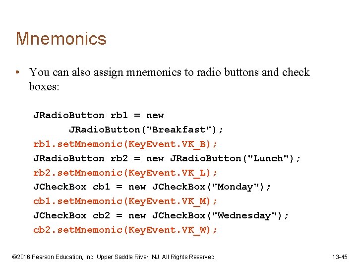
Mnemonics • You can also assign mnemonics to radio buttons and check boxes: JRadio. Button rb 1 = new JRadio. Button("Breakfast"); rb 1. set. Mnemonic(Key. Event. VK_B); JRadio. Button rb 2 = new JRadio. Button("Lunch"); rb 2. set. Mnemonic(Key. Event. VK_L); JCheck. Box cb 1 = new JCheck. Box("Monday"); cb 1. set. Mnemonic(Key. Event. VK_M); JCheck. Box cb 2 = new JCheck. Box("Wednesday"); cb 2. set. Mnemonic(Key. Event. VK_W); © 2016 Pearson Education, Inc. Upper Saddle River, NJ. All Rights Reserved. 13 -45
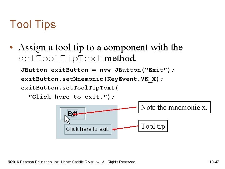
Tool Tips • A tool tip is text that is displayed in a small box when the mouse is held over a component. • The box usually gives a short description of what the component does. • Most GUI applications use tool tips as concise help to the user. © 2016 Pearson Education, Inc. Upper Saddle River, NJ. All Rights Reserved. 13 -46
Tool Tips • Assign a tool tip to a component with the set. Tool. Tip. Text method. JButton exit. Button = new JButton("Exit"); exit. Button. set. Mnemonic(Key. Event. VK_X); exit. Button. set. Tool. Tip. Text( "Click here to exit. "); Note the mnemonic x. Tool tip © 2016 Pearson Education, Inc. Upper Saddle River, NJ. All Rights Reserved. 13 -47
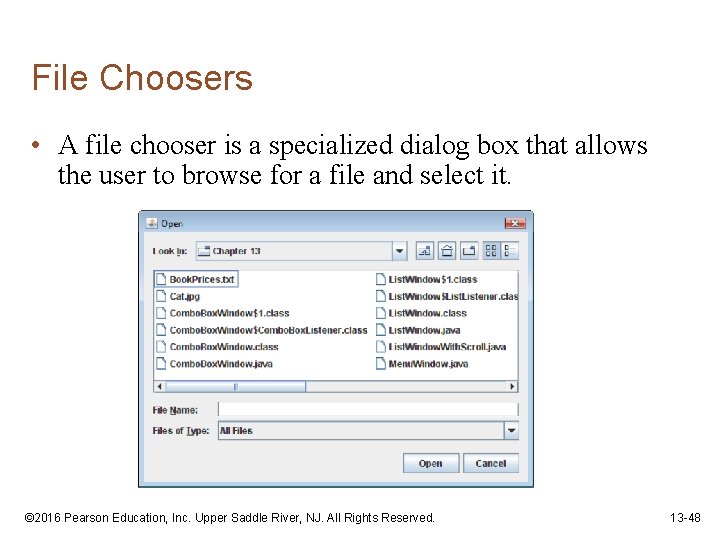
File Choosers • A file chooser is a specialized dialog box that allows the user to browse for a file and select it. © 2016 Pearson Education, Inc. Upper Saddle River, NJ. All Rights Reserved. 13 -48
File Choosers • Create an instance of the JFile. Chooser class to display a file chooser dialog box. • Two of the constructors have the form: JFile. Chooser() JFile. Chooser(String path) • The first constructor shown takes no arguments and uses the default directory as the starting point for all of its dialog boxes. • The second constructor takes a String argument containing a valid path. This path will be the starting point for the object’s dialog boxes. © 2016 Pearson Education, Inc. Upper Saddle River, NJ. All Rights Reserved. 13 -49
File Choosers • A JFile. Chooser object can display two types of predefined dialog boxes: – open file dialog box – lets the user browse for an existing file to open. – a save file dialog box – lest the user browse to a location to save a file. © 2016 Pearson Education, Inc. Upper Saddle River, NJ. All Rights Reserved. 13 -50
File Choosers • To display an open file dialog box, use the show. Open. Dialog method. • General format: int show. Open. Dialog(Component parent) • The argument can be null or a reference to a component. • If null is passed, the dialog box is normally centered in the screen. • If you pass a reference to a component the dialog box is displayed over the component. © 2016 Pearson Education, Inc. Upper Saddle River, NJ. All Rights Reserved. 13 -51
File Choosers • To display a save file dialog box, use the show. Save. Dialog method. • General format: int show. Save. Dialog(Component parent) • The argument can be either null or a reference to a component. • Both methods return an integer that indicates the action taken by the user to close the dialog box. © 2016 Pearson Education, Inc. Upper Saddle River, NJ. All Rights Reserved. 13 -52
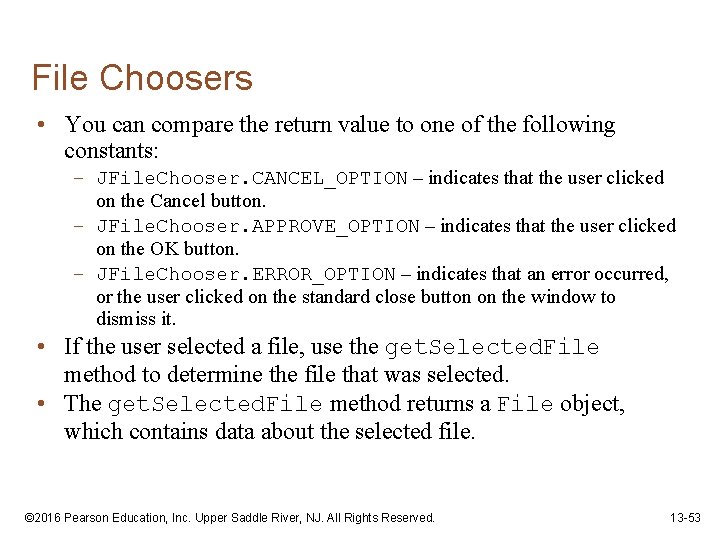
File Choosers • You can compare the return value to one of the following constants: – JFile. Chooser. CANCEL_OPTION – indicates that the user clicked on the Cancel button. – JFile. Chooser. APPROVE_OPTION – indicates that the user clicked on the OK button. – JFile. Chooser. ERROR_OPTION – indicates that an error occurred, or the user clicked on the standard close button on the window to dismiss it. • If the user selected a file, use the get. Selected. File method to determine the file that was selected. • The get. Selected. File method returns a File object, which contains data about the selected file. © 2016 Pearson Education, Inc. Upper Saddle River, NJ. All Rights Reserved. 13 -53
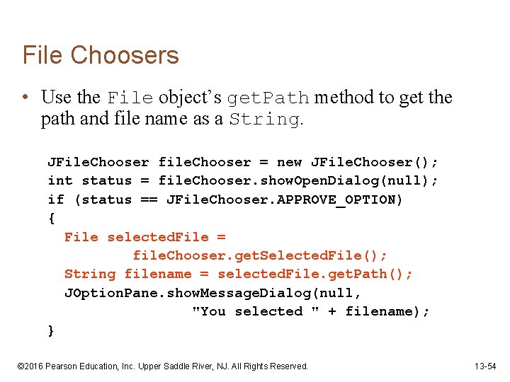
File Choosers • Use the File object’s get. Path method to get the path and file name as a String. JFile. Chooser file. Chooser = new JFile. Chooser(); int status = file. Chooser. show. Open. Dialog(null); if (status == JFile. Chooser. APPROVE_OPTION) { File selected. File = file. Chooser. get. Selected. File(); String filename = selected. File. get. Path(); JOption. Pane. show. Message. Dialog(null, "You selected " + filename); } © 2016 Pearson Education, Inc. Upper Saddle River, NJ. All Rights Reserved. 13 -54
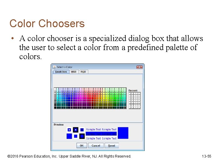
Color Choosers • A color chooser is a specialized dialog box that allows the user to select a color from a predefined palette of colors. © 2016 Pearson Education, Inc. Upper Saddle River, NJ. All Rights Reserved. 13 -55
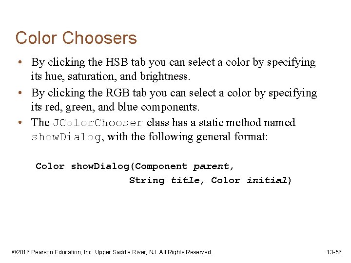
Color Choosers • By clicking the HSB tab you can select a color by specifying its hue, saturation, and brightness. • By clicking the RGB tab you can select a color by specifying its red, green, and blue components. • The JColor. Chooser class has a static method named show. Dialog, with the following general format: Color show. Dialog(Component parent, String title, Color initial) © 2016 Pearson Education, Inc. Upper Saddle River, NJ. All Rights Reserved. 13 -56
Color Choosers • If the first argument is null, the dialog box is normally centered in the screen. • If it is a reference to a component the dialog box is displayed over the component. • The second argument is the dialog title. • The third argument indicates the color that appears initially selected in the dialog box. • This method returns the color selected by the user. © 2016 Pearson Education, Inc. Upper Saddle River, NJ. All Rights Reserved. 13 -57
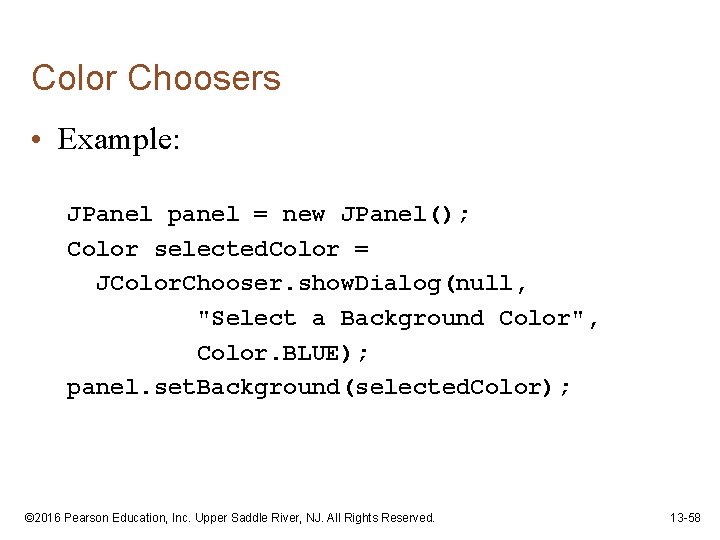
Color Choosers • Example: JPanel panel = new JPanel(); Color selected. Color = JColor. Chooser. show. Dialog(null, "Select a Background Color", Color. BLUE); panel. set. Background(selected. Color); © 2016 Pearson Education, Inc. Upper Saddle River, NJ. All Rights Reserved. 13 -58
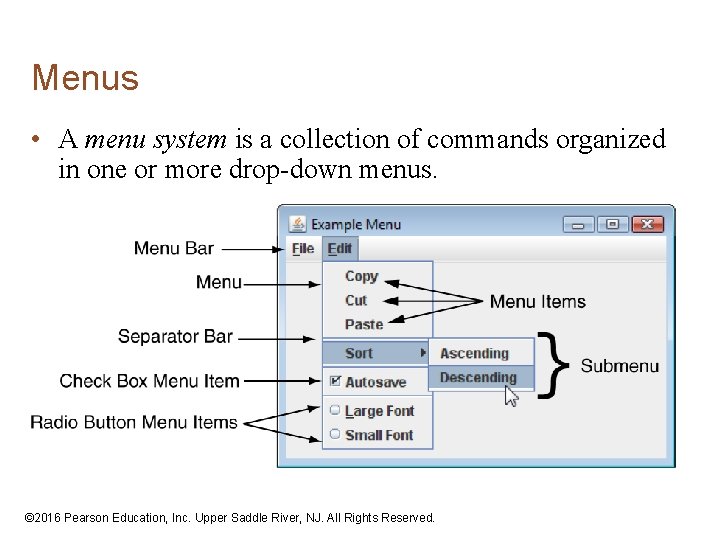
Menus • A menu system is a collection of commands organized in one or more drop-down menus. © 2016 Pearson Education, Inc. Upper Saddle River, NJ. All Rights Reserved.
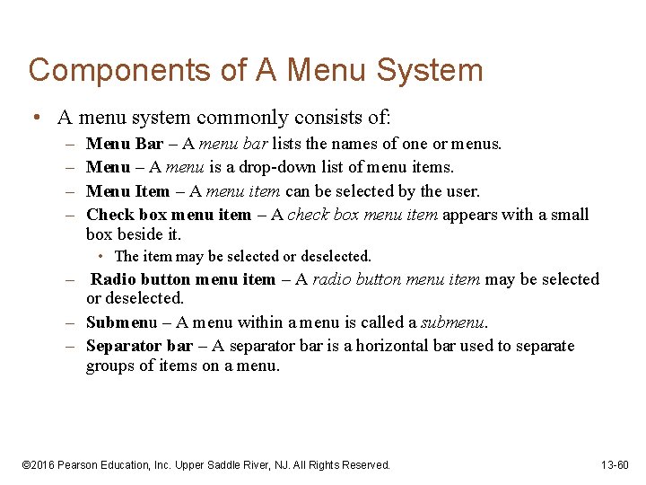
Components of A Menu System • A menu system commonly consists of: – – Menu Bar – A menu bar lists the names of one or menus. Menu – A menu is a drop-down list of menu items. Menu Item – A menu item can be selected by the user. Check box menu item – A check box menu item appears with a small box beside it. • The item may be selected or deselected. – Radio button menu item – A radio button menu item may be selected or deselected. – Submenu – A menu within a menu is called a submenu. – Separator bar – A separator bar is a horizontal bar used to separate groups of items on a menu. © 2016 Pearson Education, Inc. Upper Saddle River, NJ. All Rights Reserved. 13 -60
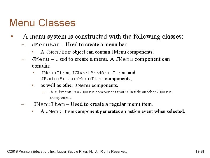
Menu Classes • A menu system is constructed with the following classes: – JMenu. Bar – Used to create a menu bar. • – A JMenu. Bar object can contain JMenu components. JMenu – Used to create a menu. A JMenu component can contain: • • JMenu. Item, JCheck. Box. Menu. Item, and JRadio. Button. Menu. Item components, as well as other JMenu components. – – A submenu is a JMenu component that is inside another JMenu component. JMenu. Item – Used to create a regular menu item. • A JMenu. Item component generates an action event when selected. © 2016 Pearson Education, Inc. Upper Saddle River, NJ. All Rights Reserved. 13 -61
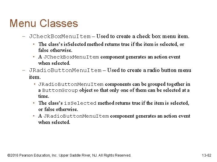
Menu Classes – JCheck. Box. Menu. Item – Used to create a check box menu item. • The class’s is. Selected method returns true if the item is selected, or false otherwise. • A JCheck. Box. Menu. Item component generates an action event when selected. – JRadio. Button. Menu. Item – Used to create a radio button menu item. • JRadio. Button. Menu. Item components can be grouped together in a Button. Group object so that only one of them can be selected at a time. • The class’s is. Selected method returns true if the item is selected, or false otherwise. • A JRadio. Button. Menu. Item component generates an action event when selected. © 2016 Pearson Education, Inc. Upper Saddle River, NJ. All Rights Reserved. 13 -62
Menu Example • Menu Example: Menu. Window. java © 2016 Pearson Education, Inc. Upper Saddle River, NJ. All Rights Reserved. 13 -63
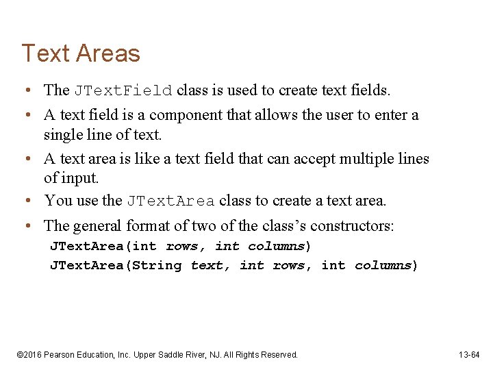
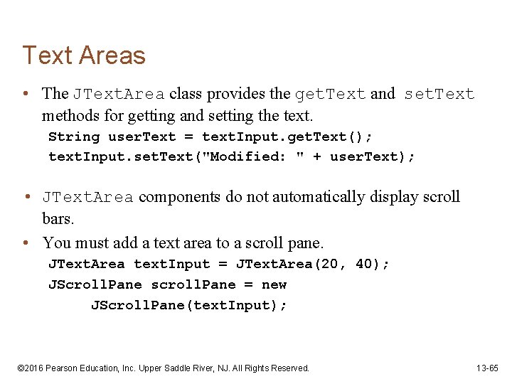
Text Areas • The JText. Field class is used to create text fields. • A text field is a component that allows the user to enter a single line of text. • A text area is like a text field that can accept multiple lines of input. • You use the JText. Area class to create a text area. • The general format of two of the class’s constructors: JText. Area(int rows, int columns) JText. Area(String text, int rows, int columns) © 2016 Pearson Education, Inc. Upper Saddle River, NJ. All Rights Reserved. 13 -64
Text Areas • The JText. Area class provides the get. Text and set. Text methods for getting and setting the text. String user. Text = text. Input. get. Text(); text. Input. set. Text("Modified: " + user. Text); • JText. Area components do not automatically display scroll bars. • You must add a text area to a scroll pane. JText. Area text. Input = JText. Area(20, 40); JScroll. Pane scroll. Pane = new JScroll. Pane(text. Input); © 2016 Pearson Education, Inc. Upper Saddle River, NJ. All Rights Reserved. 13 -65
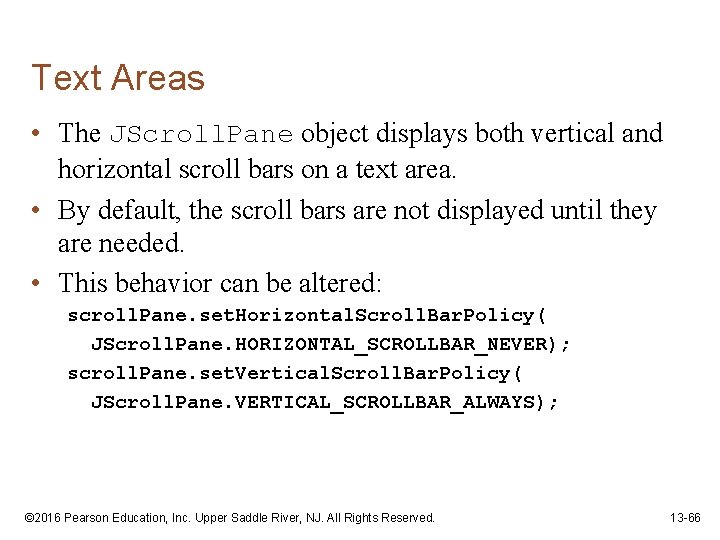
Text Areas • The JScroll. Pane object displays both vertical and horizontal scroll bars on a text area. • By default, the scroll bars are not displayed until they are needed. • This behavior can be altered: scroll. Pane. set. Horizontal. Scroll. Bar. Policy( JScroll. Pane. HORIZONTAL_SCROLLBAR_NEVER); scroll. Pane. set. Vertical. Scroll. Bar. Policy( JScroll. Pane. VERTICAL_SCROLLBAR_ALWAYS); © 2016 Pearson Education, Inc. Upper Saddle River, NJ. All Rights Reserved. 13 -66
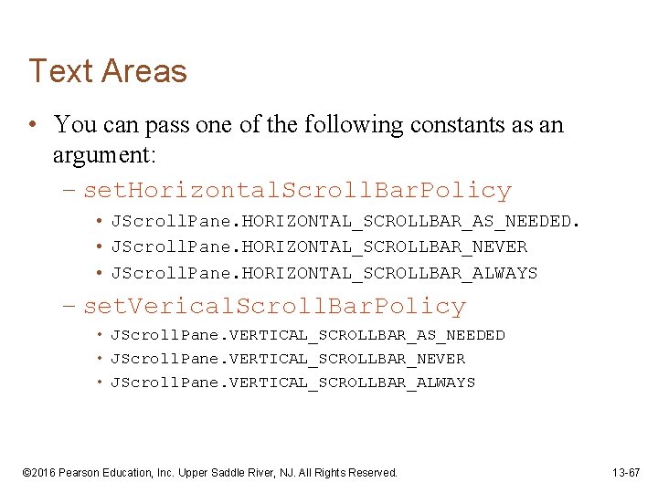
Text Areas • You can pass one of the following constants as an argument: – set. Horizontal. Scroll. Bar. Policy • JScroll. Pane. HORIZONTAL_SCROLLBAR_AS_NEEDED. • JScroll. Pane. HORIZONTAL_SCROLLBAR_NEVER • JScroll. Pane. HORIZONTAL_SCROLLBAR_ALWAYS – set. Verical. Scroll. Bar. Policy • JScroll. Pane. VERTICAL_SCROLLBAR_AS_NEEDED • JScroll. Pane. VERTICAL_SCROLLBAR_NEVER • JScroll. Pane. VERTICAL_SCROLLBAR_ALWAYS © 2016 Pearson Education, Inc. Upper Saddle River, NJ. All Rights Reserved. 13 -67
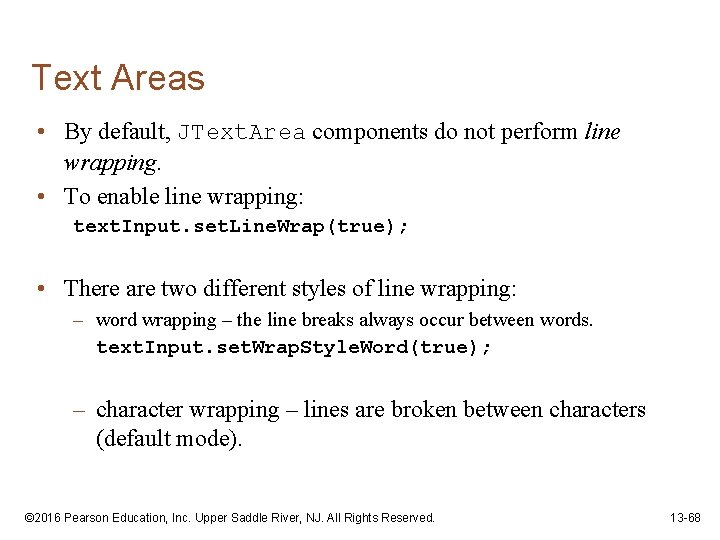
Text Areas • By default, JText. Area components do not perform line wrapping. • To enable line wrapping: text. Input. set. Line. Wrap(true); • There are two different styles of line wrapping: – word wrapping – the line breaks always occur between words. text. Input. set. Wrap. Style. Word(true); – character wrapping – lines are broken between characters (default mode). © 2016 Pearson Education, Inc. Upper Saddle River, NJ. All Rights Reserved. 13 -68
Fonts • Components display according to their font characteristics: – font – the name of the typeface – style – can be plain, bold, and/or italic – size of the text in points. • A component’s set. Font method will change the appearance of the text in the component: set. Font (Font appearance) • A Font constructor takes three parameters: Font(String font. Name, int style, int size) © 2016 Pearson Education, Inc. Upper Saddle River, NJ. All Rights Reserved. 13 -69
Fonts • Java guarantees that you will have the fonts: – Dialog, Dialog. Input, Monospaced, Sans. Serif, and Serif. • There are three font styles: – Font. PLAIN, Font. BOLD, and Font. ITALIC. • Example: label. set. Font(new Font( "Serif", Font. BOLD, 24)); • Font styles can be combined adding them. label. set. Font(new Font( "Serif", Font. BOLD + Font. ITALIC, 24)); © 2016 Pearson Education, Inc. Upper Saddle River, NJ. All Rights Reserved. 13 -70
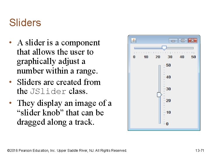
Sliders • A slider is a component that allows the user to graphically adjust a number within a range. • Sliders are created from the JSlider class. • They display an image of a “slider knob” that can be dragged along a track. © 2016 Pearson Education, Inc. Upper Saddle River, NJ. All Rights Reserved. 13 -71
Sliders • A slider is designed to represent a range of numeric values. • As the user moves the knob along the track, the numeric value is adjusted accordingly. • Between the minimum and maximum values, major tick marks are displayed with a label indicating the value at that tick mark. • Between the major tick marks are minor tick marks. © 2016 Pearson Education, Inc. Upper Saddle River, NJ. All Rights Reserved. 13 -72
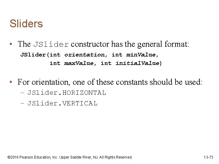
Sliders • The JSlider constructor has the general format: JSlider(int orientation, int min. Value, int max. Value, int initial. Value) • For orientation, one of these constants should be used: – JSlider. HORIZONTAL – JSlider. VERTICAL © 2016 Pearson Education, Inc. Upper Saddle River, NJ. All Rights Reserved. 13 -73
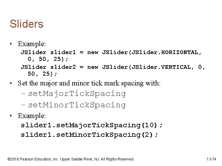
Sliders • Example: JSlider slider 1 = new JSlider(JSlider. HORIZONTAL, 0, 50, 25); JSlider slider 2 = new JSlider(JSlider. VERTICAL, 0, 50, 25); • Set the major and minor tick mark spacing with: – set. Major. Tick. Spacing – set. Minor. Tick. Spacing • Example: slider 1. set. Major. Tick. Spacing(10); slider 1. set. Minor. Tick. Spacing(2); © 2016 Pearson Education, Inc. Upper Saddle River, NJ. All Rights Reserved. 13 -74
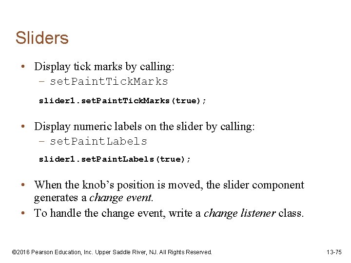
Sliders • Display tick marks by calling: – set. Paint. Tick. Marks slider 1. set. Paint. Tick. Marks(true); • Display numeric labels on the slider by calling: – set. Paint. Labels slider 1. set. Paint. Labels(true); • When the knob’s position is moved, the slider component generates a change event. • To handle the change event, write a change listener class. © 2016 Pearson Education, Inc. Upper Saddle River, NJ. All Rights Reserved. 13 -75
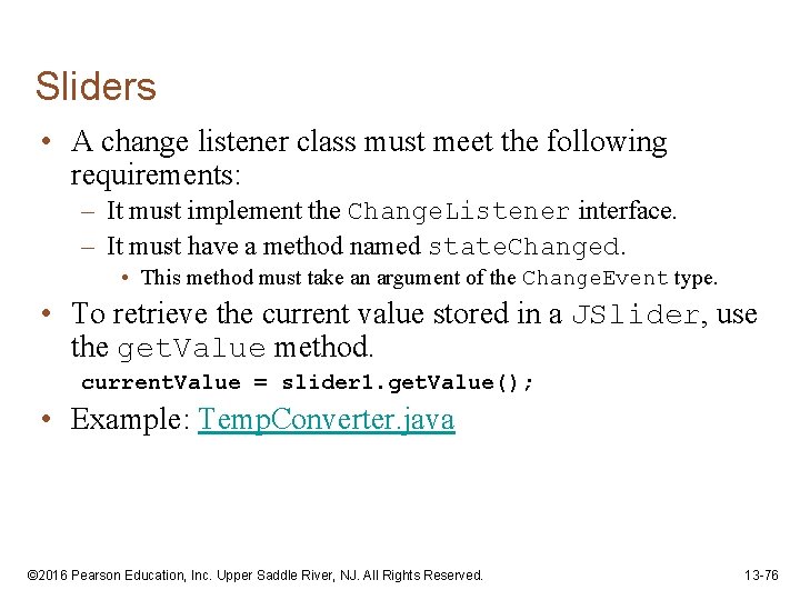
Sliders • A change listener class must meet the following requirements: – It must implement the Change. Listener interface. – It must have a method named state. Changed. • This method must take an argument of the Change. Event type. • To retrieve the current value stored in a JSlider, use the get. Value method. current. Value = slider 1. get. Value(); • Example: Temp. Converter. java © 2016 Pearson Education, Inc. Upper Saddle River, NJ. All Rights Reserved. 13 -76
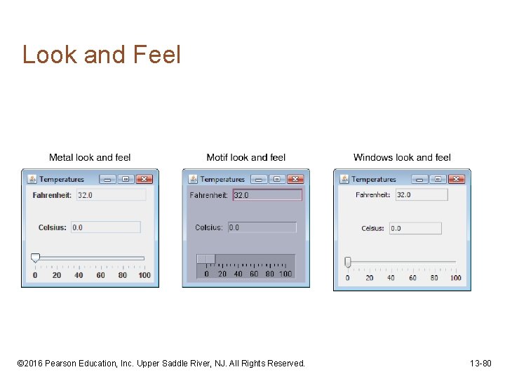
Look and Feel • The appearance of a particular system’s GUI is known as its look and feel. • Java allows you to select the look and feel of a GUI application. • On most systems, Java’s default look and feel is called Metal. • There also Motif and Windows look and feel classes for Java. – Motif is similar to a UNIX look and feel – Windows is the look and feel of the Windows operating system. © 2016 Pearson Education, Inc. Upper Saddle River, NJ. All Rights Reserved. 13 -77
Look and Feel • To change an application’s look and feel, call the UIManager class’s static set. Look. And. Feel method. • Java has a class for each look and feel. • The set. Look. And. Feel method takes the fully qualified class name for the desired look and feel as its argument. • The class name must be passed as a string. © 2016 Pearson Education, Inc. Upper Saddle River, NJ. All Rights Reserved. 13 -78
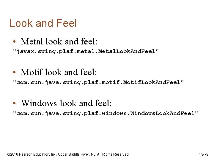
Look and Feel • Metal look and feel: "javax. swing. plaf. metal. Metal. Look. And. Feel" • Motif look and feel: "com. sun. java. swing. plaf. motif. Motif. Look. And. Feel" • Windows look and feel: "com. sun. java. swing. plaf. windows. Windows. Look. And. Feel" © 2016 Pearson Education, Inc. Upper Saddle River, NJ. All Rights Reserved. 13 -79
Look and Feel © 2016 Pearson Education, Inc. Upper Saddle River, NJ. All Rights Reserved. 13 -80
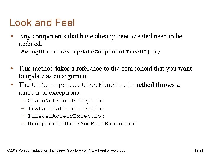
Look and Feel • Any components that have already been created need to be updated. Swing. Utilities. update. Component. Tree. UI(…); • This method takes a reference to the component that you want to update as an argument. • The UIManager. set. Look. And. Feel method throws a number of exceptions: – – Class. Not. Found. Exception Instantiation. Exception Illegal. Access. Exception Unsupported. Look. And. Feel. Exception © 2016 Pearson Education, Inc. Upper Saddle River, NJ. All Rights Reserved. 13 -81
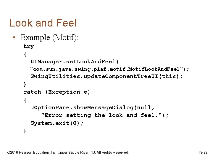
Look and Feel • Example (Motif): try { UIManager. set. Look. And. Feel( "com. sun. java. swing. plaf. motif. Motif. Look. And. Feel"); Swing. Utilities. update. Component. Tree. UI(this); } catch (Exception e) { JOption. Pane. show. Message. Dialog(null, "Error setting the look and feel. "); System. exit(0); } © 2016 Pearson Education, Inc. Upper Saddle River, NJ. All Rights Reserved. 13 -82
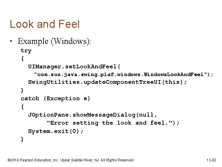
Look and Feel • Example (Windows): try { UIManager. set. Look. And. Feel( "com. sun. java. swing. plaf. windows. Windows. Look. And. Feel"); Swing. Utilities. update. Component. Tree. UI(this); } catch (Exception e) { JOption. Pane. show. Message. Dialog(null, "Error setting the look and feel. "); System. exit(0); } © 2016 Pearson Education, Inc. Upper Saddle River, NJ. All Rights Reserved. 13 -83