Chapter 12 Java FX Graphical User Interfaces Part
- Slides: 102

Chapter 12 Java. FX Graphical User Interfaces: Part 1 Java How to Program, 11/e Questions? E-mail paul. deitel@deitel. com © Copyright 1992 -2018 by Pearson Education, Inc. All Rights Reserved.

Eclipse with Scene. Builder If you don’t have Scene. Builder, download Scene. Builder from https: //gluonhq. com//products/scene-builder/ Follow instructions to integrate Scene. Builder into eclipse here https: //code. makery. ch/library/javafx-tutorial/part 1/ We want to be able to Create… a New Java. FX project We want to be able to Create… an FMXL file for the GUI Layout We want to be able to Open… Scene. Builder on the FXML file. © Copyright 1992 -2018 by Pearson Education, Inc. All Rights Reserved.

© Copyright 1992 -2018 by Pearson Education, Inc. All Rights Reserved.

© Copyright 1992 -2018 by Pearson Education, Inc. All Rights Reserved.

Introduction A graphical user interface (GUI) presents a user-friendly mechanism for interacting with an app. A GUI (pronounced “GOO-ee”) gives an app a distinctive “look-and-feel. ” GUIs are built from GUI components—sometimes called controls or widgets. “Look-and-feel” is defined as the mechanism needed to interact with an app. © Copyright 1992 -2018 by Pearson Education, Inc. All Rights Reserved.

© Copyright 1992 -2018 by Pearson Education, Inc. All Rights Reserved.

Introduction (Cont. ) Providing different apps with consistent, intuitive user-interface components gives users a sense of familiarity with a new app, so that they can learn it more quickly and use it more productively. Java’s GUI, graphics and multimedia API of the future is Java. FX. Think about the “look-and-feel” for MS Word or Power. Point. ◦ A Menu Bar across the top has the same set of options such as File, Home, Insert, Design, etc. Wherever the interfaces can be similar, they are similar. This makes it easier to switch between them © Copyright 1992 -2018 by Pearson Education, Inc. All Rights Reserved.

Java. FX Parts Java. FX has 3 parts § A GUI builder called Scene. Builder allows drag-and-drop manipulation of widgets. § A configuration language called FXML that records the widgets in the GUI, their visible attributes and their relationship to each other. § A Controller class that must be completed by the programmer to bring the GUI to life. A Java. FX application has some additional parts § A set of classes to describe the model, which is what the GUI allows the user to interact with. § A set of cascading style sheets (CSS files) to further specify “look-and-feel”. © Copyright 1992 -2018 by Pearson Education, Inc. All Rights Reserved.

Java. FX Scene Builder is a standalone Java. FX GUI visual layout tool that can also be used with various IDEs including eclipse, Net. Beans and Intelli. J. Java. FX Scene Builder enables you to create GUIs by dragging and dropping GUI components from Scene Builder’s library onto a design area, then modifying and styling the GUI—all without writing any code. Java. FX Scene Builder generates FXML (FX Markup Language)—an XML vocabulary for defining and arranging Java. FX GUI controls without writing any Java code. © Copyright 1992 -2018 by Pearson Education, Inc. All Rights Reserved.

Java. FX Scene Builder (Cont. ) The FXML code is separate from the program logic that’s defined in Java source code—this separation of the interface (the GUI) from the implementation (the Java code) makes it easier to debug, modify and maintain Java. FX GUI apps. Placing GUI components in a window can be tedious. Being able to do it dynamically using a configuration file makes the job much easier. No additional compilation is needed unless actions need to be programmed in the Controller. java class. © Copyright 1992 -2018 by Pearson Education, Inc. All Rights Reserved.

© Copyright 1992 -2018 by Pearson Education, Inc. All Rights Reserved.

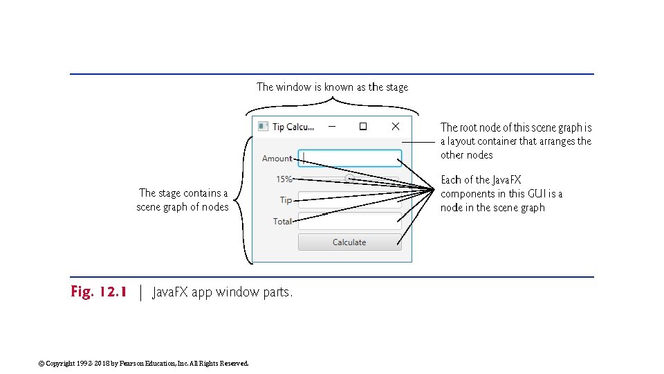
Java. FX App Window Structure A Java. FX app window consists of several parts (Fig. 12. 1) Figure 12. 1 contains a labelled image of a Tip Calculator GUI. © Copyright 1992 -2018 by Pearson Education, Inc. All Rights Reserved.

© Copyright 1992 -2018 by Pearson Education, Inc. All Rights Reserved.

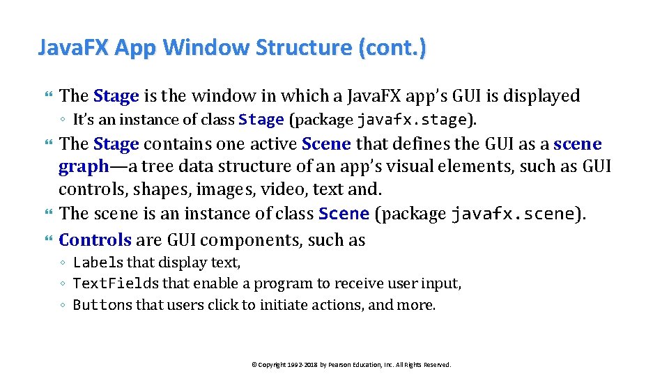
Java. FX App Window Structure (cont. ) The Stage is the window in which a Java. FX app’s GUI is displayed ◦ It’s an instance of class Stage (package javafx. stage). The Stage contains one active Scene that defines the GUI as a scene graph—a tree data structure of an app’s visual elements, such as GUI controls, shapes, images, video, text and. The scene is an instance of class Scene (package javafx. scene). Controls are GUI components, such as ◦ Labels that display text, ◦ Text. Fields that enable a program to receive user input, ◦ Buttons that users click to initiate actions, and more. © Copyright 1992 -2018 by Pearson Education, Inc. All Rights Reserved.

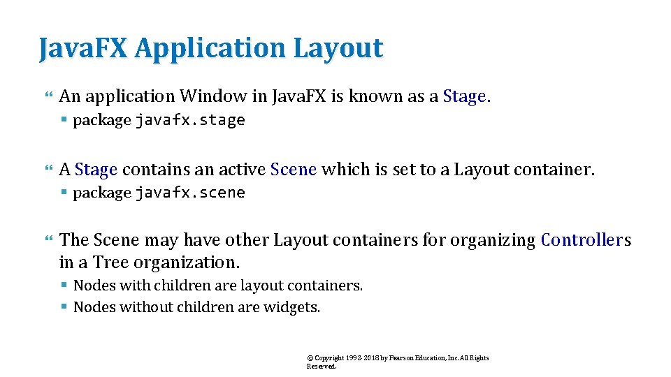
Java. FX Application Layout An application Window in Java. FX is known as a Stage. § package javafx. stage A Stage contains an active Scene which is set to a Layout container. § package javafx. scene The Scene may have other Layout containers for organizing Controllers in a Tree organization. § Nodes with children are layout containers. § Nodes without children are widgets. © Copyright 1992 -2018 by Pearson Education, Inc. All Rights Reserved.

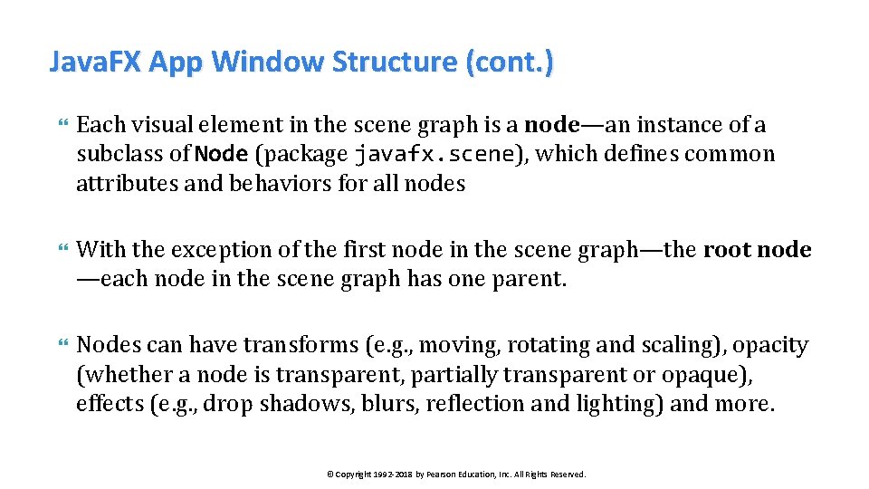
Java. FX App Window Structure (cont. ) Each visual element in the scene graph is a node—an instance of a subclass of Node (package javafx. scene), which defines common attributes and behaviors for all nodes With the exception of the first node in the scene graph—the root node —each node in the scene graph has one parent. Nodes can have transforms (e. g. , moving, rotating and scaling), opacity (whether a node is transparent, partially transparent or opaque), effects (e. g. , drop shadows, blurs, reflection and lighting) and more. © Copyright 1992 -2018 by Pearson Education, Inc. All Rights Reserved.

Java. FX controls Nodes with children are typically layout containers that arrange their child nodes in the scene. ◦ Layout containers contain controls that accept inputs or other layout containers. When the user interacts with a control, the control generates an event. Programs can respond to these events—known as event handling—to specify what should happen when each user interaction occurs. An event handler is a method that responds to a user interaction. An FXML GUI’s event handlers are defined in a so-called controller class. © Copyright 1992 -2018 by Pearson Education, Inc. All Rights Reserved.

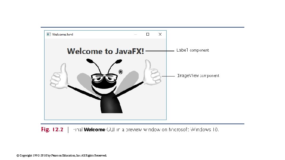
Welcome App—Displaying Text and an Image In this section, without writing any code you’ll build a GUI that displays text in a Label and an image in an Image. View (Fig. 12. 2). You'll use only visual programming techniques to drag-and-drop Java. FX components onto Scene Builder’s content panel—the design area. You’ll use Scene Builder’s Inspector to configure options, such as the Label’s text and font size, and the Image. View’s image. You’ll view the completed GUI using Scene Builder’s Show Preview in Window option. © Copyright 1992 -2018 by Pearson Education, Inc. All Rights Reserved.

© Copyright 1992 -2018 by Pearson Education, Inc. All Rights Reserved.

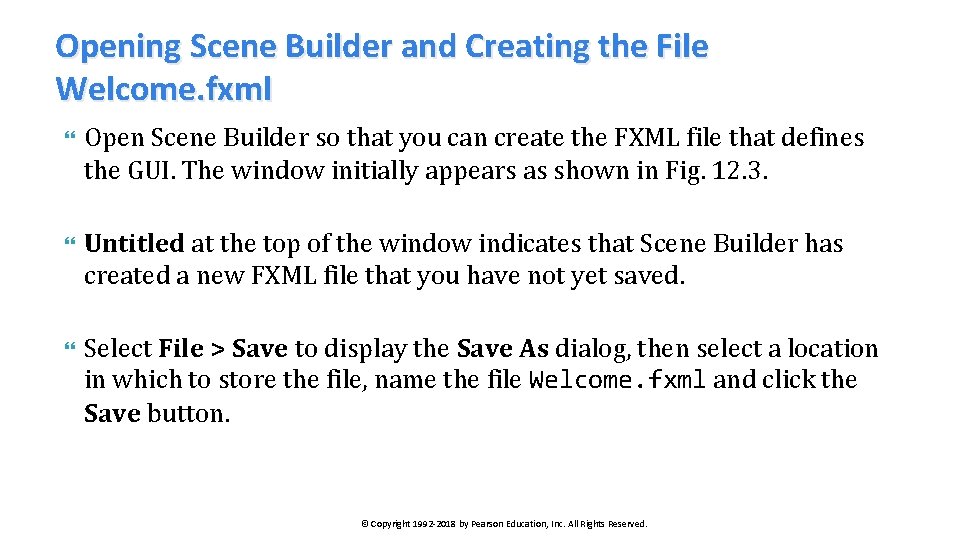
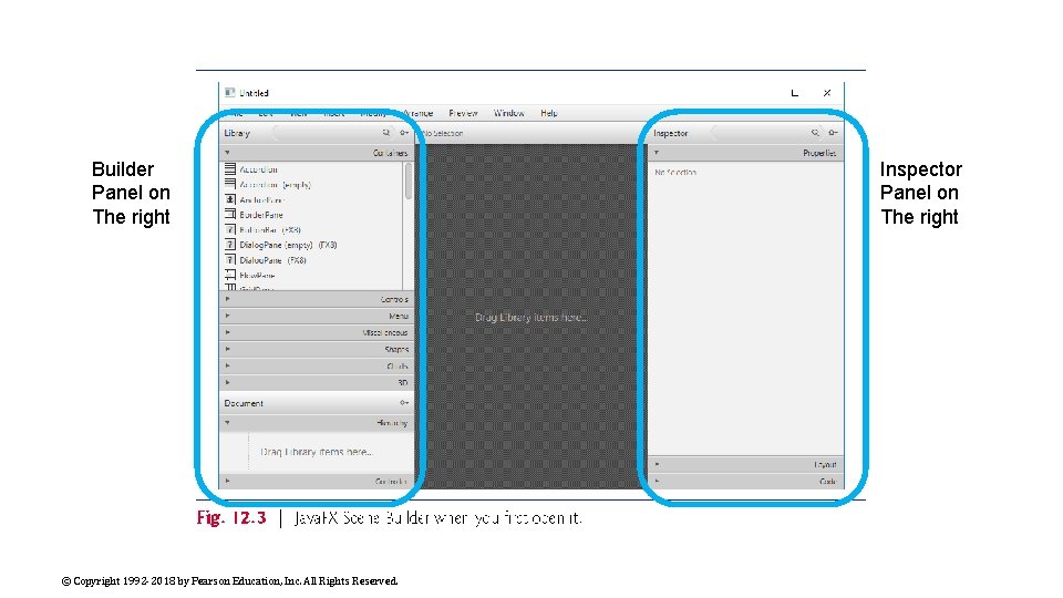
Opening Scene Builder and Creating the File Welcome. fxml Open Scene Builder so that you can create the FXML file that defines the GUI. The window initially appears as shown in Fig. 12. 3. Untitled at the top of the window indicates that Scene Builder has created a new FXML file that you have not yet saved. Select File > Save to display the Save As dialog, then select a location in which to store the file, name the file Welcome. fxml and click the Save button. © Copyright 1992 -2018 by Pearson Education, Inc. All Rights Reserved.

Builder Panel on The right © Copyright 1992 -2018 by Pearson Education, Inc. All Rights Reserved. Inspector Panel on The right

Adding an Image to the Folder Containing Welcome. fxml The image you’ll use for this app (bug. png) is located in the images- subfolder of this chapter’s examples folder. To make it easy to find the image when you’re ready to add it to the app, locate the images folder on your file system, then copy bug. png into the folder where you saved Welcome. fxml. https: //storm. cis. fordham. edu/harazduk/cs 3400/bug. png ◦ Right-click and download. © Copyright 1992 -2018 by Pearson Education, Inc. All Rights Reserved.

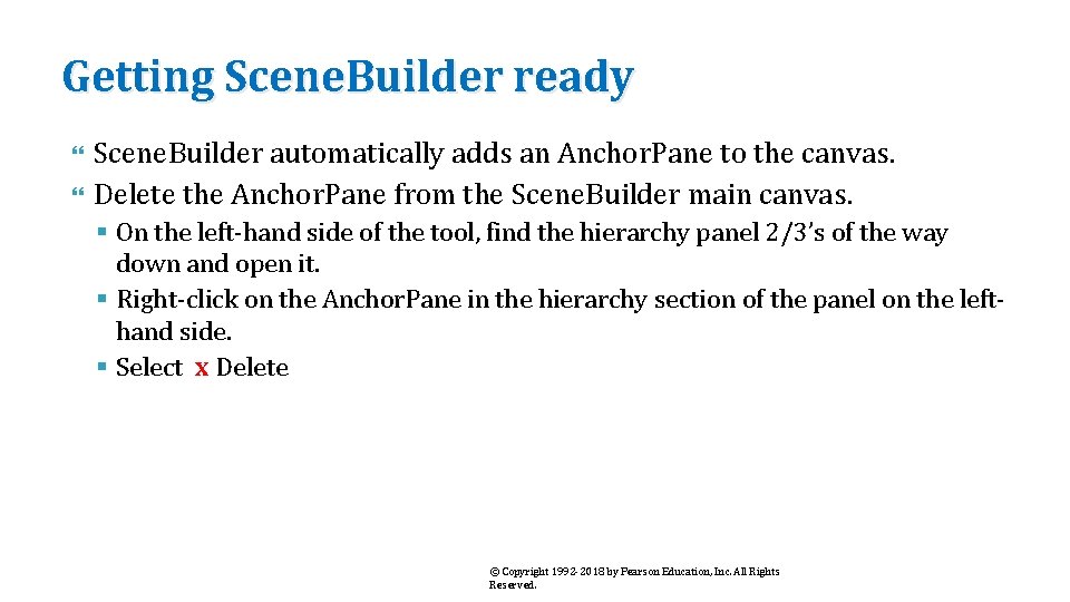
Getting Scene. Builder ready Scene. Builder automatically adds an Anchor. Pane to the canvas. Delete the Anchor. Pane from the Scene. Builder main canvas. § On the left-hand side of the tool, find the hierarchy panel 2/3’s of the way down and open it. § Right-click on the Anchor. Pane in the hierarchy section of the panel on the lefthand side. § Select x Delete © Copyright 1992 -2018 by Pearson Education, Inc. All Rights Reserved.

Creating a VBox Layout Container You'll use a VBox layout container (package javafx. scene. layout), which will be the scene graph’s root node. Layout containers help you arrange and size GUI components. A VBox arranges its nodes vertically from top to bottom. To add a VBox to Scene Builder’s, double-click VBox in the Library window’s Containers section. ◦ You also can drag-and-drop a VBox from the Containers section onto Scene Builder’s content panel. © Copyright 1992 -2018 by Pearson Education, Inc. All Rights Reserved.

Configuring the VBox Layout Container Specifying the VBox’s Alignment A VBox’s alignment determines the layout positioning of the VBox’s children. Click the Alignment property’s drop-down list and click CENTER to set it. ◦ We’d like both children to be centered vertically, so that they are spaced equally above the Label and below the Image. View. ◦ Select the VBox in Scene Builder’s content panel by clicking it. Scene Builder displays many VBox properties in the Scene Builder Inspector’s Properties section. Each property value you specify for a Java. FX object is used to set one of that object’s instance variables when Java. FX creates the object at runtime. © Copyright 1992 -2018 by Pearson Education, Inc. All Rights Reserved.

Configuring the VBox Layout Container (cont. ) Specifying the VBox’s Preferred Size The preferred size (width and height) of the scene graph’s root node is used by the scene to determine its window size when the app begins executing ◦ Select the VBox. ◦ Click the right arrow next to Inspector’s Layout section to expand it. The section expands and the right arrow changes to a down arrow. Clicking the arrow again would collapse the section. ◦ Click the Pref Width property’s text field, type 450 and press Enter to change the preferred width. ◦ Click the Pref Height property’s text field, type 300 and press Enter to change the preferred height. © Copyright 1992 -2018 by Pearson Education, Inc. All Rights Reserved.

Adding and Configuring a Label Adding a Label to the VBox Expand the Scene Builder Library window’s Controls section by clicking the right arrow next to Controls, then drag-and-drop a Label from the Controls section onto the VBox ◦ Scene Builder automatically centers the Label object horizontally and vertically in the VBox, based on the VBox’s Alignment property. © Copyright 1992 -2018 by Pearson Education, Inc. All Rights Reserved.

Adding and Configuring a Label (cont. ) Changing the Label’s Text Two ways to set the Label ◦ double click the Label and input the new text directly, or ◦ single click to select the Label, then in the Inspector’s Properties section on the right, set the Text property. Set the Label’s text to "Welcome to Java. FX!". © Copyright 1992 -2018 by Pearson Education, Inc. All Rights Reserved.

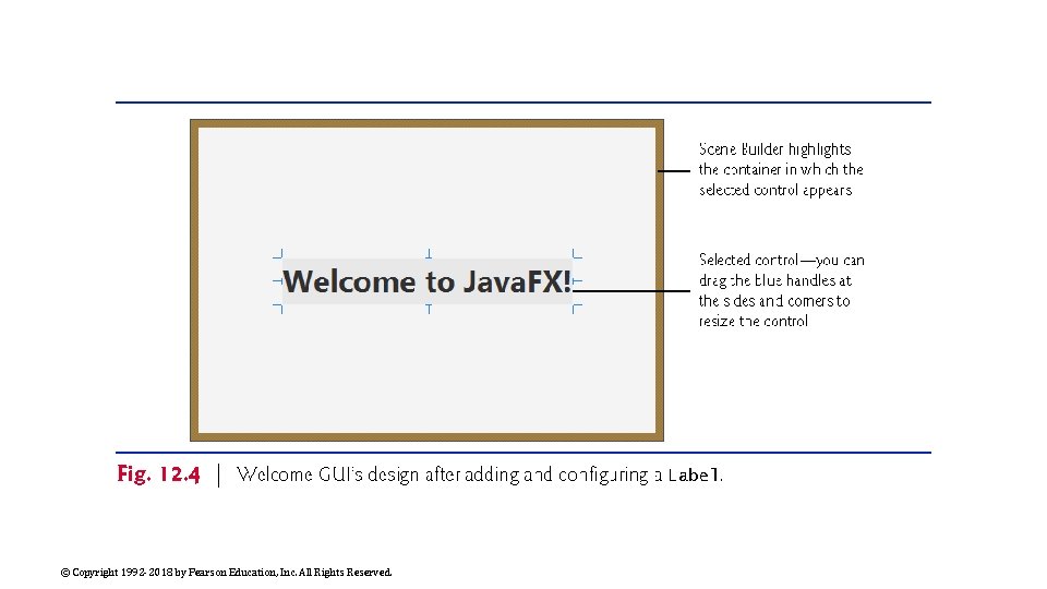
Adding and Configuring a Label (cont. ) Changing the Label’s Font Set the Label to display in a large bold font. Select the Label, then in the Inspector’s Properties section, click the value to the right of the Font property. In the window that appears, set the Style property to Bold and the Size property to 30 (or 36). The design should now appear as shown in Fig 12. 4. © Copyright 1992 -2018 by Pearson Education, Inc. All Rights Reserved.

© Copyright 1992 -2018 by Pearson Education, Inc. All Rights Reserved.

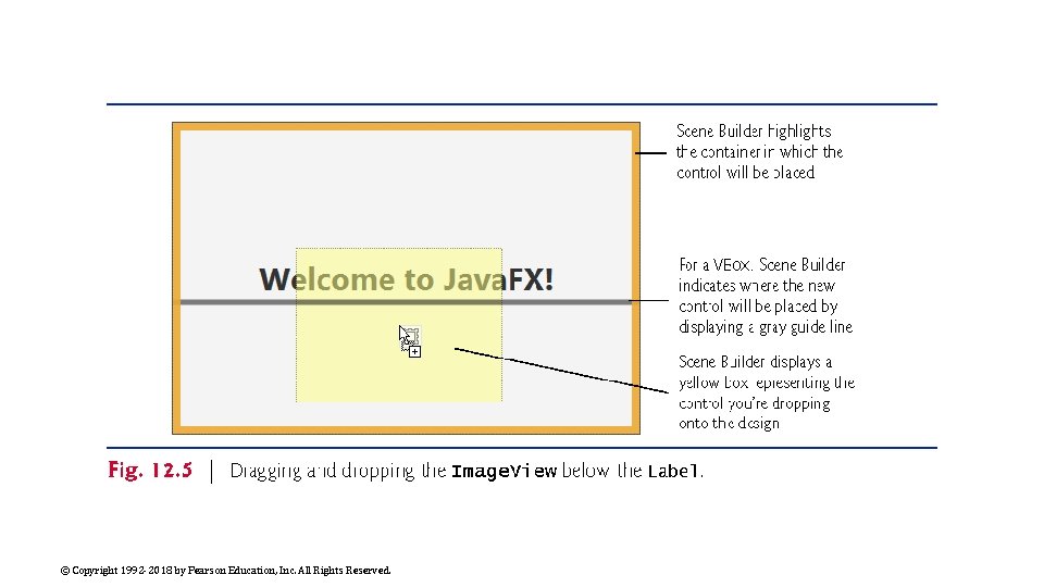
Adding and Configuring an Image. View Drag and drop an Image. View from the Library window’s Controls section to just below the Label, as shown in Fig. 12. 5. ◦ You can also double-click Image. View in the Library window, in which case Scene Builder automatically places the new Image. View object below the Label. You can reorder a VBox’s controls by dragging them in the VBox or in the Document window’s Hierarchy section (Fig. 12. 3). Scene Builder automatically centers the Image. View horizontally in the VBox. The Label and Image. View are centered vertically such that the same amount of space appears above the Label and below the Image. View. © Copyright 1992 -2018 by Pearson Education, Inc. All Rights Reserved.

© Copyright 1992 -2018 by Pearson Education, Inc. All Rights Reserved.

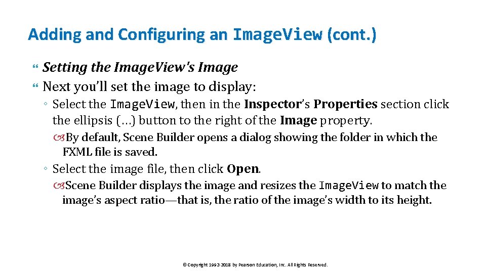
Adding and Configuring an Image. View (cont. ) Setting the Image. View's Image Next you’ll set the image to display: ◦ Select the Image. View, then in the Inspector’s Properties section click the ellipsis (…) button to the right of the Image property. By default, Scene Builder opens a dialog showing the folder in which the FXML file is saved. ◦ Select the image file, then click Open. Scene Builder displays the image and resizes the Image. View to match the image’s aspect ratio—that is, the ratio of the image’s width to its height. © Copyright 1992 -2018 by Pearson Education, Inc. All Rights Reserved.

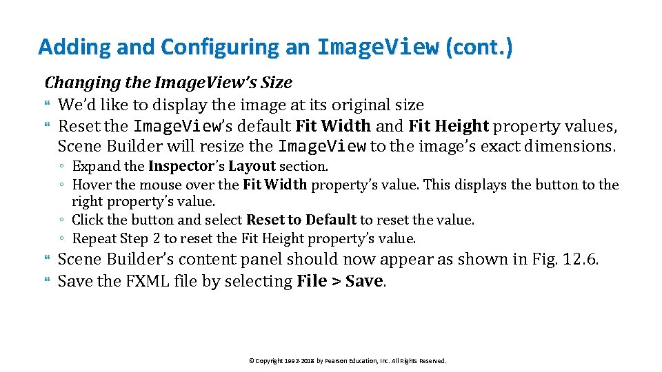
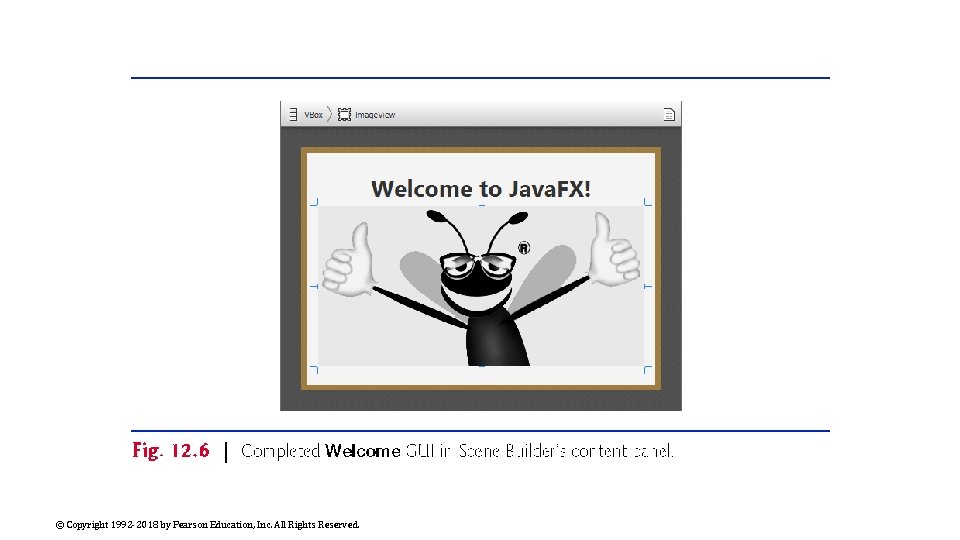
Adding and Configuring an Image. View (cont. ) Changing the Image. View’s Size We’d like to display the image at its original size Reset the Image. View’s default Fit Width and Fit Height property values, Scene Builder will resize the Image. View to the image’s exact dimensions. ◦ Expand the Inspector’s Layout section. ◦ Hover the mouse over the Fit Width property’s value. This displays the button to the right property’s value. ◦ Click the button and select Reset to Default to reset the value. ◦ Repeat Step 2 to reset the Fit Height property’s value. Scene Builder’s content panel should now appear as shown in Fig. 12. 6. Save the FXML file by selecting File > Save. © Copyright 1992 -2018 by Pearson Education, Inc. All Rights Reserved.

© Copyright 1992 -2018 by Pearson Education, Inc. All Rights Reserved.

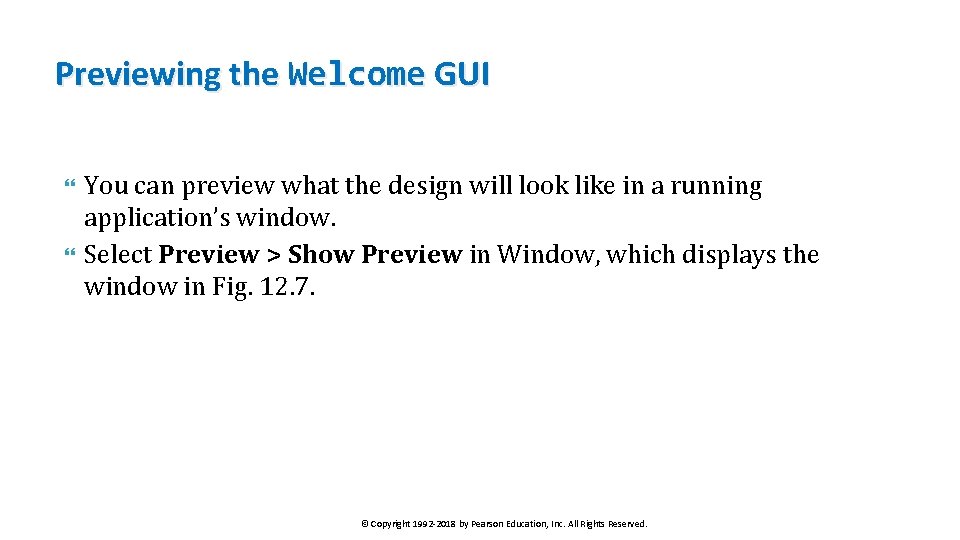
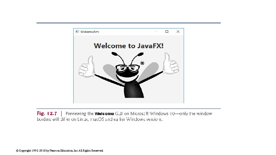
Previewing the Welcome GUI You can preview what the design will look like in a running application’s window. Select Preview > Show Preview in Window, which displays the window in Fig. 12. 7. © Copyright 1992 -2018 by Pearson Education, Inc. All Rights Reserved.

© Copyright 1992 -2018 by Pearson Education, Inc. All Rights Reserved.

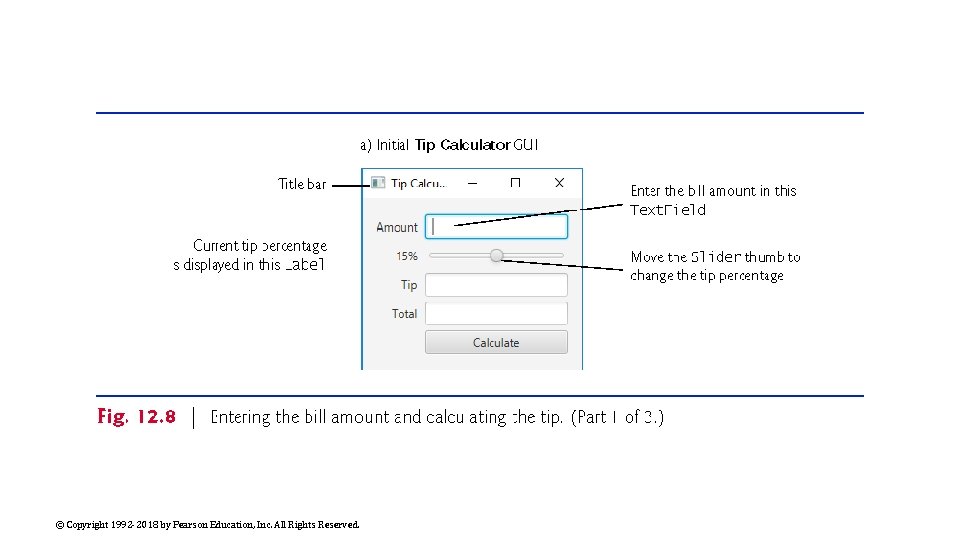
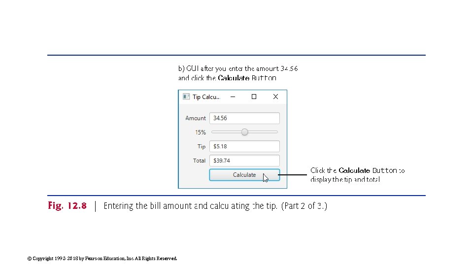
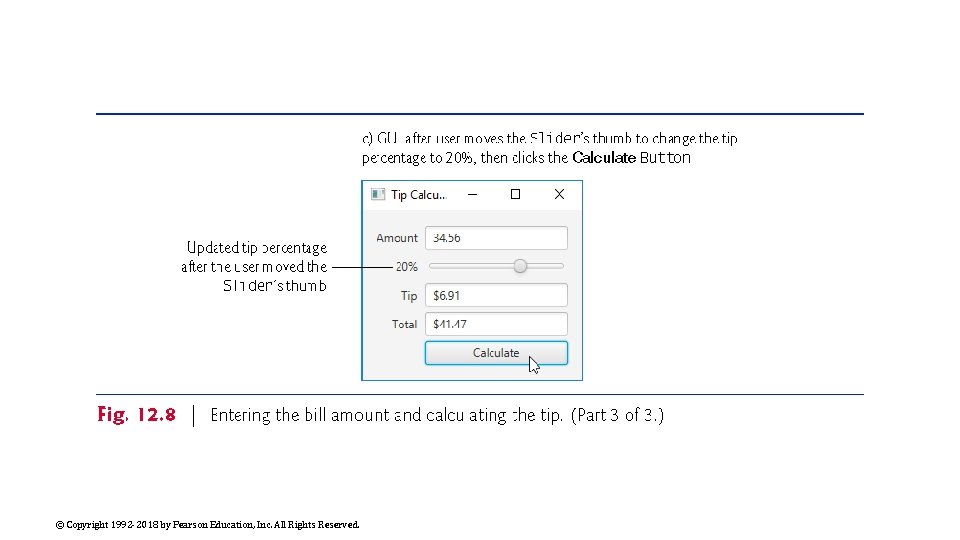
Tip Calculator App—Introduction to Event Handling The Tip Calculator app (Fig. 12. 8(a)) calculates and displays a restaurant bill tip and total. By default, the app calculates the total with a 15% tip. You can specify a tip percentage from 0% to 30% by moving the Slider thumb—this updates the tip percentage (Fig. 12. 8(b) and (c)). In this section, you’ll build a Tip Calculator app using several Java. FX components and learn how to respond to user interactions with the GUI. © Copyright 1992 -2018 by Pearson Education, Inc. All Rights Reserved.

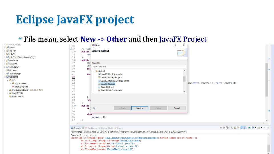
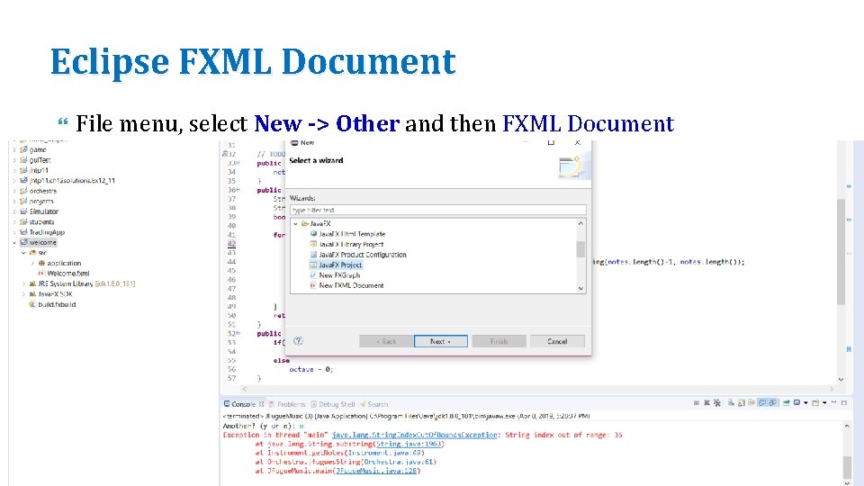
Eclipse Java. FX project File menu, select New -> Other and then Java. FX Project © Copyright 1992 -2018 by Pearson Education, Inc. All Rights Reserved.

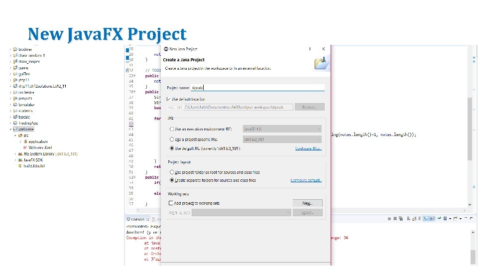
New Java. FX Project © Copyright 1992 -2018 by Pearson Education, Inc. All Rights Reserved.

Eclipse FXML Document File menu, select New -> Other and then FXML Document © Copyright 1992 -2018 by Pearson Education, Inc. All Rights Reserved.

Scene. Builder Right click the Tip. Calculator. fxml file and Open with Scene. Builder. © Copyright 1992 -2018 by Pearson Education, Inc. All Rights Reserved.

© Copyright 1992 -2018 by Pearson Education, Inc. All Rights Reserved.

© Copyright 1992 -2018 by Pearson Education, Inc. All Rights Reserved.

© Copyright 1992 -2018 by Pearson Education, Inc. All Rights Reserved.

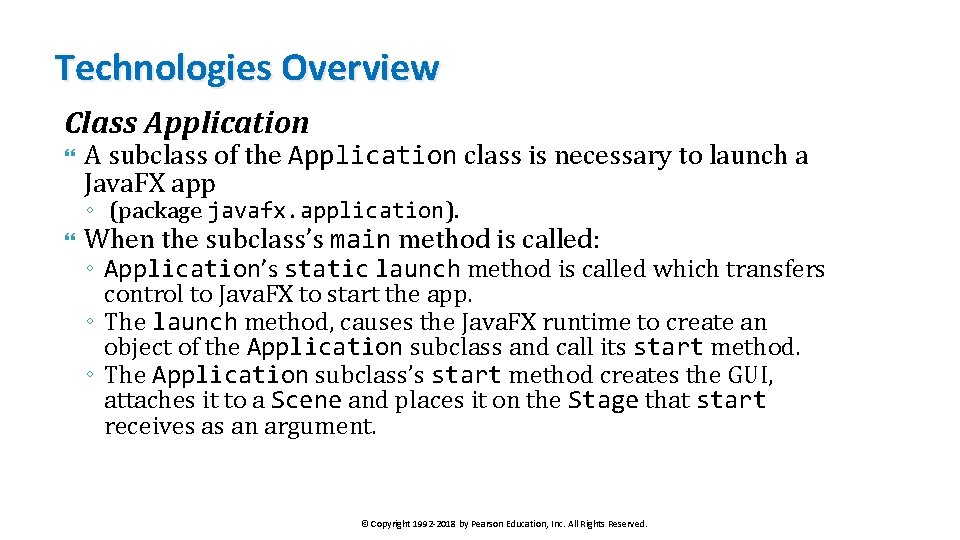
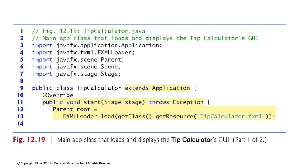
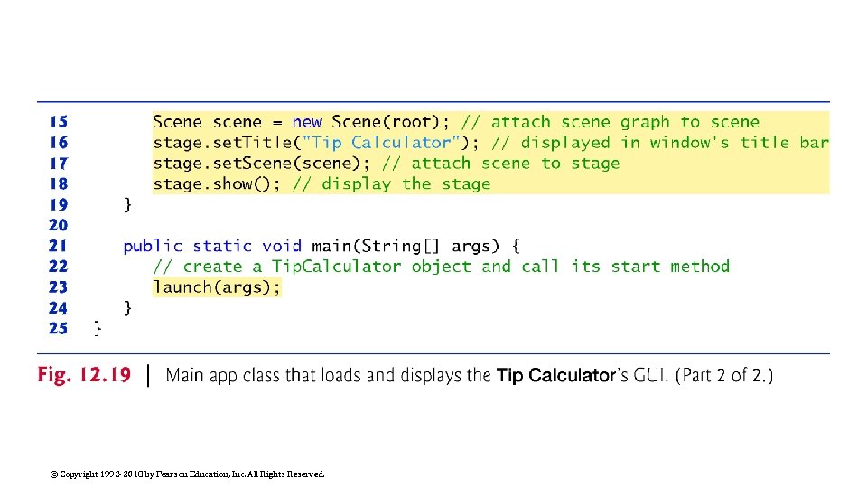
Technologies Overview Class Application A subclass of the Application class is necessary to launch a Java. FX app ◦ (package javafx. application). When the subclass’s main method is called: ◦ Application’s static launch method is called which transfers control to Java. FX to start the app. ◦ The launch method, causes the Java. FX runtime to create an object of the Application subclass and call its start method. ◦ The Application subclass’s start method creates the GUI, attaches it to a Scene and places it on the Stage that start receives as an argument. © Copyright 1992 -2018 by Pearson Education, Inc. All Rights Reserved.

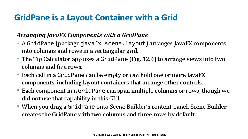
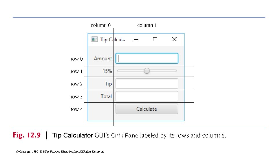
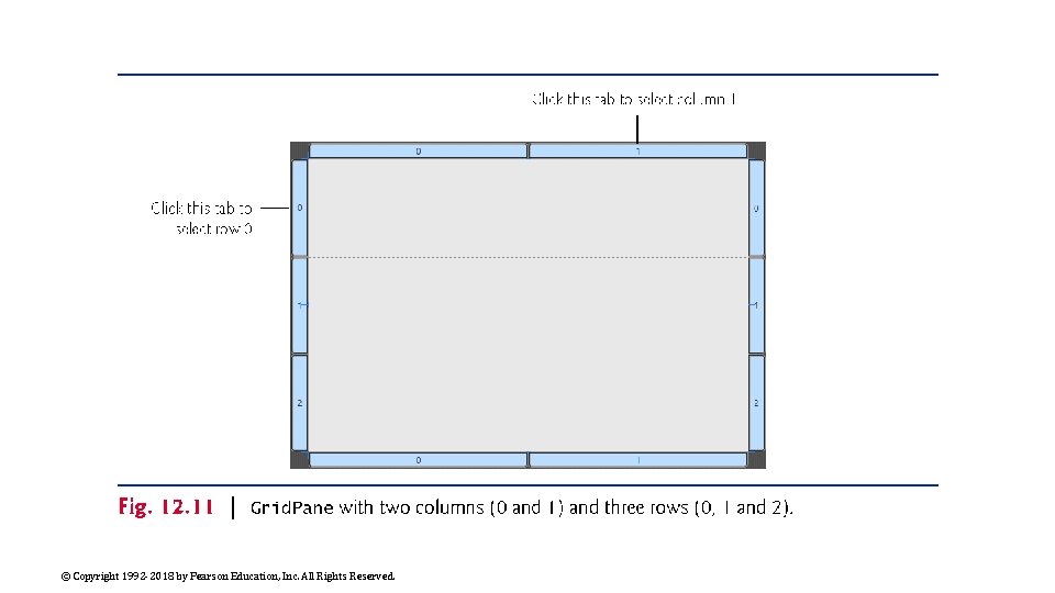
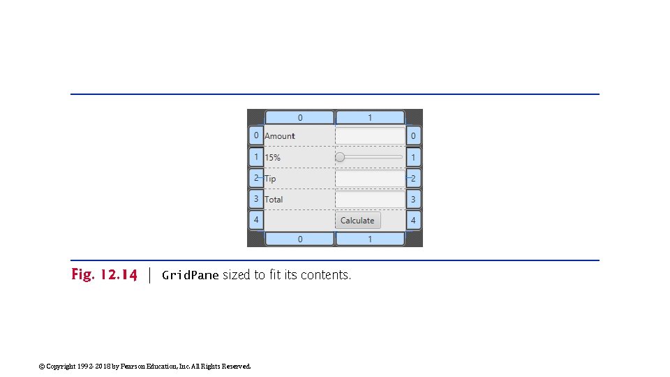
Grid. Pane is a Layout Container with a Grid Arranging Java. FX Components with a Grid. Pane A Grid. Pane (package javafx. scene. layout) arranges Java. FX components into columns and rows in a rectangular grid. The Tip Calculator app uses a Grid. Pane (Fig. 12. 9) to arrange views into two columns and five rows. Each cell in a Grid. Pane can be empty or can hold one or more Java. FX components, including layout containers that arrange other controls. Each component in a Grid. Pane can span multiple columns or rows, though we did not use that capability in this GUI. When you drag a Grid. Pane onto Scene Builder’s content panel, Scene Builder creates the Grid. Pane with two columns and three rows by default. © Copyright 1992 -2018 by Pearson Education, Inc. All Rights Reserved.

© Copyright 1992 -2018 by Pearson Education, Inc. All Rights Reserved.

A GUI is Made up of Controls A Text. Field (package javafx. scene. control) can accept text input or display text. A Slider (package javafx. scene. control) represents a value in the range 0. 0– 100. 0 by default and allows the user to select a number in that range by moving the Slider’s thumb. A Button (package javafx. scene. control) allows the user to initiate an action. Class Number. Format (package java. text) can format locale-specific currency and percentage strings. © Copyright 1992 -2018 by Pearson Education, Inc. All Rights Reserved.

GUIs are Event Driven GUIs are event driven. ◦ When the user interacts with a GUI component, the interaction—known as an event—drives the program to perform a task. The code that performs a task in response to an event is called an event handler. For certain events you can link a control to its event-handling method by using the Code section of Scene Builder’s Inspector window. You'll create the event handler entirely in code. © Copyright 1992 -2018 by Pearson Education, Inc. All Rights Reserved.

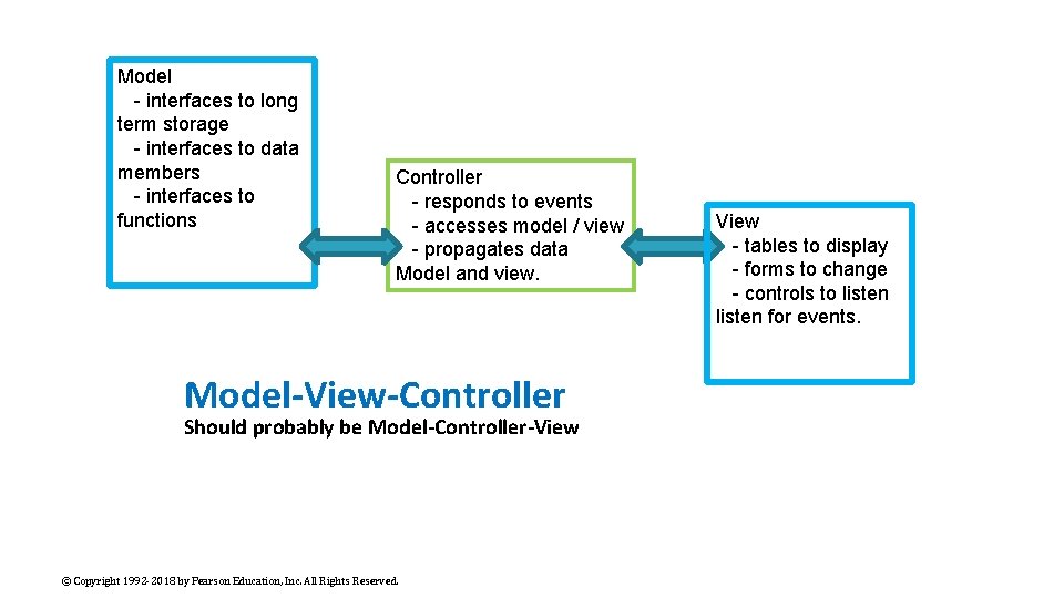
Event Handler for a Slider You implement the Change. Listener interface (package javafx. beans. value) to respond when the user moves the Slider’s thumb. Java. FX applications in which the GUI is implemented as FXML adhere to the Model-View-Controller (MVC) design pattern, which separates an app’s data (contained in the model) from the app’s GUI (the view) and the app’s processing logic (the controller). © Copyright 1992 -2018 by Pearson Education, Inc. All Rights Reserved.

MVC means Model-View-Controller The model is the domain logic of the application. The controller implements logic for processing user inputs. The view presents the data stored in the model. User input via the controllers modifies the model with the given input. Updates to the view from the model come via the controller as well. In a simple app, the model and controller are often combined into a single class. In a Java. FX FXML app, you define the app’s event handlers in a controller class. © Copyright 1992 -2018 by Pearson Education, Inc. All Rights Reserved.

Model - interfaces to long term storage - interfaces to data members - interfaces to functions Controller - responds to events - accesses model / view - propagates data Model and view. Model-View-Controller Should probably be Model-Controller-View © Copyright 1992 -2018 by Pearson Education, Inc. All Rights Reserved. View - tables to display - forms to change - controls to listen for events.

FXMLLoader and the FXML file The controller class defines instance variables for interacting with controls programmatically, as well as event-handling methods. Class FXMLLoader’s static method load uses the FXML file that represents the app’s GUI to creates the GUI’s scene graph and returns a Parent (package javafx. scene) reference to the scene graph’s root node. It also initializes the controller’s instance variables, and creates and registers the event handlers for any events specified in the FXML. © Copyright 1992 -2018 by Pearson Education, Inc. All Rights Reserved.

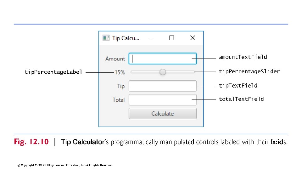
Building the App’s GUI The fx: id property must be provided to access the controller in the program. Each object’s name is specified via its fx: id property. You can set this property’s value by selecting a component in your scene, then expanding the Inspector window’s Code section—the fx: id property appears at the top. Figure 12. 10 shows the fx: id properties of the Tip Calculator’s programmatically manipulated controls. For clarity, our naming convention is to use the control’s class name in the fx: id property. © Copyright 1992 -2018 by Pearson Education, Inc. All Rights Reserved.

© Copyright 1992 -2018 by Pearson Education, Inc. All Rights Reserved.

Building the App’s GUI (Cont. ) Open Scene Builder to create a new FXML file. Then, select File > Save to display the Save As dialog, specify the location in which to store the file, name the file Tip. Calculator. fxml and click the Save button. Drag a Grid. Pane from the Library window’s Containers section onto Scene Builder’s content panel. By default, the Grid. Pane contains two columns and three rows as shown in Fig. 12. 11 By default, the Grid. Pane contains two columns and three rows. You can add a row above or below an existing row by right clicking a row and selecting Grid Pane > Add Row Above or Grid Pane > Add Row Below. You can delete a row or column by right clicking the tab containing its row or column number and selecting Delete. © Copyright 1992 -2018 by Pearson Education, Inc. All Rights Reserved.

© Copyright 1992 -2018 by Pearson Education, Inc. All Rights Reserved.

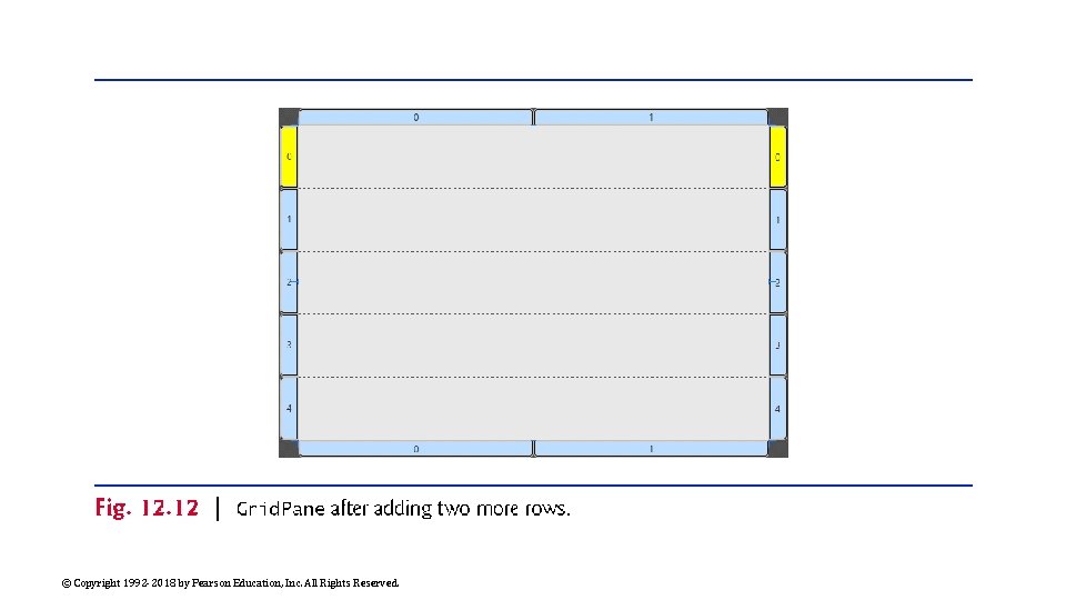
Building the App’s GUI (Cont. ) By default, the Grid. Pane contains two columns and three rows. You can add a row above or below an existing row by right clicking a row and selecting Grid Pane > Add Row Above or Grid Pane > Add Row Below. You can delete a row or column by right clicking the tab containing its row or column number and selecting Delete. After adding two rows, the Grid. Pane should appear as shown in Fig. 12. © Copyright 1992 -2018 by Pearson Education, Inc. All Rights Reserved.

© Copyright 1992 -2018 by Pearson Education, Inc. All Rights Reserved.

Building the App’s GUI (Cont. ) You’ll now add the controls to the Grid. Pane. For those that have fx: ids, while the control is selected, set its fx: id property in the Inspector window’s Code section. Perform the following steps: ◦ Drag Labels from the Library window’s Controls section into the first four rows of the Grid. Pane’s column 0. ◦ As you add each Label, set its text as shown Fig. 12. 10. © Copyright 1992 -2018 by Pearson Education, Inc. All Rights Reserved.

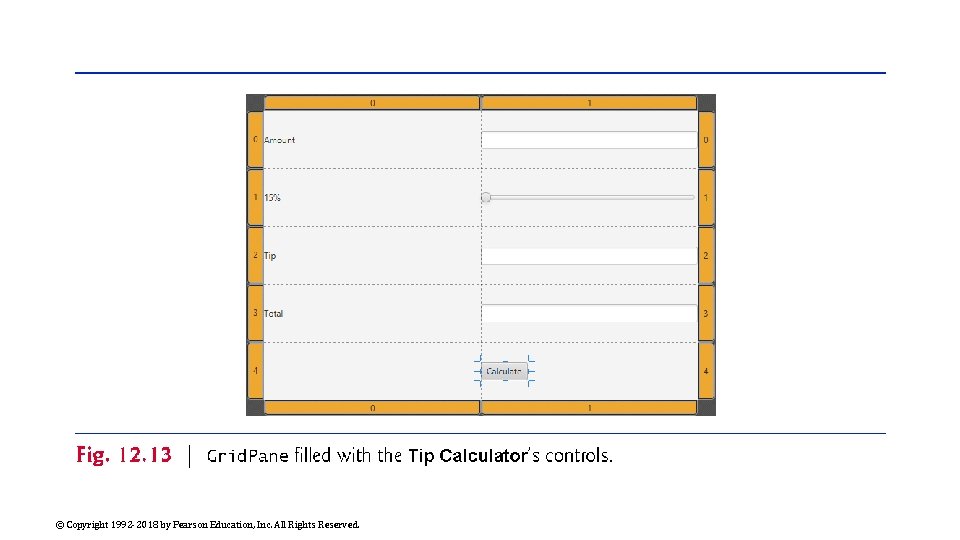
Building the App’s GUI (Cont. ) Drag Text. Fields from the Library window’s Controls section into rows 0, 2 and 3 of the Grid. Pane’s column 1 Drag a horizontal Slider from the Library window’s Controls section into row 1 of the Grid. Pane’s column 1 Adding a Button. Drag a Button from the Library window’s Controls section into row 4 of the Grid. Pane’s right column. You can set the Button’s text by double clicking it, or by selecting the Button, then setting its Text property in the Inspector window’s Properties section. The Grid. Pane should appear as shown in Fig. 12. 13. © Copyright 1992 -2018 by Pearson Education, Inc. All Rights Reserved.

© Copyright 1992 -2018 by Pearson Education, Inc. All Rights Reserved.

Sizing the Grid. Pane to Fit Its Contents When you begin designing a GUI by adding a layout, Scene Builder sets the layout object’s Pref Width property to 600 and Pref Height property to 400 We’d like the layout’s size to be computed, based on the layout’s contents. ◦ Select the Grid. Pane by clicking inside the Grid. Pane, but not on any of the controls you’ve placed into its columns and rows. Sometimes, easier to select the Grid. Pane in the Document window’s Hierarchy section. ◦ In the Inspector’s Layout section, reset the Pref Width and Pref Height property values to their defaults (as you did in Section 12. 4. 4). Sets both properties’ values to USE_COMPUTED_SIZE, so the layout calculates its own size. The layout now appears as shown in Fig. 12. 14. © Copyright 1992 -2018 by Pearson Education, Inc. All Rights Reserved.

© Copyright 1992 -2018 by Pearson Education, Inc. All Rights Reserved.

Align the Grid. Pane A Grid. Pane column’s contents are left-aligned by default. To right-align the contents of column 0, select it by clicking the tab at the top or bottom of the column, then in the Inspector’s Layout section, set the Halignment (horizontal alignment) property to RIGHT. © Copyright 1992 -2018 by Pearson Education, Inc. All Rights Reserved.

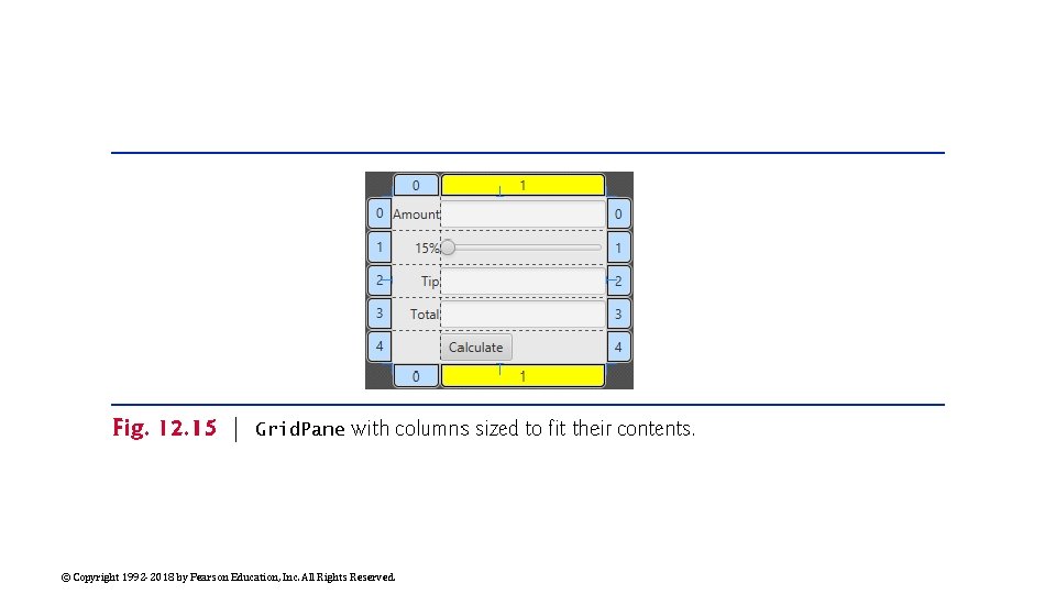
Configure the Grid. Pane By default, Scene Builder sets each Grid. Pane column’s width to 100 pixels and each row’s height to 30 pixels to ensure that you can easily drag controls into the Grid. Pane’s cells. In this app, we sized each column to fit its contents. ◦ Select the column 0 by clicking the tab at the top or bottom of the column, then in the Inspector’s Layout section, reset the Pref Width property to its default size (that is, USE_COMPUTED_SIZE) to indicate that the column’s width should be based on its widest child—the Amount Label in this case. ◦ Repeat this process for column 1. The Grid. Pane should appear as shown in Fig 12. 15. © Copyright 1992 -2018 by Pearson Education, Inc. All Rights Reserved.

© Copyright 1992 -2018 by Pearson Education, Inc. All Rights Reserved.

Configure the Button By default, Scene Builder sets a Button’s width based on its text. For this app, we chose to make the Button the same width as the other controls in the Grid. Pane’s right column. To do so, select the Button, then in the Inspector’s Layout section, set the Max Width property to MAX_VALUE. ◦ The Button’s width grows to fill the column’s width. © Copyright 1992 -2018 by Pearson Education, Inc. All Rights Reserved.

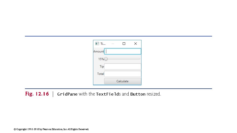
See a Preview the GUI by selecting Preview > Show Preview in Window. As you can see in Fig. 12. 16, ◦ There’s no space between the Labels in the left column and the controls in the right column. ◦ There’s no space around the Grid. Pane, because by default the Stage is sized to fit the Scene’s contents. Thus, many of the controls touch the window’s borders. You’ll fix these issues in the next step. © Copyright 1992 -2018 by Pearson Education, Inc. All Rights Reserved.

© Copyright 1992 -2018 by Pearson Education, Inc. All Rights Reserved.

Padding fills the Edges The space between a node’s contents and its top, right, bottom and left edges is known as the padding, which separates the contents from the node’s edges. Since the Grid. Pane’s size determines the Stage’s window size, the Grid. Pane’s padding separates its children from the window’s edges. © Copyright 1992 -2018 by Pearson Education, Inc. All Rights Reserved.

The Gap between Controls To set the padding, select the Grid. Pane, then in the Inspector’s Layout section, set the Padding property’s four values (which represent the TOP, RIGHT, BOTTOM and LEFT) to 14 ◦ The recommended distance between a control’s edge and the Scene’s edge. You can specify the default amount of space between a Grid. Pane’s columns and rows with its Hgap (horizontal gap) and Vgap (vertical gap) properties, respectively. ◦ Because Scene Builder sets each Grid. Pane row’s height to 30 pixels—which is greater than the heights of this app’s controls—there’s already some vertical space between the components. © Copyright 1992 -2018 by Pearson Education, Inc. All Rights Reserved.

The Gap between Controls To specify the horizontal gap between the columns, select the Grid. Pane in the Document window’s Hierarchy section In the Inspector’s Layout section, set the Hgap property to 8 ◦ Recommended distance between controls. If you’d like to precisely control the vertical space between components, you can reset each row’s Pref Height to its default value, then set the Grid. Pane’s Vgap property. © Copyright 1992 -2018 by Pearson Education, Inc. All Rights Reserved.

Keyboard Focus You can type in a Text. Field only if it’s “in focus”—that is, it’s the control that the user is interacting with. When you click an interactive control, it receives the focus. When you press the Tab key, the focus transfers from the current focusable control to the next in the order the controls were added to the GUI. In this app, the tip. Text. Field and total. Text. Field are neither editable nor focusable. Select both Text. Fields, then in the Inspector’s Properties section uncheck the Editable and Focus Traversable properties. To select multiple controls at once, you can click the first (in the Document window’s Hierarchy section or in the content panel), then hold the Shift key and click each of the others. © Copyright 1992 -2018 by Pearson Education, Inc. All Rights Reserved.

Configure the Slider By default, a Slider’s range is 0. 0 to 100. 0 and its initial value is 0. 0. This app allows only integer tip percentages in the range 0 to 30 with a default of 15. Select the Slider, then in the Inspector’s Properties section, set the Max property to 30 and the Value property to 15. Set the Block Increment property to 5 ◦ The amount by which the Value property increases or decreases when the user clicks between an end of the Slider and the Slider’s thumb. Save the FXML file by selecting File > Save. We’ll restrict the Slider’s values to integers when we respond to its events in Java code © Copyright 1992 -2018 by Pearson Education, Inc. All Rights Reserved.

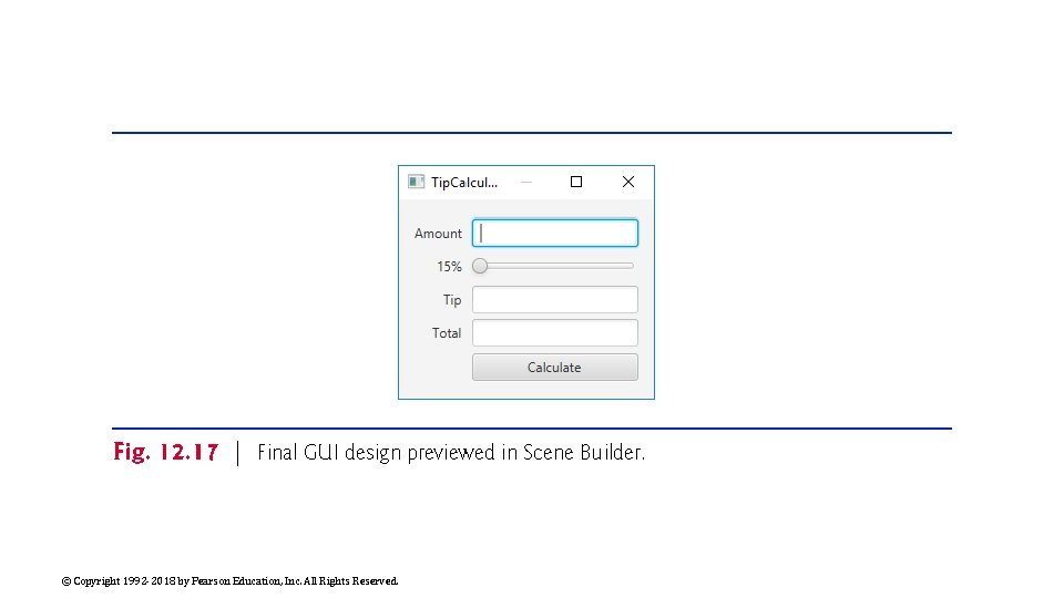
Preview the Tip. Calculator Select Preview > Show Preview in Window to view the final GUI (Fig. 12. 16). When we discuss the Tip. Calculator. Controller class in Section 12. 5. 5, we’ll show to specify the Calculate Button’s event handler in the FXML file. © Copyright 1992 -2018 by Pearson Education, Inc. All Rights Reserved.

© Copyright 1992 -2018 by Pearson Education, Inc. All Rights Reserved.

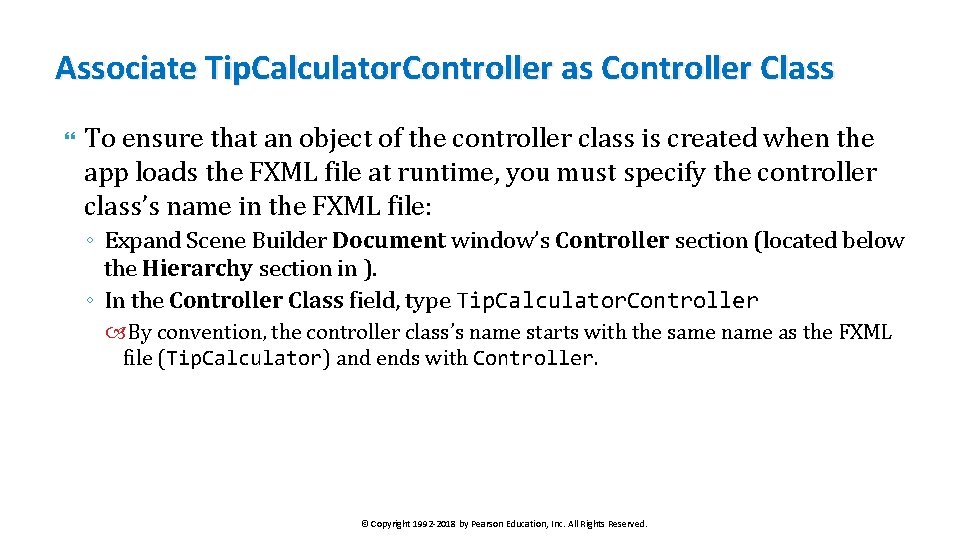
Associate Tip. Calculator. Controller as Controller Class To ensure that an object of the controller class is created when the app loads the FXML file at runtime, you must specify the controller class’s name in the FXML file: ◦ Expand Scene Builder Document window’s Controller section (located below the Hierarchy section in ). ◦ In the Controller Class field, type Tip. Calculator. Controller By convention, the controller class’s name starts with the same name as the FXML file (Tip. Calculator) and ends with Controller. © Copyright 1992 -2018 by Pearson Education, Inc. All Rights Reserved.

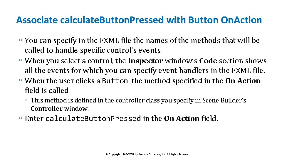
Associate calculate. Button. Pressed with Button On. Action You can specify in the FXML file the names of the methods that will be called to handle specific control’s events When you select a control, the Inspector window’s Code section shows all the events for which you can specify event handlers in the FXML file. When the user clicks a Button, the method specified in the On Action field is called ◦ This method is defined in the controller class you specify in Scene Builder’s Controller window. Enter calculate. Button. Pressed in the On Action field. © Copyright 1992 -2018 by Pearson Education, Inc. All Rights Reserved.

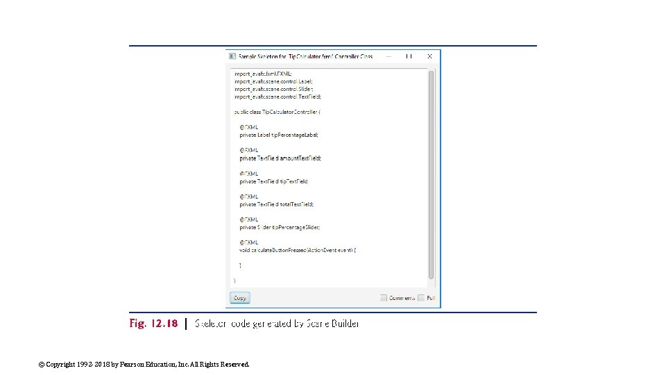
Scene. Builder can Generate Controller class You can have Scene Builder generate the initial controller class containing the variables you’ll use to interact with controls programmatically and the empty Calculate Button event handler. ◦ Scene Builder calls this the “controller skeleton. ” Select View > Show Sample Controller Skeleton to generate the skeleton in Fig. 12. 18. The sample class has the class name you specified, a variable for each control that has an fx: id an empty Calculate Button event handler. You can click the Copy button, then paste the contents into a file named Tip. Calculator. Controller. java in the same folder as the Tip. Calculator. fxml file you created in this section. © Copyright 1992 -2018 by Pearson Education, Inc. All Rights Reserved.

© Copyright 1992 -2018 by Pearson Education, Inc. All Rights Reserved.

Tip. Calculator Class A simple Java. FX FXML-based app has two Java source-code files Tip. Calculator. java—This file contains the Tip. Calculator class, which declares the main method that loads the FXML file to create the GUI and attaches the GUI to a Scene displayed on the app’s Stage. Tip. Calculator. Controller. java—This file contains the Tip. Calculator. Controller class, where you’ll specify the Slider and Button controls’ event handlers. © Copyright 1992 -2018 by Pearson Education, Inc. All Rights Reserved.

Tip. Calculator Class Fig. 12. 19 presents class Tip. Calculator. The starting point for a Java. FX app is an Application subclass, so class Tip. Calculator extends Application (line 9). main calls class Application’s static launch method (line 23) to initialize the Java. FX runtime and to begin executing the app. This causes the Java. FX runtime to create an object of the Tip. Calculator class and calls its start method (lines 10– 19), passing the Stage object representing the window in which the app will be displayed. The Java. FX runtime creates the window. © Copyright 1992 -2018 by Pearson Education, Inc. All Rights Reserved.

© Copyright 1992 -2018 by Pearson Education, Inc. All Rights Reserved.

© Copyright 1992 -2018 by Pearson Education, Inc. All Rights Reserved.

Tip. Calculator. Controller Class Figures 12. 20– 12. 23 present the class Tip. Calculator. Controller © Copyright 1992 -2018 by Pearson Education, Inc. All Rights Reserved.

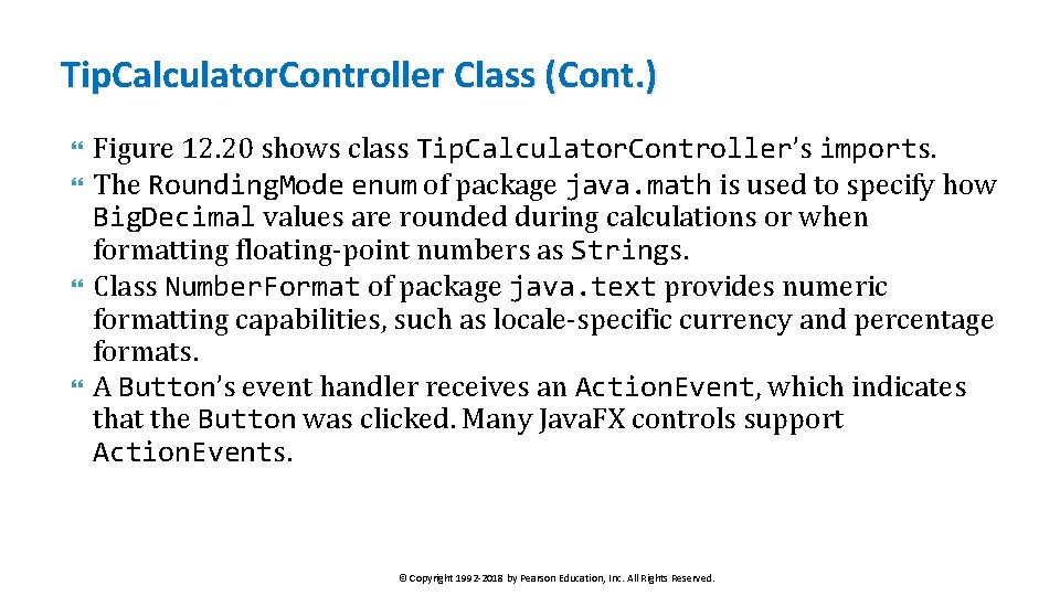
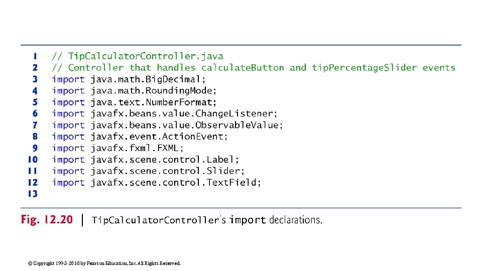
Tip. Calculator. Controller Class (Cont. ) Figure 12. 20 shows class Tip. Calculator. Controller’s imports. The Rounding. Mode enum of package java. math is used to specify how Big. Decimal values are rounded during calculations or when formatting floating-point numbers as Strings. Class Number. Format of package java. text provides numeric formatting capabilities, such as locale-specific currency and percentage formats. A Button’s event handler receives an Action. Event, which indicates that the Button was clicked. Many Java. FX controls support Action. Events. © Copyright 1992 -2018 by Pearson Education, Inc. All Rights Reserved.

Tip. Calculator. Controller Class (Cont. ) Change. Listener and Observable. Value are used to respond to Slider events. The annotation FXML (package javafx. fxml) is used in a Java. FX controller class’s code to mark instance variables that should refer to Java. FX components in the GUI’s FXML file and methods that can respond to the events of Java. FX components in the GUI’s FXML file. Package javafx. scene. control contains many Java. FX control classes. © Copyright 1992 -2018 by Pearson Education, Inc. All Rights Reserved.

© Copyright 1992 -2018 by Pearson Education, Inc. All Rights Reserved.

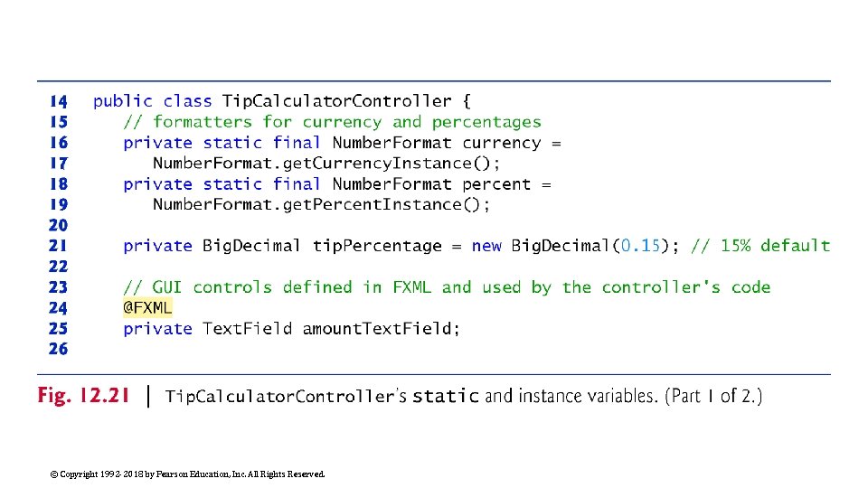
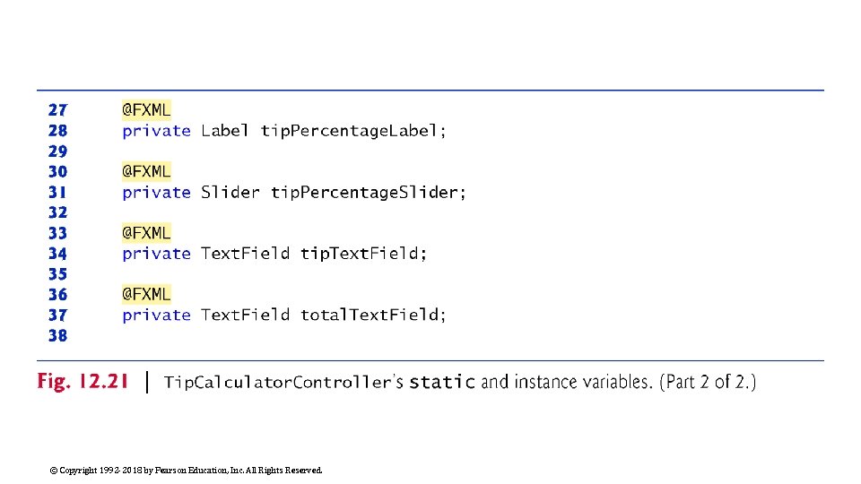
Tip. Calculator. Controller Class (Cont. ) Fig. 12. 21 presents class Tip. Calculator. Controller’s static and instance variables. The @FXML annotation preceding an instance variable indicates that the variable’s name can be used in the FXML file that describes the app’s GUI. The variable names that you specify in the controller class must precisely match the fx: id values you specified when building the GUI. When the FXMLLoader loads an FXML file to create a GUI, it also initializes each of the controller’s instance variables that are declared with @FXML to ensure that they refer to the corresponding GUI components in the FXML file. © Copyright 1992 -2018 by Pearson Education, Inc. All Rights Reserved.

© Copyright 1992 -2018 by Pearson Education, Inc. All Rights Reserved.

© Copyright 1992 -2018 by Pearson Education, Inc. All Rights Reserved.

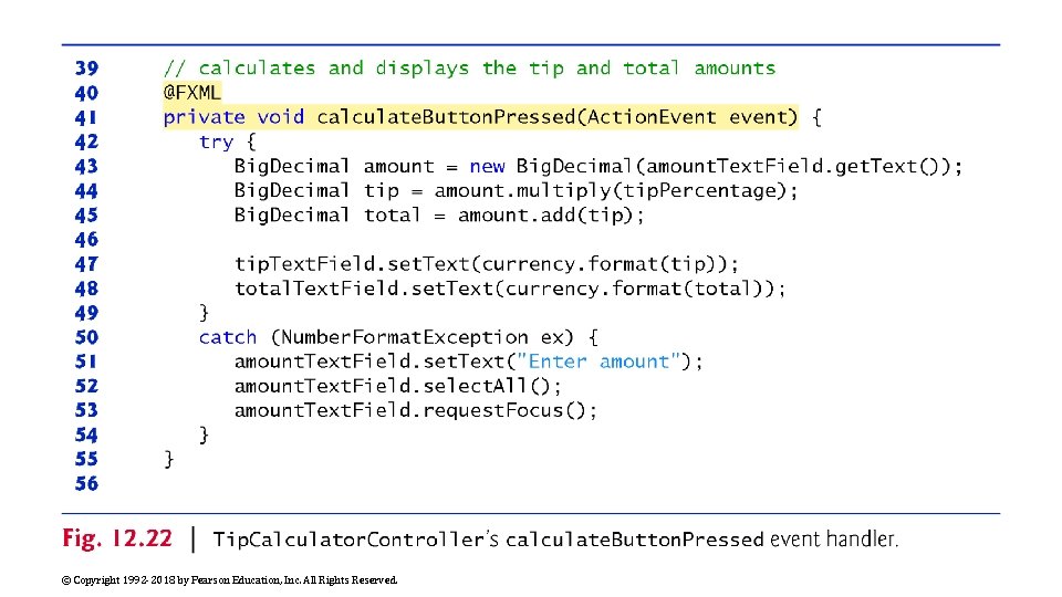
Tip. Calculator. Controller Class (Cont. ) Figure 12. 22 presents class Tip. Calculator. Controller’s calculate. Button. Pressed method, which is called with the user clicks the Calculate Button. The @FXML annotation preceding a method indicates that the method can be used to specify a control’s event handler in the FXML file that describes the app’s GUI. © Copyright 1992 -2018 by Pearson Education, Inc. All Rights Reserved.

© Copyright 1992 -2018 by Pearson Education, Inc. All Rights Reserved.

Tip. Calculator. Controller Class (Cont. ) When the FXMLLoader loads Tip. Calculator. fxml to create the GUI, it creates and registers an event handler for the Calculate Button’s Action. Event. The event handler for this event must implement interface Event. Handler<Action. Event This interface contains a handle method that returns void and receives an Action. Event parameter. This method’s body, in turn, calls method calculate. Button. Pressed when the user clicks the Calculate Button. FXMLLoader performs similar tasks for every event listener you specify via the Scene Builder Inspector window’s Code section. © Copyright 1992 -2018 by Pearson Education, Inc. All Rights Reserved.

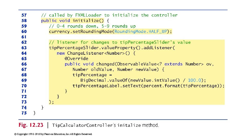
Tip. Calculator. Controller Class (Cont. ) Figure 12. 23 presents class Tip. Calculator. Controller’s initialize method. When the FXMLLoader creates an object of a controller class, it determines whether the class contains an initialize method with no parameters and, if so, calls that method to initialize the controller. This method can be used to configure the controller before the GUI is displayed. © Copyright 1992 -2018 by Pearson Education, Inc. All Rights Reserved.

© Copyright 1992 -2018 by Pearson Education, Inc. All Rights Reserved.

Tip. Calculator. Controller Class (Cont. ) Each Java. FX control has properties and some generate events when they change. For such events, you must manually register as the event handler an object that implements the Change. Listener interface (package javafx. beans. value). ◦ Change. Listener is a generic type that’s specialized with the property’s type. The call to value. Property (line 63) returns a Double. Property (package javax. beans. property) that represents the Slider’s value. ◦ A Double. Property is an Observable. Value<Number> that can notify listeners when a value changes. Each class that implements interface Observable. Value provides method add. Listener (called on line 63) to register an event-handler that implements interface Change. Listener. ◦ For a Slider’s value, add. Listener’s argument is an object that implements Change. Listener<Number>, because the Slider’s value is a numeric value. © Copyright 1992 -2018 by Pearson Education, Inc. All Rights Reserved.

Tip. Calculator. Controller Class (Cont. ) An anonymous inner class can access its top-level class’s instance variables, static variables and methods However, an anonymous inner class has limited access to the local variables of the method in which it’s declared—it can access only the final or effectively final (Java SE 8) local variables declared in the enclosing method’s body. © Copyright 1992 -2018 by Pearson Education, Inc. All Rights Reserved.

© Copyright 1992 -2018 by Pearson Education, Inc. All Rights Reserved.

© Copyright 1992 -2018 by Pearson Education, Inc. All Rights Reserved.