Chapter 1 Warm Up Warm Up The measurements


- Slides: 19

Chapter 1 Warm Up

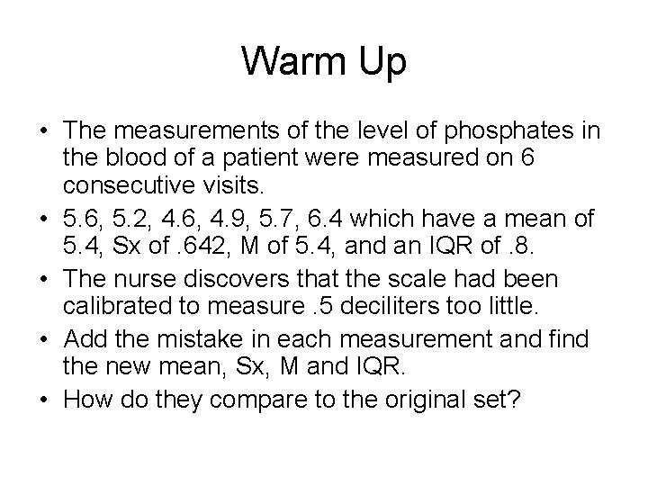
Warm Up • The measurements of the level of phosphates in the blood of a patient were measured on 6 consecutive visits. • 5. 6, 5. 2, 4. 6, 4. 9, 5. 7, 6. 4 which have a mean of 5. 4, Sx of. 642, M of 5. 4, and an IQR of. 8. • The nurse discovers that the scale had been calibrated to measure. 5 deciliters too little. • Add the mistake in each measurement and find the new mean, Sx, M and IQR. • How do they compare to the original set?

Oops…… • The nurse discovers that the physician actually needs liters instead of deciliters. • Multiply the mistake in each measurement and find the new mean, Sx, M and IQR. • How do they compare to the original set?

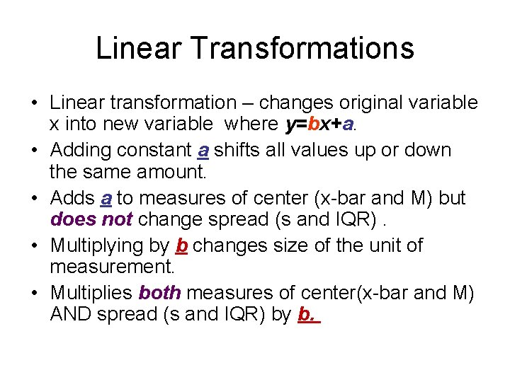
Linear Transformations • Linear transformation – changes original variable x into new variable where y=bx+a. • Adding constant a shifts all values up or down the same amount. • Adds a to measures of center (x-bar and M) but does not change spread (s and IQR). • Multiplying by b changes size of the unit of measurement. • Multiplies both measures of center(x-bar and M) AND spread (s and IQR) by b.

Chapter 1 In Conclusion

Things of Note: 1. Why do we square the deviations? The reason we square the numbers is because otherwise it would all add up to zero, thus not yielding any info at all! Also, the process of squaring yields the smallest possible difference from the mean. 2. Why do we use s more often than s 2? The standard deviation is a more natural measure of spread - it is the average distance from the mean. It is also in the SAME UNITS as our data - our variance is NOT. 3. Why do we divide by n-1? Remember, we’re measuring how far the data points deviate from each other. Can one point deviate from itself? No. So only “n-1” observation can deviate from one another. This concept is called “The degrees of freedom. ”

• Concept Question: Suppose we’re measuring the weight of an atom and we make several measurements to be sure. Do we want s to be large or small? • Answer: Smaller, since it is the average distance from the mean, we want to be closer to the actual measure.

Properties of the Standard Deviation • “s” measures the spread about the MEAN and should be used ONLY when the mean is chosen as the measure of center • “s” = 0 when there is no spread. This only happens when all observations have the same value. • As the observations get farther apart, “s” gets larger. • “s” is NOT a resistant measure of spread. Why? Because a few large outliers can make “s” very large.

5 # Summary and Quartiles • Percentile: # of people/things at or below the given score. • Min-smallest number • First Quartile: Q 1; 25 th percentile How to find it: Find the median. Look at the bottom half of the data. Find the median of the bottom half of the data. That’s the first quartile. • Second Quartile: M; Median, 50 th percentile • Third Quartile: Q 3: 75 th percentile How to find it: Find the median. Look at the top half of the data. Find the median of the upper half. That’s the third quartile. • If you have an odd total number of data points, DO NOT count the median as a data point when finding the quartiles. Max-largest number

Interquartile Range • Interquartile Range: IQR (interquartile range); Q 3 - Q 1; Measures spread of the middle half (50%) of the data • Meaning: If a data value falls between Q 1 and Q 3, we know that it is not unusual. • The IQR is VERY IMPORTANT because it can help identify outliers in the data. • Use the 1. 5 • IQR Criterion for Outliers • A data point is a suspected outlier if it falls more than 1. 5 • IQR above Q 3 or below Q 1. Low End Outlier: IF Data value < Q 1 - 1. 5 • IQR High End Outlier: IF Data value > Q 3 + 1. 5 • IQR

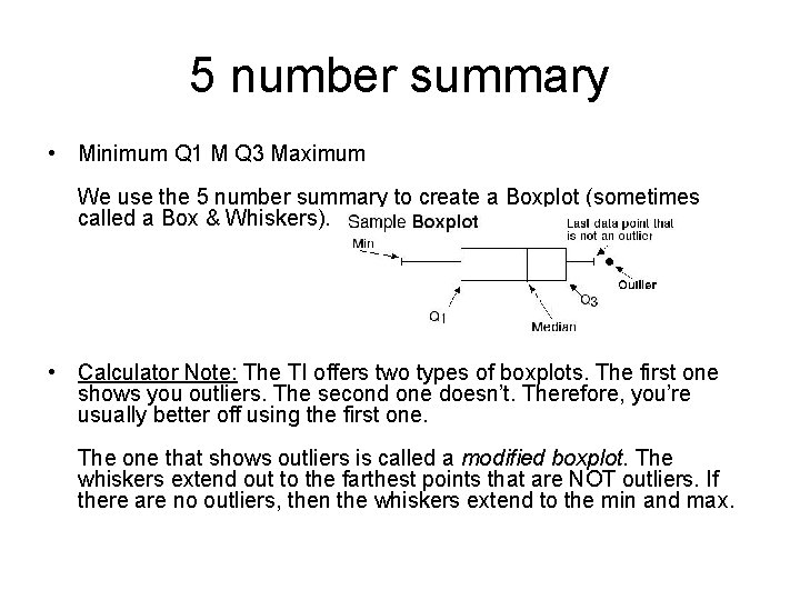
5 number summary • Minimum Q 1 M Q 3 Maximum We use the 5 number summary to create a Boxplot (sometimes called a Box & Whiskers). • Calculator Note: The TI offers two types of boxplots. The first one shows you outliers. The second one doesn’t. Therefore, you’re usually better off using the first one. The one that shows outliers is called a modified boxplot. The whiskers extend out to the farthest points that are NOT outliers. If there are no outliers, then the whiskers extend to the min and max.

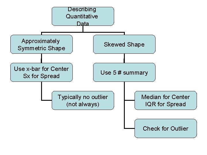
• Q: So how do you know whether to use Median and IQR OR the mean and the standard deviation when describing distributions? • A: Use the M and IQR when the data seems to be skewed; use the x-bar and Sx when you have a reasonably symmetric distribution. • MORAL: ALWAYS PLOT YOUR DATA!!!

Why do we like Box Plots • Show less detail than histograms or stem plots • Best used for side by side comparison • Can be horizontal or vertical • Median is easy to see • Give indication of symmetry or skewness – If symmetric. Q 1 and Q 3 will be equally distant from M – If skewed right, Q 3 will be farther away from M than Q 1 – If skewed left, Q 1 will be farther away from M than Q 3 • Using modified plots, outliers are easy to see

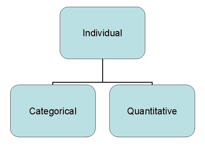
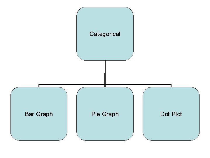
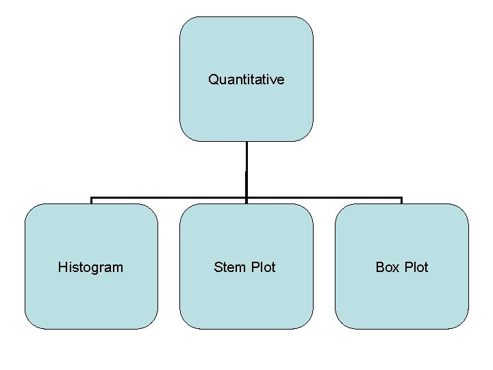
Individual Categorical Quantitative

Categorical Bar Graph Pie Graph Dot Plot

Quantitative Histogram Stem Plot Box Plot

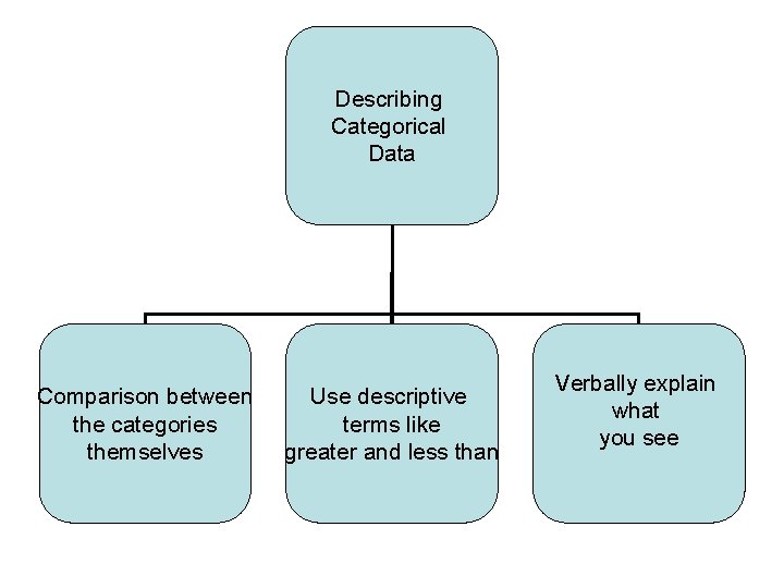
Describing Categorical Data Comparison between the categories themselves Use descriptive terms like greater and less than Verbally explain what you see

Describing Quantitative Data Approximately Symmetric Shape Skewed Shape Use x-bar for Center Sx for Spread Use 5 # summary Typically no outlier (not always) Median for Center IQR for Spread Check for Outlier

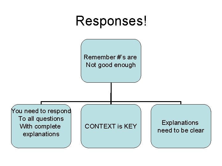
Responses! Remember #’s are Not good enough You need to respond To all questions With complete explanations CONTEXT is KEY Explanations need to be clear