Chapter 1 Looking at Data Types of variables
Chapter 1 Looking at Data

Types of variables
Looking at Data n n Be sure that each variable really does measure what you want it to. A poor choice of variables can lead to misleading conclusions!! For example, in most situations, a rate is more meaningful than a simple count. Distributions can be of the form Table n Graph n Formula n
Categorical variables n n n Count = frequency (# of times that category was observed) Percent = relative frequency = proportion How to display categorical variables: n Table n Pie chart n Uses the relative frequency to construct angles n Relative frequency defines how big the “slice” of the pie is n Bar graph n Can have both relative frequency and frequency bar graphs n Height of the bar indicates either the relative frequency or the frequency of that category
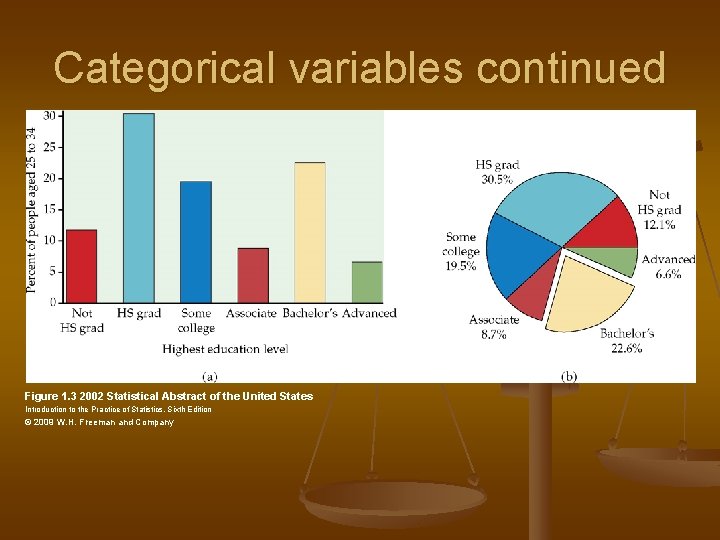
Categorical variables continued Figure 1. 3 2002 Statistical Abstract of the United States Introduction to the Practice of Statistics, Sixth Edition © 2009 W. H. Freeman and Company
Quantitative Variables n Stemplot n n n Determine stems and leaves Write down ALL stems from smallest to largest Write leaves along side corresponding stems Order leaves Histograms n n Breaks the range of a variable into intervals (called classes) Classes should be of equal length
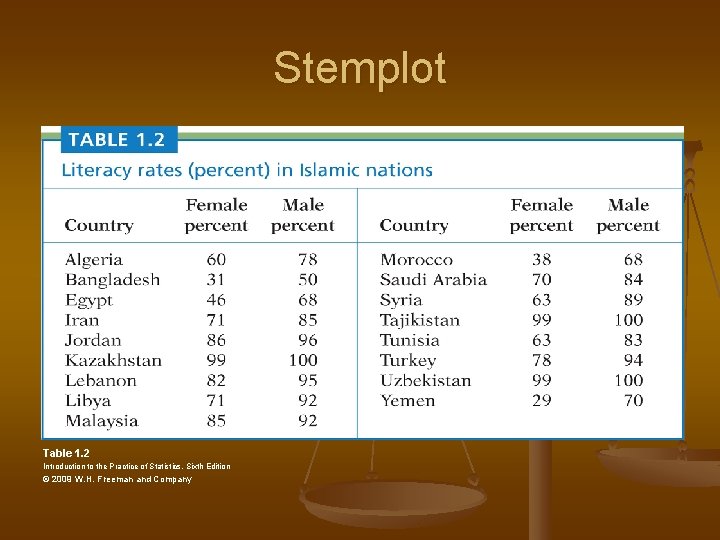
Stemplot Table 1. 2 Introduction to the Practice of Statistics, Sixth Edition © 2009 W. H. Freeman and Company

Stemplot for Female Figure 1. 5 Female Introduction to the Practice of Statistics, Sixth Edition © 2009 W. H. Freeman and Company
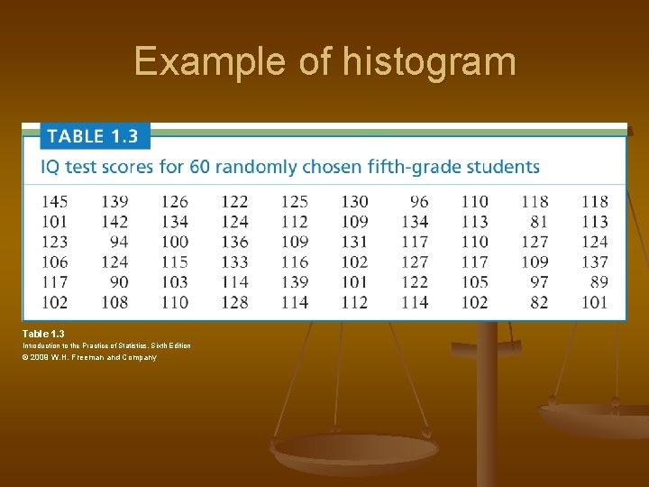
Example of histogram Table 1. 3 Introduction to the Practice of Statistics, Sixth Edition © 2009 W. H. Freeman and Company
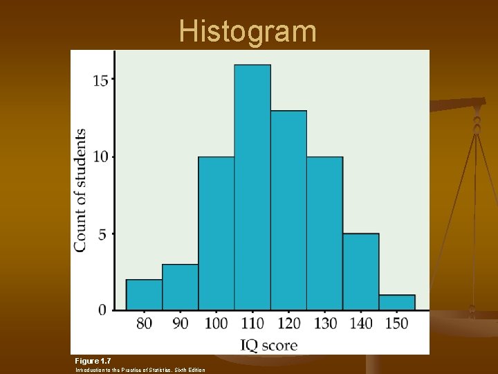
Histogram Figure 1. 7 Introduction to the Practice of Statistics, Sixth Edition
Quantitative Variables continued n Examining distributions of Quantitative Variables is best done by looking at graphs n n Overall pattern (shape, spread, center) Outliers (values outside pattern of data) Modes – the peaks in a distribution (unimodal, bimodal, no modes) Shape of distribution n Symmetric Right Skewed Left Skewed
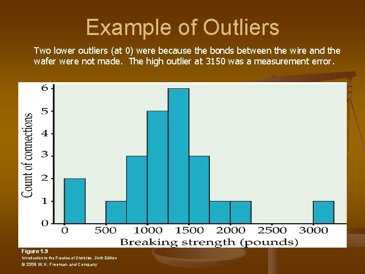
Example of Outliers Two lower outliers (at 0) were because the bonds between the wire and the wafer were not made. The high outlier at 3150 was a measurement error. Figure 1. 9 Introduction to the Practice of Statistics, Sixth Edition © 2009 W. H. Freeman and Company
Time Plot n n n Shows how variable changes over time (time is always on the horizontal axis) Seasonal variation – systematic pattern that keeps reappearing Trend - persistent long-term rise or fall

Example of Time plot Table 1. 4
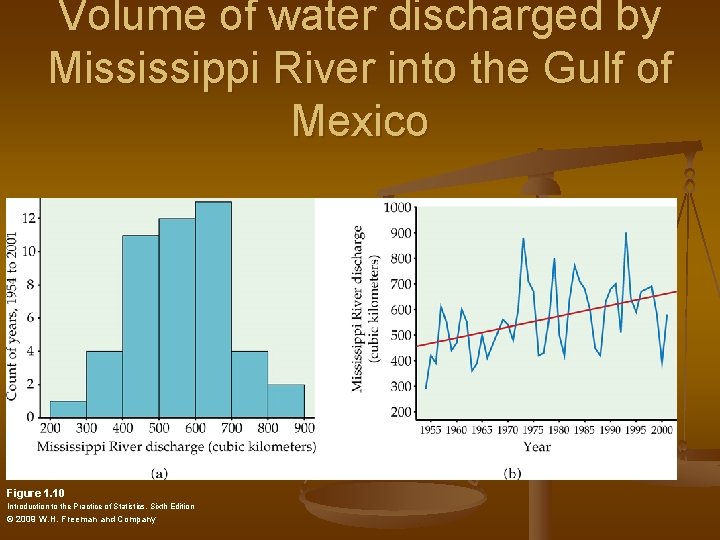
Volume of water discharged by Mississippi River into the Gulf of Mexico Figure 1. 10 Introduction to the Practice of Statistics, Sixth Edition © 2009 W. H. Freeman and Company
1. 2 Describing Distributions with Numbers n Measuring center Mean n Median (see data next page) n Mode n n In a symmetric distribution, the mean and median are close to each other Right skewed – mean is higher than median Left skewed – mean is lower than median
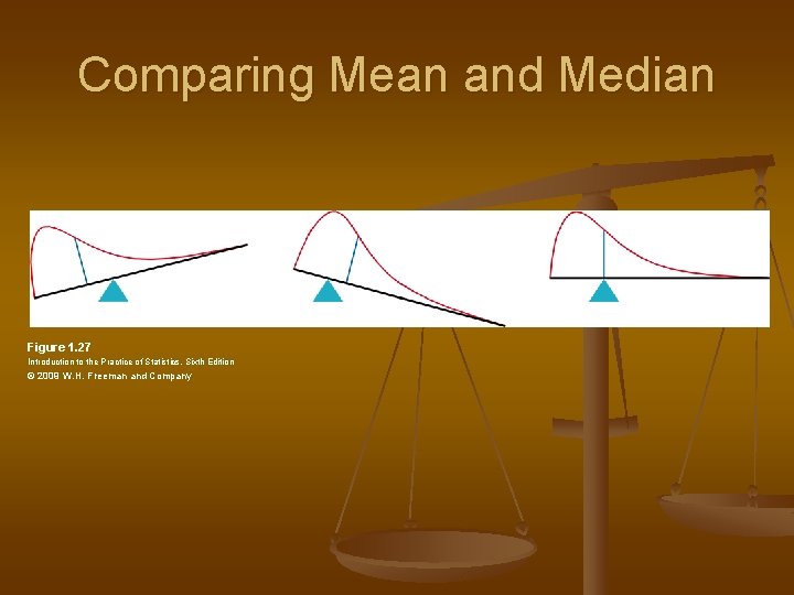
Comparing Mean and Median Figure 1. 27 Introduction to the Practice of Statistics, Sixth Edition © 2009 W. H. Freeman and Company
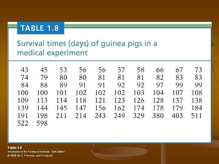
Table 1. 8 Introduction to the Practice of Statistics, Sixth Edition © 2009 W. H. Freeman and Company
1. 2 Continued n n n If outliers are present in data, it is better to use median (also better to use median if the distribution is skewed) Why is spread so important? Measuring spread Range n Standard deviation n Quartiles n
Measuring Spread n Range n n Maximum – Minimum Standard deviation Average deviation from mean n Properties of standard deviation n Measures spread about mean (should only be used when mean is used as the measure of central tendency n s = 0 only when there is no spread n Outliers affect s n
Quartiles n Quartiles pth percentile - p% fall at or below that value n (100 -p)% falls above n 25 th percentile = 1 st Quartile (Q 1) n 50 th percentile = 2 nd Quartile (Q 2) n 75 th percentile = 3 rd Quartile (Q 3) n
Quantiles n To find Quartiles Order data n Find median n First Quartile is the median of the first half of data n Third Quartile is the median of the second half of data n n Use Guinea pig example n Data is already order, n=72
IQR n n Inter-quartile range (IQR)=Q 3 -Q 1 Five-number summary n n Minimum, Q 1, Median, Q 3, Maximum Boxplot – displays the five-number summary Box from Q 1 to Q 3 n Line at the median n “Whiskers” to the maximum and minimum n
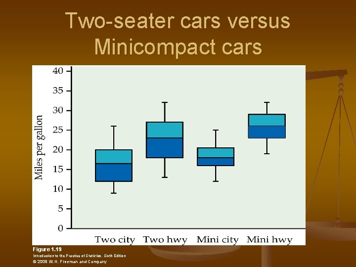
Two-seater cars versus Minicompact cars Figure 1. 19 Introduction to the Practice of Statistics, Sixth Edition © 2009 W. H. Freeman and Company
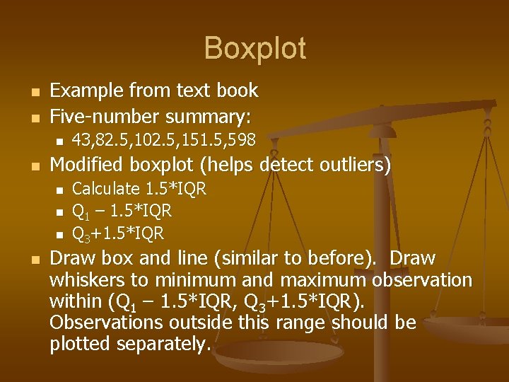
Boxplot n n Example from text book Five-number summary: n n Modified boxplot (helps detect outliers) n n 43, 82. 5, 102. 5, 151. 5, 598 Calculate 1. 5*IQR Q 1 – 1. 5*IQR Q 3+1. 5*IQR Draw box and line (similar to before). Draw whiskers to minimum and maximum observation within (Q 1 – 1. 5*IQR, Q 3+1. 5*IQR). Observations outside this range should be plotted separately.
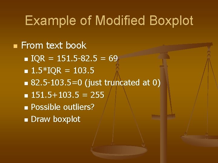
Example of Modified Boxplot n From text book IQR = 151. 5 -82. 5 = 69 n 1. 5*IQR = 103. 5 n 82. 5 -103. 5=0 (just truncated at 0) n 151. 5+103. 5 = 255 n Possible outliers? n Draw boxplot n
Choosing a Summary for Data Set n n n If distribution is skewed or has outliers, it is best to use the five-number summary. If distribution is “reasonably” symmetric, use the mean and standard deviation. ALWAYS PLOT DATA BEFORE DECIDING ON A NUMERICAL SUMMARY
1. 3 The Normal Distribution n Density curve Always on or above horizontal axis n Area under curve equal to 1 n n n Symmetric density curves have equal mean and median Normal distribution Mean=Median=Mode n Symmetric, unimodal n Area under curve = 1 n
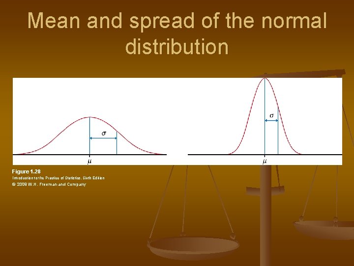
Mean and spread of the normal distribution Figure 1. 28 Introduction to the Practice of Statistics, Sixth Edition © 2009 W. H. Freeman and Company
Empirical Rule(68 -95 -99. 7% Rule) n n n Approximately 68% of the data will fall within one standard deviation of the mean Approximately 95% of the data will fall within two standard deviations of the mean Approximately 99. 7% of the data will fall within three standard deviations of the mean
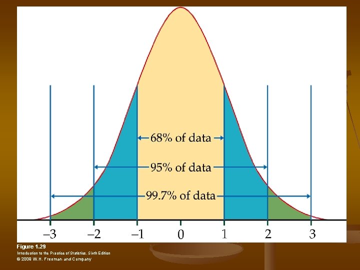
Figure 1. 29 Introduction to the Practice of Statistics, Sixth Edition © 2009 W. H. Freeman and Company
Example n Weights of apples are normally distributed with a mean of 10 oz and a standard deviation of 2 oz. The middle 68% of apples weigh between _____ and _____. n Middle 95% n Middle 99. 7% n Approximately what percent of apples weigh below 6 oz? n Approximately what percent of apples weigh above 4 oz? n
Z-scores n n Tells # of standard deviations an observation is from the mean. Negative z-scores (observation is below the mean) Positive z-scores (observation is above the mean) Z-score = 0 (observation is equal to the mean)
Z-scores n n n Z= (X-m)/s Find z-score for an apple that weighs 11 oz. 15 oz? If we assume the distribution of the variable is normal, then the z-scores have a standard normal distribution.
Standard Normal Distribution n n n The standard normal distribution has a mean of 0 and a standard deviation of 1. Can use Table A to get area under the curve for a standard normal. Area under curve = proportion (percent) Look at table What percent of apples weigh below 7 oz? What percent of apples weigh more than 5 oz?
- Slides: 35