Chapter 1 Graphing Qualitative vs Quantitative Qualitative data


 – The variable")


 variable A. Temperature B. Freshwater oxygen content.")
 variable A. Temperature B. Freshwater oxygen content.")


- Slides: 15
Chapter 1 Graphing
Qualitative vs. Quantitative • Qualitative data – data which cannot be measured. – Example – hair color, eye color, types of trees, color of a solution. • Quantitative data – data which can be measured. – a. Example – How much does a person weigh? How many grams of sugar is there in an apple? What is the temperature outside? Number of days. Percentage. Years.
Independent Variable vs. Dependent Variable • Independent variable: x-axis (manipulated variable) – The variable you have control over, what you can manipulate. It is what you think will affect the dependent variable. – Amount of light, water, temperature, time, hair color, eye color. • Dependent variable: y-axis (responding variable) – The variable you measure in the experiment and what is affected during the experiment. The dependent variable responds to the independent variable. – This is what you are measuring.
Line Graph • Shows the relationship between the independent and dependent variable. • Both the independent and dependent variables are quantitative.
Creating a Line Graph • 1. Label each axis – Indicate on each axis what is being measured and in what units of measurement. • Examples: Time (minutes), Distance (meters) • Space the values so that your graph fills as much of the grid as possible. • Use the x-axis for the independent variable • Use the y-axis for the dependent variable. • Plot and connect the points. • In graphs with more than one plot, identify each plot. • Provide a title for your graph.
Bar Graph • Used to show comparisons between groups. • The independent variable can be qualitative or quantitative. • The dependent variable is quantitative.
Pie Graph • Shows what percentage of 100 is represented by a piece of information. • Data adds up to 100%. • The size of each pie slice is proportional to the percentage of the category it represents.
Clicker Question • A student records the height of a bean plant in cm daily. This is an example of A. Qualitative data. B. Quantitative data
Clicker Question • A student records the types of animals which inhabit a one square mile area. This is an example of A. Qualitative data. B. Quantitative data
Clicker Question • Identify the independent (manipulated) variable A. Temperature B. Freshwater oxygen content. C. Neither temperature or freshwater oxygen content
Clicker Question • Identify the dependent (responding) variable A. Temperature B. Freshwater oxygen content. C. Neither temperature or freshwater oxygen content
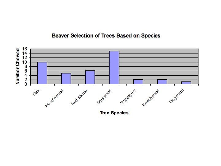
Clicker Question • Identify the independent variable. A. Tree species B. Number chewed C. There is no independent variable
Clicker Question • Which data would go on the x-axis? A. Tree species B. Number chewed
Clicker Question • What type of graph would best represent this data? A. Line graph B. Pie graph C. Bar graph