Chapter 1 Exploring Data Introduction Statistics the science
- Slides: 63

Chapter 1 Exploring Data

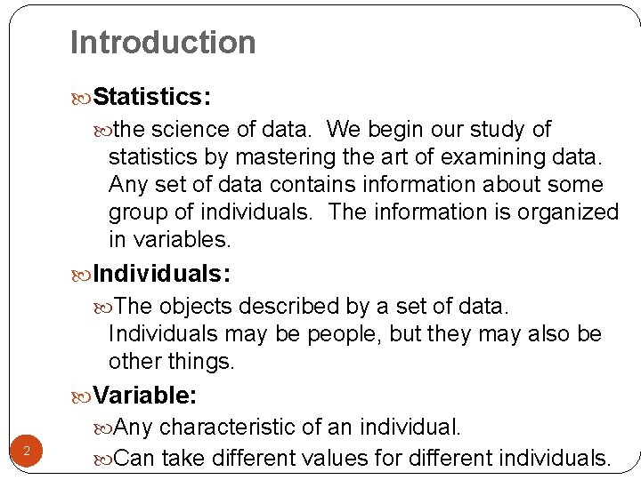
Introduction Statistics: the science of data. We begin our study of statistics by mastering the art of examining data. Any set of data contains information about some group of individuals. The information is organized in variables. Individuals: The objects described by a set of data. Individuals may be people, but they may also be other things. Variable: Any characteristic of an individual. 2 Can take different values for different individuals.

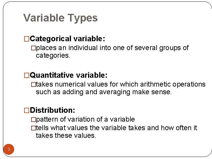
Variable Types �Categorical variable: �places an individual into one of several groups of categories. �Quantitative variable: �takes numerical values for which arithmetic operations such as adding and averaging make sense. �Distribution: �pattern of variation of a variable �tells what values the variable takes and how often it takes these values. 3

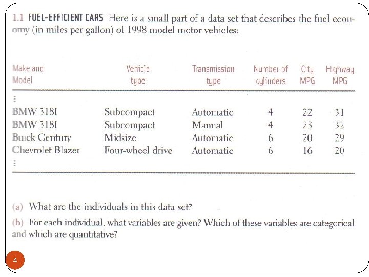
4

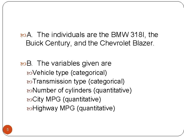
A. The individuals are the BMW 318 I, the Buick Century, and the Chevrolet Blazer. B. The variables given are Vehicle type (categorical) Transmission type (categorical) Number of cylinders (quantitative) City MPG (quantitative) Highway MPG (quantitative) 5

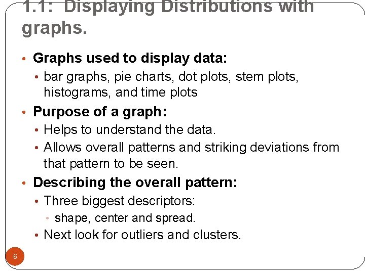
1. 1: Displaying Distributions with graphs. • Graphs used to display data: • bar graphs, pie charts, dot plots, stem plots, histograms, and time plots • Purpose of a graph: • Helps to understand the data. • Allows overall patterns and striking deviations from that pattern to be seen. • Describing the overall pattern: • Three biggest descriptors: • shape, center and spread. • Next look for outliers and clusters. 6

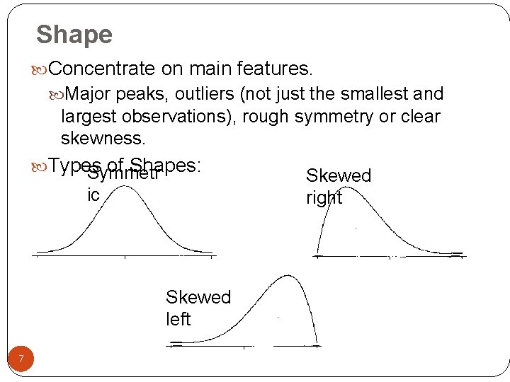
Shape Concentrate on main features. Major peaks, outliers (not just the smallest and largest observations), rough symmetry or clear skewness. Types of Shapes: Symmetr ic Skewed left 7 Skewed right

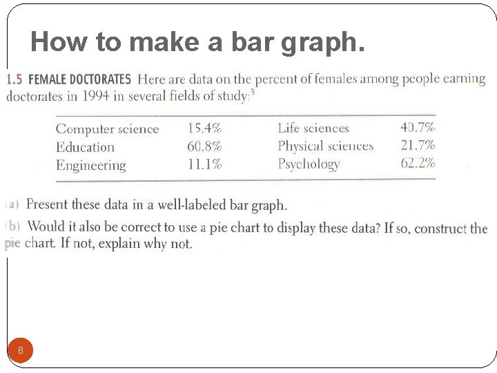
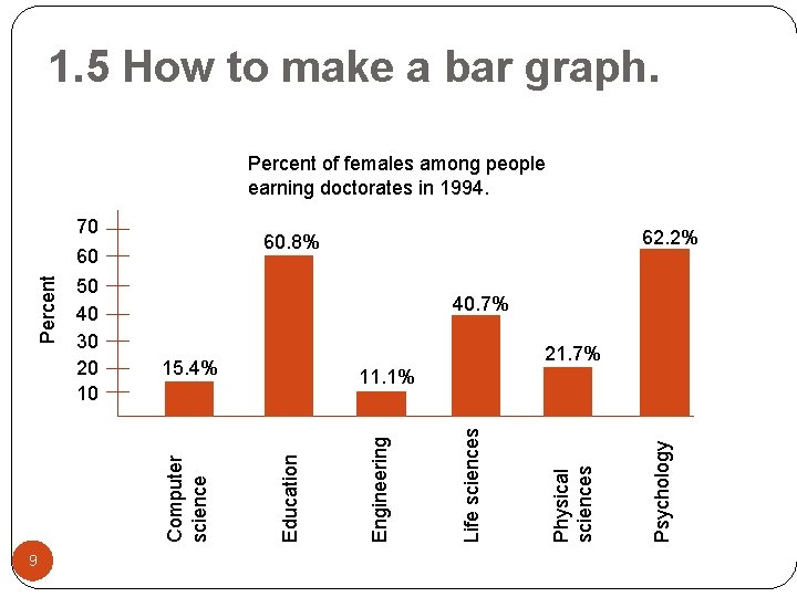
How to make a bar graph. 8

1. 5 How to make a bar graph. 9 62. 2% 60. 8% 40. 7% 21. 7% 15. 4% Psychology Physical sciences Life sciences Engineering 11. 1% Education 70 60 50 40 30 20 10 Computer science Percent of females among people earning doctorates in 1994.

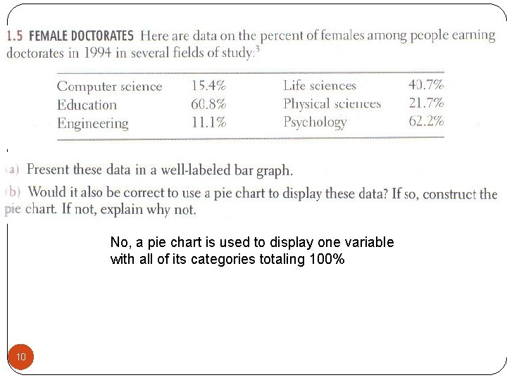
No, a pie chart is used to display one variable with all of its categories totaling 100% 10

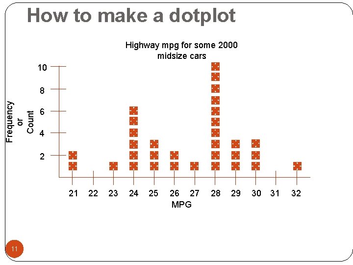
How to make a dotplot Highway mpg for some 2000 midsize cars 10 Frequency or Count 8 6 4 2 21 11 22 23 24 25 26 27 MPG 28 29 30 31 32

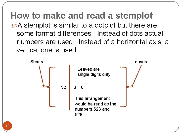
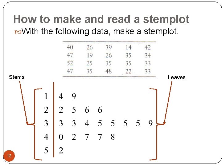
How to make and read a stemplot A stemplot is similar to a dotplot but there are some format differences. Instead of dots actual numbers are used. Instead of a horizontal axis, a vertical one is used. Stems Leaves are single digits only 52 3 6 This arrangement would be read as the numbers 523 and 526. 12

How to make and read a stemplot With the following data, make a stemplot. Stems 13 Leaves

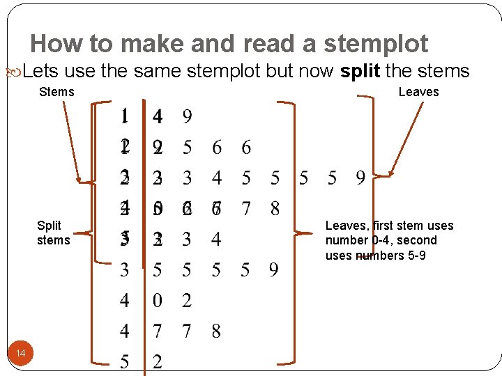
How to make and read a stemplot Lets use the same stemplot but now split the stems Split stems 14 Leaves, first stem uses number 0 -4, second uses numbers 5 -9

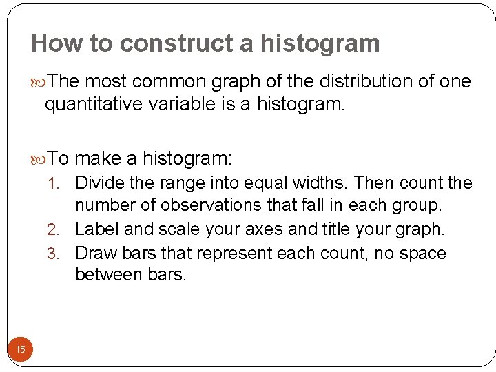
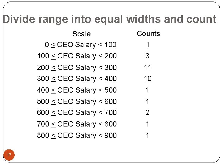
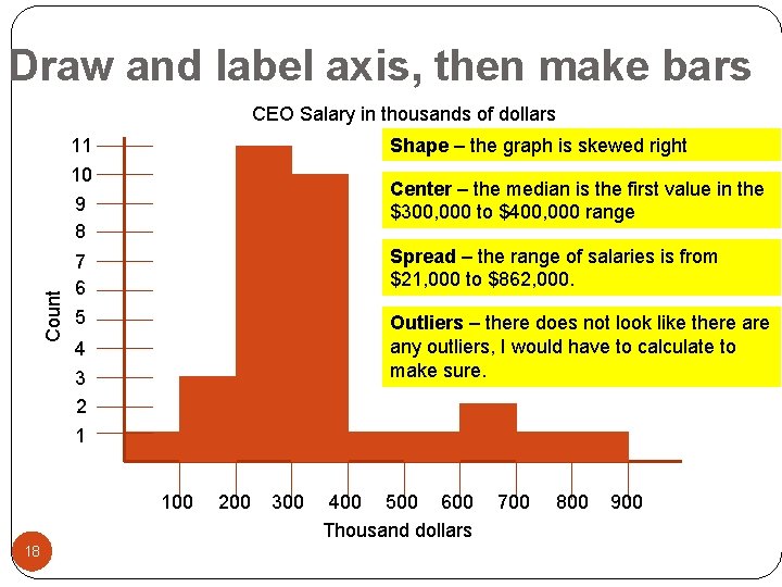
How to construct a histogram The most common graph of the distribution of one quantitative variable is a histogram. To make a histogram: 1. Divide the range into equal widths. Then count the number of observations that fall in each group. 2. Label and scale your axes and title your graph. 3. Draw bars that represent each count, no space between bars. 15


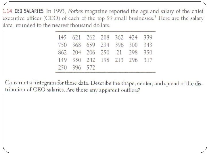
Divide range into equal widths and count Scale 0 < CEO Salary < 100 17 Counts 1 100 < CEO Salary < 200 3 200 < CEO Salary < 300 11 300 < CEO Salary < 400 10 400 < CEO Salary < 500 1 500 < CEO Salary < 600 1 600 < CEO Salary < 700 2 700 < CEO Salary < 800 1 800 < CEO Salary < 900 1

Draw and label axis, then make bars Count CEO Salary in thousands of dollars 11 10 9 8 Shape – the graph is skewed right 7 6 Spread – the range of salaries is from $21, 000 to $862, 000. 5 Outliers – there does not look like there any outliers, I would have to calculate to make sure. Center – the median is the first value in the $300, 000 to $400, 000 range 4 3 2 1 100 18 200 300 400 500 600 Thousand dollars 700 800 900

Section 1. 1 Day 1 Homework: #’s 2, 4, 6, 8, 11 a&b, 14, 16 Any questions on pg. 1 -4 in additional notes packet 19

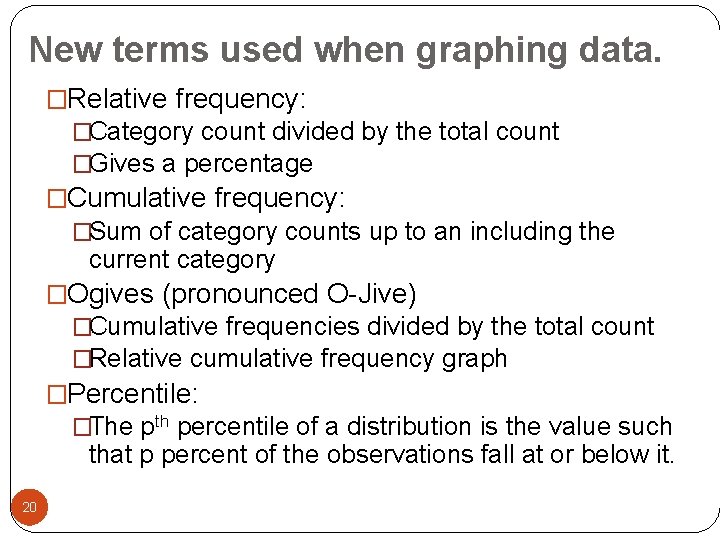
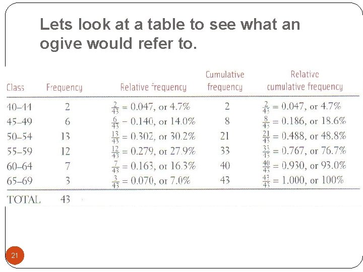
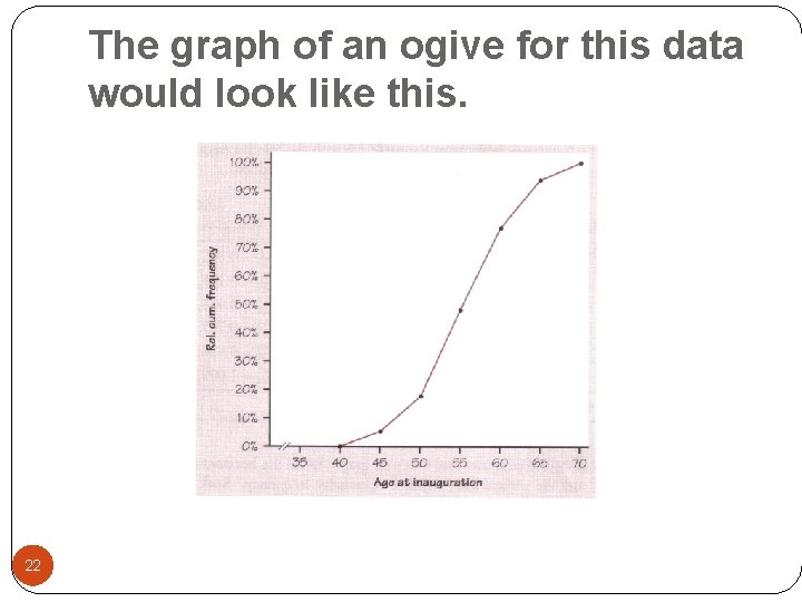
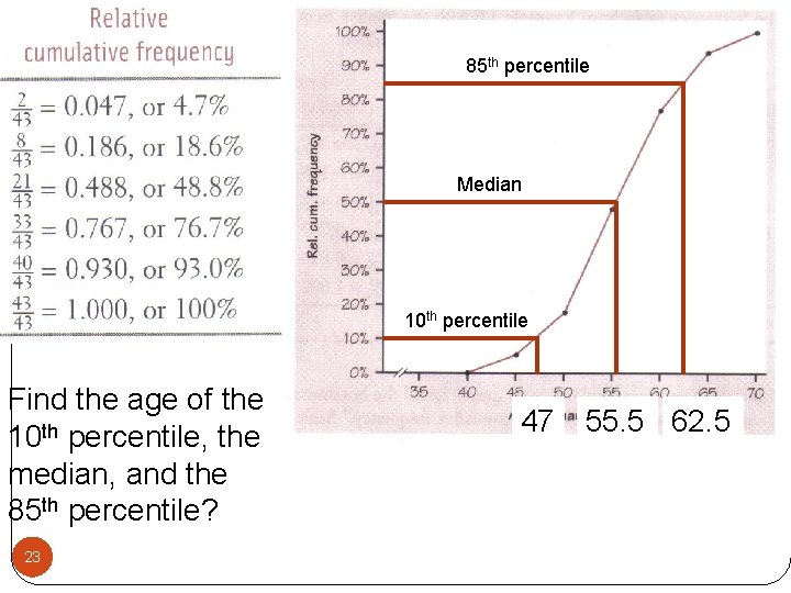
New terms used when graphing data. �Relative frequency: �Category count divided by the total count �Gives a percentage �Cumulative frequency: �Sum of category counts up to an including the current category �Ogives (pronounced O-Jive) �Cumulative frequencies divided by the total count �Relative cumulative frequency graph �Percentile: �The pth percentile of a distribution is the value such that p percent of the observations fall at or below it. 20

Lets look at a table to see what an ogive would refer to. 21

The graph of an ogive for this data would look like this. 22

85 th percentile Median 10 th percentile Find the age of the 10 th percentile, the median, and the 85 th percentile? 23 47 55. 5 62. 5

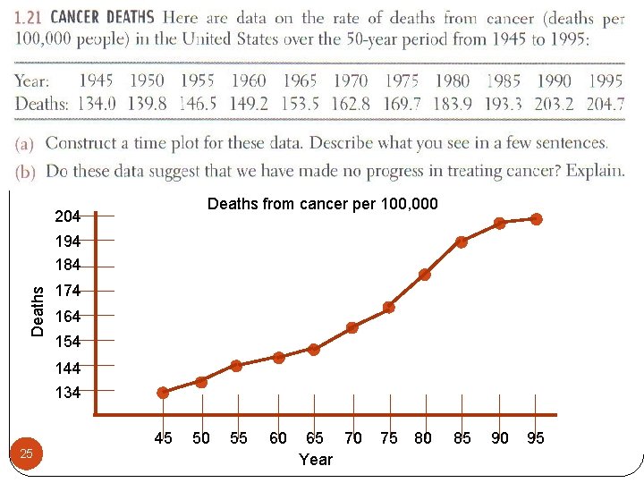
Last graph of this section Time plots : Graph of each observation against the time at which it was measured. Time is always on the x-axis. Use time plots to analyze what is occurring over time. 24

Deaths from cancer per 100, 000 204 Deaths 194 184 174 164 154 144 134 25 45 50 55 60 65 70 Year 75 80 85 90 95

Section 1. 1 Day 2 Homework: #’s 20, 22, 29 (use scale starting at 7 with width of. 5), 60, 61, 63, 66 a&c Any questions on pg. 5 -8 in additional notes packet 26

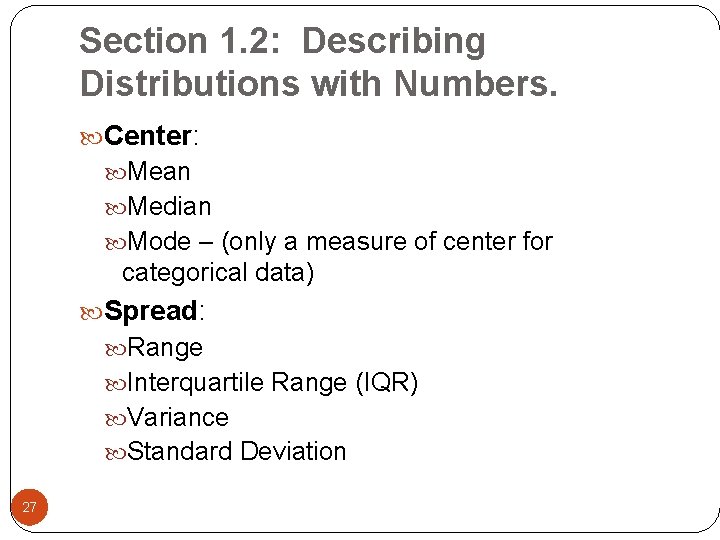
Section 1. 2: Describing Distributions with Numbers. Center: Mean Median Mode – (only a measure of center for categorical data) Spread: Range Interquartile Range (IQR) Variance Standard Deviation 27

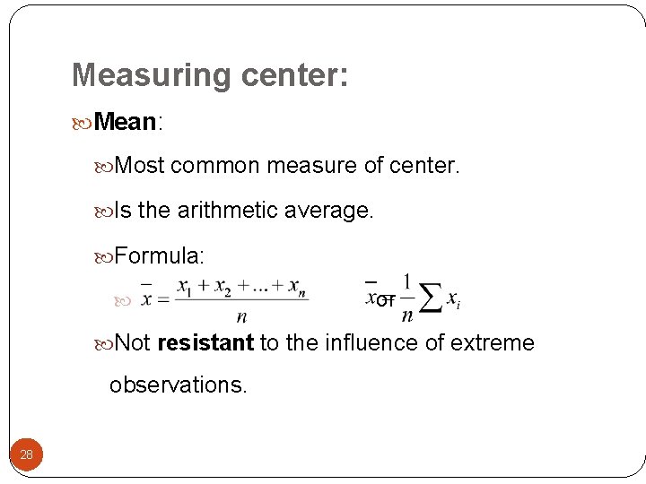
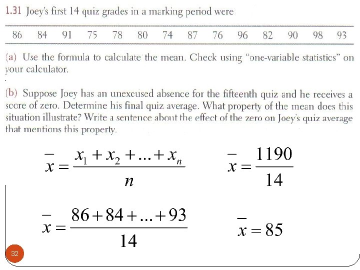
Measuring center: Mean: Most common measure of center. Is the arithmetic average. Formula: or Not resistant to the influence of extreme observations. 28

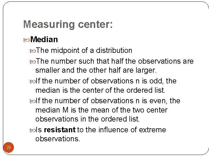
Measuring center: Median The midpoint of a distribution The number such that half the observations are smaller and the other half are larger. If the number of observations n is odd, the median is the center of the ordered list. If the number of observations n is even, the median M is the mean of the two center observations in the ordered list. Is resistant to the influence of extreme observations. 29

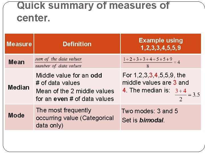
Quick summary of measures of center. Measure Definition Example using 1, 2, 3, 3, 4, 5, 5, 9 Mean Median Middle value for an odd # of data values Mean of the 2 middle values for an even # of data values For 1, 2, 3, 3, 4, 5, 5, 9, the middle values are 3 and 4. The median is: Mode The most frequently occurring value (Categorical data only) Two modes: 3 and 5 Set is bimodal.

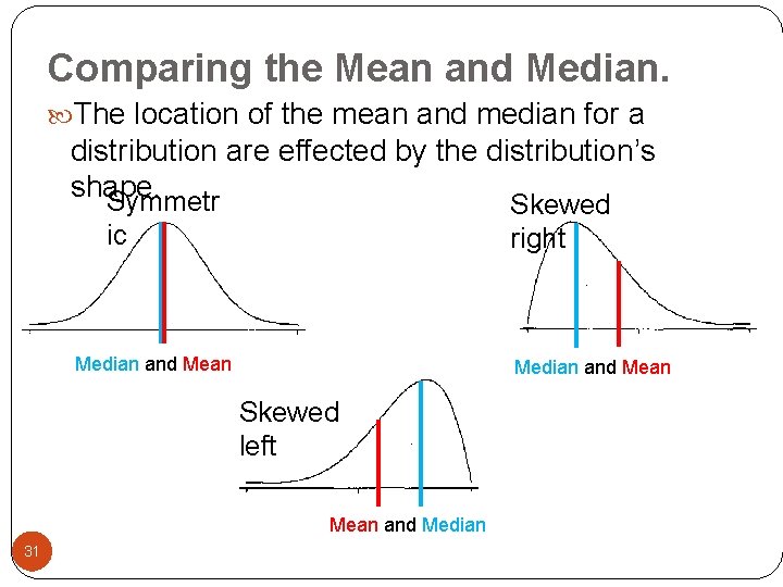
Comparing the Mean and Median. The location of the mean and median for a distribution are effected by the distribution’s shape. Symmetr Skewed right ic Median and Mean Skewed left Mean and Median 31

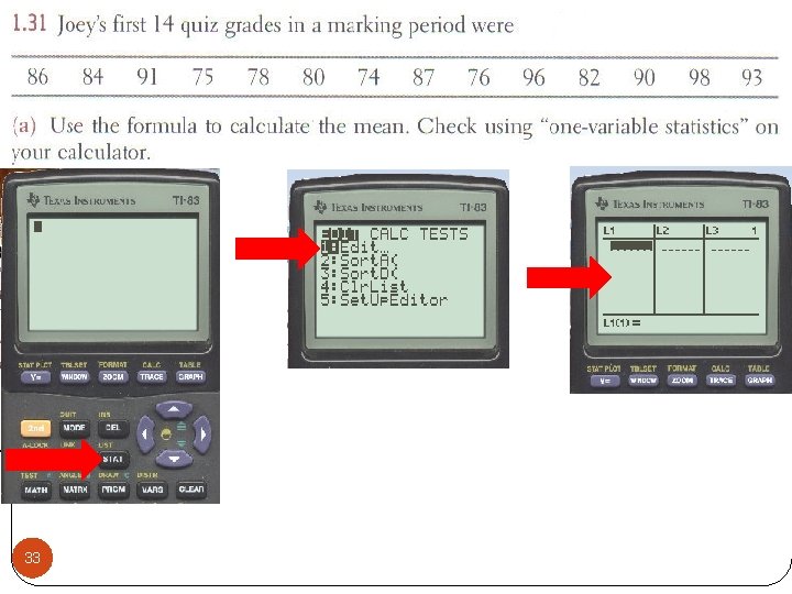
32

33

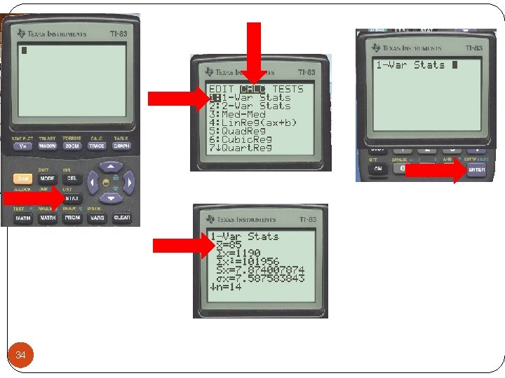
34

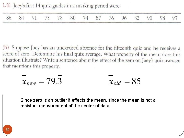
Since zero is an outlier it effects the mean, since the mean is not a resistant measurement of the center of data. 35

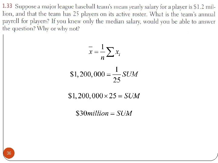
36

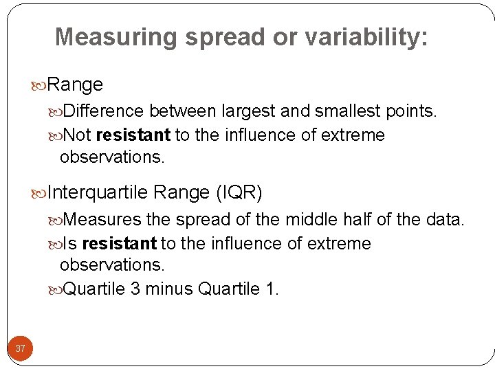
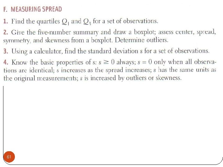
Measuring spread or variability: Range Difference between largest and smallest points. Not resistant to the influence of extreme observations. Interquartile Range (IQR) Measures the spread of the middle half of the data. Is resistant to the influence of extreme observations. Quartile 3 minus Quartile 1. 37

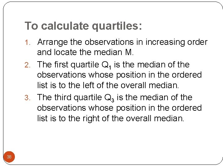
To calculate quartiles: 1. Arrange the observations in increasing order and locate the median M. 2. The first quartile Q 1 is the median of the observations whose position in the ordered list is to the left of the overall median. 3. The third quartile Q 3 is the median of the observations whose position in the ordered list is to the right of the overall median. 38

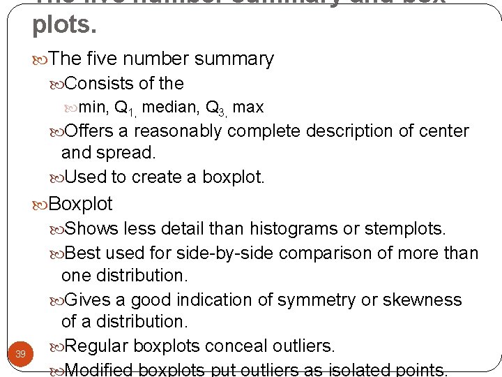
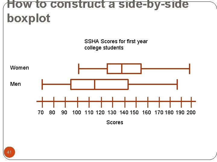
The five number summary and box plots. The five number summary Consists of the min, Q 1, median, Q 3, max Offers a reasonably complete description of center and spread. Used to create a boxplot. Boxplot Shows less detail than histograms or stemplots. Best used for side-by-side comparison of more than 39 one distribution. Gives a good indication of symmetry or skewness of a distribution. Regular boxplots conceal outliers. Modified boxplots put outliers as isolated points.

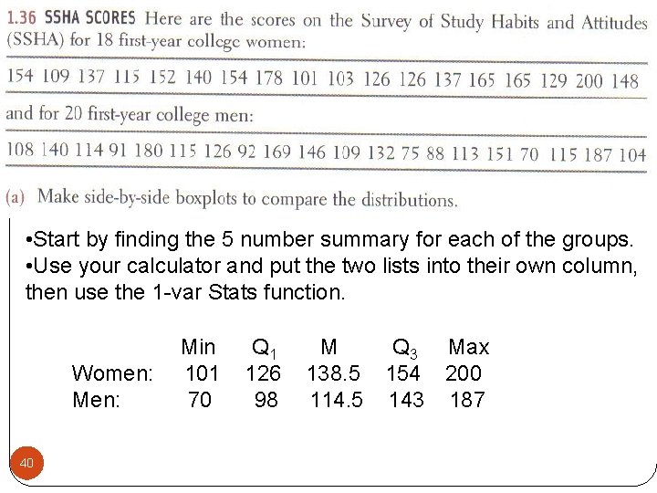
• Start by finding the 5 number summary for each of the groups. • Use your calculator and put the two lists into their own column, then use the 1 -var Stats function. Women: Men: 40 Min 101 70 Q 1 126 98 M Q 3 Max 138. 5 154 200 114. 5 143 187

How to construct a side-by-side boxplot SSHA Scores for first year college students Women Men 70 80 90 100 110 120 130 140 150 160 170 180 190 200 Scores 41

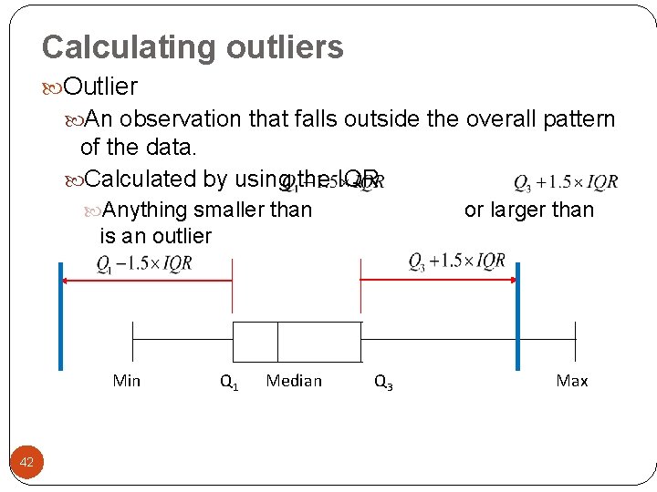
Calculating outliers Outlier An observation that falls outside the overall pattern of the data. Calculated by using the IQR Anything smaller than or larger than is an outlier Min 42 Q 1 Median Q 3 Max

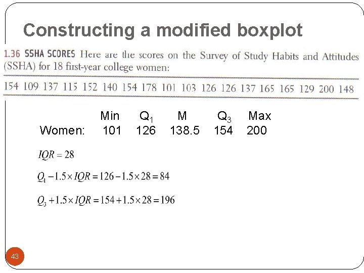
Constructing a modified boxplot Women: 43 Min 101 Q 1 126 M 138. 5 Q 3 154 Max 200

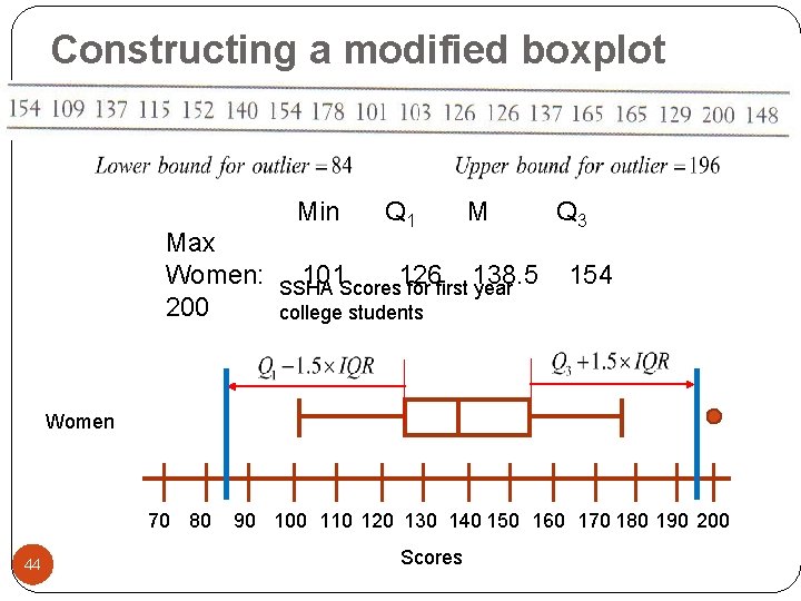
Constructing a modified boxplot Min Max Women: 200 101 Q 1 126 M 138. 5 SSHA Scores for first year college students Q 3 154 Women 70 80 44 90 100 110 120 130 140 150 160 170 180 190 200 Scores

Section 1. 2 Day 1 Homework: #’s 34, 35, 37 a-d, 39, 66 b, 67, 68, 69 Any questions on pg. 9 -12 in additional notes packet. 45

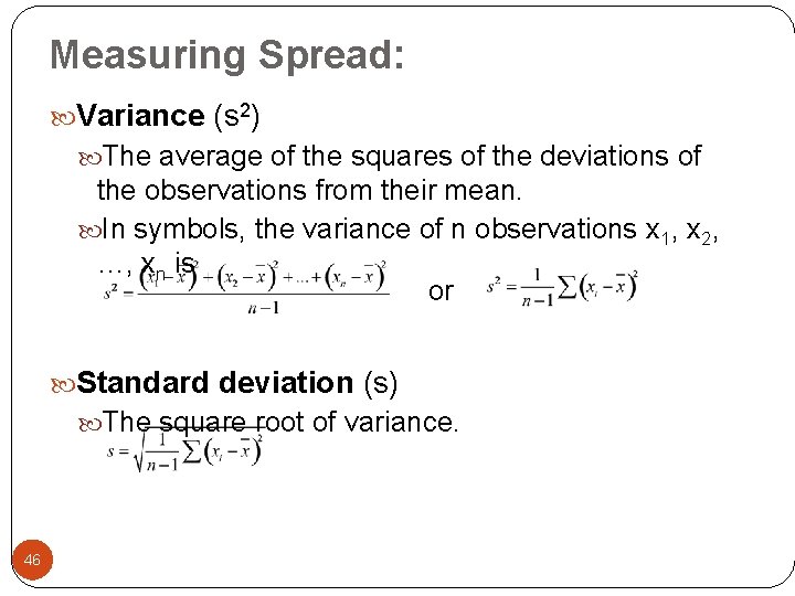
Measuring Spread: Variance (s 2) The average of the squares of the deviations of the observations from their mean. In symbols, the variance of n observations x 1, x 2, …, xn is or Standard deviation (s) The square root of variance. 46

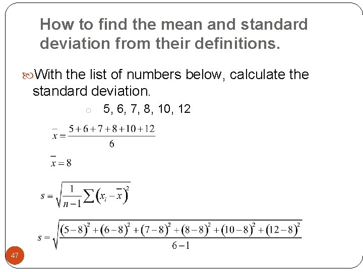
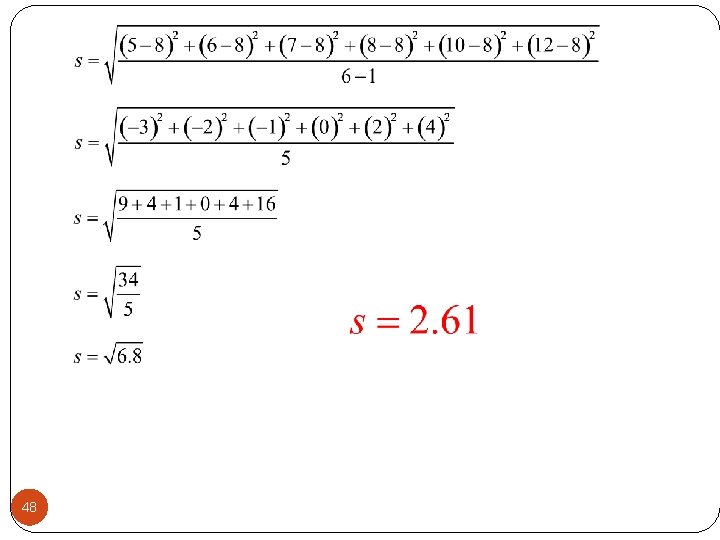
How to find the mean and standard deviation from their definitions. With the list of numbers below, calculate the standard deviation. o 47 5, 6, 7, 8, 10, 12

48

Properties of Variance: Uses squared deviations from the mean because the sum of all the deviations not squared is always zero. Has square units. Found by taking an average but dividing by n- 1. The sum of the deviations is always zero, so the last deviation can be found once the other n -1 deviations are known. Means only n-1 of the squared deviations can vary freely, so the average is found by dividing by n-1. 49 n-1 is called the degrees of freedom.

Properties of Standard Deviation Measures the spread about the mean and should be used only when the mean is chosen as the measure of center. Equals zero when there is no spread, happens when all observations are the same value. Otherwise it is always positive. Not resistant to the influence of extreme observations or strong skewness. 50

Mean & Standard Deviation Vs. Median & the 5 -Number Summary Mean & Standard Deviation Most common numerical description of a distribution. Used for reasonably symmetric distributions that are free from outliers. Five-Number Summary Offer a reasonably complete description of center 51 and spread. Used for describing skewed distributions or a distribution with strong outliers.

Always plot your data. Graphs Give the best overall picture of a distribution. Numerical measures of center and spread Only give specific facts about a distribution. Do not describe its entire shape. Can give a misleading picture of a distribution or the comparison of two or more distributions. 52

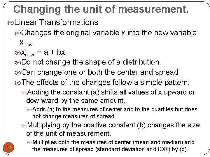
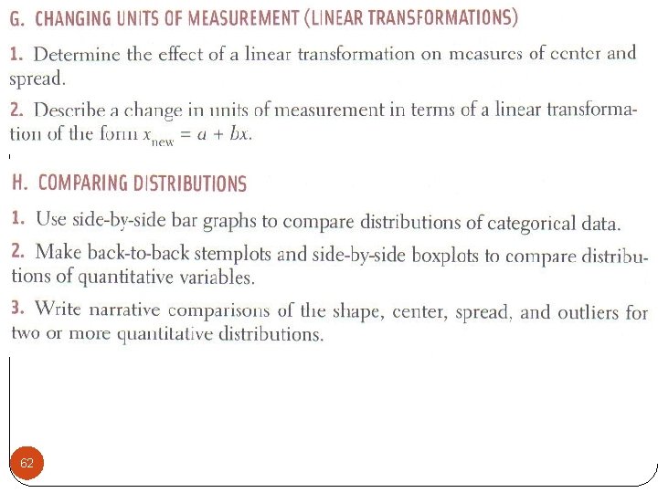
Changing the unit of measurement. Linear Transformations Changes the original variable x into the new variable xnew = a + bx Do not change the shape of a distribution. Can change one or both the center and spread. The effects of the changes follow a simple pattern. Adding the constant (a) shifts all values of x upward or downward by the same amount. Adds (a) to the measures of center and to the quartiles but does not change measures of spread. Multiplying by the positive constant (b) changes the size of the unit of measurement. 53 Multiplies both the measures of center (mean and median) and the measures of spread (standard deviation and IQR) by (b).

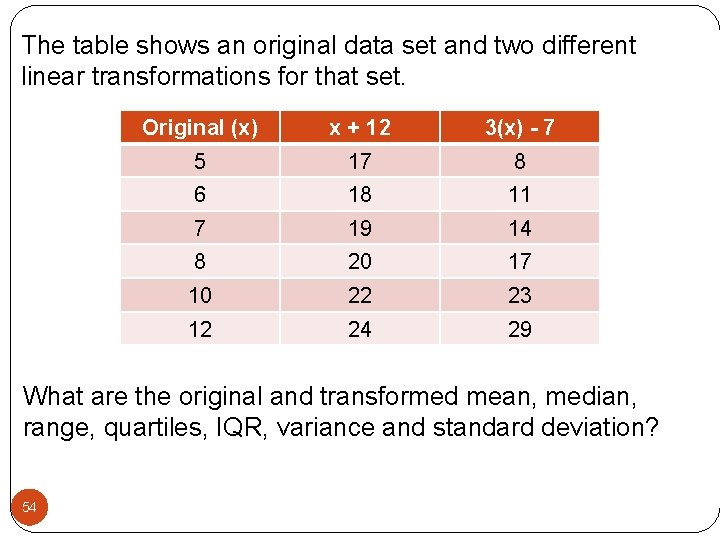
The table shows an original data set and two different linear transformations for that set. Original (x) x + 12 3(x) - 7 5 17 8 6 18 11 7 19 14 8 20 17 10 22 23 12 24 29 What are the original and transformed mean, median, range, quartiles, IQR, variance and standard deviation? 54

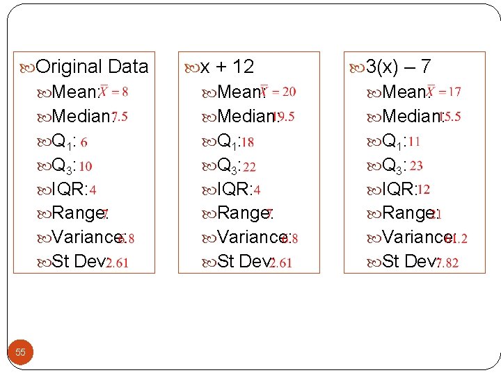
Original Data 55 x + 12 3(x) – 7 Mean: Median: Q 1: Q 3: IQR: Range: Variance: St Dev:

Section 1. 2 Day 2 Homework: #’s (40, 41) find mean and standard deviation, 42 – 46, 54 – 56, 58 Any questions on pg. 13 -16 in additional notes packet. 56

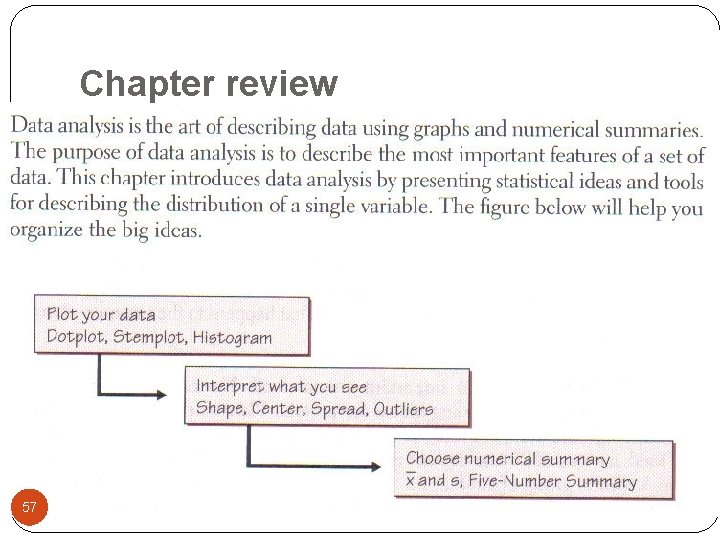
Chapter review 57

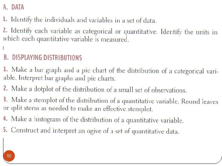
58

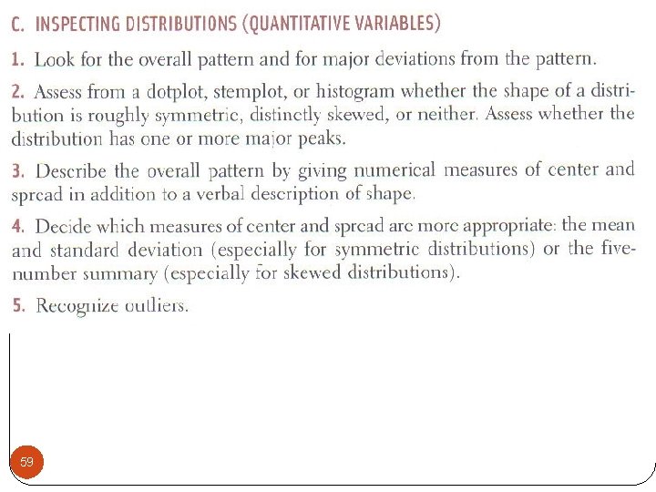
59

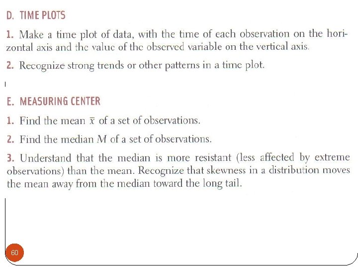
60

61

62

Chapter 1 Complete Homework: #’s 60, 61, 63, 66 – 69 Any questions on pg. 17 -20 in additional notes packet. 63