CHAPTER 1 Exploring Data 1 1 Analyzing Categorical
- Slides: 25

CHAPTER 1 Exploring Data 1. 1 Analyzing Categorical Data The Practice of Statistics, 5 th Edition Starnes, Tabor, Yates, Moore Bedford Freeman Worth Publishers

Analyzing Categorical Data Learning Objectives After this section, you should be able to: ü DISPLAY categorical data with a bar graph ü IDENTIFY what makes some graphs of categorical data deceptive ü CALCULATE and DISPLAY the marginal distribution of a categorical variable from a two-way table ü CALCULATE and DISPLAY the conditional distribution of a categorical variable for a particular value of the other categorical variable in a two-way table ü DESCRIBE the association between two categorical variables The Practice of Statistics, 5 th Edition 2

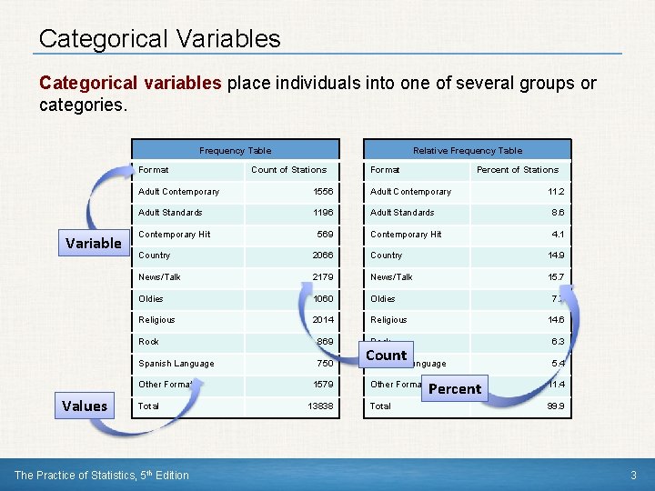
Categorical Variables Categorical variables place individuals into one of several groups or categories. Frequency Table Format Variable Count of Stations Format Percent of Stations Adult Contemporary 1556 Adult Contemporary Adult Standards 1196 Adult Standards 8. 6 Contemporary Hit 4. 1 Contemporary Hit 569 11. 2 Country 2066 Country 14. 9 News/Talk 2179 News/Talk 15. 7 Oldies 1060 Oldies Religious 2014 Religious Rock 869 Spanish Language 750 Other Formats Values Relative Frequency Table Total The Practice of Statistics, 5 th Edition 1579 13838 7. 7 14. 6 Rock Count Spanish Language Other Formats Total Percent 6. 3 5. 4 11. 4 99. 9 3

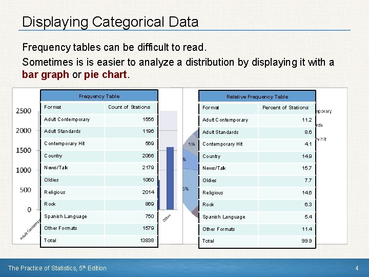
Displaying Categorical Data Frequency tables can be difficult to read. Sometimes is is easier to analyze a distribution by displaying it with a bar graph or pie chart. Frequency Table Format Relative Frequency Table Count of Stations Format Percent of Stations Adult Contemporary 1556 Adult Contemporary Adult Standards 1196 Adult Standards 8. 6 Contemporary Hit 4. 1 Contemporary Hit 569 11. 2 Country 2066 Country 14. 9 News/Talk 2179 News/Talk 15. 7 Oldies 1060 Oldies Religious 2014 Religious 7. 7 14. 6 Rock 869 Rock 6. 3 Spanish Language 750 Spanish Language 5. 4 Other Formats Total The Practice of Statistics, 5 th Edition 1579 13838 Other Formats 11. 4 Total 99. 9 4

Graphs: Good and Bar graphs compare several quantities by comparing the heights of bars that represent those quantities. Our eyes, however, react to the area of the bars as well as to their height. üWhen you draw a bar graph, make the bars equally wide. It is tempting to replace the bars with pictures for greater eye appeal. üDon’t do it! There are two important lessons to keep in mind: (1) beware the pictograph, and (2) watch those scales. The Practice of Statistics, 5 th Edition 5

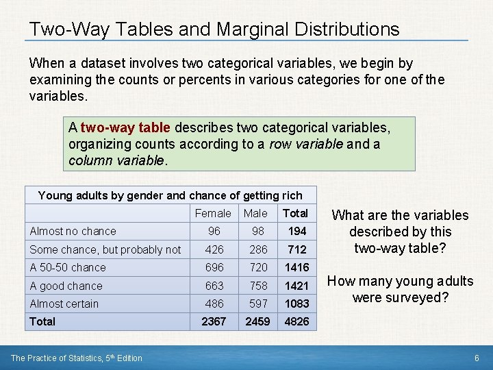
Two-Way Tables and Marginal Distributions When a dataset involves two categorical variables, we begin by examining the counts or percents in various categories for one of the variables. A two-way table describes two categorical variables, organizing counts according to a row variable and a column variable. Young adults by gender and chance of getting rich Female Male Total Almost no chance 96 98 194 Some chance, but probably not 426 286 712 A 50 -50 chance 696 720 1416 A good chance 663 758 1421 Almost certain 486 597 1083 Total 2367 2459 4826 The Practice of Statistics, 5 th Edition What are the variables described by this two-way table? How many young adults were surveyed? 6

Two-Way Tables and Marginal Distributions The marginal distribution of one of the categorical variables in a twoway table of counts is the distribution of values of that variable among all individuals described by the table. Note: Percents are often more informative than counts, especially when comparing groups of different sizes. How to examine a marginal distribution: 1)Use the data in the table to calculate the marginal distribution (in percents) of the row or column totals. 2)Make a graph to display the marginal distribution. The Practice of Statistics, 5 th Edition 7

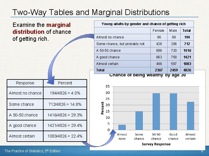
Two-Way Tables and Marginal Distributions Examine the marginal distribution of chance of getting rich. Response Percent Almost no chance 194/4826 = 4. 0% Some chance 712/4826 = 14. 8% A 50 -50 chance 1416/4826 = 29. 3% A good chance 1421/4826 = 29. 4% Almost certain 1083/4826 = 22. 4% The Practice of Statistics, 5 th Edition Young adults by gender and chance of getting rich Female Male Total Almost no chance 96 98 194 Some chance, but probably not 426 286 712 A 50 -50 chance 696 720 1416 A good chance 663 758 1421 Almost certain 486 597 1083 Total 2367 2459 4826 8

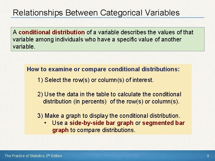
Relationships Between Categorical Variables A conditional distribution of a variable describes the values of that variable among individuals who have a specific value of another variable. How to examine or compare conditional distributions: 1) Select the row(s) or column(s) of interest. 2) Use the data in the table to calculate the conditional distribution (in percents) of the row(s) or column(s). 3) Make a graph to display the conditional distribution. • Use a side-by-side bar graph or segmented bar graph to compare distributions. The Practice of Statistics, 5 th Edition 9

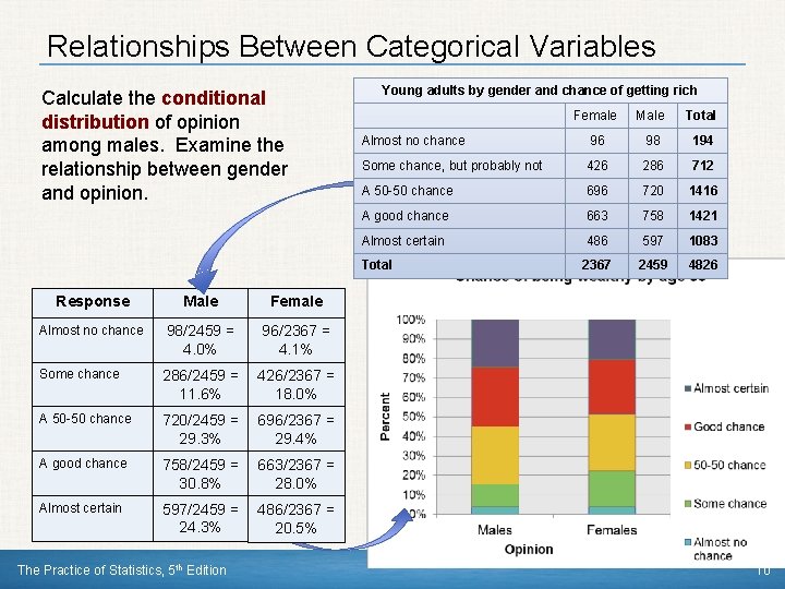
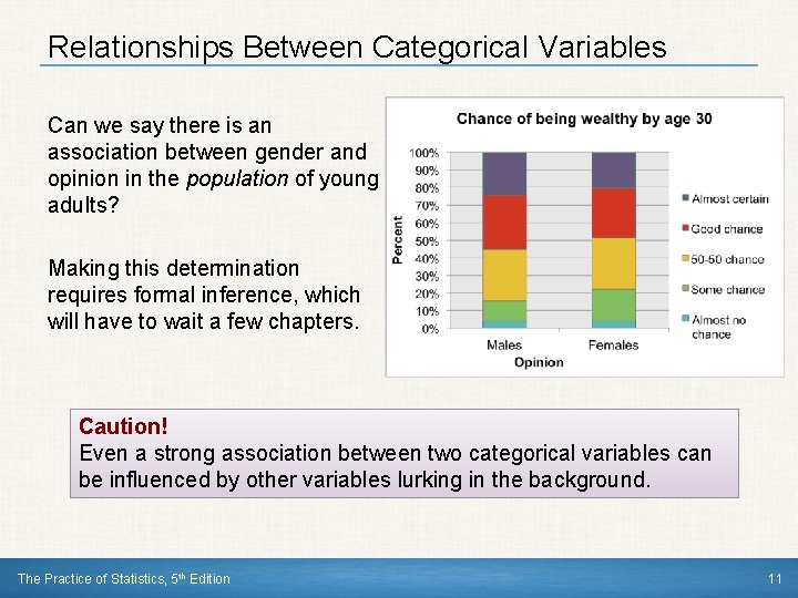
Relationships Between Categorical Variables Calculate the conditional distribution of opinion among males. Examine the relationship between gender and opinion. Response Male Female Almost no chance 98/2459 = 4. 0% 96/2367 = 4. 1% Some chance 286/2459 = 11. 6% 426/2367 = 18. 0% A 50 -50 chance 720/2459 = 29. 3% 696/2367 = 29. 4% A good chance 758/2459 = 30. 8% 663/2367 = 28. 0% Almost certain 597/2459 = 24. 3% 486/2367 = 20. 5% The Practice of Statistics, 5 th Edition Young adults by gender and chance of getting rich Female Male Total Almost no chance 96 98 194 Some chance, but probably not 426 286 712 A 50 -50 chance 696 720 1416 A good chance 663 758 1421 Almost certain 486 597 1083 Total 2367 2459 4826 10

Relationships Between Categorical Variables Can we say there is an association between gender and opinion in the population of young adults? Making this determination requires formal inference, which will have to wait a few chapters. Caution! Even a strong association between two categorical variables can be influenced by other variables lurking in the background. The Practice of Statistics, 5 th Edition 11

Data Analysis: Making Sense of Data Section Summary In this section, we learned how to… ü DISPLAY categorical data with a bar graph ü IDENTIFY what makes some graphs of categorical data deceptive ü CALCULATE and DISPLAY the marginal distribution of a categorical variable from a two-way table ü CALCULATE and DISPLAY the conditional distribution of a categorical variable for a particular value of the other categorical variable in a two-way table ü DESCRIBE the association between two categorical variables The Practice of Statistics, 5 th Edition 12

CHAPTER 1 Exploring Data 1. 2 Displaying Quantitative Data with Graphs The Practice of Statistics, 5 th Edition Starnes, Tabor, Yates, Moore Bedford Freeman Worth Publishers

Displaying Quantitative Data with Graphs Learning Objectives After this section, you should be able to: ü MAKE and INTERPRET dotplots and stemplots of quantitative data ü DESCRIBE the overall pattern of a distribution and IDENTIFY any outliers ü IDENTIFY the shape of a distribution ü MAKE and INTERPRET histograms of quantitative data ü COMPARE distributions of quantitative data The Practice of Statistics, 5 th Edition 14

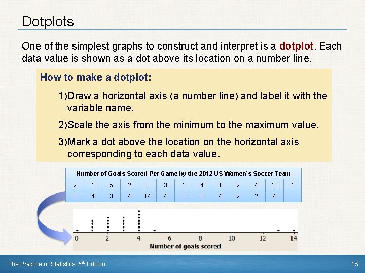
Dotplots One of the simplest graphs to construct and interpret is a dotplot. Each data value is shown as a dot above its location on a number line. How to make a dotplot: 1)Draw a horizontal axis (a number line) and label it with the variable name. 2)Scale the axis from the minimum to the maximum value. 3)Mark a dot above the location on the horizontal axis corresponding to each data value. Number of Goals Scored Per Game by the 2012 US Women’s Soccer Team 2 1 5 2 0 3 1 4 1 2 4 13 3 4 14 4 3 3 4 2 2 4 The Practice of Statistics, 5 th Edition 1 15

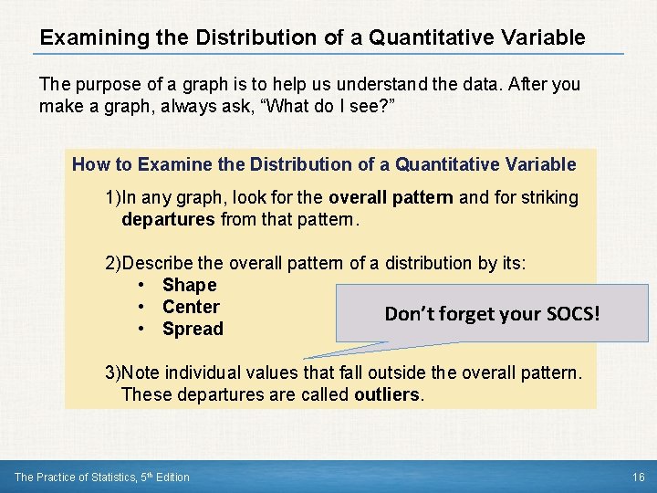
Examining the Distribution of a Quantitative Variable The purpose of a graph is to help us understand the data. After you make a graph, always ask, “What do I see? ” How to Examine the Distribution of a Quantitative Variable 1)In any graph, look for the overall pattern and for striking departures from that pattern. 2)Describe the overall pattern of a distribution by its: • Shape • Center Don’t forget your SOCS! • Spread 3)Note individual values that fall outside the overall pattern. These departures are called outliers. The Practice of Statistics, 5 th Edition 16

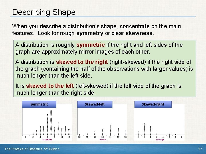
Describing Shape When you describe a distribution’s shape, concentrate on the main features. Look for rough symmetry or clear skewness. A distribution is roughly symmetric if the right and left sides of the graph are approximately mirror images of each other. A distribution is skewed to the right (right-skewed) if the right side of the graph (containing the half of the observations with larger values) is much longer than the left side. It is skewed to the left (left-skewed) if the left side of the graph is much longer than the right side. Symmetric The Practice of Statistics, 5 th Edition Skewed-left Skewed-right 17

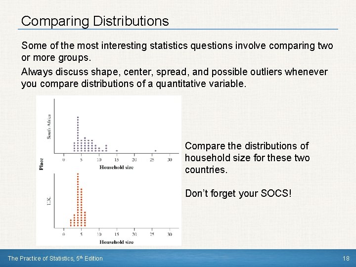
Comparing Distributions Some of the most interesting statistics questions involve comparing two or more groups. Always discuss shape, center, spread, and possible outliers whenever you compare distributions of a quantitative variable. Compare the distributions of household size for these two countries. Don’t forget your SOCS! The Practice of Statistics, 5 th Edition 18

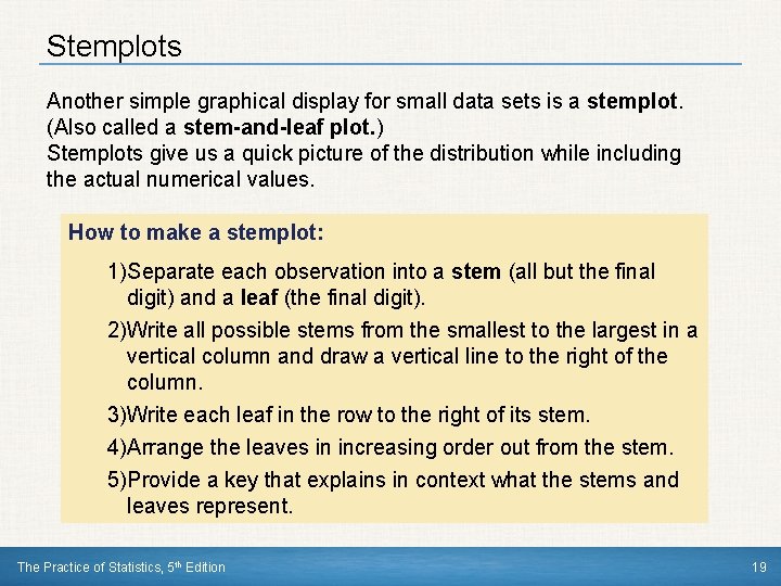
Stemplots Another simple graphical display for small data sets is a stemplot. (Also called a stem-and-leaf plot. ) Stemplots give us a quick picture of the distribution while including the actual numerical values. How to make a stemplot: 1)Separate each observation into a stem (all but the final digit) and a leaf (the final digit). 2)Write all possible stems from the smallest to the largest in a vertical column and draw a vertical line to the right of the column. 3)Write each leaf in the row to the right of its stem. 4)Arrange the leaves in increasing order out from the stem. 5)Provide a key that explains in context what the stems and leaves represent. The Practice of Statistics, 5 th Edition 19

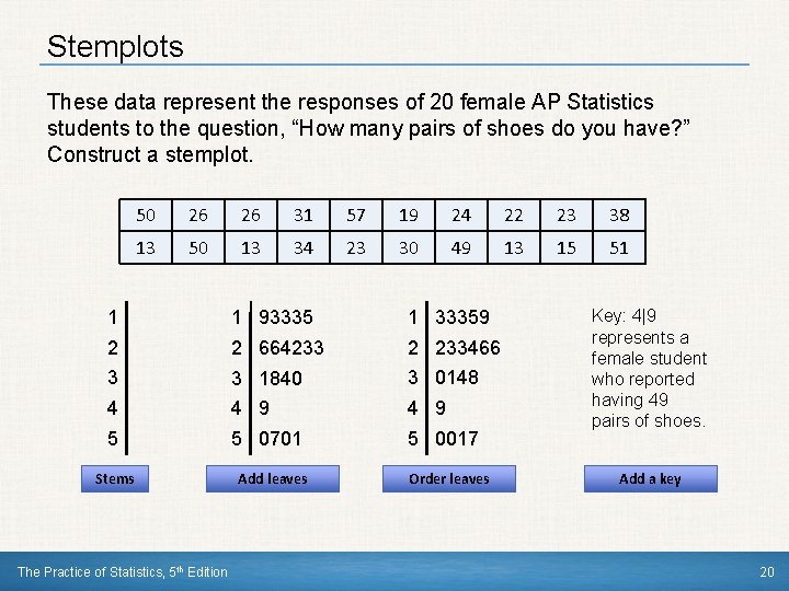
Stemplots These data represent the responses of 20 female AP Statistics students to the question, “How many pairs of shoes do you have? ” Construct a stemplot. 50 26 26 31 57 19 24 22 23 38 13 50 13 34 23 30 49 13 15 51 1 1 93335 1 33359 2 2 664233 2 233466 3 3 1840 3 0148 4 4 9 5 5 0701 5 0017 Stems The Practice of Statistics, 5 th Edition Add leaves Order leaves Key: 4|9 represents a female student who reported having 49 pairs of shoes. Add a key 20

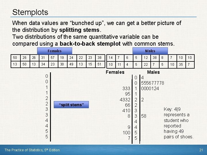
Stemplots When data values are “bunched up”, we can get a better picture of the distribution by splitting stems. Two distributions of the same quantitative variable can be compared using a back-to-back stemplot with common stems. Females Males 50 26 26 31 57 19 24 22 23 38 14 7 6 5 12 38 8 7 10 10 13 50 13 34 23 30 49 13 15 51 10 11 4 5 22 7 5 10 35 7 0 0 1 1 2 2 3 3 4 4 5 5 Females “split stems” The Practice of Statistics, 5 th Edition 333 95 4332 66 410 8 9 100 7 Males 0 0 1 1 2 2 3 3 4 4 5 5 4 555677778 0000124 2 58 Key: 4|9 represents a student who reported having 49 pairs of shoes. 21

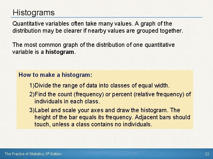
Histograms Quantitative variables often take many values. A graph of the distribution may be clearer if nearby values are grouped together. The most common graph of the distribution of one quantitative variable is a histogram. How to make a histogram: 1)Divide the range of data into classes of equal width. 2)Find the count (frequency) or percent (relative frequency) of individuals in each class. 3)Label and scale your axes and draw the histogram. The height of the bar equals its frequency. Adjacent bars should touch, unless a class contains no individuals. The Practice of Statistics, 5 th Edition 22

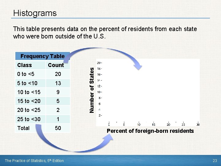
Histograms This table presents data on the percent of residents from each state who were born outside of the U. S. Class Count 0 to <5 20 5 to <10 13 10 to <15 9 15 to <20 5 20 to <25 2 25 to <30 1 Total 50 The Practice of Statistics, 5 th Edition Number of States Frequency Table Percent of foreign-born residents 23

Using Histograms Wisely Here are several cautions based on common mistakes students make when using histograms. Cautions! 1)Don’t confuse histograms and bar graphs. 2)Don’t use counts (in a frequency table) or percents (in a relative frequency table) as data. 3)Use percents instead of counts on the vertical axis when comparing distributions with different numbers of observations. 4)Just because a graph looks nice, it’s not necessarily a meaningful display of data. The Practice of Statistics, 5 th Edition 24

Data Analysis: Making Sense of Data Section Summary In this section, we learned how to… ü MAKE and INTERPRET dotplots and stemplots of quantitative data ü DESCRIBE the overall pattern of a distribution ü IDENTIFY the shape of a distribution ü MAKE and INTERPRET histograms of quantitative data ü COMPARE distributions of quantitative data The Practice of Statistics, 5 th Edition 25