CH 3 GRAPHIC REPRESENTATION Qualitative Graphs What Will



- Slides: 10

CH 3 GRAPHIC REPRESENTATION Qualitative Graphs

What Will You Learn In Ch 3? Graphs for Qualitative Data � How to create qualitative graphs from categorical variable data � Pie graph � Bar graph

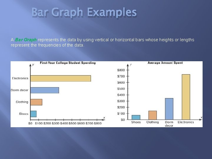
Bar Graph Examples A Bar Graph represents the data by using vertical or horizontal bars whose heights or lengths represent the frequencies of the data.

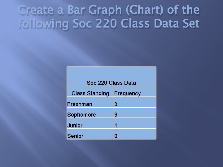
Create a Bar Graph (Chart) of the following Soc 220 Class Data Set Soc 220 Class Data Class Standing Frequency Freshman 3 Sophomore 9 Junior 1 Senior 0

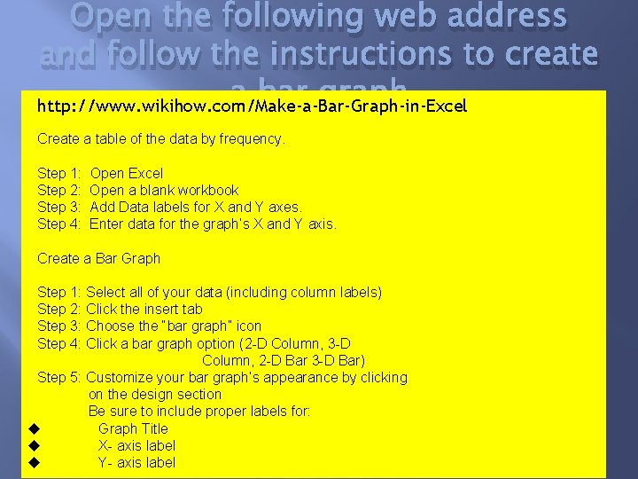
Open the following web address and follow the instructions to create a bar graph http: //www. wikihow. com/Make-a-Bar-Graph-in-Excel Create a table of the data by frequency. Step 1: Step 2: Step 3: Step 4: Open Excel Open a blank workbook Add Data labels for X and Y axes. Enter data for the graph’s X and Y axis. Create a Bar Graph Step 1: Select all of your data (including column labels) Step 2: Click the insert tab Step 3: Choose the “bar graph” icon Step 4: Click a bar graph option (2 -D Column, 3 -D Column, 2 -D Bar 3 -D Bar) Step 5: Customize your bar graph’s appearance by clicking on the design section Be sure to include proper labels for: Graph Title X- axis label Y- axis label

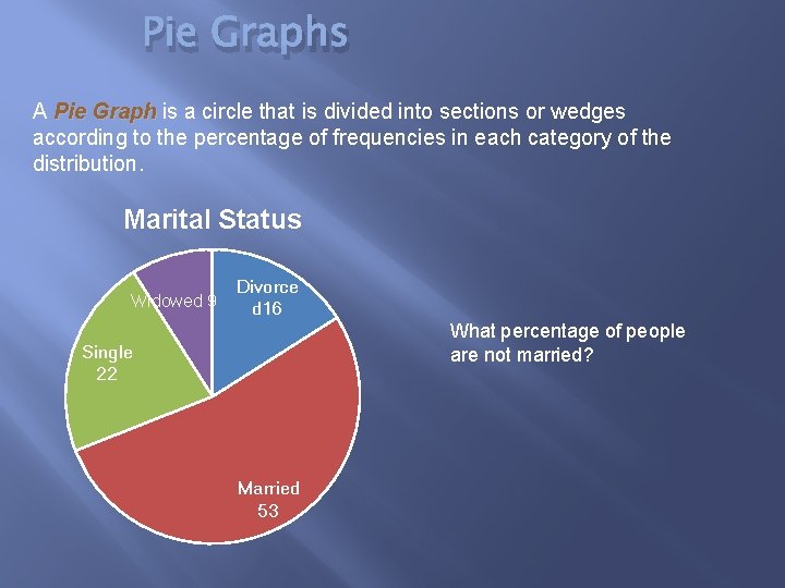
Pie Graphs A Pie Graph is a circle that is divided into sections or wedges according to the percentage of frequencies in each category of the distribution. Marital Status Widowed 9 Divorce d 16 What percentage of people are not married? Single 22 Married 53

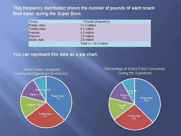
This frequency distribution shows the number of pounds of each snack food eaten during the Super Bowl. Snack Potato chips Tortilla chips Pretzels Popcorn Snack nuts Pounds (frequency) 11. 2 million 8. 2 million 4. 3 million 3. 8 million 2. 5 million Total n = 30. 0 million You can represent this data as a pie chart: Snack Food Consumed During the Superbowl (in millions) Snack nuts; 2, 5 Popcorn; 3, 8 Potato chips; 11, 2 Pretzels; 4, 3 Tortilla chips; 8, 2 Percentage of Snack Food Consumed During the Superbowl Snack nuts 8% Popcorn 13% Potato chips 37% Pretzels 14% Tortilla chips 27% 7

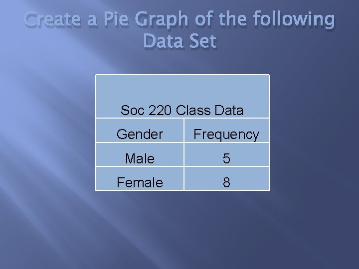
Create a Pie Graph of the following Data Set Soc 220 Class Data Gender Frequency Male 5 Female 8

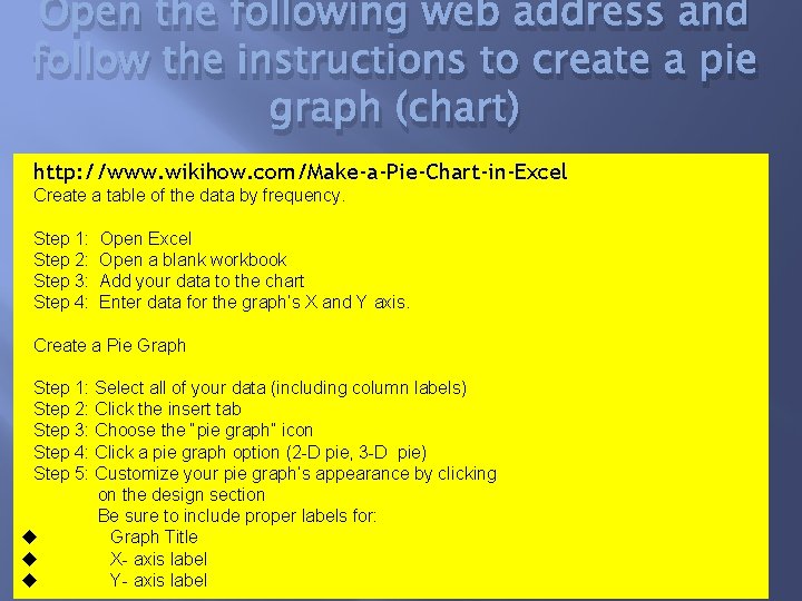
Open the following web address and follow the instructions to create a pie graph (chart) http: //www. wikihow. com/Make-a-Pie-Chart-in-Excel Create a table of the data by frequency. Step 1: Step 2: Step 3: Step 4: Open Excel Open a blank workbook Add your data to the chart Enter data for the graph’s X and Y axis. Create a Pie Graph Step 1: Select all of your data (including column labels) Step 2: Click the insert tab Step 3: Choose the “pie graph” icon Step 4: Click a pie graph option (2 -D pie, 3 -D pie) Step 5: Customize your pie graph’s appearance by clicking on the design section Be sure to include proper labels for: Graph Title X- axis label Y- axis label

Lab 2 Activity: Qualitative Graphs � See Qualitative Graph Activity in your My. Heritage course page. � Open Lab 2 activity – Qualitative Graphs � Open Soc 220 class survey data to complete part 1 � Open 2017 Legends Casino Donations file to complete part 2 � Answer reflection questions 3 a & 3 b � Turn in lab activity document by uploading it in your My. Heritage Soc 220 Coursework under lab activity 2.