
CB 2200 Tutorial Week 2 Tutor ZHANG Wei

CB 2200 Tutorial Week 2 Tutor: ZHANG Wei Department of Management Sciences Email: wzhang 283 -c@my. cityu. edu. hk
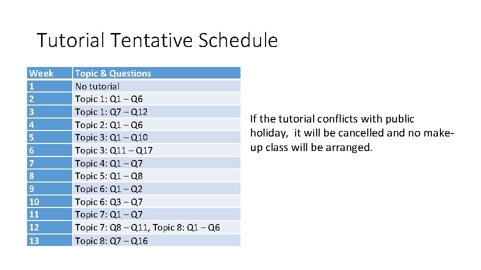
Tutorial Tentative Schedule Week 1 2 3 4 5 6 7 8 9 10 11 12 13 Topic & Questions No tutorial Topic 1: Q 1 – Q 6 Topic 1: Q 7 – Q 12 Topic 2: Q 1 – Q 6 Topic 3: Q 1 – Q 10 Topic 3: Q 11 – Q 17 Topic 4: Q 1 – Q 7 Topic 5: Q 1 – Q 8 Topic 6: Q 1 – Q 2 Topic 6: Q 3 – Q 7 Topic 7: Q 1 – Q 7 Topic 7: Q 8 – Q 11, Topic 8: Q 1 – Q 6 Topic 8: Q 7 – Q 16 If the tutorial conflicts with public holiday, it will be cancelled and no makeup class will be arranged.
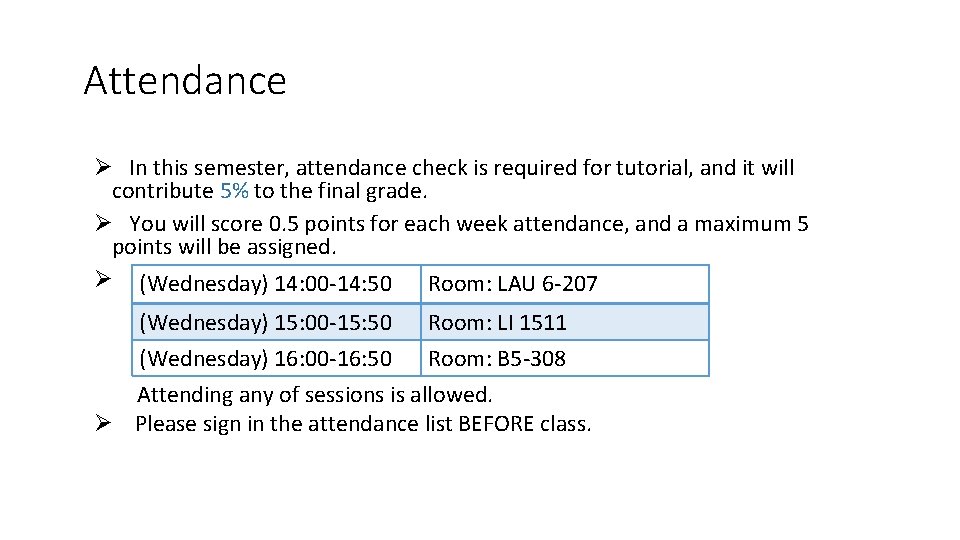
Attendance Ø In this semester, attendance check is required for tutorial, and it will contribute 5% to the final grade. Ø You will score 0. 5 points for each week attendance, and a maximum 5 points will be assigned. Ø (Wednesday) 14: 00 -14: 50 Room: LAU 6 -207 (Wednesday) 15: 00 -15: 50 (Wednesday) 16: 00 -16: 50 Room: LI 1511 Room: B 5 -308 Attending any of sessions is allowed. Ø Please sign in the attendance list BEFORE class.
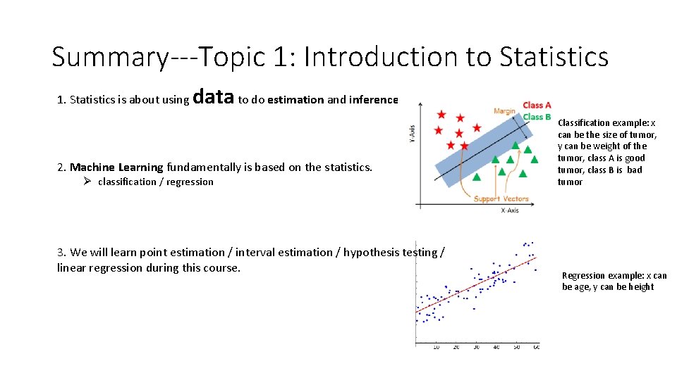
Summary---Topic 1: Introduction to Statistics 1. Statistics is about using data to do estimation and inference. 2. Machine Learning fundamentally is based on the statistics. Ø classification / regression 3. We will learn point estimation / interval estimation / hypothesis testing / linear regression during this course. Classification example: x can be the size of tumor, y can be weight of the tumor, class A is good tumor, class B is bad tumor Regression example: x can be age, y can be height
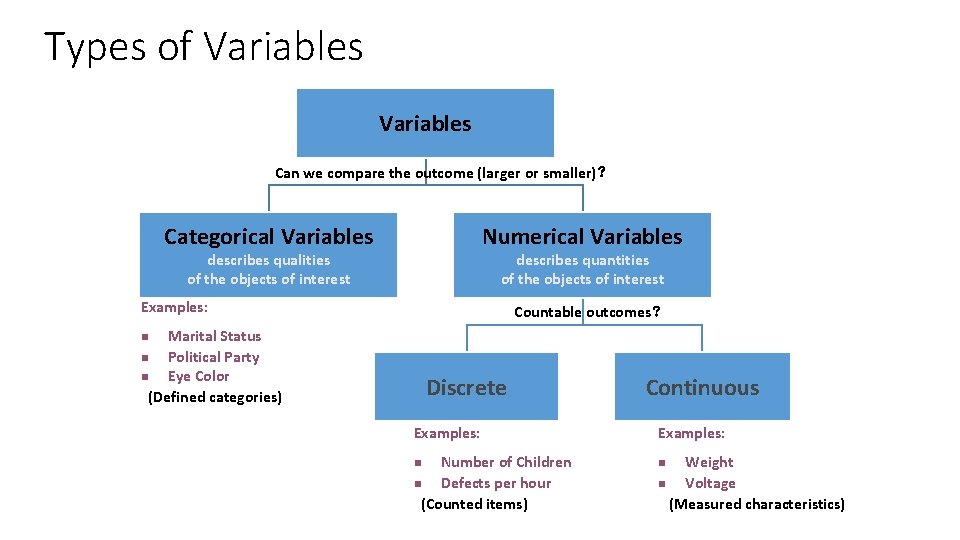
Types of Variables Can we compare the outcome (larger or smaller)? Categorical Variables Numerical Variables describes qualities of the objects of interest describes quantities of the objects of interest Examples: Countable outcomes? Marital Status n Political Party n Eye Color (Defined categories) n Discrete Examples: Number of Children n Defects per hour (Counted items) n Continuous Examples: Weight n Voltage (Measured characteristics) n
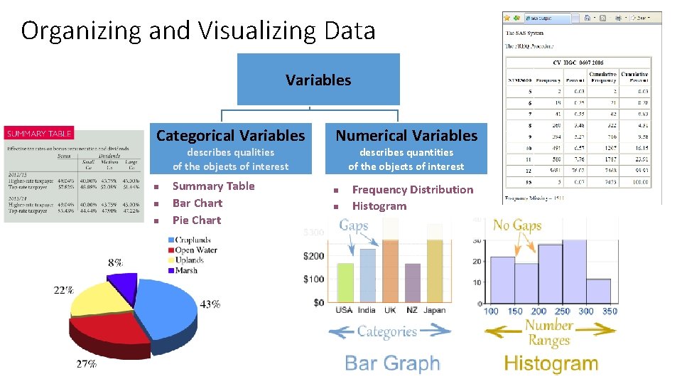
Organizing and Visualizing Data Variables Categorical Variables describes qualities of the objects of interest n n n Summary Table Bar Chart Pie Chart Numerical Variables describes quantities of the objects of interest n n Frequency Distribution Histogram 6
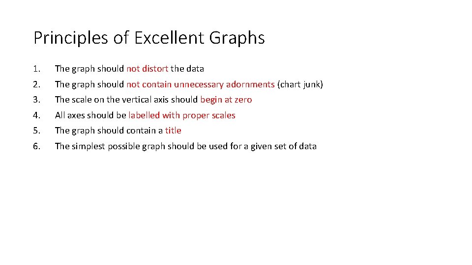
Principles of Excellent Graphs 1. The graph should not distort the data 2. The graph should not contain unnecessary adornments (chart junk) 3. The scale on the vertical axis should begin at zero 4. All axes should be labelled with proper scales 5. The graph should contain a title 6. The simplest possible graph should be used for a given set of data
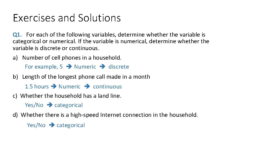
Exercises and Solutions Q 1. For each of the following variables, determine whether the variable is categorical or numerical. If the variable is numerical, determine whether the variable is discrete or continuous. a) Number of cell phones in a household. For example, 5 Numeric discrete b) Length of the longest phone call made in a month 1. 5 hours Numeric continuous c) Whether the household has a land line. Yes/No categorical d) Whethere is a high-speed Internet connection in the household. Yes/No categorical
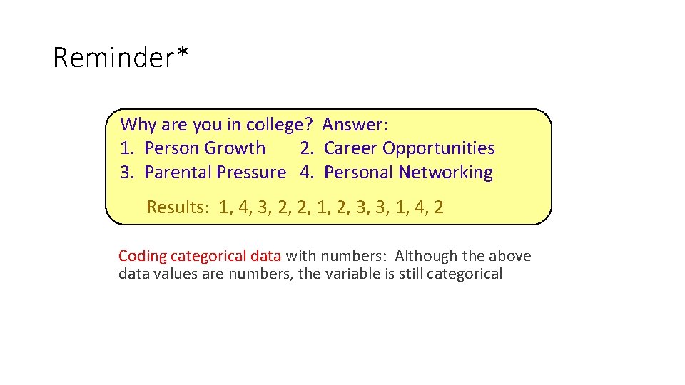
Reminder* Why are you in college? Answer: 1. Person Growth 2. Career Opportunities 3. Parental Pressure 4. Personal Networking Results: 1, 4, 3, 2, 2, 1, 2, 3, 3, 1, 4, 2 Coding categorical data with numbers: Although the above data values are numbers, the variable is still categorical
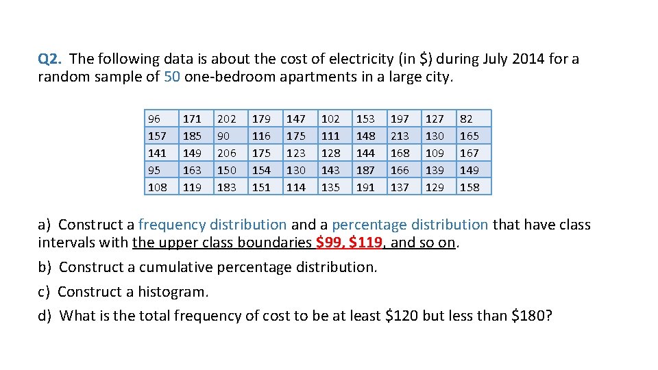
Q 2. The following data is about the cost of electricity (in $) during July 2014 for a random sample of 50 one-bedroom apartments in a large city. 96 157 141 95 108 171 185 149 163 119 202 90 206 150 183 179 116 175 154 151 147 175 123 130 114 102 111 128 143 135 153 148 144 187 191 197 213 168 166 137 127 130 109 139 129 82 165 167 149 158 a) Construct a frequency distribution and a percentage distribution that have class intervals with the upper class boundaries $99, $119, and so on. b) Construct a cumulative percentage distribution. c) Construct a histogram. d) What is the total frequency of cost to be at least $120 but less than $180?
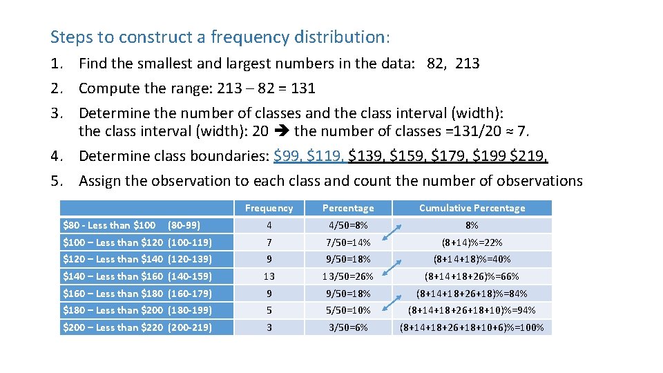
Steps to construct a frequency distribution: 1. Find the smallest and largest numbers in the data: 82, 213 2. Compute the range: 213 – 82 = 131 3. Determine the number of classes and the class interval (width): 20 the number of classes =131/20 ≈ 7. 4. Determine class boundaries: $99, $119, $139, $159, $179, $199 $219, 5. Assign the observation to each class and count the number of observations Frequency Percentage Cumulative Percentage 4 4/50=8% 8% $100 – Less than $120 (100 -119) 7 7/50=14% (8+14)%=22% $120 – Less than $140 (120 -139) 9 9/50=18% (8+14+18)%=40% $140 – Less than $160 (140 -159) 13 13/50=26% (8+14+18+26)%=66% $160 – Less than $180 (160 -179) 9 9/50=18% (8+14+18+26+18)%=84% $180 – Less than $200 (180 -199) 5 5/50=10% (8+14+18+26+18+10)%=94% $200 – Less than $220 (200 -219) 3 3/50=6% (8+14+18+26+18+10+6)%=100% $80 - Less than $100 (80 -99)
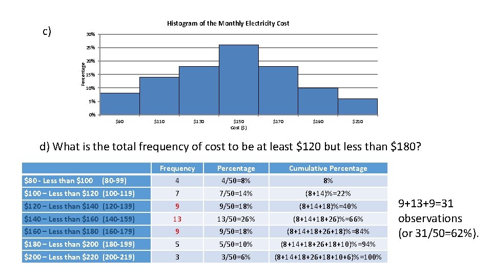
Histogram of the Monthly Electricity Cost c) 30% Percentage 25% 20% 15% 10% 5% 0% $90 $110 $130 $150 Cost ($) $170 $190 $210 d) What is the total frequency of cost to be at least $120 but less than $180? Frequency Percentage Cumulative Percentage 4 4/50=8% 8% $100 – Less than $120 (100 -119) 7 7/50=14% (8+14)%=22% $120 – Less than $140 (120 -139) 9 9/50=18% (8+14+18)%=40% $140 – Less than $160 (140 -159) 13 13/50=26% (8+14+18+26)%=66% $160 – Less than $180 (160 -179) 9 9/50=18% (8+14+18+26+18)%=84% $180 – Less than $200 (180 -199) 5 5/50=10% (8+14+18+26+18+10)%=94% $200 – Less than $220 (200 -219) 3 3/50=6% (8+14+18+26+18+10+6)%=100% $80 - Less than $100 (80 -99) 9+13+9=31 observations (or 31/50=62%).
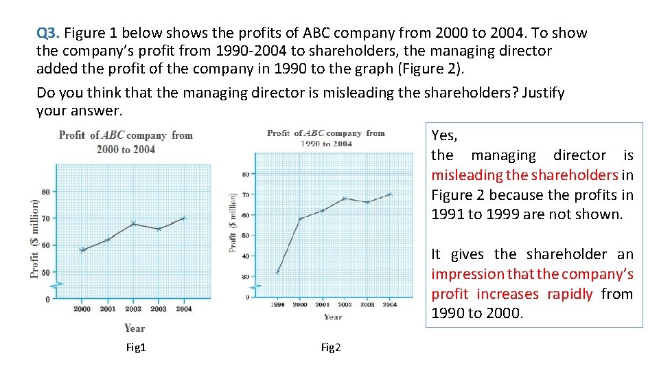
Q 3. Figure 1 below shows the profits of ABC company from 2000 to 2004. To show the company’s profit from 1990 -2004 to shareholders, the managing director added the profit of the company in 1990 to the graph (Figure 2). Do you think that the managing director is misleading the shareholders? Justify your answer. Yes, the managing director is misleading the shareholders in Figure 2 because the profits in 1991 to 1999 are not shown. It gives the shareholder an impression that the company’s profit increases rapidly from 1990 to 2000. Fig 1 Fig 2
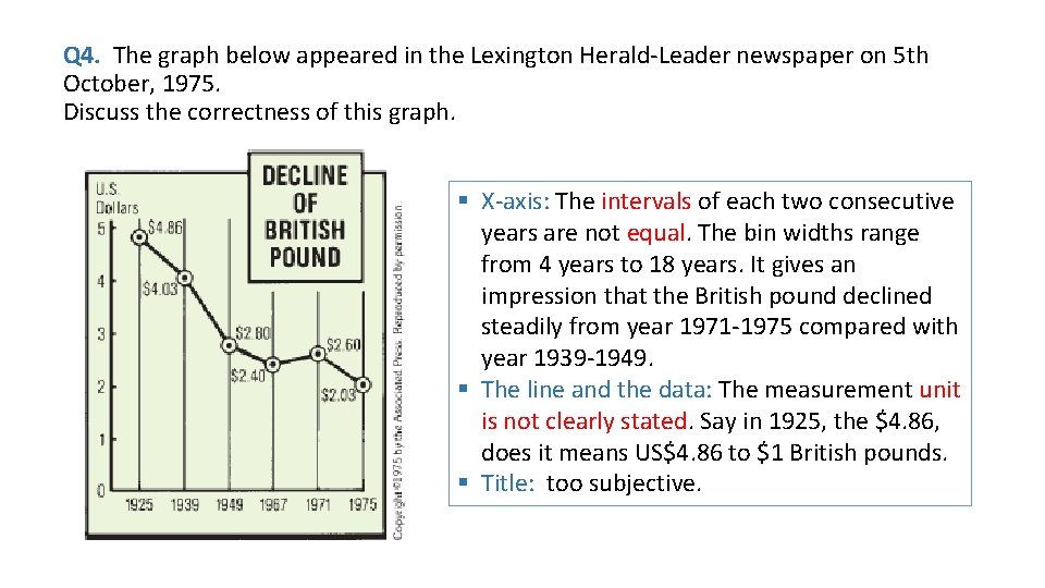
Q 4. The graph below appeared in the Lexington Herald-Leader newspaper on 5 th October, 1975. Discuss the correctness of this graph. . § X-axis: The intervals of each two consecutive years are not equal. The bin widths range from 4 years to 18 years. It gives an impression that the British pound declined steadily from year 1971 -1975 compared with year 1939 -1949. § The line and the data: The measurement unit is not clearly stated. Say in 1925, the $4. 86, does it means US$4. 86 to $1 British pounds. § Title: too subjective.
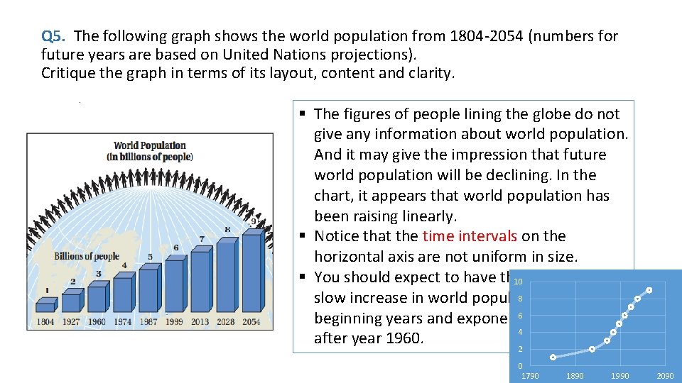
Q 5. The following graph shows the world population from 1804 -2054 (numbers for future years are based on United Nations projections). Critique the graph in terms of its layout, content and clarity. . § The figures of people lining the globe do not give any information about world population. And it may give the impression that future world population will be declining. In the chart, it appears that world population has been raising linearly. § Notice that the time intervals on the horizontal axis are not uniform in size. § You should expect to have the 10 graph showing 8 slow increase in world population at the 6 beginning years and exponential increase 4 after year 1960. 2 0 1790 1890 1990 2090
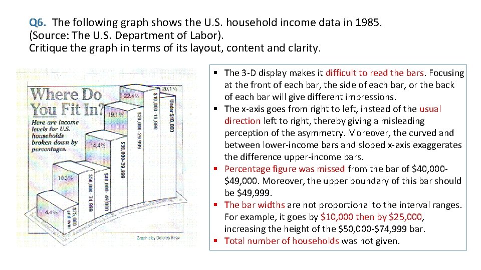
Q 6. The following graph shows the U. S. household income data in 1985. (Source: The U. S. Department of Labor). Critique the graph in terms of its layout, content and clarity. . § The 3 -D display makes it difficult to read the bars. Focusing at the front of each bar, the side of each bar, or the back of each bar will give different impressions. § The x-axis goes from right to left, instead of the usual direction left to right, thereby giving a misleading perception of the asymmetry. Moreover, the curved and between lower-income bars and sloped x-axis exaggerates the difference upper-income bars. § Percentage figure was missed from the bar of $40, 000$49, 000. Moreover, the upper boundary of this bar should be $49, 999. § The bar widths are not proportional to the interval ranges. For example, it goes by $10, 000 then by $25, 000, increasing the height of the $50, 000 -$74, 999 bar. § Total number of households was not given.
- Slides: 16