CATEGORICAL DATA CHAPTER 3 GET A CALCULATOR CATEGORICAL


… Overall, the bar chart shows")

 allows us to look at two categorical")
 Titanic 800 700 600 500 400 300 200 100")


 Construct a graphical display that shows the association between “class” and “survival”. Write")


- Slides: 29
CATEGORICAL DATA CHAPTER 3 GET A CALCULATOR!
CATEGORICAL DATA chapter 3 THE THREE RULES OF DATA ANALYSIS won’t be difficult to remember: 1. Make a picture — things may be revealed that are not obvious in the raw data. These will be things to think about. 2. MAKE A PICTURE — important features of and patterns in the data will show up. You may also see things that you did not expect. 3. MAKE A PICTURE — the best way to tell others about your data is with a well-chosen picture. Slide 3 - 2
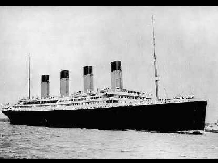
Launched: Builders: 31 st May 1911 Harland Wolff, Belfast Port of Registry: Liverpool Passengers Lost: Crew Lost: Total Lost: 818 (62%) 684 (77%) 1, 502 (68%) Slide 3 - 5
DISTRIBUTION name of categories and how frequently each occurs Frequency distribution Relative frequency distribution Slide 3 - 6
this is What doa Violation you see? of the “Area Principle” When we look at each ship, we see the area taken up by the ship, instead of the length of the ship. Slide 3 - 7
BAR GRAPHS n n A bar chart displays the distribution of a categorical variable, showing the counts for each category next to each other for easy comparison. A bar chart stays true to the area principle. For bar charts (with categorical data), be spaces between the bars!!! sure to leave Slide 3 - 8
BAR CHARTS n A relative frequency bar graph displays the relative proportion of counts for each category. Slide 3 - 9
Pie Charts When you are interested in parts of the whole, a pie chart might be your display of choice. Slide 3 - 10
WHAT CAN GO WRONG? While some people might like the pie chart on the left better, it is harder to compare fractions of the whole, which a well-done pie chart does. Slide 3 - 11
WHAT CAN GO WRONG? This plot of the percentage of high-school students who engage in specified dangerous behaviors has a problem. Can you see it? if you are making a pie chart with percentages (or proportions), make sure the percentages add up to 100%!!! Slide 3 - 12
In which region do the greatest NUMBER of people wear seatbelts? Slide 3 - 13
n Note: we are using the word “proportion” “percentage”)… Overall, the bar chart shows that all four(or regions of the country have more than 60% of the car drivers …NOT word “ ” wearing seat belts. number n The Midwest has the smallest proportion of car drivers wearing seat belts (about 62%) where the South and West have the largest proportion (about 78 - 80%). Slide 3 - 14
back to the Titanic…
A 2 -WAY TABLE (OR “CONTINGENCY” TABLE) allows us to look at two categorical variables together. Survival Class Alive Dead Total First Second Third Crew Total 203 118 178 212 711 122 167 528 673 1490 325 285 706 885 2201 marginal distributions Slide 3 - 16
SIDE-BY-SIDE BAR GRAPH (FOR COUNTS) Titanic 800 700 600 500 400 300 200 100 0 First Second Alive Third Crew Dead Slide 3 - 17
n n What percent of the people on the Titanic died? 1490/2201 = 67. 7% What percent of the people were surviving crew? 212/2201 = 9. 6% *What percent of the survivors were First class? 203/711 = 28. 6% *What percent of First class survived? 203/325 = 62. 5% Slide 3 - 18
CONDITIONAL DISTRIBUTIONS Separated on the CONDITION of SURVIVAL: Slide 3 - 19
c) Construct a graphical display that shows the association between “class” and “survival”. Write a few sentences describing the association between class and To check for an association between variables, you MUST compare survival status. PROPORTIONS (not COUNTS!!!) Slide 3 - 20
n A segmented bar graph displays the same information as a pie chart, but in the form of bars instead of circles. Proportion SEGMENTED BAR GRAPH Slide 3 - 21
SEGMENTED BAR GRAPH n A segmented bar graph displays the same information as a pie chart, but in the form of bars instead of circles. FIRST SECOND THIRD CREW Slide 3 - 22
SEGMENTED BAR GRAPH …DESCRIBE THE ASSOCIATION BETWEEN FIRST THE TWO VARIABLES: FIRST SECOND First class passengers make up a much Whengroup describing association between larger proportion of the “alive” categorical variables, you MUST compare The proportion than of 2 ndthe class is slightly “dead” group. (not. SECOND COUNTS!!!) THIRD greater in the “alive” group PROPORTIONS than the “dead” group. The proportions of “crew” and “third class” are greater in the “dead” group THIRD than the “alive” group. CREW Slide 3 - 23
ANOTHER TYPE OF GRAPH THAT SHOWS ASSOCIATION… Titanic: Class vs Survival 0, 50 0, 40 0, 30 0, 20 0, 10 0, 00 First Second Alive Third Crew Dead Slide 3 - 24
LEVEL OF EDUCATION BY GENDER Gender Level of Education Male Female Total Not High School Graduate* College Graduate Total 318 603 165 1086 29. 3% 55. 5% 15. 2% 100% 212 402 110 724 29. 3% 55. 5% 15. 2% 100% 530 1005 275 1810 29. 3% 55. 5% 15. 2% 100% *and not a college graduate Slide 3 - 25
LEVEL OF EDUCATION BY GENDER 700 600 A graph that compares COUNTS is no good for displaying association! 500 (especially when the sample sizes are unequal!) 400 300 200 100 0 not high school male female college
LEVEL OF EDUCATION BY GENDER Not High School Graduate* College Graduate Total Male 318 29. 3% 603 55. 5% 165 15. 2% 1086 100% Female 212 29. 3% 402 55. 5% 110 15. 2% 724 100% Total 530 29. 3% 1005 55. 5% 275 15. 2% 1810 100% College Graduate High School Graduate (but not college grad) Not High School Graduate Male Female GENDER is INDEPENDENT of LEVEL OF EDUCATION (no association) Slide 3 - 27
INDEPENDENT = NO ASSOCIATION DEPENDENT = ASSOCIATION The variables would be considered independent if the distribution of proportions were the same for each group. Not High School Graduate* College Graduate Total Male 318 29. 3% 603 55. 5% 165 15. 2% 1086 100% Female 212 29. 3% 402 55. 5% 110 15. 2% 724 100% Total 530 29. 3% 1005 55. 5% 275 15. 2% 1810 100% Slide 3 - 28
stop!