Calculate Choose graphs to support how you display


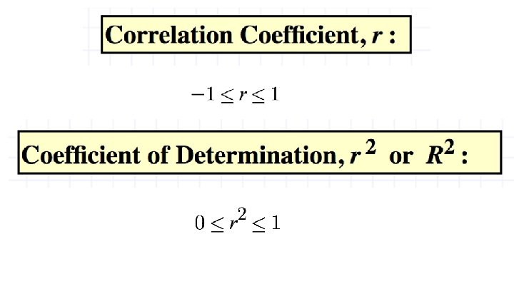

 Calculate the r. http: //www.")

- Slides: 14
Calculate: Choose graphs to support how you display your data Mean, median, mode Range, Standard Deviation - Titles - Labels - Creative Science Fair Math Support Use these statistics concepts to EXPLAIN your data (Analysis of Results)
Analyze The math test scores of five students are: 92, 88, 80, 68 and 52. σ = 14. 53 A different math class took the same test with these five test scores: 92, 92, 52. σ = 19. 6
Opener The stem and leaf plot shows the number of hours students spent studying for a science exam. 1. Find: - Mean, median, mode - Range and standard deviation 2. Describe the data in a paragraph using mathematical language.
Number of hours students spent studying for a science exam Mean Median Mode = 62. 76 Range Standard Deviation = 62. 762 51, 60, 64, 71, 73, 74, 76, 77, 78, 79, 84, 93, 94
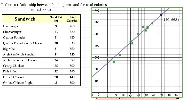
Are they related? • Smoking & lung cancer • Confidence/Self-Esteem & Depression • Shoe Size & Age • Ice Cream & Subject
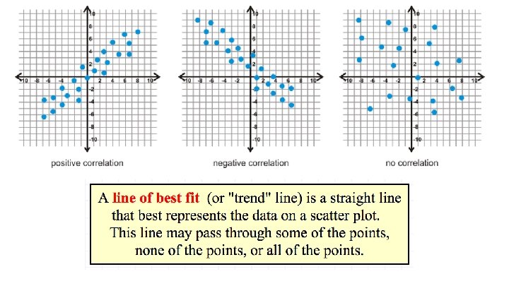
How well does the line represent the data?
http: //www. alcula. com/calculators/statistics/correlation-coefficient/
What does this all mean? Use Plot. ly to find a line of best fit and coefficient of determination. Make a prediction.
Open a google or pages doc. (Title: Correlation. Coefficient_Name) Calculate the r. http: //www. alcula. com/calculators/statistics/correlation-coefficient/ Go to plot. ly 1) Take a screenshot of the scatterplot with the line of best fit. 2) Use the line to predict the pool attendance for 18 deg C, 30, & 40.
On Your Own Calculate the correlation coefficient. Interpret. Make a scatterplot with line of best fit. Describe the graph.