Box Whisker Plot Scott Davis QI Coordinator Tacoma
Box & Whisker Plot Scott Davis, QI Coordinator, Tacoma Pierce County Health Department 7/12 1
Box Plot When would I use this tool? You are analyzing a continuous variable (time, pressure, weight, etc. ) You want to compare samples side by side on the same scale You have at least 15 data points per sample 2
Box Plot What does this tool tell me? It gives you a picture of the variation in your data … – Range (highest, and lowest) – Where most (75%) of your data fall – A sense of the center of your data 3
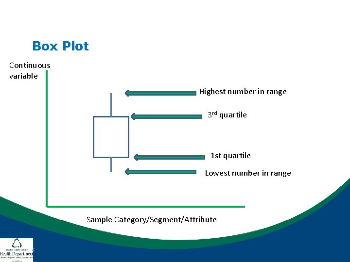
Box Plot Continuous variable Highest number in range 3 rd quartile 1 st quartile Lowest number in range Sample Category/Segment/Attribute 4
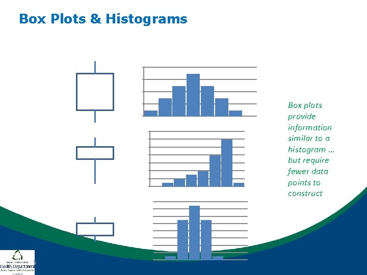
Box Plots & Histograms Box plots provide information similar to a histogram … but require fewer data points to construct 5
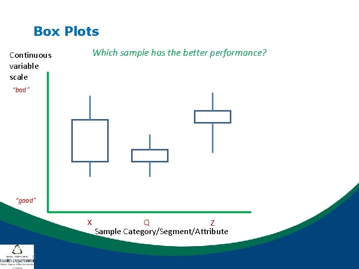
Box Plots Which sample has the better performance? Continuous variable scale “bad” “good” X 6 Q Z Sample Category/Segment/Attribute
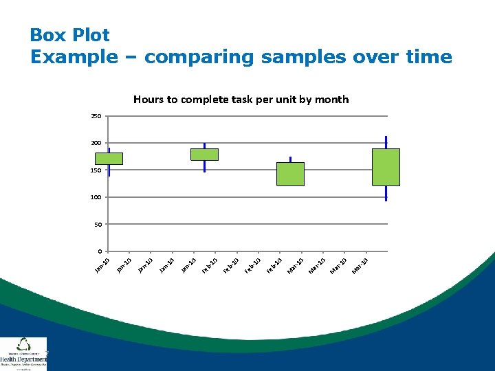
Box Plot Example – comparing samples over time Hours to complete task per unit by month 250 200 150 100 50 7 -1 0 ar M 10 b. Fe 10 n. Ja Ja n- 10 0
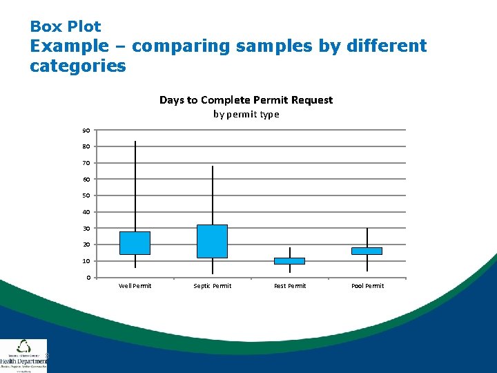
Box Plot Example – comparing samples by different categories Days to Complete Permit Request by permit type 90 80 70 60 50 40 30 20 10 0 Well Permit 8 Septic Permit Rest Permit Pool Permit
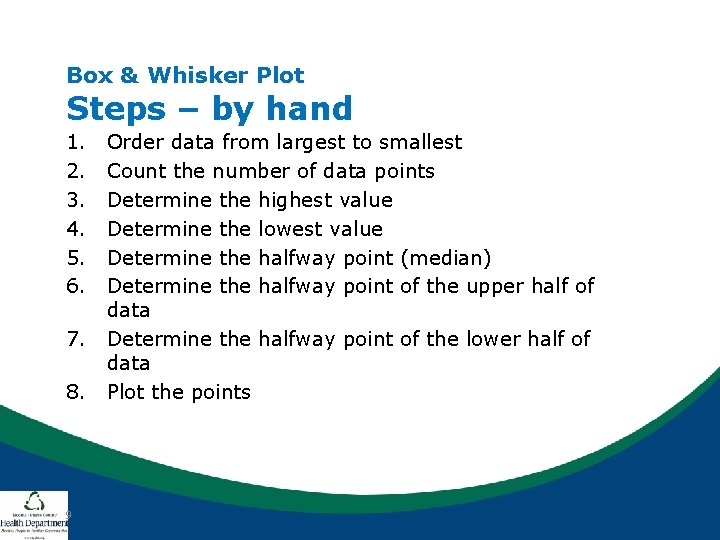
Box & Whisker Plot Steps – by hand 1. 2. 3. 4. 5. 6. 7. 8. 9 Order data from largest to smallest Count the number of data points Determine the highest value Determine the lowest value Determine the halfway point (median) Determine the halfway point of the upper half of data Determine the halfway point of the lower half of data Plot the points
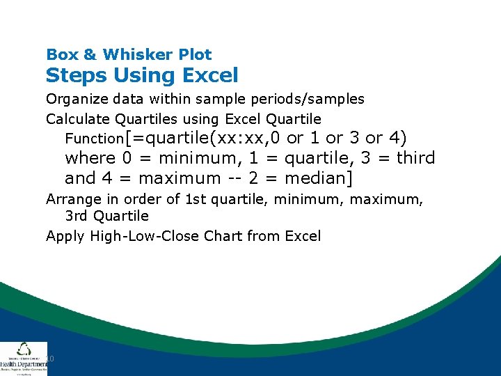
Box & Whisker Plot Steps Using Excel Organize data within sample periods/samples Calculate Quartiles using Excel Quartile Function[=quartile(xx: xx, 0 or 1 or 3 or 4) where 0 = minimum, 1 = quartile, 3 = third and 4 = maximum -- 2 = median] Arrange in order of 1 st quartile, minimum, maximum, 3 rd Quartile Apply High-Low-Close Chart from Excel 10
- Slides: 10