Box and Whisker Plots a k a the
Box and Whisker Plots (a. k. a. “the 5 number summary”) 6. SP
6. SP Warm Up Use the data below for Questions 1 -4. 14, 25, 37, 53, 26, 12, 70, 31 1. What is the mean? 2. What is the median? 3. What is the mode? 4. What is the range? Course 2
The 5 Number Summary The five number summary is another name for the visual representation of the box and whisker plot. The five number summary consist of : ◦ ◦ ◦ The The The median ( 2 nd quartile) 1 st quartile 3 rd quartile maximum value in a data set minimum value in a data set
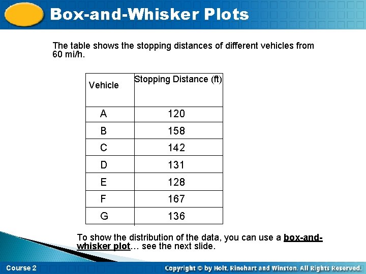
Box-and-Whisker Plots The table shows the stopping distances of different vehicles from 60 mi/h. Vehicle Stopping Distance (ft) A 120 B 158 C 142 D 131 E 128 F 167 G 136 To show the distribution of the data, you can use a box-andwhisker plot… see the next slide. Course 2
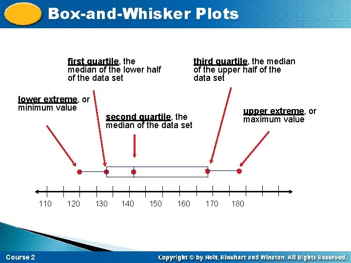
Box-and-Whisker Plots first quartile, the median of the lower half of the data set lower extreme, or minimum value 110 Course 2 120 third quartile, the median of the upper half of the data set upper extreme, or maximum value second quartile, the median of the data set 130 140 150 160 170 180
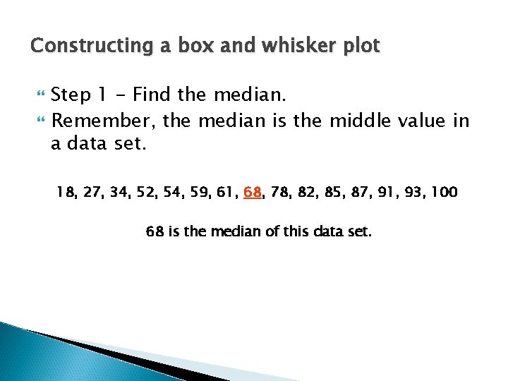
Constructing a box and whisker plot Step 1 - Find the median. Remember, the median is the middle value in a data set. 18, 27, 34, 52, 54, 59, 61, 68, 78, 82, 85, 87, 91, 93, 100 68 is the median of this data set.

Constructing a box and whisker plot Step 2 – Find the lower quartile. The lower quartile is the median of the data set to the left of 68. (18, 27, 34, 52, 54, 59, 61, ) 68, 78, 82, 85, 87, 91, 93, 100 52 is the lower quartile
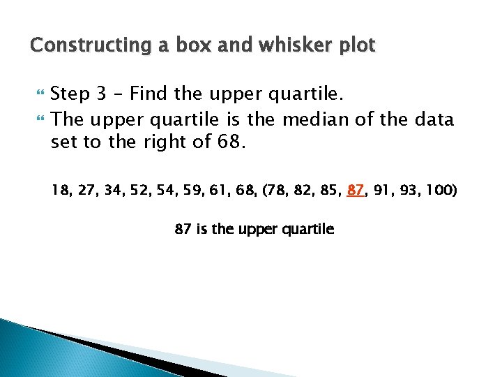
Constructing a box and whisker plot Step 3 – Find the upper quartile. The upper quartile is the median of the data set to the right of 68. 18, 27, 34, 52, 54, 59, 61, 68, (78, 82, 85, 87, 91, 93, 100) 87 is the upper quartile
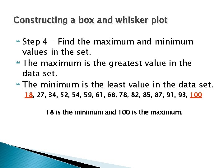
Constructing a box and whisker plot Step 4 – Find the maximum and minimum values in the set. The maximum is the greatest value in the data set. The minimum is the least value in the data set. 18, 27, 34, 52, 54, 59, 61, 68, 78, 82, 85, 87, 91, 93, 100 18 is the minimum and 100 is the maximum.
Constructing a box and whisker plot Step 5 – Find the inter-quartile range (IQR). The inter-quartile (IQR) range is the difference between the upper and lower quartiles. ◦ ◦ Upper Quartile = 87 Lower Quartile = 52 87 – 52 = 35 35 = IQR
The 5 Number Summary Organize the 5 number summary ◦ ◦ ◦ Median – 68 Lower Quartile – 52 Upper Quartile – 87 Max – 100 Min – 18
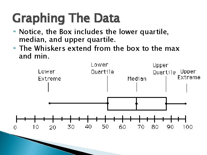
Graphing The Data Notice, the Box includes the lower quartile, median, and upper quartile. The Whiskers extend from the box to the max and min.
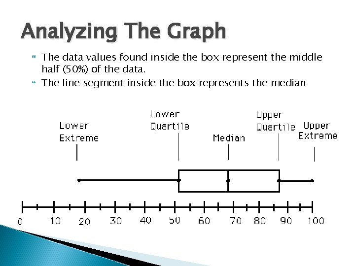
Analyzing The Graph The data values found inside the box represent the middle half (50%) of the data. The line segment inside the box represents the median
Practice Use the following set of data to create the 5 number summary. 3, 7, 11, 15, 21, 23, 39, 41, 45, 50, 61, 87, 99, 220
Median What is the median or 2 nd quartile? 3, 7, 11, 15, 21, 23, 39, 41, 45, 50, 61, 87, 99, 220 The median is 39
Lower Quartile (1 st Quartile) What is the lower or 1 st quartile? (3, 7, 11, 15, 21, 23), 39, 41, 45, 50, 61, 87, 99, 220 The lower quartile is 11
Upper Quartile (3 rd Quartile) What is the upper or 3 rd quartile? 3, 7, 11, 15, 21, 23, 39, (41, 45, 50, 61, 87, 99, 220) The upper quartile is 61
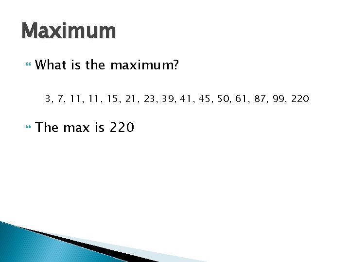
Maximum What is the maximum? 3, 7, 11, 15, 21, 23, 39, 41, 45, 50, 61, 87, 99, 220 The max is 220
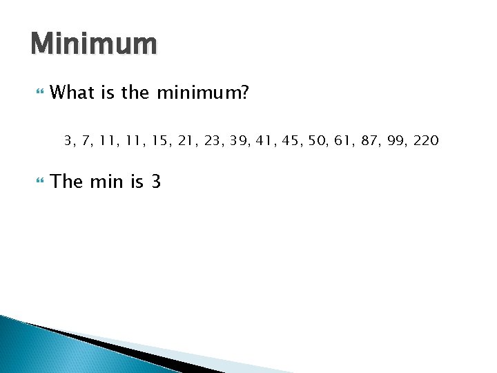
Minimum What is the minimum? 3, 7, 11, 15, 21, 23, 39, 41, 45, 50, 61, 87, 99, 220 The min is 3
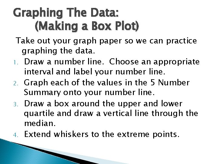
Graphing The Data: (Making a Box Plot) Take out your graph paper so we can practice graphing the data. 1. Draw a number line. Choose an appropriate interval and label your number line. 2. Graph each of the values in the 5 Number Summary onto your number line. 3. Draw a box around the upper and lower quartile and draw a vertical line through the median. 4. Extend whiskers to the extreme points.
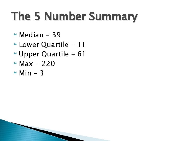
The 5 Number Summary Median - 39 Lower Quartile - 11 Upper Quartile - 61 Max - 220 Min - 3
Interpreting the Box Plot: Study your Box and Whisker Plot to determine what it is telling you. Make a statement about what it is saying, then support the statement with facts from your graph. The following slides show you how to interpret and describe your box plot.
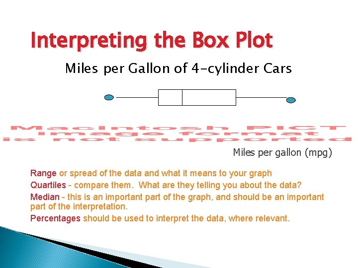
Interpreting the Box Plot Miles per Gallon of 4 -cylinder Cars Miles per gallon (mpg) Range or spread of the data and what it means to your graph Quartiles - compare them. What are they telling you about the data? Median - this is an important part of the graph, and should be an important part of the interpretation. Percentages should be used to interpret the data, where relevant.
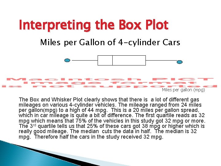
Interpreting the Box Plot Miles per Gallon of 4 -cylinder Cars Miles per gallon (mpg) The Box and Whisker Plot clearly shows that there is a lot of different gas mileages on various 4 -cylinder vehicles. The mileage ranged from 24 miles per gallon(mpg) to a high of 44 mpg. This is a 20 miles per gallon spread, which in car mileage is quite a bit of difference. The first quartile reads as 32 mpg which means that 75% of the vehicles in this study got 32 mpg or more. The 3 rd quartile tells us that 25% of these cars got 38 mpg or higher which is really good mileage. The median cuts the data in half. The median is 32 mpg. Therefore half the cars in the study received 32 mpg.
Box-and-Whisker Plots On Your Own Use the data for Questions 1 -3. 24, 20, 18, 25, 22, 30, 29, 35, 30, 28, 24, 38 1. What is the range? 20 2. What is the 3 rd quartile? 31 3. Create a box-and-whisker plot for the data. Course 2

Review of Box Plots http: //www. youtube. com/watch? v=Co. Vf 1 j. Lx gj 4
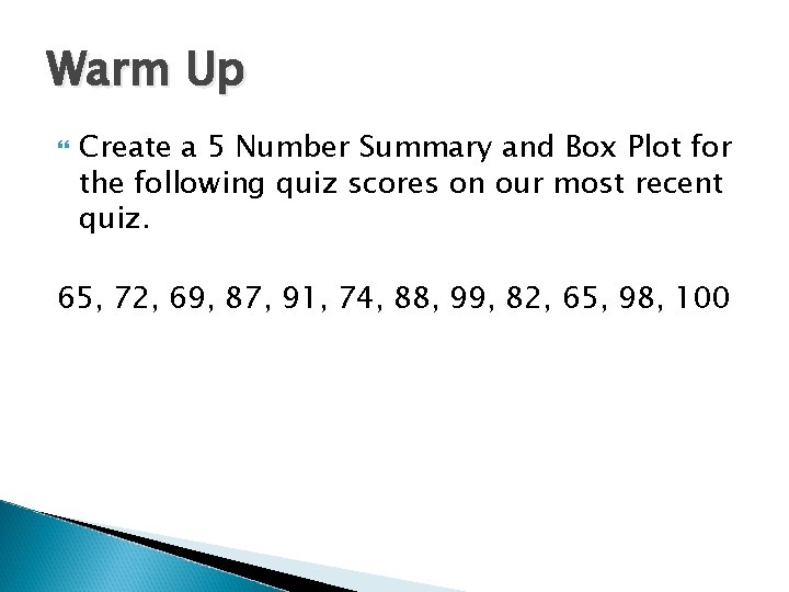
Warm Up Create a 5 Number Summary and Box Plot for the following quiz scores on our most recent quiz. 65, 72, 69, 87, 91, 74, 88, 99, 82, 65, 98, 100
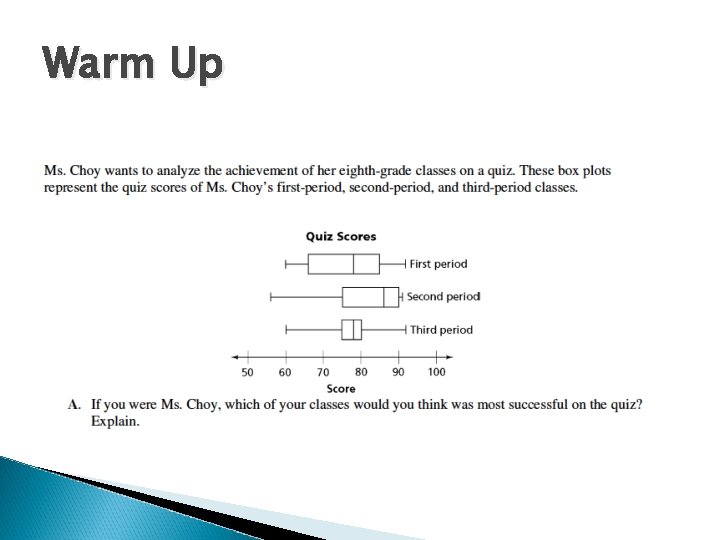
Warm Up
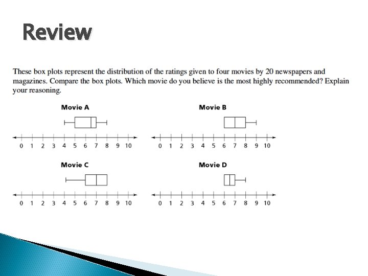
Review
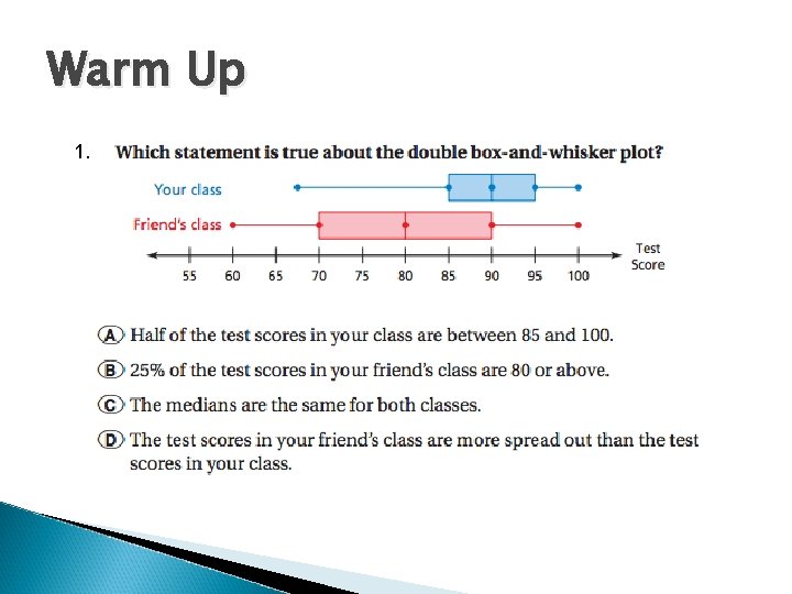
Warm Up 1.
Warm Up, cont…
- Slides: 31